> ## Documentation Index
> Fetch the complete documentation index at: https://help.dingtalk.io/llms.txt
> Use this file to discover all available pages before exploring further.
# Approval form controls
> Learn about the layout, basic, and enhanced controls of an Approval form — including each control's use cases, settings, attributes, data constraints, and search boundaries.
## 1. Form control details
An Approval form is composed of various controls, grouped into three categories:
| Control category | Included controls |
| ----------------- | ----------------------------------------------------------------------------------------------------------------------------------------------------------------------------------------------- |
| Layout controls | Column split |
| Basic controls | Single-line input, Multi-line input, Numeric input, Single Select, Multiselect, Date, Date range, Description text, ID card, Phone |
| Enhanced controls | Cascade/Category, Image, Details/Spreadsheet, Amount, Attachment, Signature, Contact, Department, Current location, Calculate Formula, Associated Approval form, Province/City/District, Rating |
### 1) Layout controls
Column split improves information density on the desktop by arranging Form Fields into multiple columns side by side.
Column split takes effect only on the **desktop**; the mobile side still displays in a single column. This control has no Attribute Settings, data constraints, or Search.
Column split control in the control library:

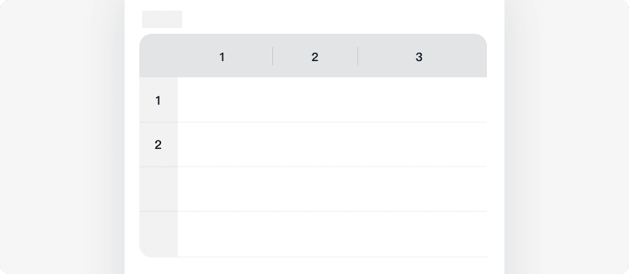
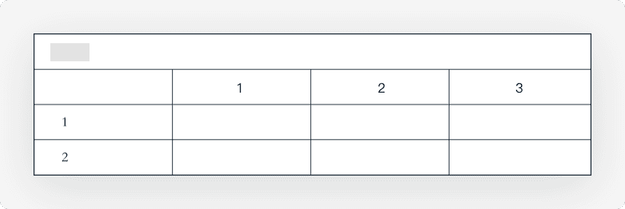
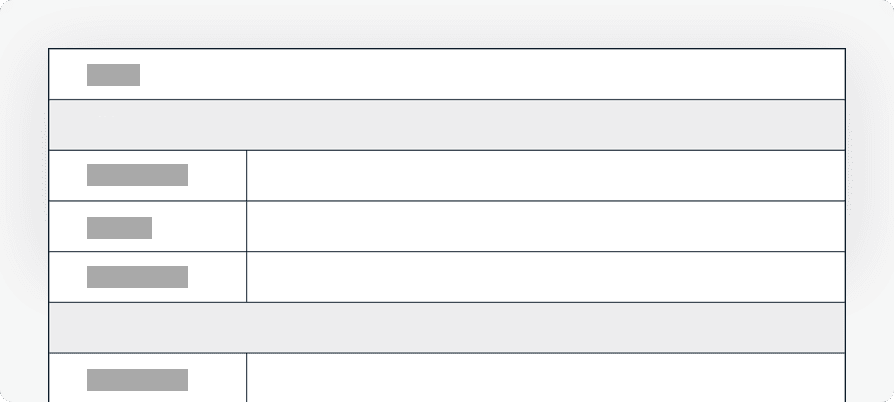
Use Column split to organize fields in the form designer:

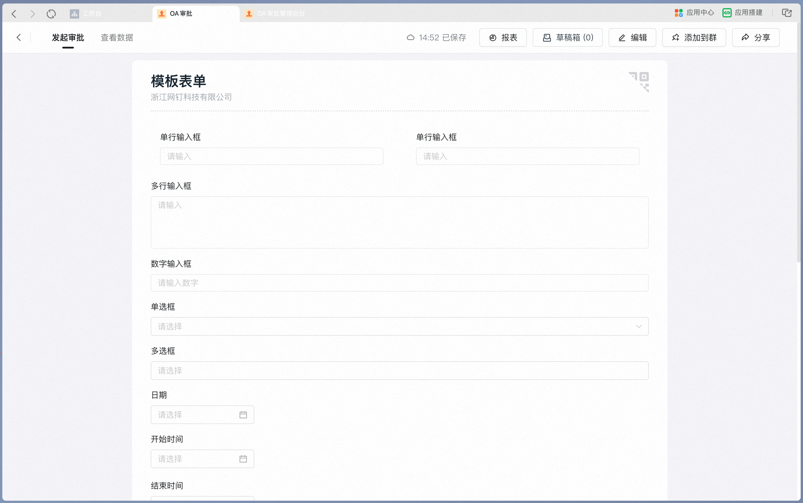
Column split as it appears on a desktop form:
### 2) Basic controls
Basic controls share the following common settings:
| Common setting | Description |
| ---------------- | --------------------------------------------------------------------------------------------------------------------------------------------------------------- |
| Title | The Title displayed on the form. Up to 50 characters |
| Placeholder text | The gray hint text shown inside an empty input on the form. Up to 50 characters |
| Default | The Default Content shown inside an empty input on the form. When Step Permissions are set to "Editable", the field value bound to this control can be modified |
| Required setting | Off by default. When On, the field bound to this control is validated on form submission, and submission is blocked if the field is empty |
| Print setting | On by default. When Off, the field bound to this control is excluded from the downloaded or printed form-detail PDF |
#### 1. Single-line input
Use this control to enter simple Text, such as a contract name or item name.
**Settings interface**
Add a single-line input in the form designer:
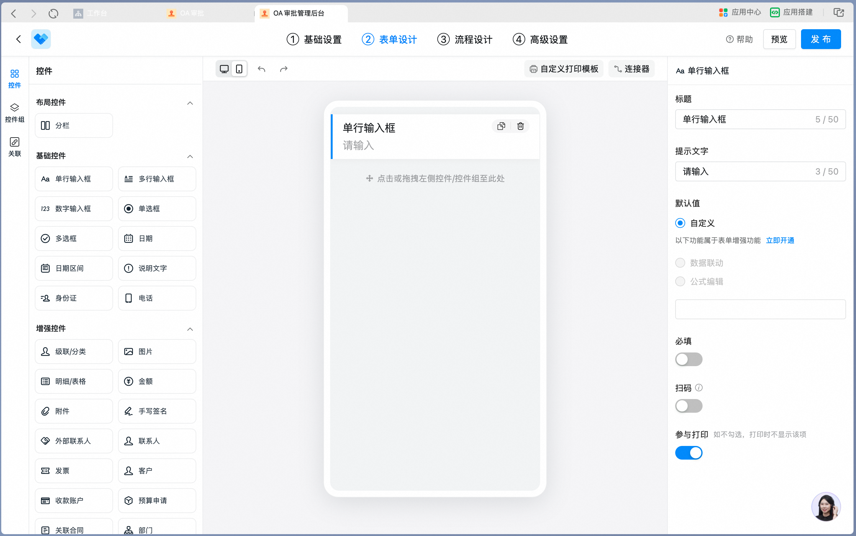
Single-line input Attribute Settings panel:
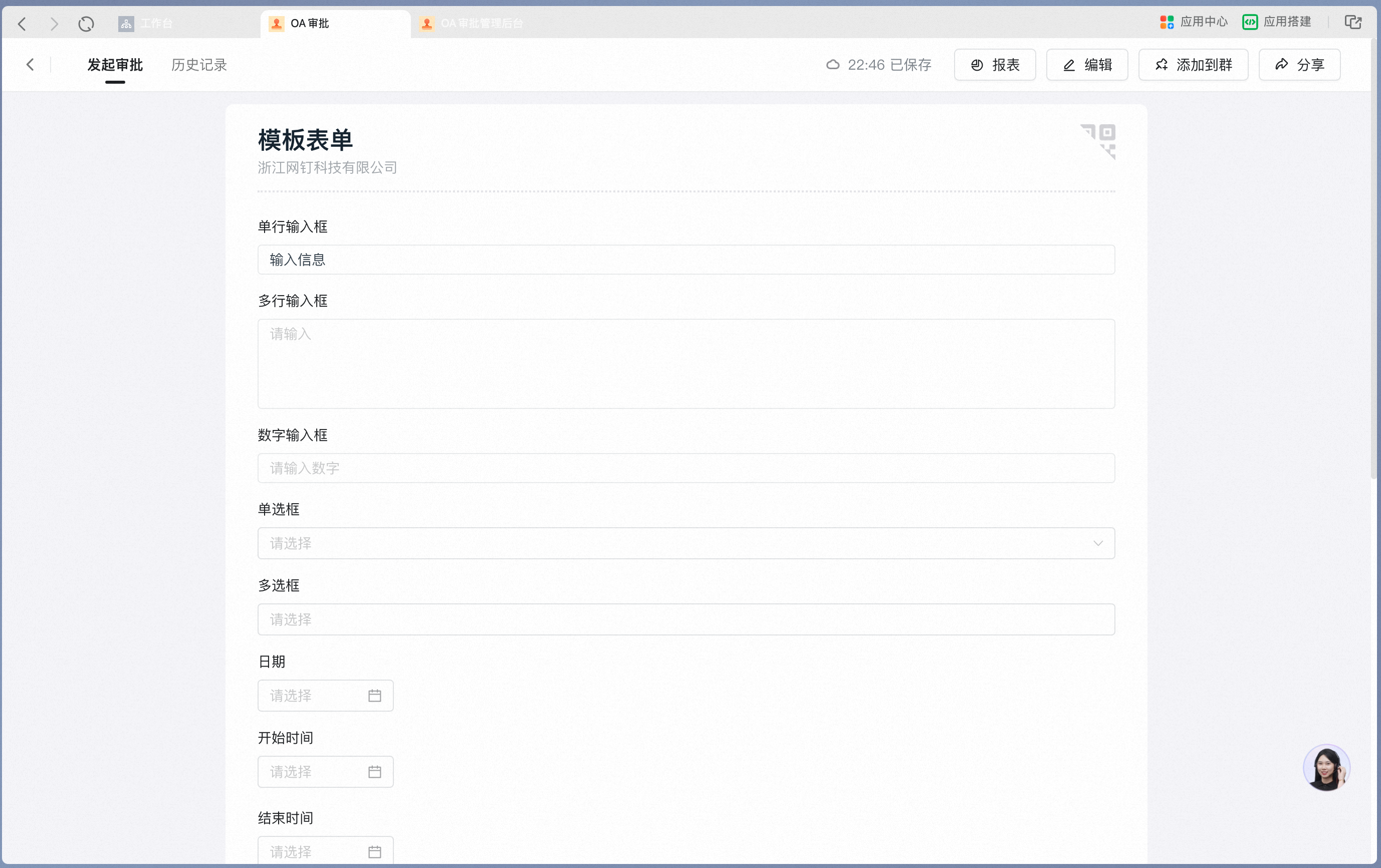
Single-line input as it appears on a mobile form:
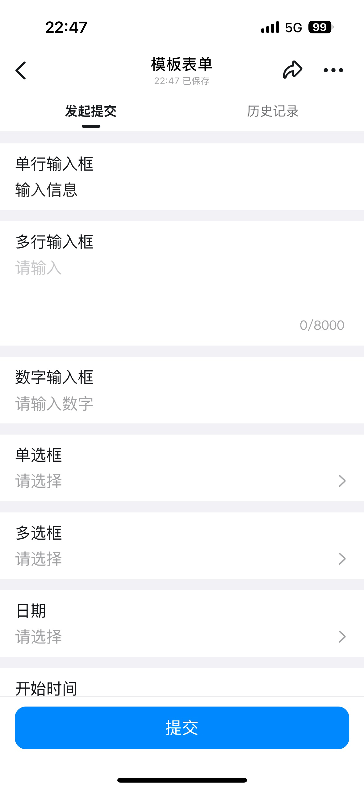
**Attribute Settings**
| Attribute | Description |
| ---------------- | -------------------------------------------------------------------------------------------------------------------- |
| Scan-to-fill | Off by default. When On, Content can be filled in quickly by scanning a code |
| Data linkage | A paid capability. When On, supports filling in Data from other forms according to specific rules |
| Formula editor | A paid capability. When On, supports using formulas to fetch system fields, process Data, and perform logical checks |
| Input validation | A paid capability. When On, supports validating the entered Content against specific rules |
The single-line input recognizes Links and Markdown-formatted Content:

Entered Content as it appears on the Approval detail Page:

**Data constraints and Search**
| Item | Description |
| --------------- | --------------------------------------------------- |
| Search boundary | Exact Field match, with fuzzy Search also supported |
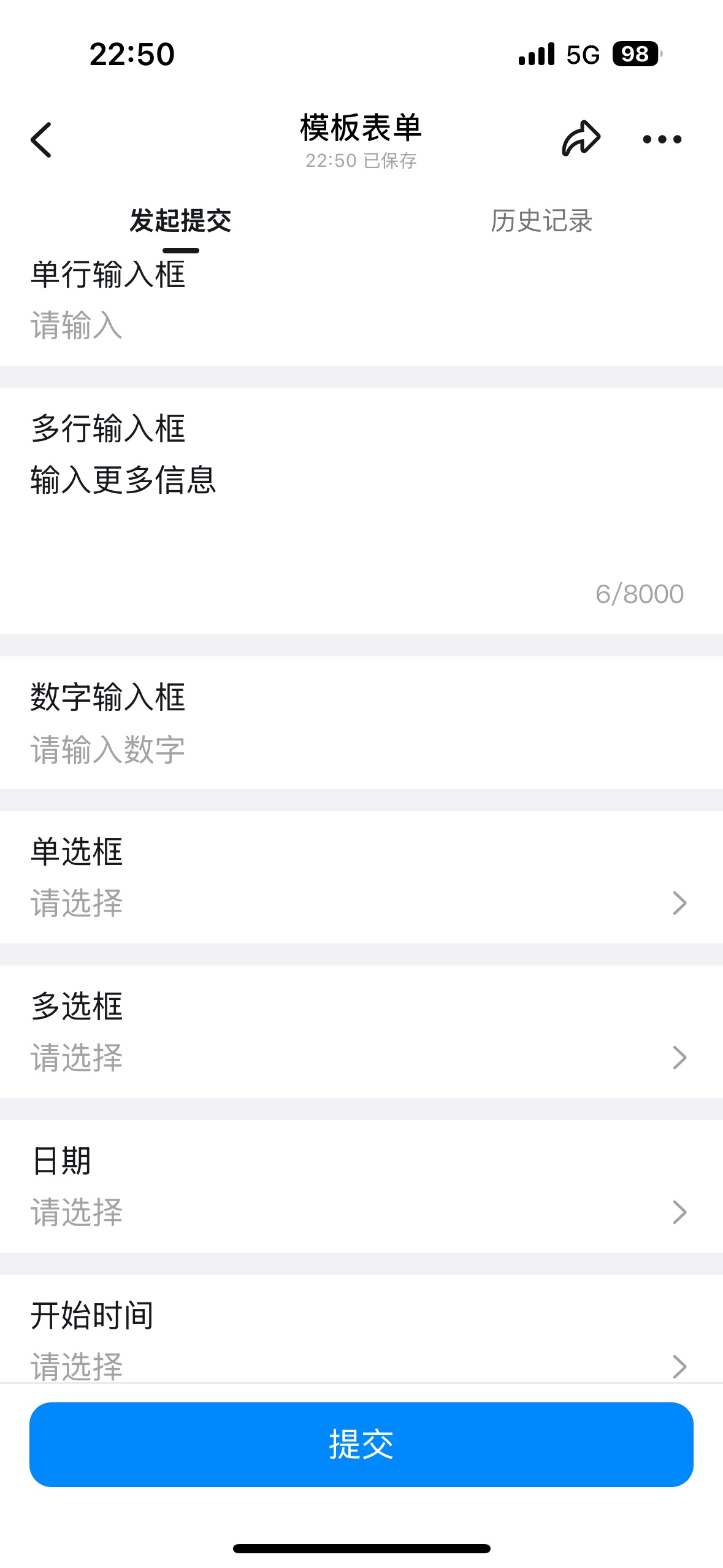
#### 2. Multi-line input
Use this control to enter complex Text — for example, detailed notes, interview transcripts, or interview evaluations. Line breaks are supported.
**Settings interface**
Add a multi-line input in the form designer:

Multi-line input Attribute Settings panel:
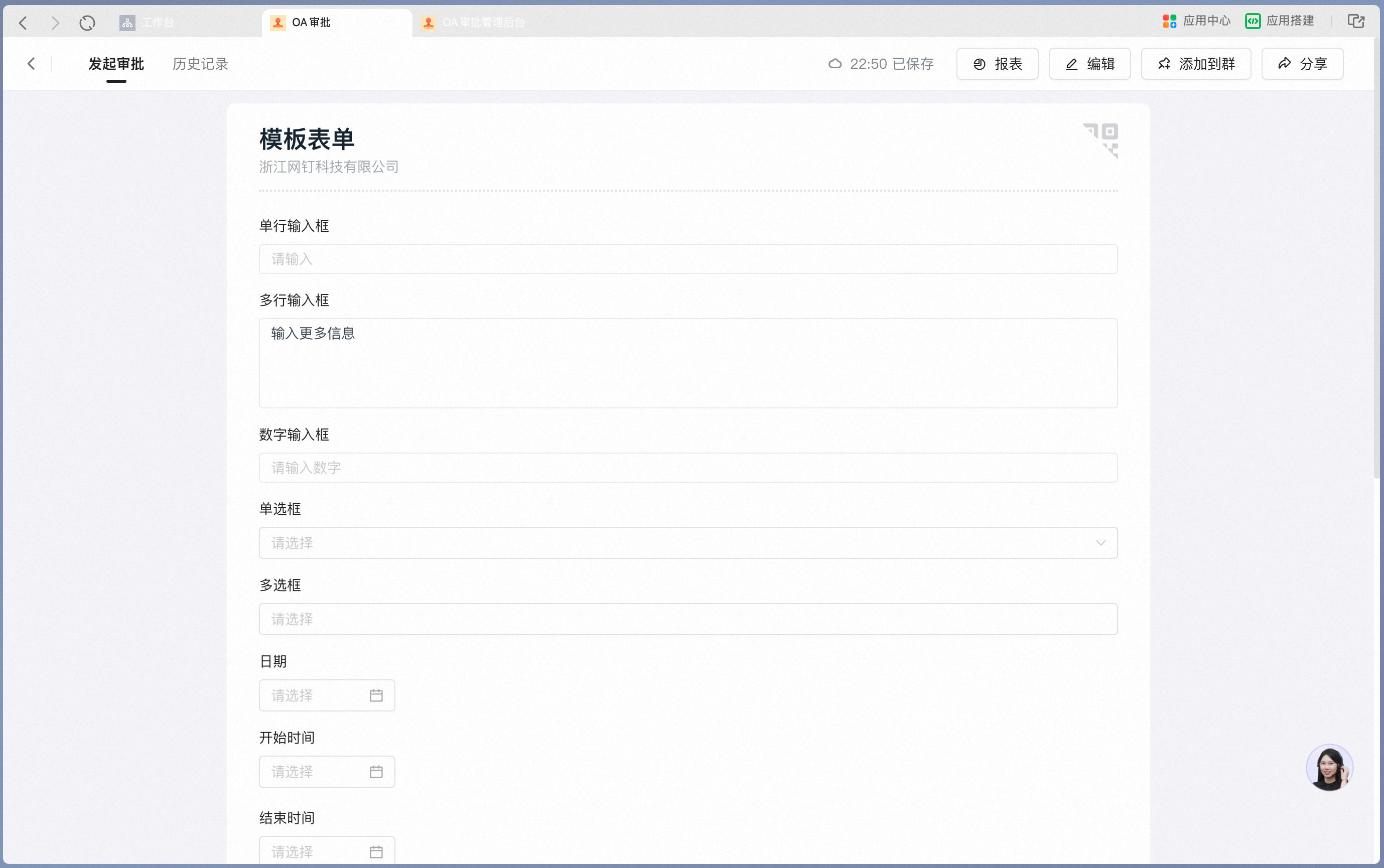
Multi-line input as it appears on a mobile form:
**Attribute Settings**
| Attribute | Description |
| ---------------- | -------------------------------------------------------------------------------------------------------------------- |
| Data linkage | A paid capability. When On, supports filling in Data from other forms according to specific rules |
| Formula editor | A paid capability. When On, supports using formulas to fetch system fields, process Data, and perform logical checks |
| Input validation | A paid capability. When On, supports validating the entered Content against specific rules |
The multi-line input supports line breaks and recognizes Links and Markdown-formatted Content:

Entered Content as it appears on the Approval detail Page:

**Data constraints and Search**
| Item | Description |
| --------------- | --------------------------------------------------- |
| Search boundary | Exact Field match, with fuzzy Search also supported |
#### 3. Numeric input
Use this control to enter Numbers, such as purchase quantity, stock quantity, or points.
**Settings interface**
Add a numeric input in the form designer:

Numeric input Attribute Settings panel:

Numeric input as it appears on a mobile form:

**Attribute Settings**
| Attribute | Description |
| ---------------- | -------------------------------------------------------------------------------------------------------------------------------------------------------- |
| Unit | The unit displayed on the form |
| Decimal places | Empty by default. Once a value is set, decimal precision is validated on form submission, and submission is blocked if the entered Number does not match |
| Data linkage | A paid capability. When On, supports filling in Data from other forms according to specific rules |
| Formula editor | A paid capability. When On, supports using formulas to fetch system fields, process Data, and perform logical checks |
| Input validation | A paid capability. When On, supports validating the entered Content against specific rules |
| Linked payment | Off by default. When On, you can choose to generate a payment order or a receipt order |
**Data constraints and Search**
| Item | Description |
| ---------------- | --------------------------------------------- |
| Data constraints | Up to 20 digits, with up to 20 decimal places |
| Search boundary | Exact numeric match supported |
#### 4. Single Select
Use this control to pick one option from a preset list of Enum values, such as a reimbursement category or goods category. These Enum values can be edited directly on the form, or sourced by referencing Data from another Data Source as options.
**Settings interface**
Add a single Select in the form designer:

Single Select Attribute Settings panel — option Content can be edited:
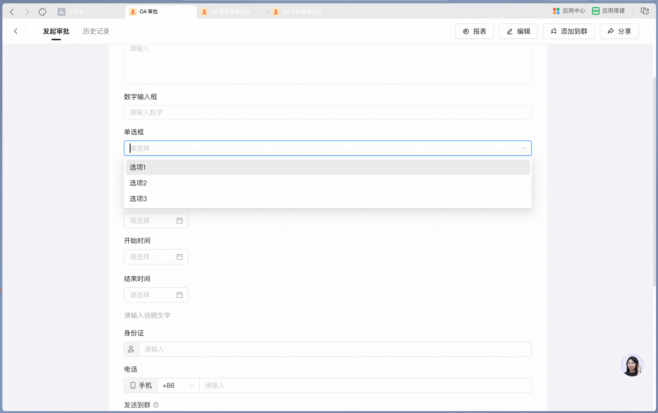
Selecting an option on a mobile form:

When "Inline options" is On, the options are displayed inline on the form:
Turn on Inline options in the attribute panel:

Inline options as they appear on a mobile form:

**Attribute Settings**
| Attribute | Description |
| -------------------------------- | ----------------------------------------------------------------------------------------------------------------------------------------------------- |
| Batch Edit | Supports Copy-Paste to generate options in one go |
| Option linkage | Supports linkage between options and controls.
For step-by-step instructions, see [How to set up Option linkage](/approval/controls-option-link) |
| Inline options | Off by default. When On, options are displayed inline on the form |
| Reference Data from another form | A paid capability. When On, Data from another form can be referenced as options |
| Data linkage | A paid capability. When On, supports filling in Data from other forms according to specific rules |
| Input validation | A paid capability. When On, supports validating the entered Content against specific rules |
**Data constraints and Search**
| Item | Description |
| ---------------- | ----------------------------------------------------------- |
| Data constraints | Up to 200 options; option display name up to 100 characters |
| Search boundary | Fuzzy Search or exact match by option supported |
#### 5. Multiselect
Use this control to pick several options from a preset list of Enum values, such as issue-cause Tags. These Enum values can be edited directly on the form, or sourced by referencing Data from another Data Source as options.
**Settings interface**
Add a Multiselect in the form designer:
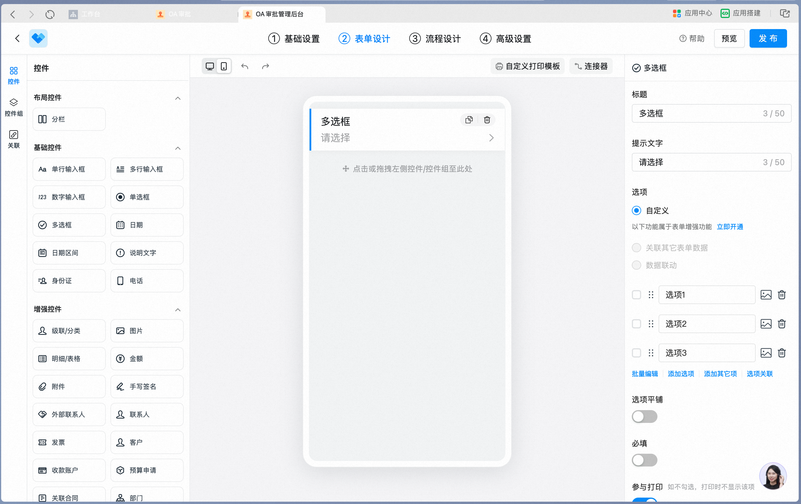
Multiselect Attribute Settings panel — option Content can be edited:
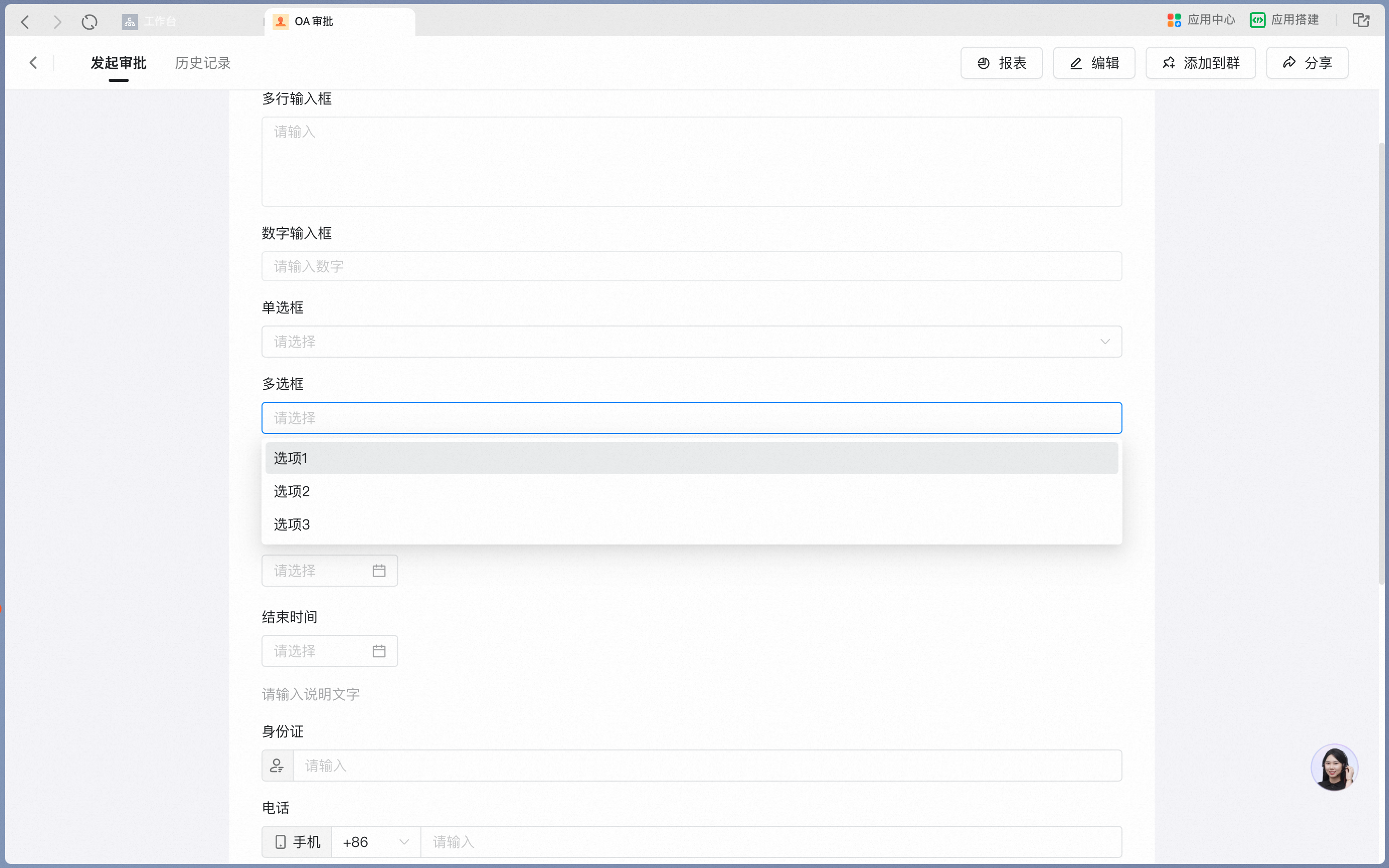
Selecting options on a mobile form:
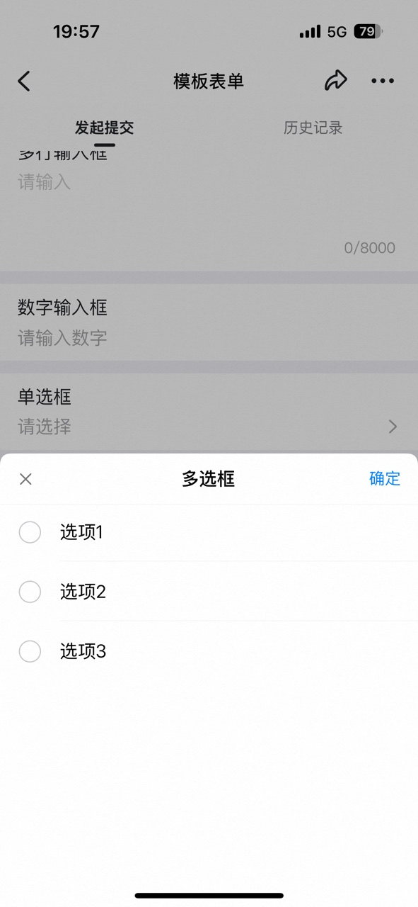
When "Inline options" is On, the options are displayed inline on the form:
Turn on Inline options in the attribute panel:

Inline options as they appear on a mobile form:

**Attribute Settings**
| Attribute | Description |
| -------------------------------- | ----------------------------------------------------------------------------------------------------------------------------------------------------- |
| Batch Edit | Supports Copy-Paste to generate options in one go |
| Option linkage | Supports linkage between options and controls.
For step-by-step instructions, see [How to set up Option linkage](/approval/controls-option-link) |
| Inline options | Off by default. When On, options are displayed inline on the form |
| Reference Data from another form | A paid capability. When On, Data from another form can be referenced as options |
| Data linkage | A paid capability. When On, supports filling in Data from other forms according to specific rules |
| Input validation | A paid capability. When On, supports validating the entered Content against specific rules |
**Data constraints and Search**
| Item | Description |
| ---------------- | ----------------------------------------------------------- |
| Data constraints | Up to 200 options; option display name up to 100 characters |
| Search boundary | Fuzzy Search or exact match by option supported |
#### 6. Date
Use this control to set a specific Date, such as the expected arrival Date of purchased items.
**Settings interface**
Add a Date control in the form designer:

Date control Attribute Settings panel:

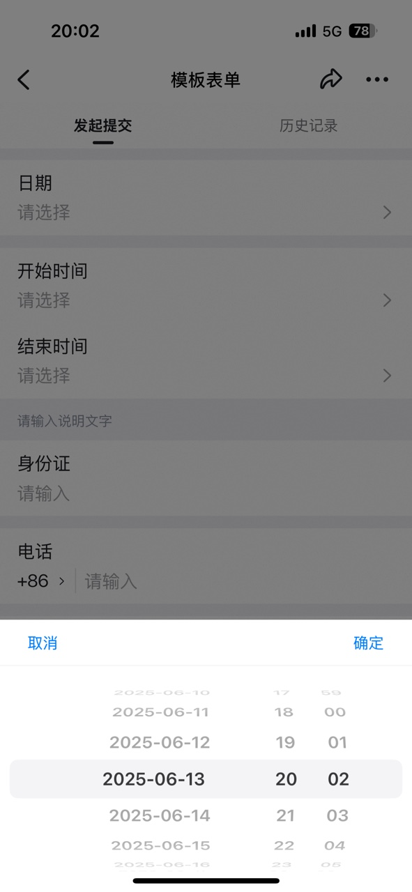
Picking a Date on the mobile side:

Picking a Date via the Date picker on desktop:

Picked Date as it appears on a mobile form:
**Attribute Settings**
| Attribute | Description |
| ----------------- | ----------------------------------------------------------------------------------------------------------------------------------- |
| Date type | Supports two types: YYYY-MM-DD and YYYY-MM-DD HH:mm |
| Data linkage | A paid capability. When On, supports filling in Data from other forms according to specific rules |
| Formula editor | A paid capability. When On, supports using formulas to fetch system fields, process Data, and perform logical checks |
| Input validation | A paid capability. When On, supports validating the entered Content against specific rules |
| Due-Date reminder | A paid capability. When On, you can set actions such as generating a To-Do or creating a New Event when the current Date is reached |
**Data constraints and Search**
| Item | Description |
| ---------------- | --------------------------------------------------------------------------------------------------------- |
| Data constraints | Data can be picked via the Date picker or typed manually. Manual entries must follow the Date type format |
| Search boundary | Fuzzy Search supported |
#### 7. Date range
Use this control to set a specific time span, such as the contract start time and end time.
**Settings interface**
Add a Date range control in the form designer:
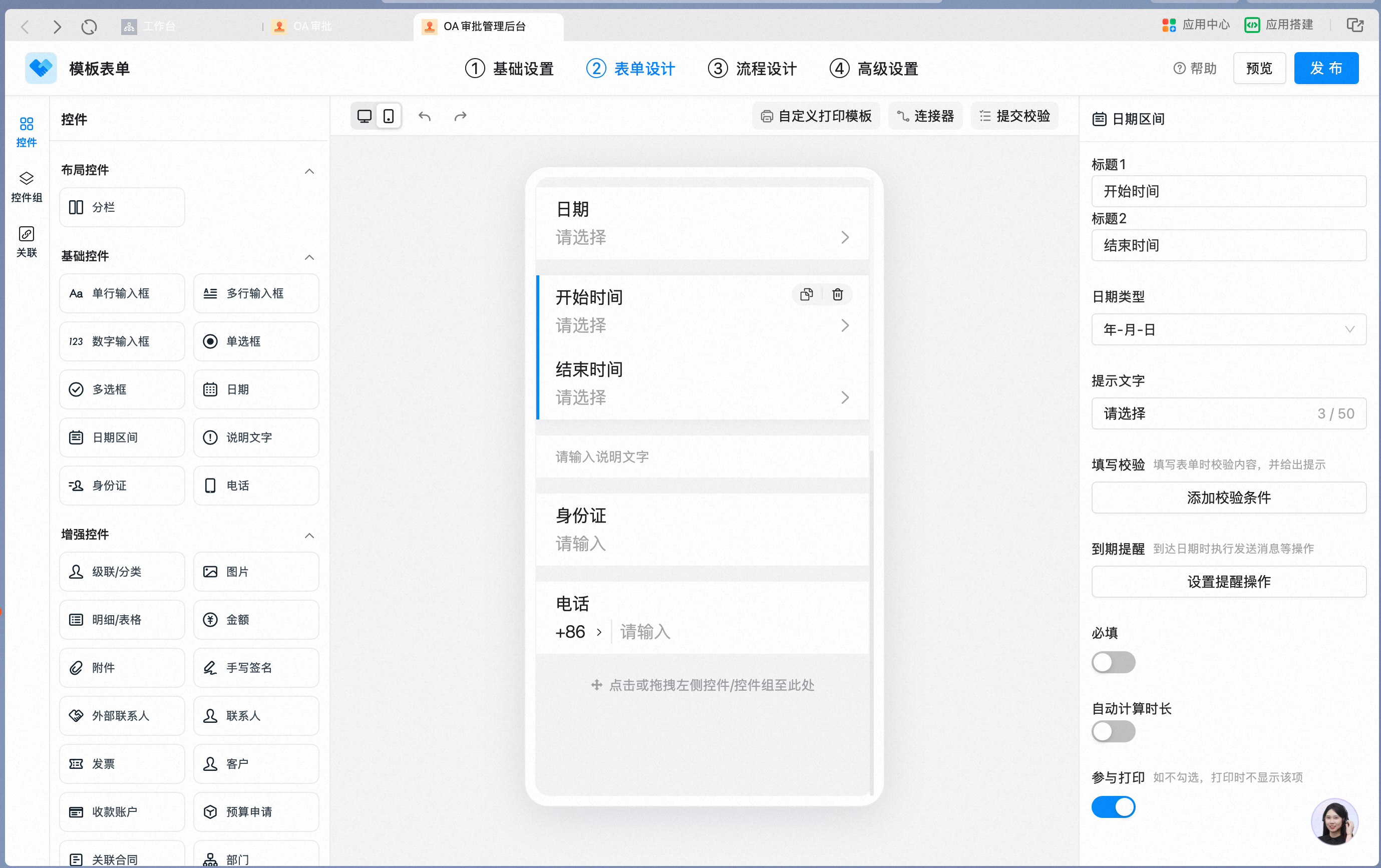
Date range Attribute Settings panel:

Date range as it appears on a mobile form:

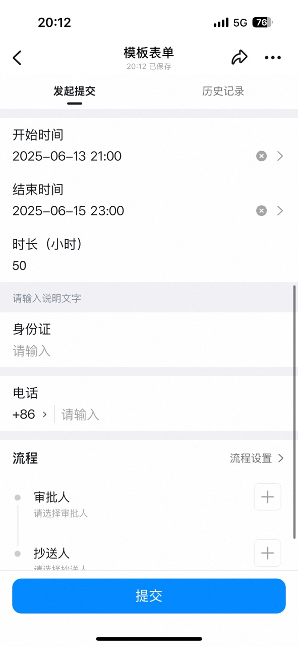
When "Auto-calculate duration" is On, the form automatically displays the difference between the start time and end time:
Turn on Auto-calculate duration in the attribute panel:

Auto-calculate duration as it appears on a mobile form:
**Attribute Settings**
| Attribute | Description |
| ----------------------- | --------------------------------------------------------------------------------------------------------------------------------------------------------------------------------------------------------------------------------------------------------------------- |
| Title 1 | The Title displayed before the start time |
| Title 2 | The Title displayed before the end time |
| Date type | Supports two types: YYYY-MM-DD and YYYY-MM-DD HH:mm |
| Auto-calculate duration | Off by default. When On, the form displays the difference between the start time and the end time.
Titles up to 20 characters.
When Date type is YYYY-MM-DD, the unit defaults to days.
When Date type is YYYY-MM-DD HH:mm, the unit defaults to hours |
| Data linkage | A paid capability. When On, supports filling in Data from other forms according to specific rules |
| Formula editor | A paid capability. When On, supports using formulas to fetch system fields, process Data, and perform logical checks |
| Input validation | A paid capability. When On, supports validating the entered Content against specific rules |
| Due-Date reminder | A paid capability. When On, you can set actions such as generating a To-Do or creating a New Event when the current Date is reached |
**Data constraints and Search**
| Item | Description |
| ---------------- | ------------------------------------------------------------------------------------------------------------------------------------------------------------------------------------------------ |
| Data constraints | Data can be picked via the Date picker or typed manually. Manual entries must follow the Date type format. When Auto-calculate duration is Enabled, the duration unit changes with the Date type |
| Search boundary | Fuzzy Search and exact match supported |
#### 8. Description text
This control is often used to describe the purpose of the current form. Add Links, red-highlighted Text, and similar elements to strengthen reminders. It is typically used to display rules and regulations, or items the Respondent must confirm — such as a Link to a letter of commitment.
**Settings interface**
Add a Description text control in the form designer:
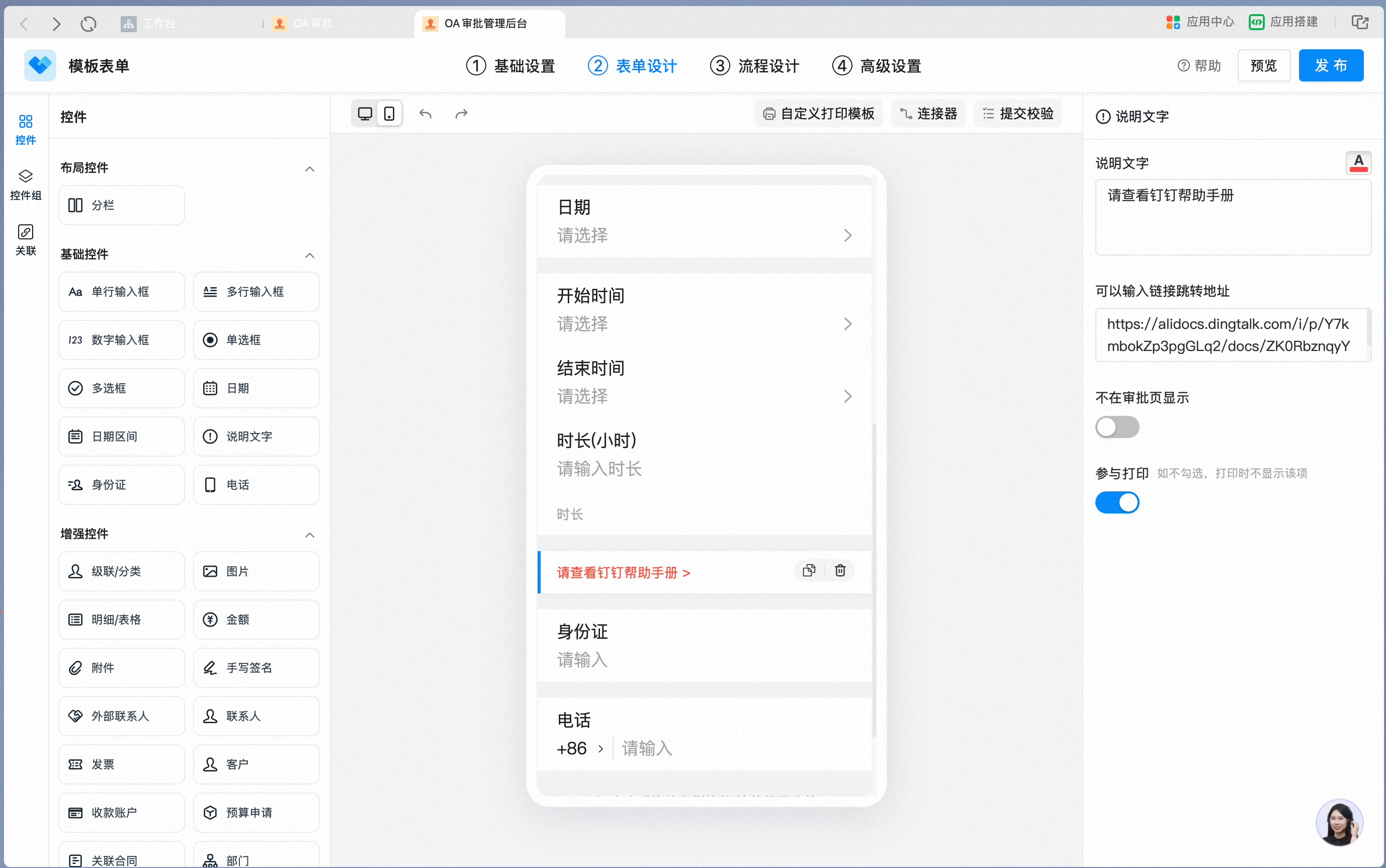
Description text Attribute Settings panel — Text Content, color, and Redirect To Link can be configured:
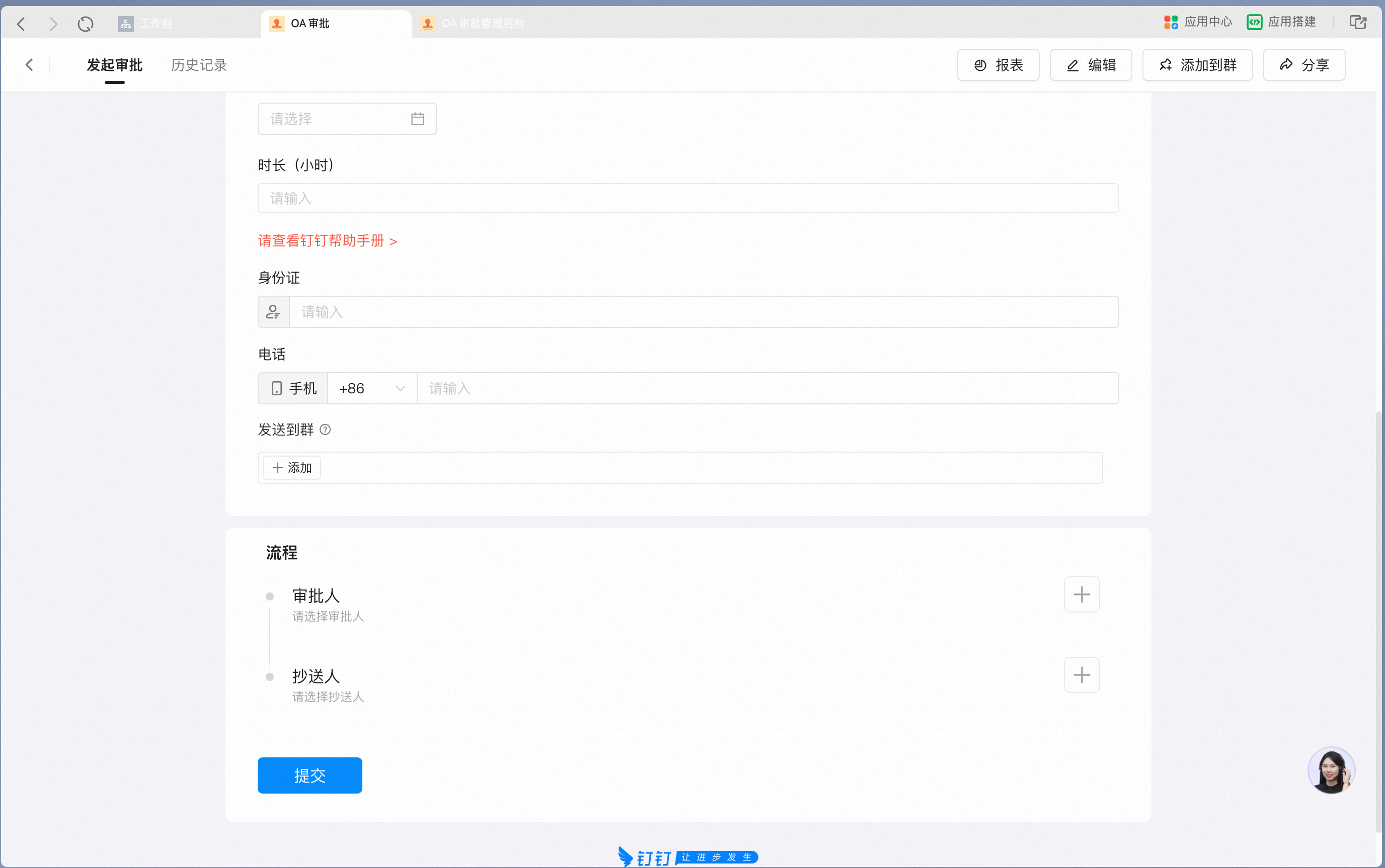
Description text as it appears on a mobile form:

**Attribute Settings**
| Attribute | Description |
| --------------------- | --------------------------------------------------------------------------------------------------------------------------------------------------------------------------------------------------- |
| Description text | Enter the Description text. When the Approval is initiated, this Text is displayed on the form as Read-only, and the Text Color can be set to red for stronger reminders. Line breaks are supported |
| Redirect To Link URL | Enter a URL that starts with "http". Clicking the Text will Redirect To the corresponding Page |
| Hide on Approval Page | Off by default. When On, the Description text is not displayed on the Approval detail Page — it is visible only to the initiator when starting the Approval, so it does not distract the approver |
**Data constraints and Search**
| Item | Description |
| ---------------- | --------------------------------------------------------------------- |
| Data constraints | Description text is up to 1,024 characters; line breaks are supported |
| Search boundary | Search not supported |
#### 9. ID card
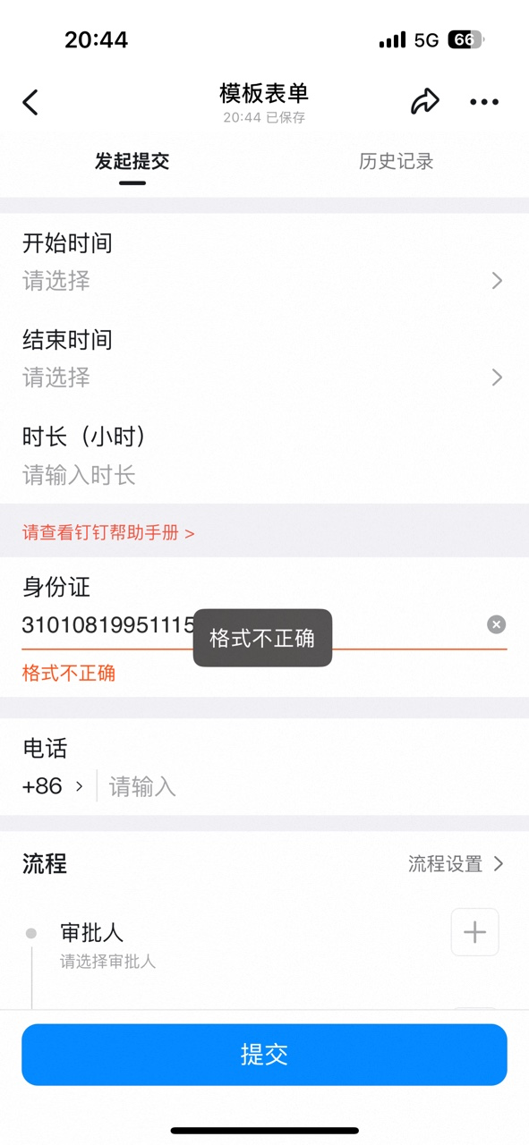
Use this control in scenarios that require the ID card Number to be entered accurately. If the ID card information is invalid, an Error message appears on Submit.
**Settings interface**
Add an ID card control in the form designer:
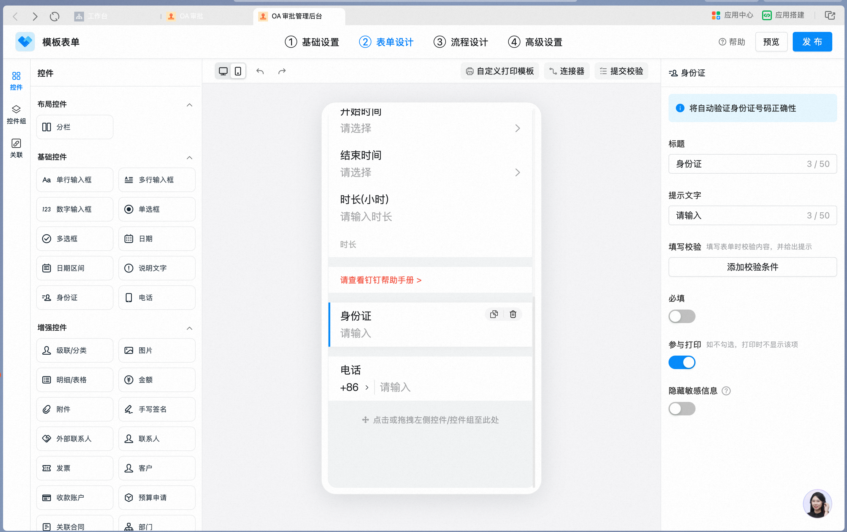
ID card control Attribute Settings panel:
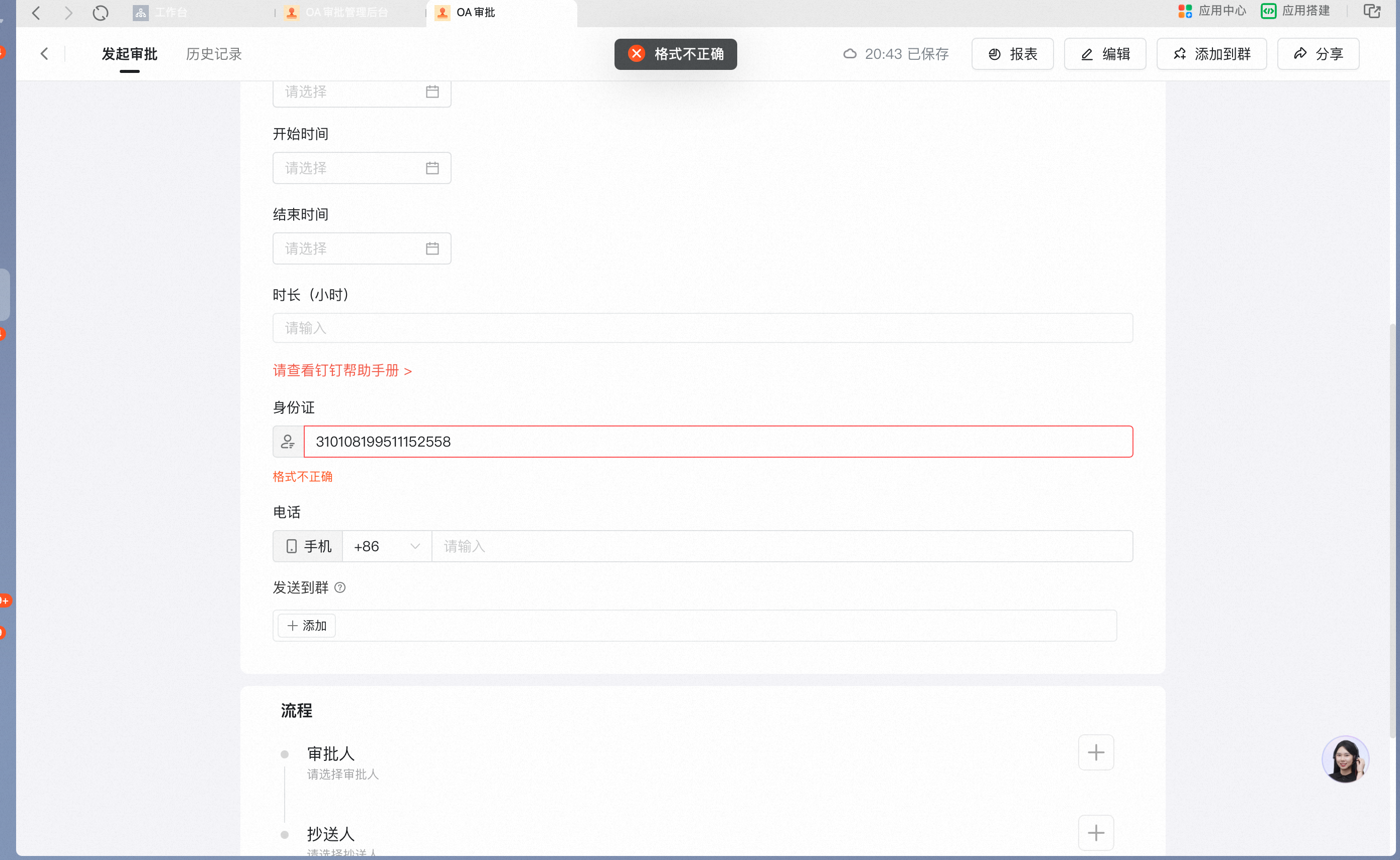
Validation Tips on mobile when the ID card Number format is invalid:
**Attribute Settings**
| Attribute | Description |
| ------------------- | -------------------------------------------------------------------------------------------------------------------- |
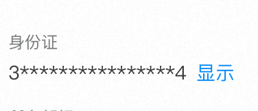
| Hide sensitive info | Off by default. When On, the ID card information is only displayed on the Approval form after the user clicks "Show" |
With Hide sensitive info On, the ID card Number is masked on the Approval form:
**Data constraints and Search**
| Item | Description |
| ---------------- | -------------------------------------------------------------------------------------------------------- |
| Data constraints | The system automatically validates the format of the ID card Number. Invalid formats cannot be submitted |
| Search boundary | Fuzzy Search and exact match supported |
#### 10. Phone
Supports format validation for mobile Numbers and landlines from common countries. When a Phone number is required, the entry can be pre-checked on Submit.
**Settings interface**
Add a Phone control in the form designer:
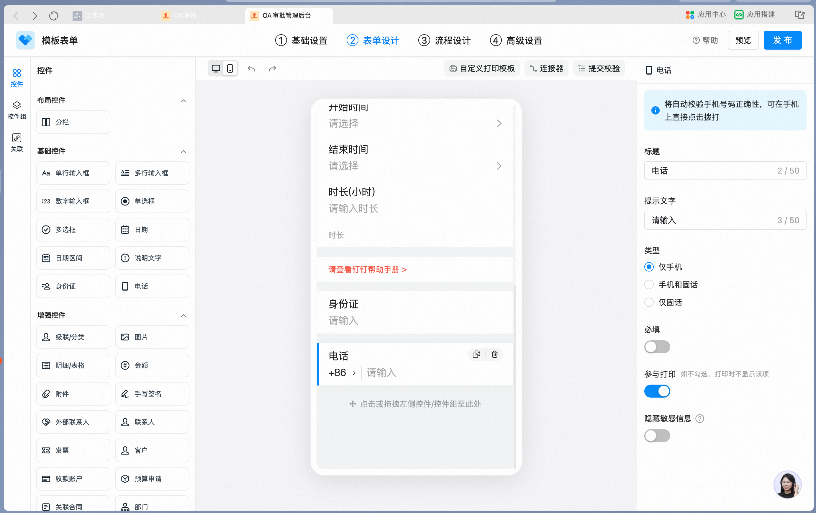
Phone control Attribute Settings panel — the Phone Type can be selected:

Validation Tips on mobile when the Phone number format is invalid:

**Attribute Settings**
| Attribute | Description |
| ------------------- | ------------------------------------------------------------------------------------------------------------------ |
| Type | Supports three types: mobile only, mobile and landline, and landline only |
| Hide sensitive info | Off by default. When On, the Phone information is only displayed on the Approval form after the user clicks "Show" |
**Data constraints and Search**
| Item | Description |
| ---------------- | ------------------------------------------------------------------------------------------------------ |
| Data constraints | The system automatically validates the format of the Phone number. Invalid formats cannot be submitted |
| Search boundary | Fuzzy Search and exact match supported |
### 3) Enhanced controls
#### 1. Cascade/Category
Use this control in scenarios where categories must be maintained in Tiers, such as recording item information for inventory management, or Province/City/District.
**Settings interface**
Add a Cascade/Category control in the form designer:

Edit the category Data — a multi-Tier category Table of contents is supported:

Cascade/Category Attribute Settings panel — the Data source can be selected:

Tier-by-Tier picking of Cascade/Category on mobile:

**Attribute Settings**
| Attribute | Description |
| ----------- | ----------------------------------------------------------------- |
| Data source | Supports fetching the Data tiers set up in Smart Finance directly |
**Data constraints and Search**
| Item | Description |
| ---------------- | ---------------------------------------------------------------------------------------------------------------------------------------------------------------------------------------------------------------------------------------------------- |
| Data constraints | Across all Tiers in the category Data Source, the total number of category Entries is capped at 10,000; the Table of contents supports up to 5 Tiers; within the same directory, category names must be unique; global category codes must be unique |
| Search boundary | Fuzzy Search and exact match supported. When using exact match, using a parent category as the exact Search key matches all Data under that category |
#### 2. Image
Use this control to capture Image information in form-Data scenarios — for example, in customer-visit records, use the Image control to log on-site notes from a visit.
**Settings interface**
Add an Image control in the form designer:

Image control Attribute Settings panel — Upload count limit and watermark photos can be configured:

Uploading images on mobile:

With Watermark photos On, images must be uploaded via Take photo and carry watermark info:

**Attribute Settings**
| Attribute | Description |
| ------------------ | ---------------------------------------------------------------------------------------- |
| Upload count limit | Defaults to 9 images; up to 50 images |
| Watermark photos | Off by default. When On, images must be uploaded via Take photo and carry watermark info |
**Data constraints and Search**
| Item | Description |
| ---------------- | ------------------------------------- |
| Data constraints | Defaults to 9 images; up to 50 images |
| Search boundary | Search not supported |
#### 3. Details/Spreadsheet
Details/Spreadsheet is a control that organizes Data and information as Records and Columns. It is primarily used for collecting repeated Data that shares the same header — for example, inventory-inbound details or reimbursement details.
* The control itself carries no Data. Think of it as a block into which Data can be repeatedly added, or as an empty Table
* The Data items you fill in (that is, the header of the Spreadsheet) are defined by placing the required controls (such as single-line inputs, single Select, and so on) into the detail control
For step-by-step instructions, see [detail control](/approval/controls-detail).
**Settings interface**
Add a Details/Spreadsheet control in the form designer:

Drag other controls into the Details table to compose the header:

Details/Spreadsheet Attribute Settings panel:

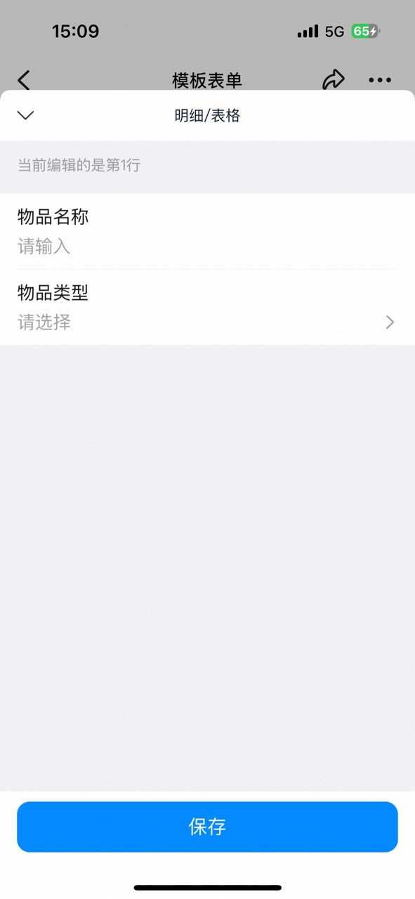
Filling in Details Data on mobile:

Details table as it appears on a mobile Approval form:
**Attribute Settings**
| Attribute | Description |
| ---------------- | ---------------------------------------------------------------------------------------------------------------------------------------------------------------------------------------------------------------- |
| Data linkage | Via Data linkage inside a Details table, all Details from another form can be filled into the current Spreadsheet Details. By choosing which header fields to display, you can also filter the displayed Columns |
| Display style | A paid capability. Used to optimize how the Details table is displayed on the form |
| Enhanced actions | A paid capability. Used to improve the efficiency of filling in the Details table, enabling quick Data Import and clearing |
Configuration steps for Data linkage:
Turn on Data linkage in the Details attribute panel:
Select the linked Target form and Details Field:

Set linkage conditions and fill rules:
Select which header fields to display to filter the displayed Columns:
**Data constraints and Search**
| Item | Description |
| ---------------- | ---------------------------------------------------------------------------------------------------------------------------- |
| Data constraints | A Details table cannot contain another Details table; a Details table cannot contain a kit; up to 50 Columns and 100 Records |
| Search boundary | The name of the Details table itself is not searchable; the Content inside the Details table supports fuzzy Search |
#### 4. Amount
Use this control in scenarios that require Chinese uppercase Amount, or that need Linked payment.
**Settings interface**
Add an Amount control in the form designer:
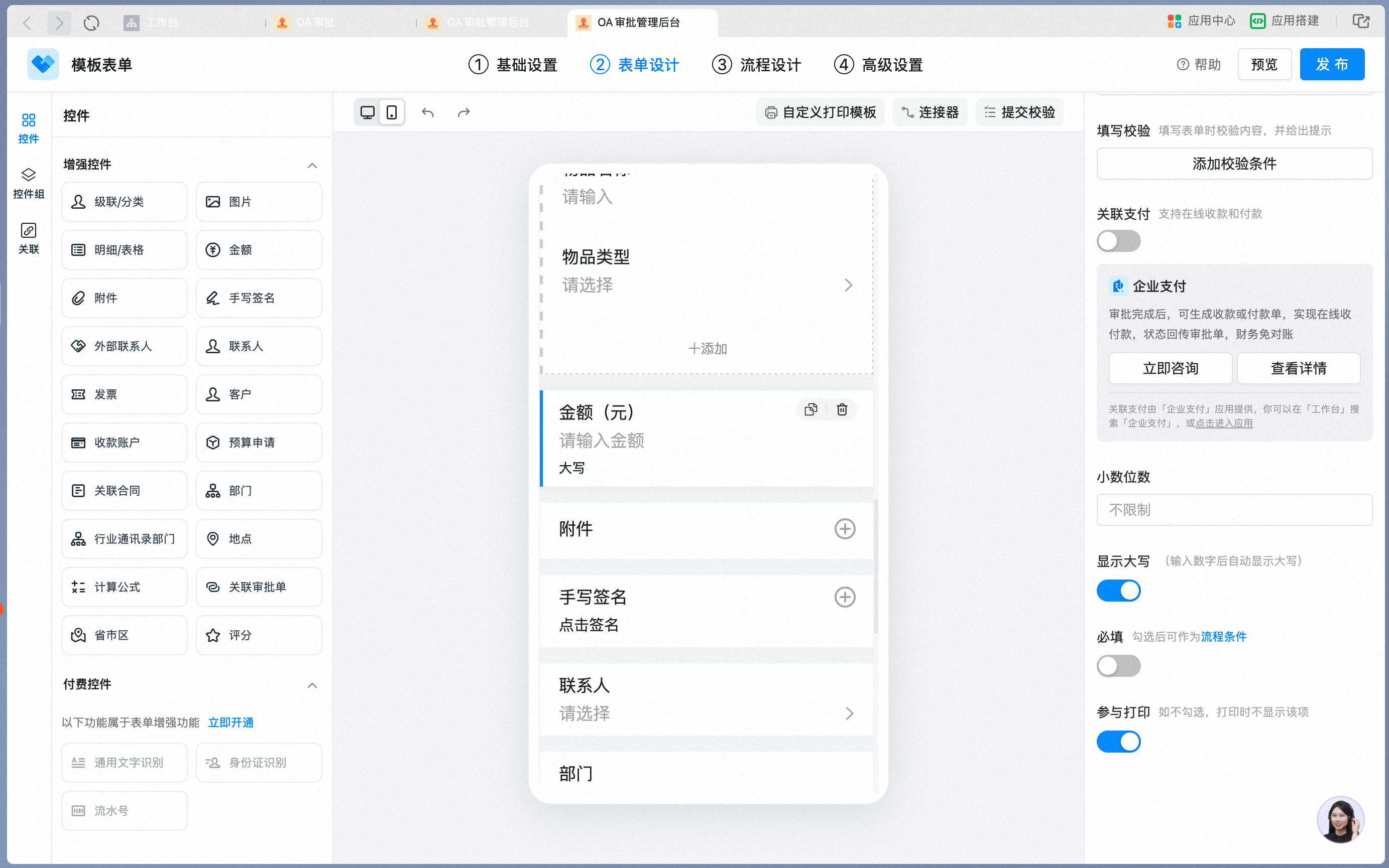
Amount control Attribute Settings panel:

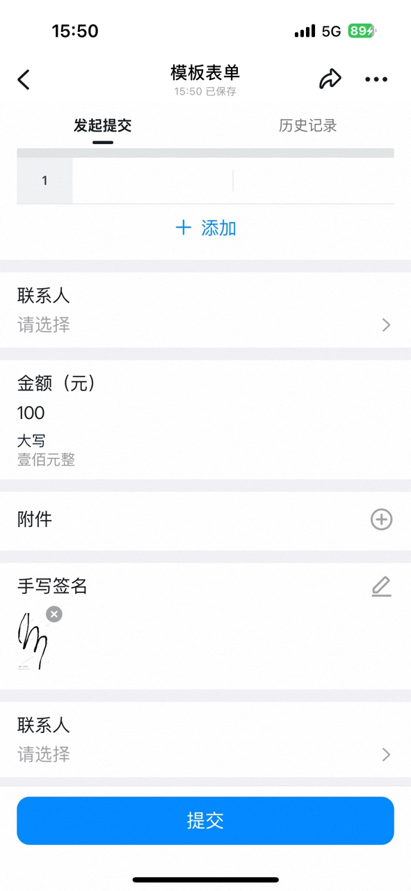
Amount control as it appears on a mobile form:
**Attribute Settings**
| Attribute | Description |
| ---------------- | -------------------------------------------------------------------------------------------------------------------------------------------------------- |
| Show uppercase | Off by default. When On, the entered Amount is automatically converted to Chinese uppercase and displayed on the form in gray Font |
| Decimal places | Empty by default. Once a value is set, decimal precision is validated on form submission, and submission is blocked if the entered Amount does not match |
| Data linkage | A paid capability. When On, supports filling in Data from other forms according to specific rules |
| Formula editor | A paid capability. When On, supports using formulas to fetch system fields, process Data, and perform logical checks |
| Input validation | A paid capability. When On, supports validating the entered Content against specific rules |
| Linked payment | Off by default. When On, you can choose to generate a payment order or a receipt order |
With Show uppercase On, the Amount is automatically converted to Chinese uppercase:

**Data constraints and Search**
| Item | Description |
| ---------------- | ----------------------------------------------------------------------------------------------------------------------------------------------------------------------------------------------- |
| Data constraints | Up to 20 digits, with the Chinese-uppercase display supporting Amounts of up to 16 digits. Linked payment limitation: when there are multiple Amount controls, only one supports Linked payment |
| Search boundary | Exact match supported |
#### 5. Attachment
Use this control to Upload File information. It supports previewing common Text formats such as docx, doc, and pdf, as well as Video-format files. For example, in a contract scenario, use the Attachment control to Upload the contract file; in a procurement scenario, use it to Upload an Excel file.
**Settings interface**
Add an Attachment control in the form designer:

Attachment control Attribute Settings panel:
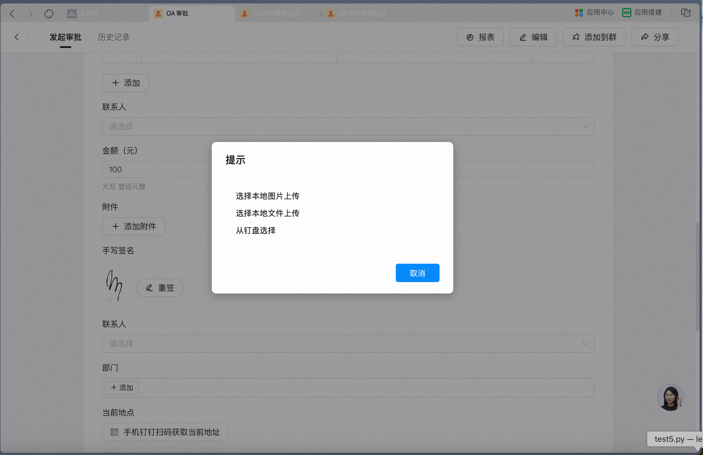
Add Attachment flow on mobile:

**Attribute Settings**
| Attribute | Description |
| ------------------ | ---------------------------------------------------------------------------------------------------------------------------------------------------------------------------------------------------------------- |
| E-signature | For contract scenarios, supports signing online via e-signature. E-signature is provided by a third-party service |
| Attachment editing | A paid capability. When On, attachments can be edited online (requires Step Edit Permission), the attachment count can be set, upload-via-Take-photo-only can be Enabled, and attachment requirements can be set |
**Data constraints and Search**
| Item | Description |
| ---------------- | ------------------------------------------------------------------------------------------------------------------------------------------------------------------------------------------------------ |
| Data constraints | Up to 30 files per Attachment control at a time; the total File Size per upload cannot exceed 8 GB (bounded by the actual Drive max File Size); documents supported for online Preview are up to 20 MB |
| Search boundary | Search not supported |
#### 6. Signature
This control adds a Signature to the form. On Submit or on change, adding a Signature creates a confirmation step to ensure formality — for scenarios such as letters of commitment.
**Settings interface**
Add a Signature control in the form designer:

Signature Attribute Settings panel — the signing mode can be selected:
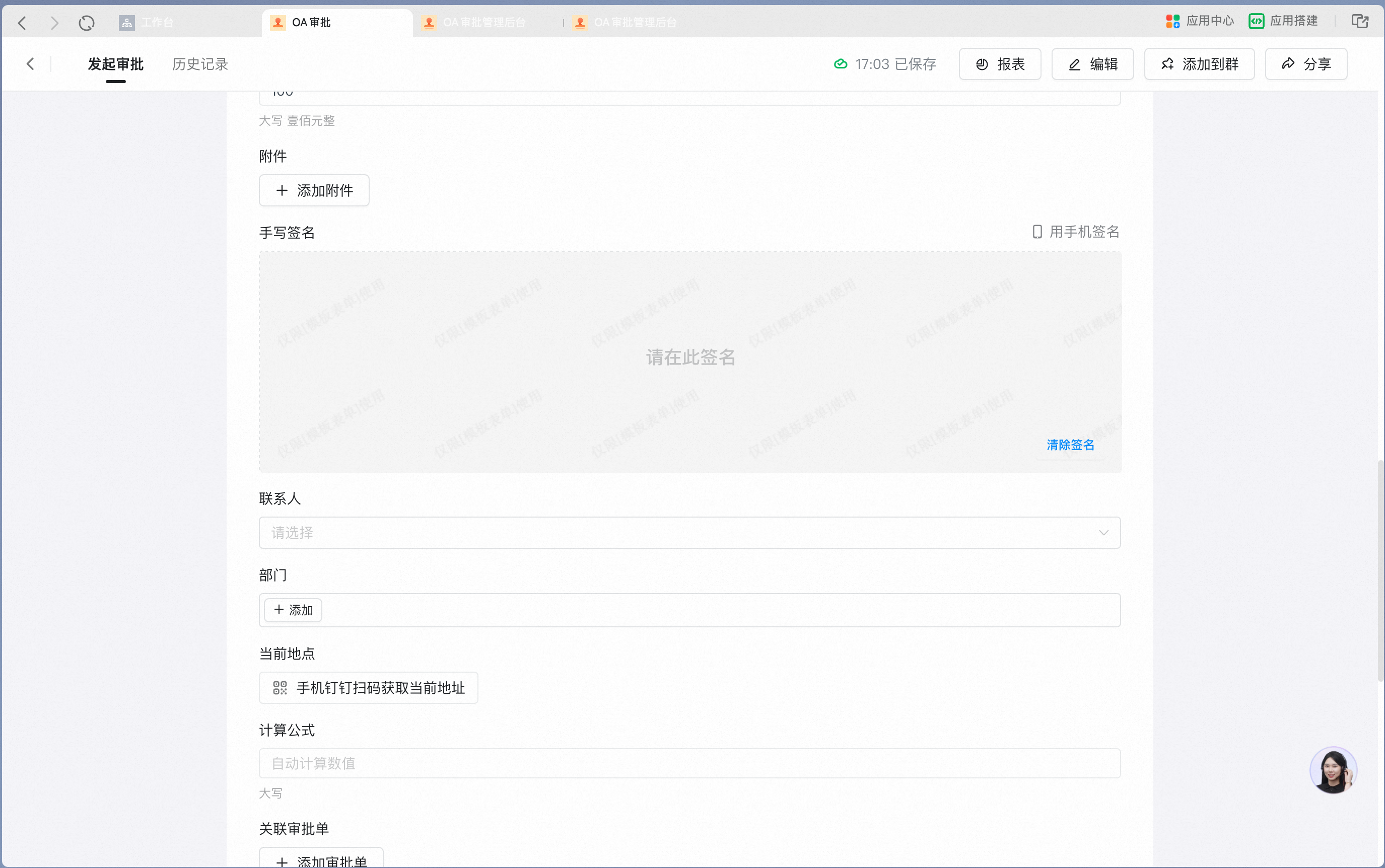
Signing on mobile:

**Attribute Settings**
| Attribute | Description |
| ------------ | ------------------------------------------------------------------------------ |
| Signing mode | Two modes are available: reuse the previous Signature, or sign anew every time |
**Data constraints and Search**
| Item | Description |
| ---------------- | -------------------- |
| Data constraints | Not applicable |
| Search boundary | Search not supported |
#### 7. Contact
Use this control to select a User from the Contacts. Use the Contact control when the owner of a specific item needs to be shown; a Contact on a form can also be set as an approver — for step-by-step instructions, see [How to set a form-internal Contact as the approver](/approval/set-form-contact-approval).
**Settings interface**
Add a Contact control in the form designer:

Contact control Attribute Settings panel:
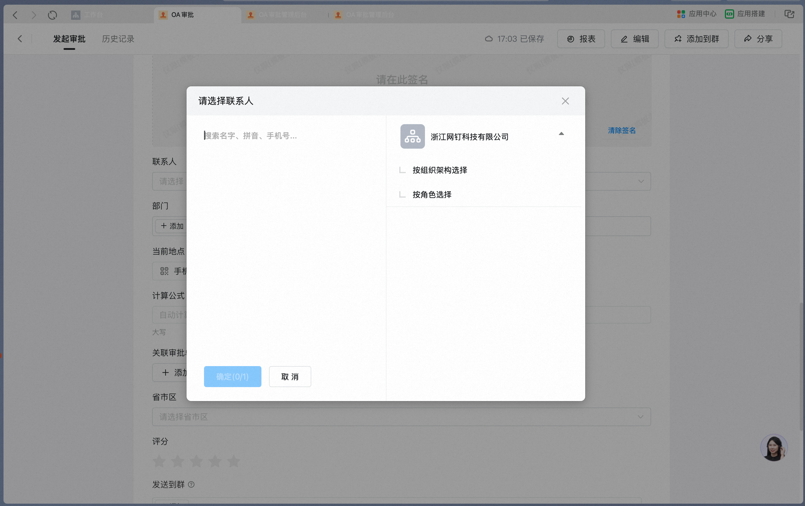
Picking a Contact from the Contacts on mobile:

Contact as it appears on a mobile form:

**Attribute Settings**
| Attribute | Description |
| -------------------------- | -------------------------------------------------------------------------------------------------------------------- |
| Contact options | Only one User can be selected by default; can be set to allow selecting multiple Users at once |
| Data linkage | A paid capability. When On, supports filling in Data from other forms according to specific rules |
| Formula editor | A paid capability. When On, supports using formulas to fetch system fields, process Data, and perform logical checks |
| Current Approval initiator | A paid capability. When On, the current form initiator is filled in as the Default |
| Input validation | A paid capability. When On, supports validating the entered Content against specific rules |
**Data constraints and Search**
| Item | Description |
| ---------------- | ------------------------------------------------------------------------------------------------------------------ |
| Data constraints | Only Users within the Organization can be selected. When selecting multiple Users, up to 100 Users can be selected |
| Search boundary | Global fuzzy Search supported; exact filtering not supported |
#### 8. Department
Supports selecting an already-created Department from the Contacts. Use the Department control when the owning Department for a specific item needs to be shown. The manager or Role corresponding to a Department on a form can be set as an approver — commonly used in role-transfer and handover scenarios.
**Settings interface**
Add a Department control in the form designer:

Department control Attribute Settings panel:
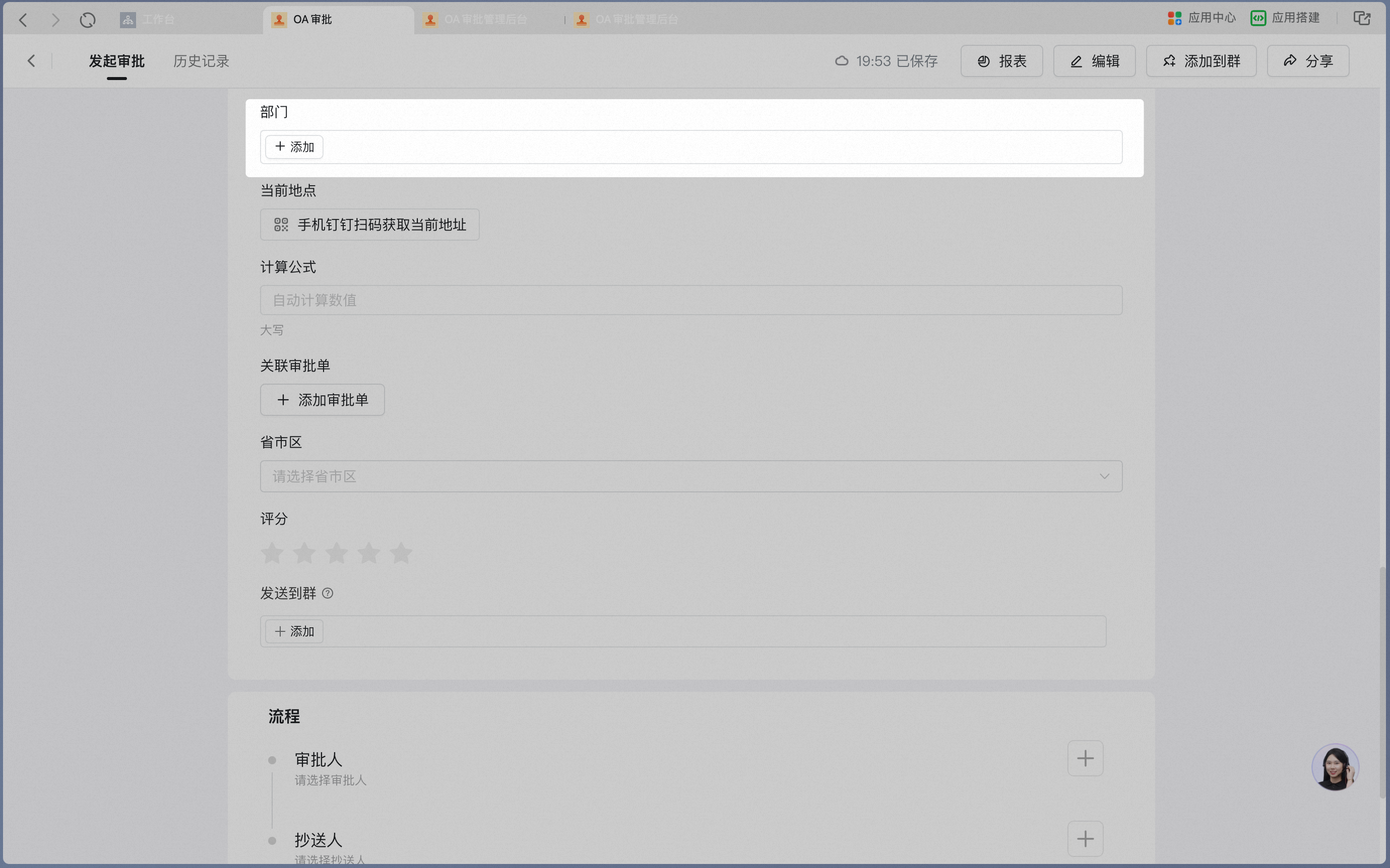
Picking a Department from the Contacts on mobile:

**Attribute Settings**
| Attribute | Description |
| ---------------------- | ---------------------------------------------------------------------------------------------------- |
| Department options | Only one Department can be selected by default; can be set to allow selecting multiple Departments |
| Initiator's Department | A paid capability. When On, the Department of the current form initiator is filled in as the Default |
| Input validation | A paid capability. When On, supports validating the entered Content against specific rules |
**Data constraints and Search**
| Item | Description |
| ---------------- | -------------------------------------------------------------------------------------------------------------------------------------- |
| Data constraints | Only Departments within the Organization can be selected. When selecting multiple Departments, up to 1,000 Departments can be selected |
| Search boundary | Fuzzy Search not supported; exact filtering supported |
#### 9. Current location
Supports capturing the User's current Location. In scenarios such as customer visits, Location info must be captured in real time, and the User can also fine-tune the Location manually.
**Settings interface**
Add a Current location control in the form designer:

Current location Attribute Settings panel:

Capturing the current Location on mobile, with fine-tuning supported:

**Attribute Settings**
| Attribute | Description |
| ------------------- | ----------------------------------------------------------------------------------------------------------------------------------------- |
| Hide sensitive info | Off by default. When On, address information is displayed as \*\*\*\* on the Approval detail Page and must be revealed by tapping to show |
**Data constraints and Search**
| Item | Description |
| ---------------- | -------------------------------------------------------------------------------------------------------------------------------------------------------------- |
| Data constraints | The current address can only be captured via mobile DingTalk. Fine-tuning is only Allowed within a specific range; an Error is raised if the range is exceeded |
| Search boundary | Fuzzy Search supported |
Desktop Tips prompt the user to scan with mobile DingTalk to capture the current Location:

Error Tips when fine-tuning exceeds the Allowed range:

#### 10. Calculate Formula
Supports simple arithmetic such as addition, subtraction, multiplication, and division. Use this control in scenarios that need automatic numeric Calculation — such as orders and finance — for example, computing the total price from a unit price and a quantity.
**Settings interface**
Add a Calculate Formula control in the form designer:

Edit the Calculate Formula — the four arithmetic operations can be applied to Amount and Numerical controls on the form:
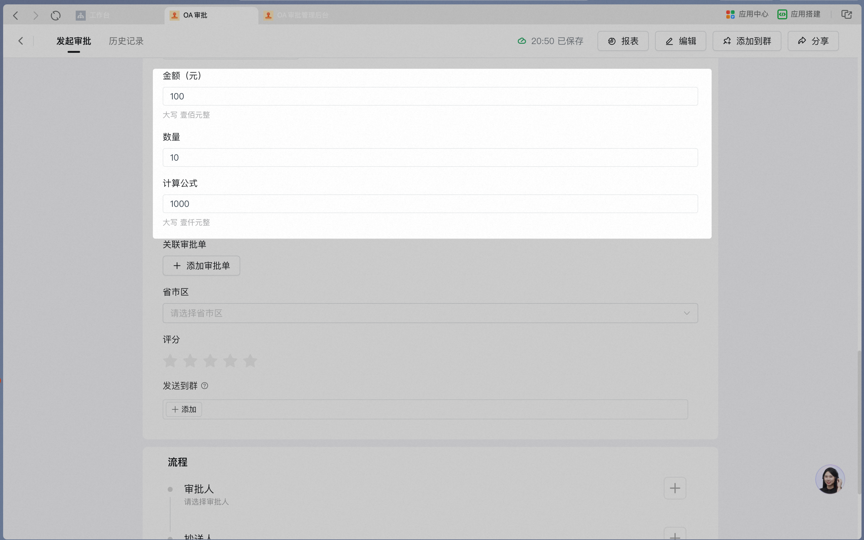
The Calculation result is displayed automatically on a mobile form:
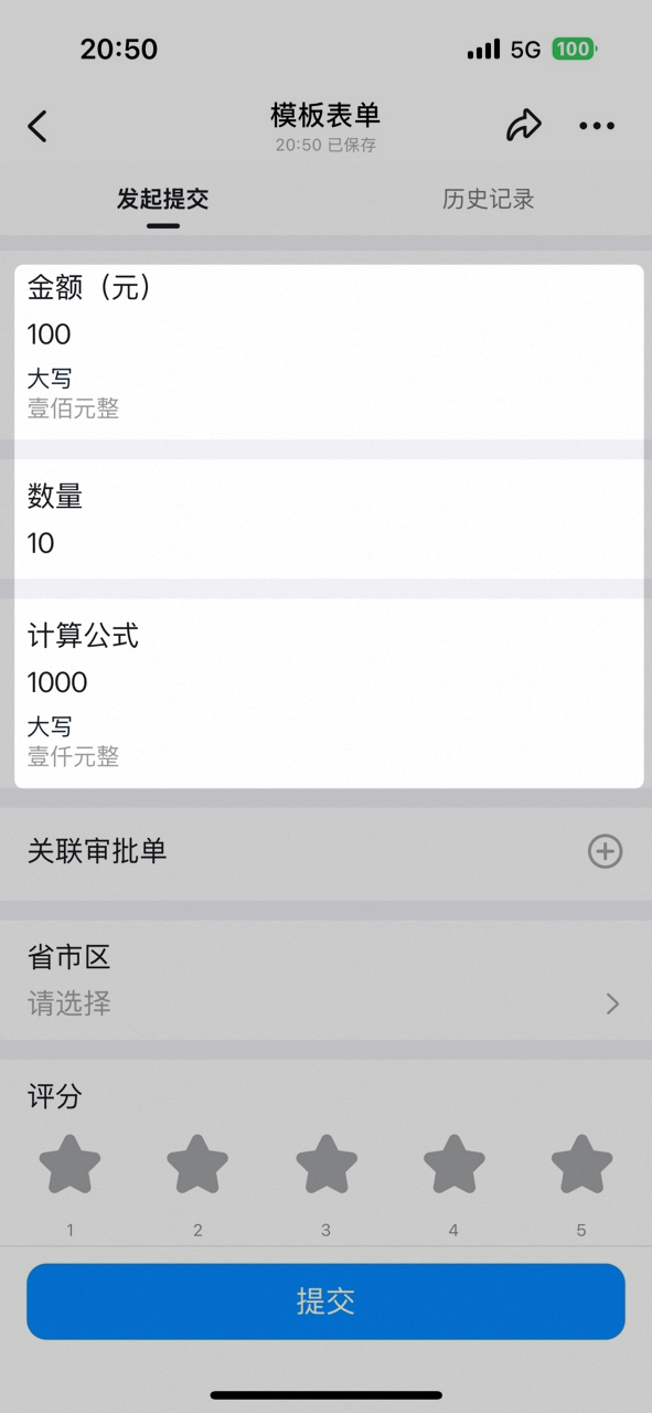
**Attribute Settings**
| Attribute | Description |
| ---------------------- | -------------------------------------------------------------------------------------------------------------------------------------------------------- |
| Formula | The four arithmetic operations can be applied to Amount and Numerical controls on the form |
| Set field as Read-only | Off by default. When set as Read-only, the Calculation result cannot be modified |
| Show uppercase | On by default. The Amount is automatically converted to Chinese uppercase on the form and displayed in gray Font |
| Decimal places | Empty by default. Once a value is set, decimal precision is validated on form submission, and submission is blocked if the entered Number does not match |
| Linked payment | Off by default. When On, you can choose to generate a payment order or a receipt order |
**Data constraints and Search**
| Item | Description |
| ---------------- | ----------------------------------------------------------------------------------- |
| Data constraints | When the Calculate Formula control is hidden, the Calculation result is not Updated |
| Search boundary | Fuzzy Search supported |
#### 11. Associated Approval form
Supports selecting one Record from an Approval form within the Organization — for example, linking a procurement form or a business-trip form from a reimbursement form.
**Settings interface**
Add an Associated Approval form control in the form designer:
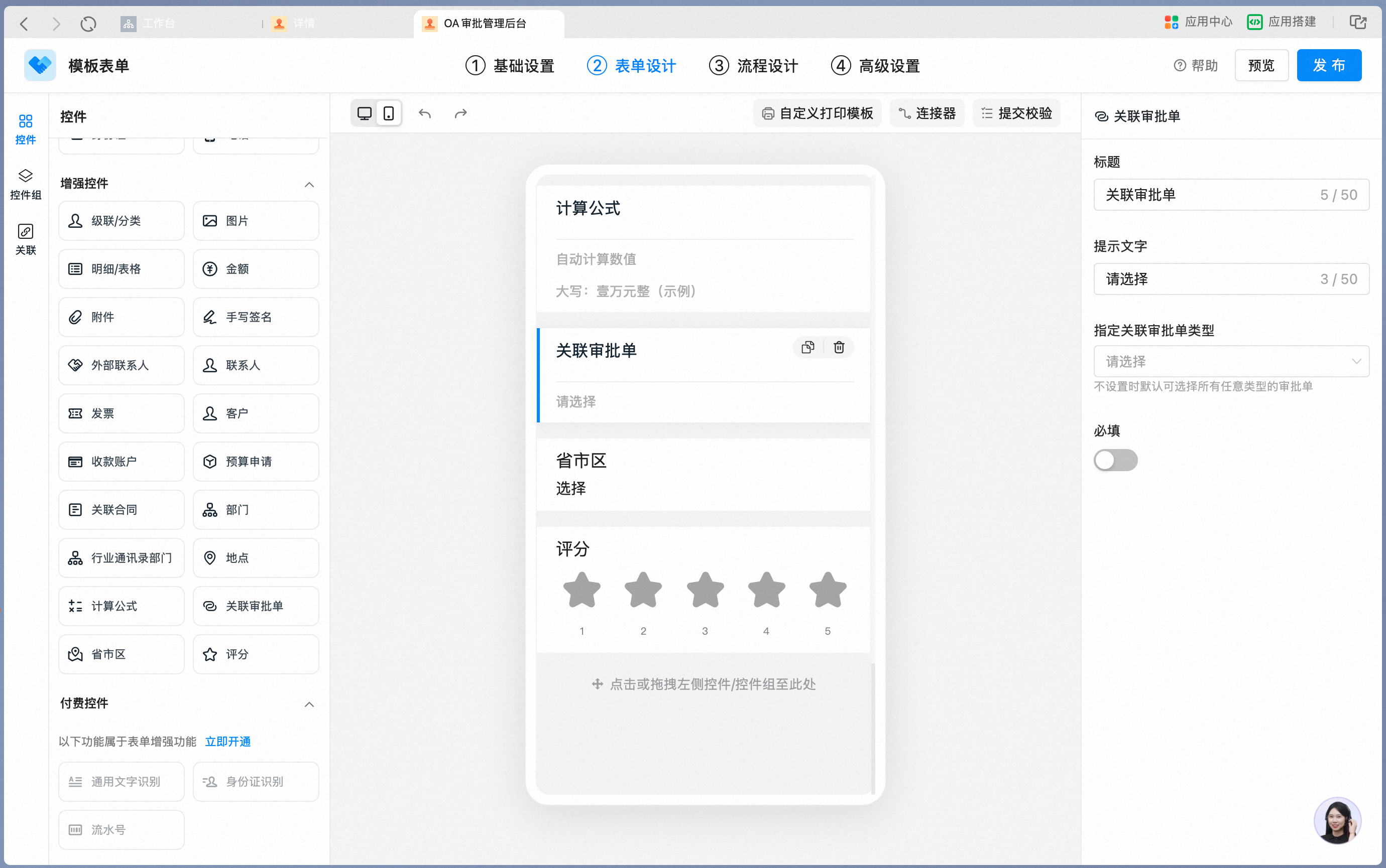
Associated Approval form Attribute Settings panel — the Type of the associated Approval form can be specified:
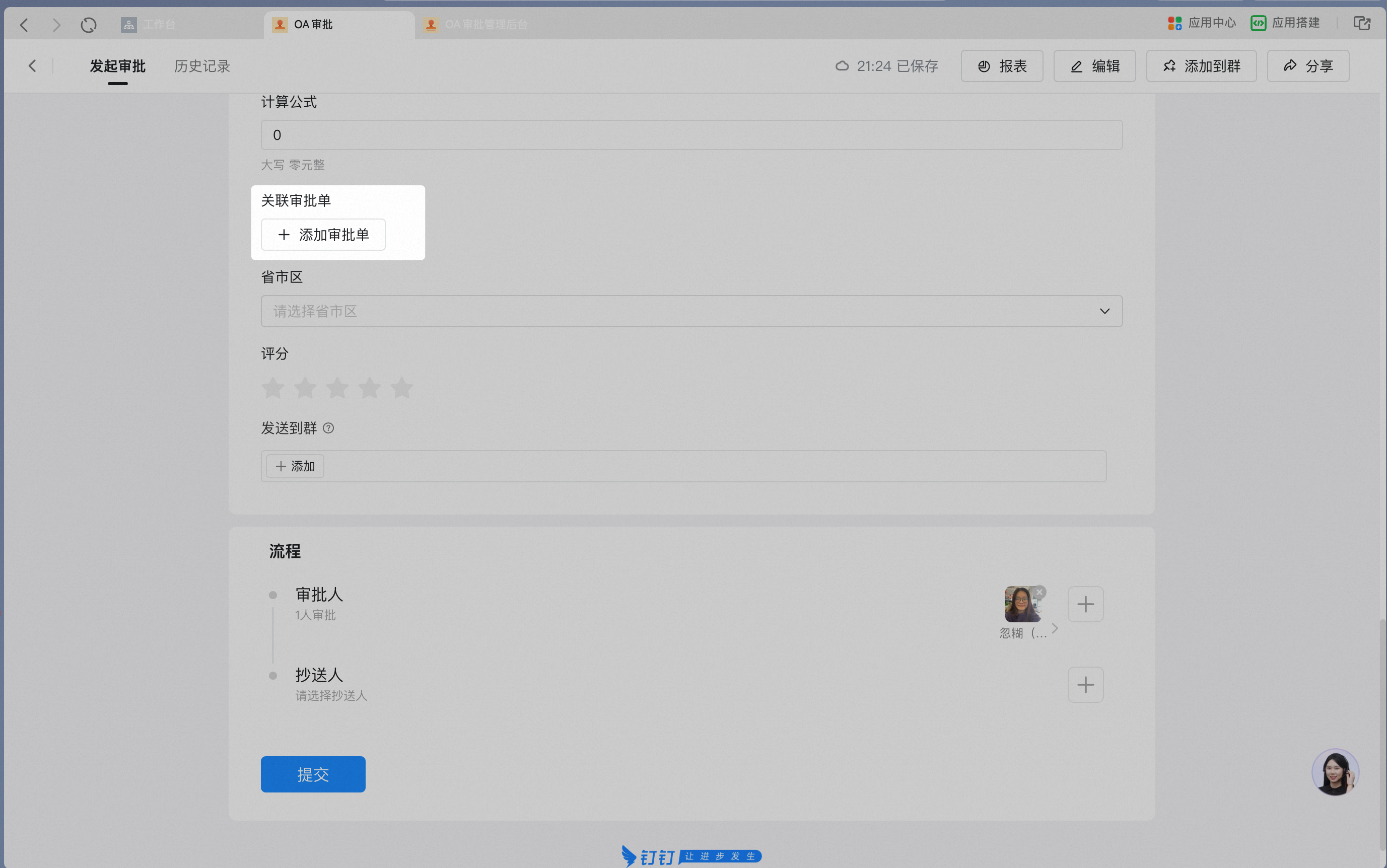
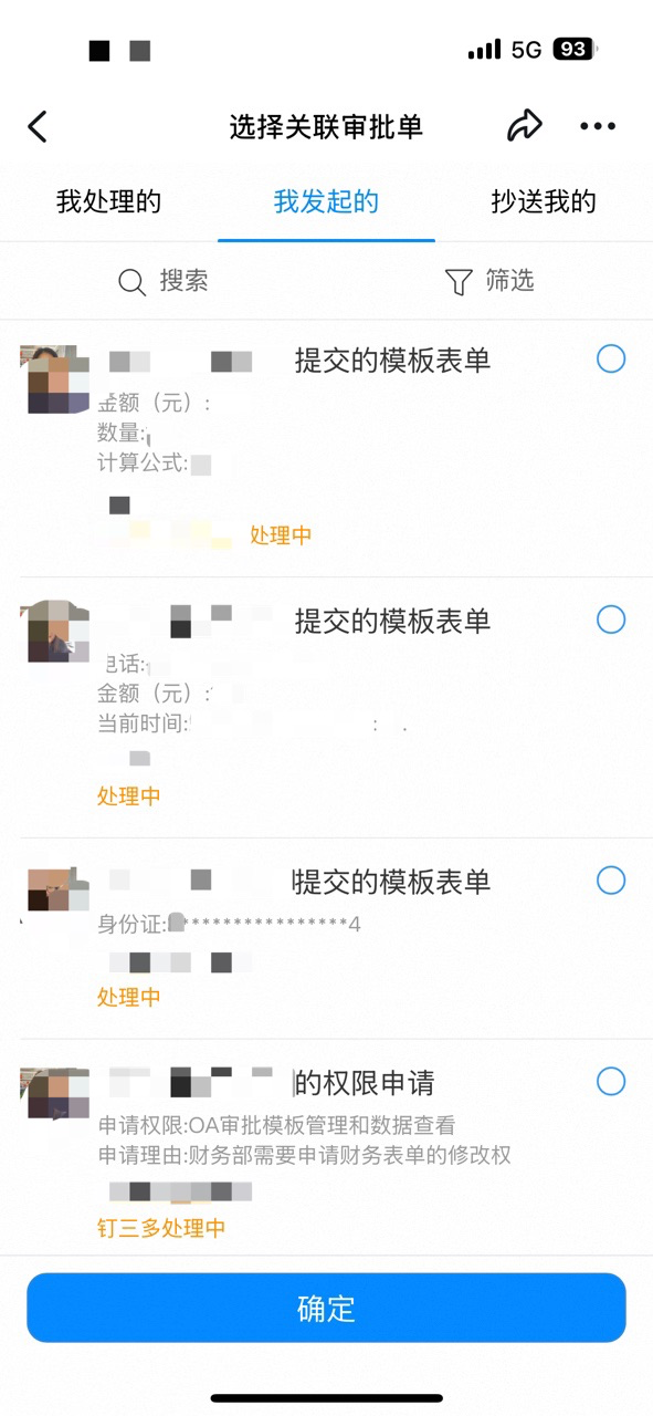
Selecting the Approval form to associate on mobile:
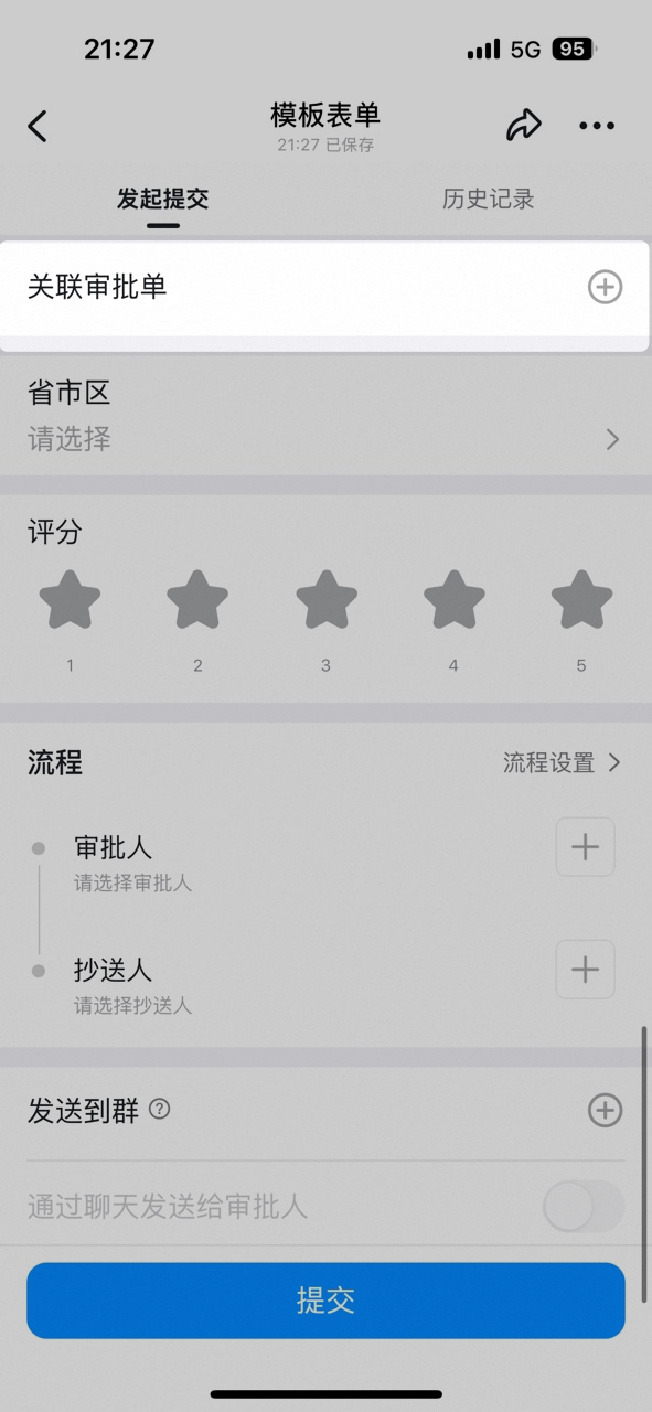
Selecting the Approval form to associate on desktop:
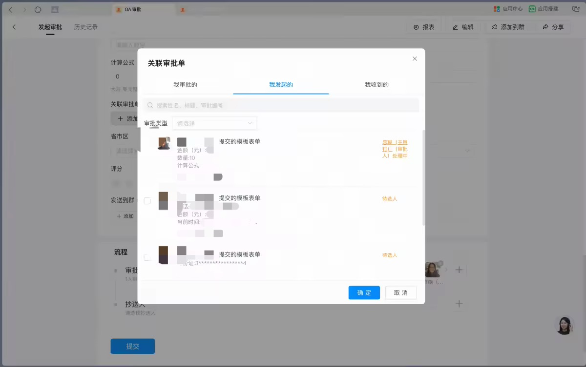
Associated Approval form as it appears on a mobile form:
**Attribute Settings**
| Attribute | Description |
| ----------------------------------------- | ----------------------------------------------------------------------------------------------------------------------------------------------------------------------------------------------------------------------------------------------------------------------------------------------------------------------------------------------------------------- |
| Specify the associated Approval form Type | Once the Admin has specified an Approval form Type, the Submitter can only associate instances of that specific Template. For example, in a business-trip reimbursement form, this Associated Approval form can be set to the business-trip Approval form. If this Attribute is not set, the Submitter can submit any Approval form they have View Permission for |
**Data constraints and Search**
| Item | Description |
| ---------------- | --------------------------------------------------------------------------------------------------------------------------------------------------------------------------------------------------- |
| Data constraints | The Submitter can only submit Data they have permission to view — including Data they approved, initiated, or received. The Approval forms here also include Data forms without an Approval process |
| Search boundary | Fuzzy Search by Approval form Title supported |
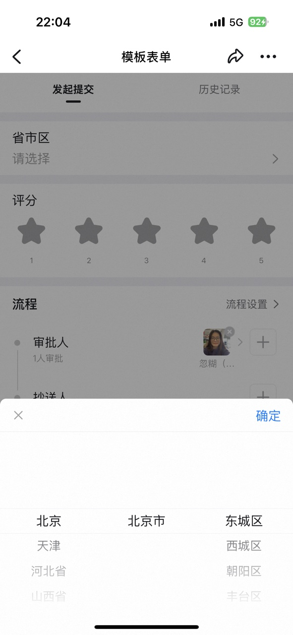
#### 12. Province/City/District
Supports the User selecting address information — Province/City/District, street, and a free-form detailed address. It is typically used in scenarios where the User must provide address information, helping the User fill in the address quickly and accurately, and avoiding errors or omissions.
**Settings interface**
Add a Province/City/District control in the form designer:

Province/City/District Attribute Settings panel — the address format can be selected:
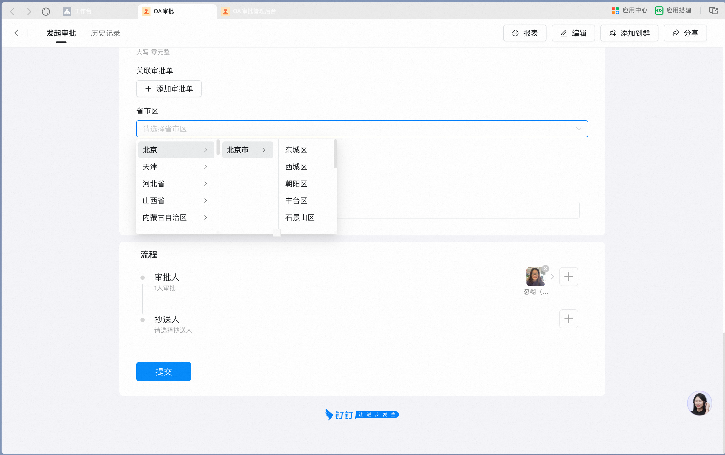
Picking Province/City/District Tier-by-Tier and filling in the detailed address on mobile:
**Attribute Settings**
| Attribute | Description |
| ------------------- | ------------------------------------------------------------------------------------------------------------------------------------------- |
| Format | Supports Province/City, Province/City/District, or Province/City/District plus street |
| Data linkage | A paid capability. When On, supports filling in Data from other forms according to specific rules |
| Hide sensitive info | Off by default. When On, detailed address info is displayed as \*\*\*\* on the Approval detail Page and must be revealed by tapping to show |
With Hide sensitive info On, the detailed address is masked on the Approval detail Page:

**Data constraints and Search**
| Item | Description |
| ---------------- | ------------------------------------------------------------------------------------------------------------ |
| Data constraints | Data linkage can only link to the same control on another form; the detailed address is up to 500 characters |
| Search boundary | Fuzzy Search supported |
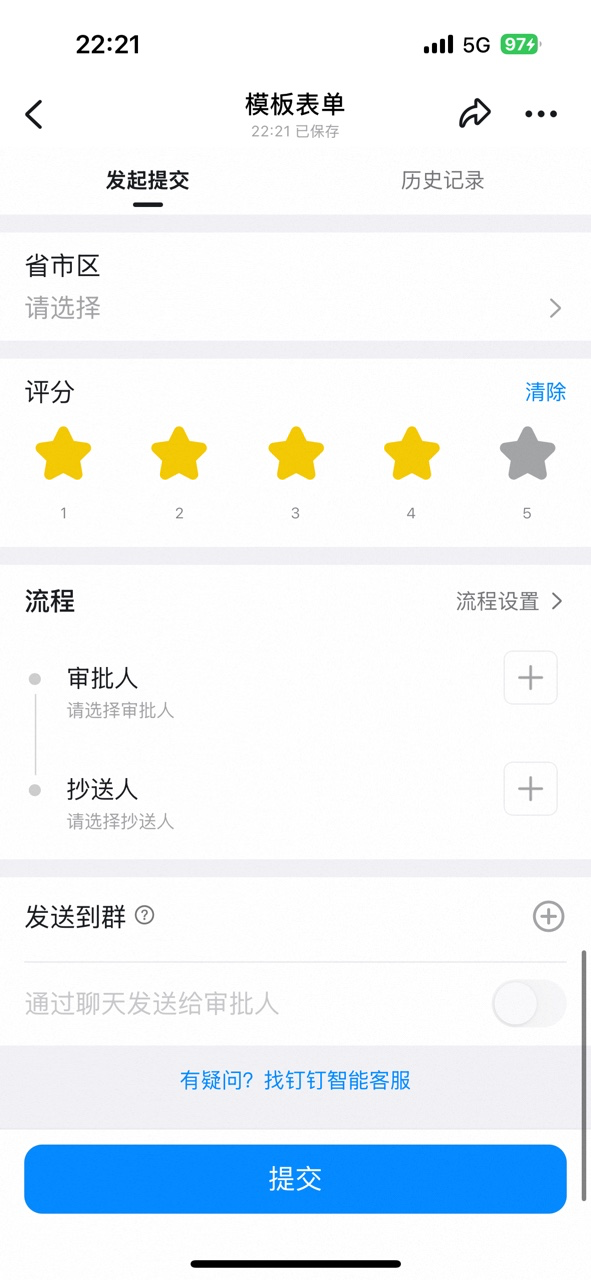
#### 13. Rating
Pick a number of stars as the Rating. Both 5-star and 10-star scales are supported — for example, satisfaction surveys, experience Feedback, and other scenarios where the User must provide a Rating.
**Settings interface**
Add a Rating control in the form designer:

Rating control Attribute Settings panel — 5-star or 10-star scale can be selected:
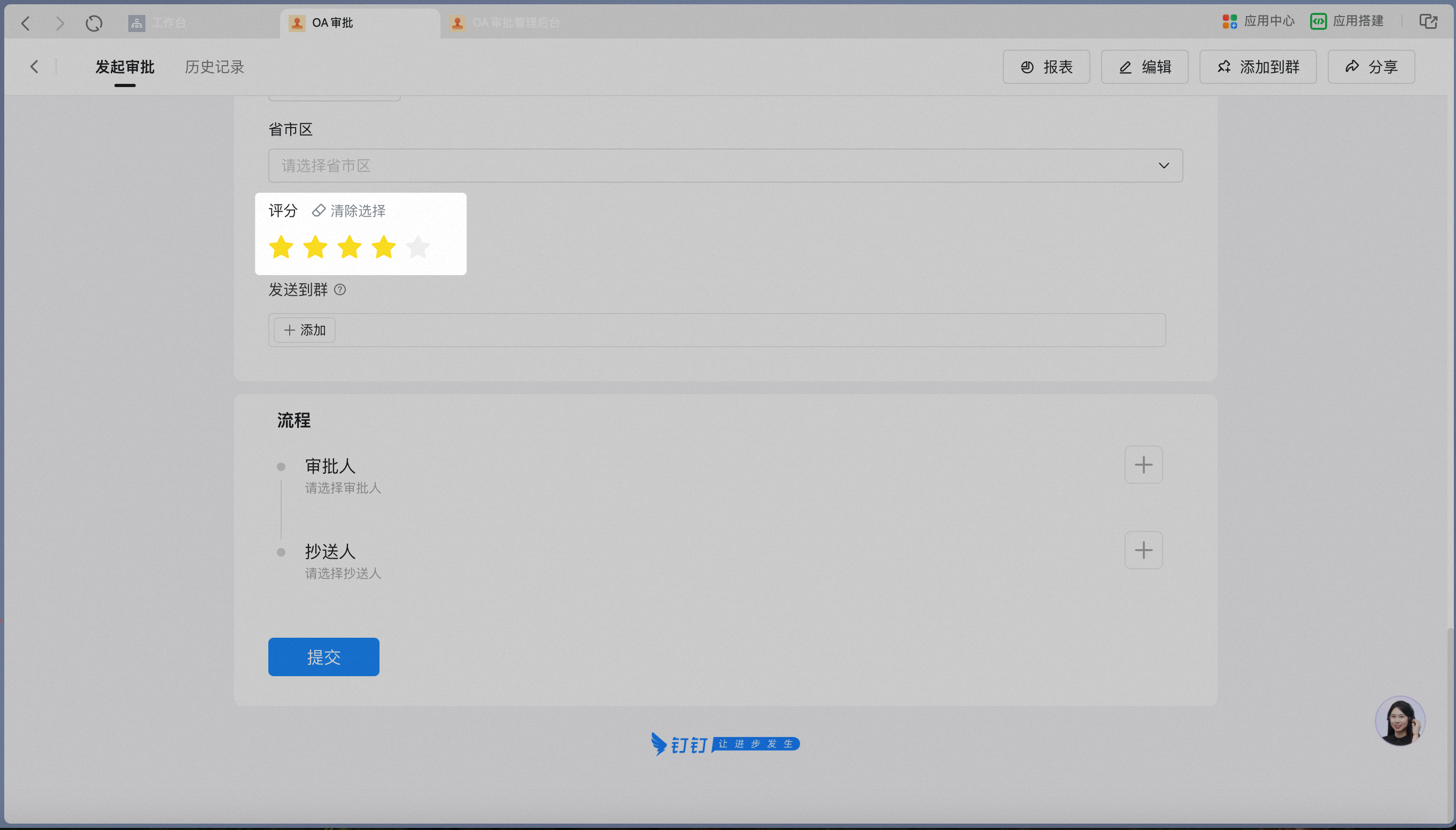
Tapping stars to rate on mobile:
**Attribute Settings**
| Attribute | Description |
| ------------ | ---------------------------------- |
| Rating scale | Supports 5-star and 10-star scales |
Selecting 4 stars shows 4 points on the Approval detail Page:

**Data constraints and Search**
| Item | Description |
| ---------------- | --------------------------------------------------------------------------------------------------------------------------- |
| Data constraints | When the 5-star scale is set and 4 stars are selected while filling in the form, the Approval detail Page displays 4 points |
| Search boundary | Search not supported |
## 2. Related documents
Set up linked display between single Select options and other controls
Use the Details/Spreadsheet control to collect multiple Records with the same fields
Design Approval process Steps and conditional branches
Use AI controls to improve form-filling and Approval efficiency