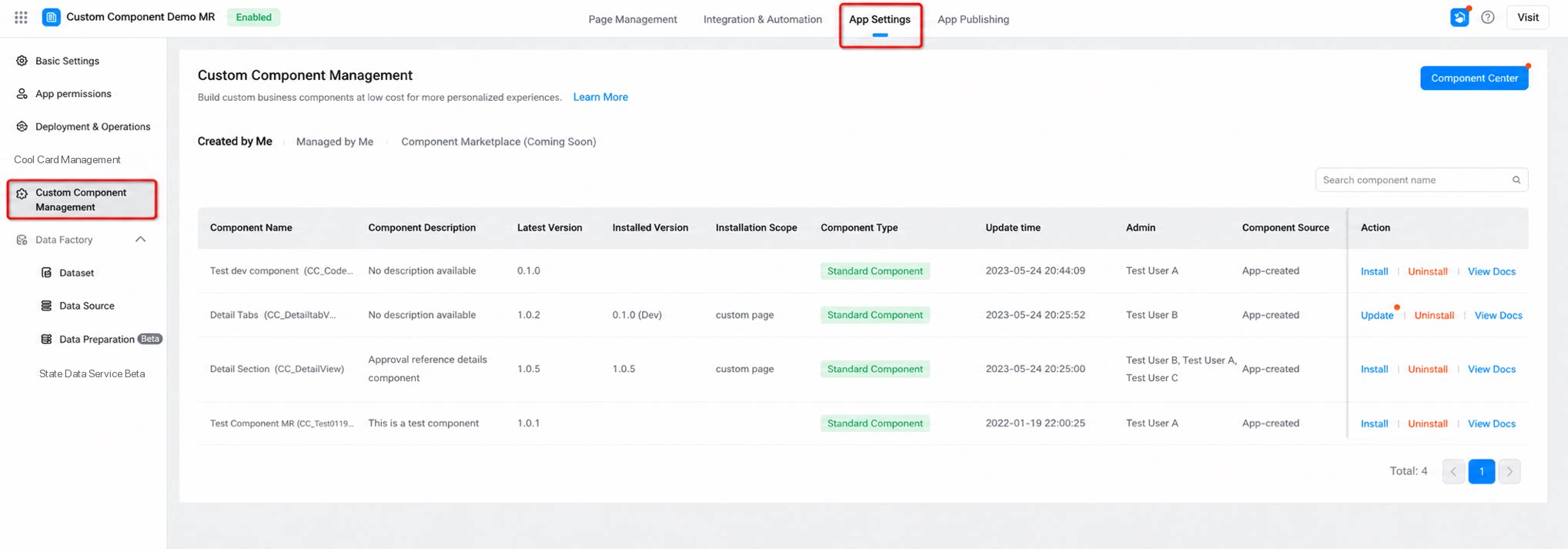
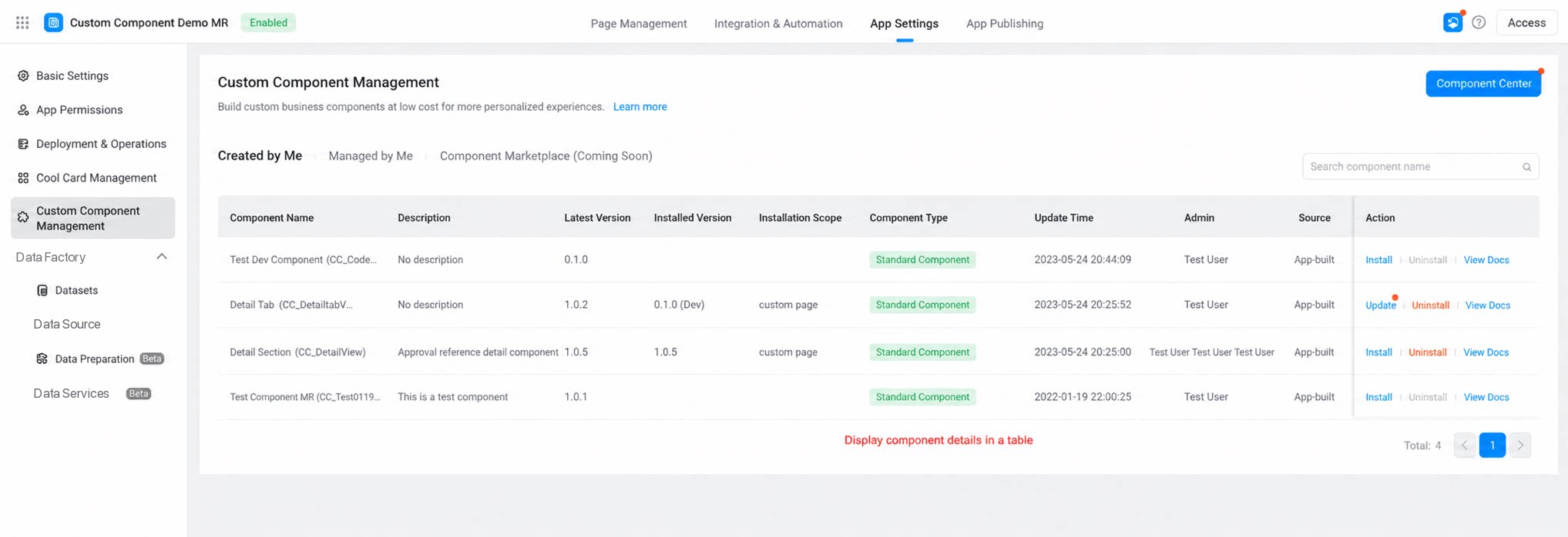
| Field | Description |
| Component name | The component name entered at creation. It cannot be modified afterward. |
| Component description | The summary entered when the component was created. It can be modified later. |
| Latest version | The highest version reached in the component’s current development iteration. | Click to view version differences. |
| Installed version | The version currently available for use in the form designer. |
| Component type | The type of the current component. Click to view the component type description. |
| Installation scope | The installation scope of the current component, which determines whether the component can be used in specific page types of the current app. Click to view the installation scope description. |
| Update time | The most recent release time of the current component version. |
| Admin | Has permission to develop and debug the current component. The creator is the default admin. Admins can be added or removed. |
| Component source | Sources include app self-built or app distribution. |
| Action - Install | Install the current component. Pay attention to the component version and installation scope. |
| Action - Update | After the component is installed successfully for the first time, the version can be updated continuously. |
| Action - Uninstall | Components can be uninstalled after installation (you can uninstall components visible to you personally — those you created or manage). Once the current component and its specific version have been installed within the selected page scope, clicking Uninstall removes the component from All installed pages > Component library > Custom component list. Existing content on saved pages is not affected, but the component content can no longer be added or modified. Proceed with caution. |
| Action - View document | Click to view the documentation for the current component. The document link is entered during component creation or in the component’s basic information, making it easier for users to understand the component. |


 Chats
Chats Calendar
 Meetings
 Contacts
 Mail
Mail Docs
Docs Drive
Drive AI Table
 AI Minutes
 Attendance
 Approval
 YiDA
YiDA Admin Console