Chats
Chats Calendar
 Meetings
 Contacts
 Mail
Mail Docs
Docs Drive
Drive AI Table
 AI Minutes
 Attendance
 Approval
 YiDA
YiDA Admin Console
1. Feature Overview
1.1 About Custom Components
Custom components let you build your own components. This improves the fit between components and your business needs, lowers development and maintenance costs, and increases reusability.1.2 Use Cases
When the standard YiDA components do not meet your app’s business needs, build a component tailored to your scenario based on industry practices or requirements. Custom components can also be shared across the same organization, making them easy to reuse when you build similar apps later.1.3 Component Structure
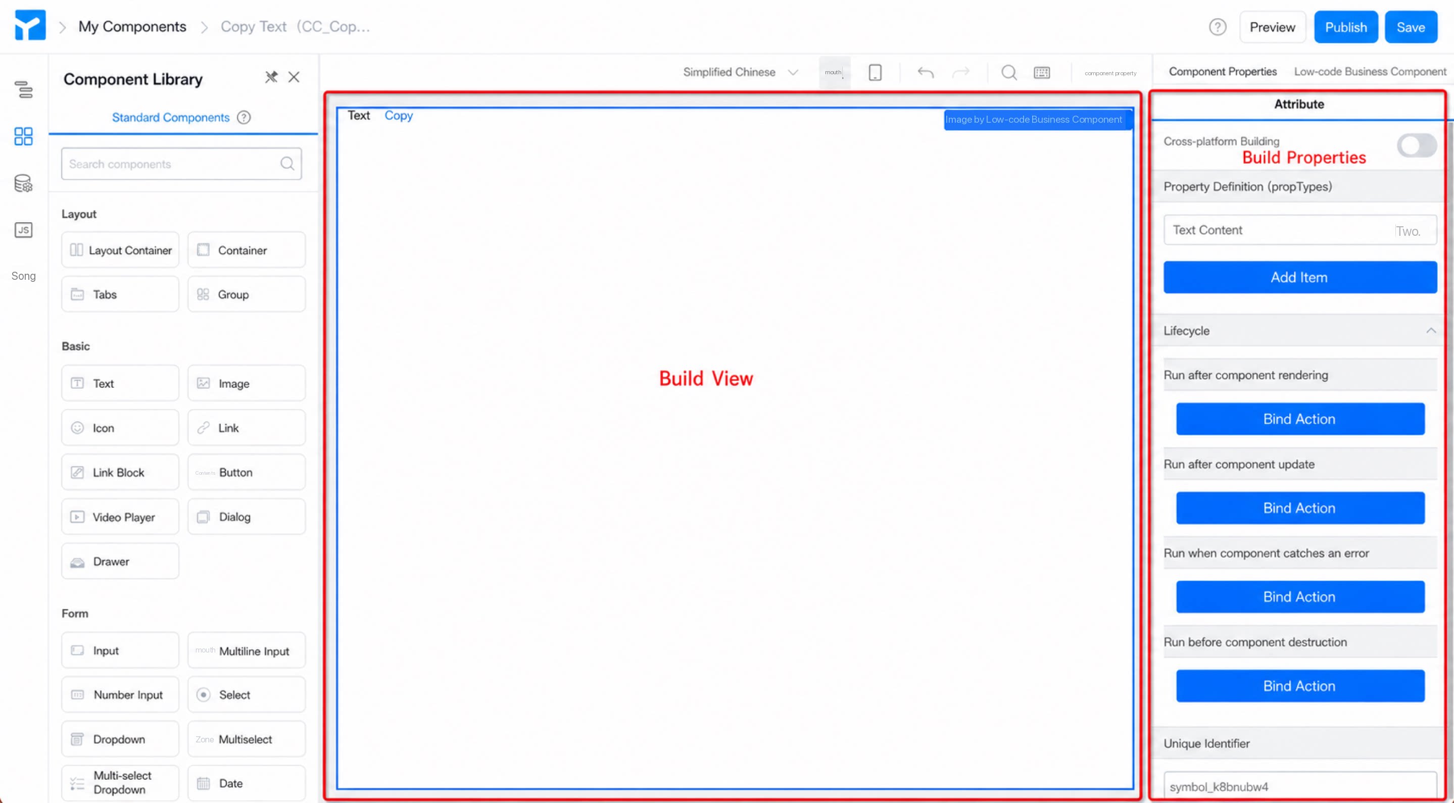
A component consists of a view and attributes. On the consumer side, you change a component’s attributes to render different views. The view divides further into a design view and a runtime view. In most cases, the two views can be reused.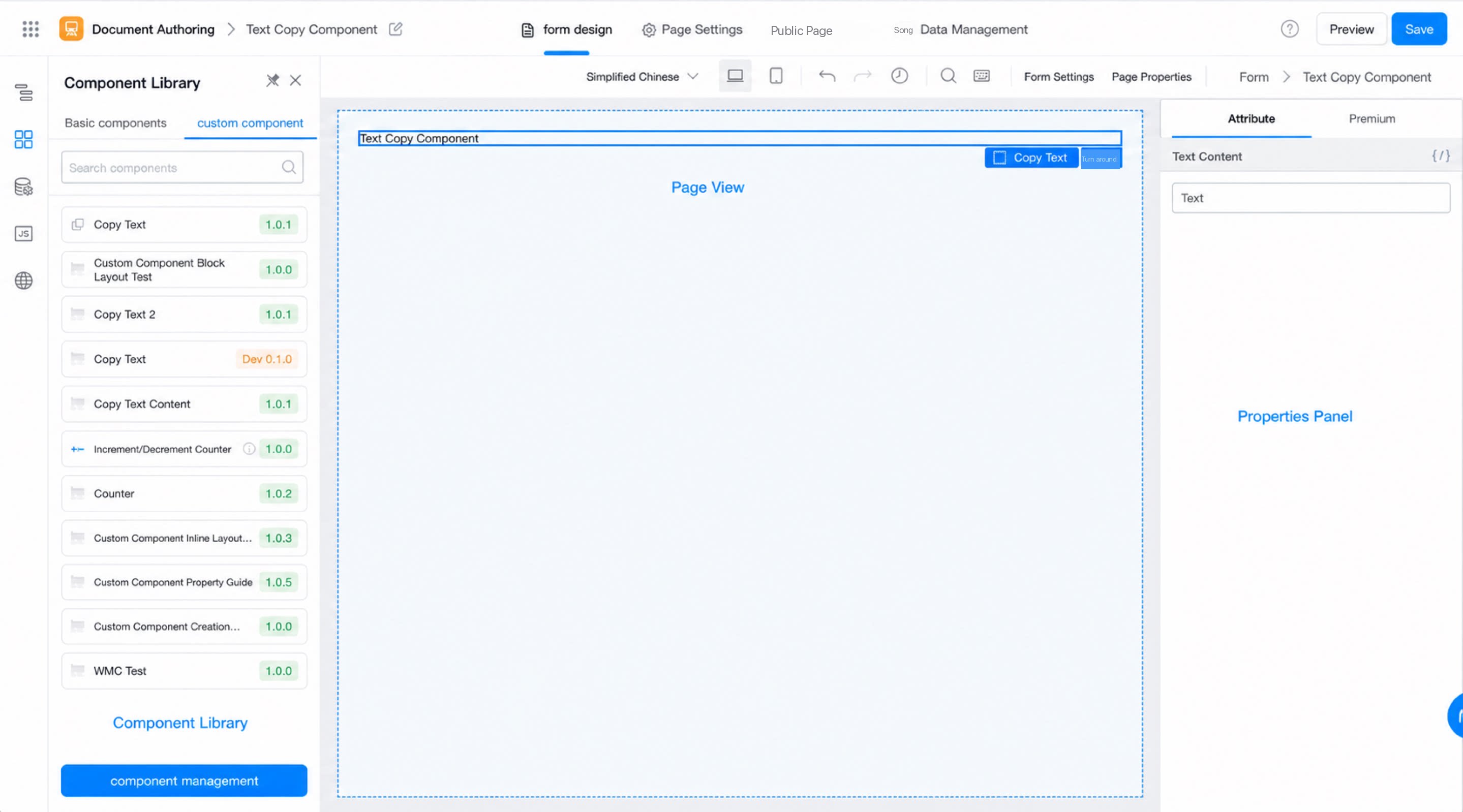
2. Step-By-Step Guide
Walk through a small example that implements a text-copy feature with a custom component to experience the full flow: build, debug, install, and use.2.1 Scenario
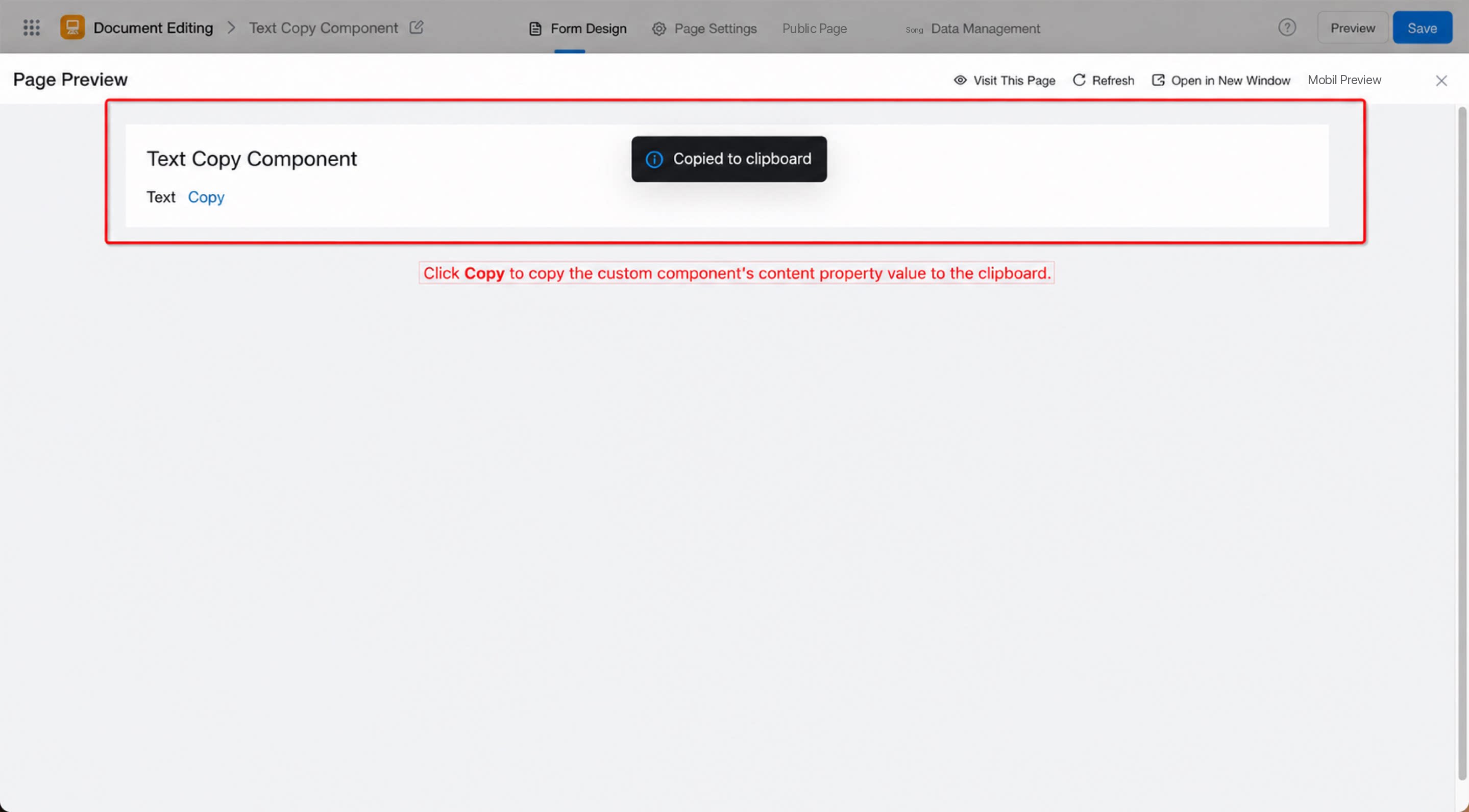
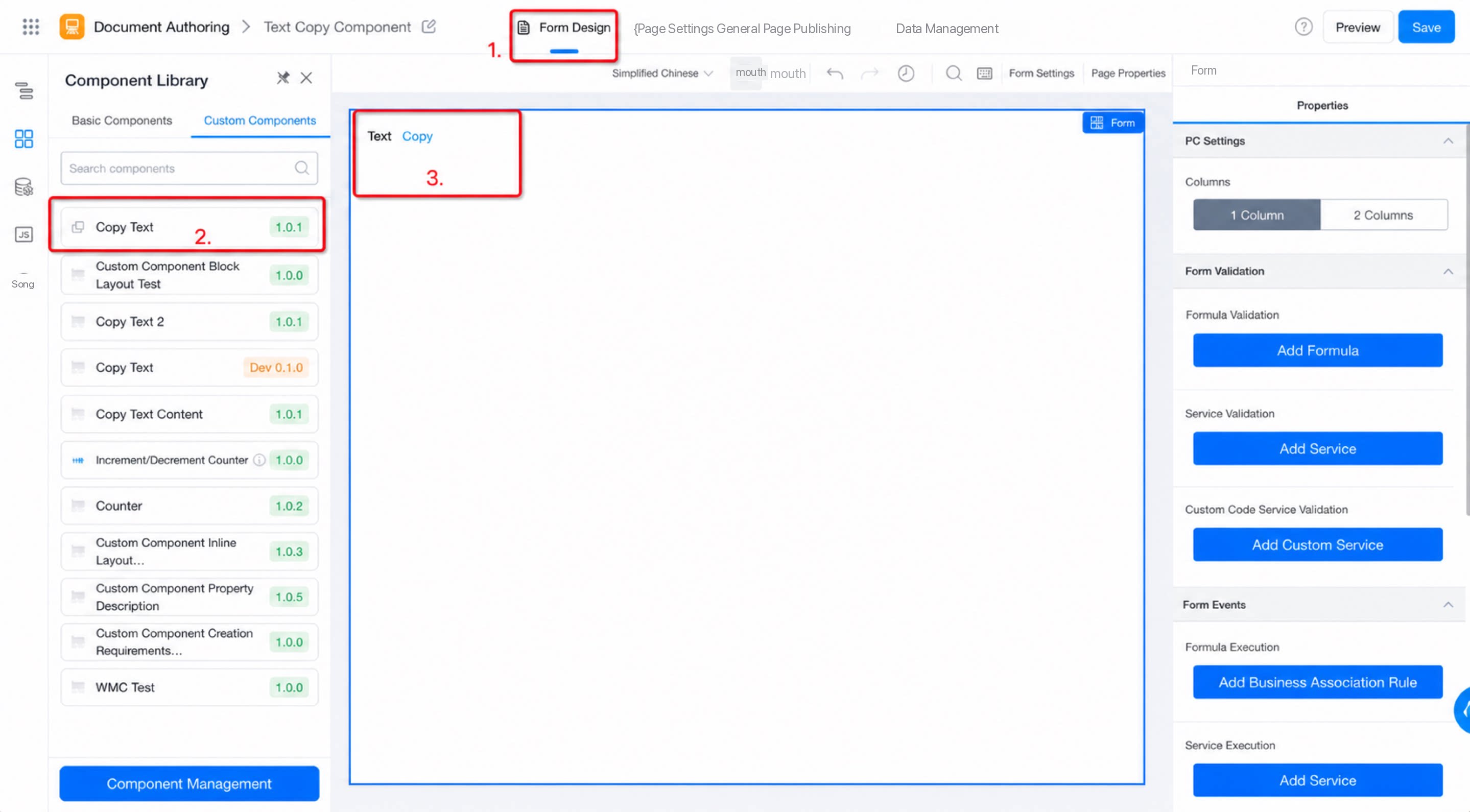
Use the custom component feature to extend YiDA’s built-in Text component with low-code, and implement a text-copy feature. Users can copy field content to the clipboard, which helps when they need to reuse the same values.2.2 End Result
2.3 Steps
2.3.1 Step 1: Create a Custom Component
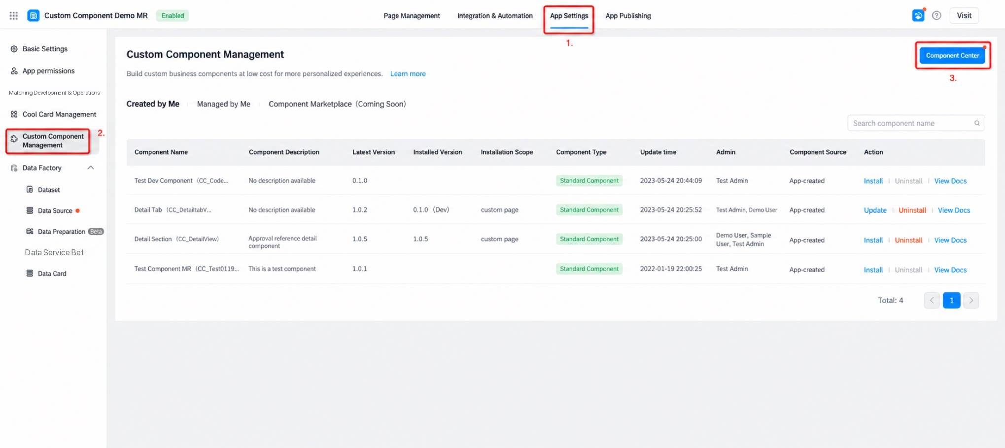
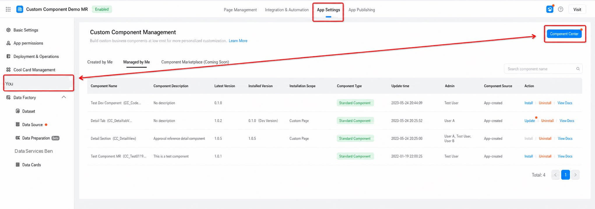
Configure the component’s name, type, identifier, and other attributes to create a component that fits your business needs at low cost. Steps:- YiDA app > App settings > Component management > Component center (see Figure 2.3-1).
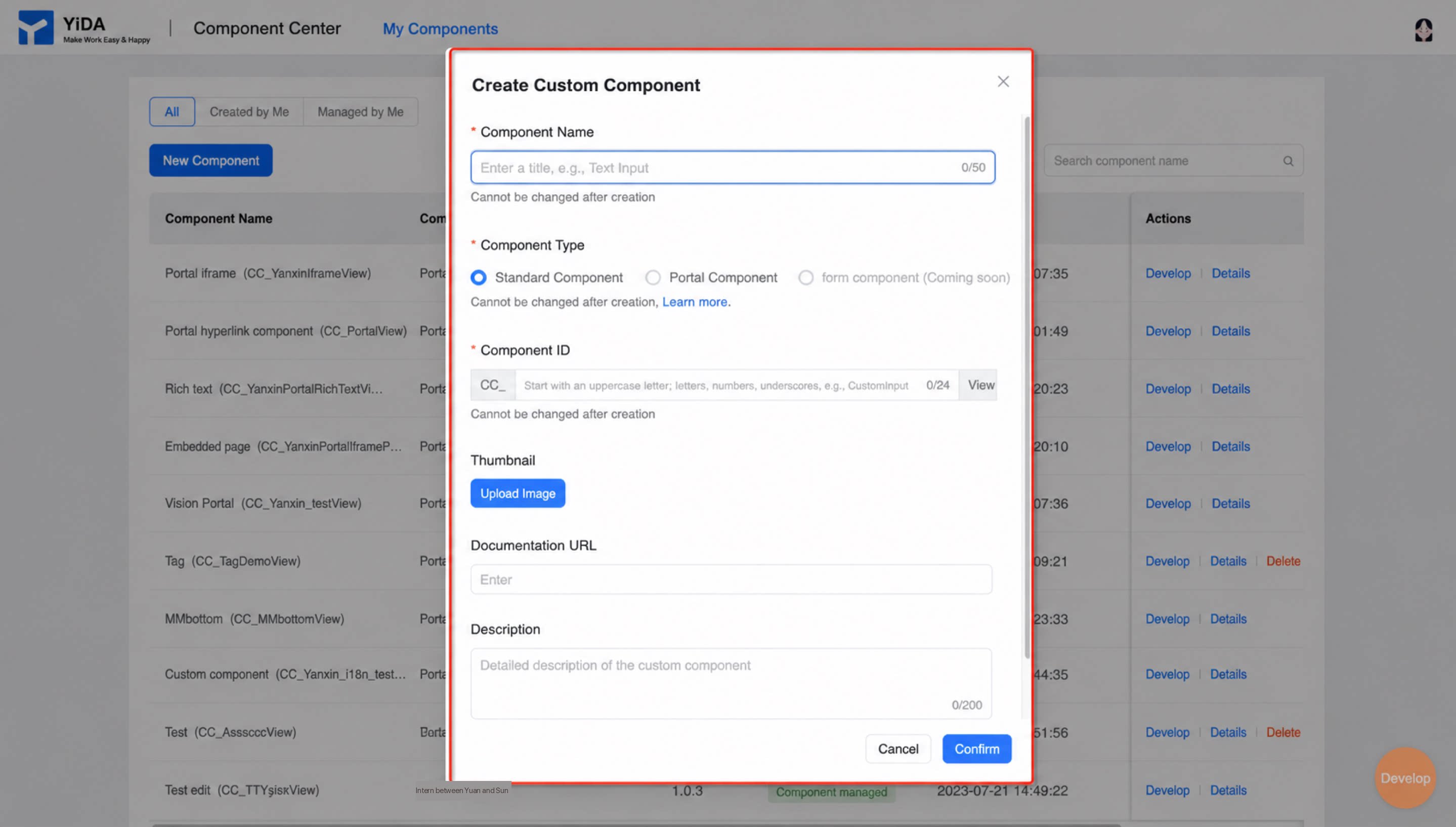
- Add component > Fill in the component name, type, identifier, and other attributes > Confirm (see Figure 2.3-2).
2.3.2 Step 2: Develop and Debug the Custom Component
Develop and debug the component to meet different business needs. This example implements a counter feature. Steps: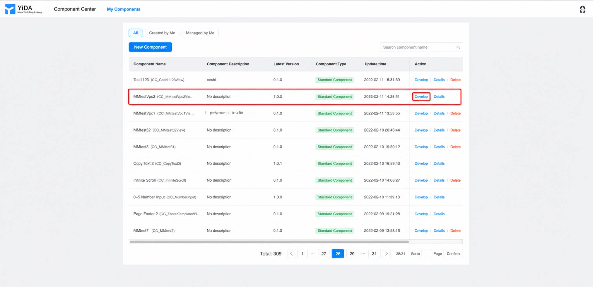
- Component center > My components > Locate the component to debug > Develop (see Figure 2.3-3).
1
Step 1
As mentioned above, a component is built from a view and attributes. When developing a component, first abstract the attributes it needs. Start with the attributes: this component needs only one attribute for the text content. Go to Attribute configuration > Attribute definition, add a text content attribute named
content, set the attribute type to text, and choose textSetter as the setter.2
Step 2
Once the attributes are defined, build the component’s view. Drag the required standard YiDA components onto the canvas (this example uses two Text components, named “Text” and “Copy”) and configure their basic attributes. Bind the Text component’s content to a variable — the attribute
props.content you just defined — so the passed-in value renders at runtime (see Figure 2.3-4).- Configure an action on the Button component to implement the text-copy behavior. Select the “Copy” text > Create action >
onCopyTexton click (see Figure 2.3-5).
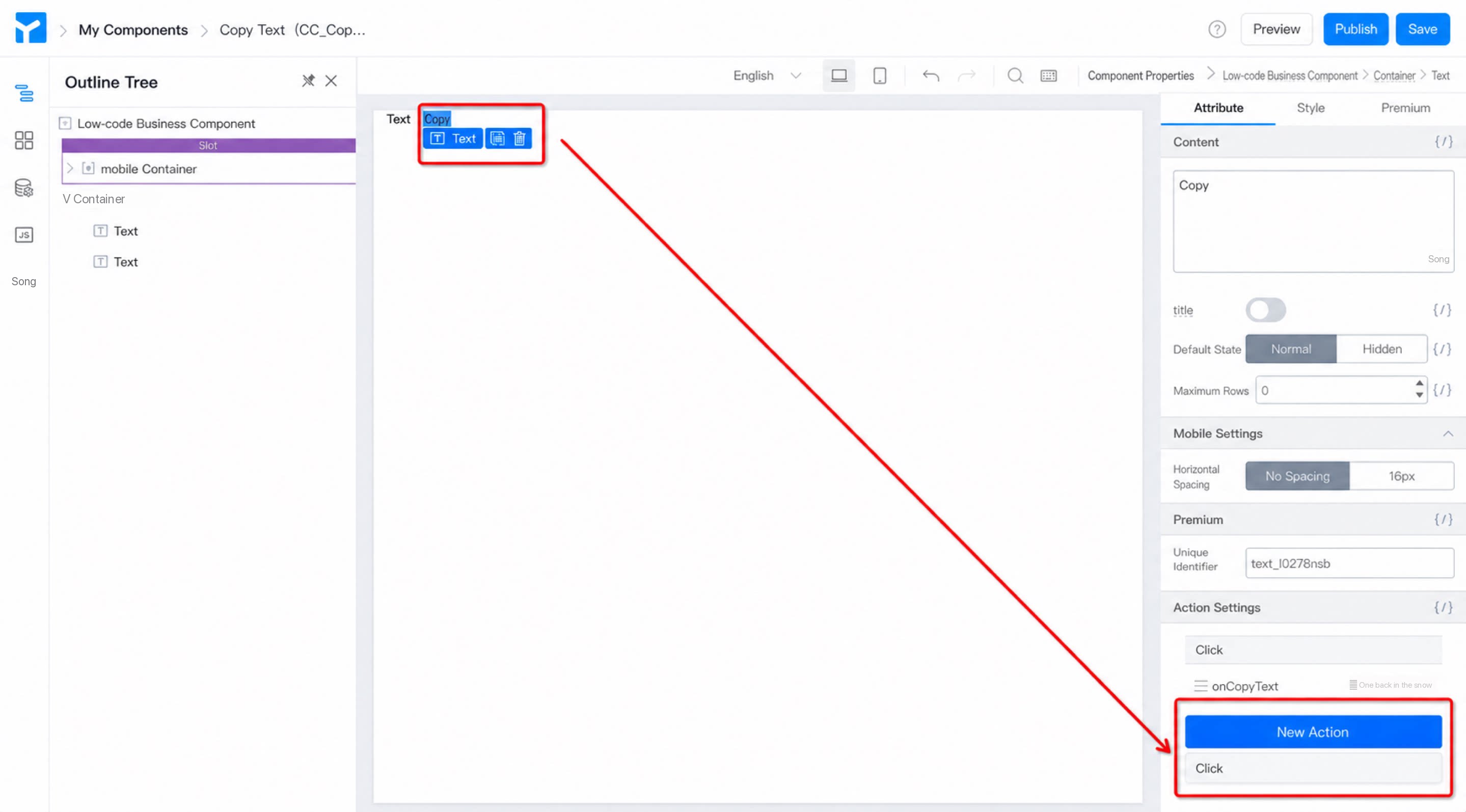
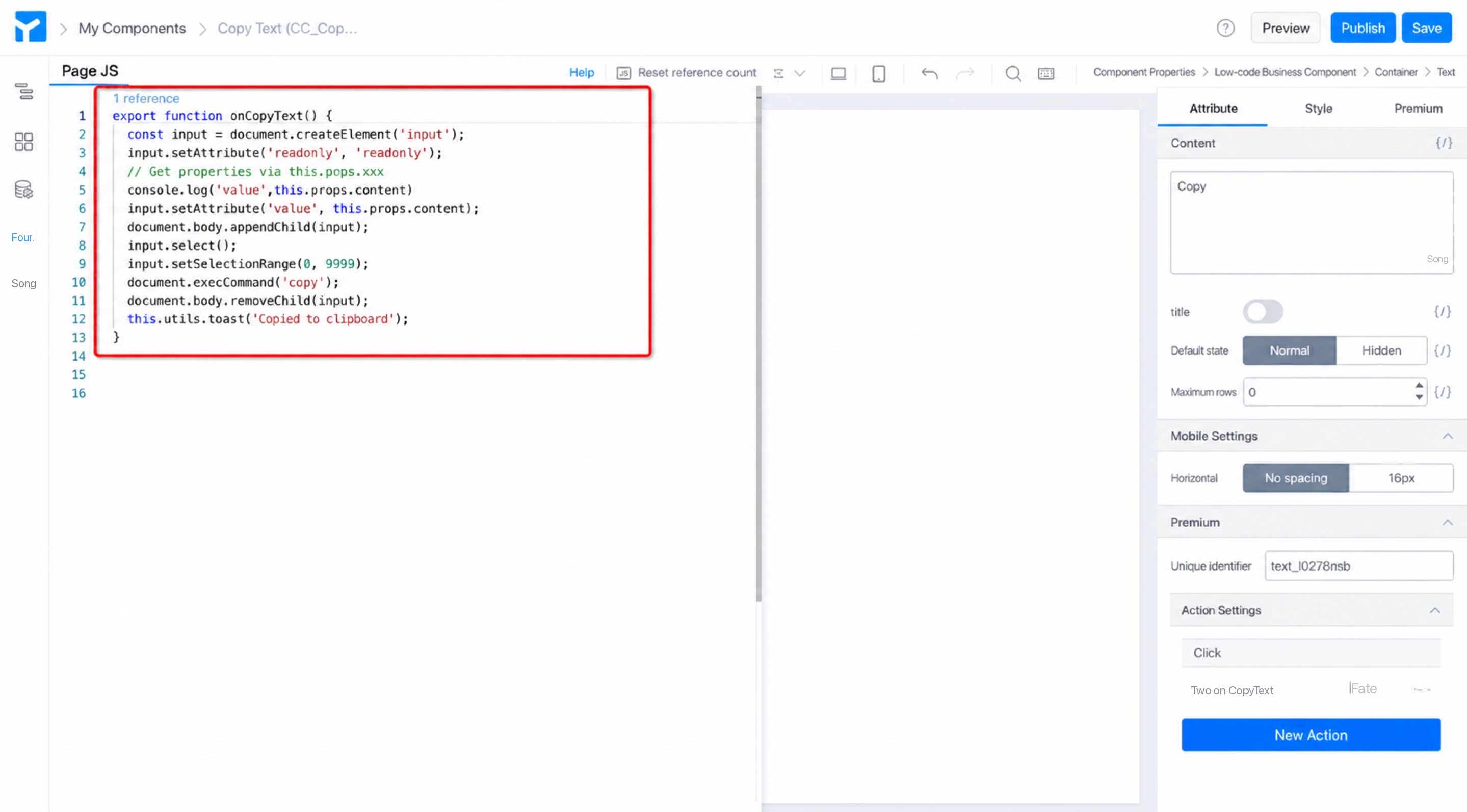
- Write the copy logic in the JS panel (see Figure 2.3-6).
1
Save > Preview the component
2
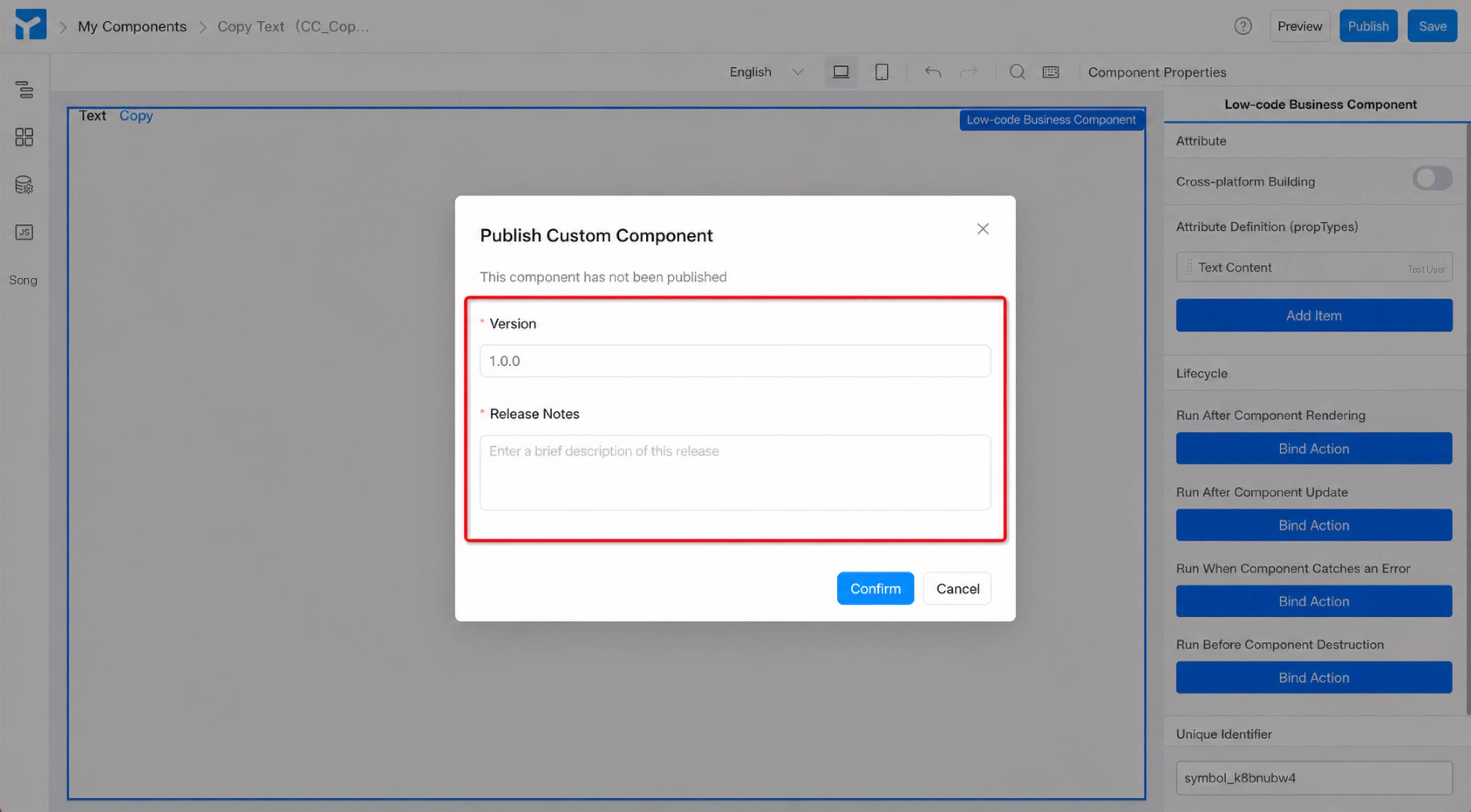
Publish > Fill in the version number and release notes > Confirm (see Figure 2.3-7).
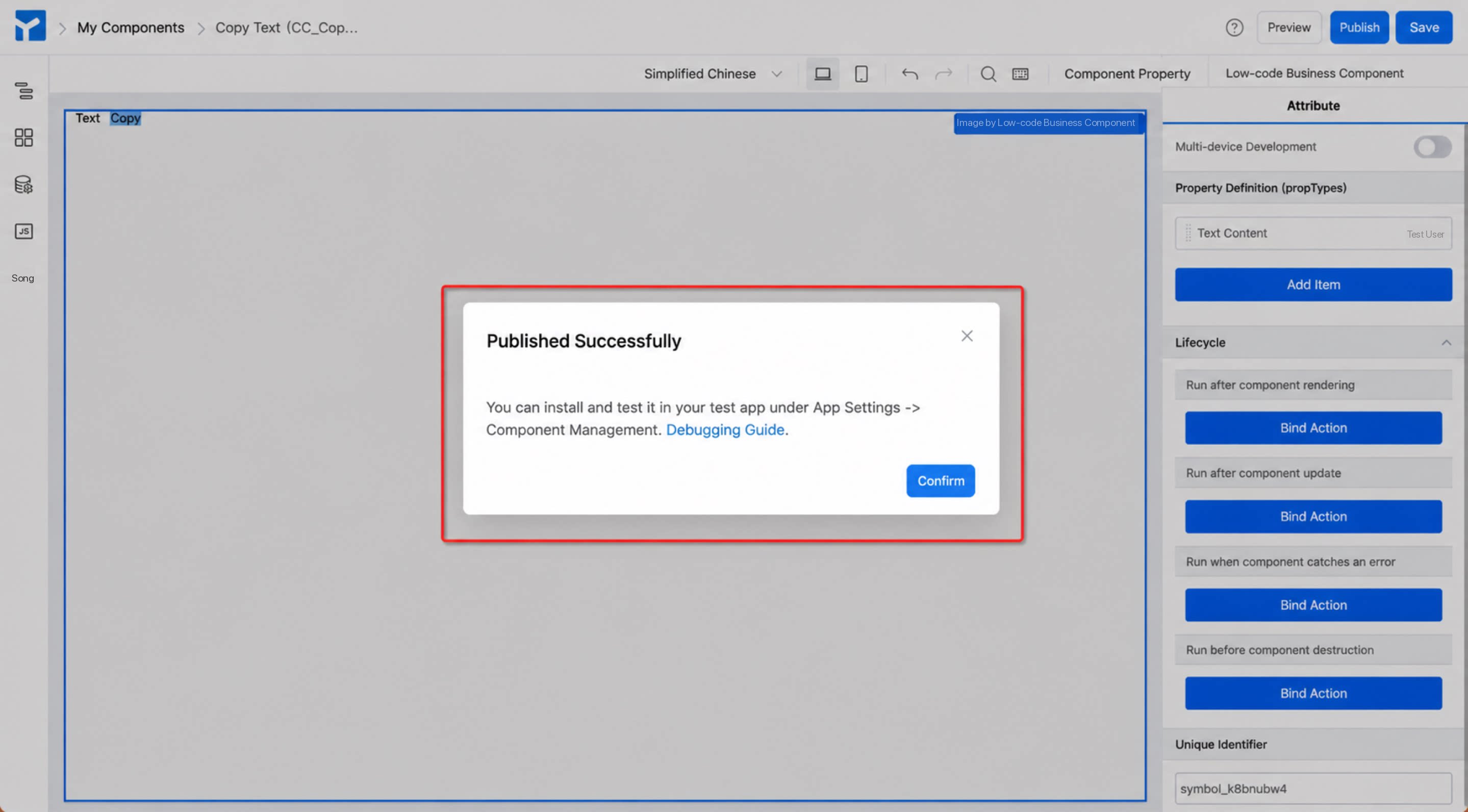
- A confirmation appears when the component is published (see Figure 2.3-8). In real development, once you save the component, you can install the development version (0.1.0) for live debugging. Publish an official version only after development is complete.
2.3.3 Step 3: Install the Custom Component
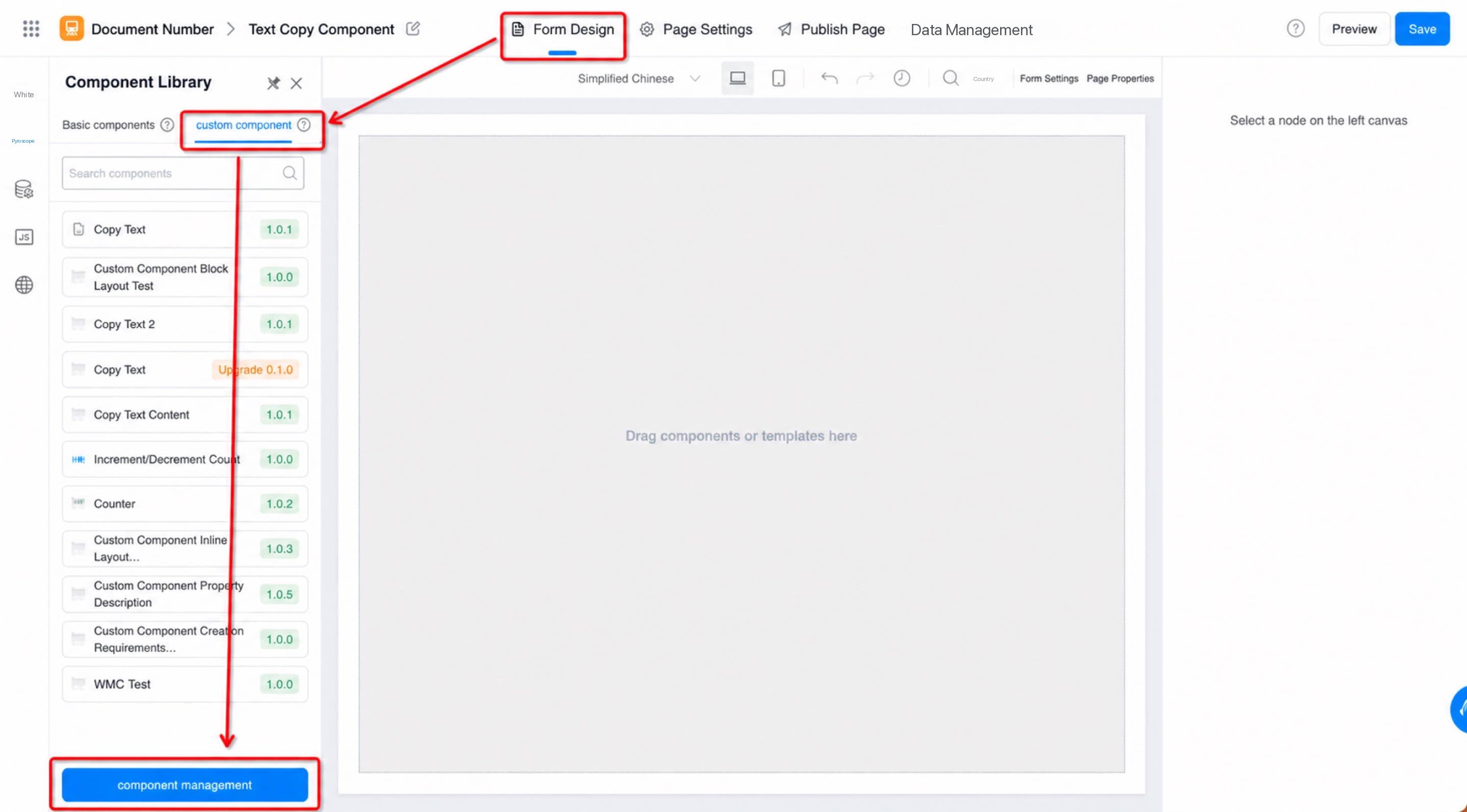
Install the developed and debugged component into a page so you can use it when designing that page. During component installation, select a page type. The custom component appears only in the page designer of the page type you select. Steps:- Form design page > Component library > Custom components > Component management (see Figure 2.3-9).
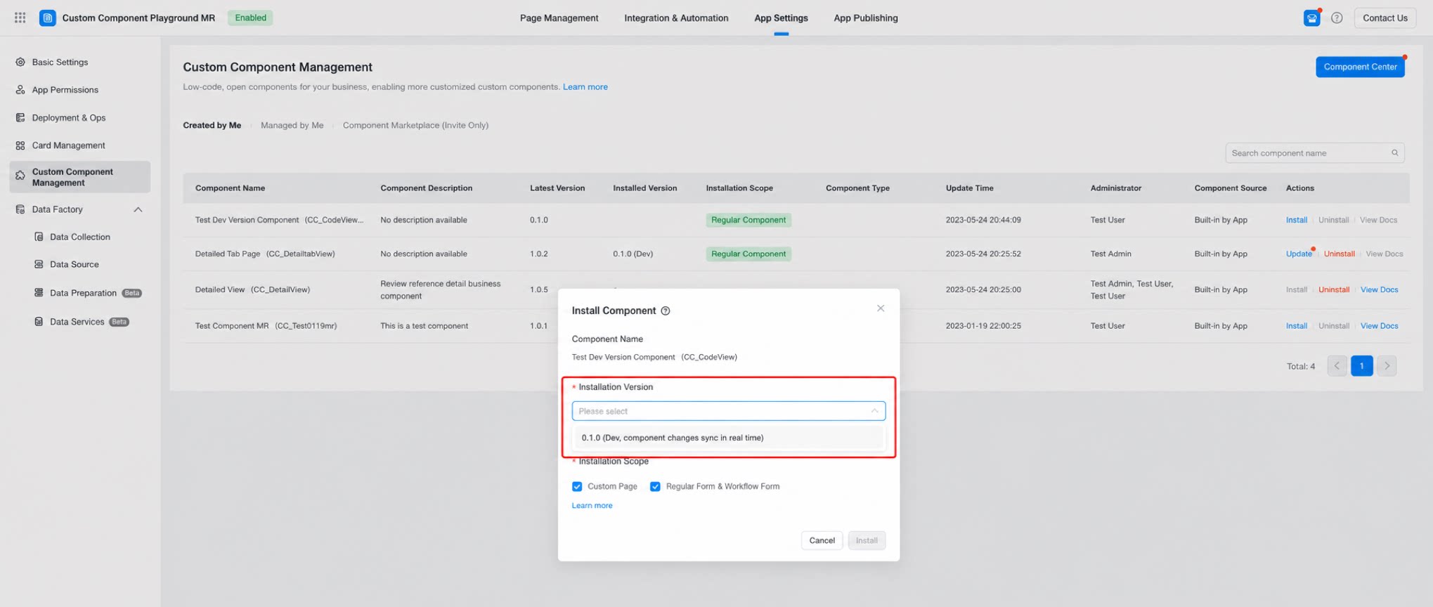
- Component management page > Component list > Select the custom component to install > Install (see Figure 2.3-10).
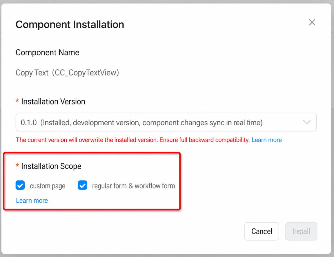
- Choose the installation version and installation scope > Install (see Figure 2.3-11).
2.3.4 Step 4: Use the Custom Component
After the steps above, the custom component appears under Custom components in the page’s component library. Use it as follows. Steps:- Form design page > Component library > Custom components > Select the desired component > Drag it onto the canvas (see Figure 2.3-12).
2.3.5 Step 5: View or Edit Component Information
To update a component’s thumbnail, help document URL, or description while it is in use, follow the steps below. Steps- App settings > Component management > Component center (see Figure 2.3-13).
- Select the component to view or edit > Details (see Figure 2.3-14).
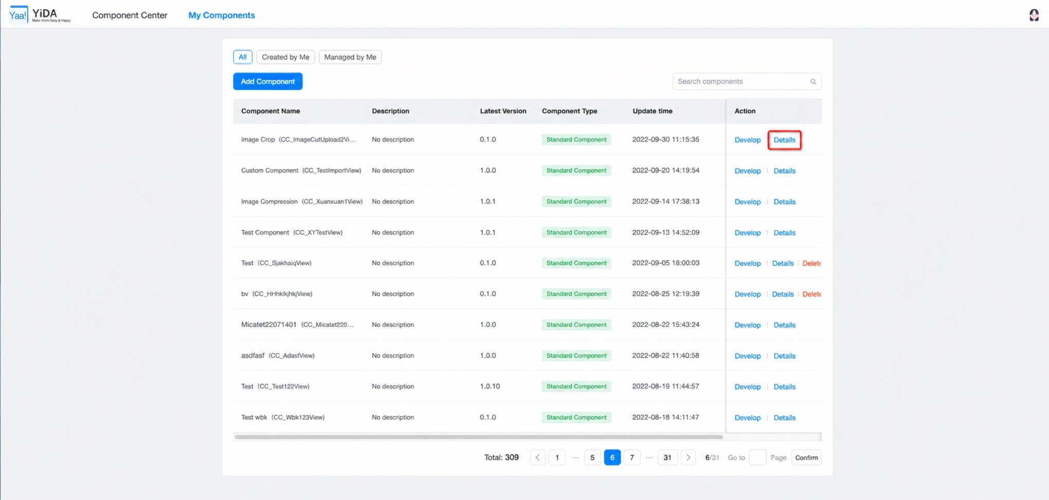
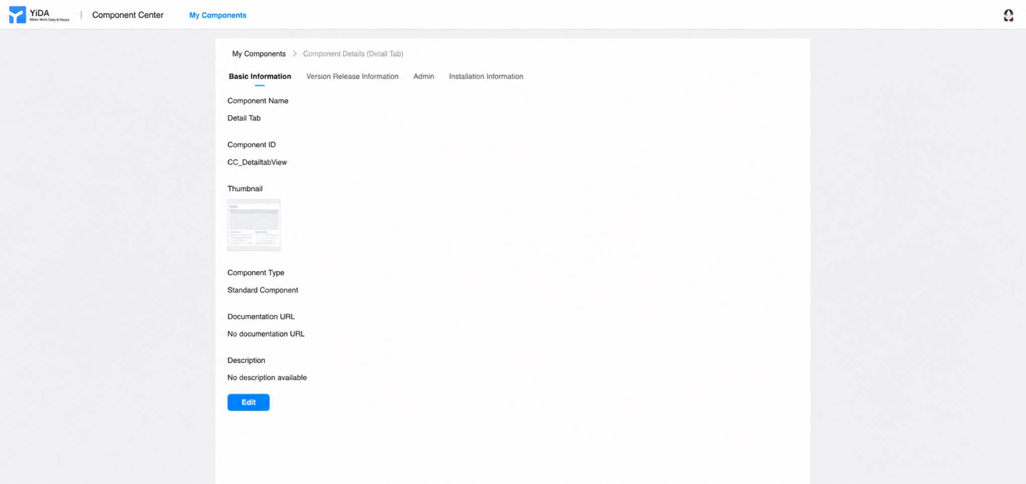
The component details page contains three sections: Basic information, Release information, and Admin (see Figure 2.3-15).
- Basic information: Click “Edit” to update the custom component’s thumbnail, help document URL, and description. Other fields are set when the component is created and cannot be changed.
- Release information: View the component’s iteration history, including versions and their release notes.
- Admin (has permission to develop and debug the custom component; defaults to the component creator): Add or remove admins to manage permissions.
- Installation information: View the component’s installation history, including the installed app, version, scope, installer, and installation time.
3. Custom Component Attributes
Beyond extending existing YiDA components, the custom component feature lets you customize the attributes (propTypes) of the components you build. This makes custom components a better fit for developers’ daily scenarios and habits, and provides greater flexibility.
3.1 Entry Point for Configuring Custom Component Attributes
Path: Low-code component designer > Select the “low-code business component” on the canvas > Attributes on the right (see Figure 3.1-1).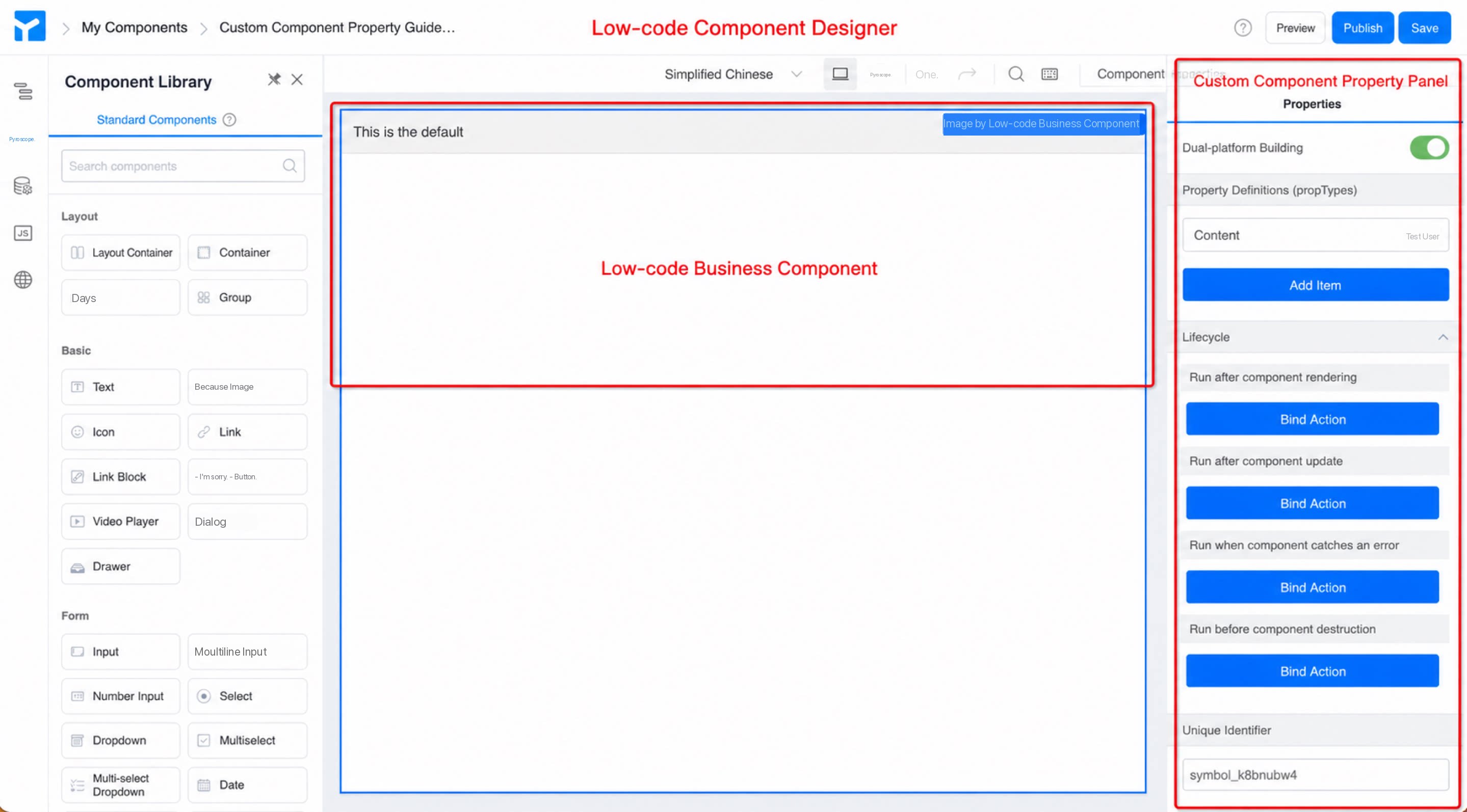
3.2 Custom Component Attribute Configuration
Custom component attributes are organized into four sections: Dual-end design, Attribute definition (propTypes), Lifecycle, and Unique identifier.
- Dual-end design: A toggle. When enabled, the PC and mobile designs are fully separated, so you can design each side independently to meet different requirements on both ends.
- Attribute definition (
propTypes): Customize basic attributes of the custom component, such as Title, Name, Type (data format), and Default. You can also bind events for Whether hidden (visibility state) and On change (value changes) to cover a wide range of business needs. For details, see Component attribute configuration. - Lifecycle: A custom component has four lifecycle hooks — component mounted (
componentDidMount), component updated (componentDidUpdate), component caught error (componentDidCatch), and before component unmount (componentWillUnmount). Write logic in the appropriate hook to meet complex business needs. - Unique identifier: Like standard YiDA components, custom components have a unique identifier attribute that serves as the component’s ID. It is generated automatically and usually does not need to be changed. YiDA uses it for backend data storage, code binding, and so on.
4. Appendix
4.1 Component Types
YiDA custom components come in three types: Regular component, Form component, and Portal component. The key differences are:- Regular components are typically used for display-only features and cannot store data. They are similar to the built-in “Rich text” and “Group” components.
- Form components can submit data. They are more complex to develop than regular components and require additional metadata configuration.
- Portal components are also used for display-only features and cannot store data. They are designed for use on portal pages.
4.2 Component Installation Types
YiDA page types include regular form page, workflow form page, report page, DataV dashboard, custom page, external link, and portal page. YiDA custom components (regular component type) can currently be installed on custom pages, regular forms, and workflow forms. When installing, select the matching page type — the component then appears in the page designer for that page type.4.3 Component Versions
YiDA custom components have two versions: development and official. We added extra conventions on top of semantic versioning.- 0.1.0 is the default development version. The development version stays in real-time sync with the component designer and is used for debugging.
- 1.x.x is the official released version. It locks the current functionality and ensures stability in production. For production apps, always install the 1.x.x official release.
5. FAQ
Q: Is deleting a component safe? Deleting and uninstalling components is now supported. Developers are responsible for ensuring backward compatibility. Q: How should I understand custom components? Refer to this link. Q: What is a component made of? A component consists of a view and attributes. On the consumer side, you change a component’s attributes to render different views. The view divides further into a design view and a runtime view. In most cases, the two views can be reused. On the producer side, you build the view and the attributes separately. Q: If an app that uses a custom component is distributed to another organization via app distribution, will it open correctly? Yes. After the app is distributed to another organization, that organization can use the component normally. If the distributed app has Edit Permission enabled, the target organization can also install components. Q: How do I read a custom component’s attribute on the page? Custom components behave like Basic components. Usethis.$('fieldId').get('propName') to read an attribute.
Q: How do I update a custom component’s attribute on the page?
Custom components behave like Basic components. Use this.$('fieldId').set('propName', propValue) to update an attribute.
You can also bind the attribute to a Data Source variable.
Q: How does a component access and interact with other components on the page?
Add a function-type attribute to the custom component — an event callback.
On the page, use this callback to interact with other components.
Inside the component, call this.props.xxx() at the appropriate time — for example, on a component event or in the component’s DidMount — to fire the callback.
Tip: function-type attributes support a Default value and can be hidden.
Q: Can custom components install third-party NPM packages?
A: Not yet. Load CDN resources dynamically instead.
this.props.xxx to branch your logic. For example:
Or
Q: Can I set styles dynamically inside a component?
Yes. Use a container component, add a “custom style class” to it, and bind the class to a variable.