1. Introduction to Component Attributes
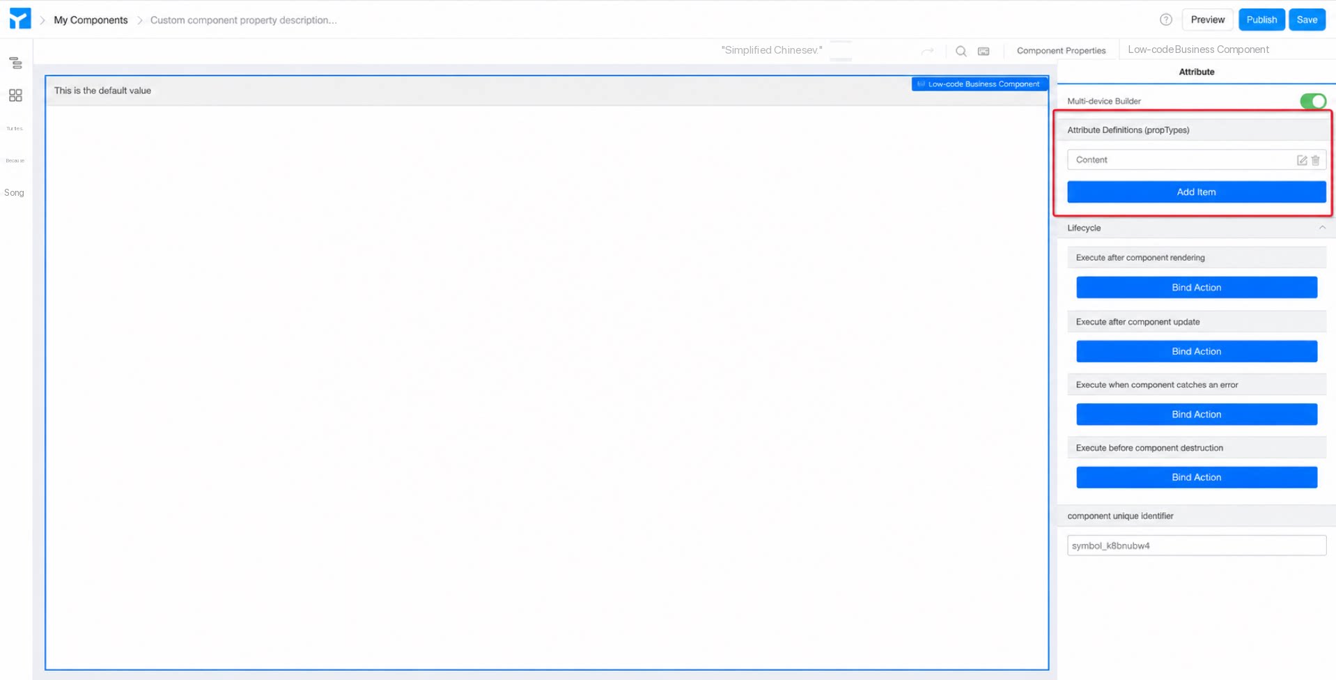
Custom components support attribute definition (propTypes) operations, which enrich components at the attribute level. Adding custom attributes improves customizability while making components more flexible and better aligned with business requirements. (As shown in Figure 1.1-1)
Figure 1.1-1 Entry point for component attribute definition
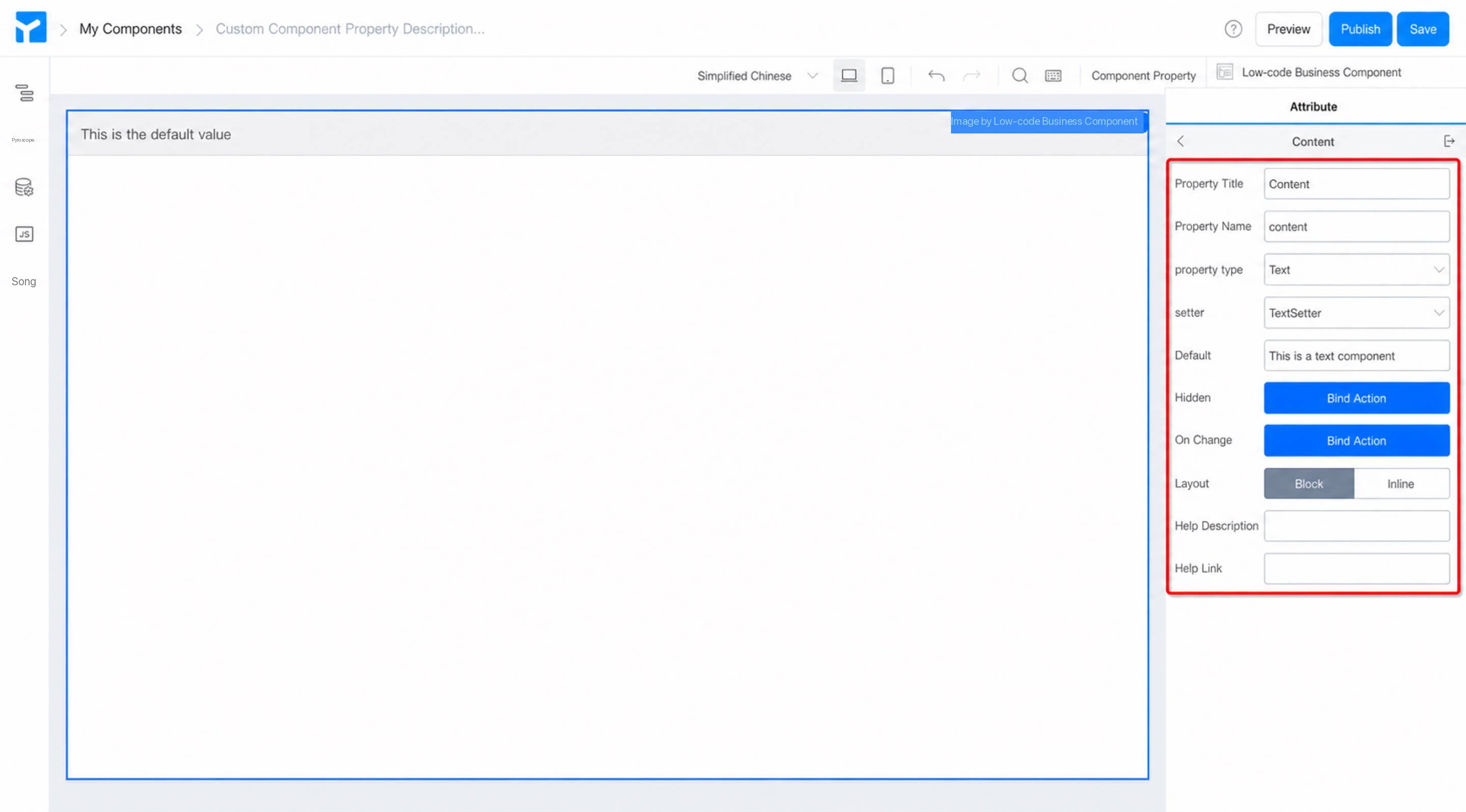
Component attributes can be added using the “Add entry” button, customized using the “Edit” button, and removed using the “Delete” button. Click the “Edit” button to view all configuration items for a component attribute. (As shown in Figure 1.1-2)
Figure 1.1-2 Configuration items for custom component attribute definitions
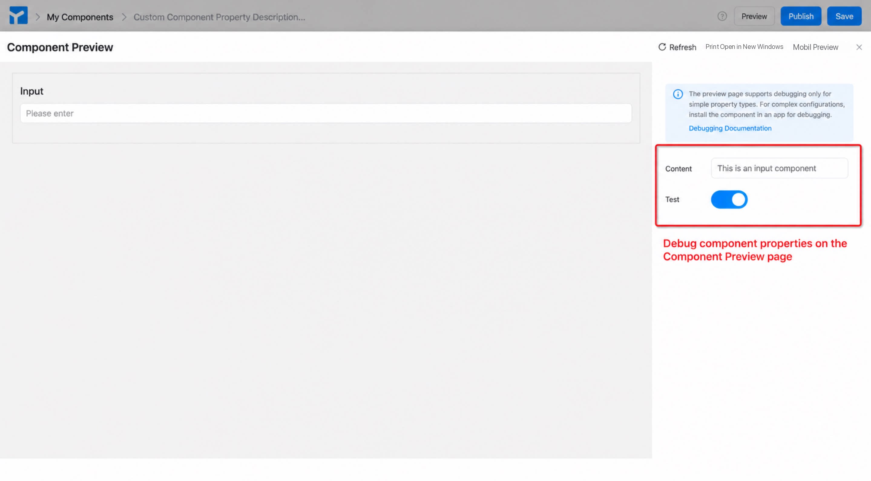
All custom component attribute definitions can be viewed and configured on the component preview page (for simple attribute debugging) or after being installed into an app (for complex attribute configuration, including code-related debugging). (As shown in Figure 1.1-3)
Figure 1.1-3 Preview and debugging of component attributes
For detailed descriptions of each configuration item, see the sections below.
1.1 Attribute Title
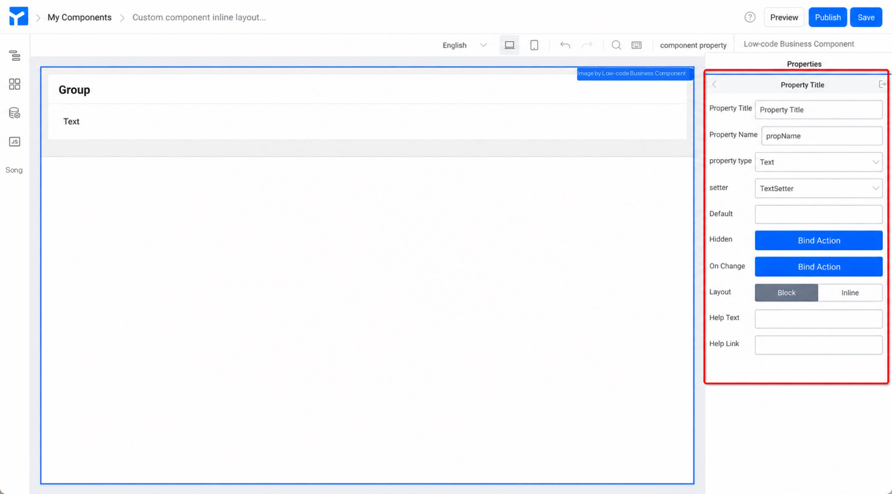
The attribute name configured for a custom component. The default attribute title is “Attribute title”. A clear and easy-to-understand title helps users better understand the meaning of the attribute or identify the content that needs to be filled in.
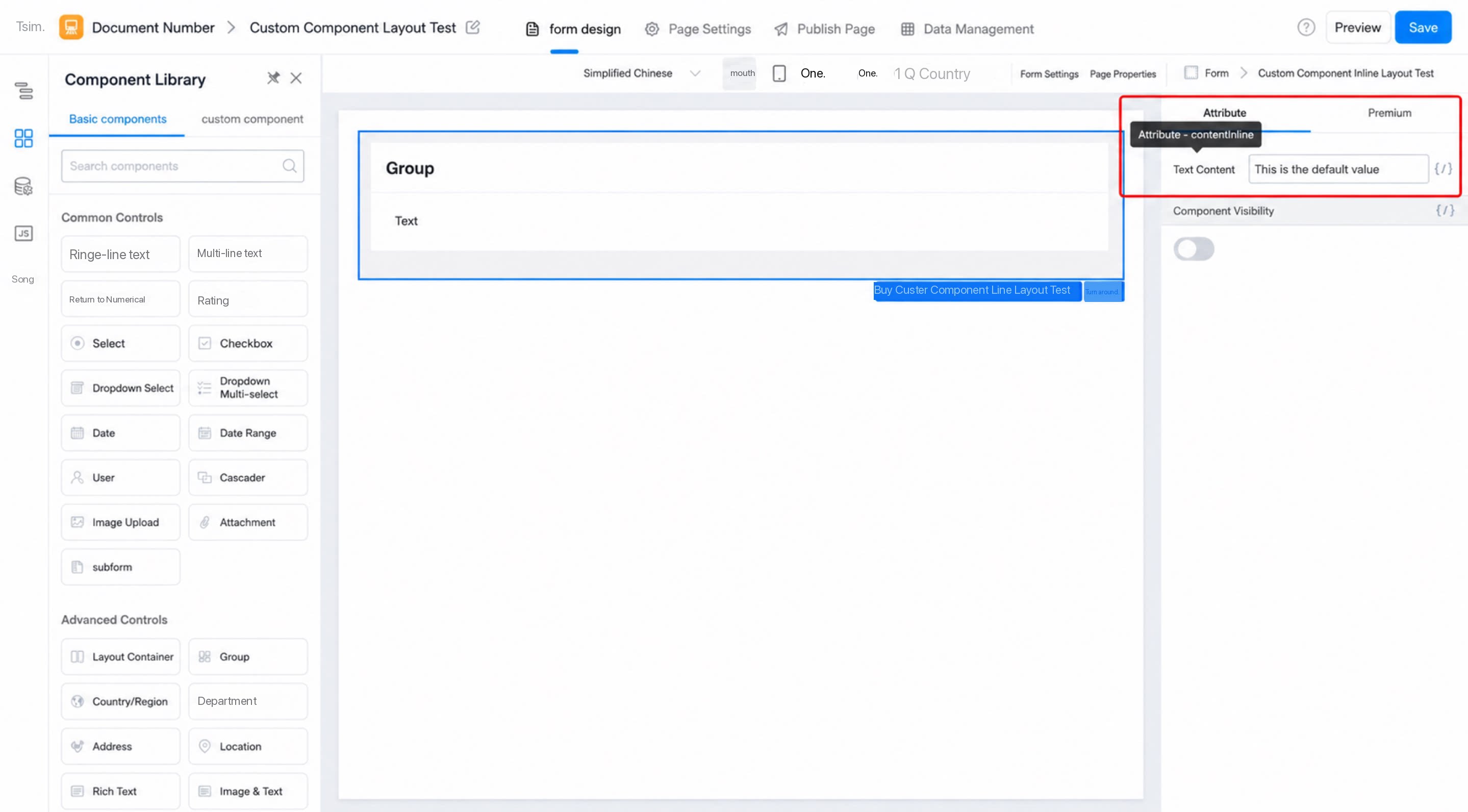
When the component is used on a page, it appears as shown below:
Figure 1.1-4 Component attribute appearance in the form designer
1.2 Attribute Name
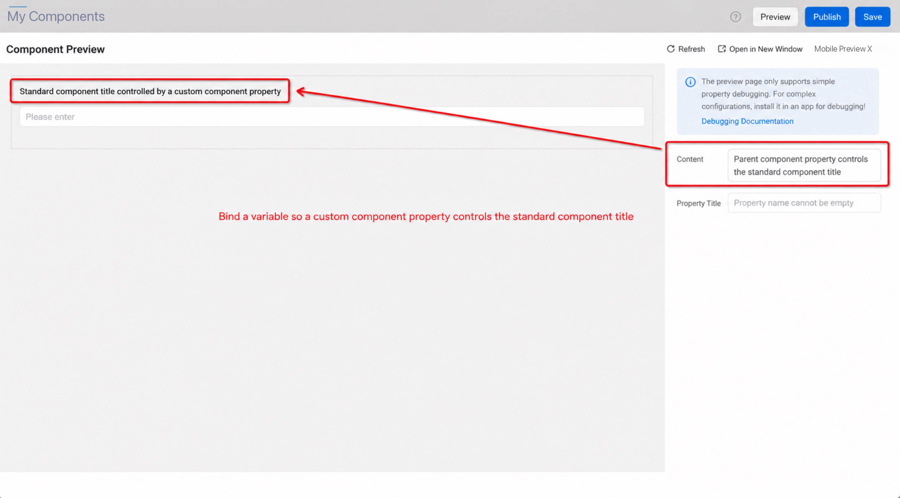
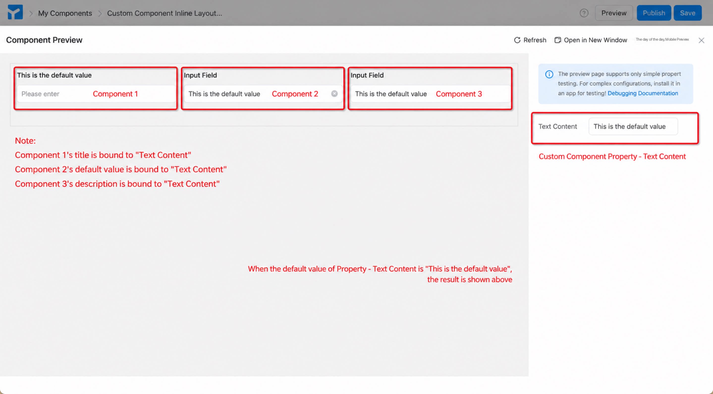
The attribute name of a component is the attribute key, similar to props.xxx in a component. The default value is propName. You can bind variables in page design to control the component. For example, you can use the attribute value of a custom component as the title of another component inside the custom component. (As shown in Figure 1.1-5)
Figure 1.1-5 Using the attribute name
Note: The attribute name of a component cannot be empty; otherwise, errors will occur during invocation or assignment operations.
1.3 Attribute Type
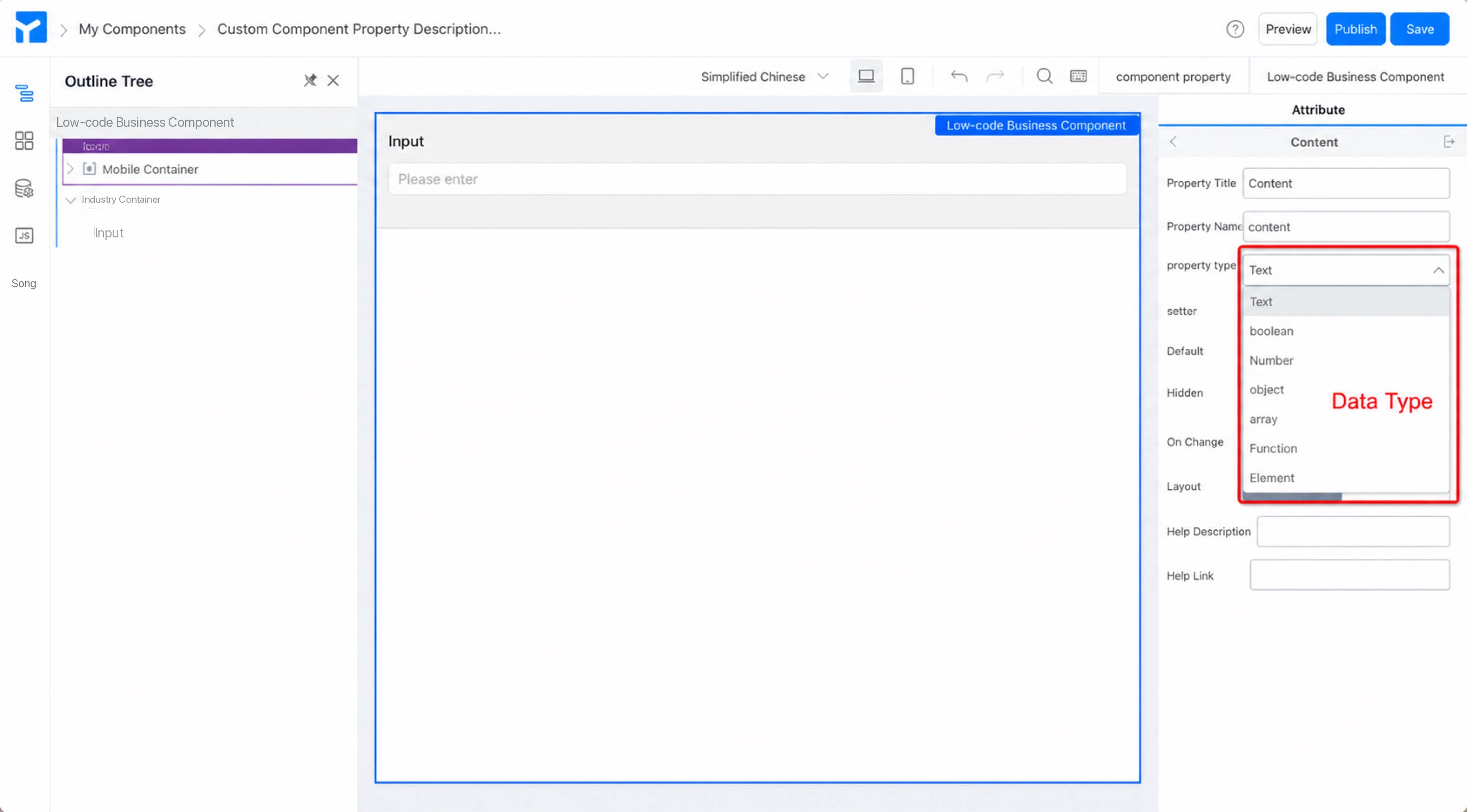
Component attribute types are similar to common data types, and include seven types: Text, Boolean, Number, Object, Array, Function, and Element. Each data type corresponds to several setters to meet users’ needs for processing data across different dimensions. (As shown in Figure 1.1-6)
Figure 1.1-6 Attribute type definitions
1.4 Setter
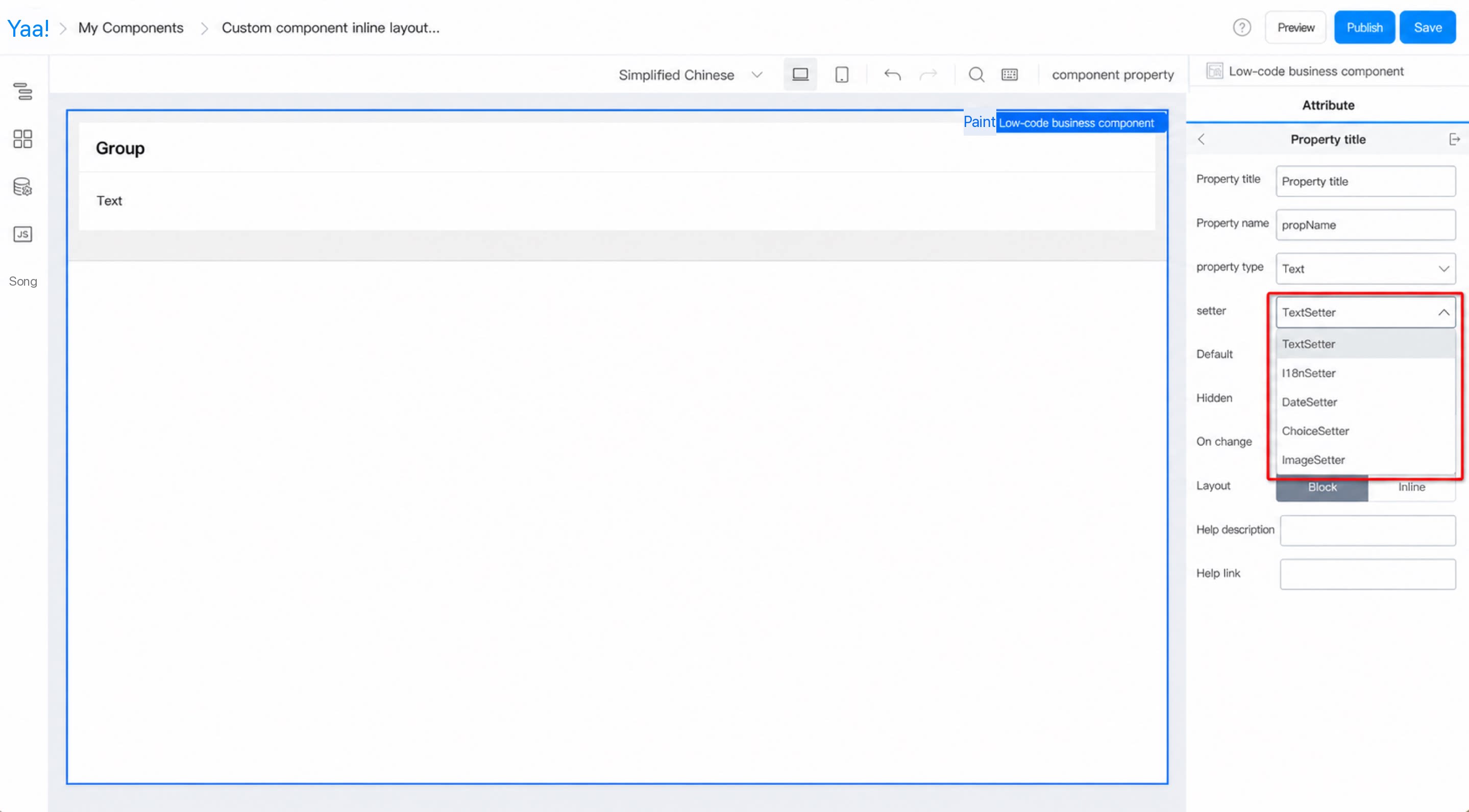
Components with different attribute types have different attribute setters, enabling different component rendering and data processing methods. For example, the Text type corresponds to five setters. (As shown in Figure 1.1-7)
Figure 1.1-7 Component attribute setters
1.5 Default Value
Refers to the field that is displayed by default in the custom component within the form when a user accesses the form. (See Figure 1.1-8 for the effect)
Figure 1.1-8 Default value of a component attribute
1.6 Whether to Support Variable Binding
Variable binding in page design.
1.7 Whether to Hide
Controls whether the attribute is hidden. Rarely used.
1.8 On Change
Can be used to create linkage between multiple attributes. Rarely used.
1.9 Layout
Divided into two types: block and inline, used to set how the custom component is arranged on the page.
1.10 Help Description
1.11 Help Link


 Chats
Chats Calendar
 Meetings
 Contacts
 Mail
Mail Docs
Docs Drive
Drive AI Table
 AI Minutes
 Attendance
 Approval
 YiDA
YiDA Admin Console