Plan availability
For full plan details, see all benefits. Click Upgrade or Book a consultation.
Overview
When adding or editing a dashboard widget, you can now select multiple tables as data sources. Combine related tables for more complete and deeper insights.Example scenario
A national restaurant chain stores foot traffic data per region in separate tables — North China, East China, South China, and West China traffic tables. The operations director wants the company-wide monthly foot traffic trend, not four separate regional reports. Combine multiple data sources into a line chart — X-axis is month, Y-axis sums foot traffic across regions. The chart clearly shows peak months and overall growth/decline. Based on accurate trends, the team can prep marketing and staffing for peak months and run promotions in low months.Supported chart types
Configuration
XY-axis charts (column, line, bar, scatter, combo, area)
Using a basic column chart as an example — configure type/data and custom style: Data: check Multiple data sources — pick multiple tables from the dropdown. Configure data range per table. All data enables filters; picking a specific view inherits the view’s filter config.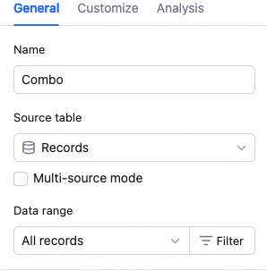 Chart: switch chart type, pick a color theme.
 X-axis: pick an X field per table (preferably same type), sort basis (X value or record order), and order.
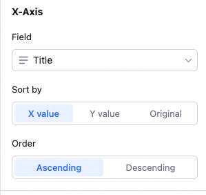 Sort basis details:
X value: sort by the X field’s value — numeric, alphabetical, single/multi-select option order, etc.
Record order: sort by record order in the source view.
Y-axis: first decide whether to aggregate by X value. Without aggregation, each table appears as a separate series; with aggregation, each table’s Y values for the same X are summed. Examples below.
Sort basis details:
X value: sort by the X field’s value — numeric, alphabetical, single/multi-select option order, etc.
Record order: sort by record order in the source view.
Y-axis: first decide whether to aggregate by X value. Without aggregation, each table appears as a separate series; with aggregation, each table’s Y values for the same X are summed. Examples below.
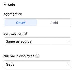 Configure aggregation (count of records or aggregated field value).
With “count of records”: Y-axis shows the record count corresponding to the X field.
With “aggregated field value”: pick a Y field per table and a single overall aggregation (count, distinct count, sum, average, max, min).
Without group aggregation: each Y series is shown independently — e.g., Y shows total purchase count and total sales count per product.
Configure aggregation (count of records or aggregated field value).
With “count of records”: Y-axis shows the record count corresponding to the X field.
With “aggregated field value”: pick a Y field per table and a single overall aggregation (count, distinct count, sum, average, max, min).
Without group aggregation: each Y series is shown independently — e.g., Y shows total purchase count and total sales count per product.
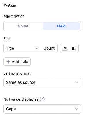 With group aggregation: Y series are merged by aggregation — e.g., Y shows the combined purchase + sales count per product.
Note: sum, max, min, average only apply to numeric fields.
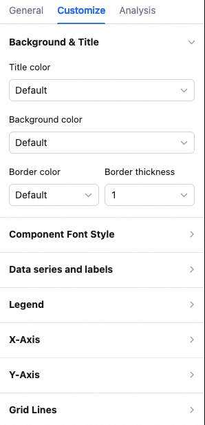
Custom style: same as single-source. Configure background color, legend position, value display, gridlines, axis labels, overlap settings, axis visibility, axis baselines, axis-tick labels, X-label angle.
With group aggregation: Y series are merged by aggregation — e.g., Y shows the combined purchase + sales count per product.
Note: sum, max, min, average only apply to numeric fields.
Custom style: same as single-source. Configure background color, legend position, value display, gridlines, axis labels, overlap settings, axis visibility, axis baselines, axis-tick labels, X-label angle.
📌 The sections below cover only multi-source-specific differences from XY-axis charts.
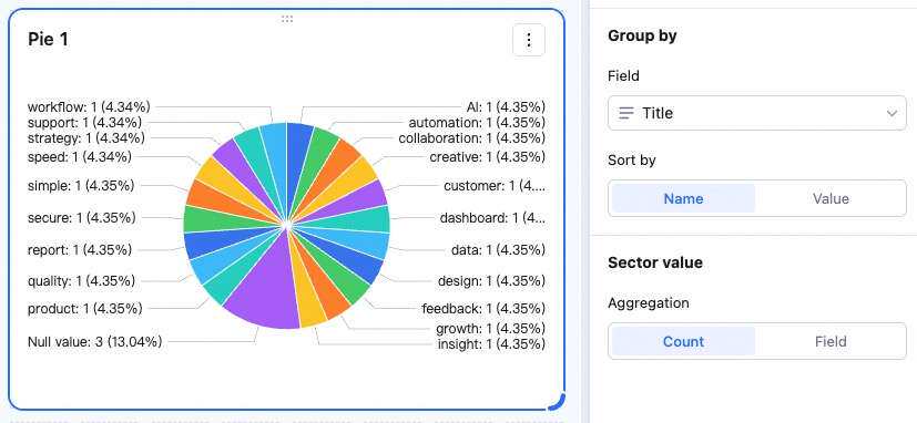
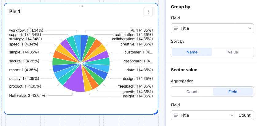
Pie chart
Sectors: pick a sector field per table (preferably same type), sort basis (by sector field value), and order (by sector value).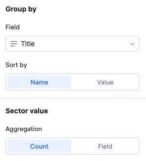 Sector value: aggregation supports count of records or aggregated field value. With count: each sector shows the total record count for the X field. With aggregated field value: sectors show the aggregated value (e.g., sum across fields). Examples below.
Word cloud
In Data, pick multiple tables and data ranges. In Keyword field, pick one keyword field per table — the word cloud shows all keywords on the left, sized by frequency.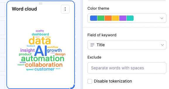
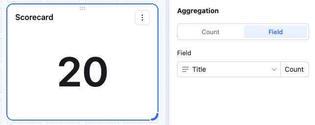
Stat number
In Data, pick multiple tables and data ranges. In Aggregation, pick one field per table and an aggregation method — the left displays the aggregated value. Example: with sum, the displayed value is the sum across both fields. With count of records, it’s the total record count.