⚠️ Note: with advanced permissions off, anyone with edit permission can create and edit dashboards; with advanced permissions on, only the AI Table owner and users with manage permission can create and edit dashboards.Common scenarios:
- Operations data overview: visualize ops data on dashboards — monitor change trends at a glance.
- Real-time project tracking: view key project metrics on mobile in real time — decide faster.
Create a dashboard
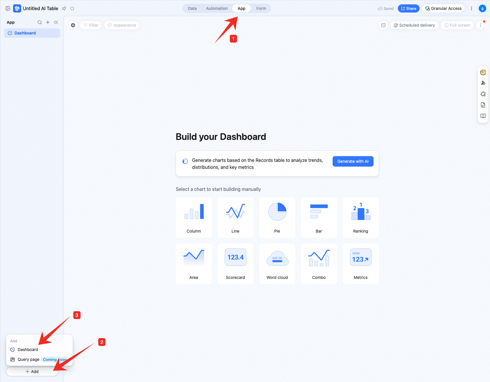
Create a new dashboard:- Click Apps at the top — open the AI Table app.
- In the lower-left, click + New app.
- In the menu, pick Dashboard.
 Add a chart:
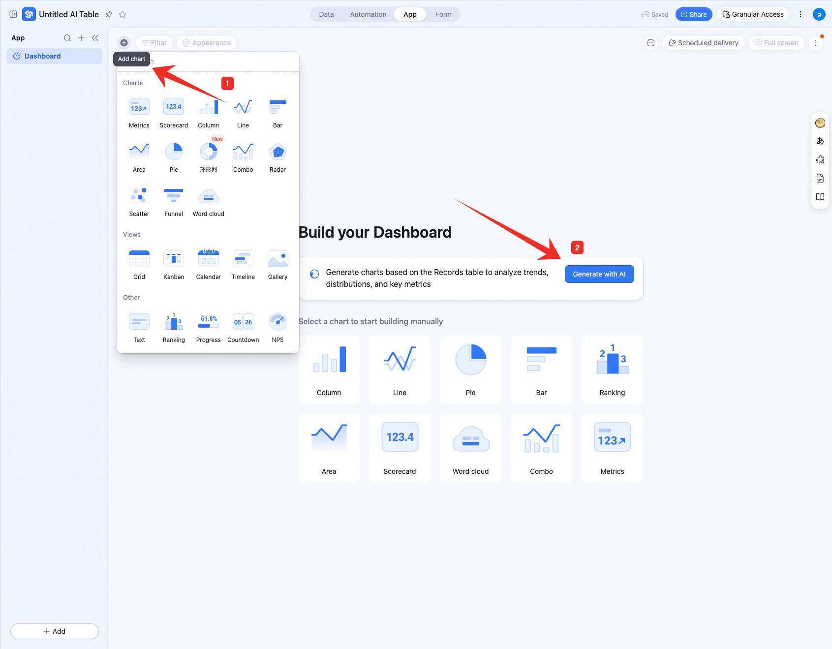
In the upper-left, click Add chart — pick a chart type from the menu.
For a brand-new dashboard, you can also pick AI generate to build it.
Add a chart:
In the upper-left, click Add chart — pick a chart type from the menu.
For a brand-new dashboard, you can also pick AI generate to build it.
Configure a dashboard
This page focuses on configuring column, line, scatter, area, bar, and pie charts. For other charts, see their dedicated pages.Configure type and data
Column / line / scatter / area / bar (XY-axis charts)
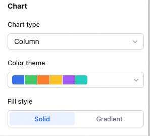
Data: pick source — table and data range. All data enables filters. Chart: switch chart type, pick a color theme.
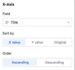
 X-axis: pick the X field, sort basis (X value, Y value, or record order), and order.
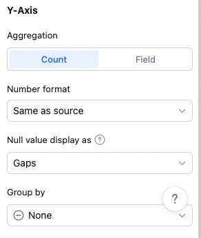
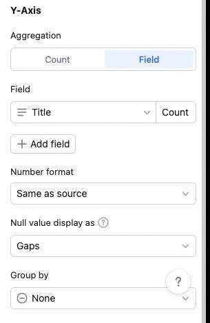
 Y-axis: aggregation (count of records or aggregated field value), Y content, and group aggregation.
With “count of records”: only set group aggregation (none or by field).
With “aggregated field value”: no grouping → multiple Y fields, each with its own aggregation (count, sum, average, max, etc.). Remove/move up/down per Y. Grouping → one Y field with one aggregation. Note: with grouping, X can’t sort by Y value.
Y-axis: aggregation (count of records or aggregated field value), Y content, and group aggregation.
With “count of records”: only set group aggregation (none or by field).
With “aggregated field value”: no grouping → multiple Y fields, each with its own aggregation (count, sum, average, max, etc.). Remove/move up/down per Y. Grouping → one Y field with one aggregation. Note: with grouping, X can’t sort by Y value.
 Sorting details:
You can sort in three places:
Sorting details:
You can sort in three places:
-
X-axis content
-
Reorder X items by:
- X value: based on the X field’s own value — numeric, alphabetical, single/multi-select option order.
- Y value: based on Y numeric value.
- Record order: drag freely to set order.
- Sort order: ascending or descending.
-
Reorder X items by:
- Multi-Y sorting: with multiple Y fields, drag to reorder them.
- Group aggregation items: with a grouping field set, drag to reorder grouped items.
- Sum, max, min, average only apply to numeric fields.
- The bar chart’s X/Y are swapped vs. column chart — Y configuration on a bar chart matches X configuration on a column chart.
- With group aggregation, X-axis can’t sort by Y value.
- With X sort basis = record order (custom), no order setting is available.
Pie chart
Data: pick the pie chart’s source — table and data range. All data enables filters.
Chart: switch chart type, pick a color theme.
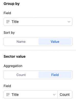
Sectors: pick the sector field and sort basis.
Sector field value: sort by the sector field’s value — numeric, alphabetical, single/multi-select option order.
Sector value: sort by the sector’s numeric value.
Sector value: count of records or aggregated field value.
Custom style
Customize background, legend, axes, etc. — make it yours.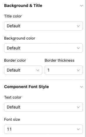
Manage a dashboard
Hover over a chart — find the icon in the upper-right. Click for: configure, rename, copy, add to dashboard center, copy as image, export as image, delete.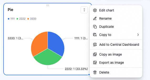 Drag the lower-right corner to resize. Drag the top to reposition.
Permissions
Advanced permissions off
Dashboard permissions follow the AI Table file’s permissions — owner, manage, and edit users can create, edit, and delete dashboards; read-only users can only view.Advanced permissions on
Only the owner and users with manage permission can edit dashboards; other users can only have view or no access.- View: collaborators in this group can only view the dashboard’s data and charts.
- No access: collaborators in this group can’t view the dashboard.
🧤 Dashboard permissions are independent of table permissions — table permission settings don’t affect dashboard permissions.