 Chats
Chats Calendar
 Meetings
 Contacts
 Mail
Mail Docs
Docs Drive
Drive AI Table
 AI Minutes
Overview
Insert image components in your AI Table app to display and manage static or animated images, enriching the visual layer. Common use cases:- Branding and decoration: drop the company logo or brand mark in the dashboard header / sidebar / background, or use a decorative background image for visual polish.
- Visual indicator support: pair key data with icons or diagrams (e.g., an “up arrow” image next to a growth metric) to make the data instantly readable.
- Background / base image: use maps, floor plans, or equipment diagrams as backgrounds in dashboards or complex reports, then overlay dynamic data points / heatmaps for data-meets-real-world visuals.
Workflow
Add an image component
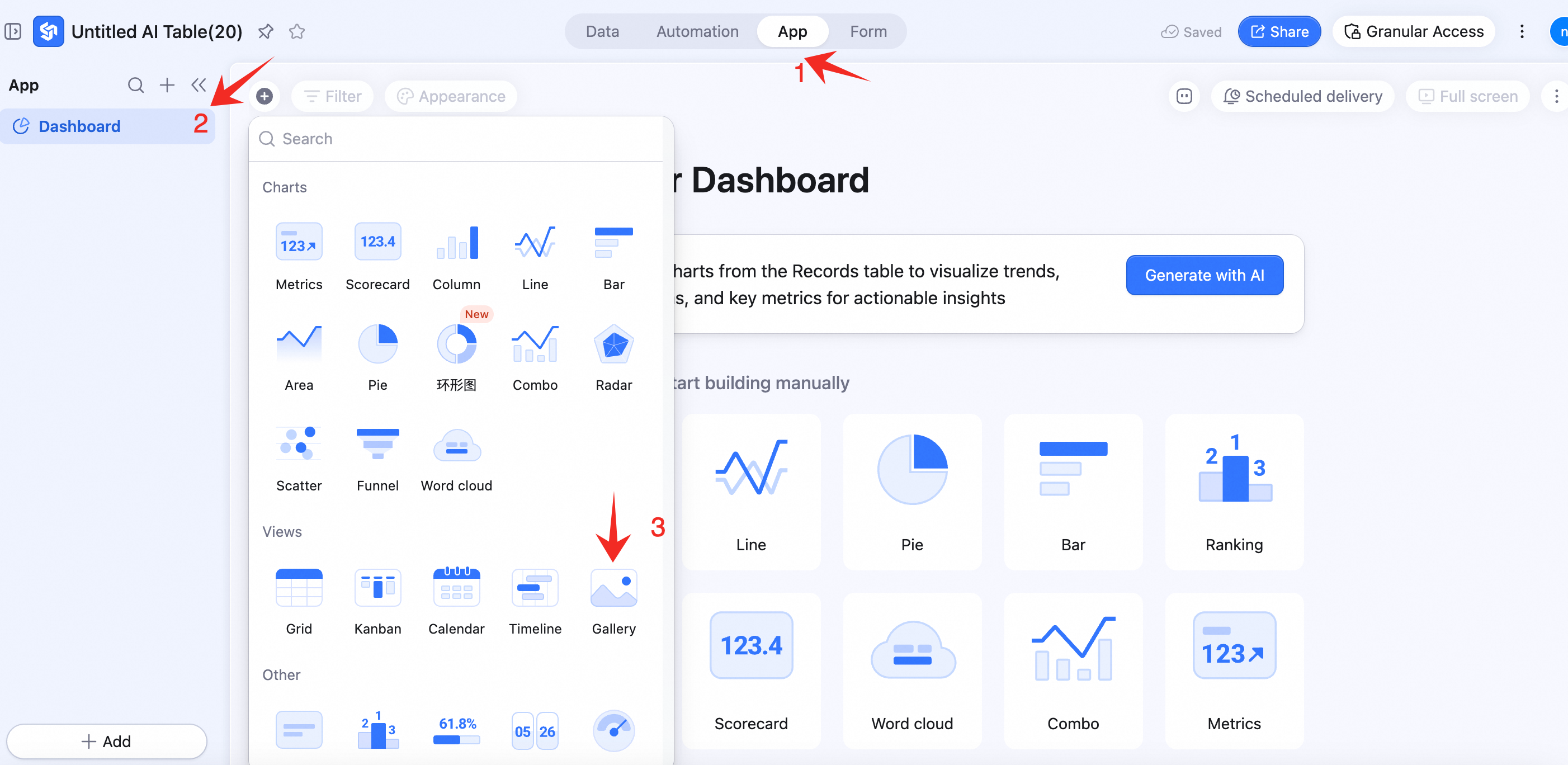
- Open the AI Table App module.
- From the left nav, pick the Dashboard.
- Click + Add component at the bottom-left, then Gallery.
Basic config
In the right panel Basic config:-
Image management
- Upload: click + Add image and upload from local. Supports JPG, PNG, JPEG, SVG, GIF, WEBP. Max 20 MB per image, up to 20 images.
- Edit: hover and click the Edit icon to set title, subtitle, jump link, fill mode — or re-upload.
- Delete: hover and click Delete.
- Reorder: with more than one image, drag the icon on the left of the image to reorder.
-
Display content
- Toggle between image + title and image only. Image-only hides any configured title.
-
Text alignment
- Position image text at the top-left / center-left / bottom-left / center, etc.
Custom config
In the right panel Custom config:- Background color: component background.
- Border color: from swatch.
- Border thickness: from dropdown.
- Transition animation: with multiple images. Choose slide or fade.
- Auto-rotate: with multiple images. On = carousel; off = manual switching.
- Switch interval (seconds): with multiple images. Default 5; adjustable.
Component management
-
Action menu
- Configure, Duplicate, Copy to, Delete.
- Resize and move