Chats
Chats Calendar
 Meetings
 Contacts
 Mail
Mail Docs
Docs Drive
Drive AI Table
 AI Minutes
 Attendance
 Approval
 YiDA
YiDA Admin Console
1. Card Overview
- As the primary presentation format for YiDA Cool Apps, cards deliver a shorter business processing path through a lightweight footprint and minimal configuration, letting users focus on their work.
- YiDA cards come in three types: message notification cards, pinned cards, and interactive cards. The creation path for each type is described below.
1.1 Create a Message Notification Card
Message notification cards include:- Form message notifications: Go to Form design >> Page settings >> Message notifications to create a form message notification. The system automatically sends a message to a specified user or chat when the form is created, edited, commented on, or deleted. For details, see Form message notifications.
- Workflow quick approval cards: When submitting a workflow, select the option to notify the approver to enable workflow approval reminders.
1.2 Create an Interactive Card
Configure the card node in Integration & Automation. When the form meets the trigger condition, the form data is pushed to the specified group chat as an interactive card.1.2.1 Procedure
Path: Admin page >> Integration & Automation >> Create Integration & Automation >> “Send card” node >> Select interactive card type1.3 Create a Pinned Chat Card
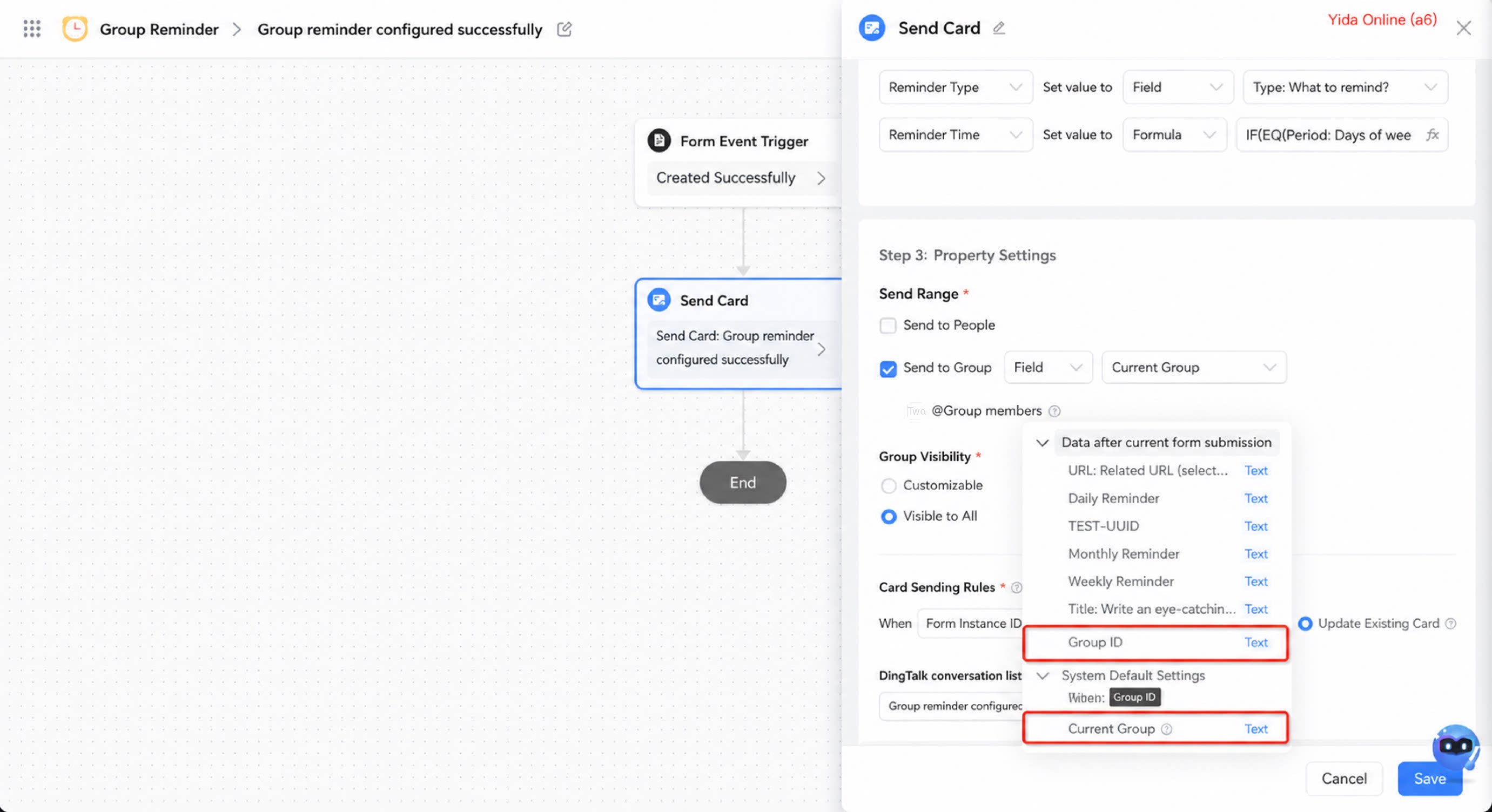
Configure the card node in Integration & Automation. When the form meets the trigger condition, the form data is pushed to the specified group chat as a pinned chat card.1.2.2 Procedure
Path: Admin page >> Integration & Automation >> Create Integration & Automation >> “Send card” node >> Select pinned chat card type2. Use Cases
On the card design page, drag and drop components to customize the card, or modify a YiDA card template to better fit your business needs.3. Card Designer Overview
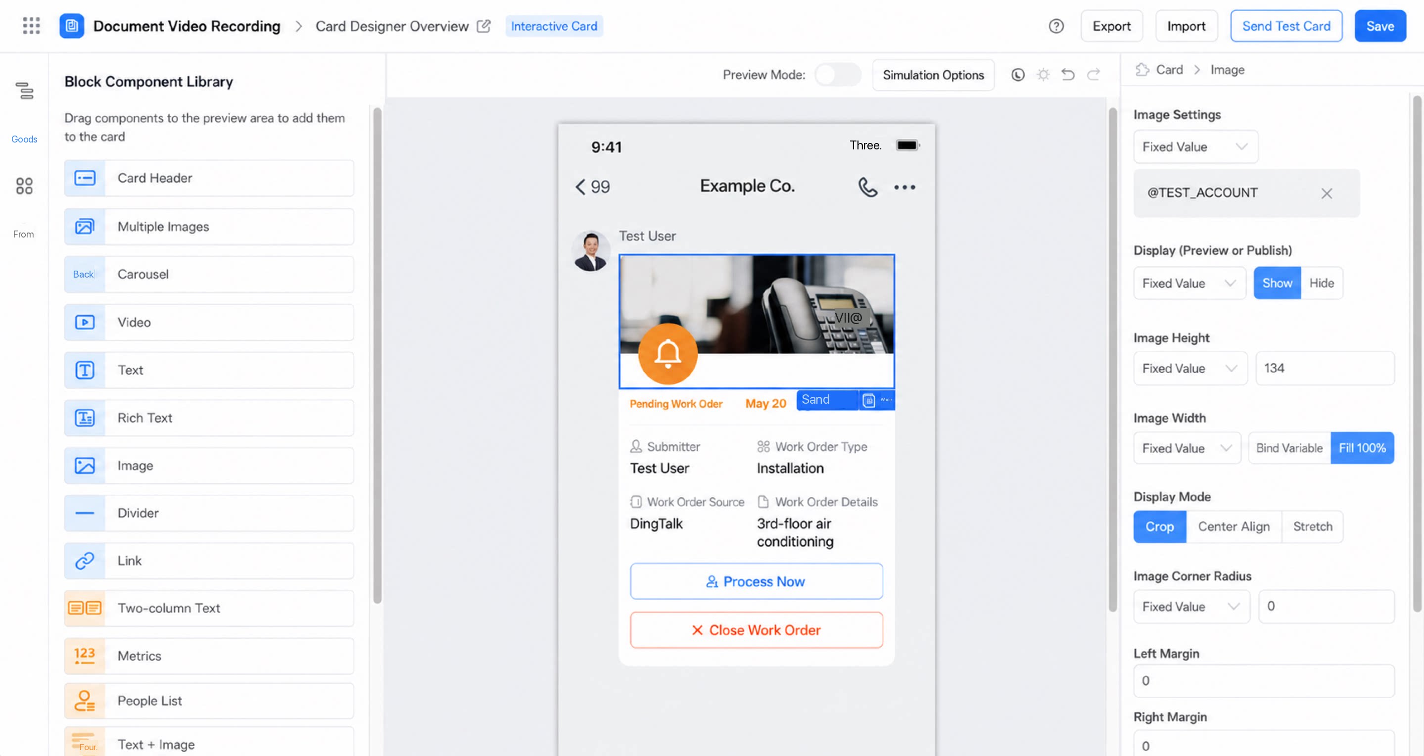
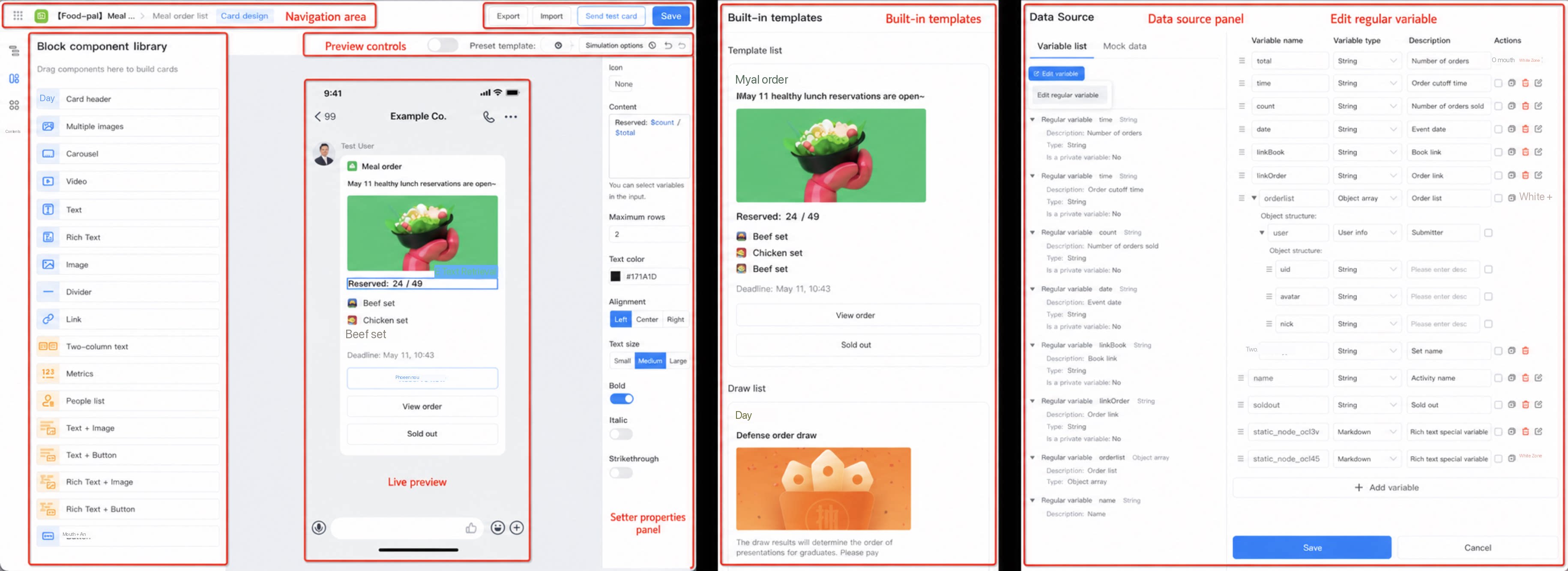
3.1 Left Toolbar
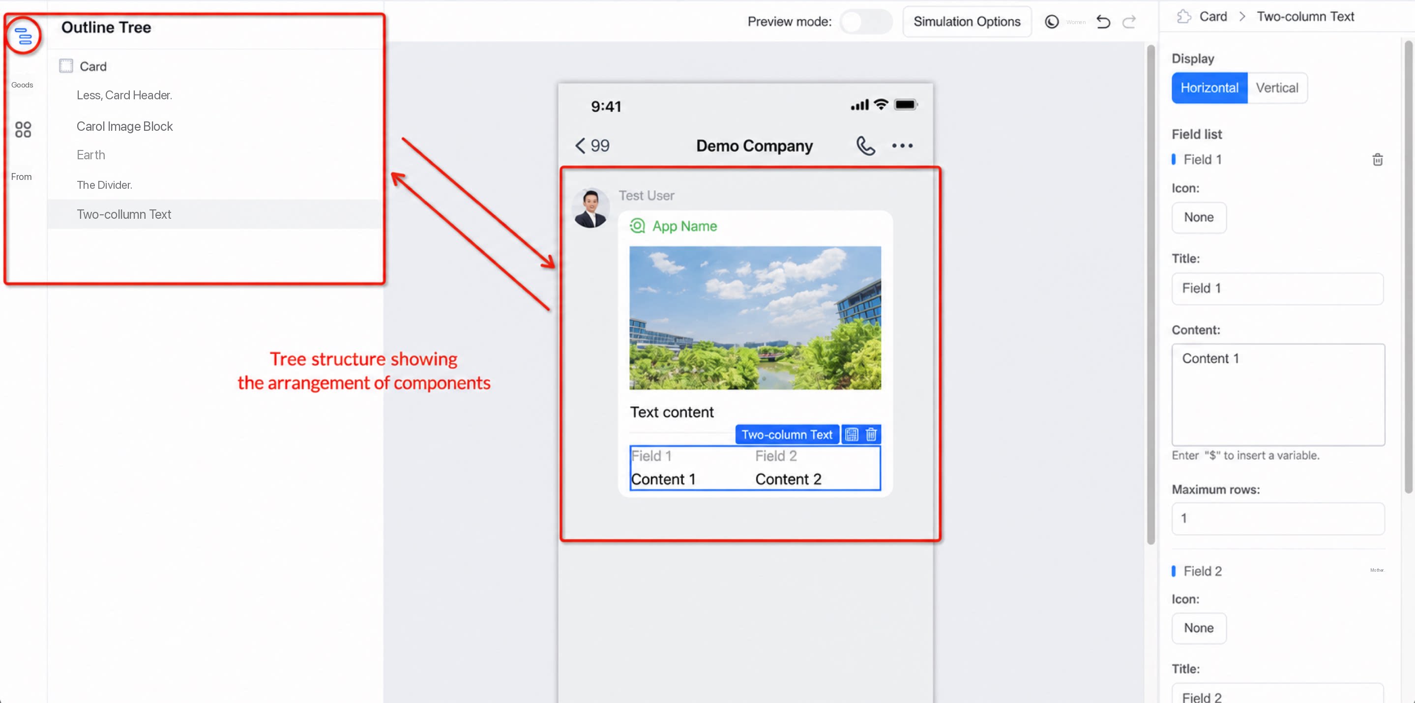
The left toolbar contains the outline tree, block component library, preset templates, and data source.3.1.1 Outline Tree
Displays the structure and arrangement of components on the card in a tree view.- Drag components in the outline to change their position on the card.
- Click the show/hide button to the right of a component name to show or hide the corresponding component on the canvas.
3.1.2 Block Component Library
The card component library provides 17 components. Drag and drop components onto the card canvas. Choosing the right components makes it easier to build polished cards.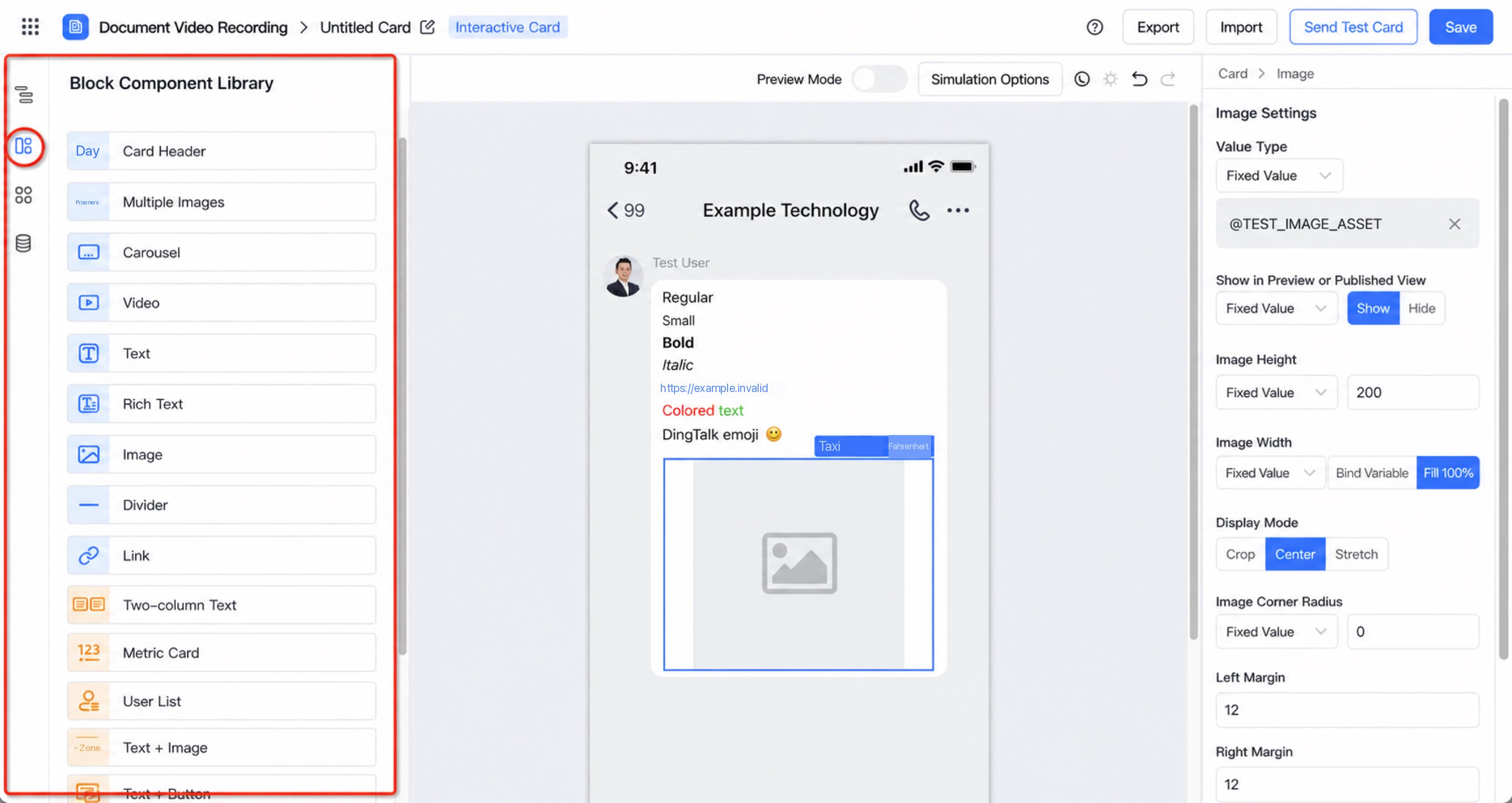
3.1.3 Preset Templates
Seven card templates are available. Enable a template to build a card quickly.| Interactive card templates | Pending ticket template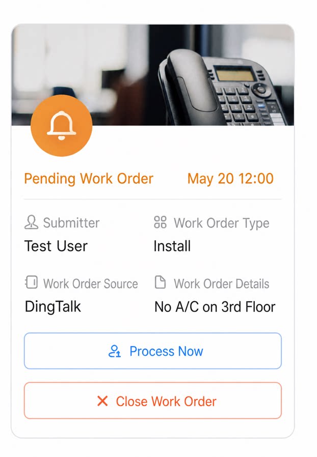 | Ticket completion template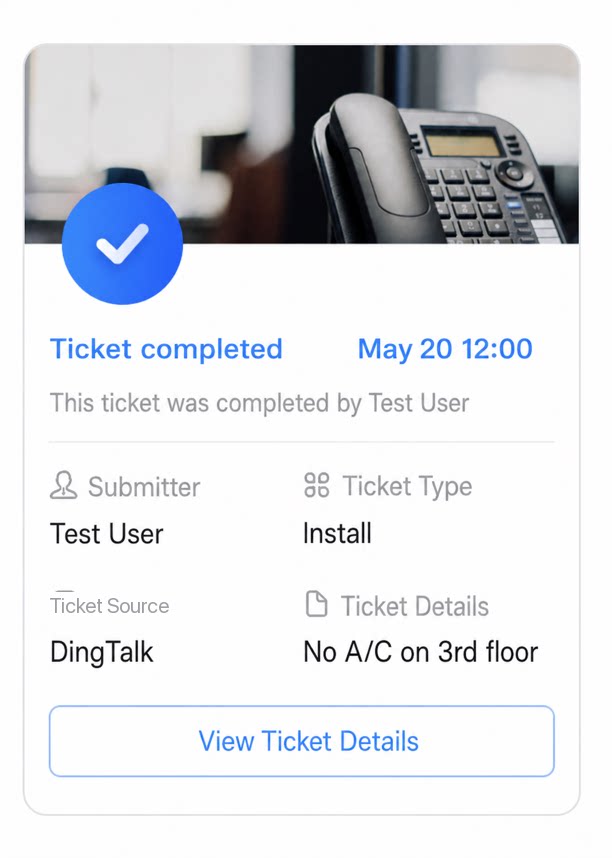 | Meal ordering template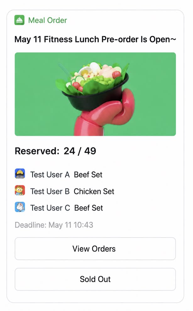 | Random draw template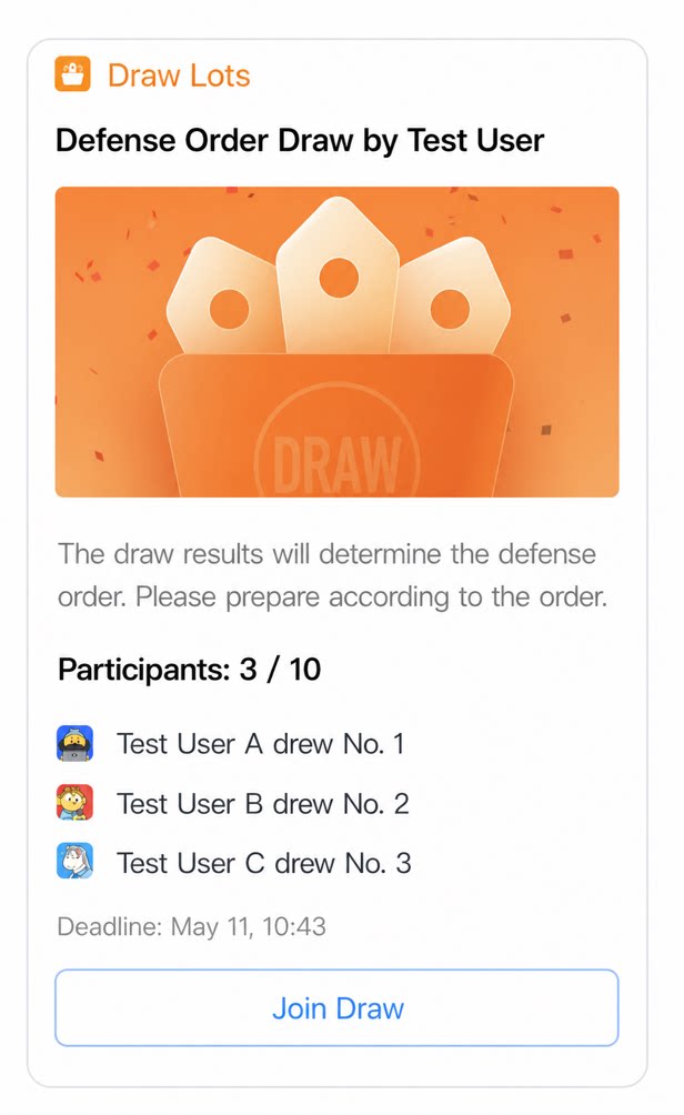 |
|---|---|---|---|---|
| Pinned card templates | Ticket info pinned template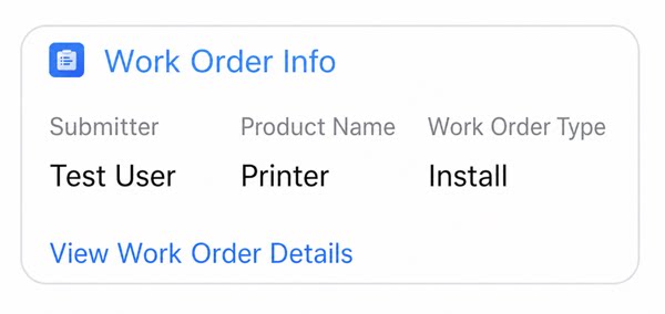 | Meal ordering pinned template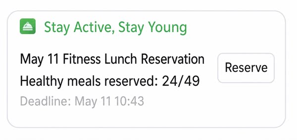 | Random draw result pinned template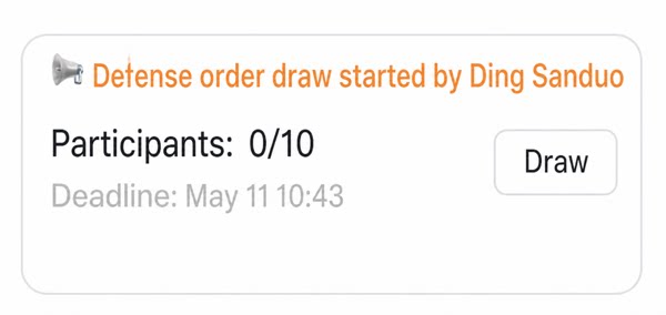 | — |
3.1.4 Data Source
Presets variables that can be bound to components to make component data dynamic. The card data source panel contains a variable list and mock data.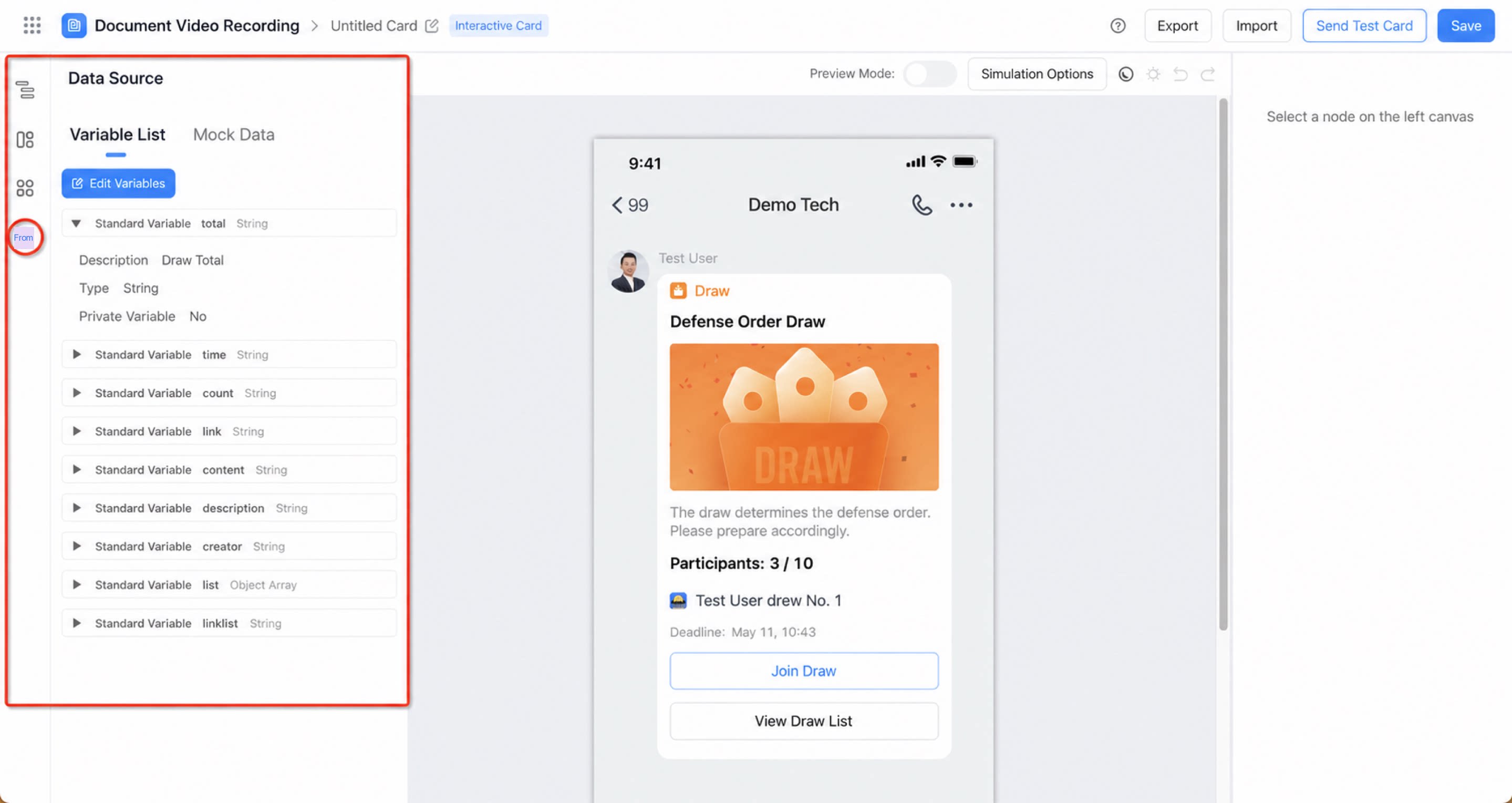
Variable list
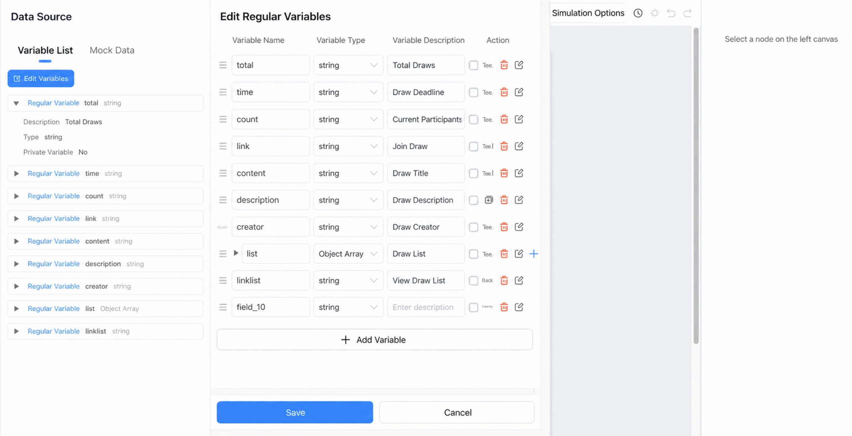
Displays the preset variables. Click a variable to view its description, type, whether it is private, and other related information.- Edit variable (edit a standard variable): Edit the name, type, and description of an existing variable. Click Add variable to create a new variable.
Mock data
The card data source introduces the front-end concept of mock data, letting designers simulate data with JSON code during the design stage. This lets you preview card effects and make adjustments without loading real data.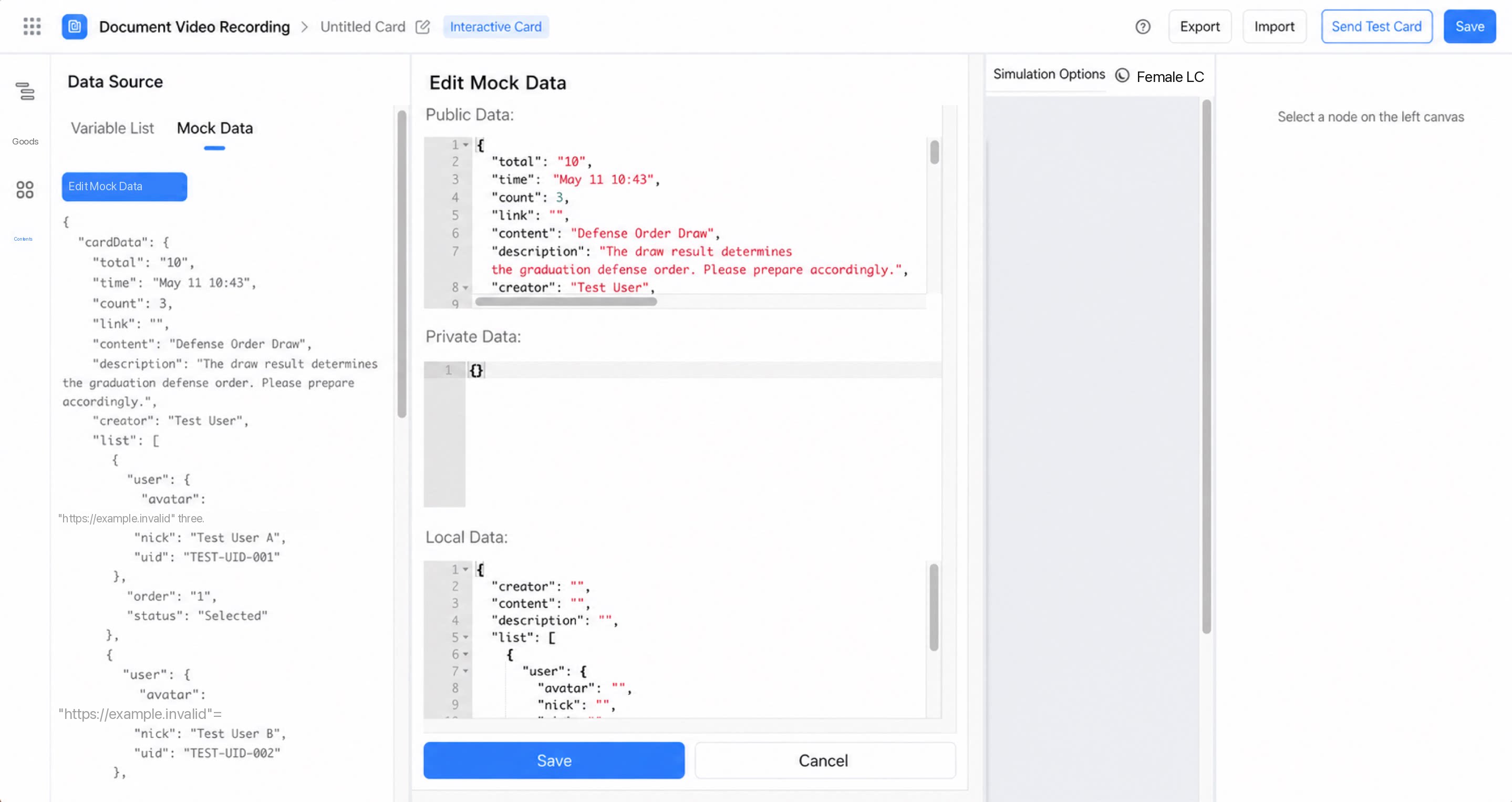
3.2 Top Preview Options
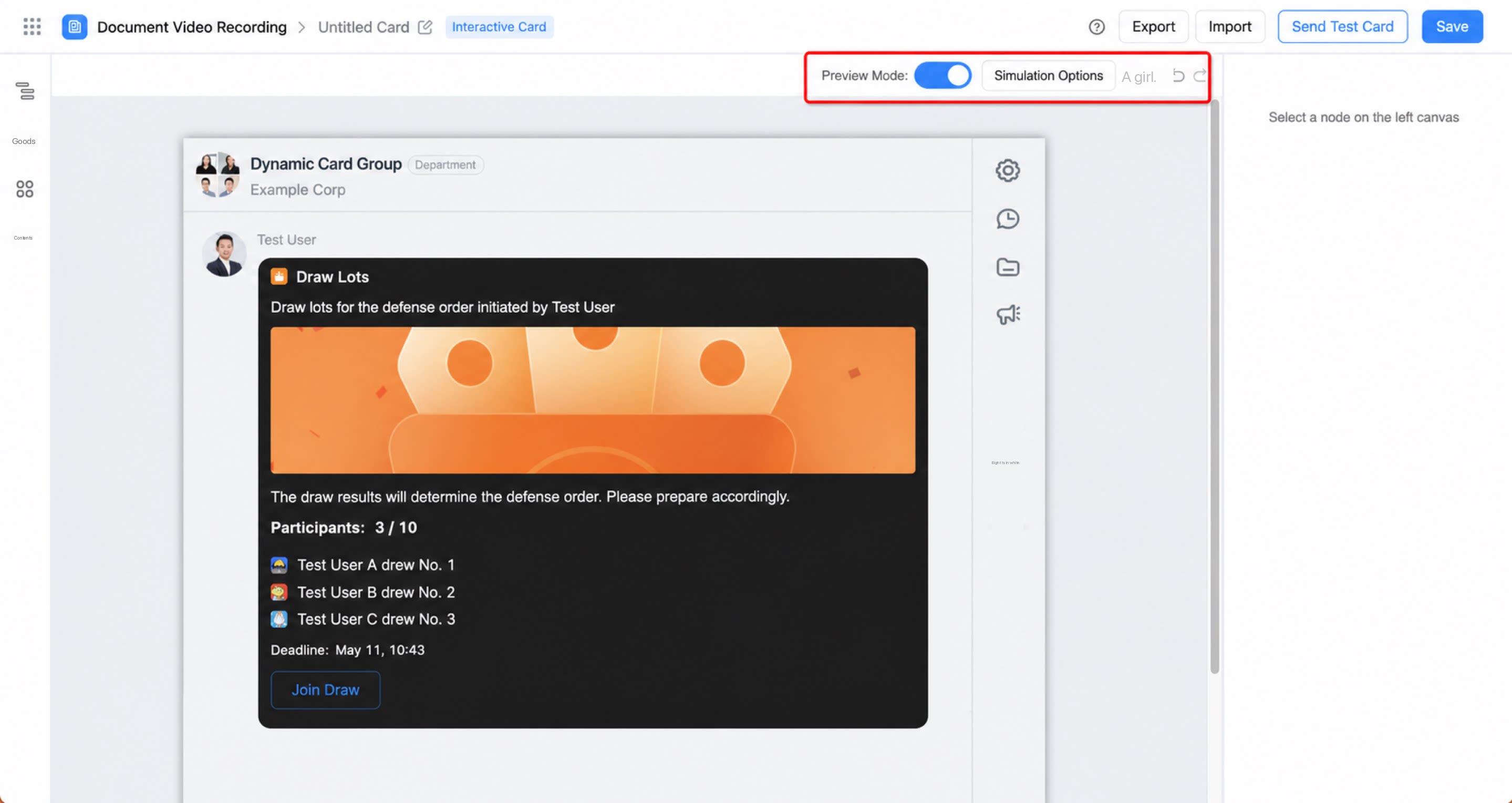
- On: View the overall card effect only. Component properties cannot be changed.
- Off: Click to select a component and design its properties in the right property panel.
- Simulated environment: Choose DingTalk Desktop, Android, or iOS to see how the card renders in different environments.
- Simulated version: Change the DingTalk version to preview the card across DingTalk versions and better match your organization’s work habits.
- Simulated language: Set the language for card content in preview mode. Seven languages are supported: Simplified Chinese, Traditional Chinese, English, Japanese, Vietnamese, Thai, and Indonesian.
3.3 Right Property Panel
Set properties for the card or card components, including style and execution logic, to match your requirements.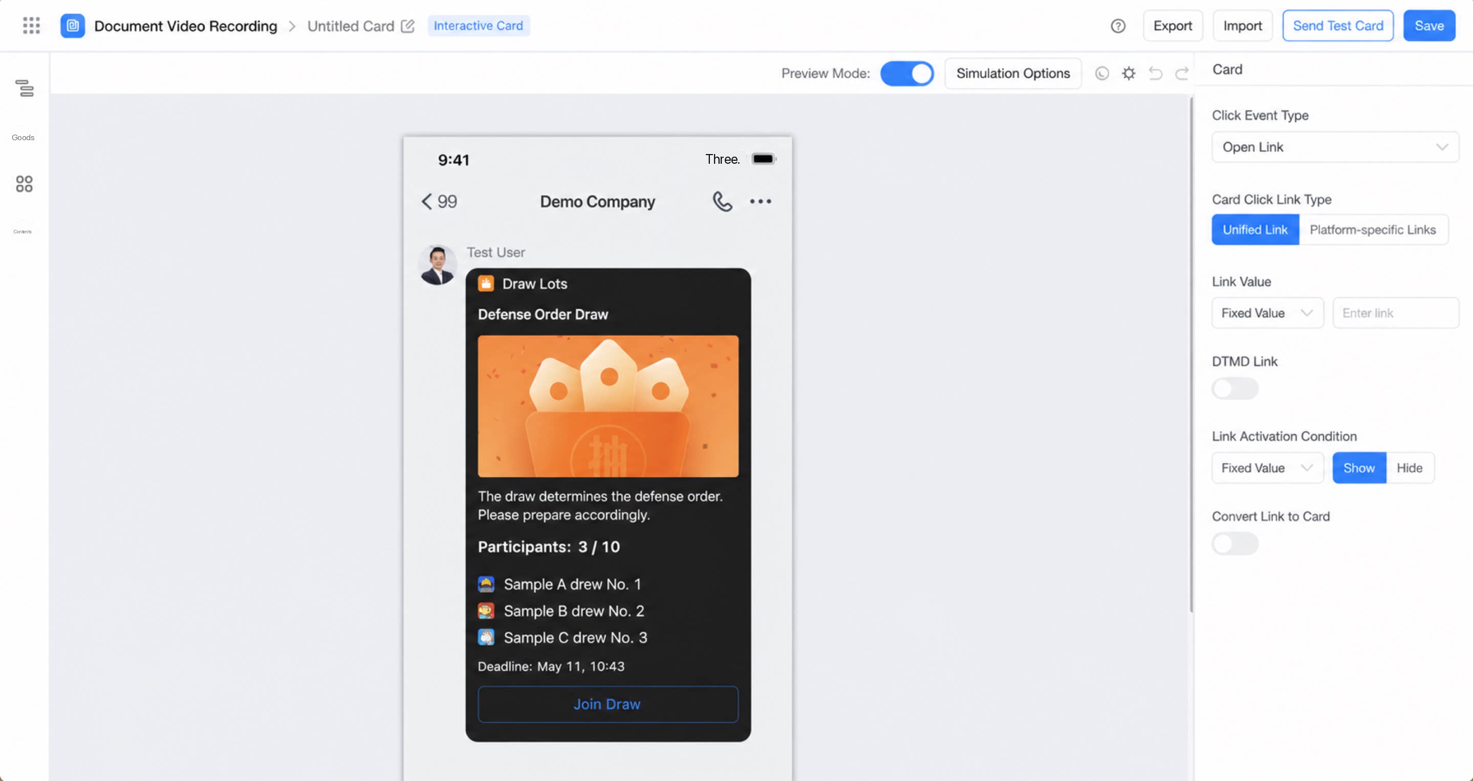
4. FAQ
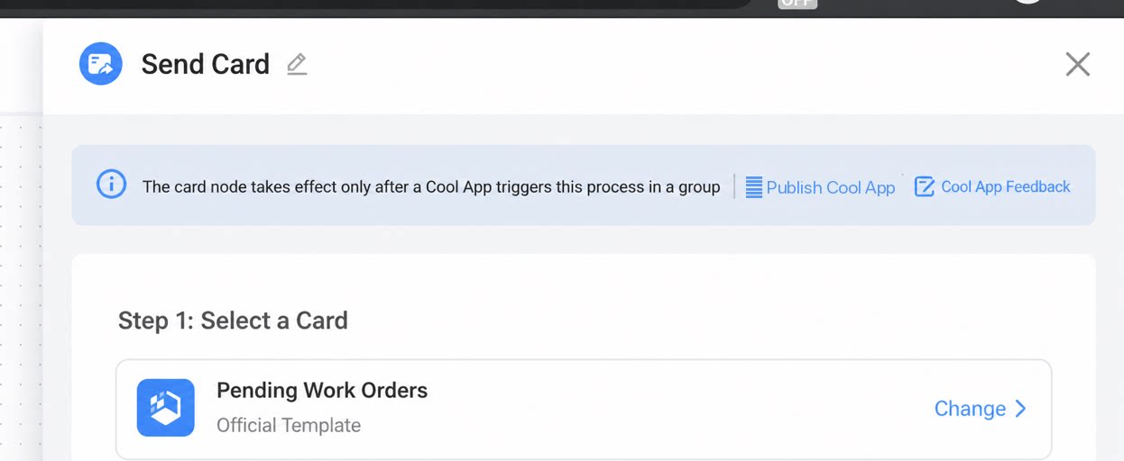
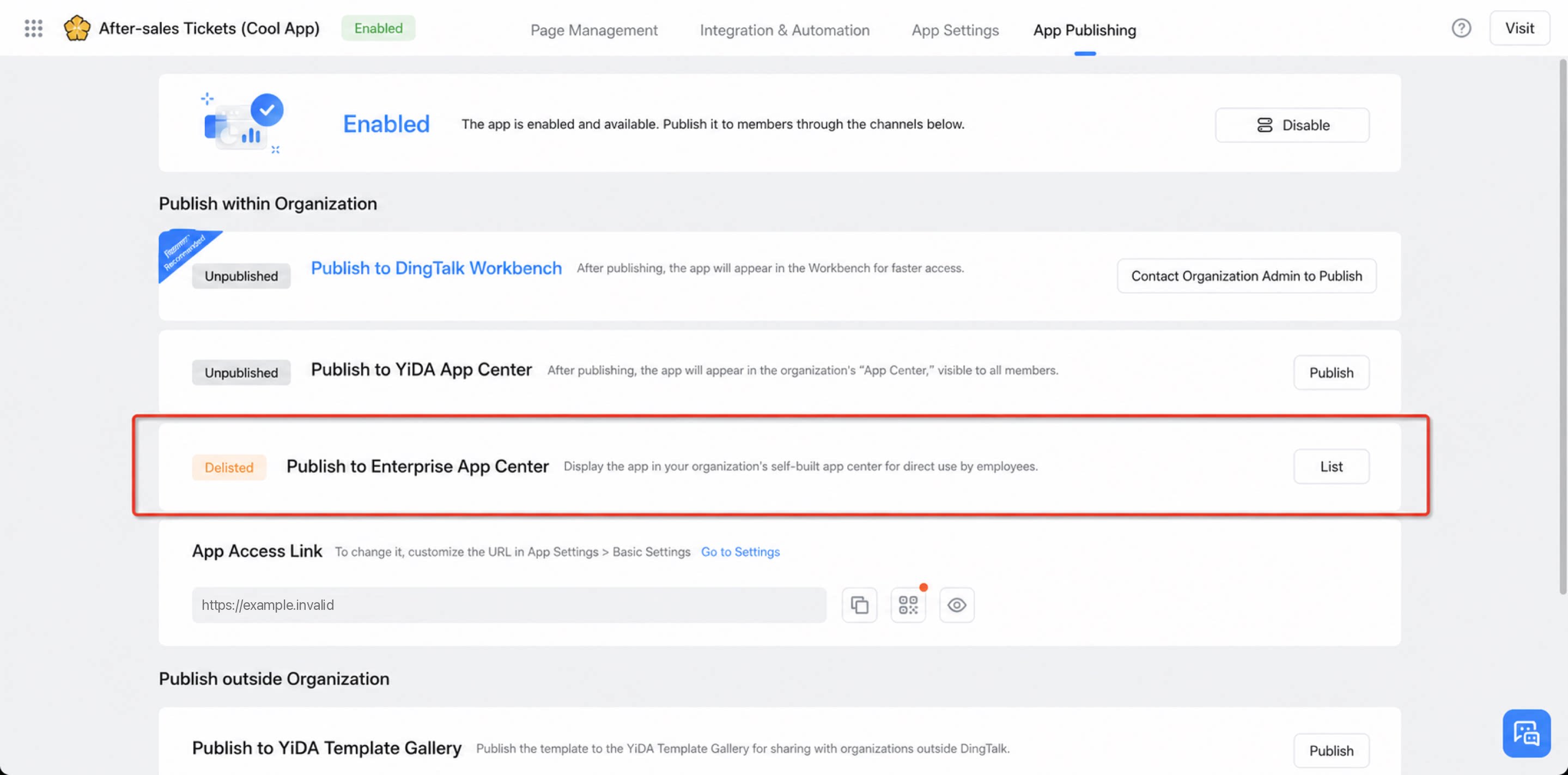
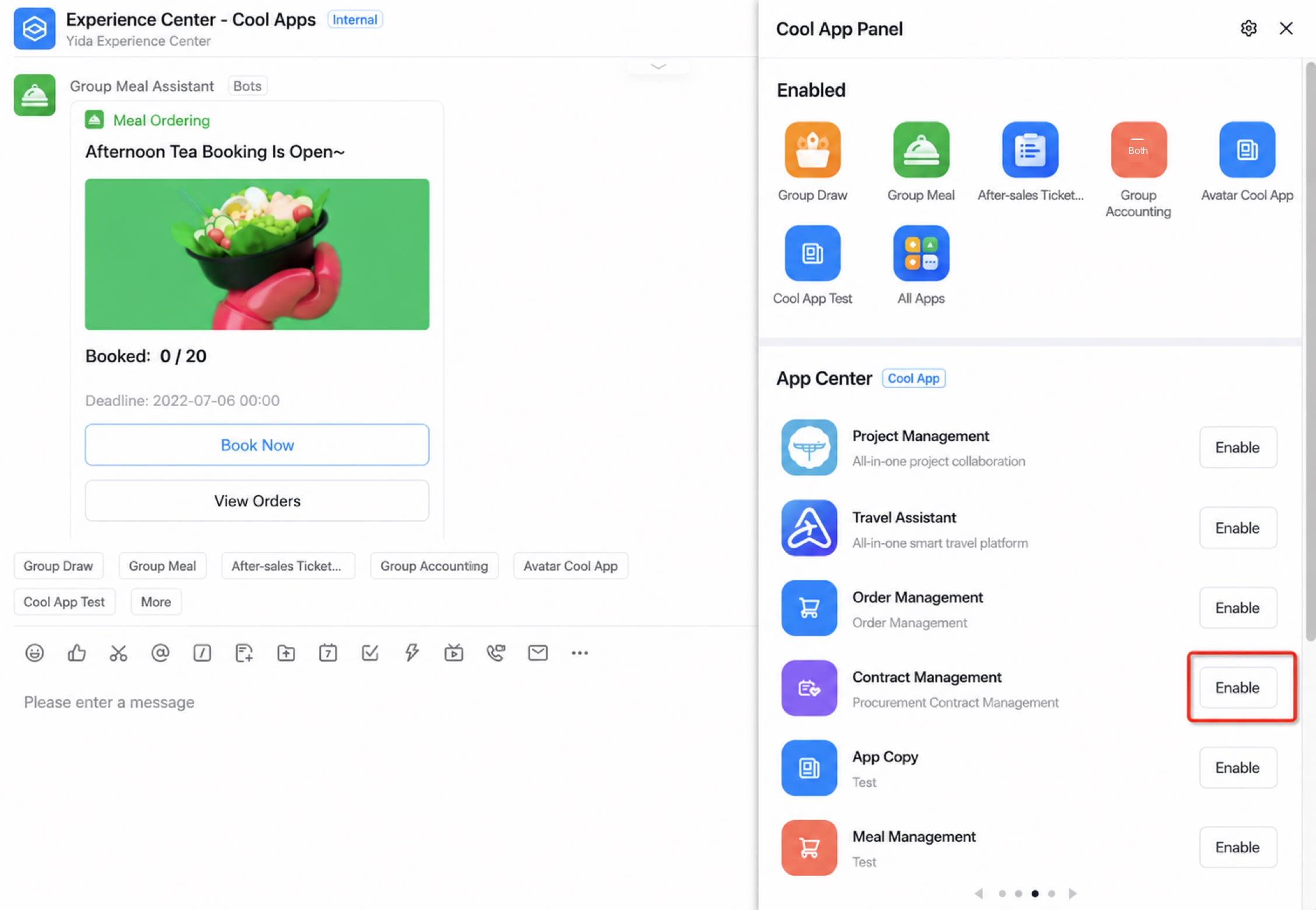
Q1: Where can I quickly create and send or update a card? A: Add a Send/Update card node in integration & automation or the new simple workflow designer. Choose an official card template or a custom interactive or pinned chat card for your card design.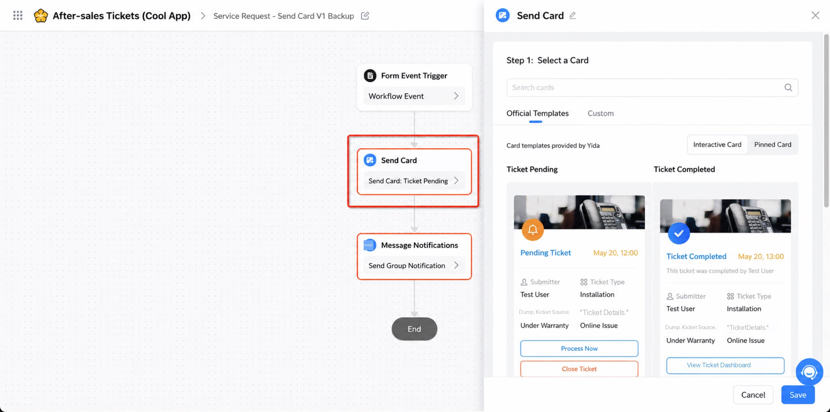
1
Step 1
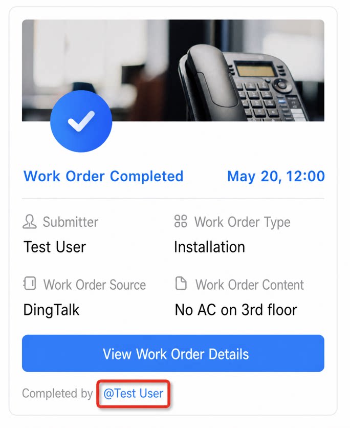
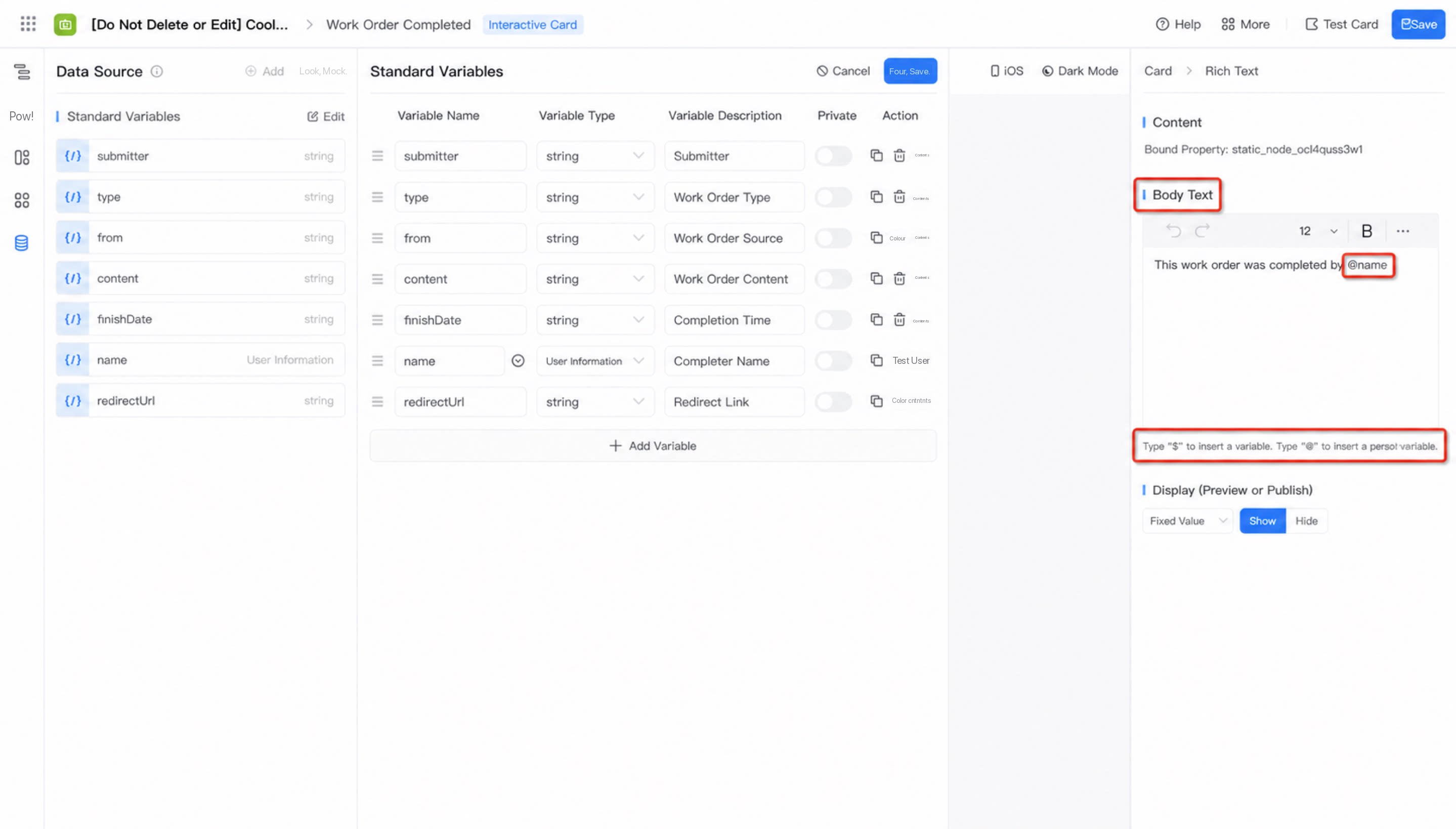
In Card designer > Data source, add a standard variable with the variable type set to “User info”, and define mock data if needed. Drag in a Rich Text component and @mention the named variable in the component setter panel.
2
Step 2
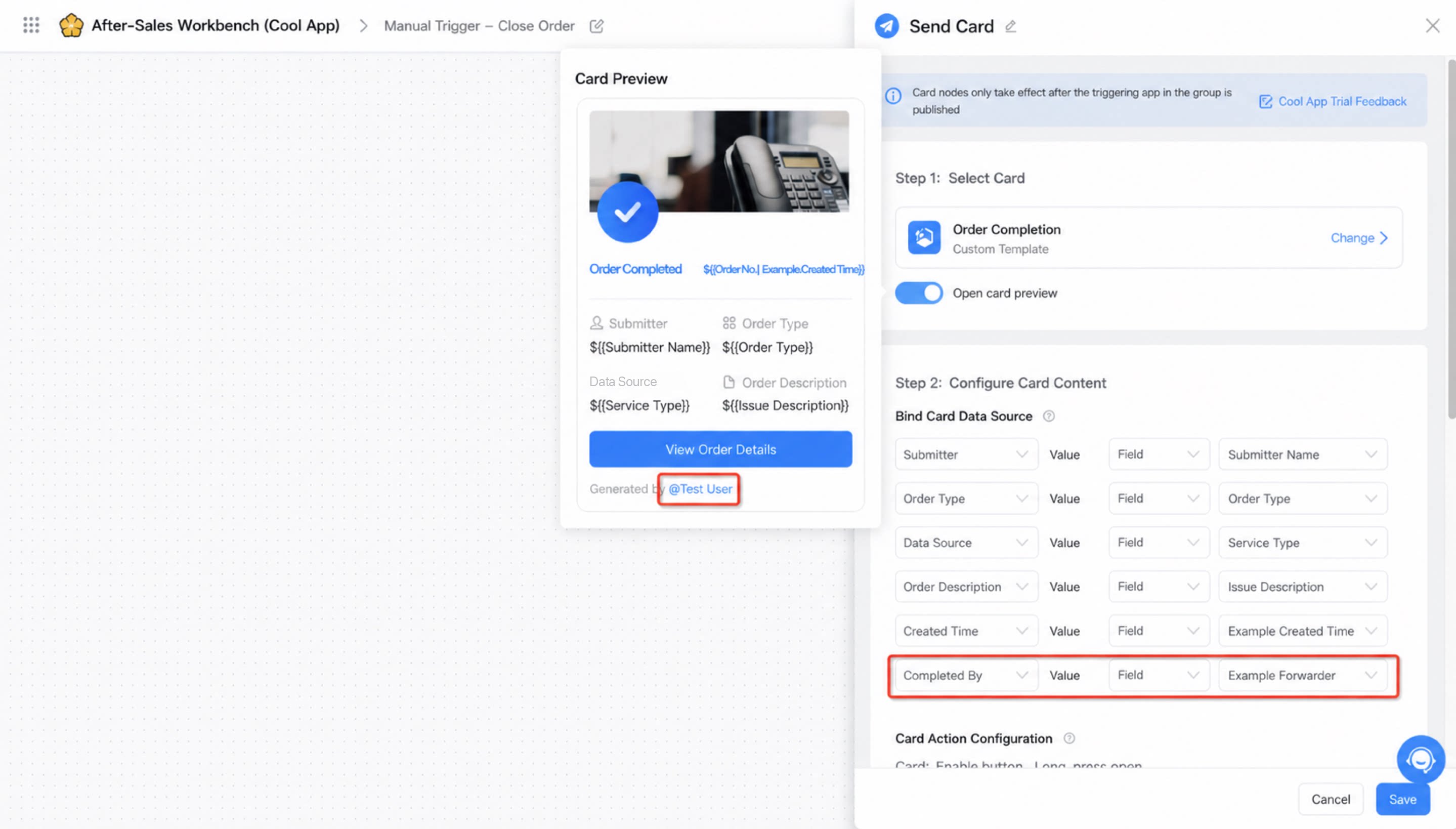
Add a Send/Update card node in integration & automation or the new simple workflow designer. In the card content configuration, bind the card data source and map the user field to the “User info” variable to enable the @mention effect.
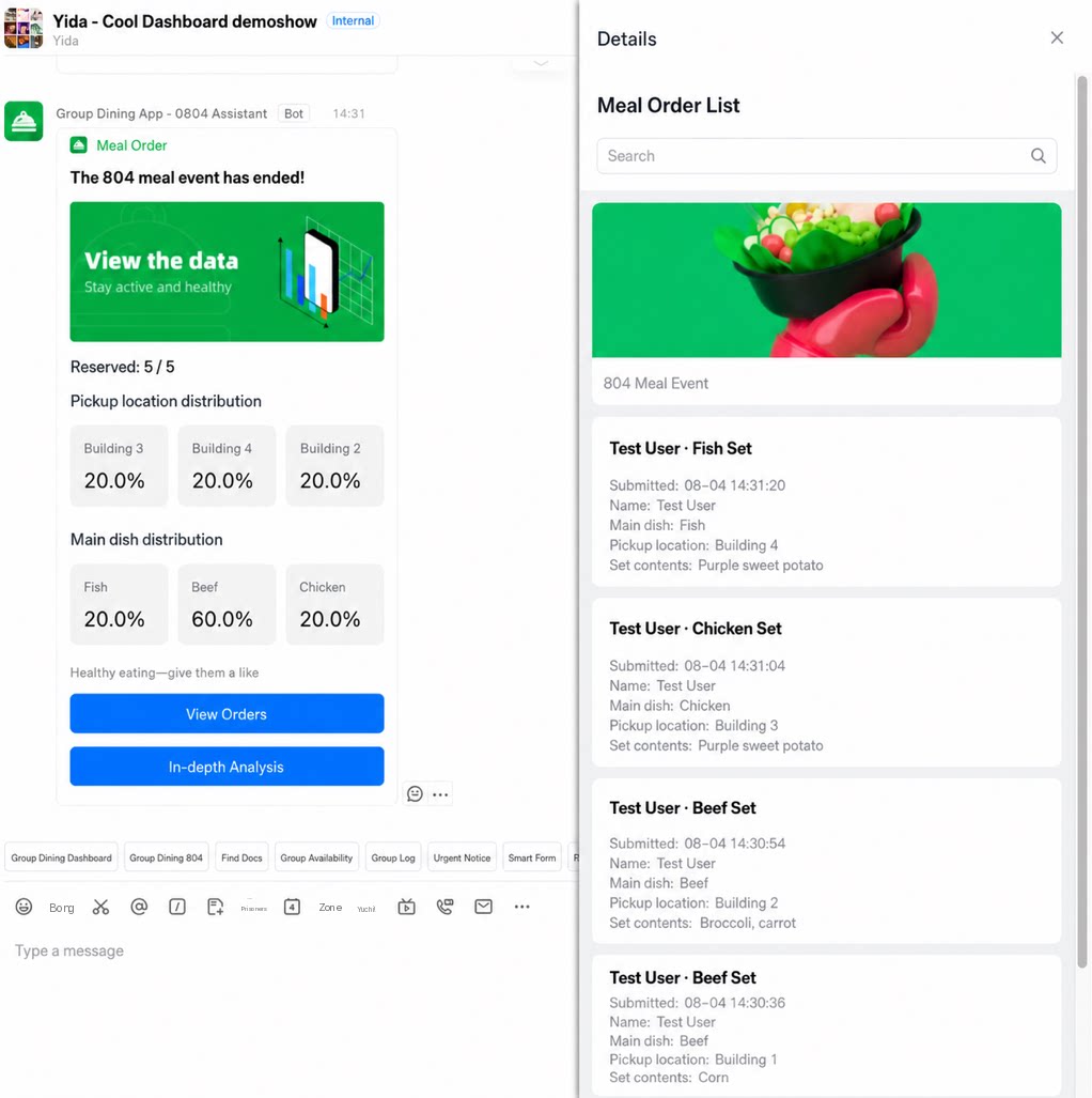
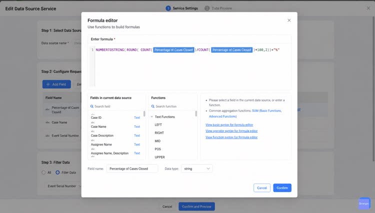
- For the full configuration flow, see 2022.08.16 release notes — YiDA Cool Dashboard (Data Service + Cool Data Card).
- Rendering report chart components on cards is not currently supported.
- Recommended design approaches vary by business scenario and by the number of metrics displayed.
1
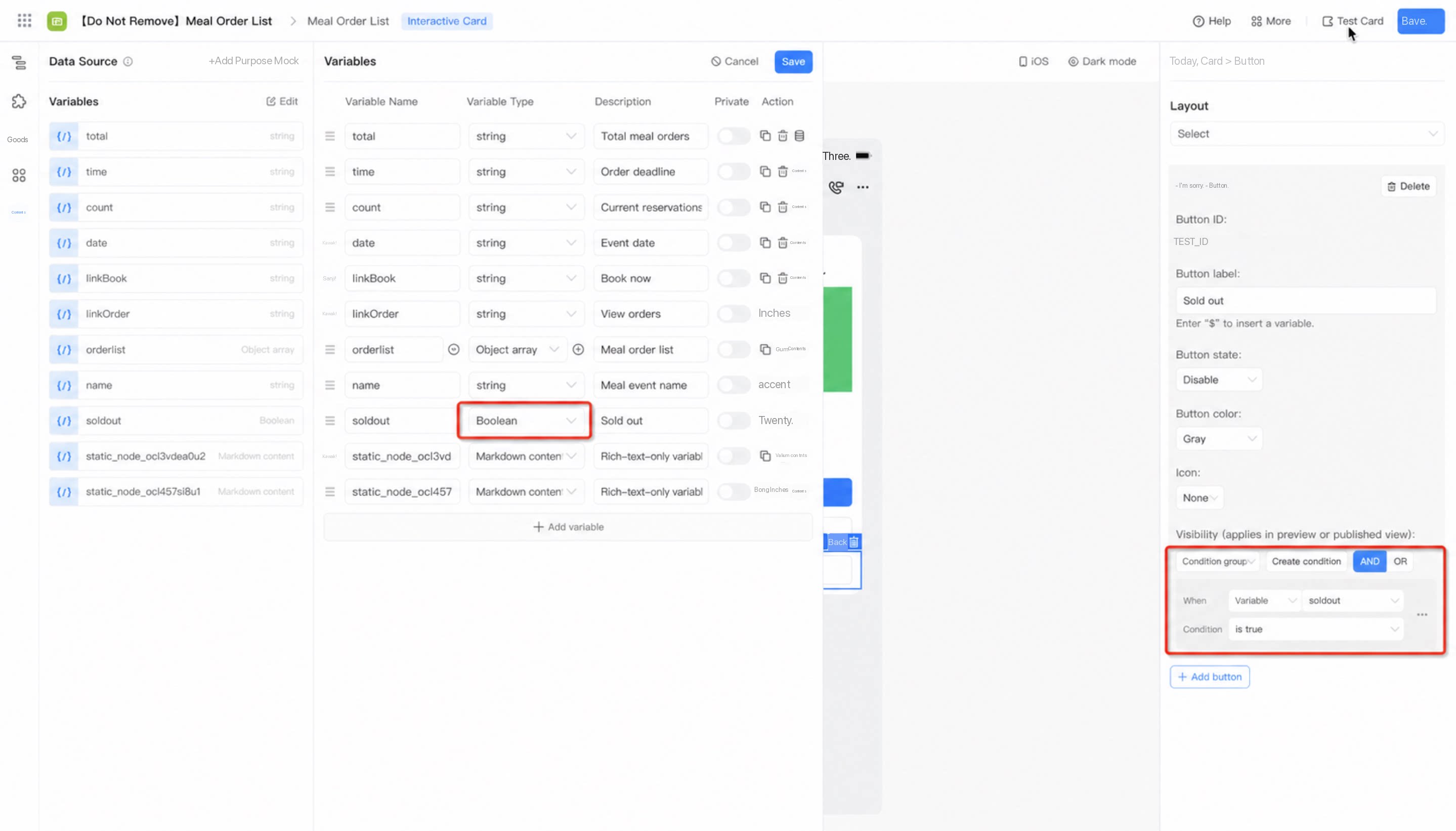
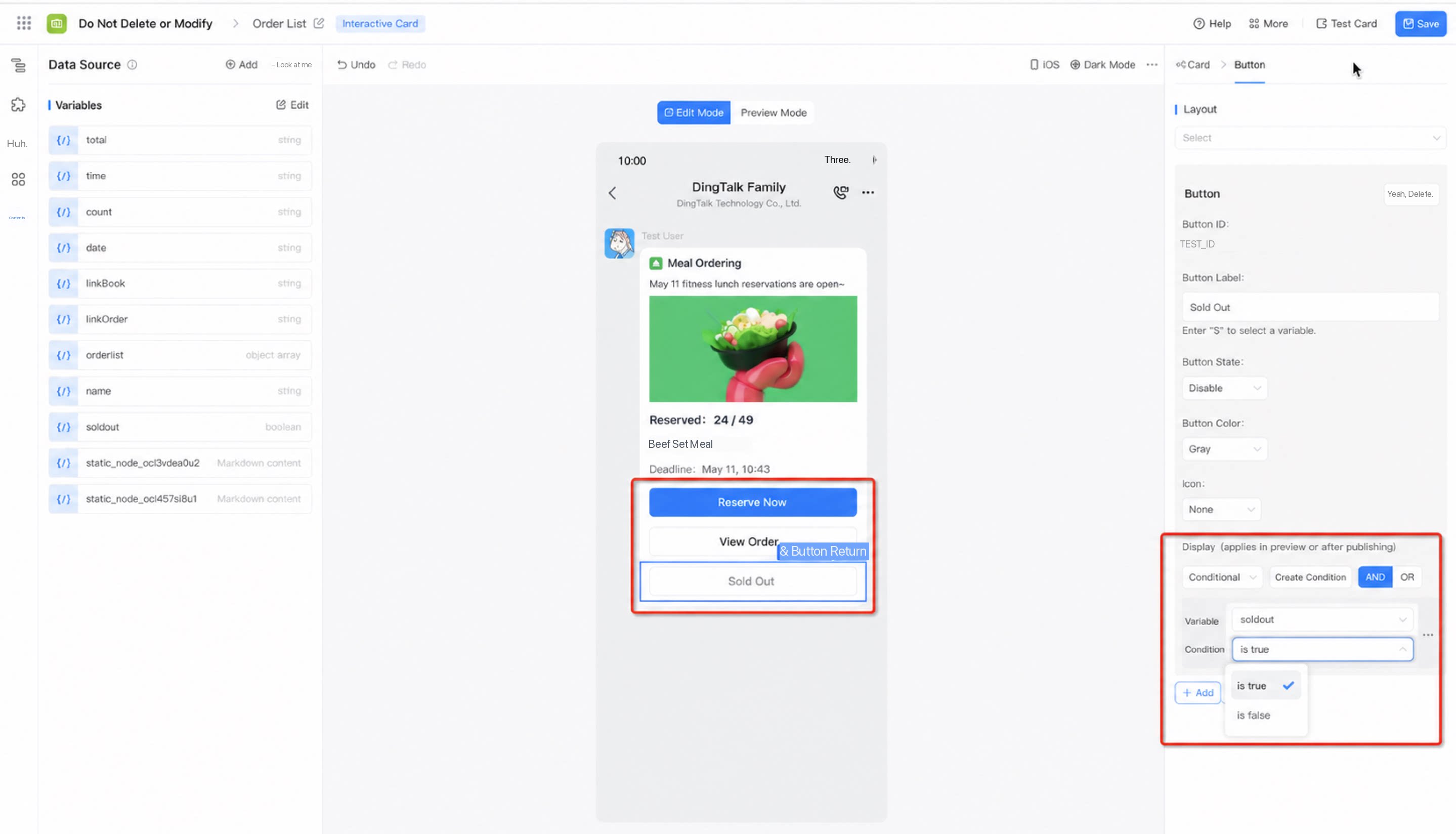
Define a conditional standard variable in the card designer, such as 'Sold out', with the variable type set to 'boolean', and configure mock data.
2
Step 2
Drag all buttons that need to be shown or hidden onto the canvas designer. In the button setter panel, configure the “Show” property. Define the condition and bind it to the variable defined in step 1. When the boolean value is true, the component is shown; otherwise, it is hidden.
3
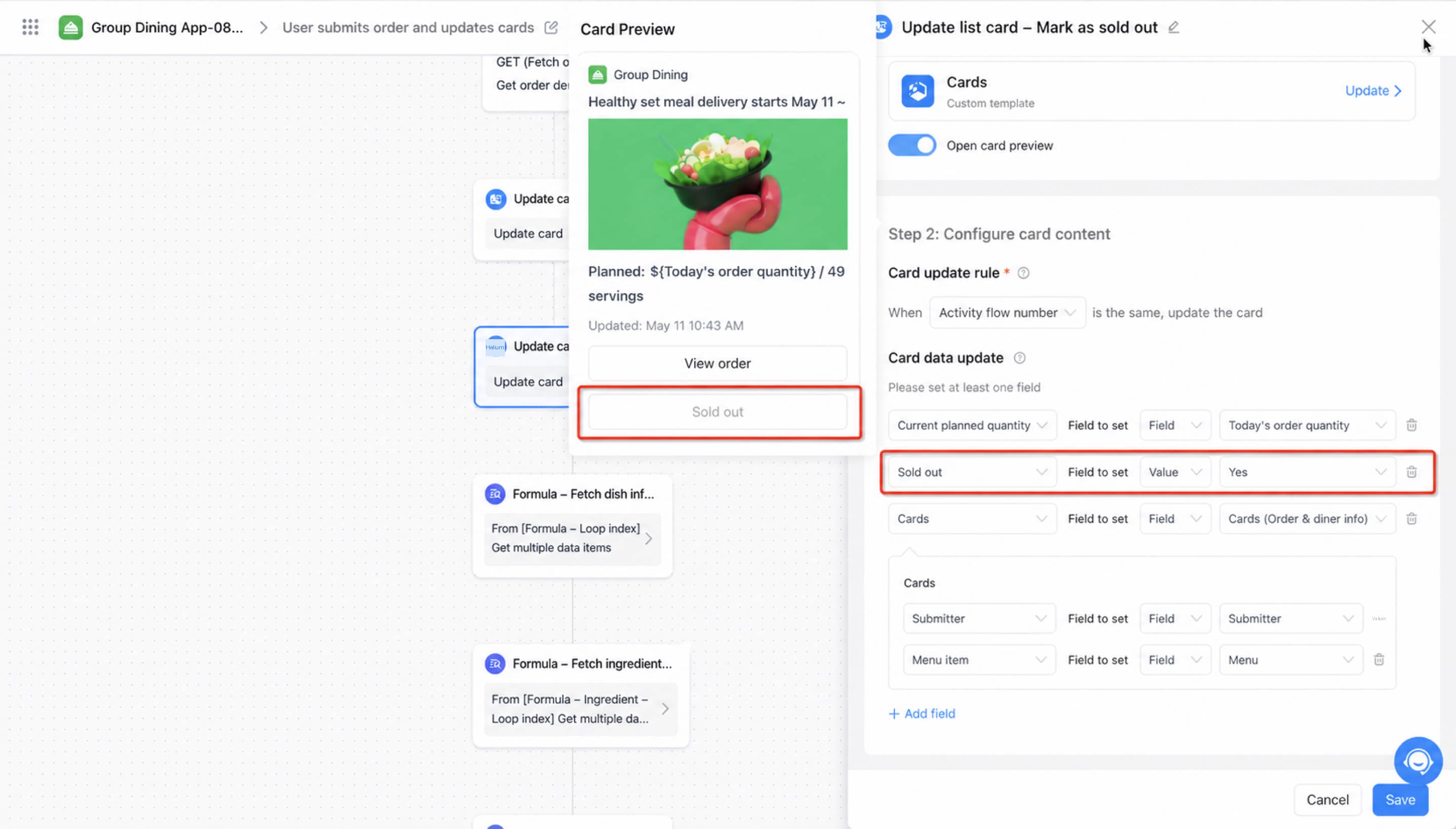
Configure the card node in integration & automation and map the workflow context data to the card data source variables.
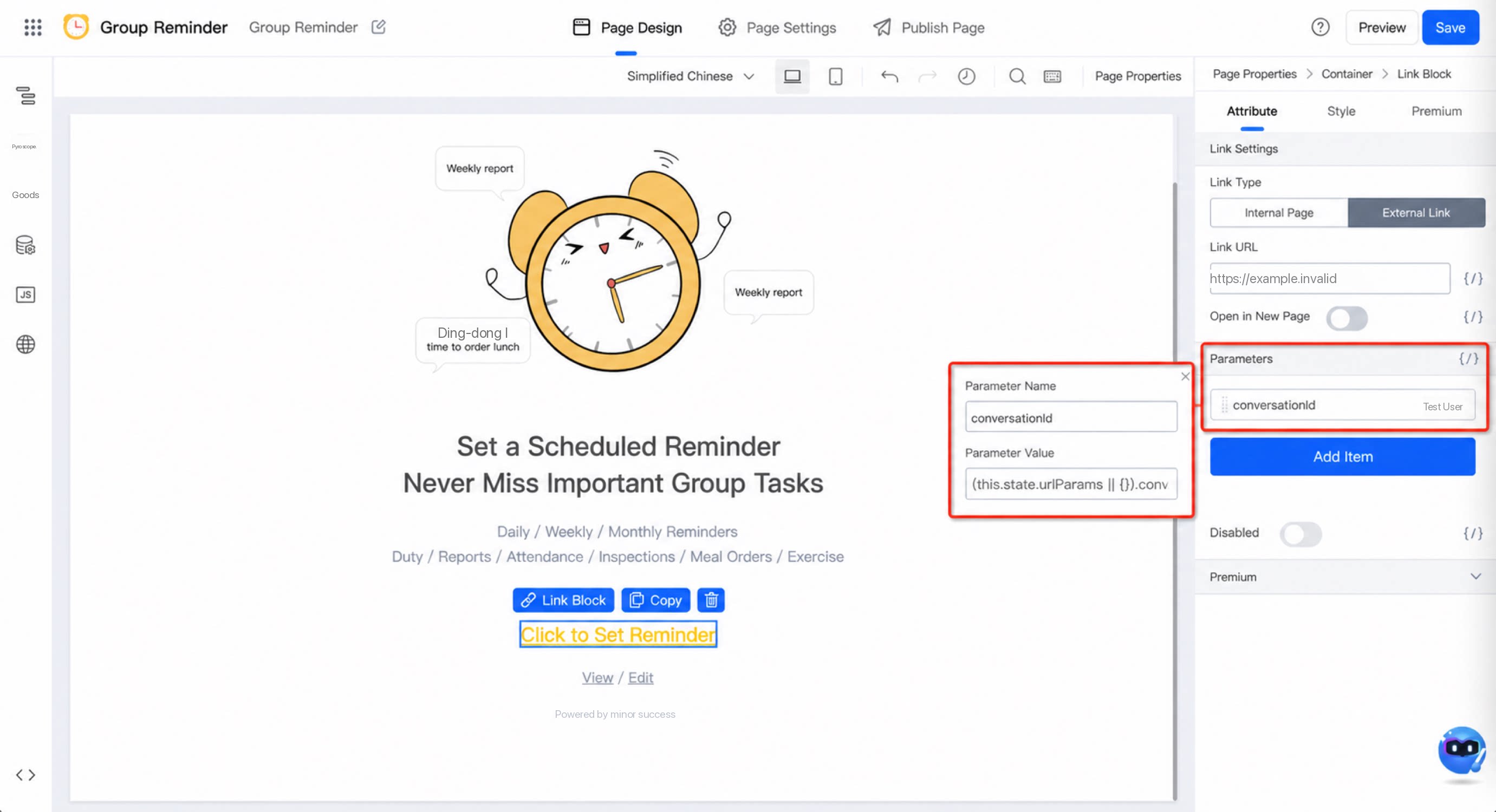
(this.state.urlParams || {}).conversationId
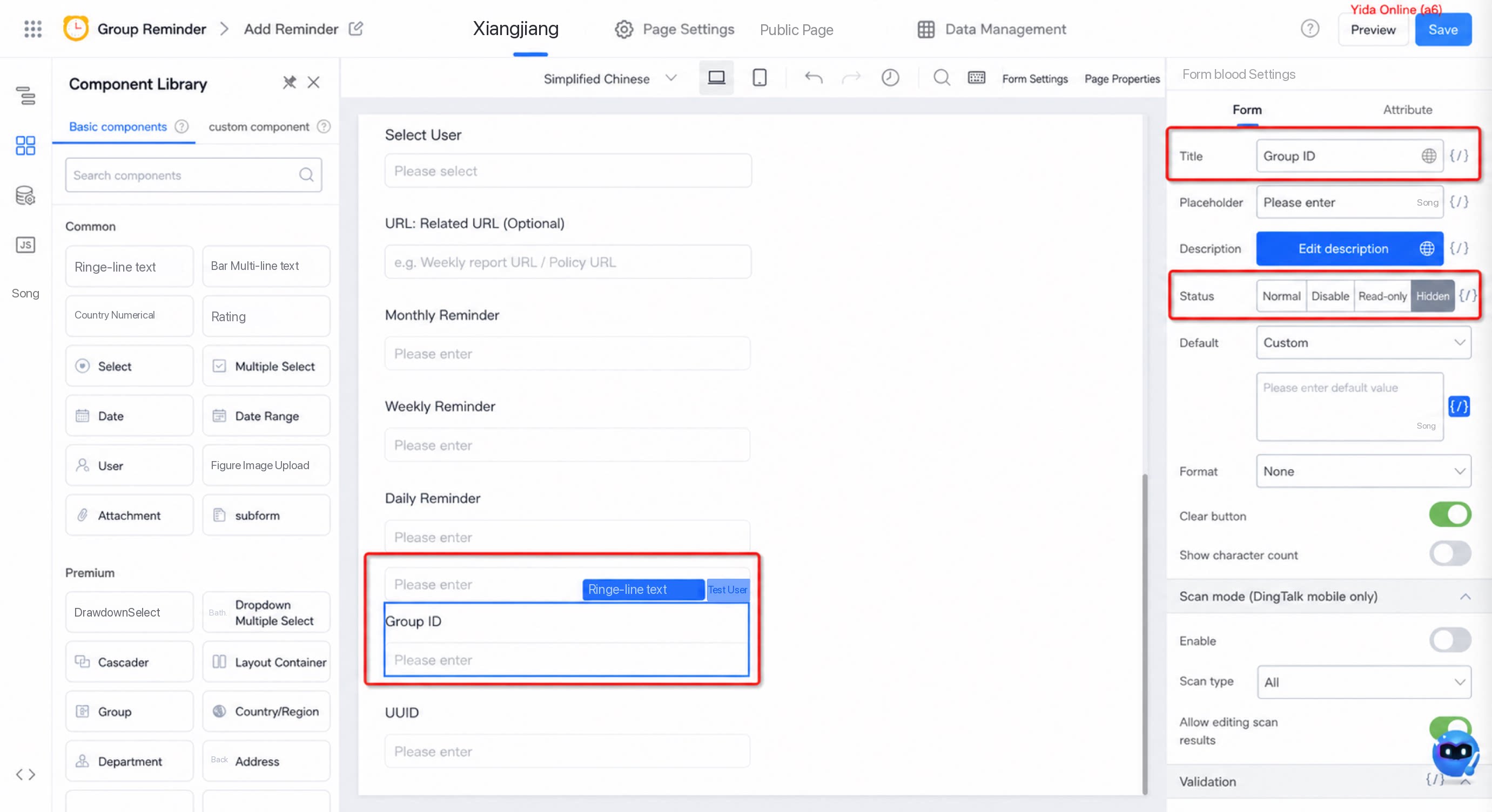
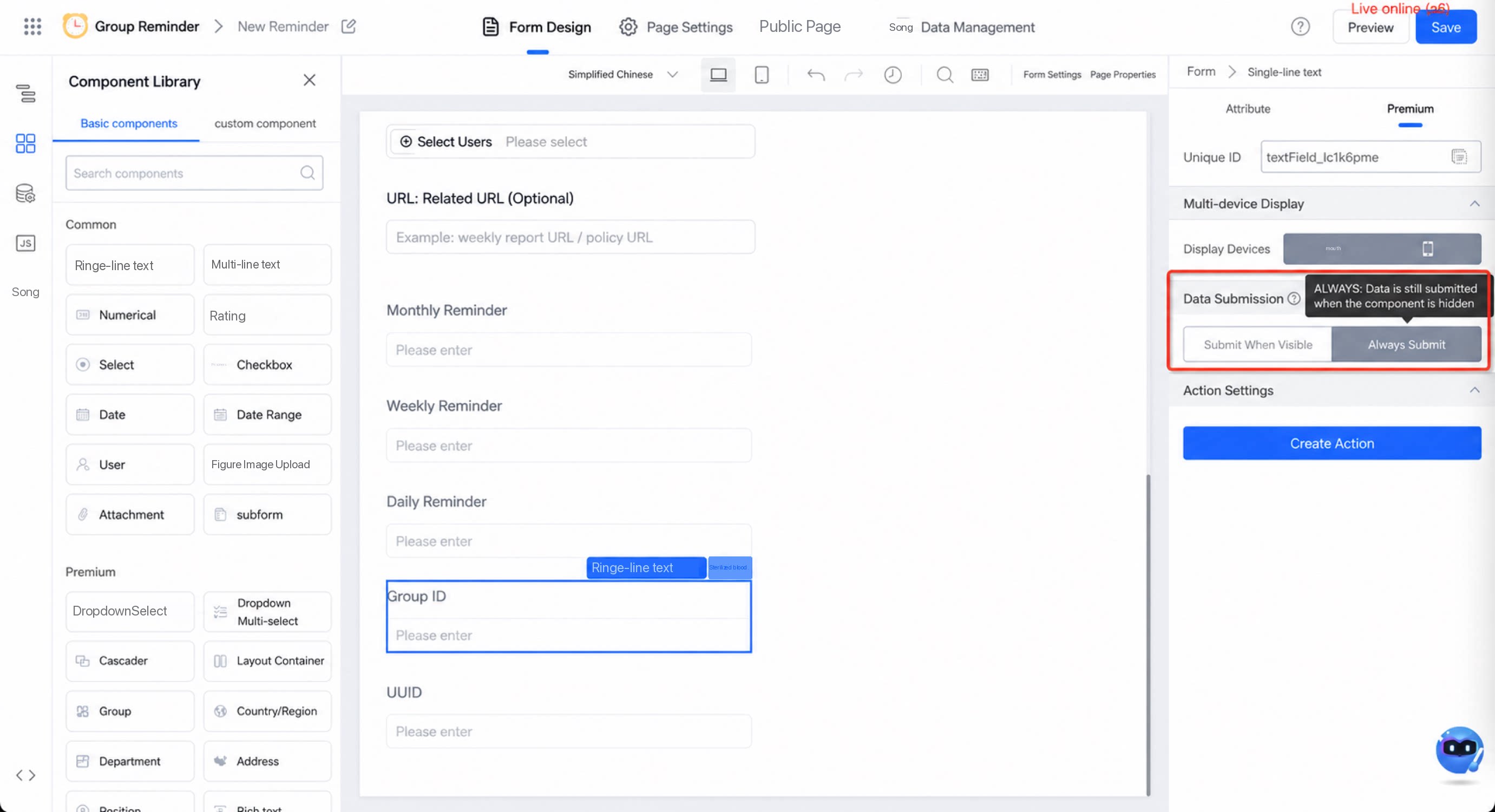
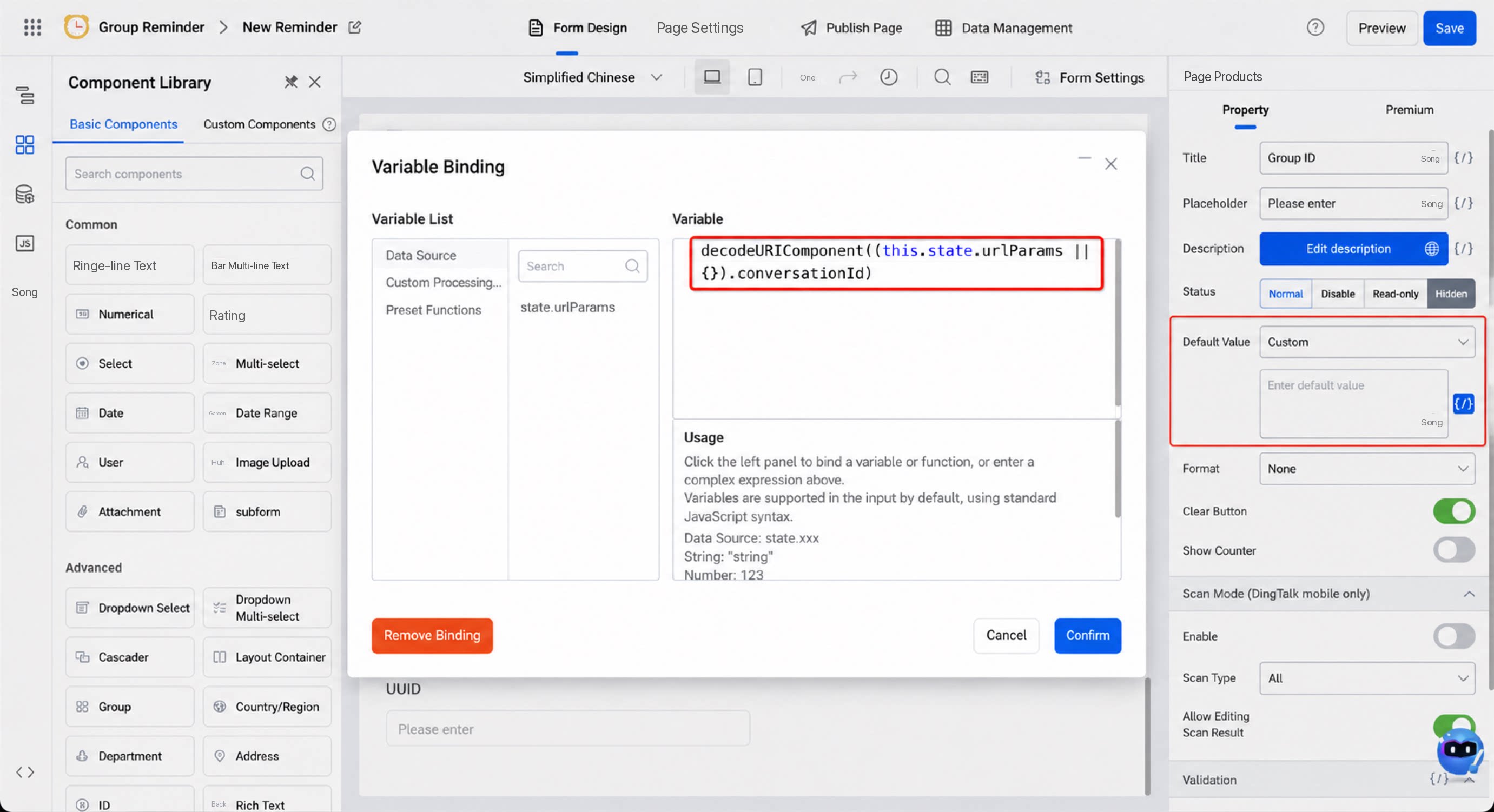
decodeURIComponent((this.state.urlParams || {}).conversationId)
Finally, when sending to a chat, choose either “current chat” or the chat identified by “Chat ID”.