Chats
Chats Calendar
 Meetings
 Contacts
 Mail
Mail Docs
Docs Drive
Drive AI Table
 AI Minutes
 Attendance
 Approval
 YiDA
YiDA Admin Console
1. Use Cases
- Display a prompt to users.
- Ask users to confirm an action.
- Let users handle tasks without leaving the current page or interrupting the workflow.
For component attributes, usage, and examples, see the Drawer component reference.
3. Basic Usage of the Drawer Component
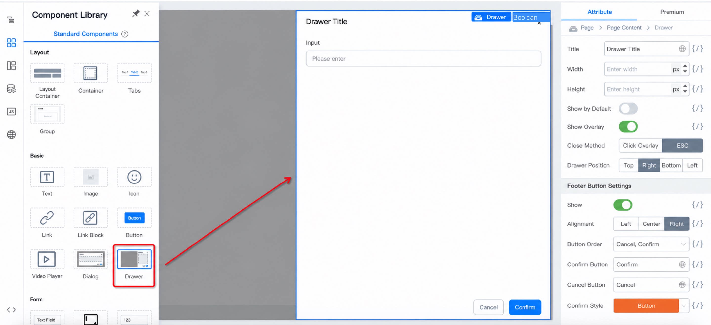
3.1 Drag the Drawer Component onto the Custom Page and Configure Its Style in the Attribute Panel
Custom page3.2 The Drawer Component Is Hidden by Default; Use the Following API to Show It
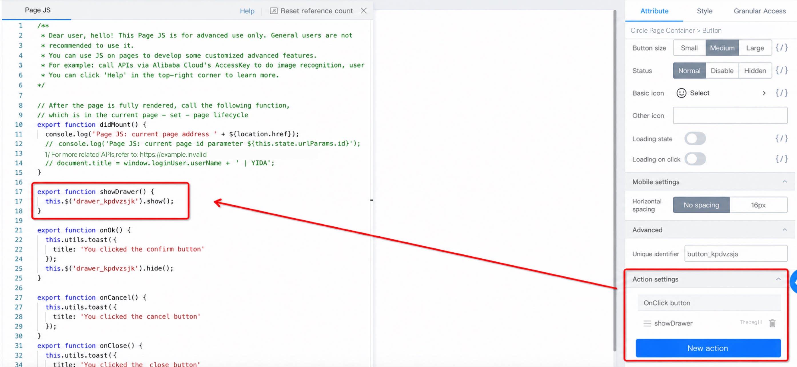
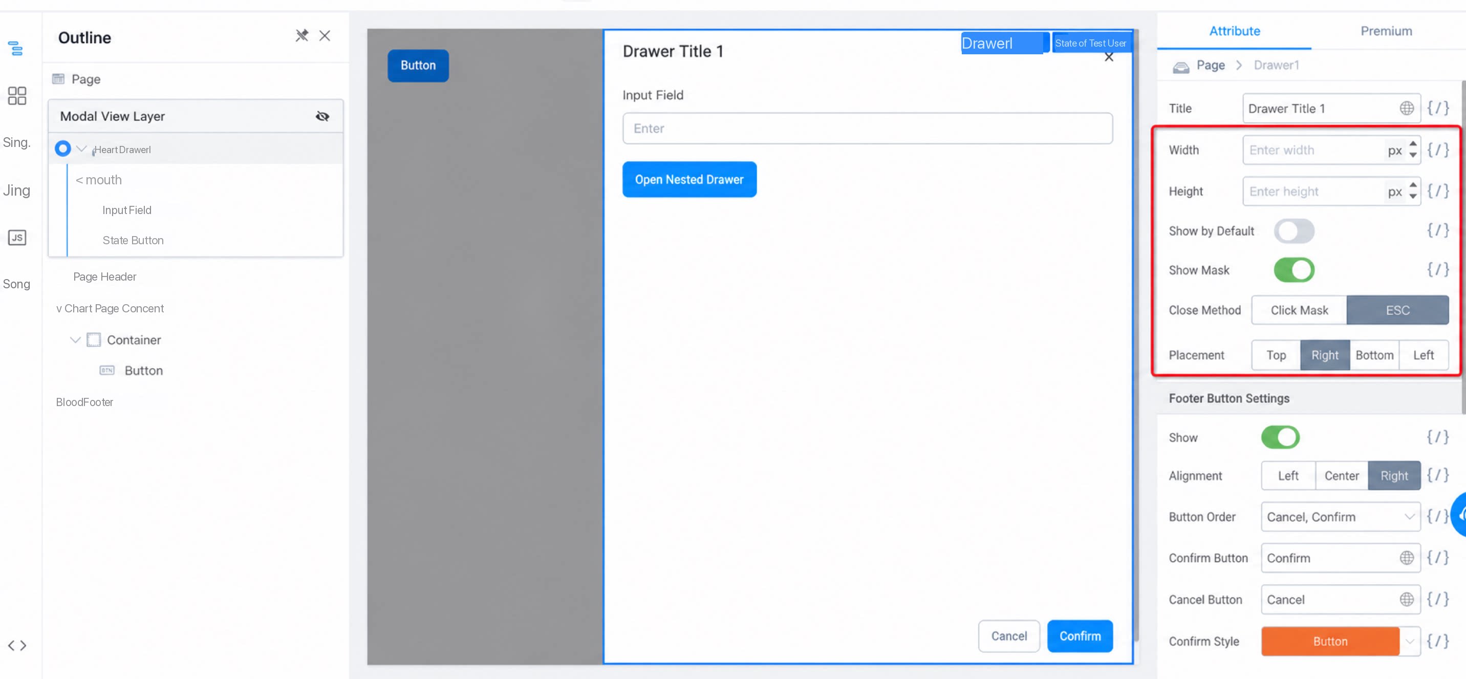
3.3 Set the Height and Width in the Attribute Panel to Control the Drawer Size, and Configure Its Pop-Up Position and Exit Method
As shown below: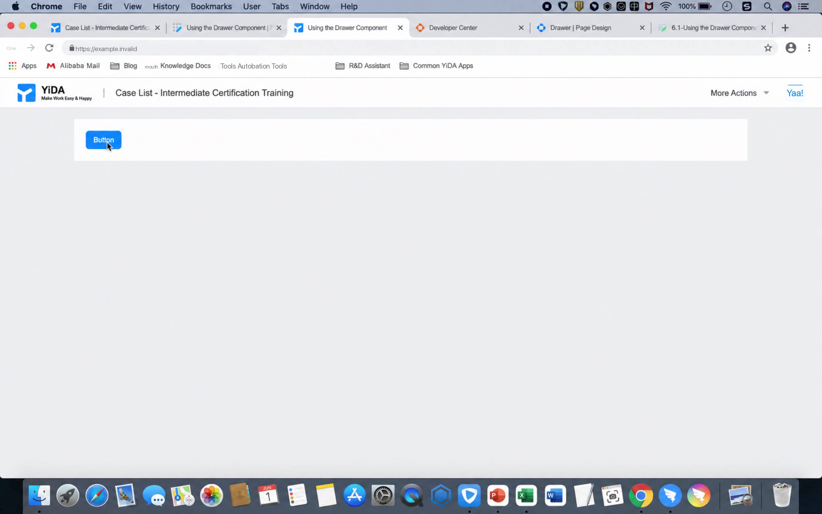
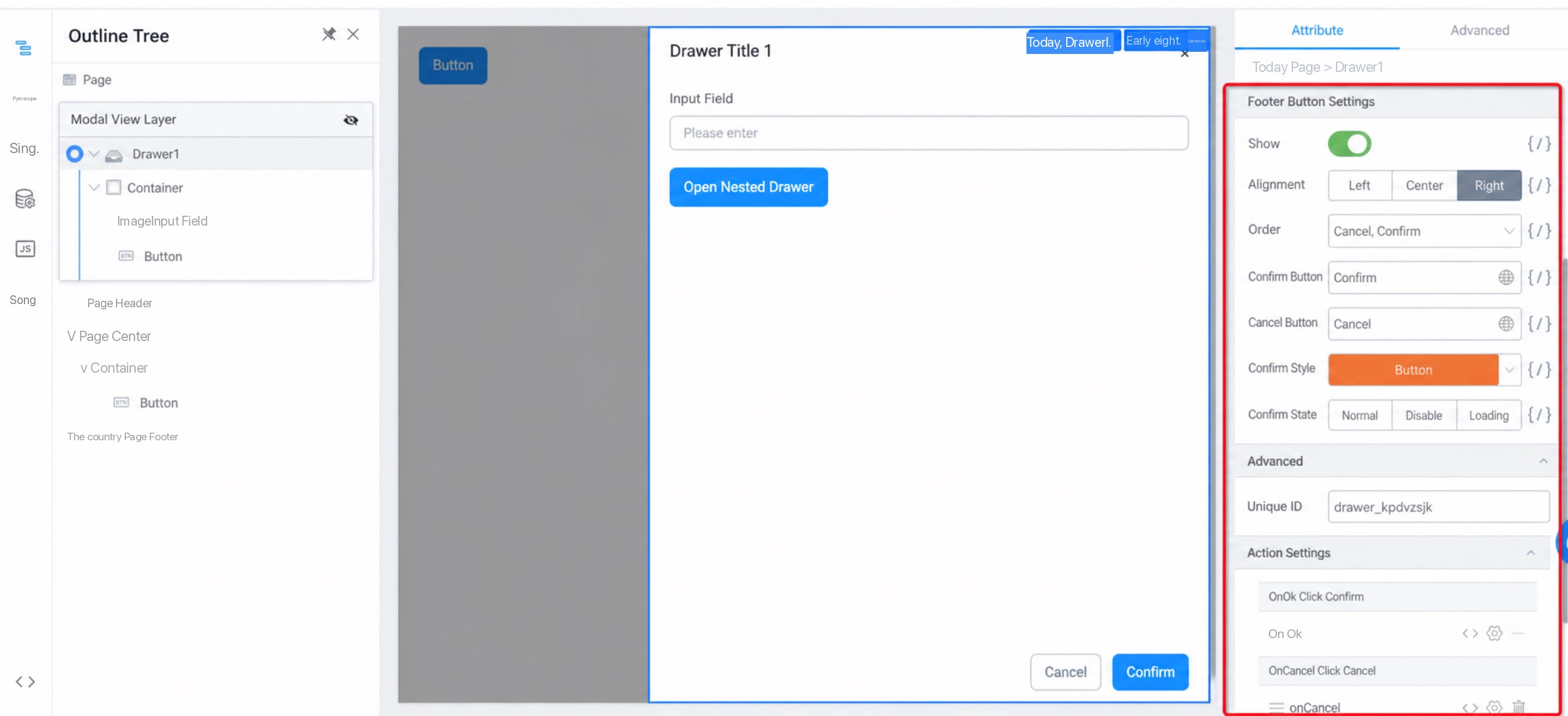
3.4 Configure the Bottom Buttons to Set Their Position, Arrangement, Content, and Action Events
As shown below: