

 Chats
Chats Calendar
 Meetings
 Contacts
 Mail
Mail Docs
Docs Drive
Drive AI Table
 AI Minutes
 Attendance
 Approval
 YiDA
YiDA Admin Console
The Steps component is a Premium component of the custom page.
1. Use Cases
The Steps component of the custom page is well suited for building forms such as dispatched personnel information entry and sign in information sign up. It also helps remind users of the progress when filling in basic information.For component attributes, usage, and examples, see Steps Component.
2. Basic Component Attributes
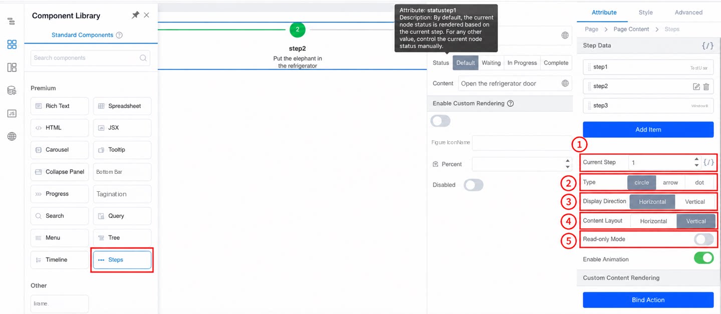
2.1 Current Step Attribute
A number type that controls the status of the step data at the current step. When the status of all step data is default, the current step shows the in-progress status, previous steps show completed, and subsequent steps show waiting.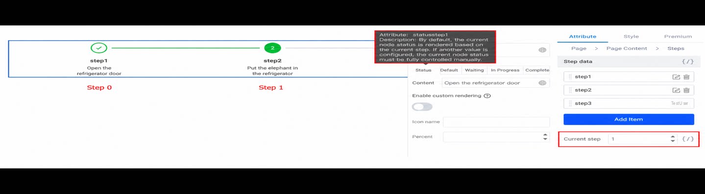
2.2 Type Attribute
The types of the Steps component include cricle (circle), arrow, and dot. The three styles are shown below.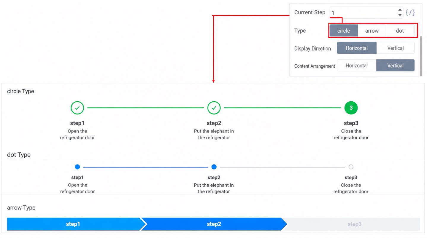
2.3 Display Direction
The display direction of the Steps component can be set to horizontal or vertical. Note that the arrow type does not support the vertical style.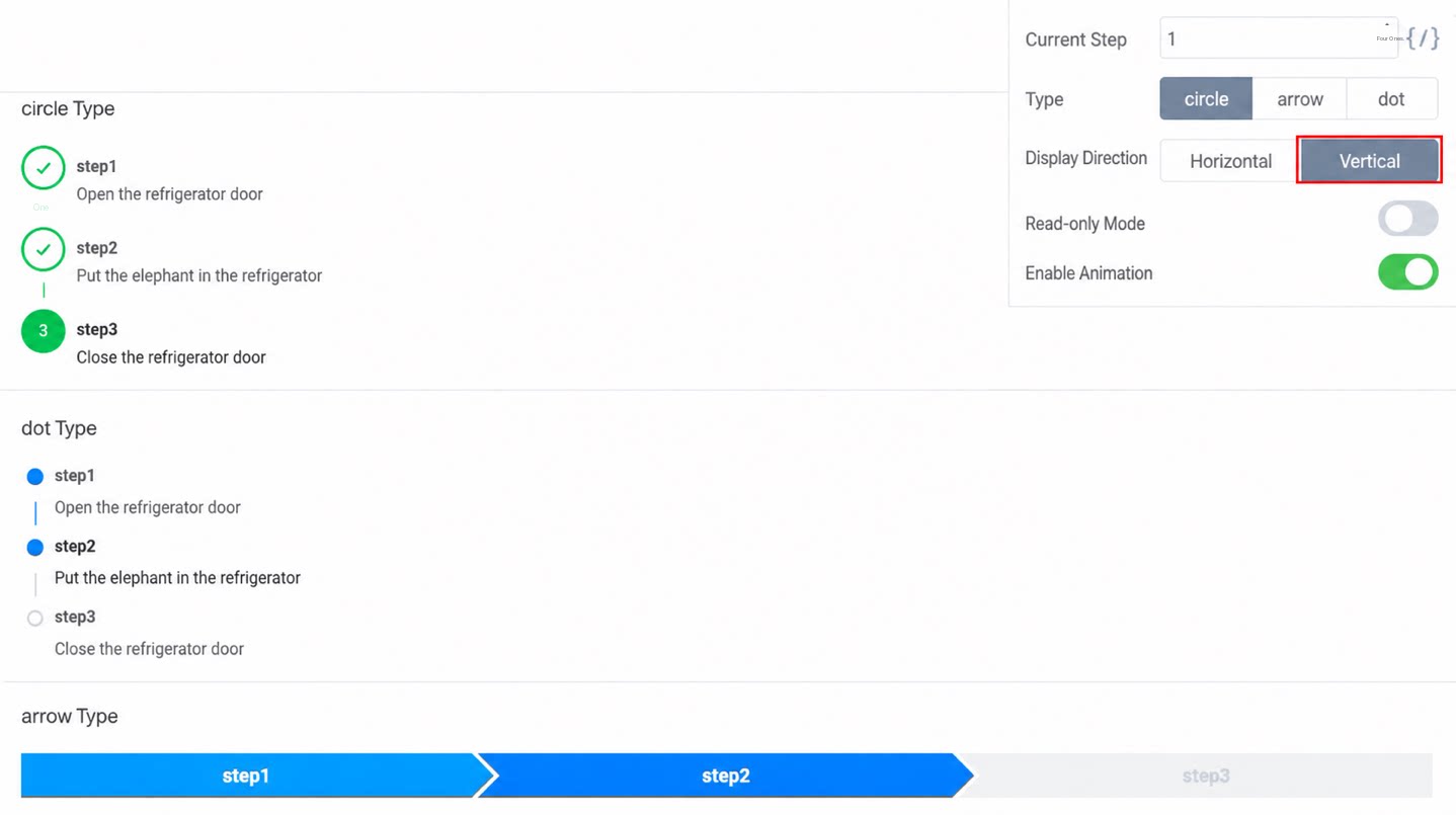
2.4 Content Alignment Attribute
The content alignment attribute is only supported by the cricle type. The arrow and dot types do not support this attribute, so it does not appear when either of these types is selected.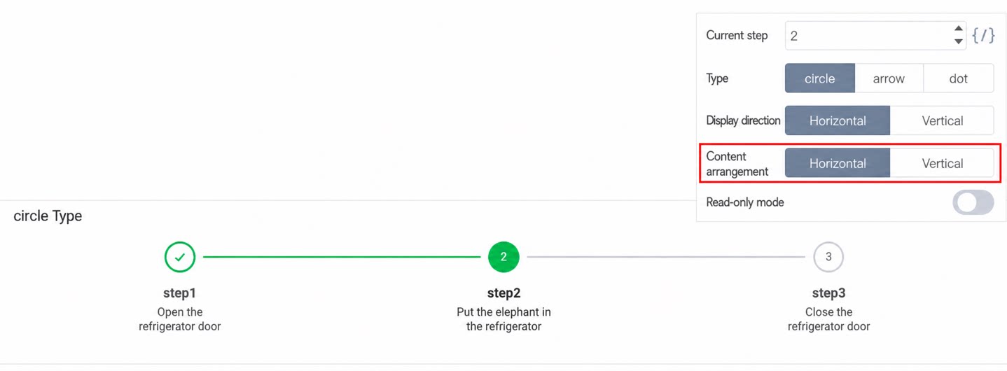
2.5 Read-Only Mode
Read-only mode is closed by default, which allows users to click step nodes to execute the custom action set on them. When Read-only mode is on, step nodes cannot be clicked, and custom actions are not triggered. Set the custom action for a node: Steps custom actionYou can copy the following code directly into the JS panel.
3. Premium Component Configuration
3.1 Data Format
3.2 Dynamically Setting Step Data
Bind the step data of the Steps component to a variable data source, drag in a Button component, and set its click action. When the Button is clicked, modify the value in the variable data source to dynamically set the step data.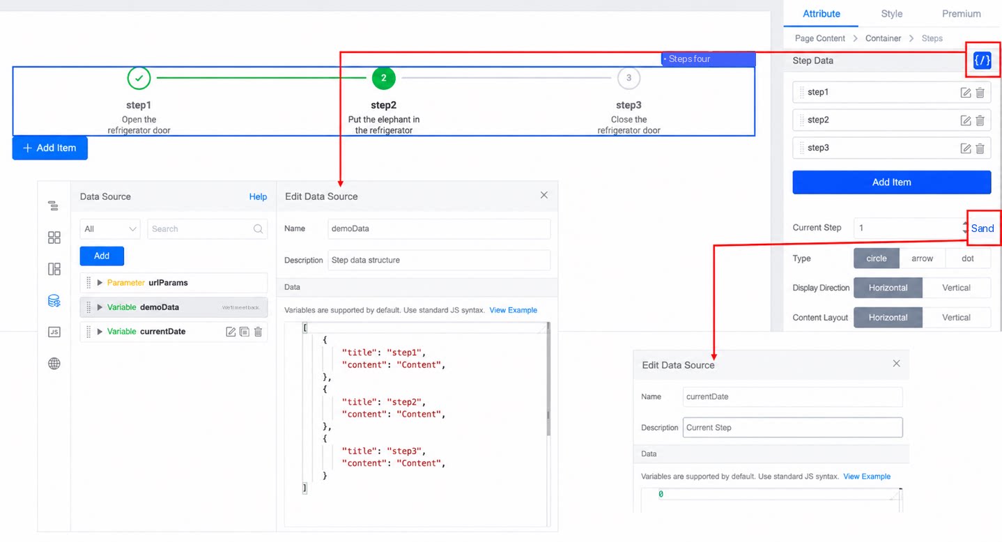
You can copy the following code directly into the JS panel.
3.3 Typical Example
Set a variable data source with a default value of 0. Bind the variable data source to the current step attribute of the Steps component.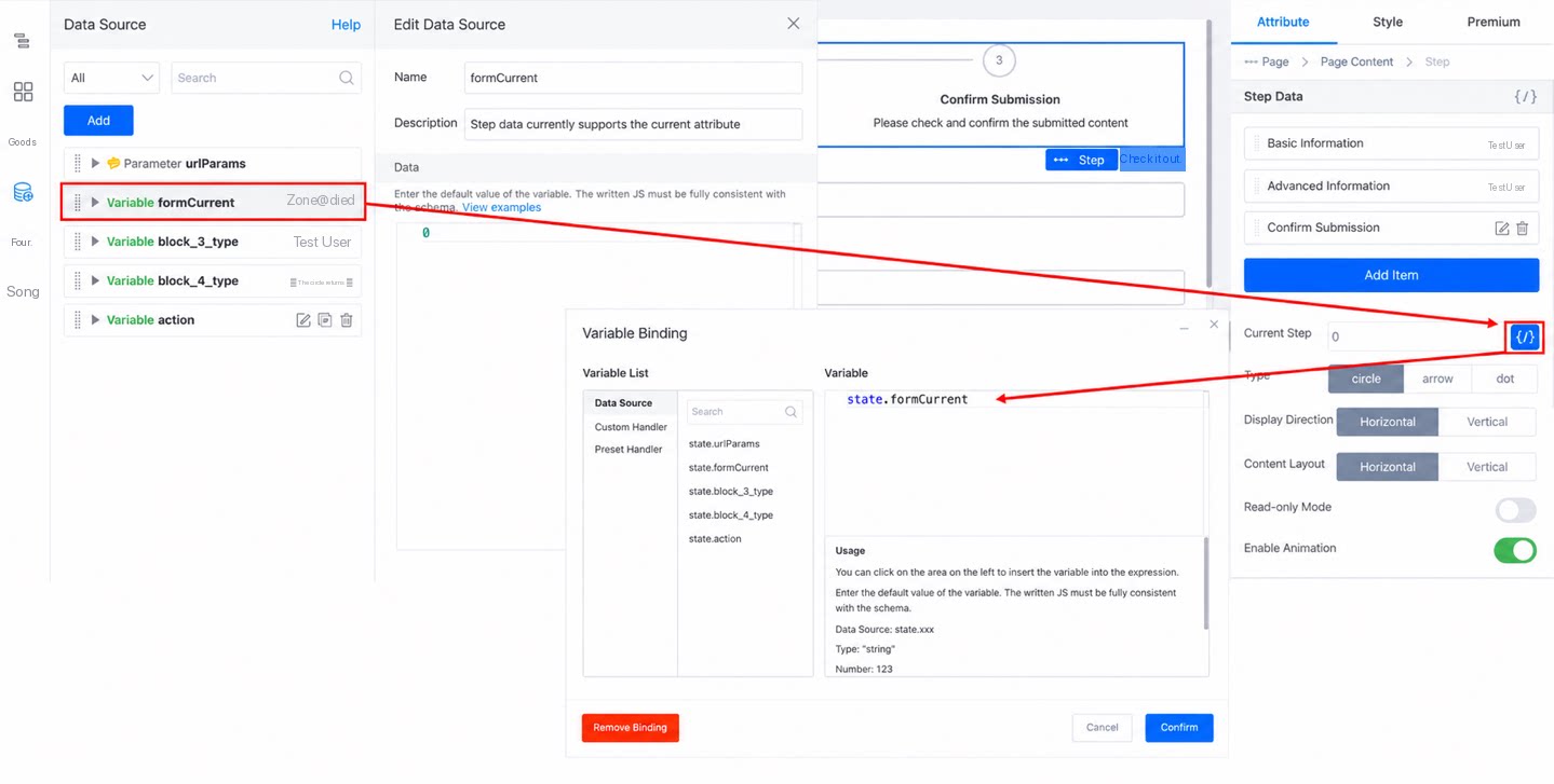
3.3.1 Preparation
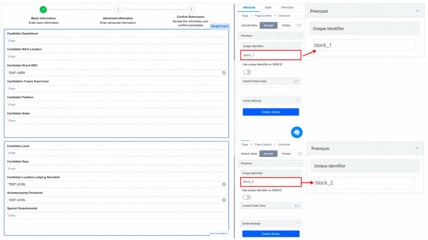
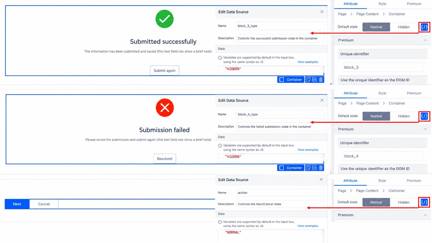
(1) Set the unique identifier of the container Component, place the Components whose Data needs to be filled in inside the container Component, and control the visibility of the Components to be filled in the Next step based on the show/hide state of the container Component.
(2) Set the Tips text, icon, and style for Submit Success/Failed. Here, a variable Data Source is used to control the visibility of the container Component.
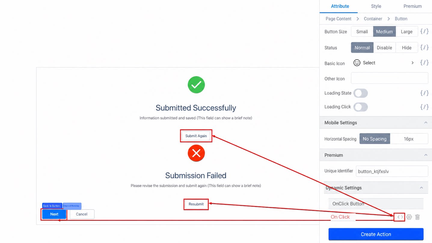
(3) Bind Actions to the Button Components. The Next, Resubmit, and Submit Again Buttons share the same onclick Action.
(4) Set the Custom click Action onclick2 on the step nodes.
Steps bound action + effect demoYou can copy the following code directly into the JS panel. Note: replace the unique identifiers of the components with your own.