

 Chats
Chats Calendar
 Meetings
 Contacts
 Mail
Mail Docs
Docs Drive
Drive AI Table
 AI Minutes
 Attendance
 Approval
 YiDA
YiDA Admin Console
1. Use Cases
Use a custom page when you need to display overall data for an app, such as items pending your action, items you created, or items CC’d to you. You can also configure quick-entry buttons for submitting forms.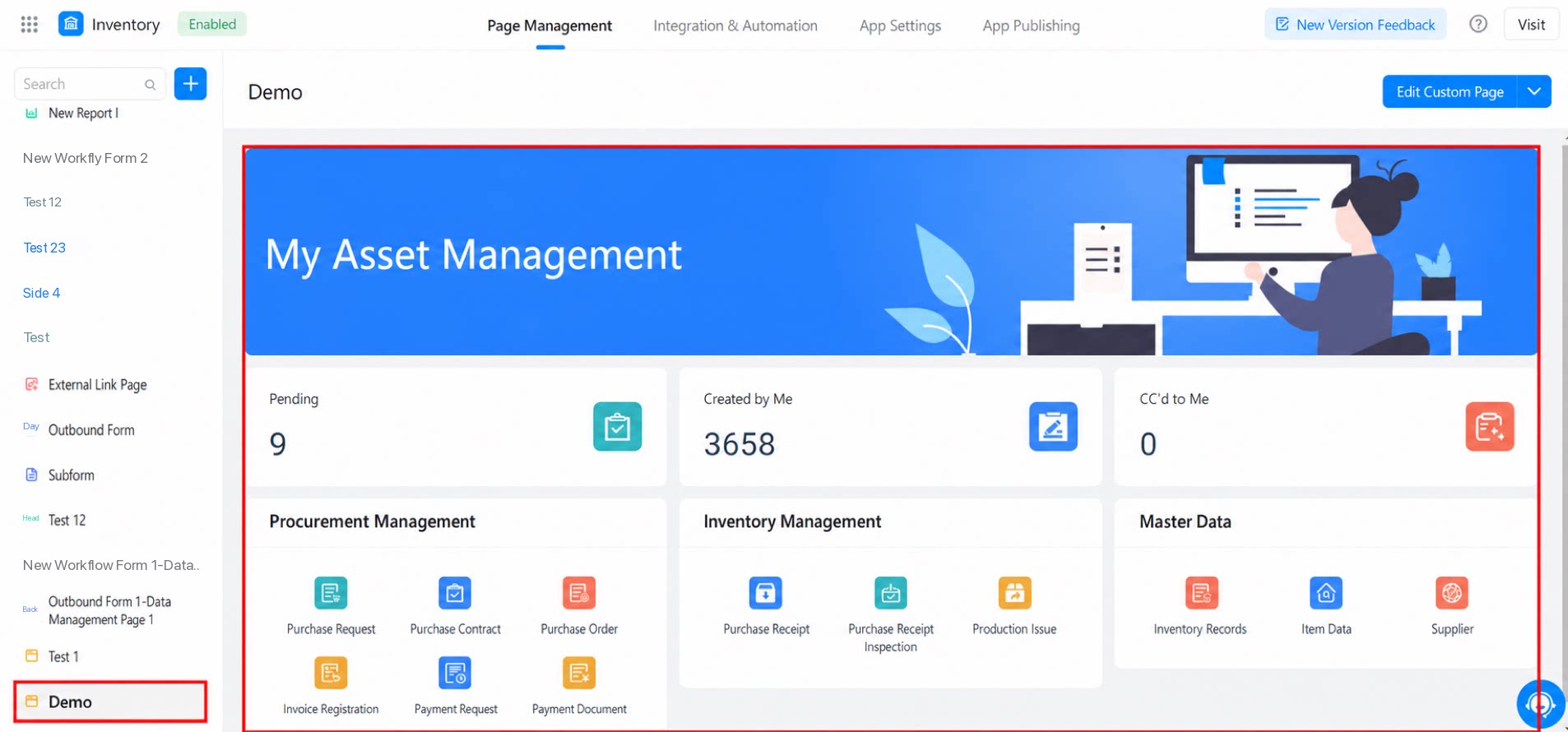
2. Overview
The custom page designer consists of four parts: the top toolbar, the left sidebar, the middle canvas, and the right property configuration panel.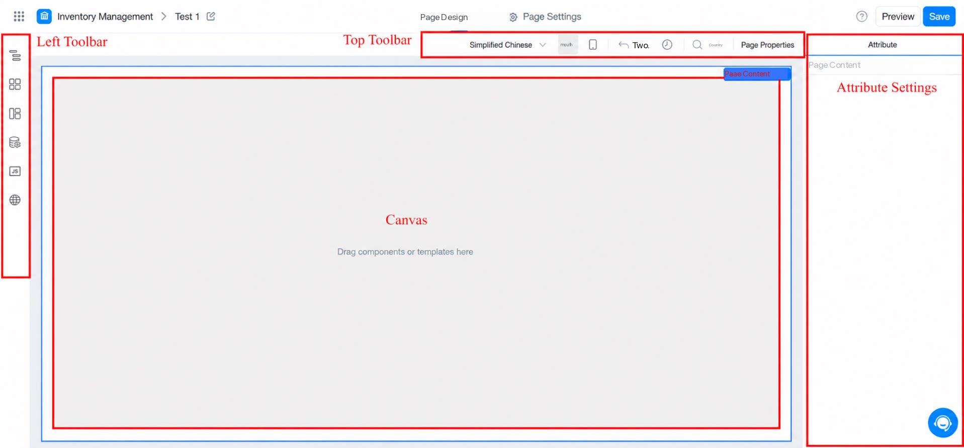
2.1 Top Toolbar
2.1.1 Page Settings
For details, see Page settings.2.1.2 Shortcuts
The YiDA designer provides a set of keyboard Shortcuts, as shown below.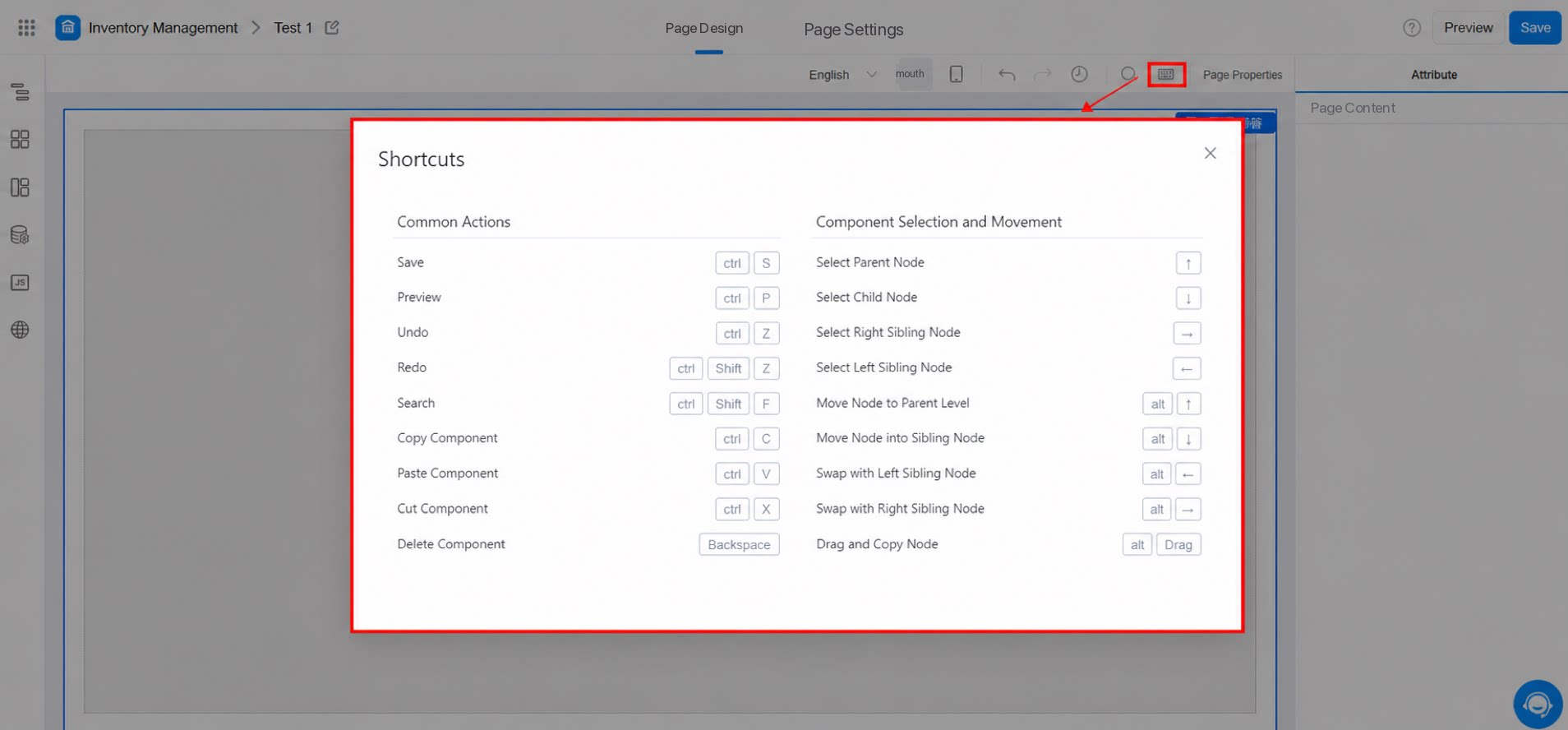
2.1.3 History
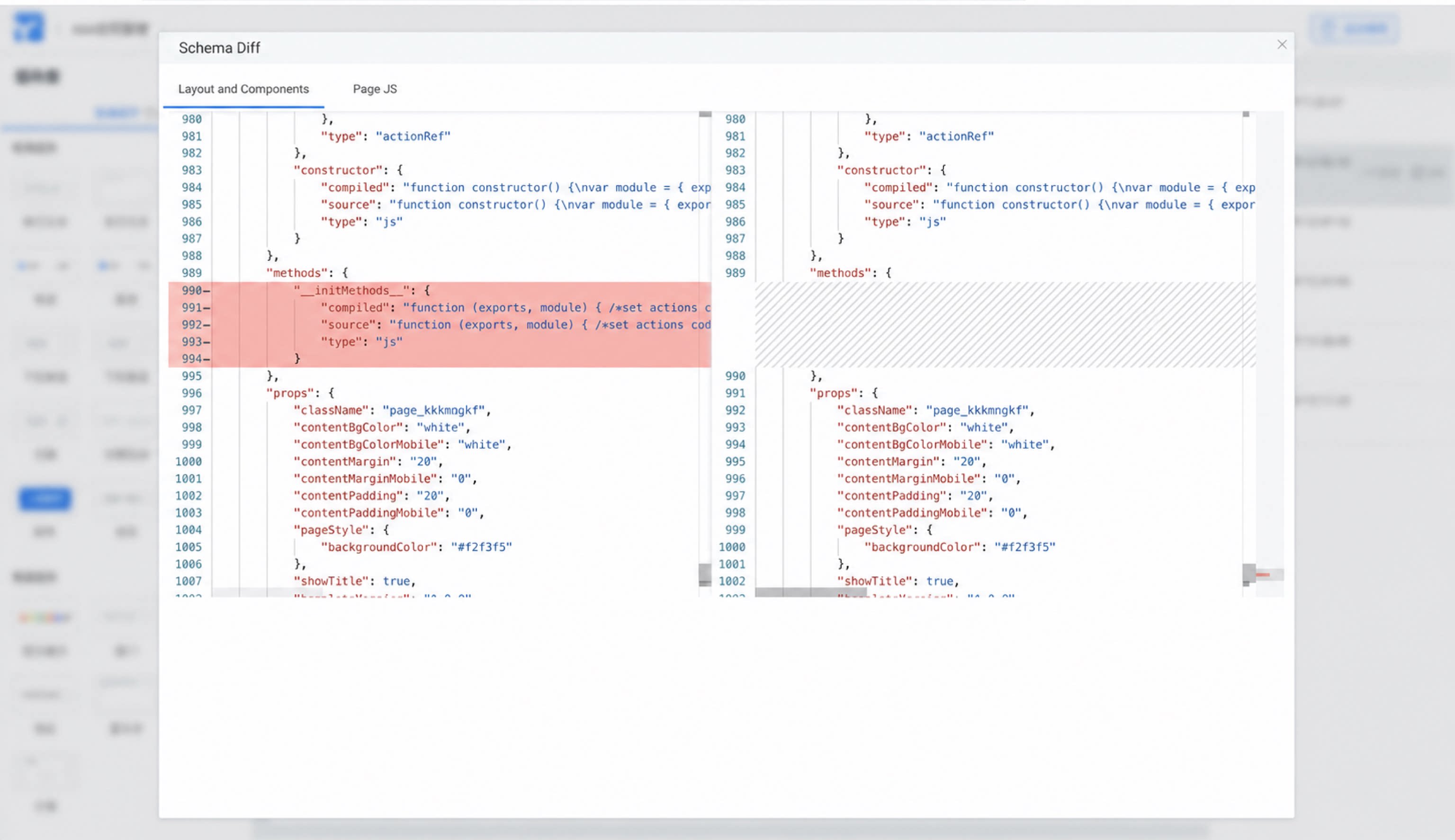
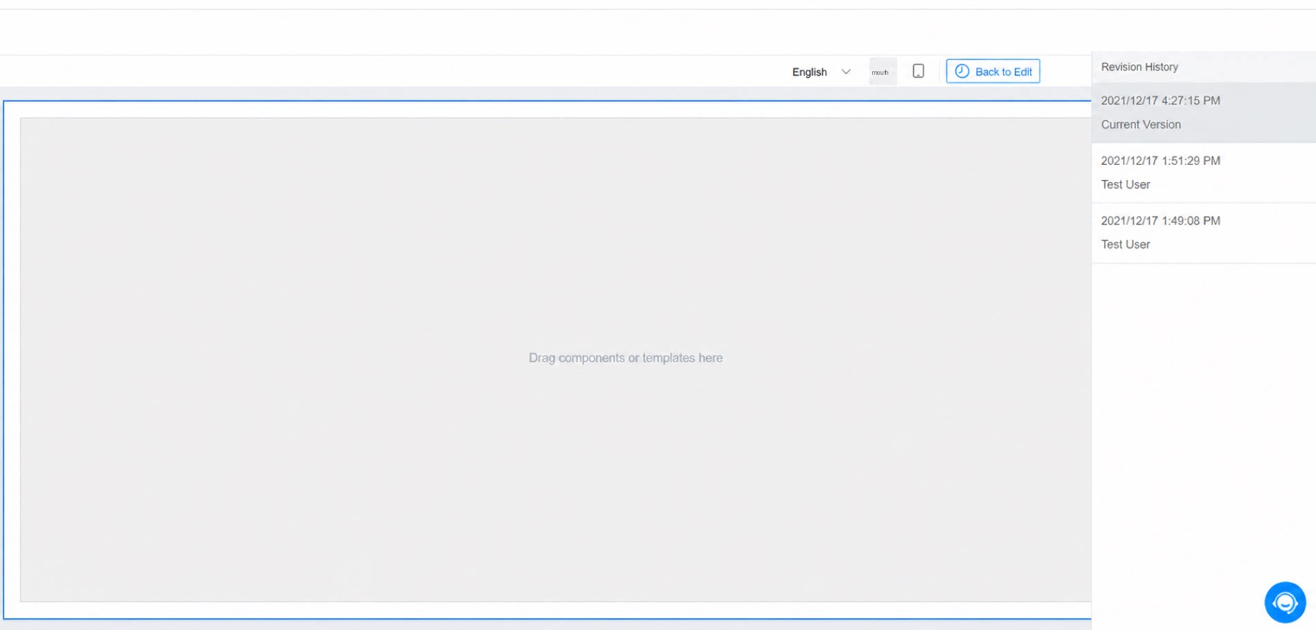
2.2 Left Sidebar
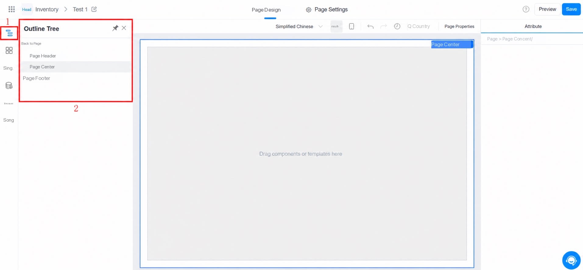
2.2.1 Outline Tree
The Outline tree provides a clearer view of the page Layout. You can also use it to drag or delete components in bulk.- Double-click a node in the Outline tree to rename it, which helps you distinguish multiple components of the same type.
- Click the pin icon in the upper-right corner to pin the Outline tree panel to the left side.
- Hold CMD / CTRL to Multiselect nodes in the Outline tree.
2.2.2 Component Library
Drag components from the Component library onto the canvas or to a target position in the Outline tree.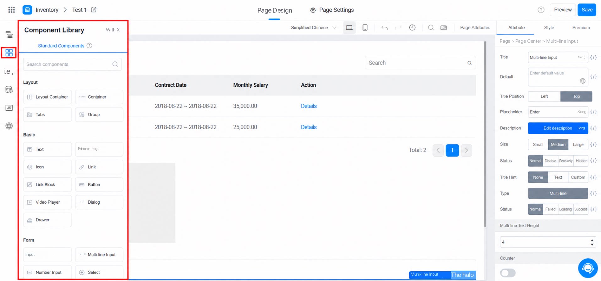
2.2.3 Block Templates
Block templates are designed to boost design efficiency. Using templates and blocks appropriately speeds up daily page design and enforces sound design patterns. For details, see Block templates.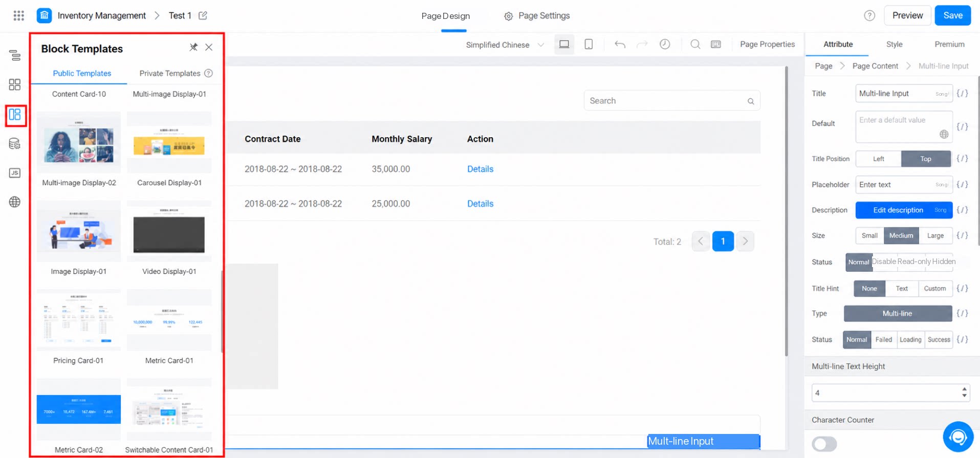
2.2.4 Data Source
A Data Source declares a local variable or a remote variable that can be used to dynamically display Data.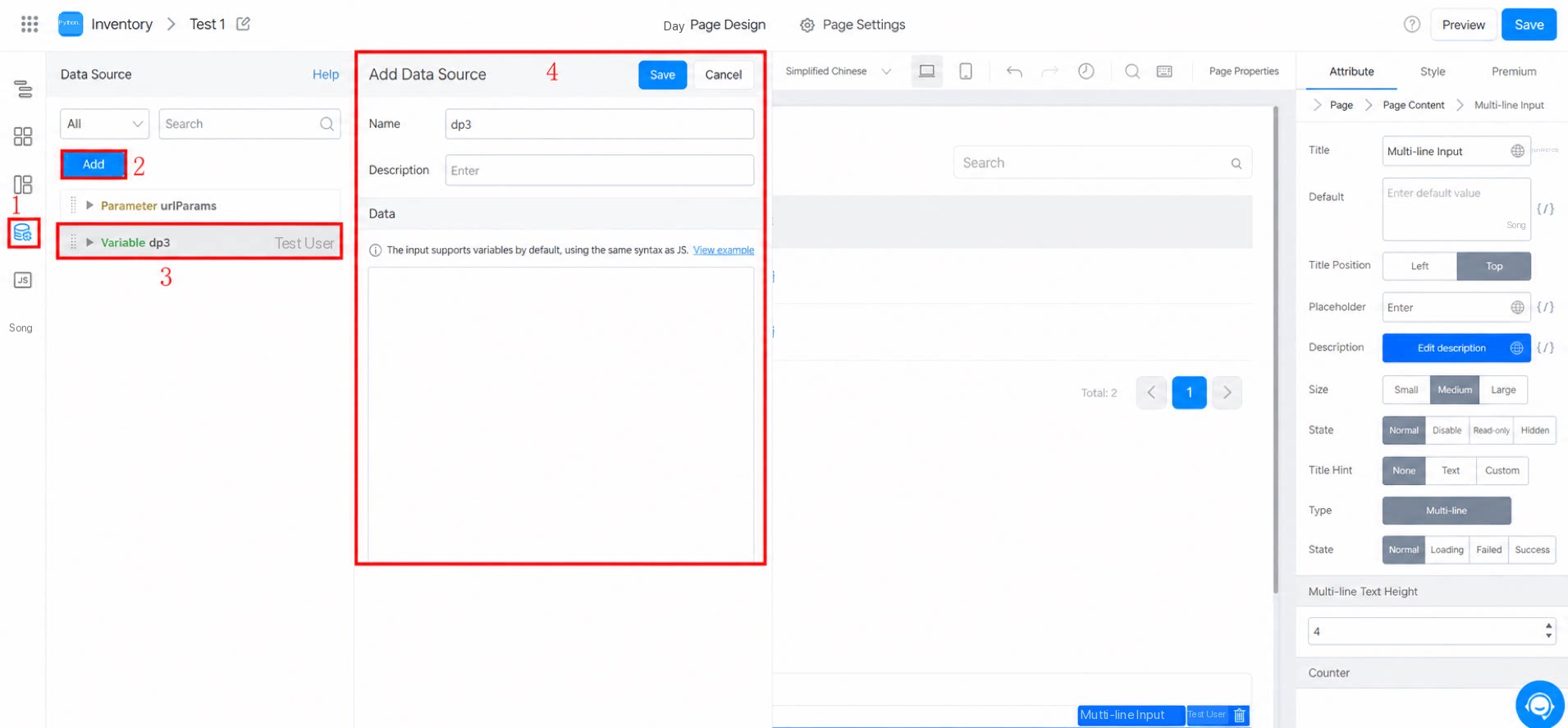
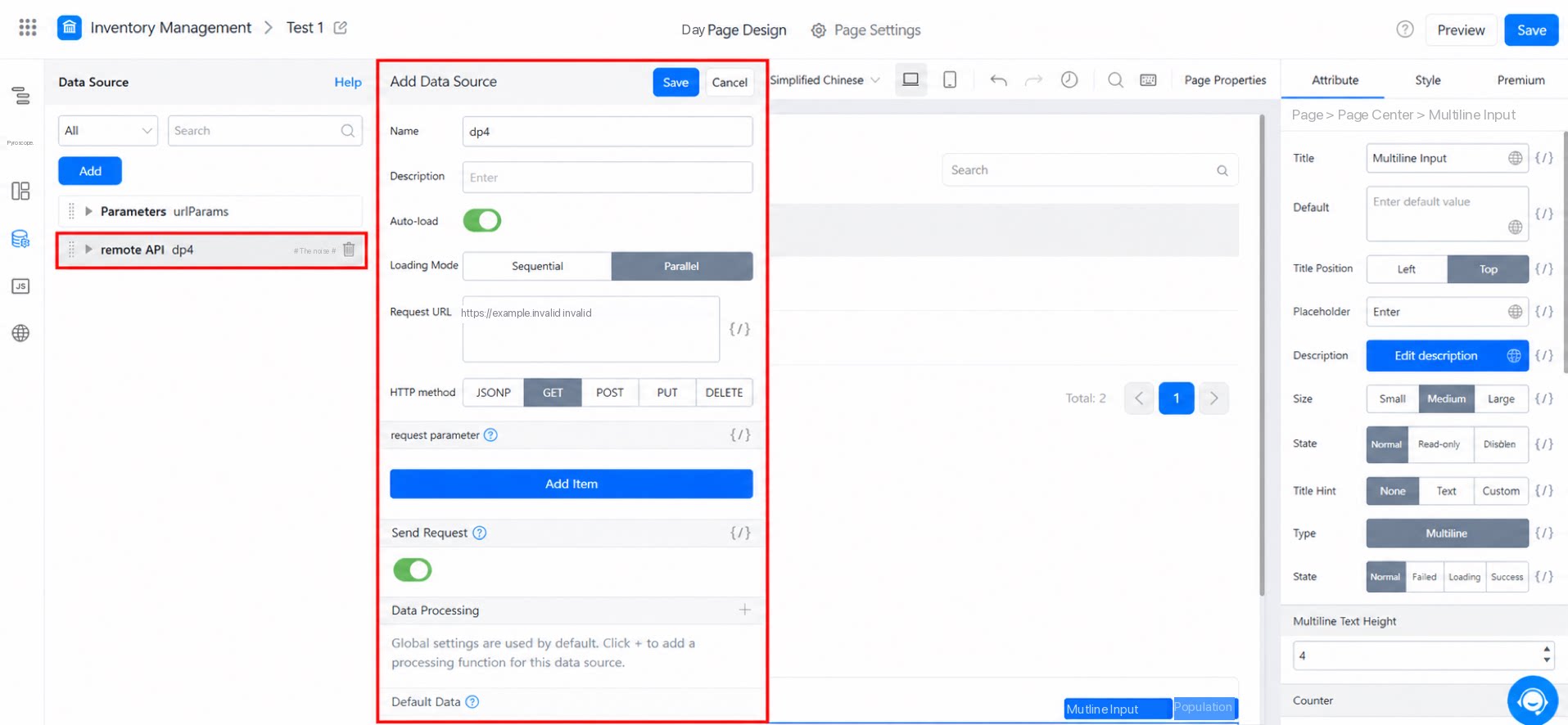
2.2.5 Action Panel
Use the Action panel to write JavaScript code for more customized requirements. For details, see Action panel.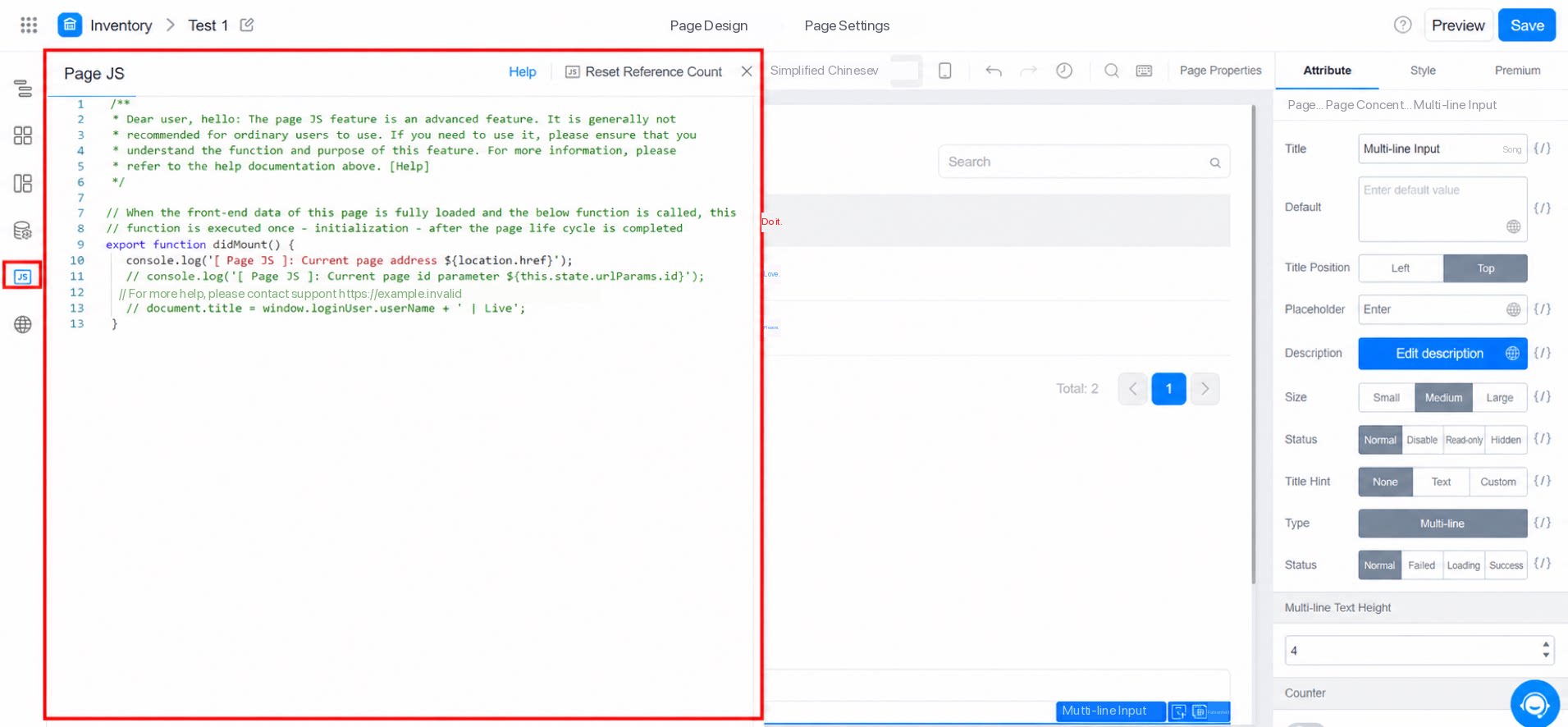
2.2.6 Internationalization Panel
Use the internationalization panel to manage multilingual copy. You can bind component properties to multilingual data in the property configuration panel. For details, see Internationalization panel.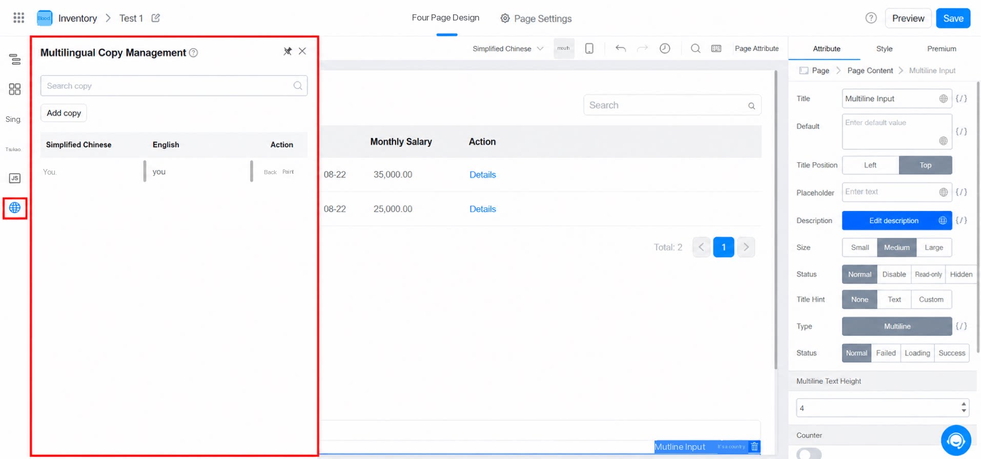
2.3 Middle Canvas
The canvas is where you arrange and Configure components to build a Page. Drag components on the canvas by following the cursor hints to lay out the page, and copy or delete components as needed. Watch the following Video for details.2.4 Right Property Configuration Panel
2.4.1 Attribute Settings
The Attribute settings panel is used to Configure the common properties of a Component. Changes take effect in real time on the canvas. Note that the results of action bindings or variable bindings must be verified in the Preview environment.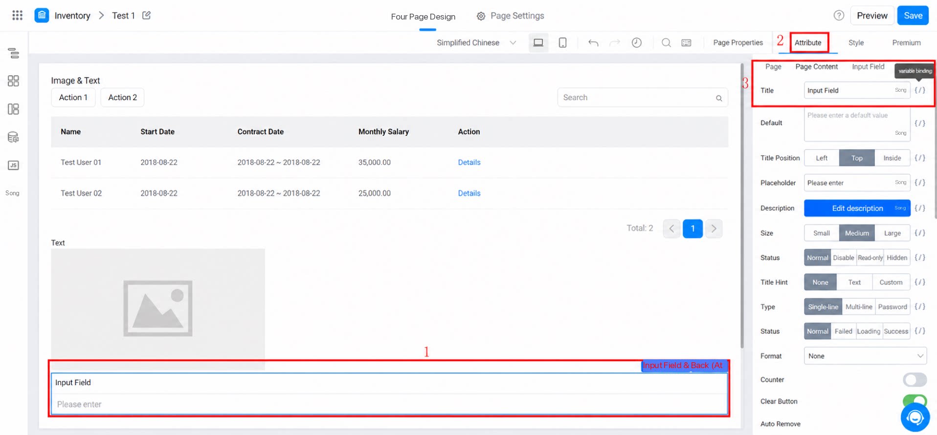
2.4.2 Style Settings Panel
The YiDA designer provides style configuration for certain components, such as the image-and-text display Component. For more style options, see Style settings.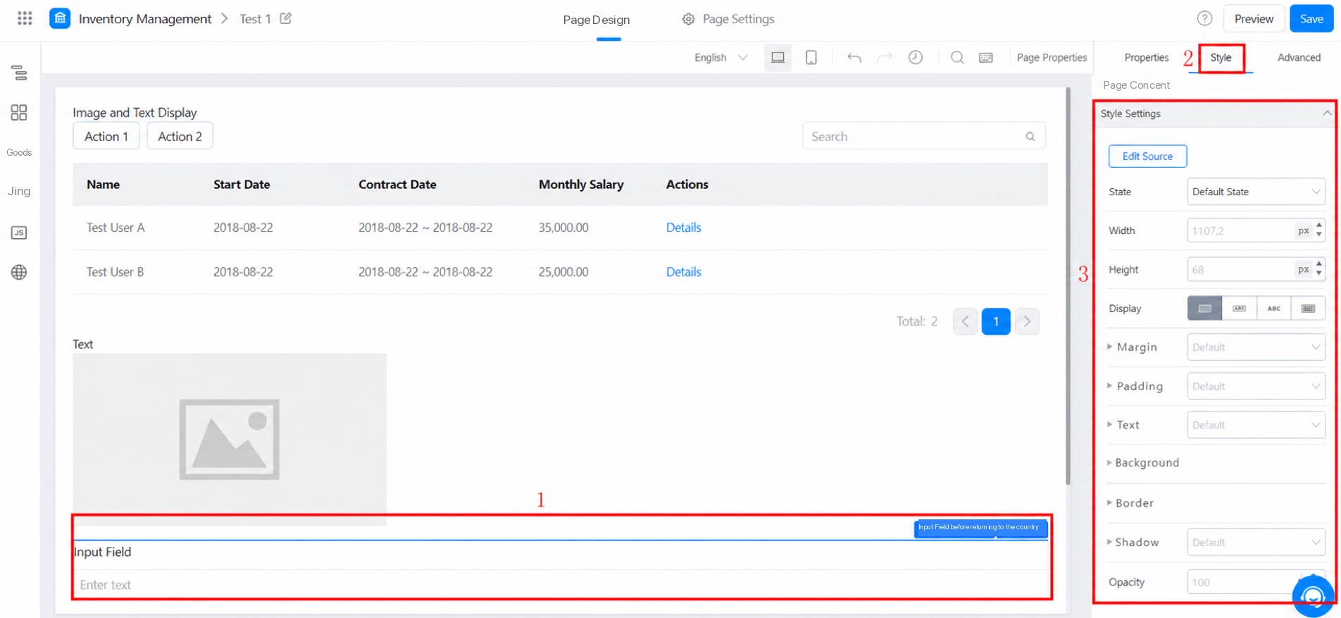
2.4.3 Premium
The Premium section is used to configure the customized needs of a Component.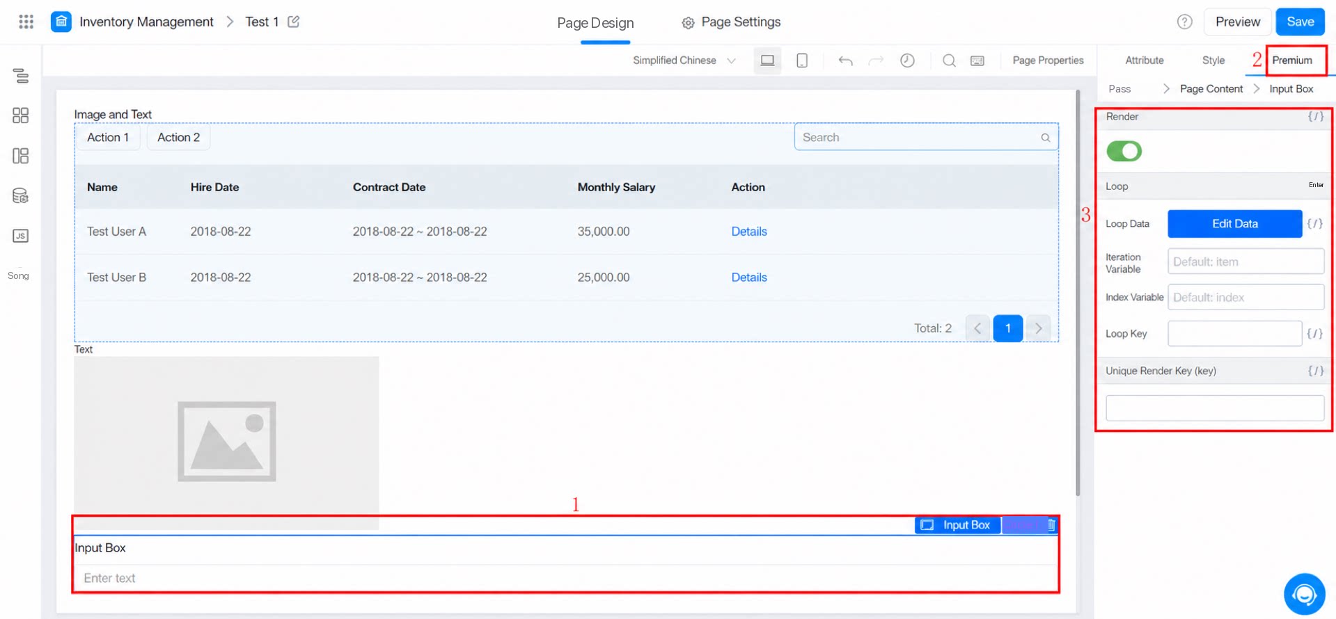
- For Render condition, see the introduction to conditional rendering.
- For Loop, see the introduction to loop rendering.
- For Render unique key, see the introduction to the render unique key.
3. FAQ
Q: In a custom page, can a detail component associate subform content from multiple forms and then paginate the subform content?
Q: In a custom page, can a detail component associate subform content from multiple forms and then paginate the subform content?
The detail component does not currently support pagination.As a workaround, use Container Component > Premium > Loop rendering together with the pagination component on the custom page to achieve data loop iteration plus pagination.
Q: Is there a limit on Page permissions groups within an app? How many permission groups can be configured at most?
Q: Is there a limit on Page permissions groups within an app? How many permission groups can be configured at most?
Except for workflow forms and regular forms, other pages support up to 100 permission groups. Workflow forms and regular forms each support up to 100 submission permission groups and 100 View Permission groups.