

 Chats
Chats Calendar
 Meetings
 Contacts
 Mail
Mail Docs
Docs Drive
Drive AI Table
 AI Minutes
 Attendance
 Approval
 YiDA
YiDA Admin Console
In grayscale release
1. Introduction
1.1 Feature Overview
Custom navigation lets organizations build personalized navigation structures tailored to different apps, so users can locate the apps, pages, or links they need more quickly and easily.1.2 Use Cases
- Custom layout: App Admins can freely adjust the tier, order, and content of navigation menus based on business needs, ensuring that the most frequently used options are always prominently placed.
- Higher satisfaction: Personalized navigation helps users find the information or features they need more efficiently, improving overall satisfaction with the system.
2. Steps
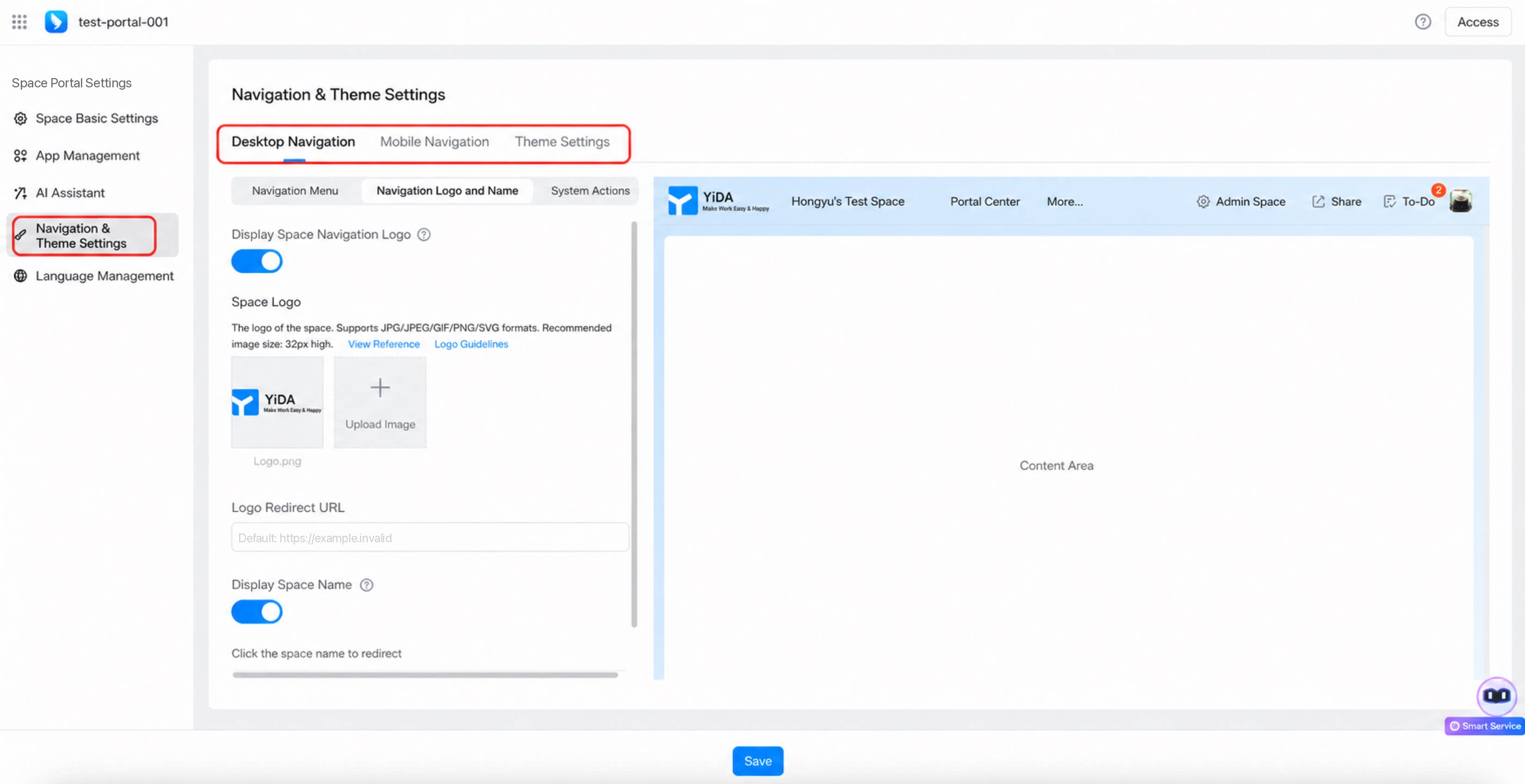
Custom space navigation currently supports desktop navigation, mobile navigation, and theme settings.2.1 Entry Point
1
Step 1
Sign in to the YiDA Workbench as an App Admin.
2
Step 2
Click Platform Management in the upper-right corner to open the platform management page. 
3
Step 3
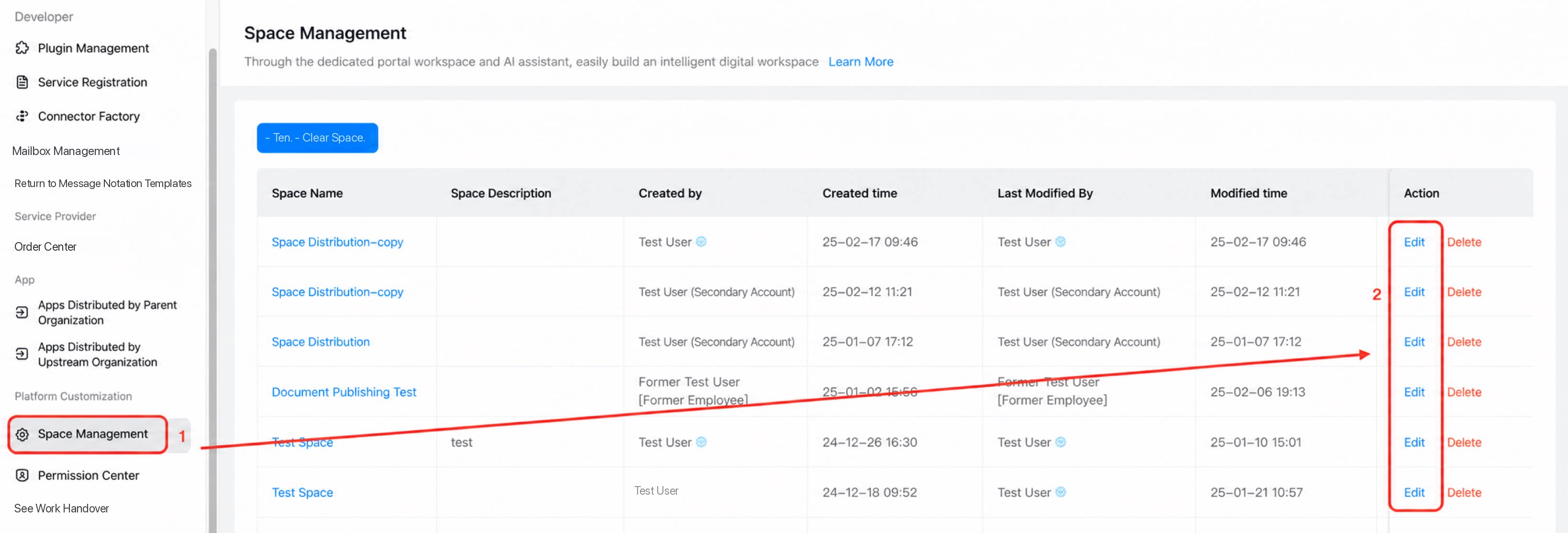
In the left-hand menu, go to Platform Dedicated Customization > Space Management, select the space you want to edit, and click Edit.
- Select Navigation & Theme.
2.2 Desktop Navigation Configuration
Desktop navigation settings are divided into three areas: navigation menu, navigation logo and name, and system actions.1. Navigation Menu Area
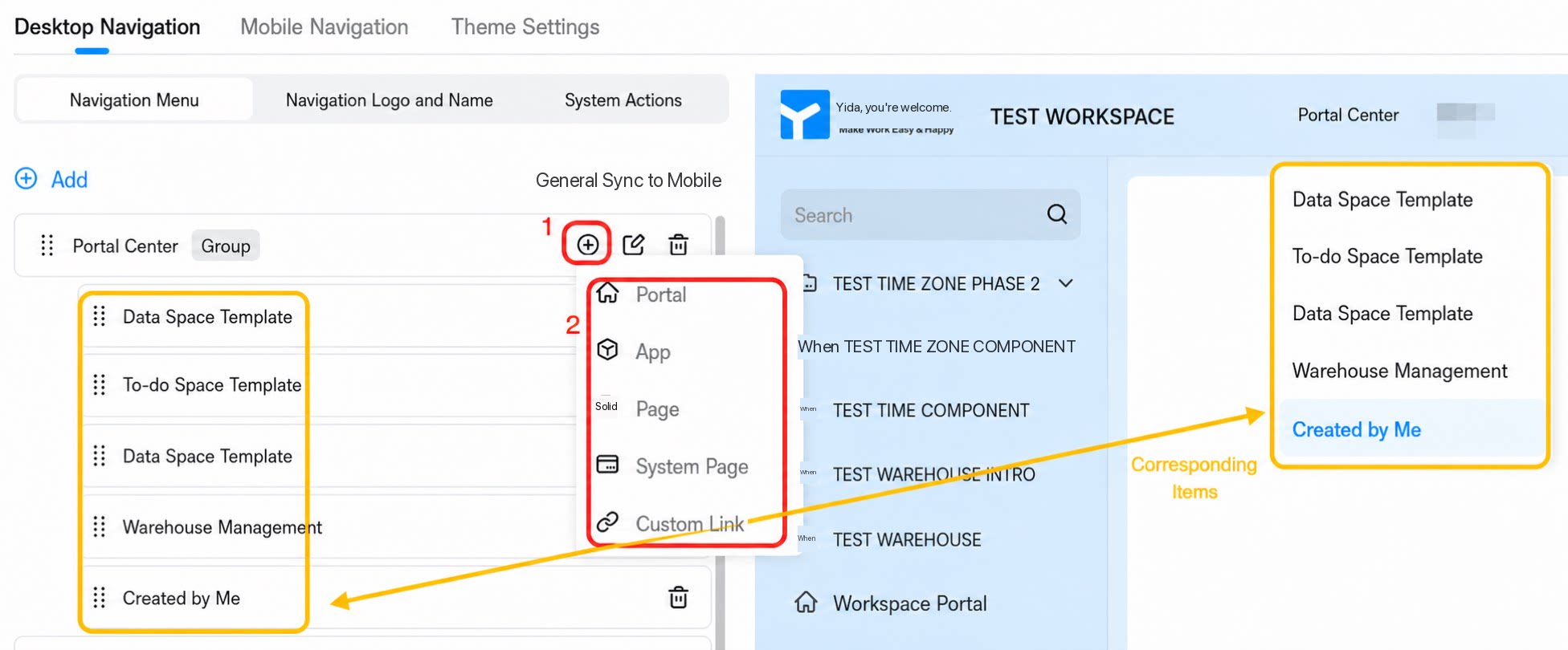
- Click Add, then select a content type. The navigation menu area currently supports 6 content types (portal, app, page, system page, custom link, and page group), with a maximum of 50 tabs.
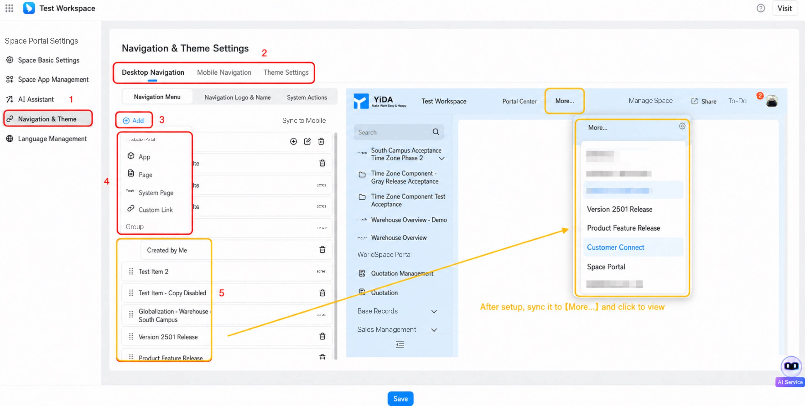
- The available content types and their corresponding options are shown in the table below:
| Content type | Illustration | Configuration |
|---|---|---|
| Portal | 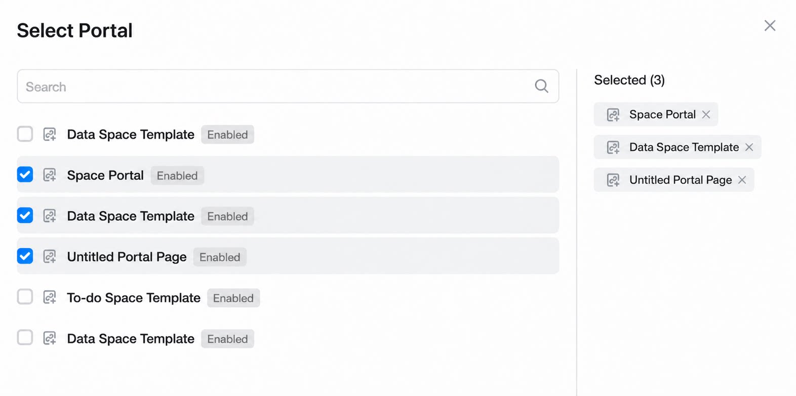 | • Portals in the current space |
| App | 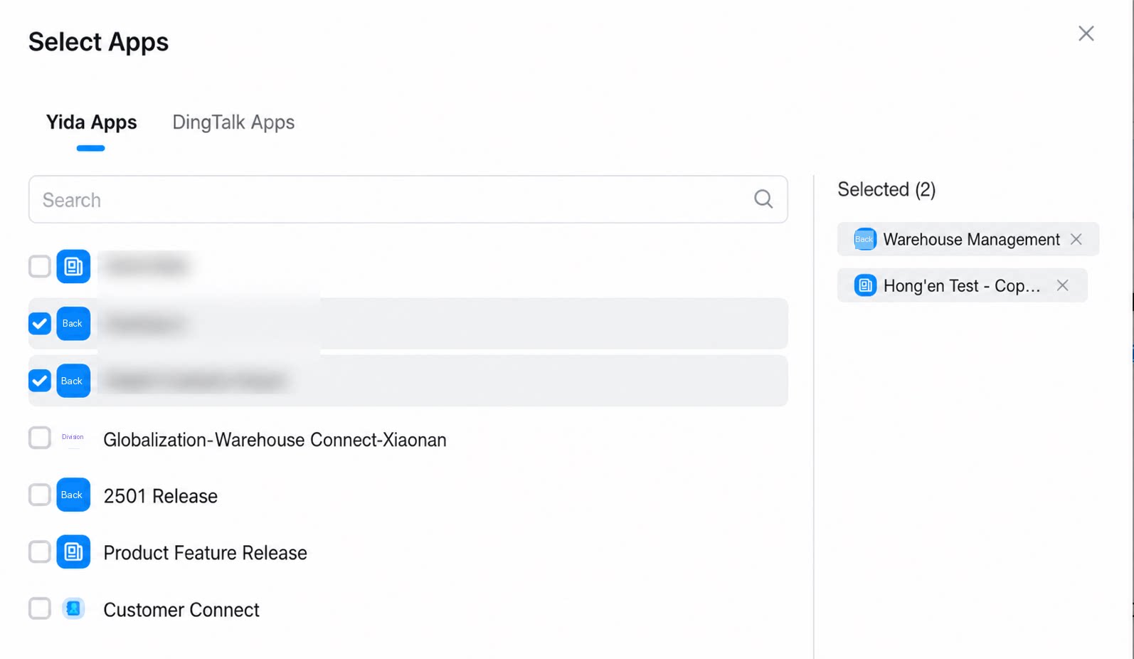 | • YiDA apps • DingTalk apps |
| Page | 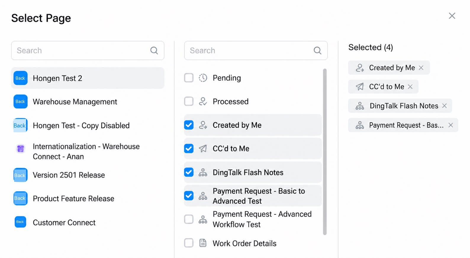 | Specific pages within a YiDA app |
| System page | 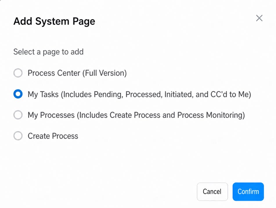 | • Process Center (full version) • My Tasks (including To Handle, Handled, Initiated by Me, and CC’d to Me) • My Processes (including process creation, process monitoring, and more) • Create Process |
| Custom link | 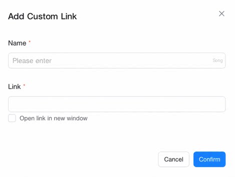 | Configure the name and URL of the custom link. The link always opens in a new window. |
| Group | 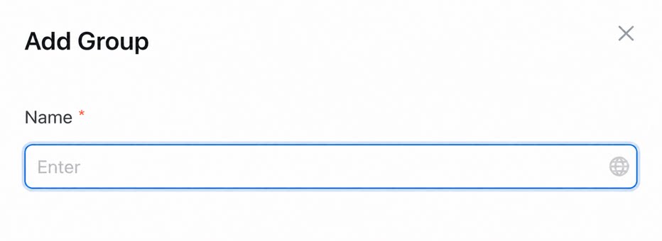 | Group name. |
- Click Confirm to add the new navigation menu item. The top-expanded style is supported, leaving room for future tier extensions.
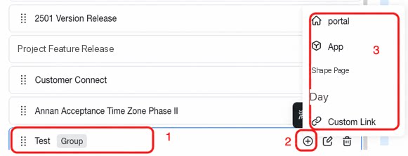
- Click the button
 on each row

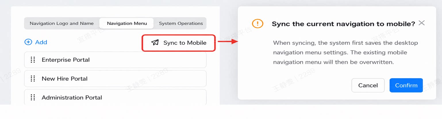
- Click Sync to Mobile to save the current desktop navigation and sync it to mobile.
2. Navigation Logo and Name Area
Use this area to configure the navigation logo and name. For example: Detailed descriptions of each option are shown below:| Illustration | Option name | Description |
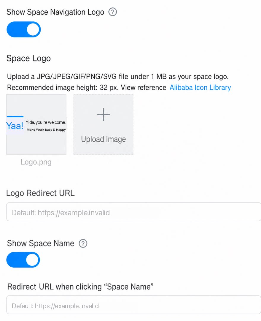 | Show space navigation logo | Can be turned on or off. |
| Space logo | Upload a jpg/jpeg/gif/png/svg file up to 1 MB as your space logo. A height of 32 pixels is recommended. | |
| Logo redirect URL | Has a default value. | |
| Show space name | Can be turned on or off. | |
| Redirect URL when clicking the space name | Has a default value. |
3. System Actions Area
- In the system actions area, you can configure the buttons displayed in the upper-right corner, including the visibility and appearance of the Share, To-Do, and Profile Photo buttons, as shown below:
2.3 Mobile Navigation Configuration
1. Configure the Navigation Menu
- First-tier navigation style: choose either Bottom navigation or Top navigation.
- Both bottom and top navigation styles are supported, with up to 2 tiers.
- Supports 7 content types (portal, app, page, system page, custom link, space AI Assistant, and page group), with a maximum of 50 tabs.
- When there are more than 5 tabs, the extra items are collapsed into “More”.
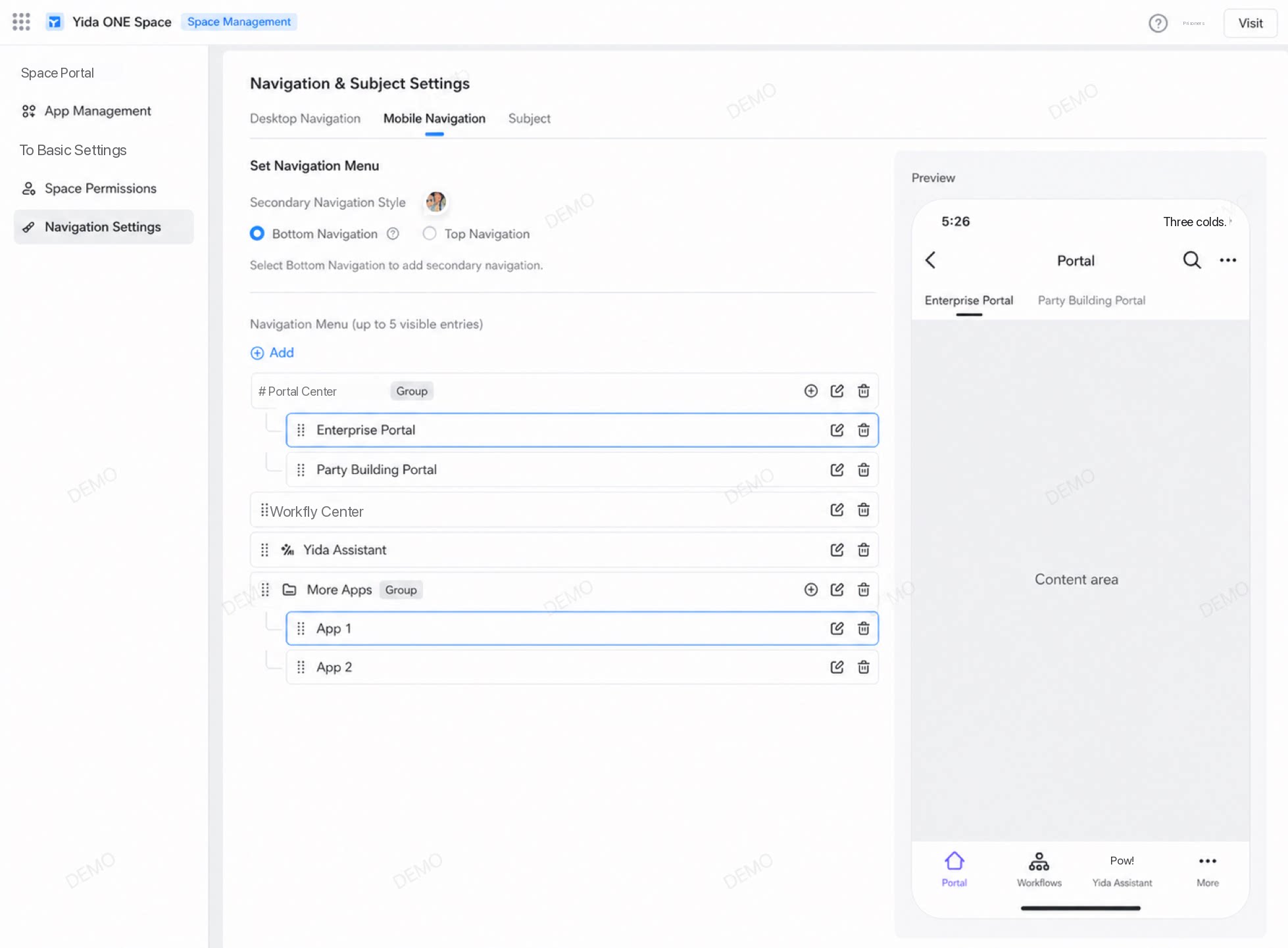
2. Content Types Available on Mobile
| Content type | Illustration | Configuration |
|---|---|---|
| Portal | 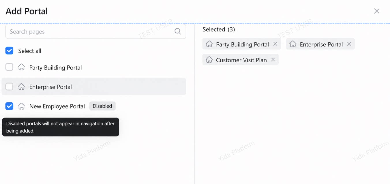 | • Portals in the current space |
| App | 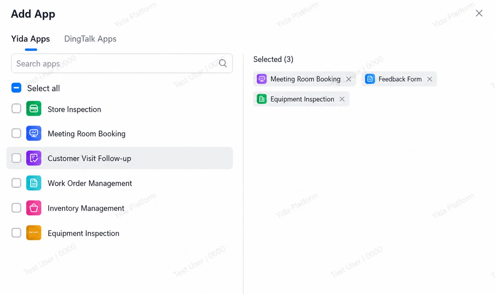 | • YiDA apps • DingTalk apps |
| Page | 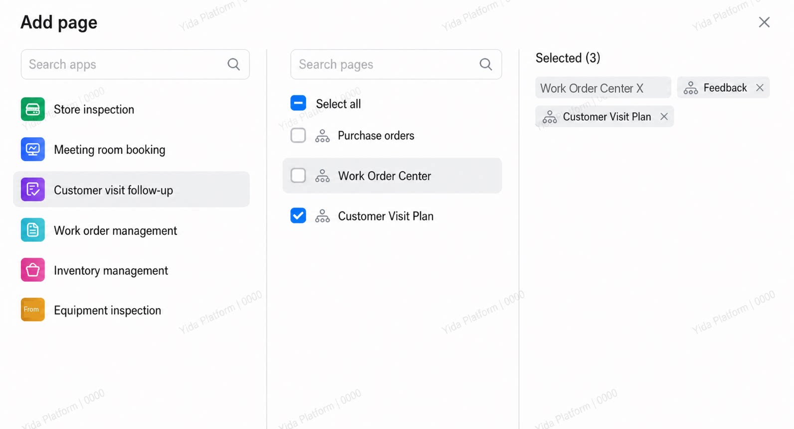 | Specific pages within a YiDA app |
| System page | | • Process Center (full version) • My Tasks (with 4 tabs, including Created by Me, and more) • My Processes (including process creation, process monitoring, and more) • Create Process |
| Space AI Assistant | / | Requires configuration; only one AI Assistant can be configured per navigation. |
| Custom link | 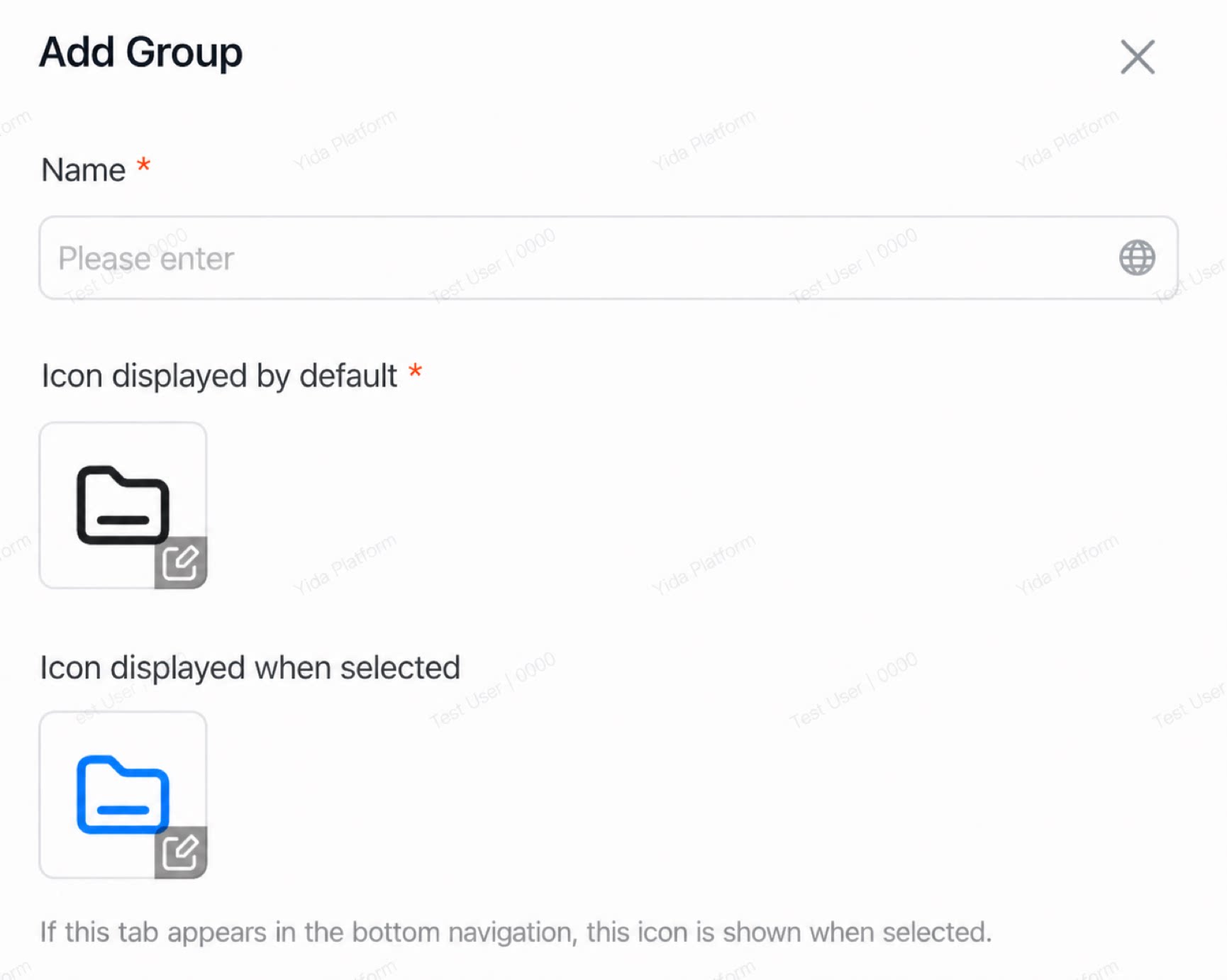 | Name, URL, and icon of the custom link. |
| Group | 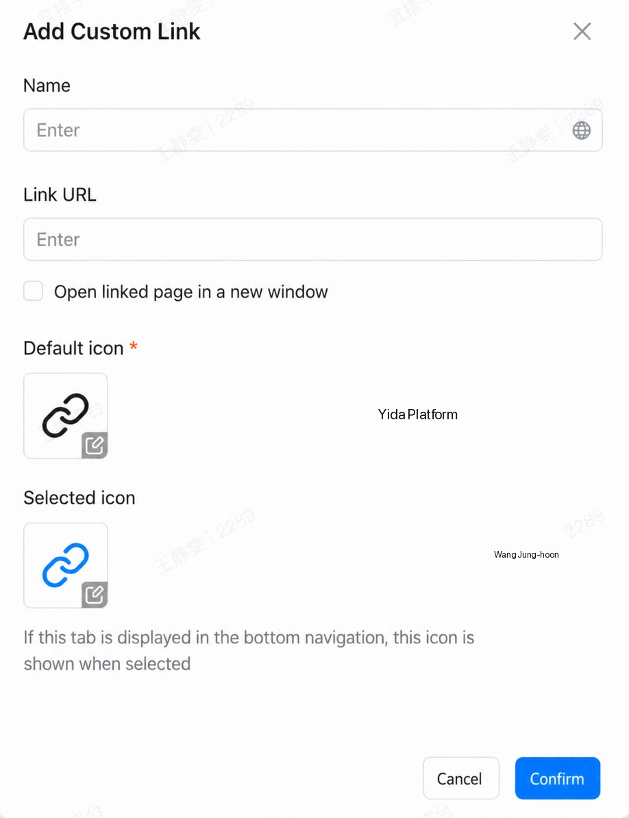 | Group name and icon. When using Add Sublevel within a group, you can select any of the 5 content types above. |
2.4 Theme Settings
Detailed descriptions of each option are shown below:| Option name | Description |
| Theme color | 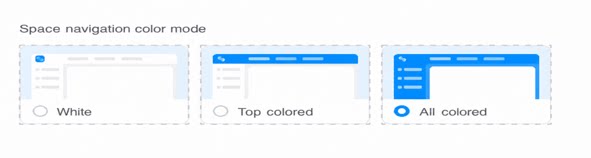 |
| Space navigation color mode | |
| Page background color | Keep original page background Example: In the portal designer, the background color is set to light blue, as shown on the left; the portal background in the space matches the setting in the designer, as shown on the right. Unified gray Example: In the portal designer, the background color is set to light blue, as shown on the left; the portal background in the space changes to gray, as shown on the right. Unified transparent Example: In the portal designer, the background color is set to light blue, as shown on the left; the portal background in the space becomes transparent and shows the space background, as shown on the right. 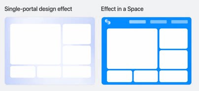 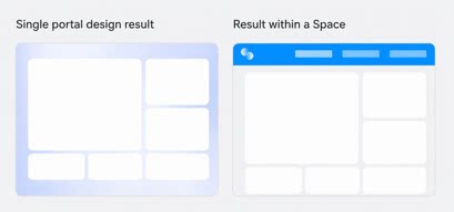 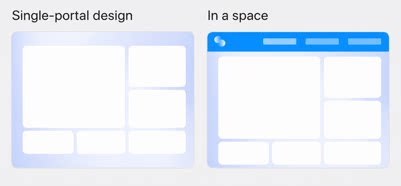 |
| Portal theme color | 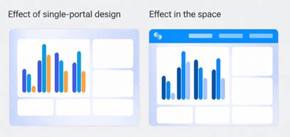 Keep original portal theme color Keep original portal theme colorExample: The theme color for icons, entries, and other elements is configured in the portal designer, as shown on the left; the original portal color scheme is retained in the space, as shown on the right. Follow space theme color Example: The theme color for icons, entries, and other elements is configured in the portal designer, as shown on the left; the space theme color is applied uniformly in the space, as shown on the right. 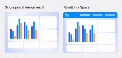 |