1. Overview

Quickly upload image and text summaries to display as announcements.

2. Entry Point

Select any app → Edit portal → Announcement board component

3. Configuration Steps

Configure the following attributes to adjust the final component behavior. After adding the Announcement board component to the portal, you can:

3.1 Switch Component Style

Click Switch appearance style to change the component style as needed. Four display styles are currently supported.

3.2 Adjust the Title Bar

Control whether to Show title, change the Title name, set Help tips, and control whether to enable the View more option. When enabled, set the redirect URL for View more.


3.3 Configure Content

3.3.1 Configure the Announcement Data Source

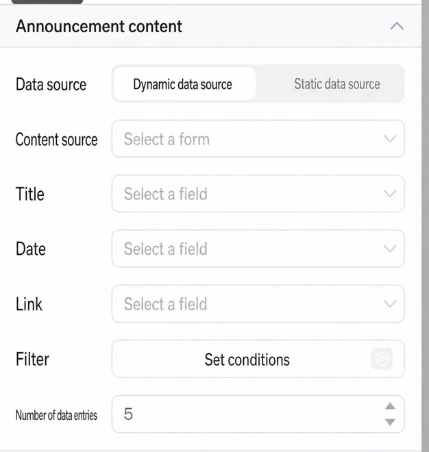
Configure the data source of the announcement. Two data source types are supported: dynamic and static.
Dynamic data source
  • Content source: Select a form under an app.
  • Title: Map to a field in the associated source form, such as Name.
  • Date: Map to a field in the associated source form, such as Date.
  • Link: Map to a field in the associated source form, such as Link.
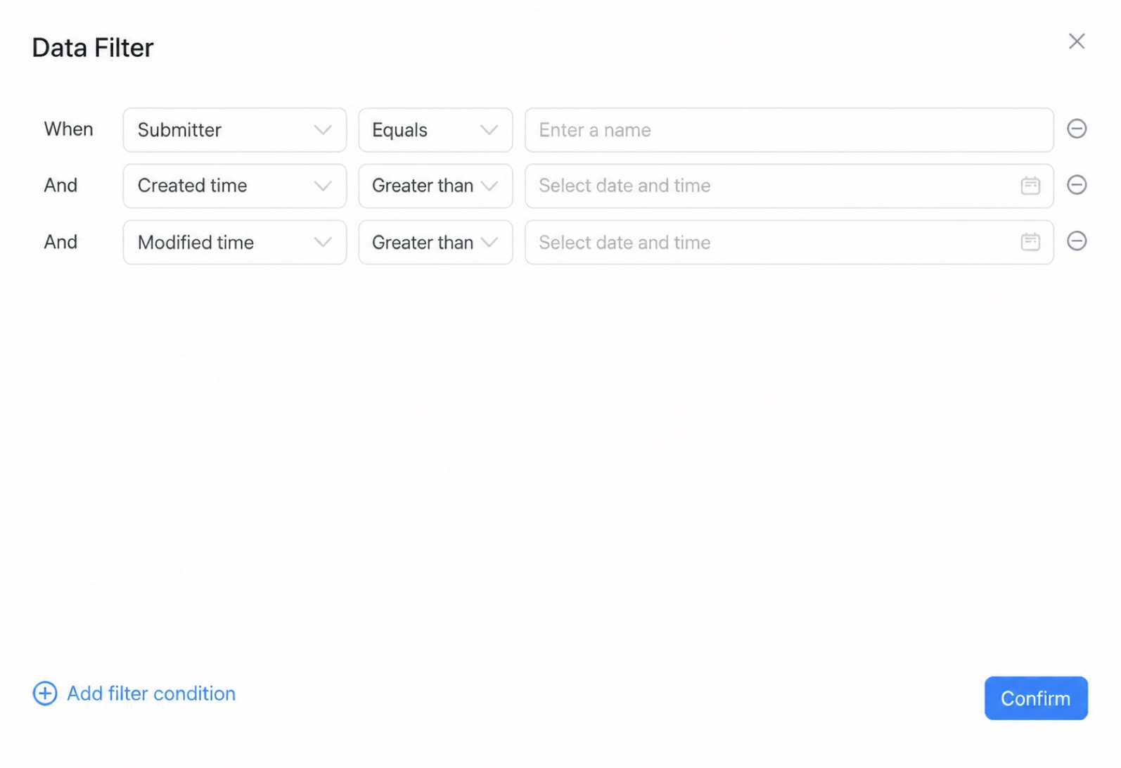
  • Filter: After selecting a form, set the data filter conditions for that form.
  • Data entries: Set the Data entries value to control the maximum number of announcements visible in real time. To view the full list, click More.
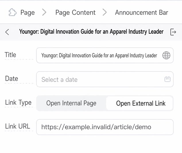
Static data source
  • Title: Customize the title name.
  • Date: Customize the date.
  • Link: Customize the link type. Supports opening an internal page or an external link.

3.3.2 Configure the Announcement Image

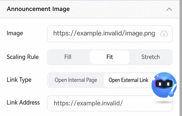
Announcement image
  • Image: Select an image.
  • Scaling rule: Supports Fill, Fit, and Stretch display modes.
  • Link: Customize the link type. Supports opening an internal page or an external link.