Chats
Chats Calendar
 Meetings
 Contacts
 Mail
Mail Docs
Docs Drive
Drive AI Table
 AI Minutes
 Attendance
 Approval
 YiDA
YiDA Admin Console
1. Introduction
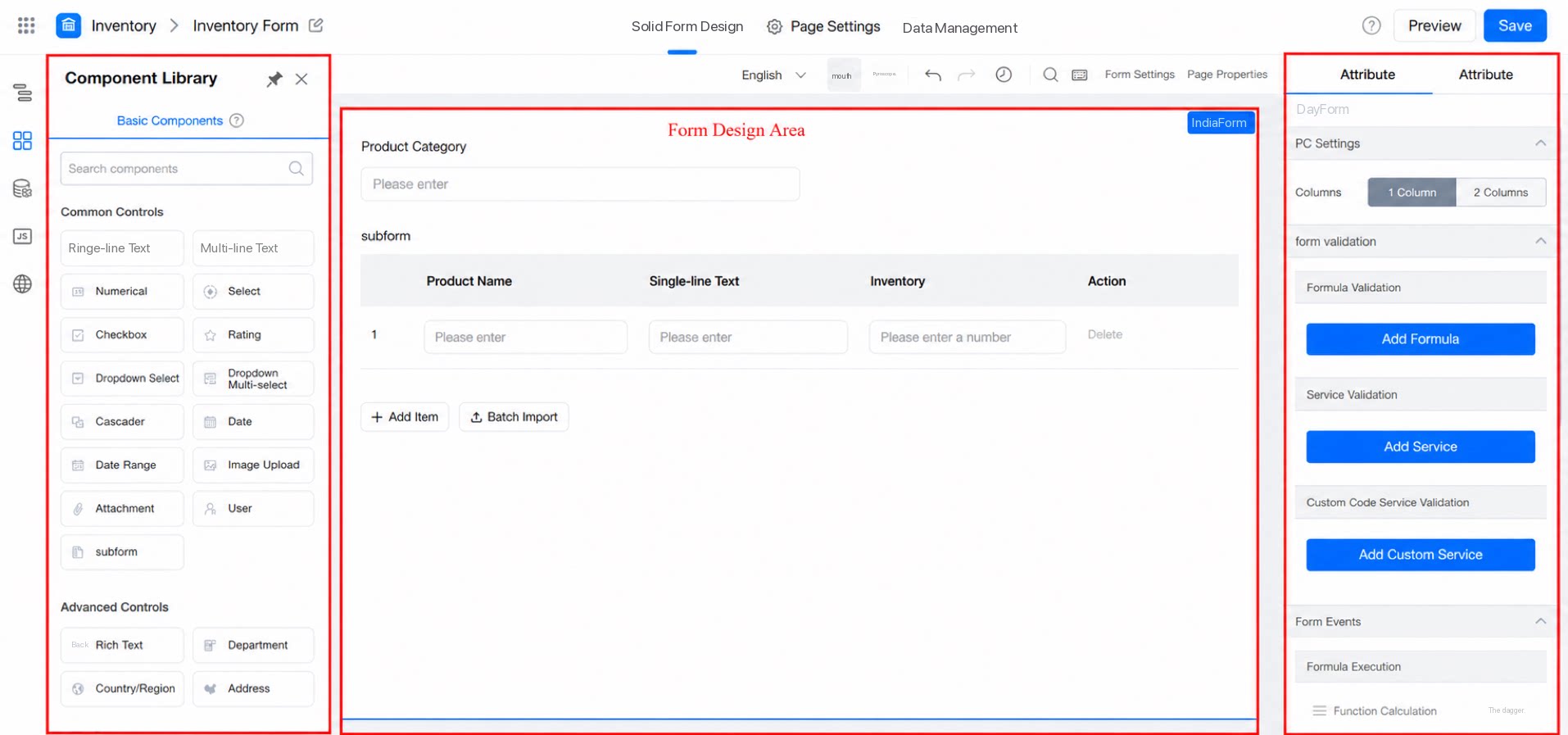
Drag a component from the left panel of the form to the center design area, then configure its basic settings on the right. Use these settings to personalize form components—for example, modify the Show field, adjust the form Layout, or change the form appearance. Path: Workbench >> YiDA >> My Apps >> Form >> click Edit in the upper right corner.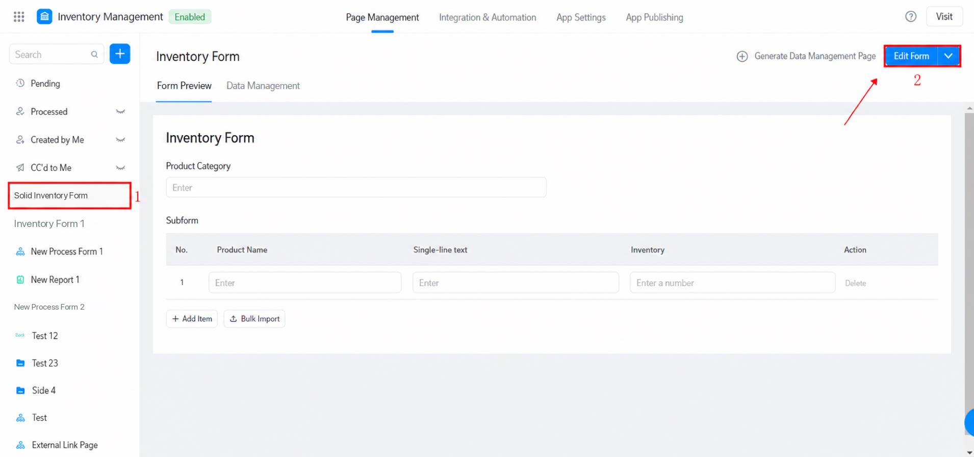
2. Attributes
Path: Select a component >> the Attribute and Premium settings appear on the right.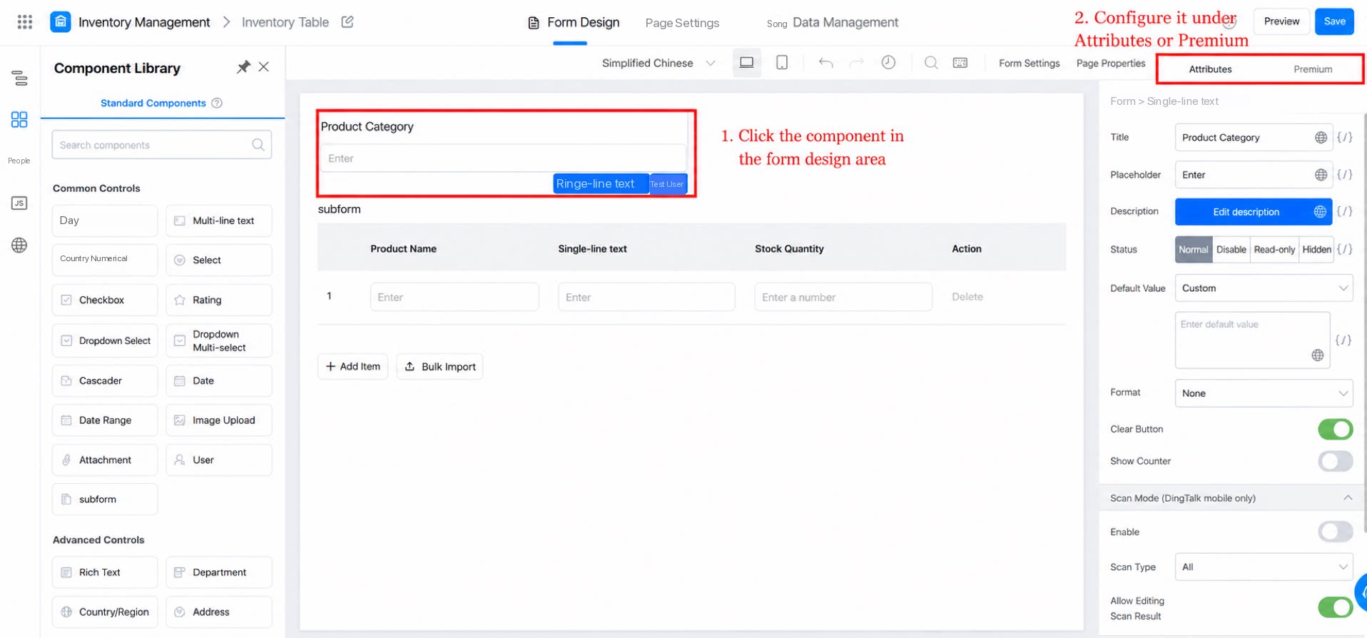
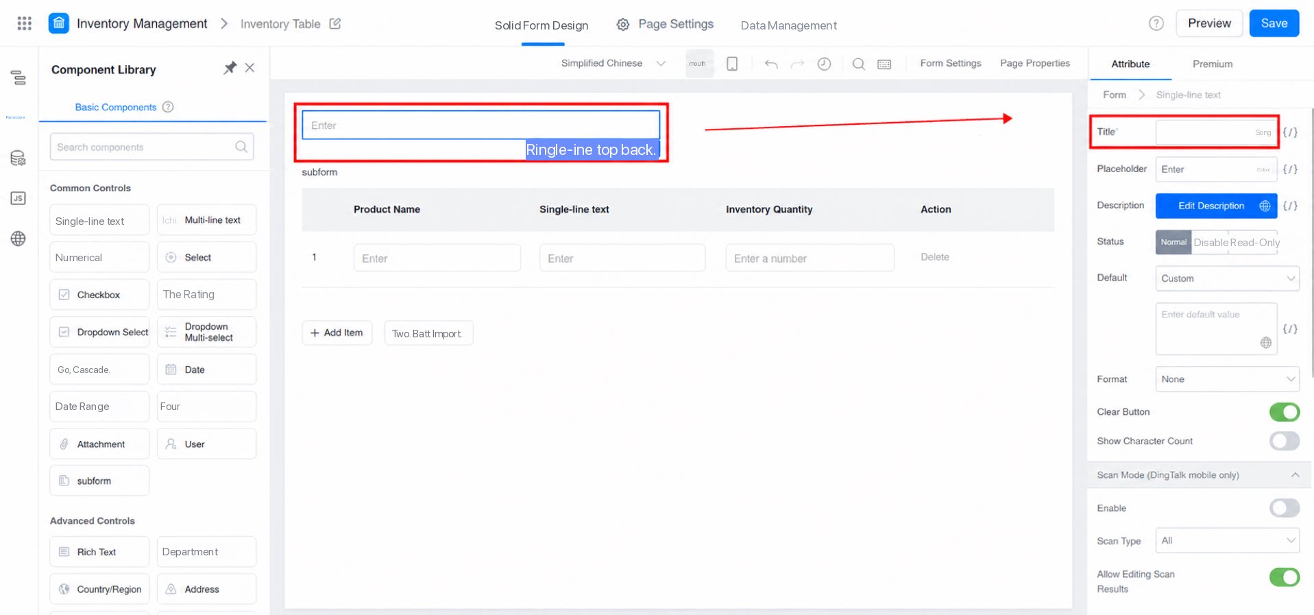
2.1 Title
This is the name of the component. By default, the title matches the component type name, and helps users identify what to fill in.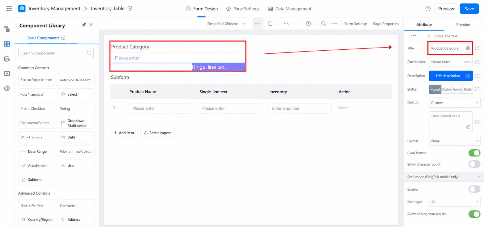
2.2 Placeholder Tip
The placeholder tip describes what content should be entered in the component. It is for guidance only and does not affect the field value. For example, “Enter the student’s name”: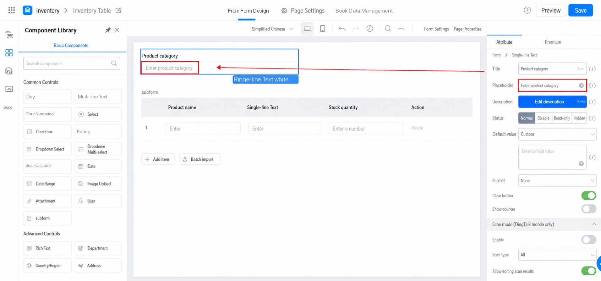
2.3 Description
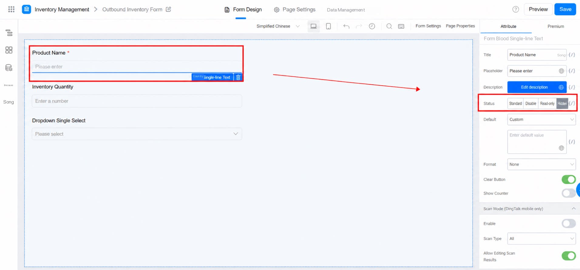
The description provides additional information about the component, and is often used to explain its function, scope, or filling instructions. You can enter Text or Insert Link.2.4 State
Set the default state of a field component. You can also control the state through permissions. For example: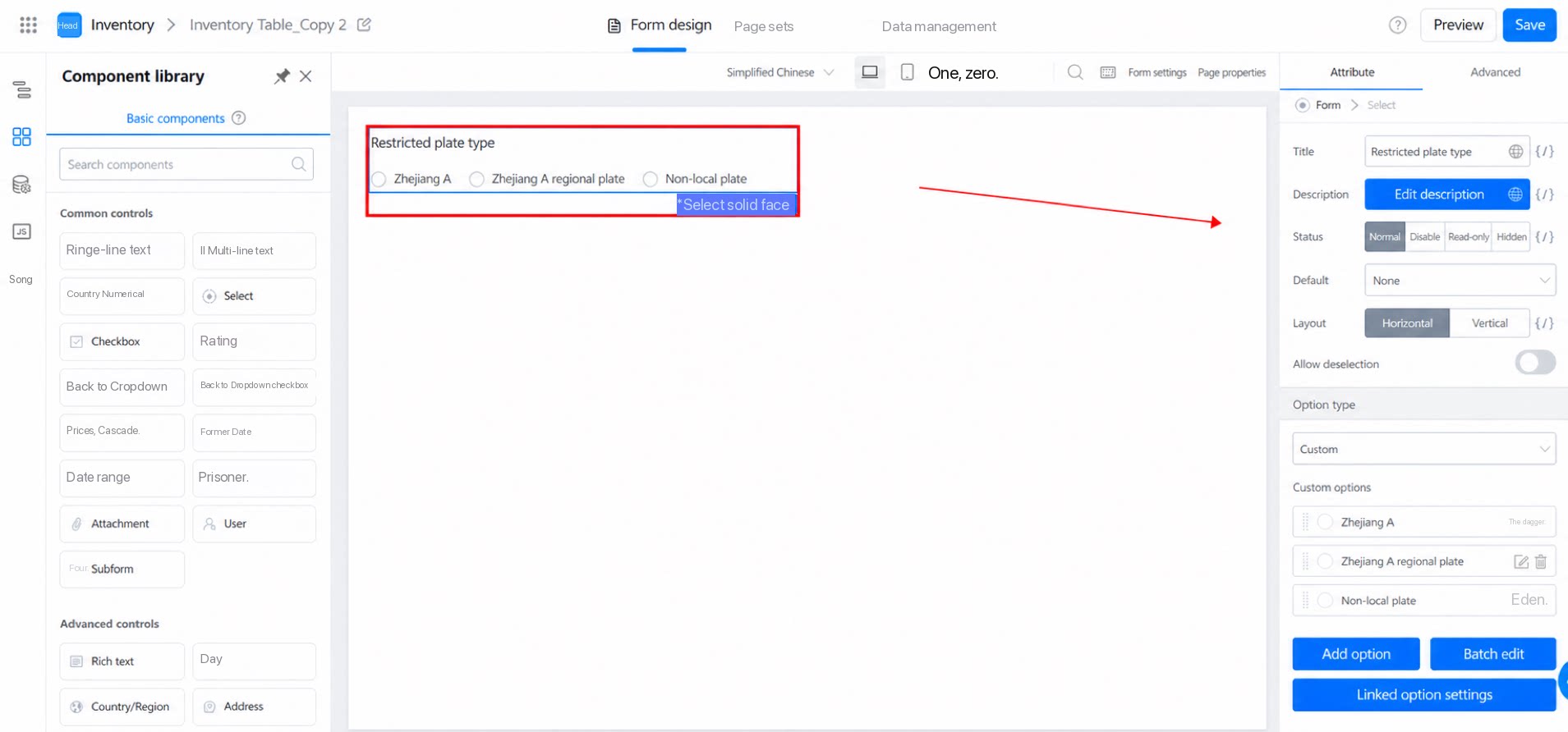
- Normal: Visible and editable.
- Disable: Visible but not editable. Unlike Read-only, the field attributes are still shown.
- Read-only: Visible but not editable.
- Hidden: The field is invisible and not editable.
2.5 Default
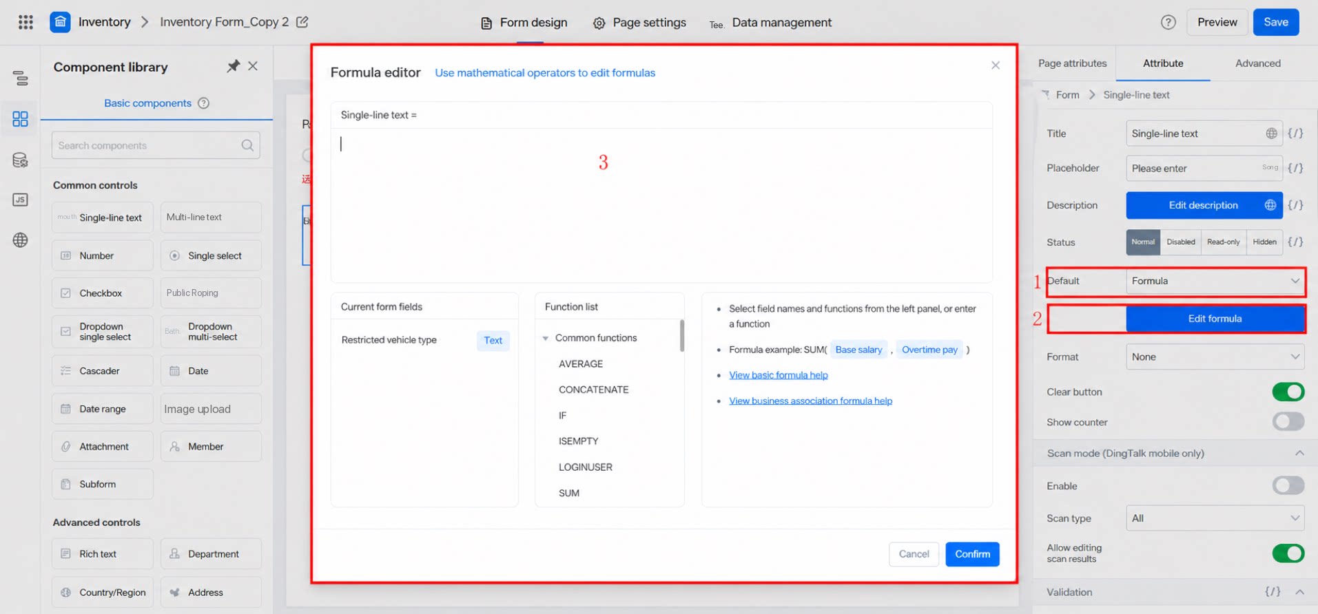
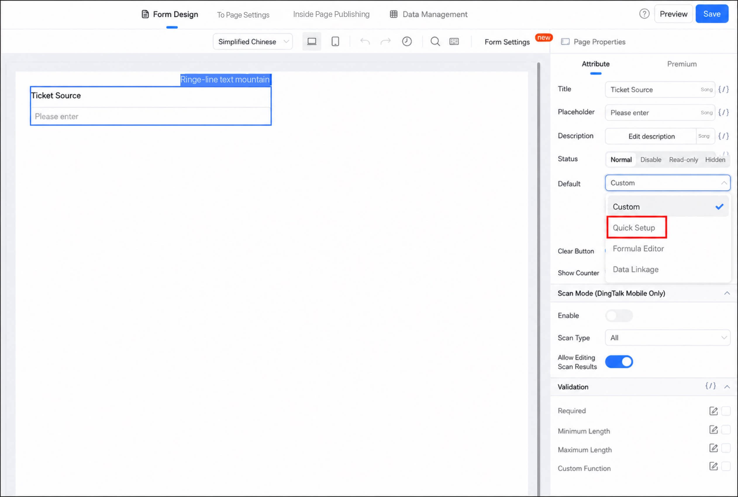
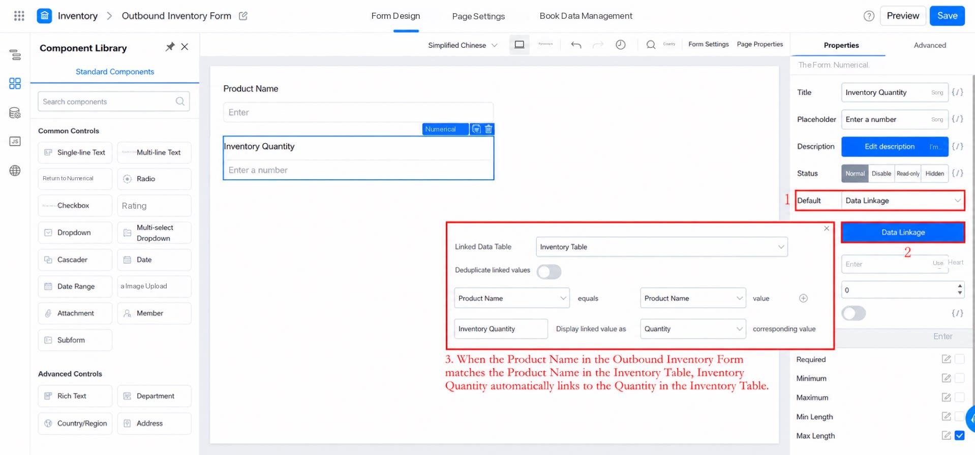
The Default value is the value the field takes when a user opens the form. For some components, you can set Custom, Quick configuration, Formula, data linkage, association with other form data, gateway data, or Search Data Source.- Custom: Set a fixed value. Users can still delete this value and enter new data when filling out the form.
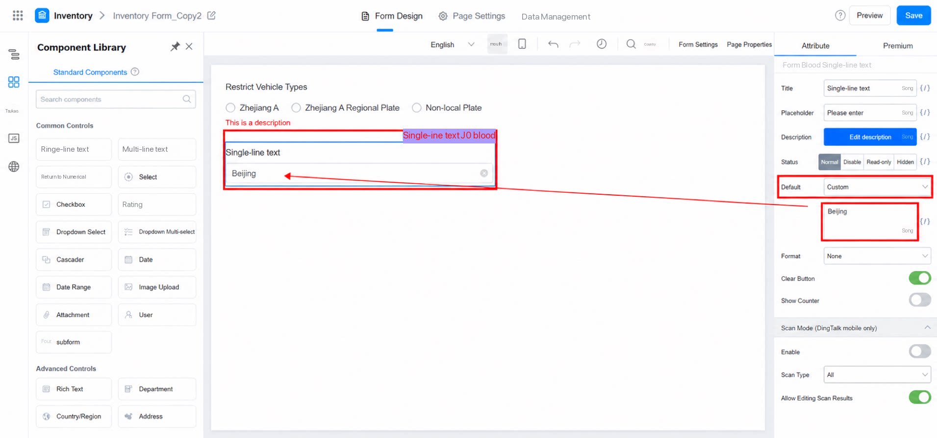
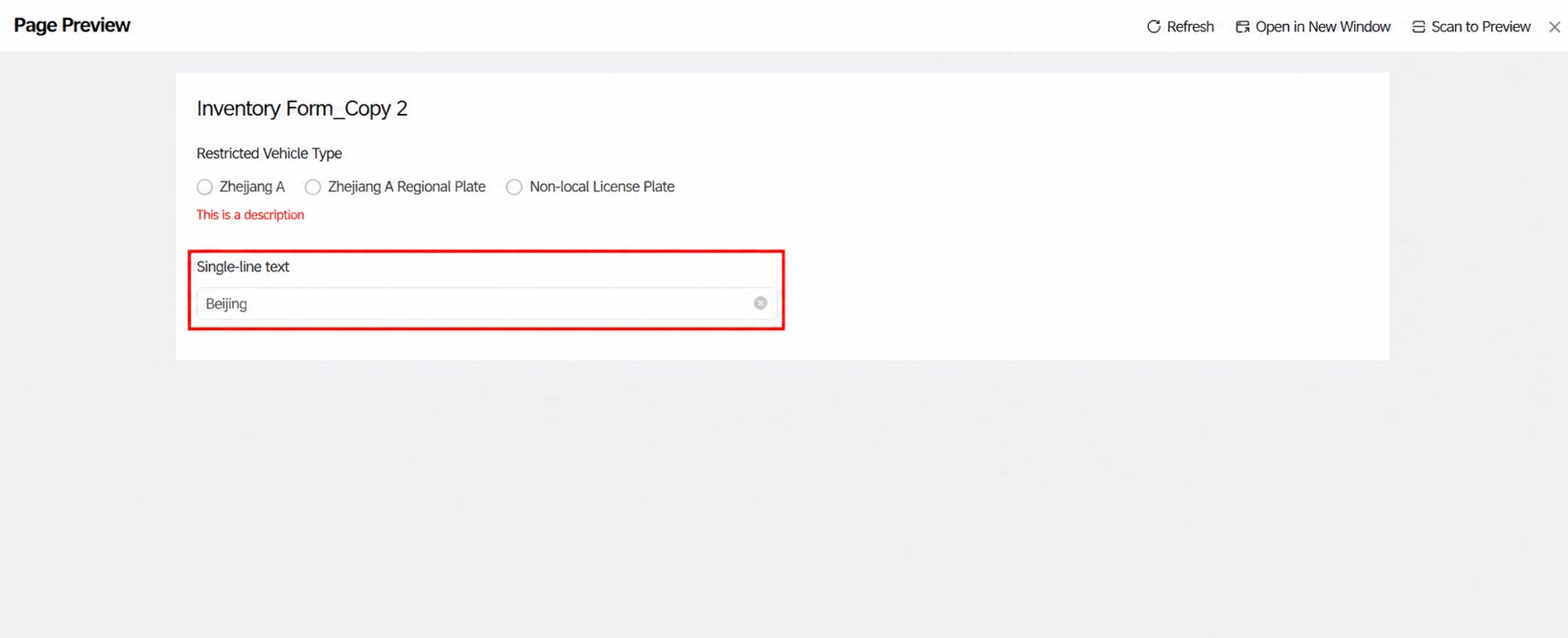
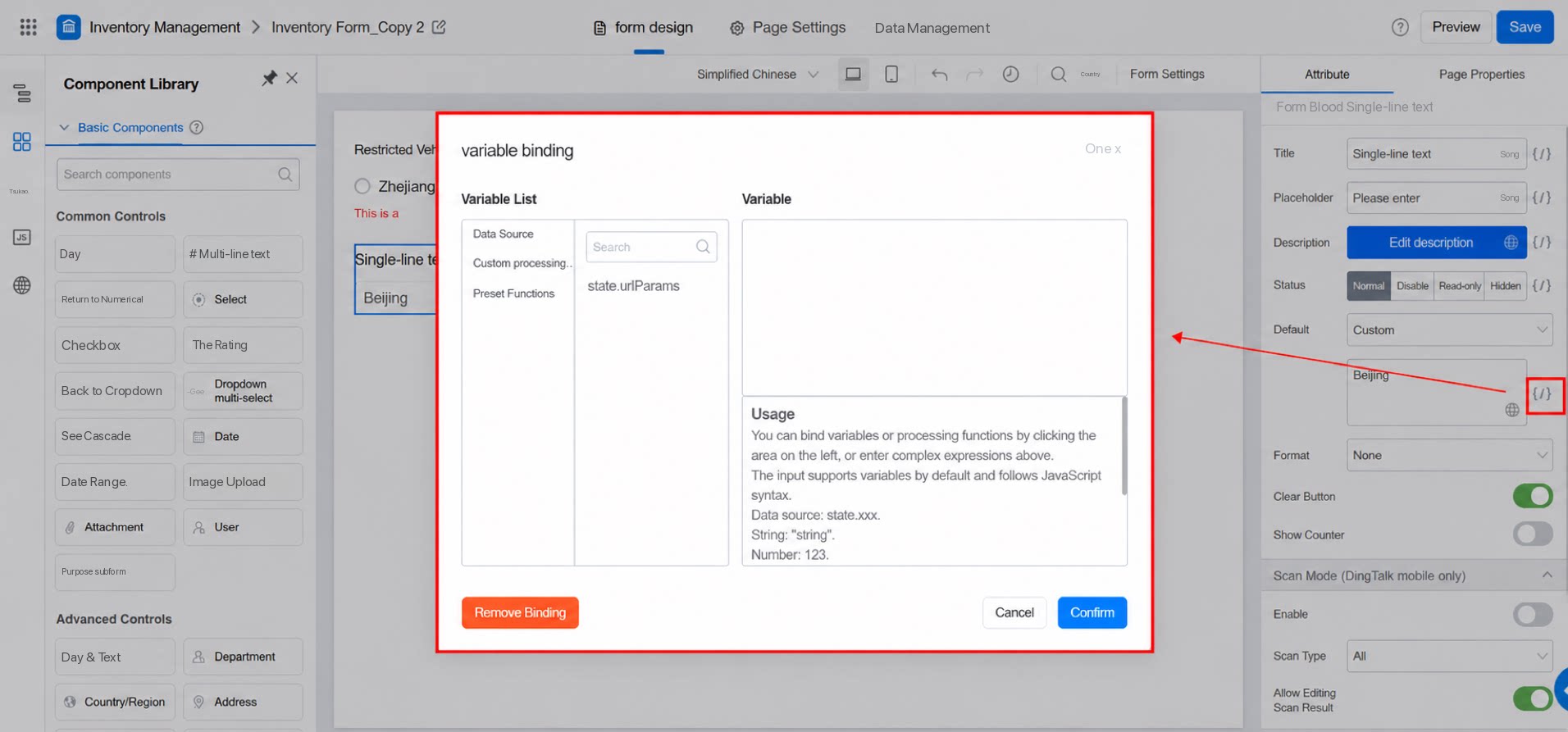
- Advanced use: Write the value from a Data Source as the Default.
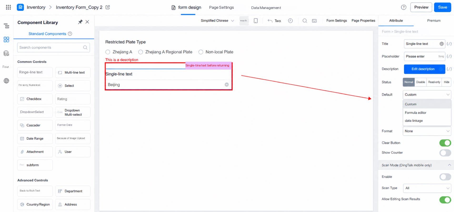
- Formula
- Quick configuration: YiDA provides shortcuts for common configuration scenarios.
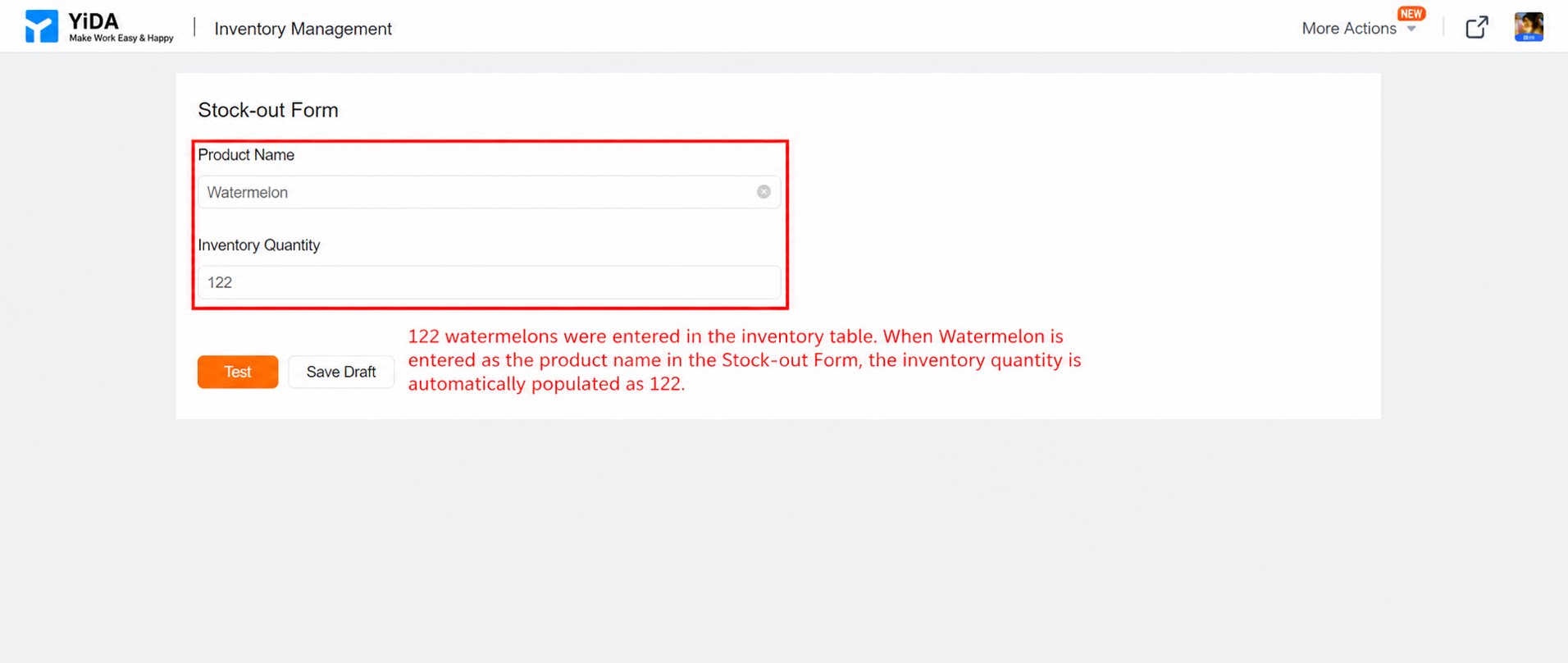
- data linkage
- Associate with other form data
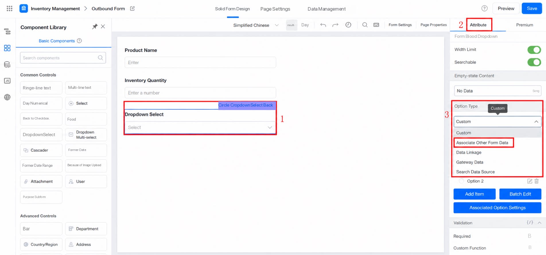
- Gateway data
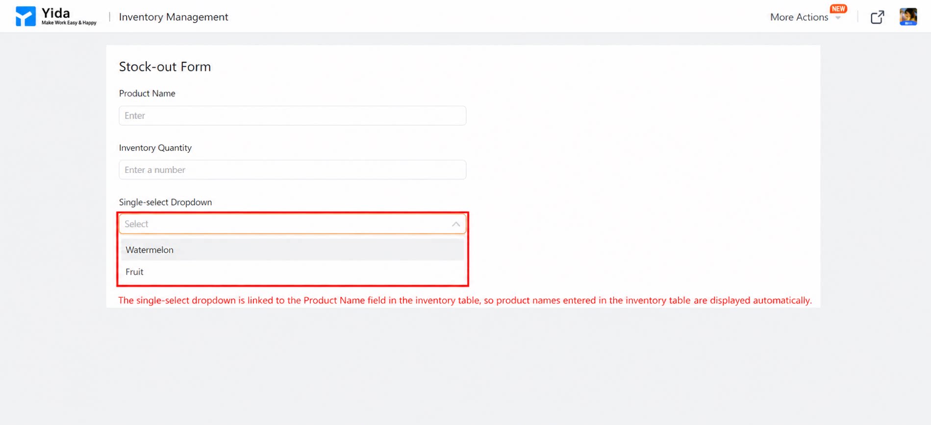
[{"text":"111","value":"111"}].
- Search Data Source
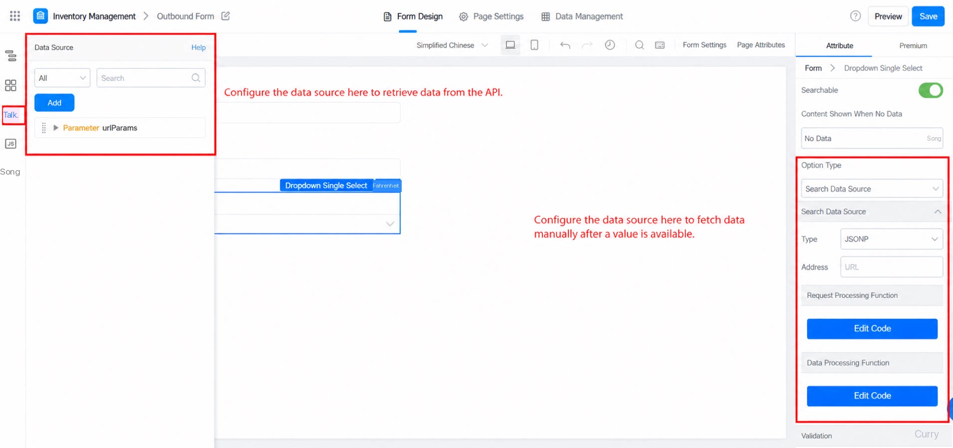
2.6 Validation
You can set Required and custom function validation on all field-type components: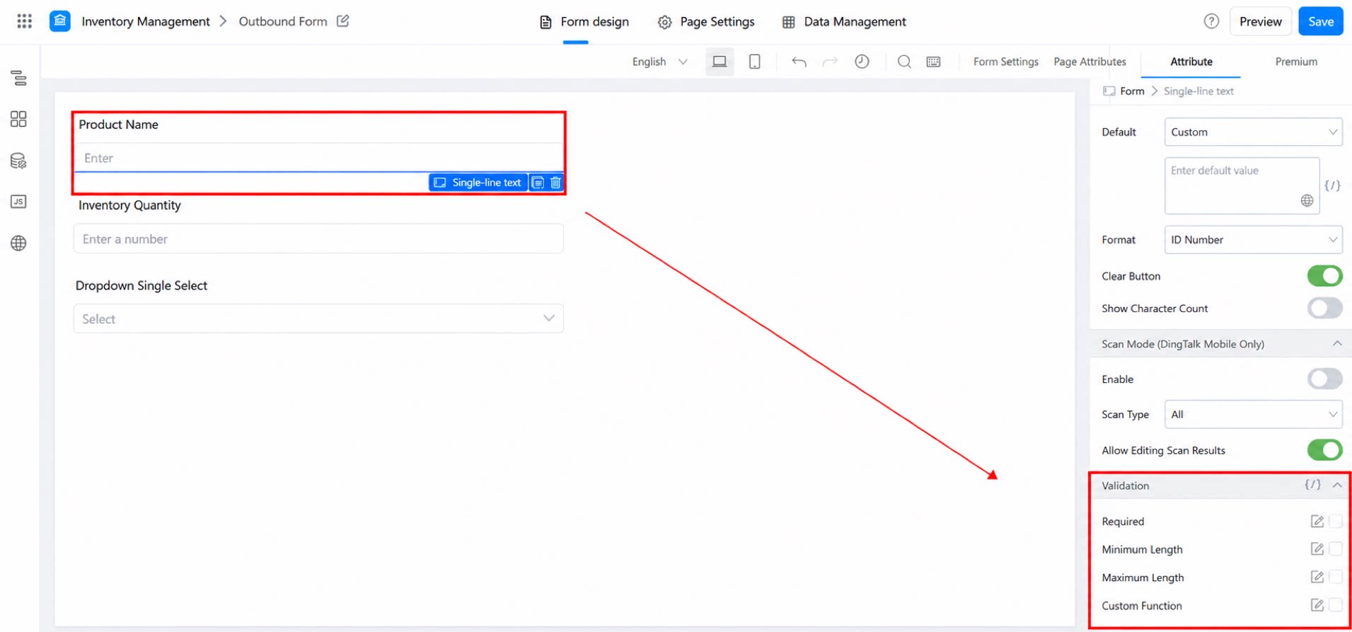
2.6.1 Required
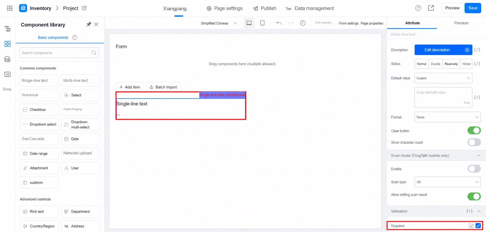
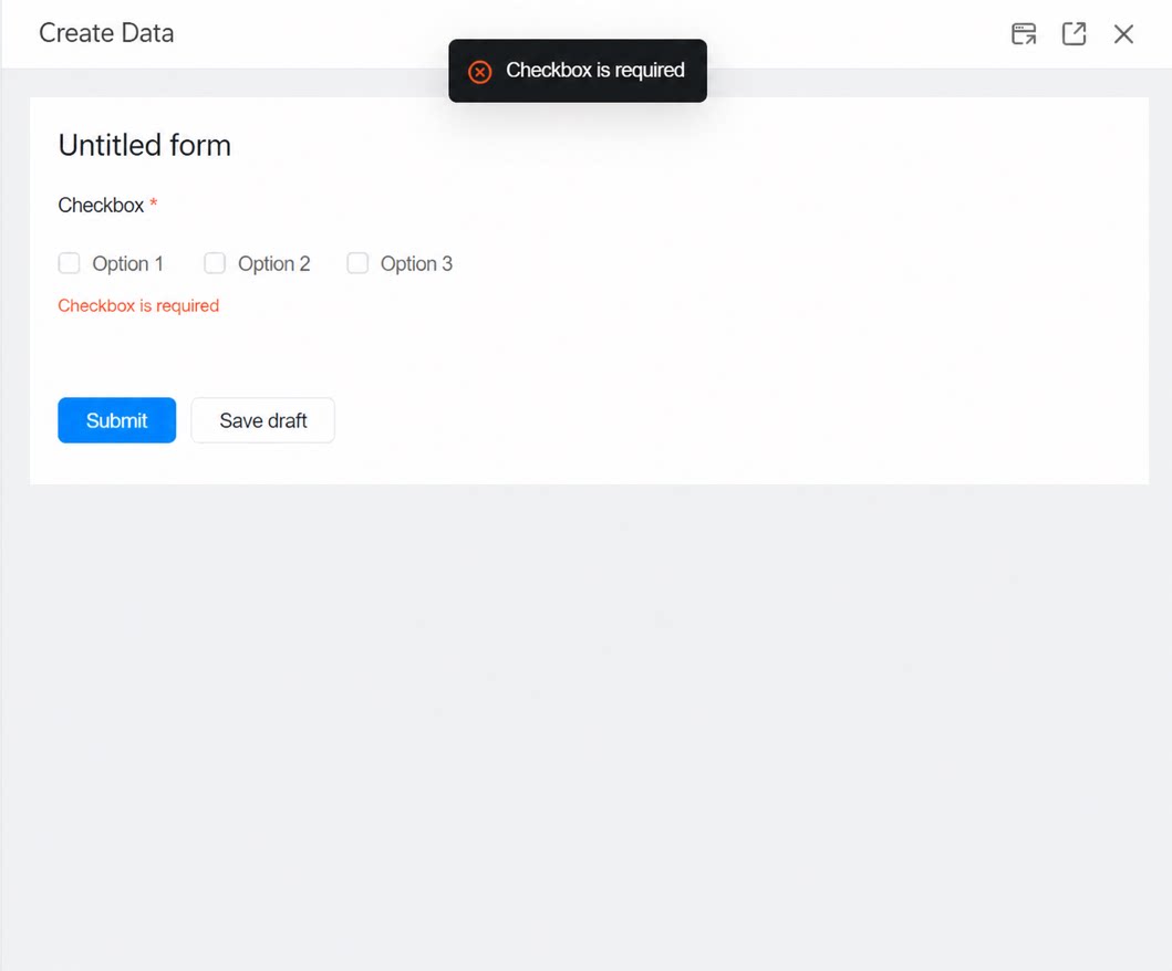
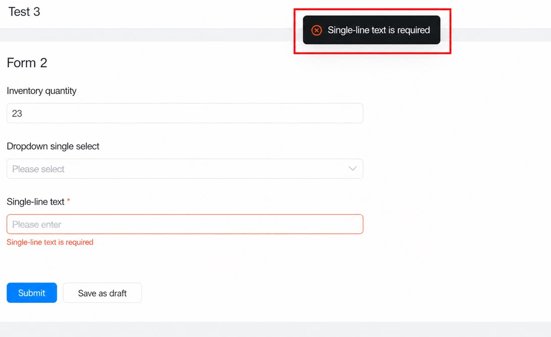
Required means the field must be filled in before data can be submitted. Otherwise, submission fails with a prompt: “XX is a required field.”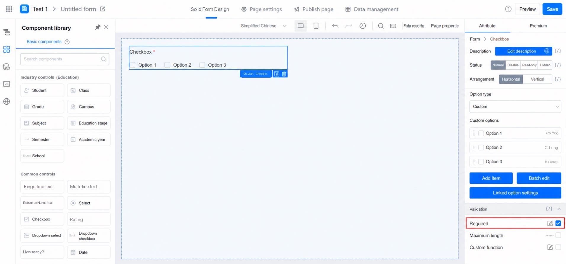
2.6.2 Minimum Value
The minimum data value allowed. For example, if the minimum value of a Numerical component is set to 4, the input value cannot be less than 4. Supported component types: Numerical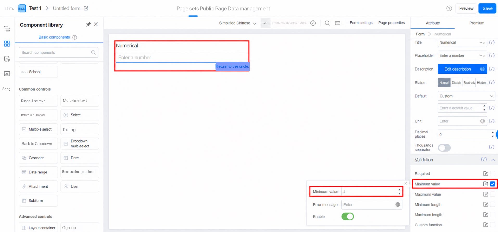
2.6.3 Maximum Value
The maximum data value allowed. For example, if the maximum value of a Numerical component is set to 50, the input value cannot exceed 50. Supported component types: Numerical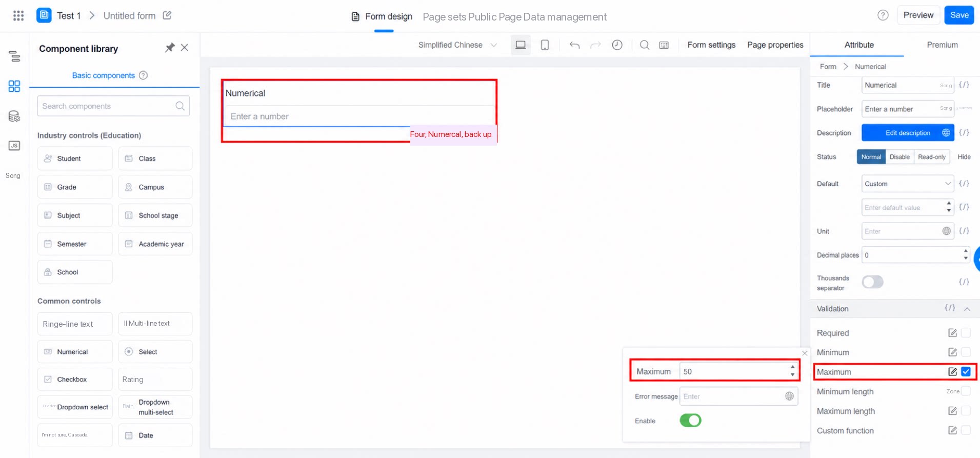
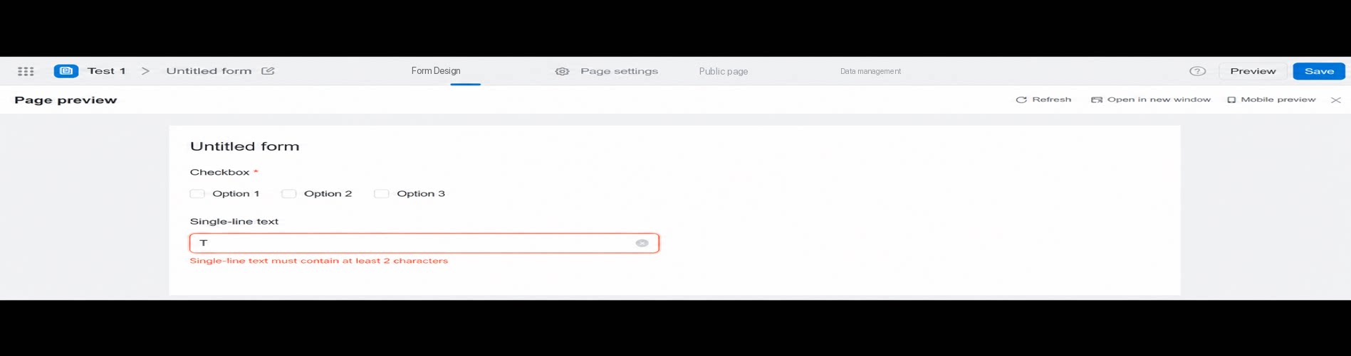
2.6.4 Minimum Length
The minimum data length. For example, if the minimum length of a Single-line text field is set to 2, the input must contain at least 2 characters. Supported component types: Numerical, Single-line text, Multi-line text.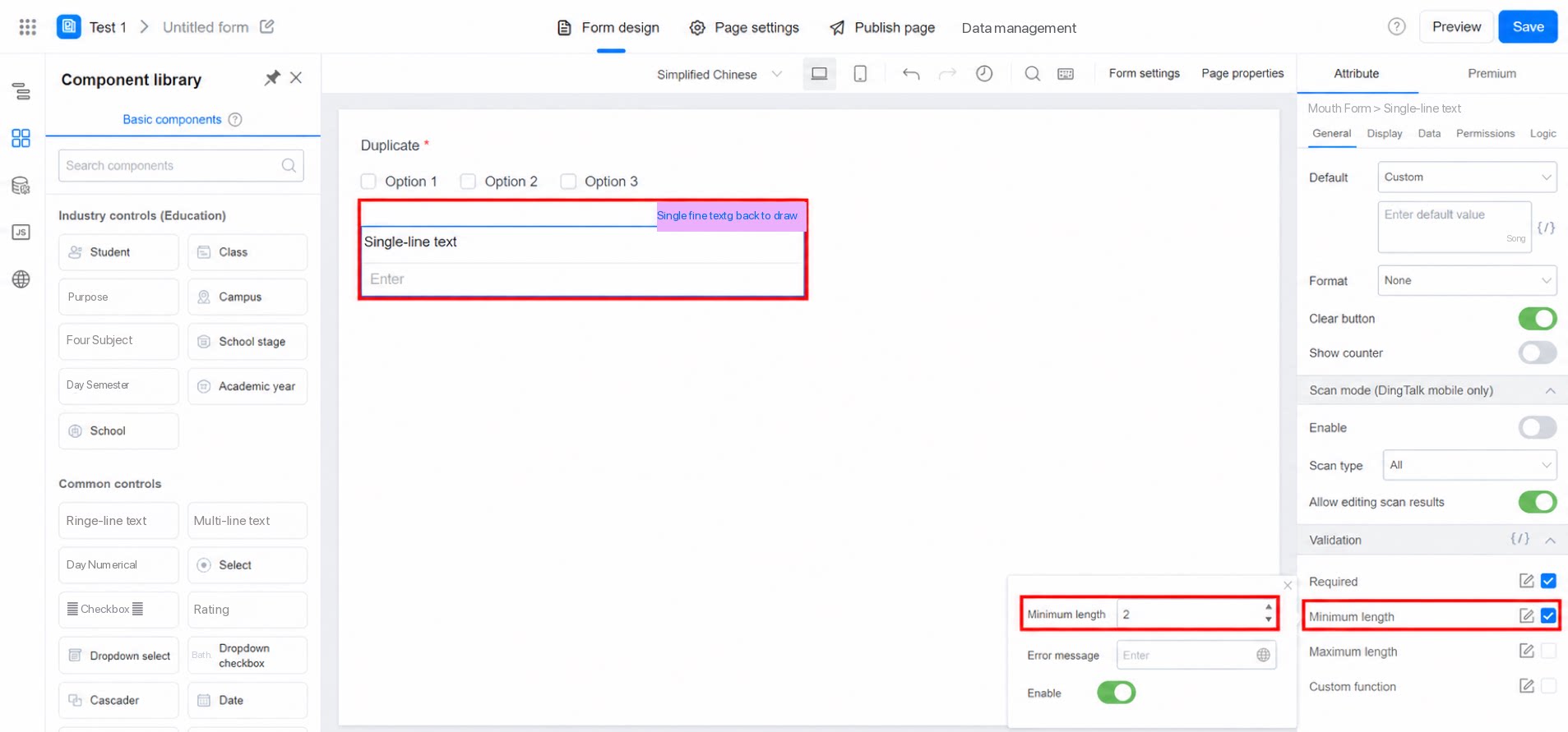
2.6.5 Maximum Length
The maximum data length. For example, if the maximum length of a Dropdown multi-select component is set to 2, no more than 2 options can be selected when submitting data. Supported component types: Numerical, Single-line text, Multi-line text, Checkbox, Dropdown multi-select, Department, associated form.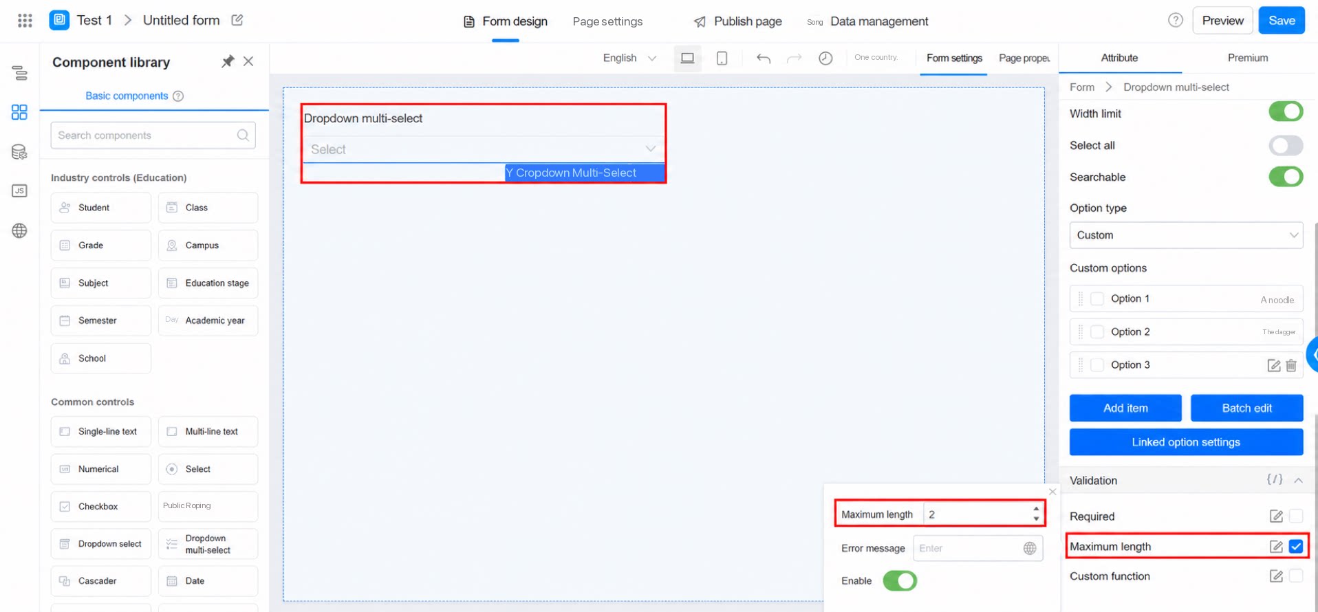
2.6.6 Custom Function (Premium Validation)
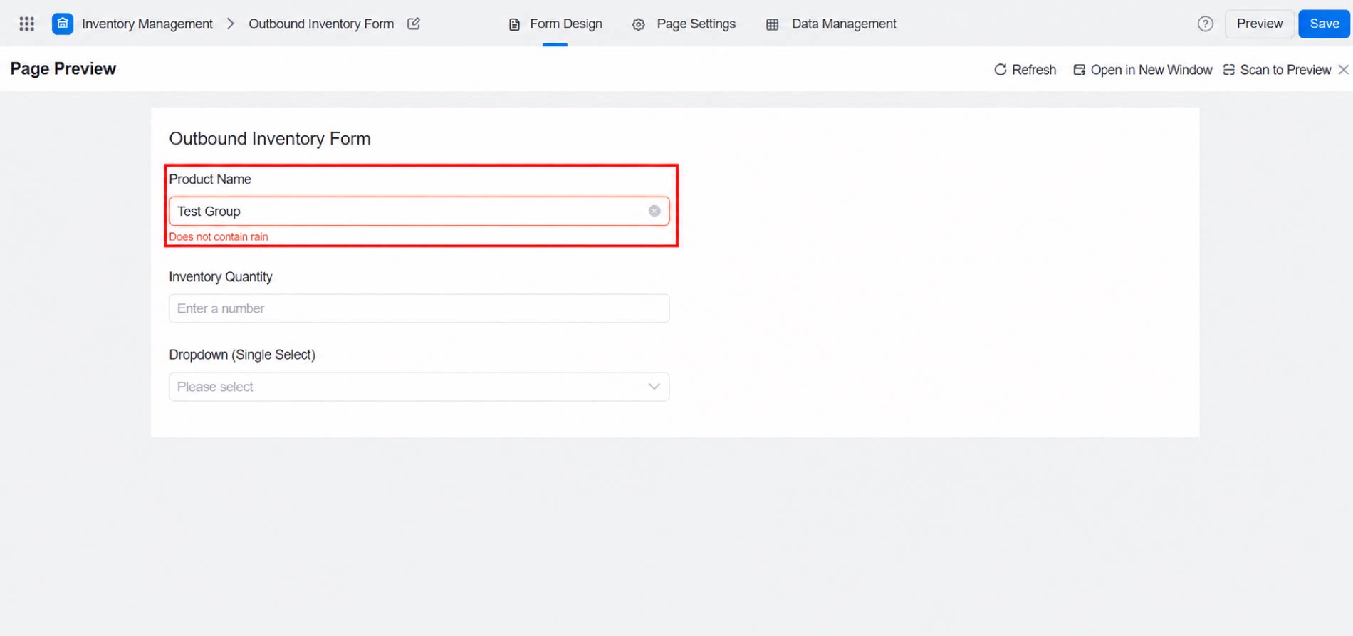
Basic coding skills are recommended, but non-developers can also reuse the code samples below. Example 1: Check whether the input contains “雨” (rain). Note: The error message for custom function validation is required; otherwise, validation may not work.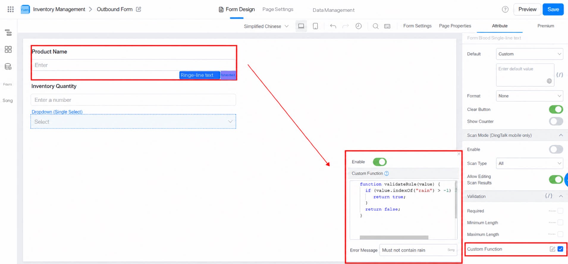
2.6.7 Error Message
When field validation fails, an error is raised and submission is blocked. Note: This field is optional. If left blank, the default message “This field is required” appears: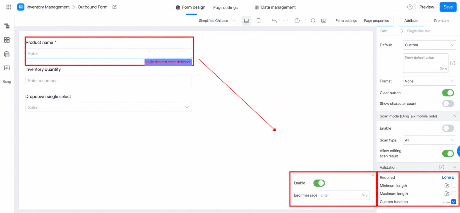
3. Premium
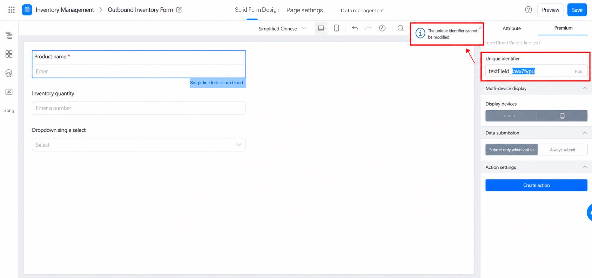
3.1 Unique Identifier
The unique identifier of the current field is used for data storage on the YiDA backend and for programmatic control. It works like an ID card for each component—every component has a different unique identifier. It generally does not need to be changed, and defaults to a system-generated value.The field unique identifier (fieldId) is what YiDA uses to reference the field. Changing it affects any formula, data storage (data may also be lost), and JS function references that use this field. We strongly recommend against modifying it.
3.2 Multi-Device Display
Some components have this option, which controls whether the component is shown on desktop or mobile.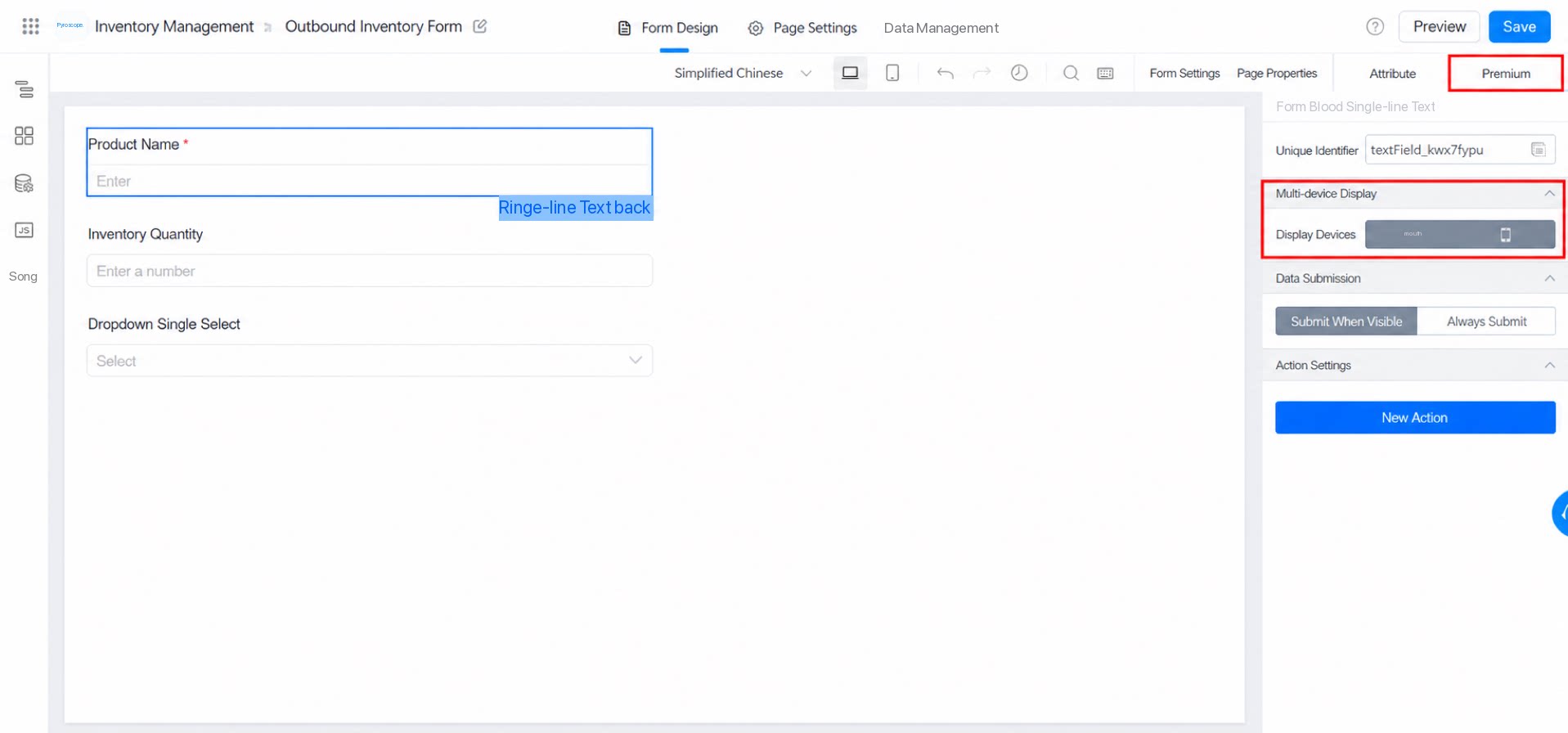
null.
Multi-device display.
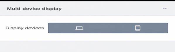
- Default: Show the component on both desktop and mobile.
- Show the component on desktop only.
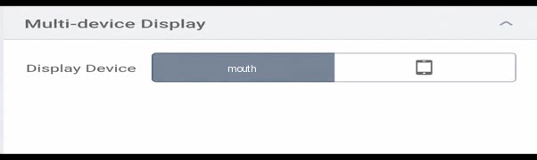
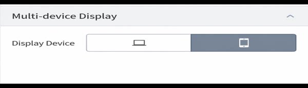
- Show the component on mobile only.
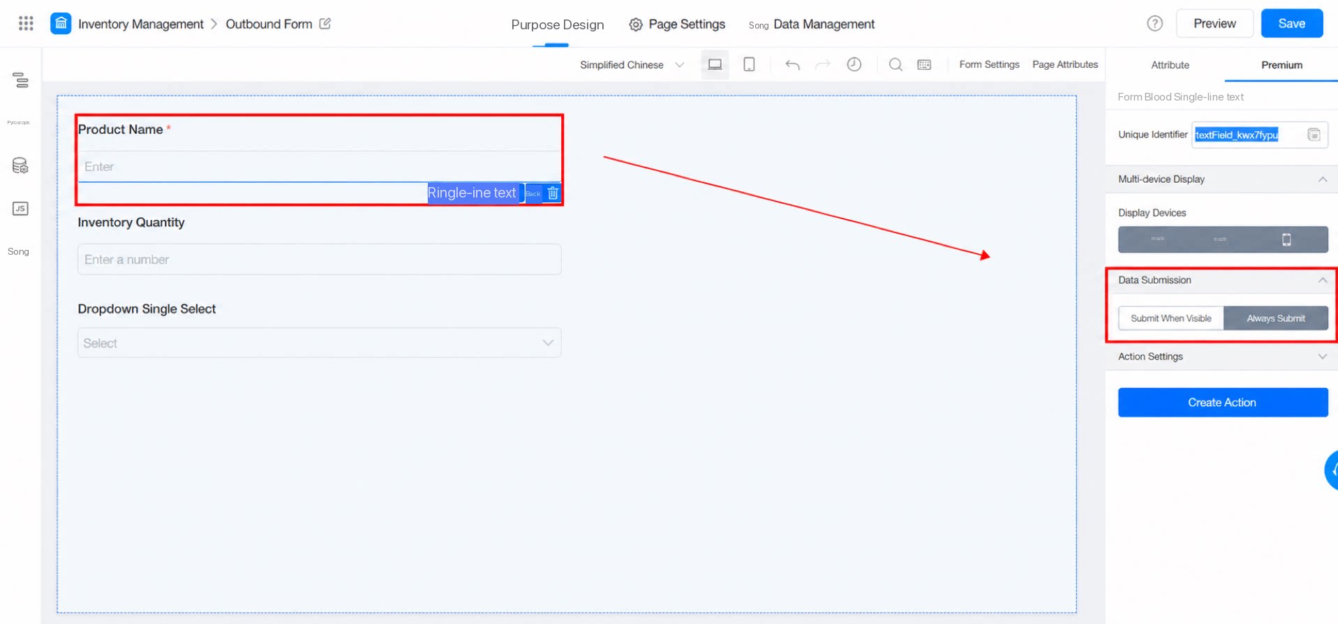
3.3 Data Submission
Some components have this attribute, which controls whether the component’s value is submitted when the form is submitted.- Submit only when visible: When the component is hidden, its data is not submitted to the backend by default.
- Always submit: Submit the field data regardless of whether the component is visible.
3.4 Action Settings
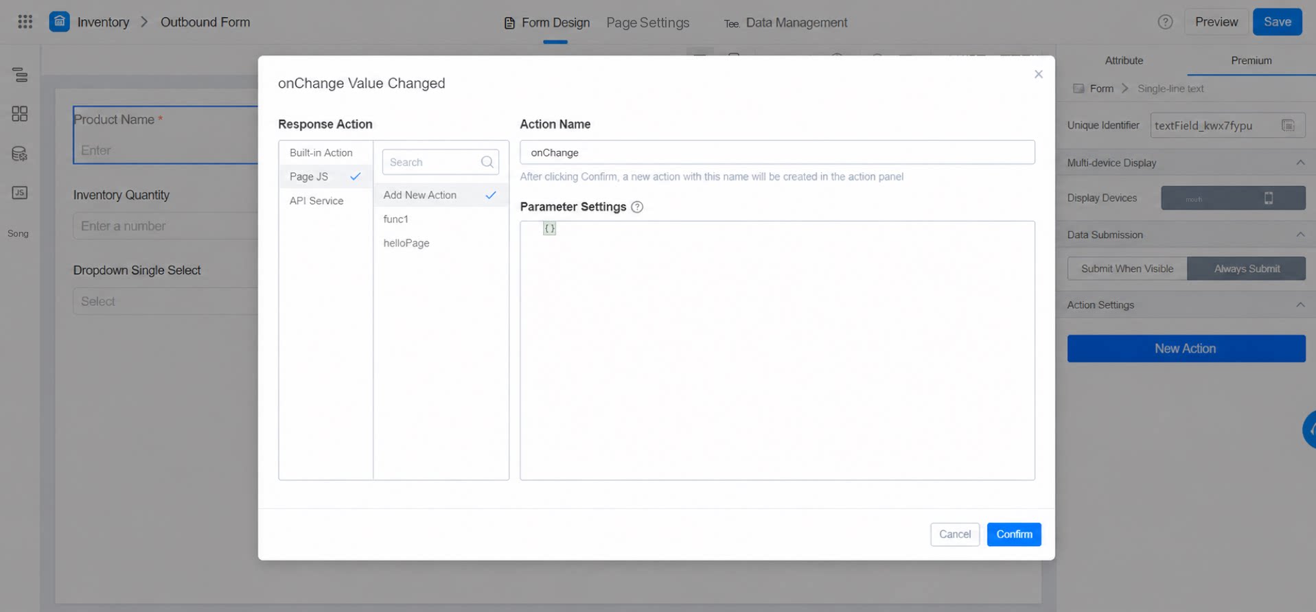
By creating an action, you can trigger behavior when a user interacts with the current field component—for example, sending an analytics event after the user finishes editing this field and moves to the next one.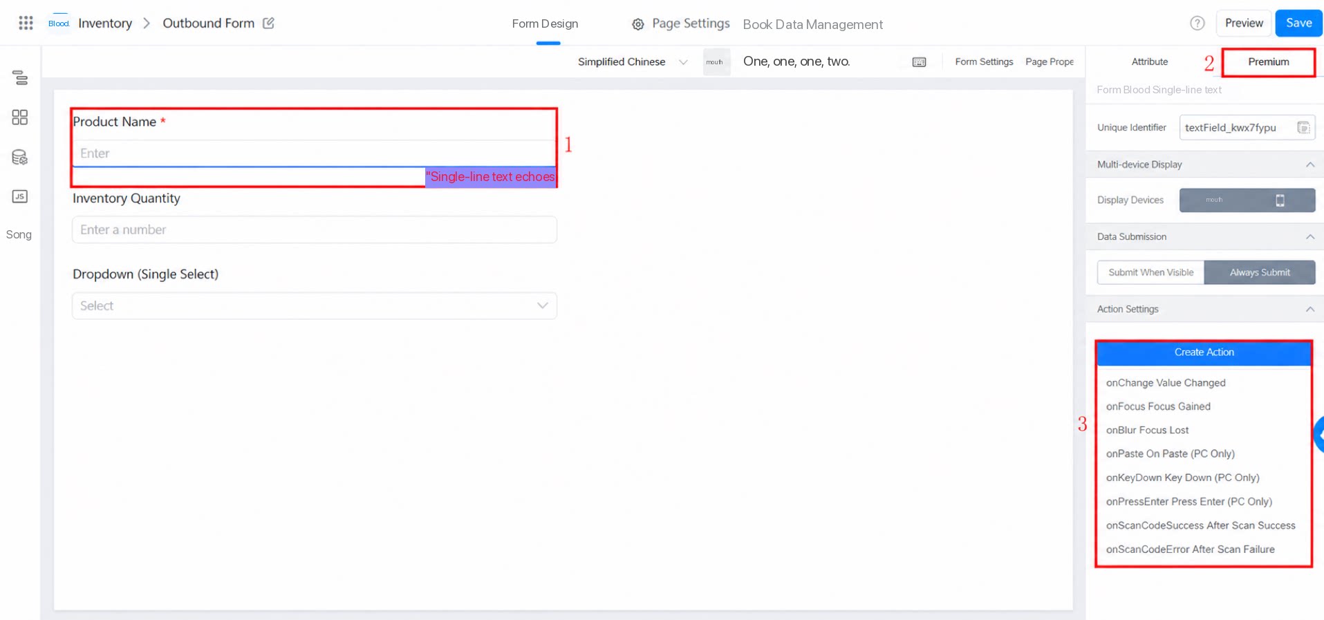
3.5 Delete and Copy
Tip: Delete a component with care, because deleting a form field may invalidate Formulas, business association rules, and other configurations. If your app is still being built, has not gone live, and has no data yet, deleting a field has little impact. If your app is already live and has data, we recommend against deleting a field. Doing so may invalidate configured Formulas and business association rules, and may cause related field data to be lost. Instead, set the field as a Hidden field. To do so: On the form editing page >> select the field >> Attribute >> State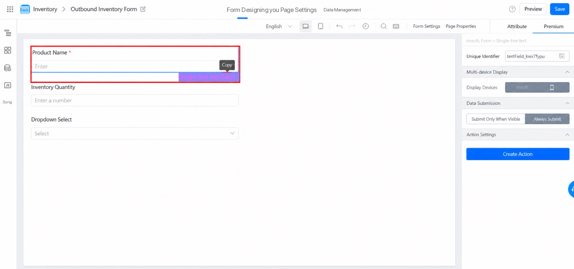
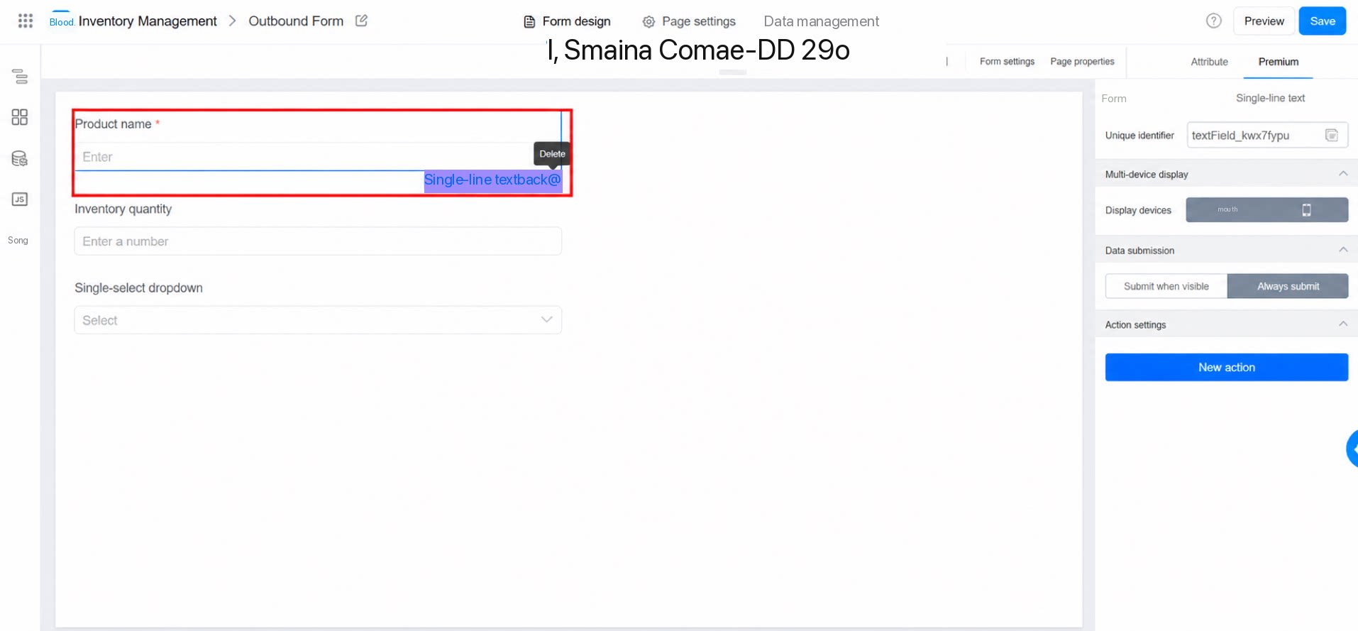
3.6 Edit a Component
Path: On the form editing page, double-click a component to edit its name: Edit the component.3.7 Copy and Paste Components (Works Across Pages)
UseCtrl+C to copy a component on the current page and Ctrl+V to paste it. (On Mac, use the Command key.)
4. FAQ
4.1 What is the maximum number of components per form page?
4.1 What is the maximum number of components per form page?
Too many components on a page affects performance and user experience. To maintain a good experience, we recommend keeping the number of components on a single page low. The Free plan supports up to 50 components per page, while other plans support up to 300. If you need more, split the form into multiple pages by business scenario.
4.2 Why isn't the Required setting taking effect?
4.2 Why isn't the Required setting taking effect?
Check whether the component state is set to Read-only. If a component is Read-only and marked as Required, the Required setting does not take effect.