1. Applicable Scenarios
Use this feature when you need to collect information or record products.
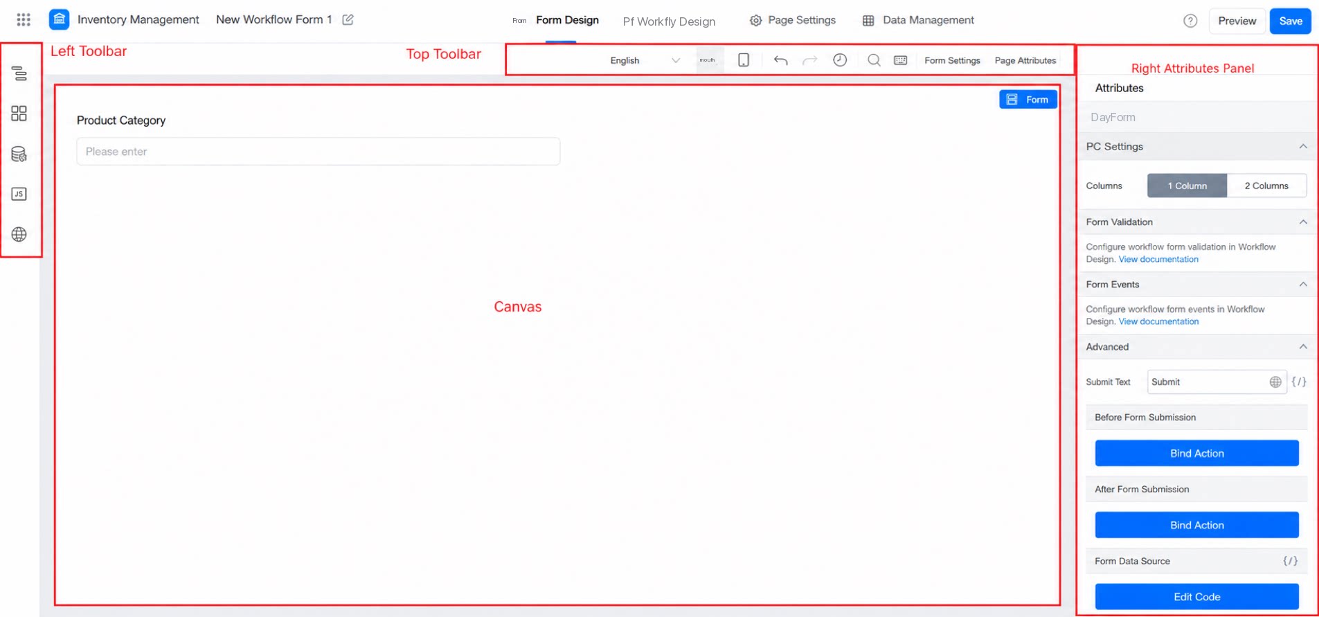
The entire configuration page in YiDA is collectively referred to as the designer page.
The page is divided into four parts: the top action bar, the left toolbar, the central canvas, and the right-side attribute configuration panel, as shown below:
2.1 Top Action Bar
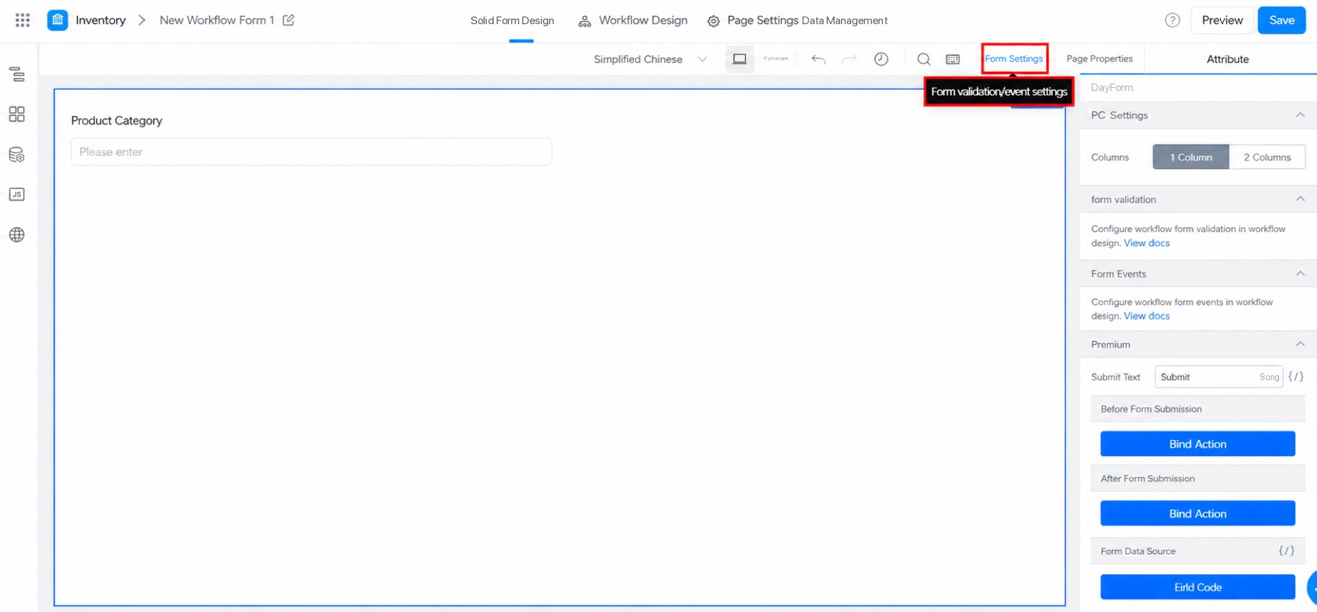
Form settings let you configure the form layout, submission validation, and various form rules.
Note: The form designer for processes differs slightly — form validation must be configured within the process.
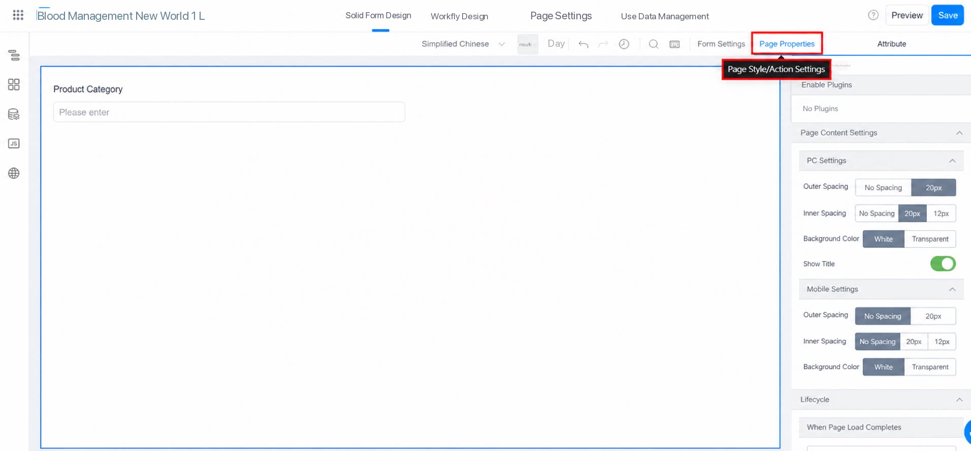
2.1.2 Page Settings
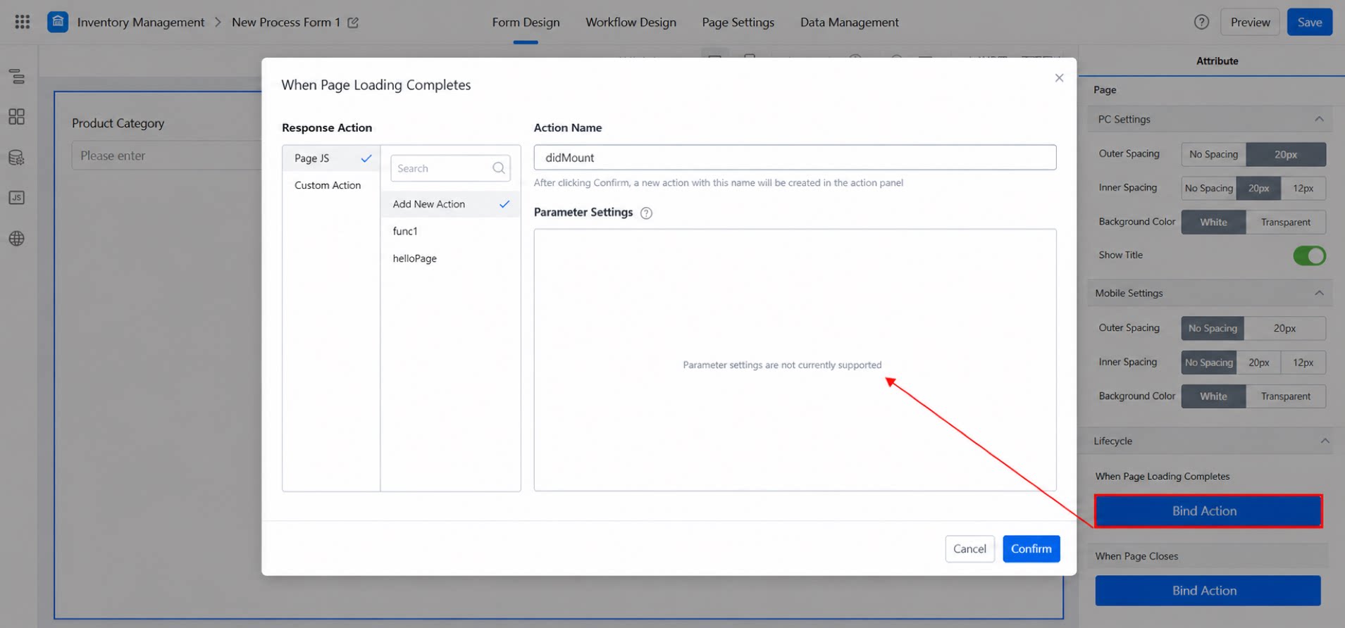
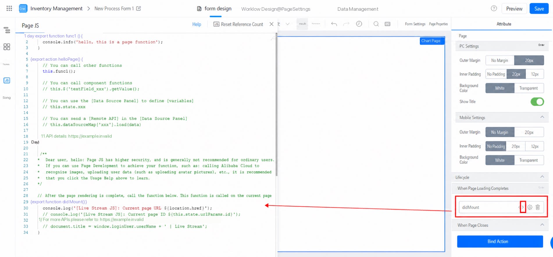
Page settings let you customize the form page layout and configure event callbacks for page lifecycle events.
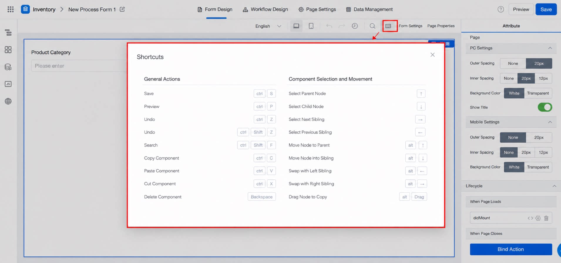
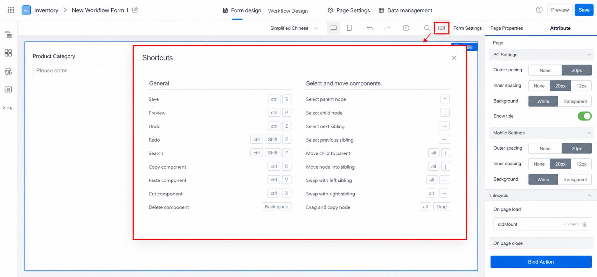
2.1.3 Shortcuts
The YiDA designer provides Shortcuts that help you complete configurations quickly, as shown below.
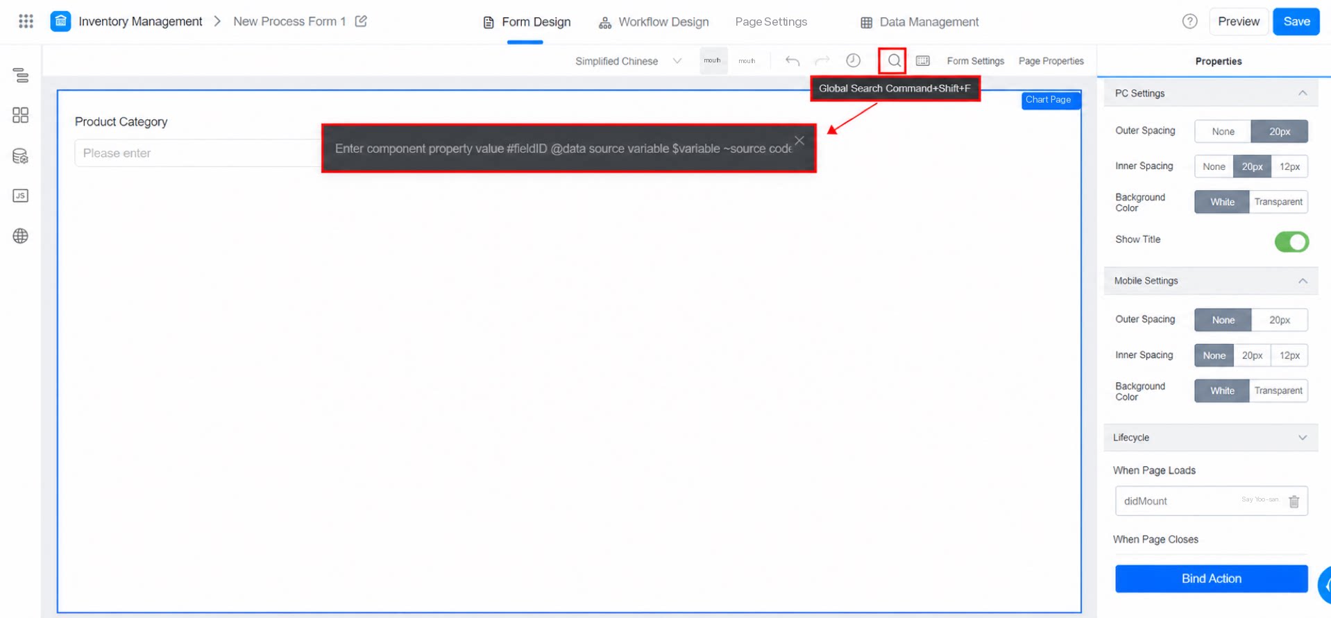
2.1.4 Global Search
When a form contains many components, use global search to quickly locate the one you need.
2.1.5 History
The YiDA designer provides a History feature. Each save is recorded automatically, up to 50 entries. You can review the 50 most recent save records, roll back to a previous version, and inspect change details.
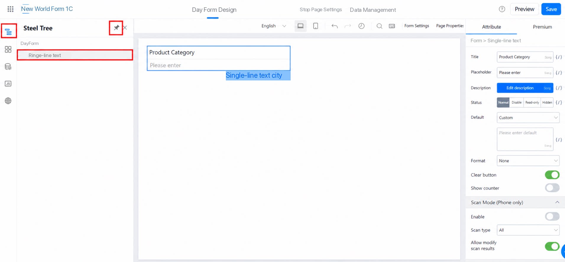
2.2.1 Outline Tree
The Outline tree gives you a clearer view of the overall page layout. You can drag, drop, or delete components in bulk directly from the Outline tree.
- Double-click an item in the Outline tree to change its alias, which helps distinguish multiple components of the same type.
- Click the Pin icon in the upper-right corner to pin the Outline panel to the left side.
- Hold CMD / CTRL to perform multi-select operations in the Outline tree.
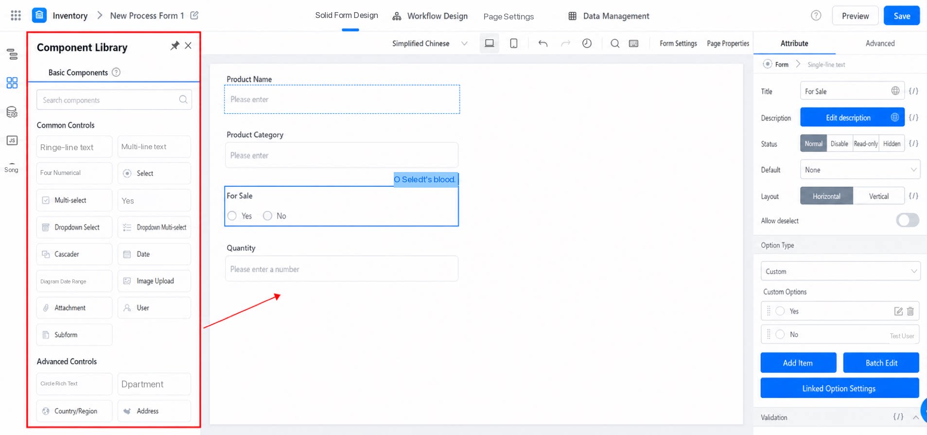
2.2.2 Component Library
Click a component in the component library and drag it to the desired position on the canvas or in the Outline tree. You can also click a component to insert it directly into the canvas.
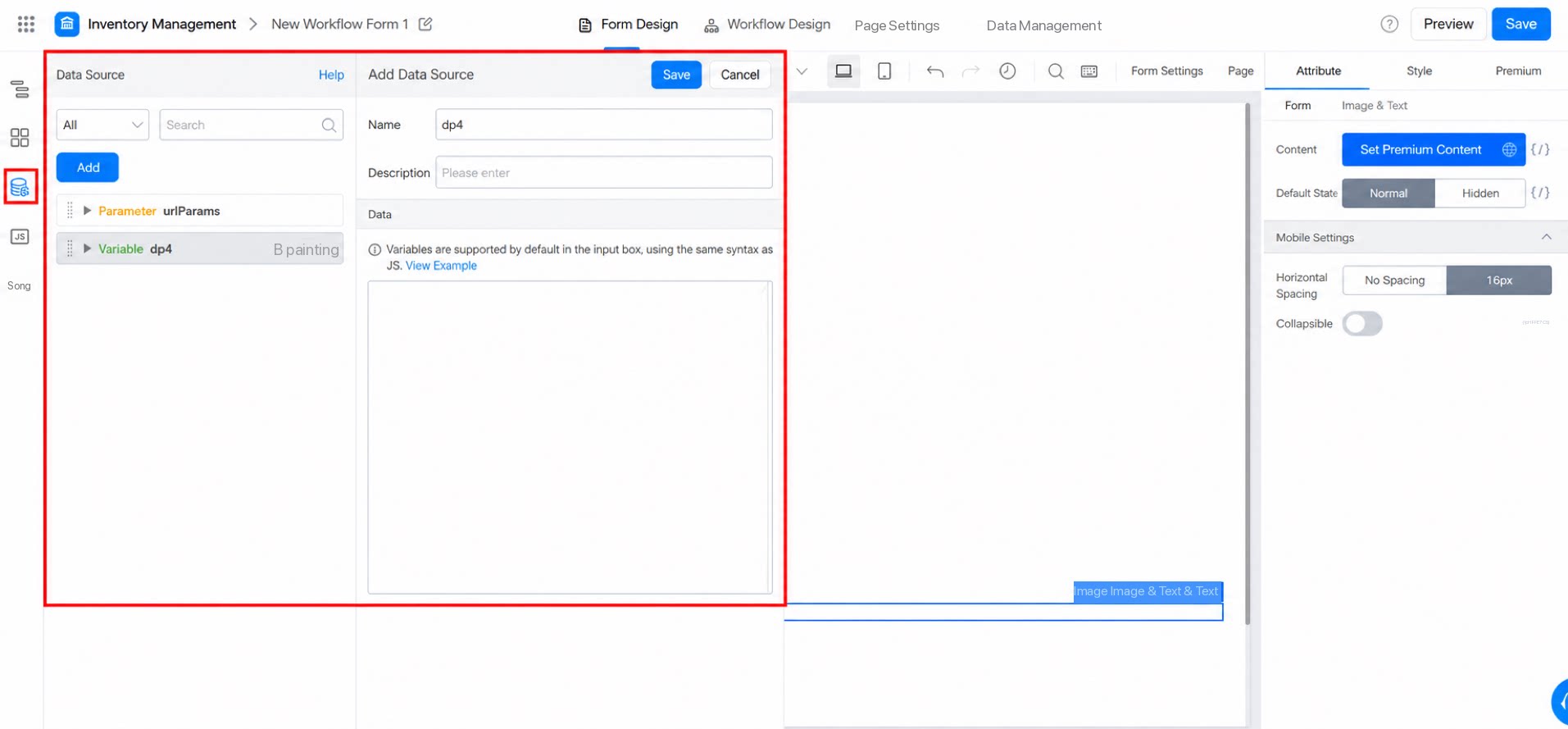
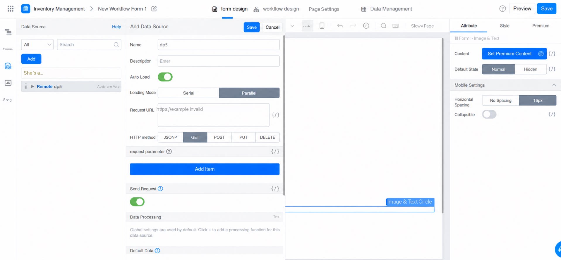
2.2.3 Data Source
Data Source lets you declare a variable or a remote variable to dynamically display data.
You can bind components to the Data Source in the component’s attribute configuration.
For details, see Data Source panel.
2.2.4 Action Panel
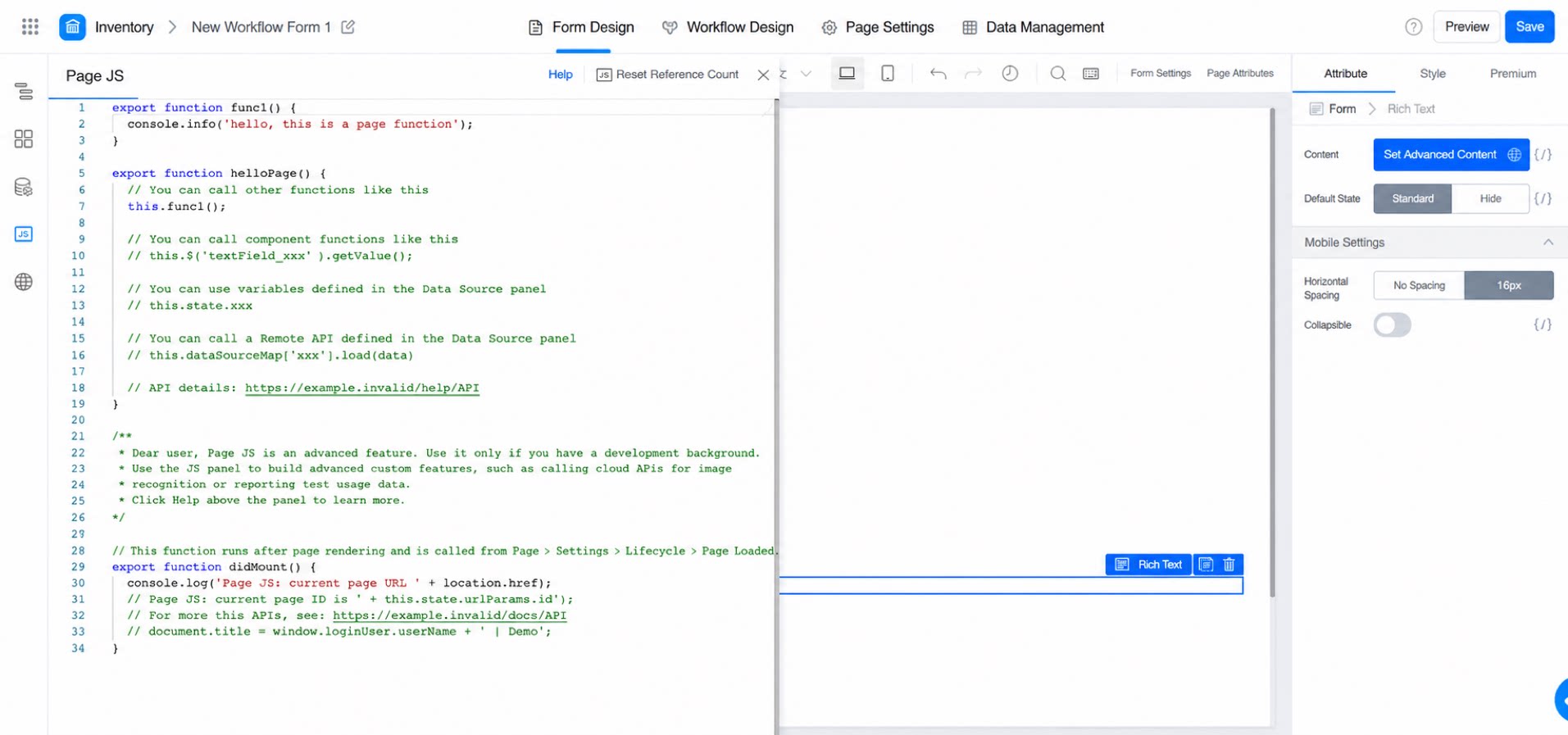
The Action panel lets you write JavaScript code to implement more customized requirements.
For details, see JS action panel - Frontend code Open.
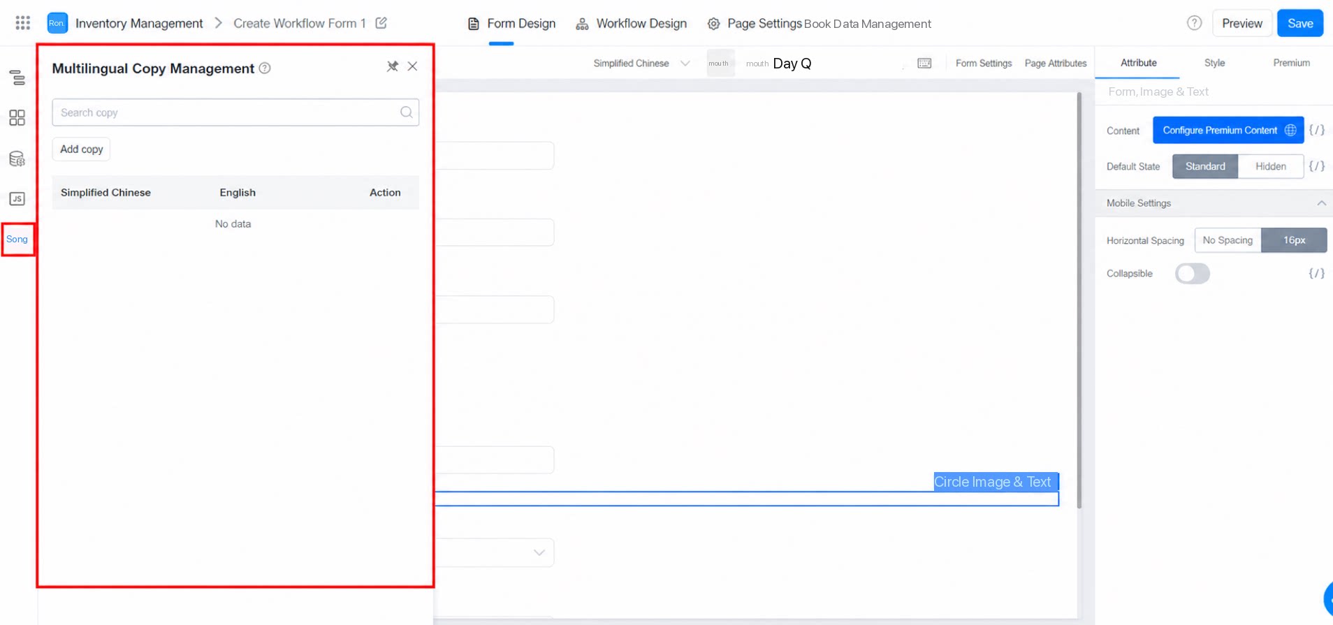
2.2.5 Internationalization Panel
The internationalization panel lets you manage multilingual copy. You can bind components to multilingual data in the component’s attribute configuration.
For details, see: Internationalization.
2.2.6 Central Canvas
Use the canvas to arrange and configure components to build the page. You can drag and drop components based on the cursor prompts, and copy or delete components — both of which support Shortcuts.
2.3 Right-Side Attribute Configuration Panel
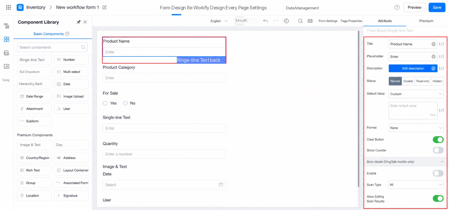
2.4.1 Attribute Settings
Attribute settings configure the common attributes of a component. Changes take effect on the canvas in real time.
Click {/} to apply data binding to the current attribute, enabling dynamic display.
Note: Data binding results cannot be previewed in real time within the designer — view them in the Preview environment instead.
For details, see Component basic information.
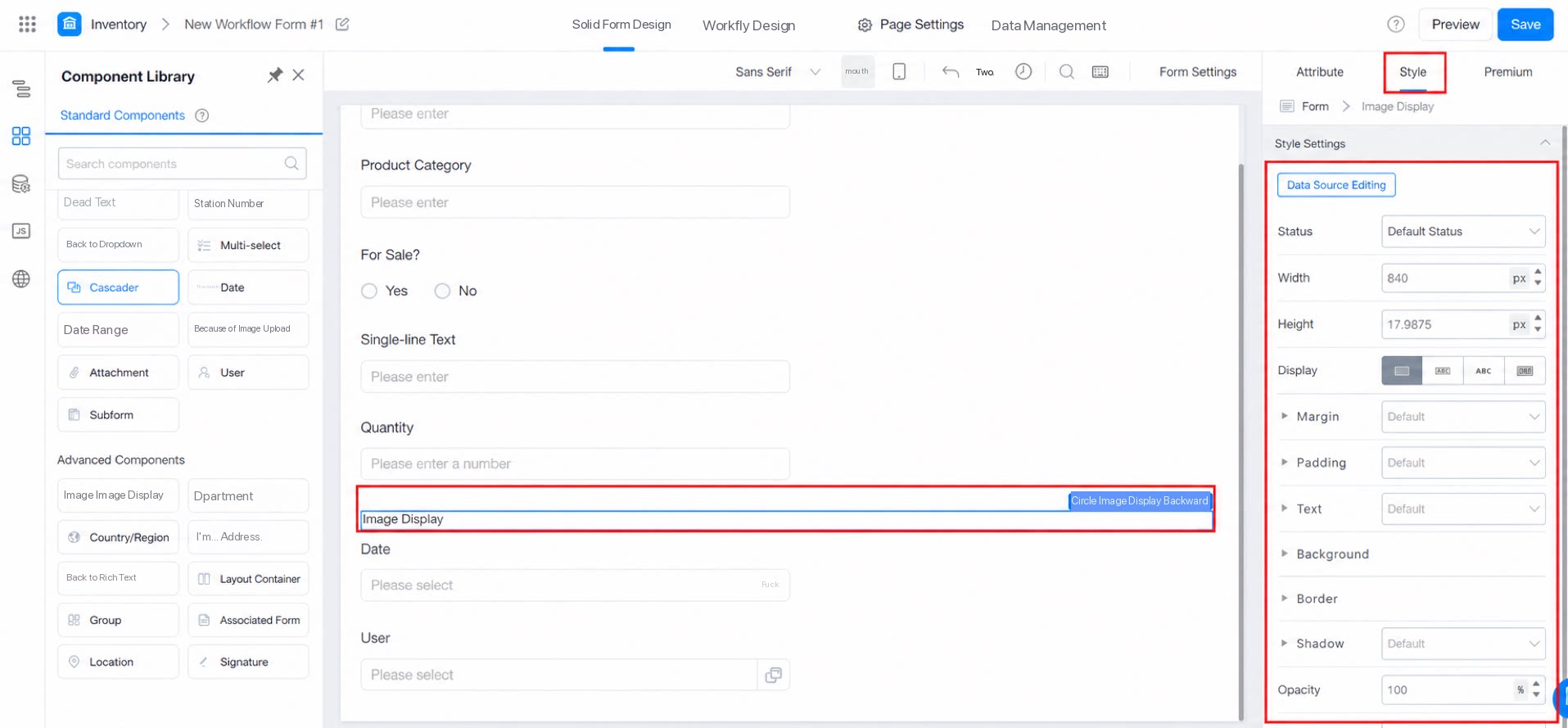
2.4.2 Style Settings Panel
The YiDA designer provides basic style configuration for components such as image and text display, layout containers, and groups. You can modify the width, height, and background, as shown below:
For details, see Custom style introduction.
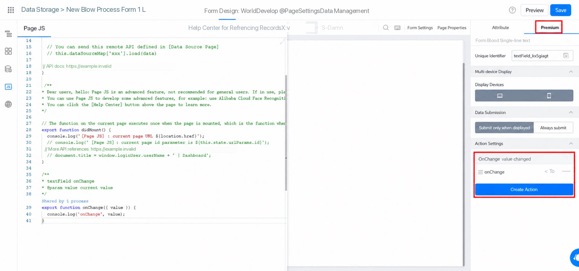
2.4.3 Premium
Premium is mainly used to configure components with special requirements.
For details, see Component basic information.
① Unique identifier: The unique identifier of the current component, used to obtain the current component instance in code, allowing you to perform advanced operations on the component.
② Multi-platform display: Specifies which platforms the current component is displayed on. By Default, it is displayed on all platforms. If you disable it for a specific platform, the component will not render on that platform.
Note: If this option is configured, data will not be submitted to the Server-side, and calling code to obtain the current component instance will return null.


 Chats
Chats Calendar
 Meetings
 Contacts
 Mail
Mail Docs
Docs Drive
Drive AI Table
 AI Minutes
 Attendance
 Approval
 YiDA
YiDA Admin Console