Chats
Chats Calendar
 Meetings
 Contacts
 Mail
Mail Docs
Docs Drive
Drive AI Table
 AI Minutes
 Attendance
 Approval
 YiDA
YiDA Admin Console
1. Form Layout Overview
1.1 Component Layout
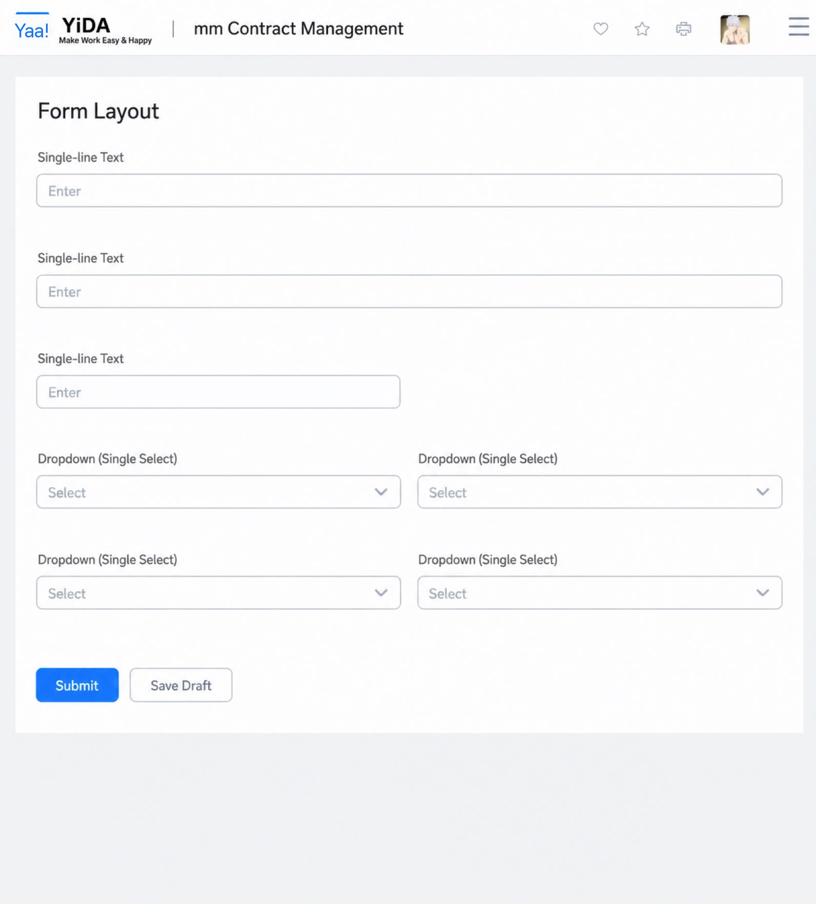
In YiDA, components are arranged in a single column by default. The Layout container, Group, and Subform (spreadsheet mode) components take up 100% of the width by default. All other components take up 50%, occupying half of the page width. To make a form use the full 100% width, use the Layout container.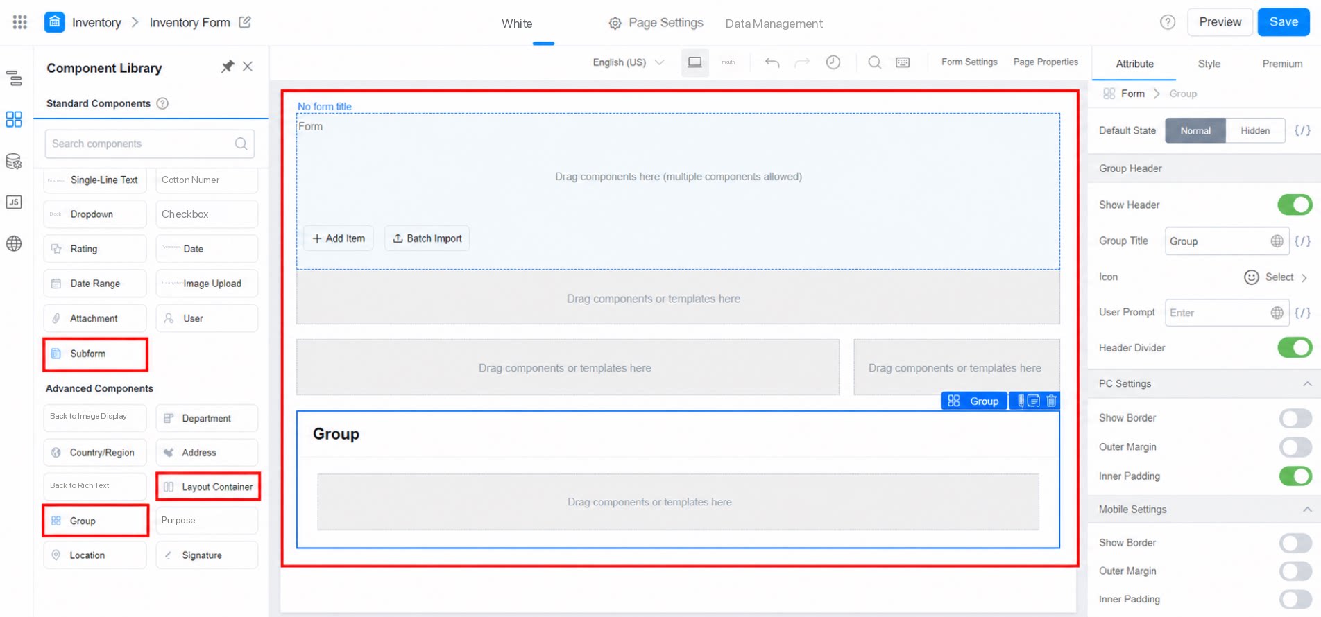
1.2 Number of Columns
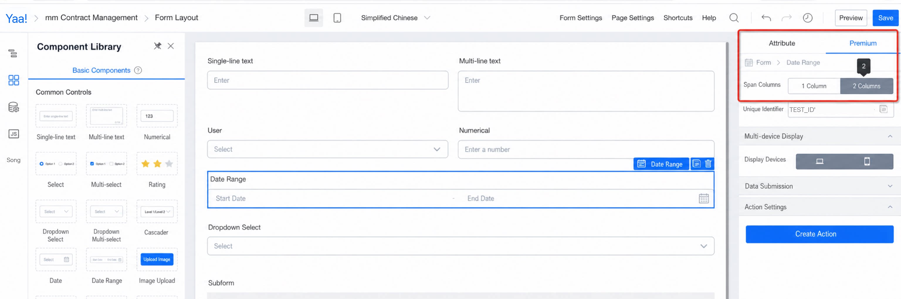
To use a two-column layout, click Columns in the form settings attribute panel. After you enable the two-column layout, a specific component may still need to occupy the full width. To do this, click the two-column option in the advanced settings of that component.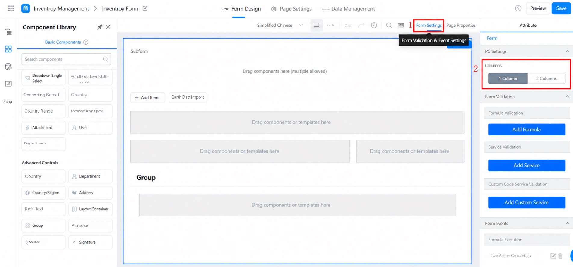
1.3 Layout Container
The layout container component lets you arrange your page more flexibly. In addition to the full 100% width mentioned above, it also supports any number of columns. For layout container configuration, see: Layout container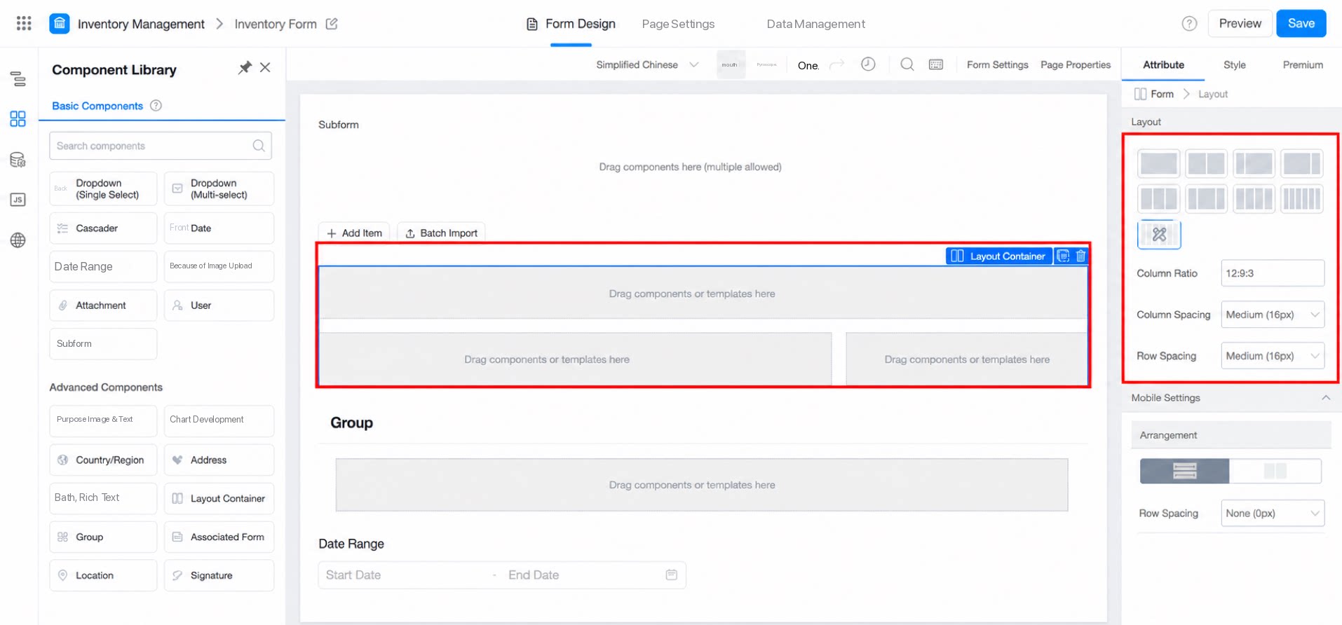
1.4 Use Groups
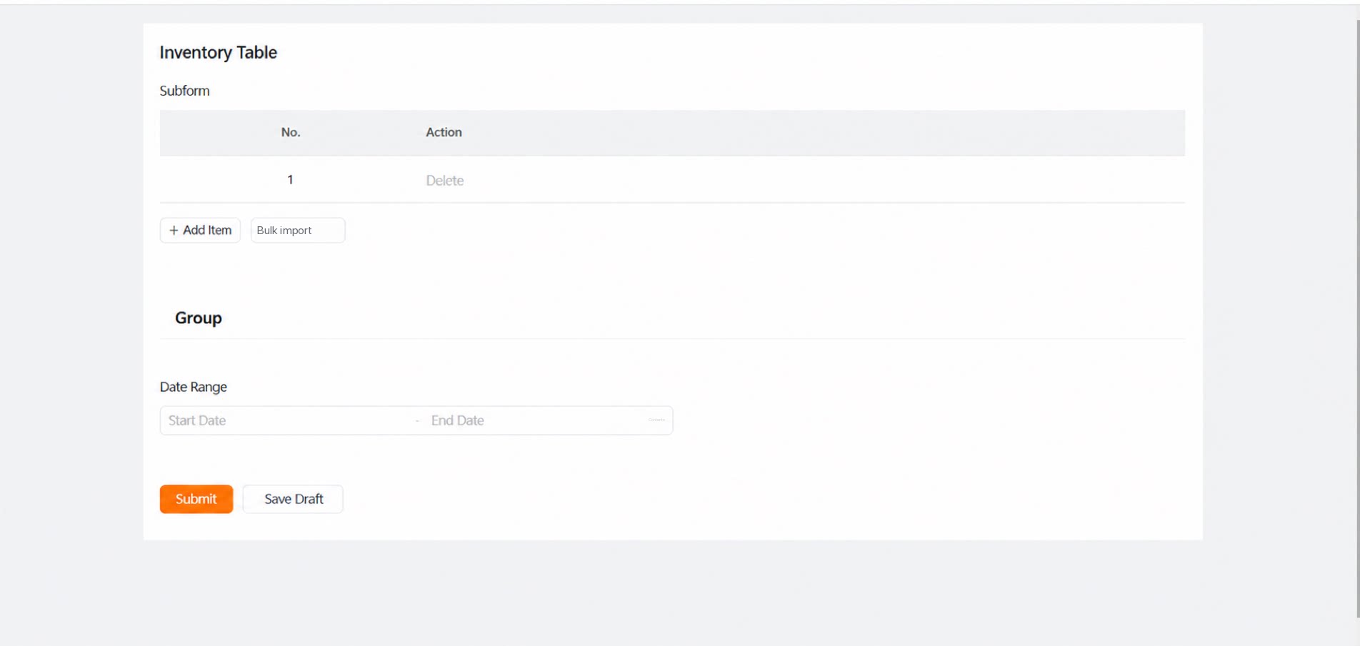
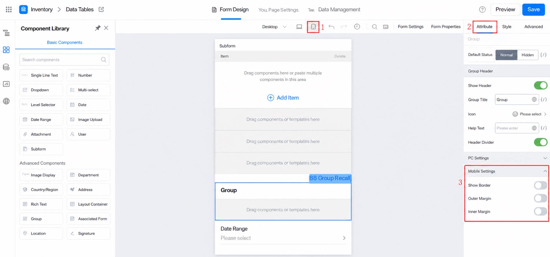
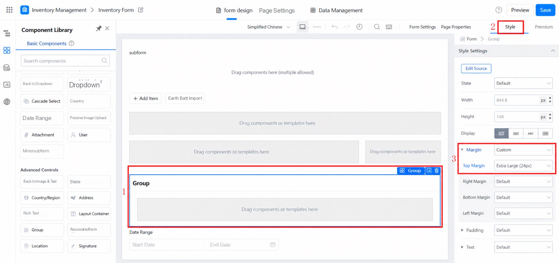
The group component lets you organize your form into groups and add group forms. It also lets you style your component layout, making the page more visually appealing. Refer to the following image for configuration: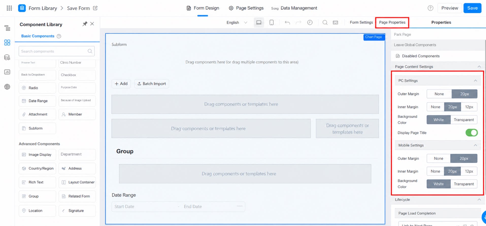
1.5 Access Modes
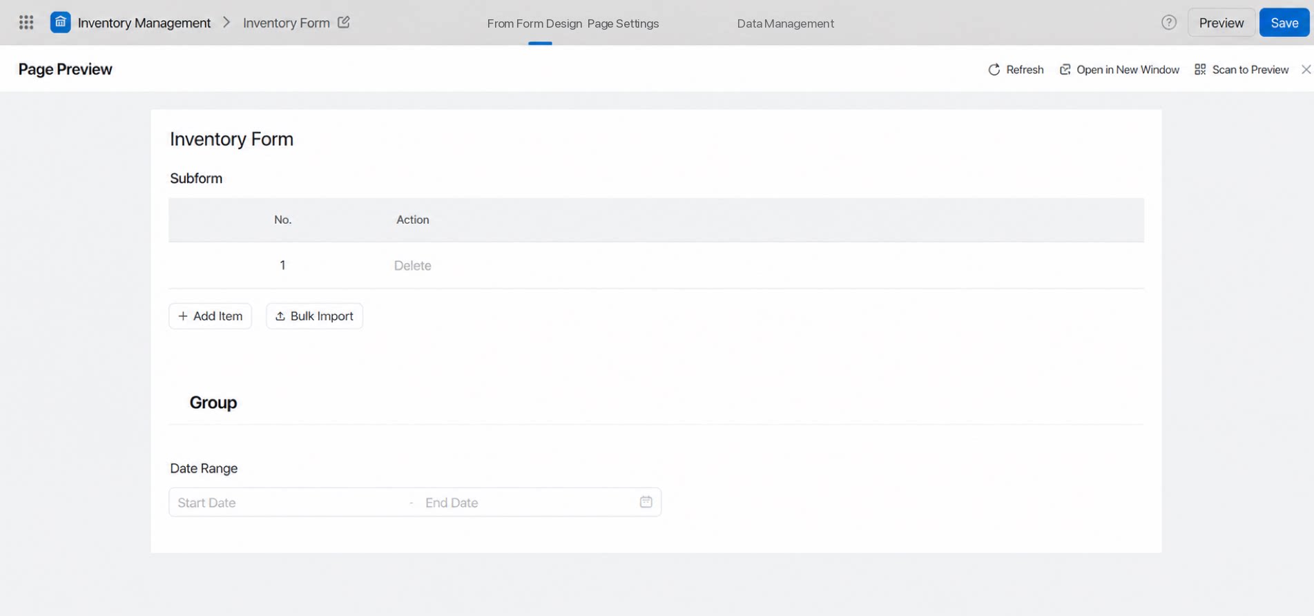
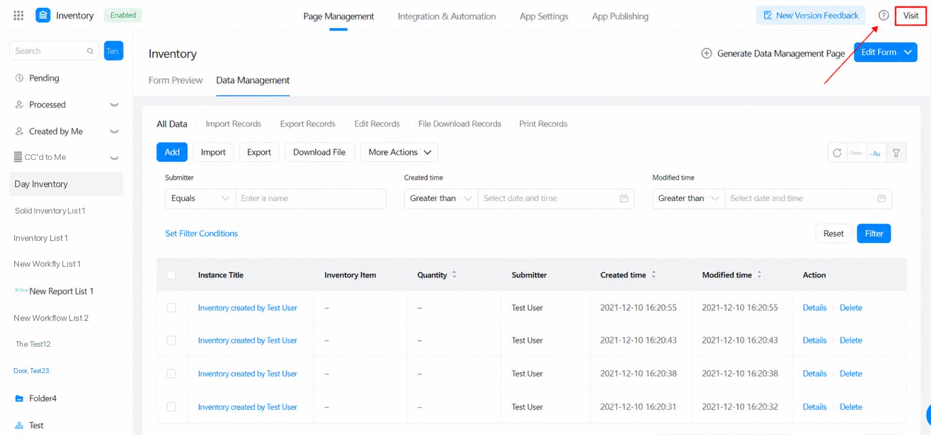
Preview access: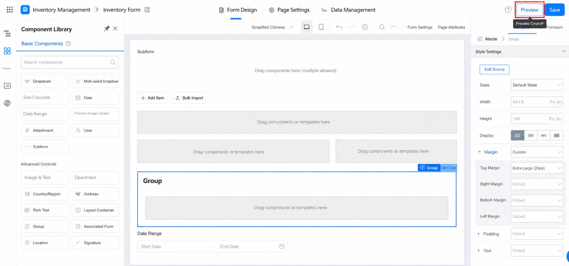
1.6 Multi-Device Display
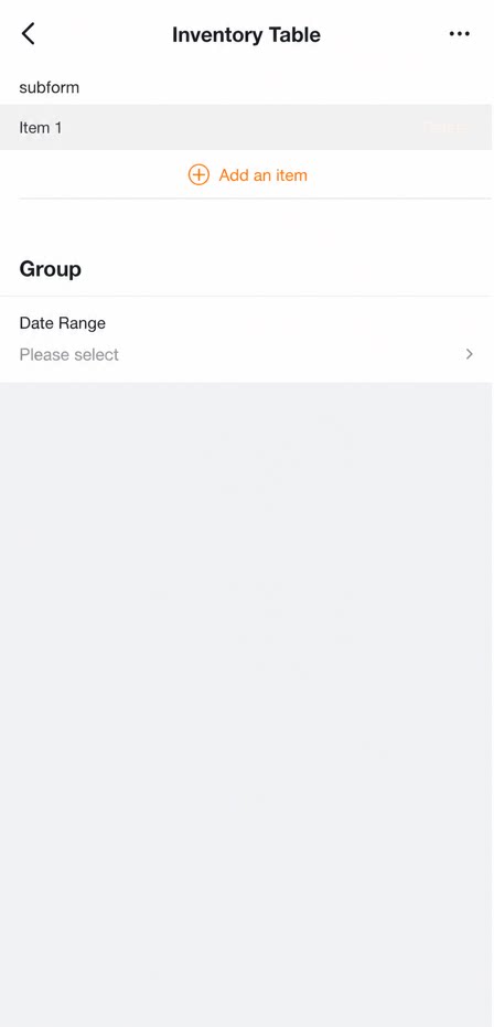
For the five layout methods mentioned above, mobile display differs from PC display. On mobile, all forms use a single-column layout by default.