Chats
Chats Calendar
 Meetings
 Contacts
 Mail
Mail Docs
Docs Drive
Drive AI Table
 AI Minutes
 Attendance
 Approval
 YiDA
YiDA Admin Console
1. Introduction
1.1. Overview
This section explains how the detail page designer works and the specific configuration options it provides for laying out content and highlighting key data. Core capabilities include: customizing button actions on the detail page, freely adjusting the detail page content layout and toggling content visibility, customizing data summary fields (in development), displaying summary information as tags (in development), and displaying key business fields as progress bars (in development).1.2. Use Cases
- CRM: On the “My Customers” page, use custom button actions to complete complex business flows in a single click, such as following up with customers, returning them to the public pool, or changing the account owner.
- Manufacturing: Use the source record page as a product specification page that shows only form field information, and hide sections such as the data summary, comments, and change history.
- Approval management: Arrange form information and approval progress side by side to review approval status at a glance.
- Project management: Display the “Project Stage” field as a progress bar to make project progress explicit.
2. User Guide
2.1. Entry Point
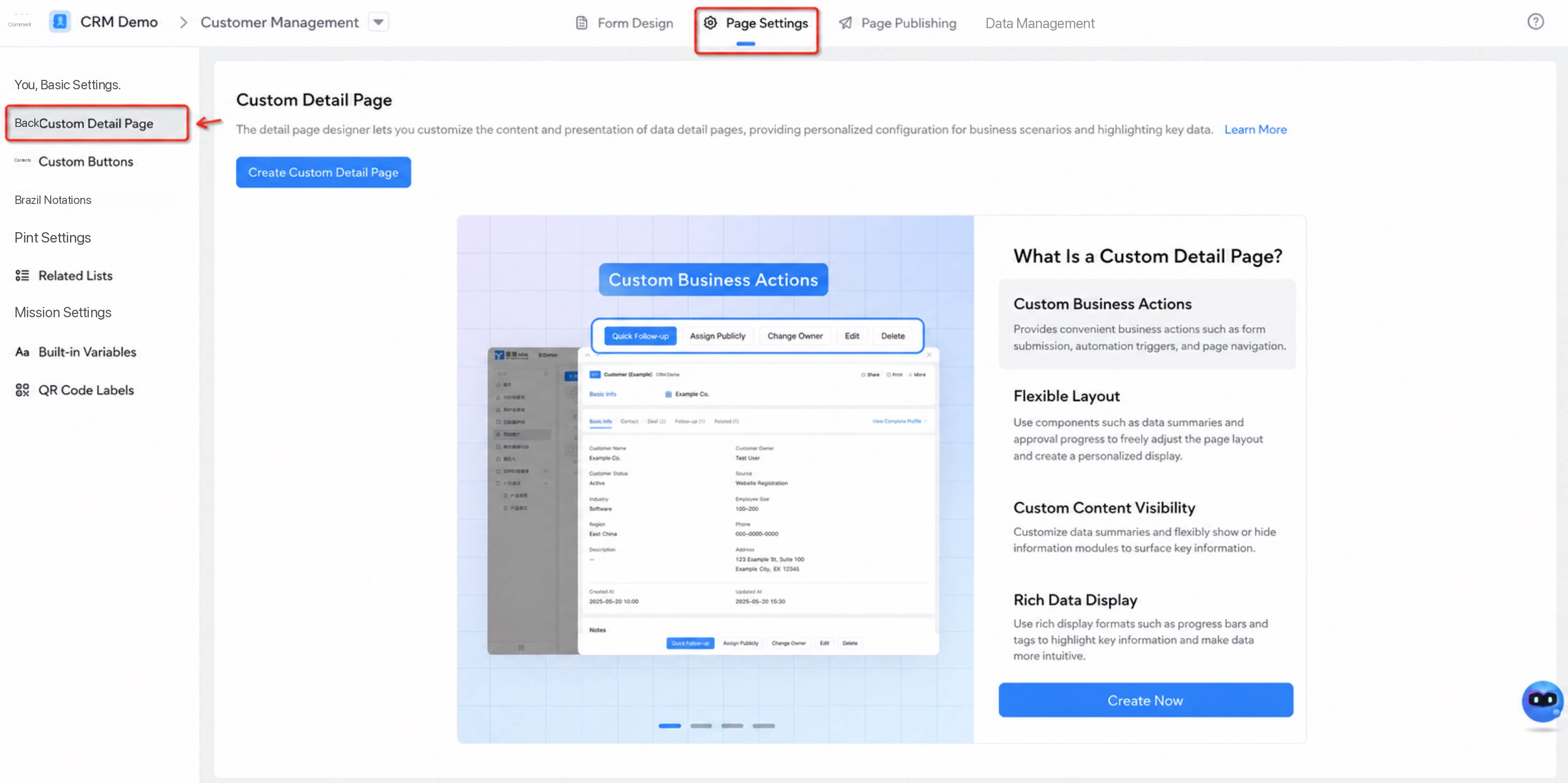
- App Management console > Form / workflow form > Page settings > Custom detail page
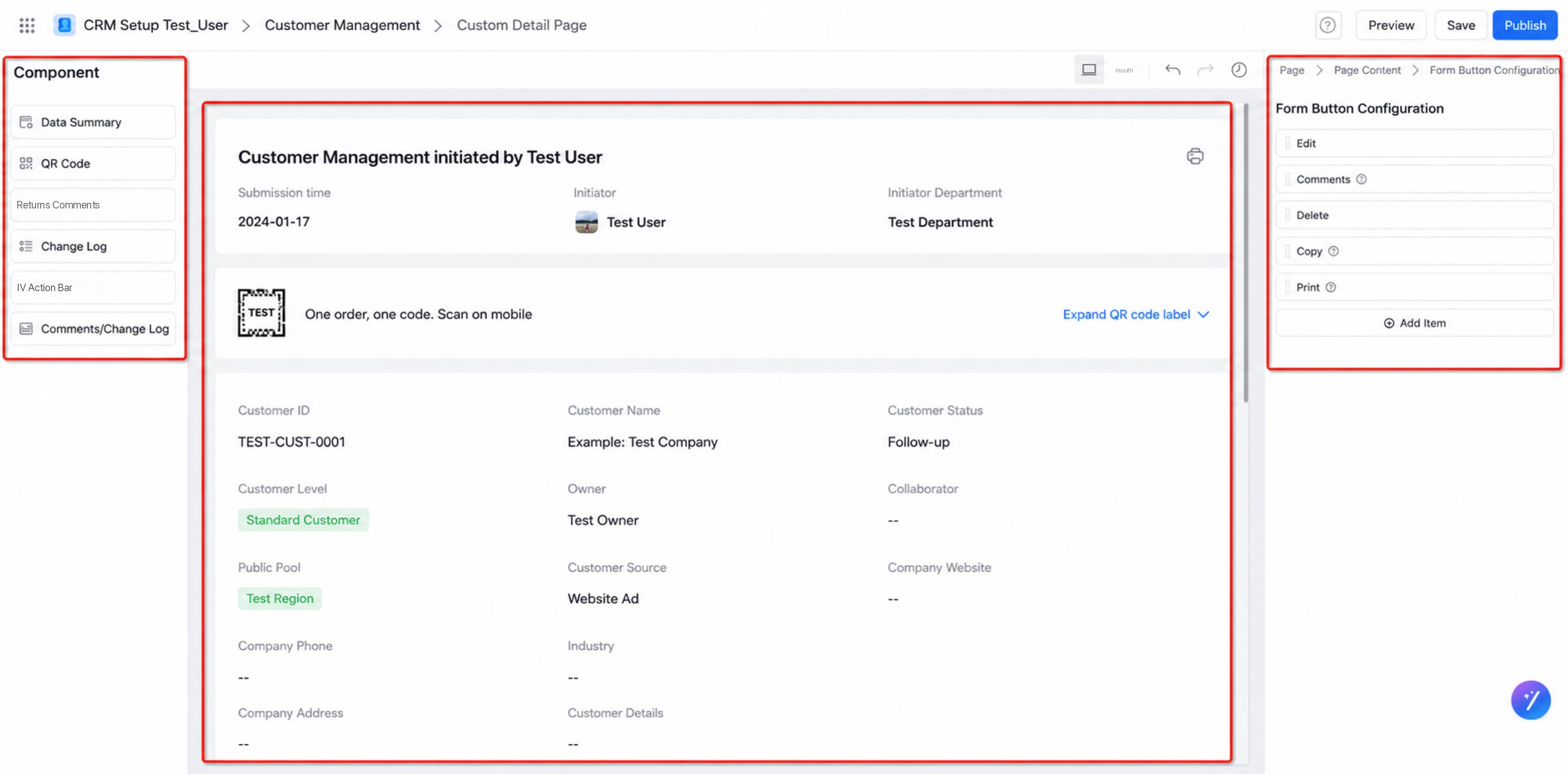
- On the custom detail page, flexibly configure the layout of each section and the custom buttons in the action bar.
- The custom detail page designer consists of the component panel on the left, the content preview area in the middle, the property configuration panel for each component on the right, and detail page actions such as preview, save, and publish.
2.2. Configure Custom Buttons
- Select the button action bar. Existing system buttons load automatically on initialization. Click “Add item” to create a custom button.
- If custom buttons already exist, select them to add them directly to the detail page.
2.3. Configure the Detail Page Layout
Each section supports deletion and drag-and-drop adjustments for layout, order, and width.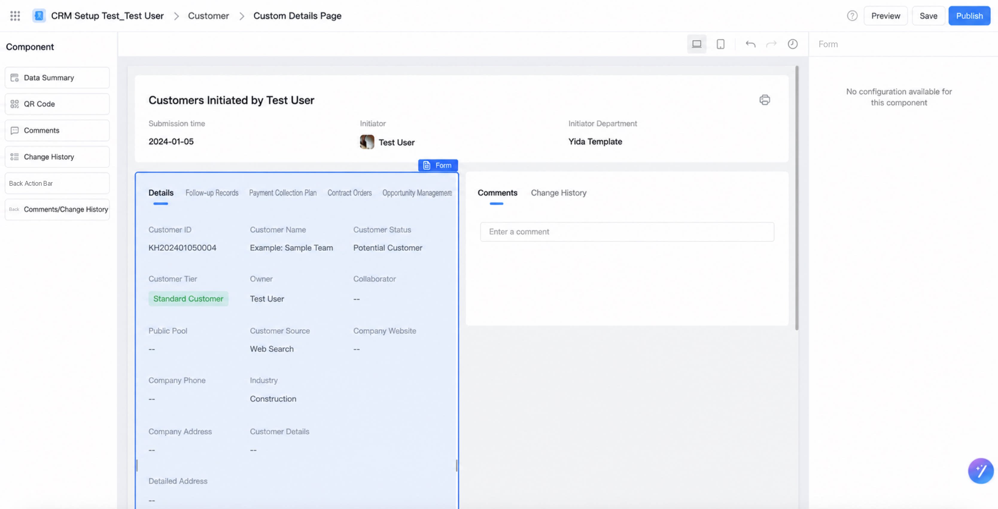
Data Summary
The data summary displays key form field information. The system currently provides a default set of form fields. Support for selecting other fields will be added later (in development).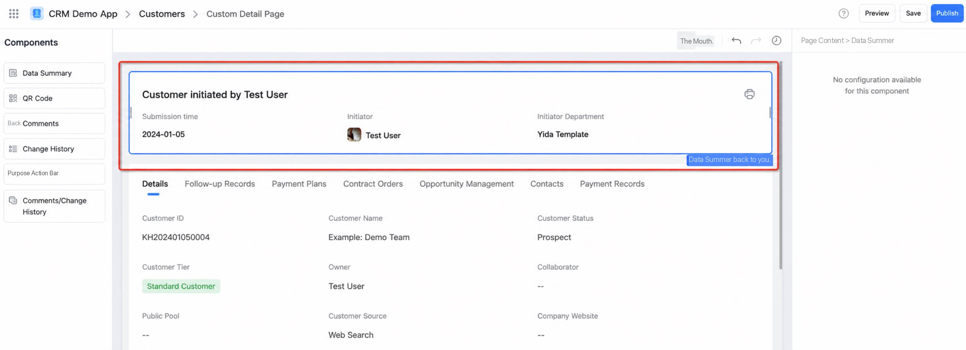
QR Code
One code per record. Scan the QR Code to quickly view record details and generate QR Code labels.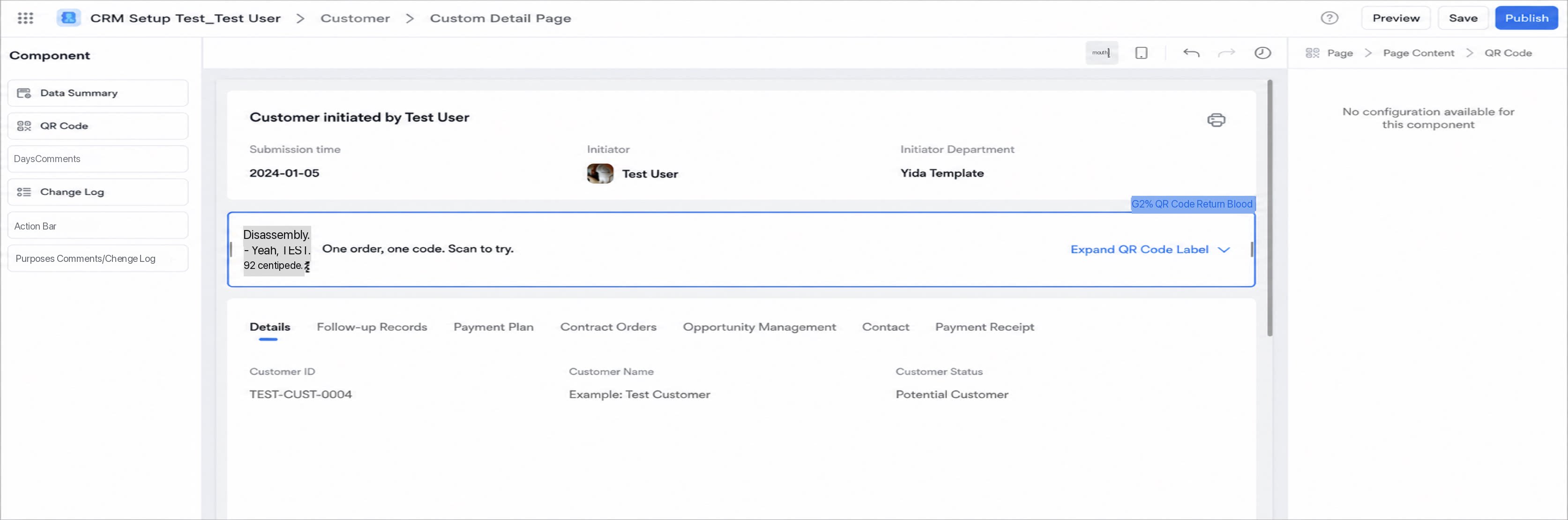
Approval Progress
For workflow forms, the source record page shows the approval progress. The platform provides a combined view of approval progress, comments, and change history. To display them separately, delete the combined component and add the standalone Approval progress component.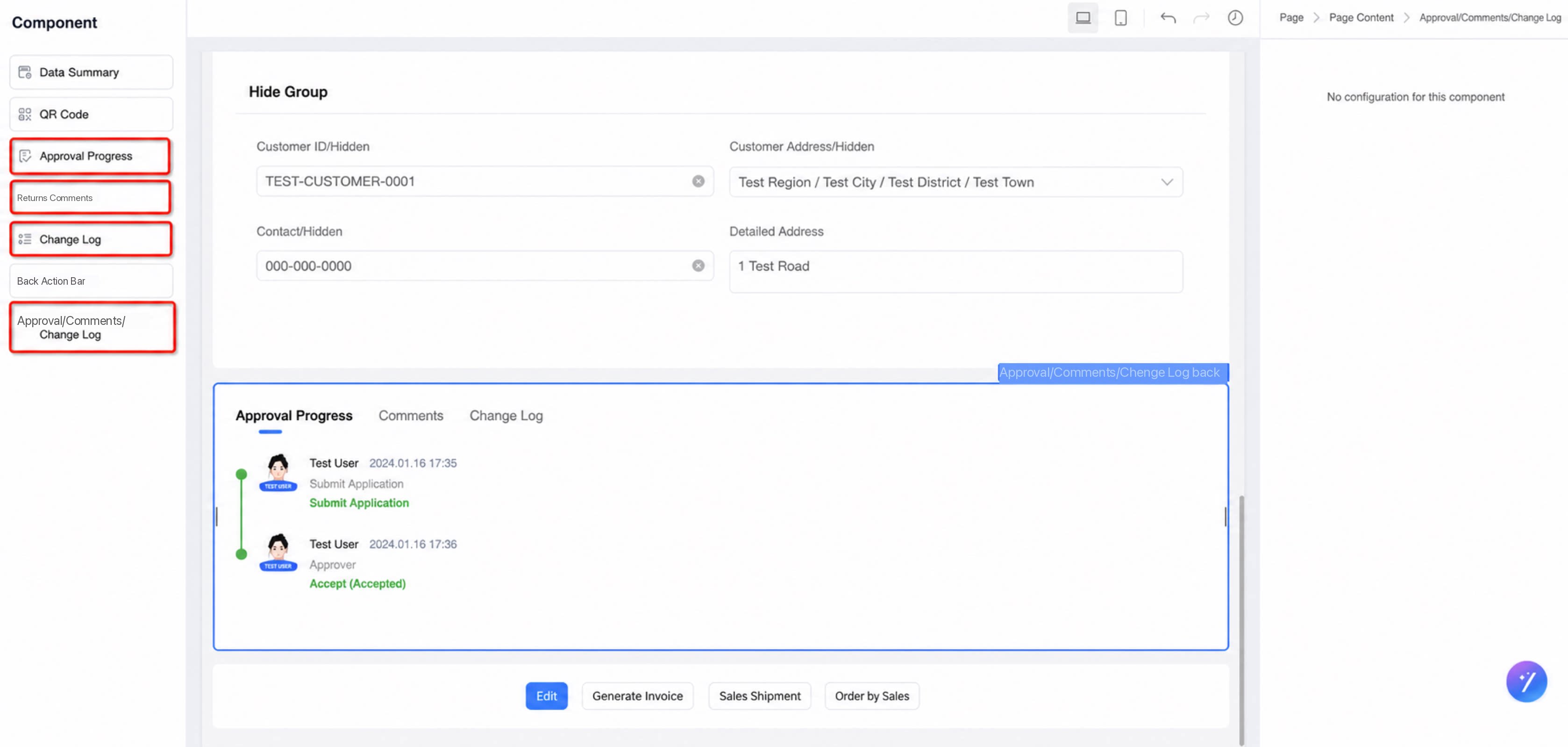
Comments
Displays comment records. The platform provides a combined view of approval progress, comments, and change history. To display them separately, delete the combined component and add the standalone Comments component.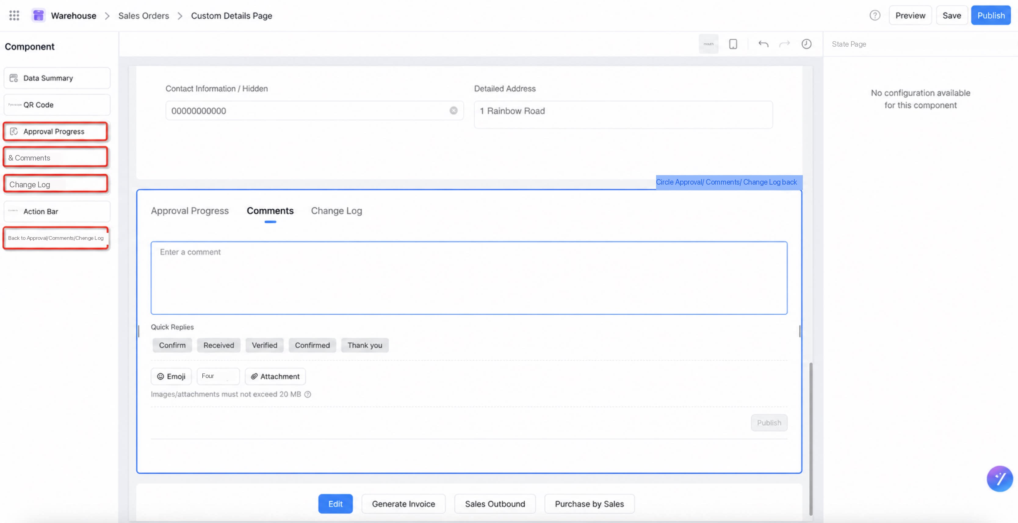
Change History
Displays the change history of form data. The platform provides a combined view of approval progress, comments, and change history. To display them separately, delete the combined component and add the standalone Change history component.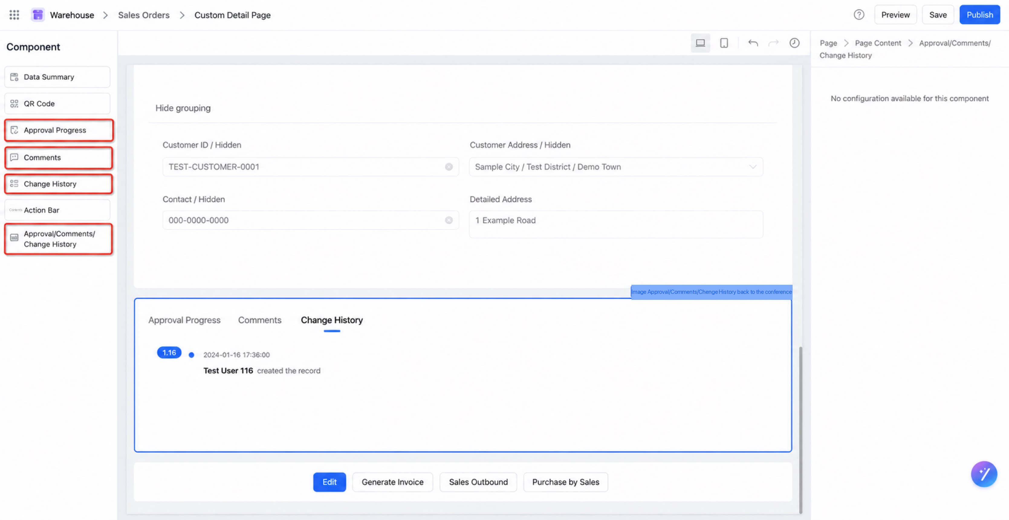
Action Bar
The action bar is pinned to the bottom in view mode. Manage its buttons through the custom button configuration.3. Notes
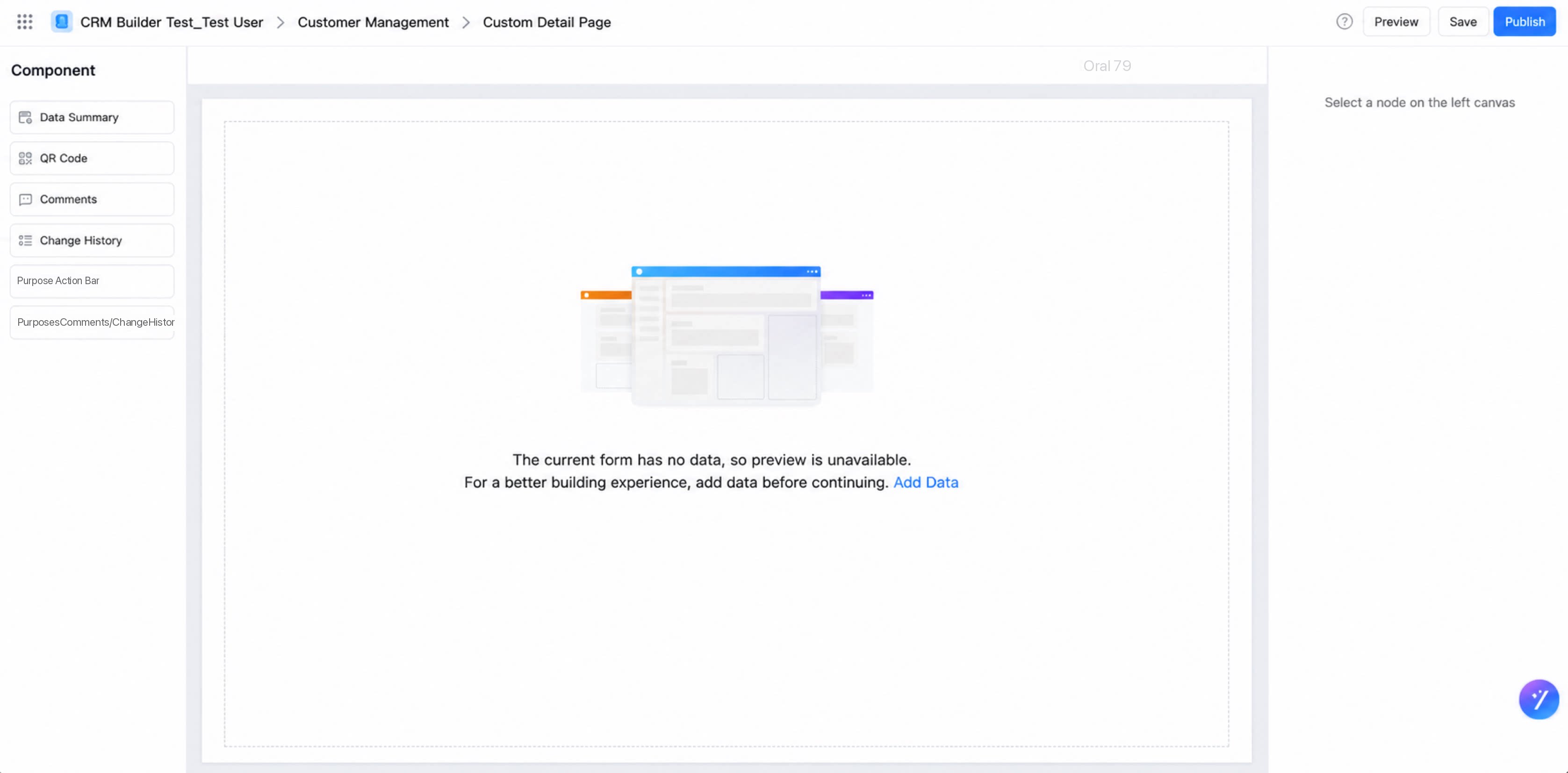
- When the form has no data, creating a custom detail page prompts you to submit sample data for a better preview experience.
- Click Preview to load the first sample record you have permission to view by default.
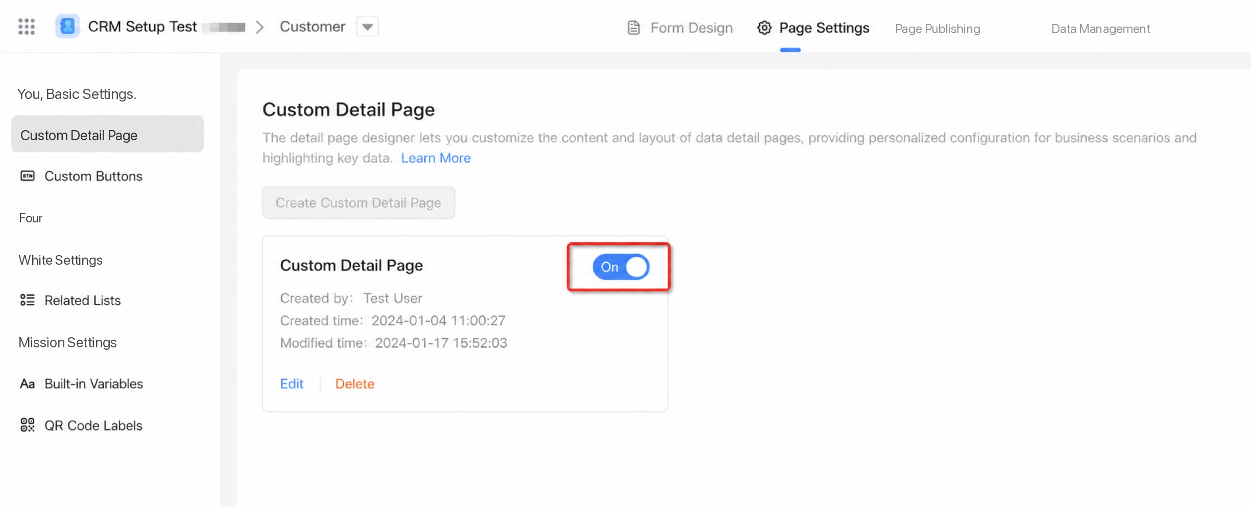
- After you click Publish, the custom detail page is On by default. To display the default detail page instead, click Close.