

 Chats
Chats Calendar
 Meetings
 Contacts
 Mail
Mail Docs
Docs Drive
Drive AI Table
 AI Minutes
 Attendance
 Approval
 YiDA
YiDA Admin Console
1. About the Layout Container Component
1.1 What Is a Layout Container
- Layout: Controls the placement of existing visual components. It represents an action.
- Layout container: A container with layout capabilities. Multiple components can be placed inside a layout container for display.
- For complex layout scenarios, use YiDA flex layout (flex-layout). This is also the mainstream CSS layout approach in front-end development today.
- For a more detailed introduction to flex layout, see the tutorial link.
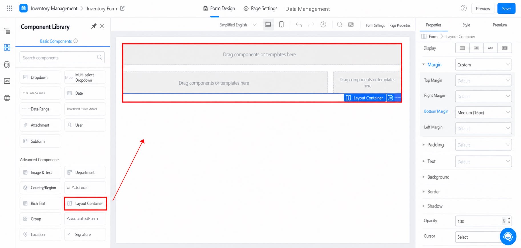
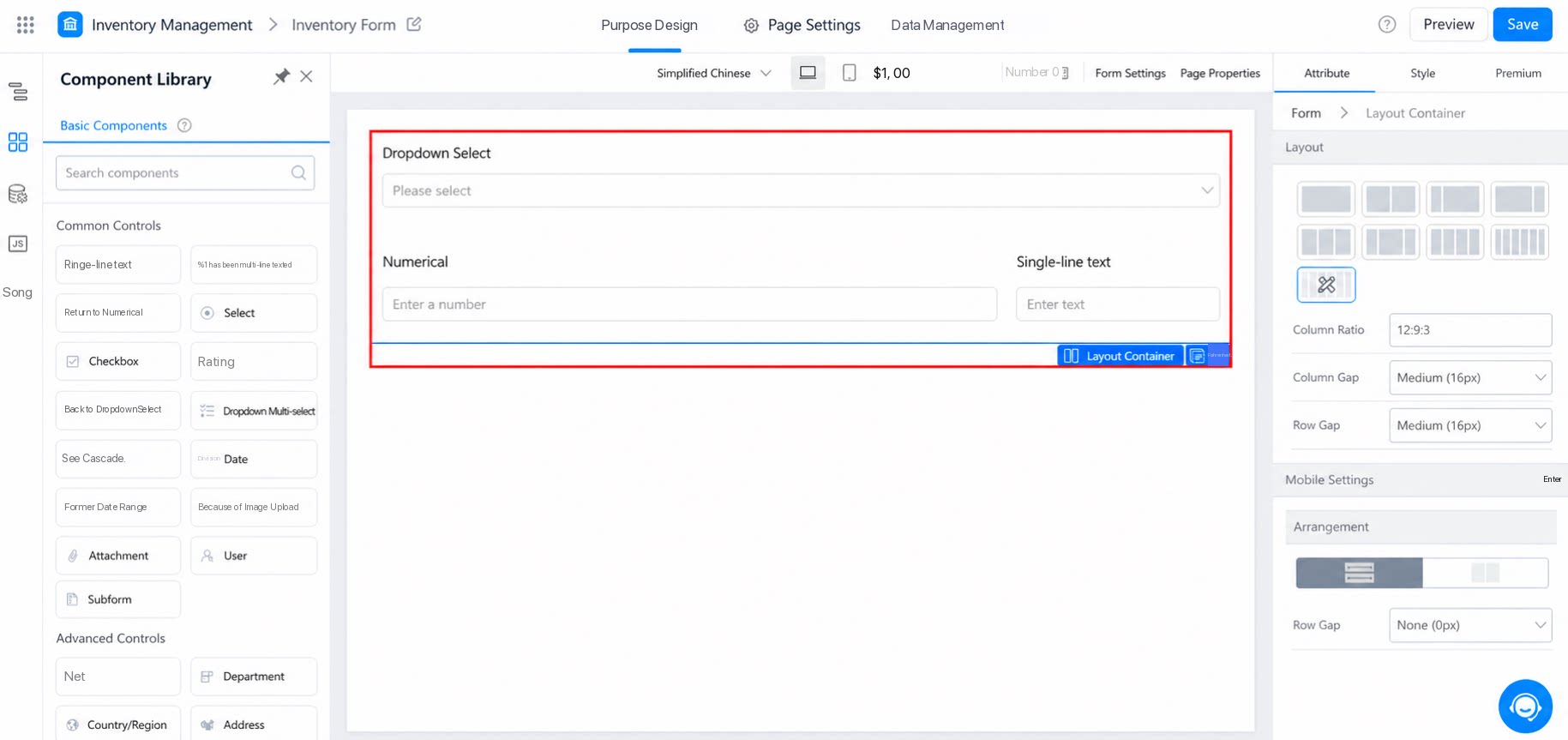
1.2 Use Cases
- When a page needs to be divided into sections—for example, displayed in two columns.
- When a page needs to adapt to different screen sizes.
- When the page layout involves nesting, relative positioning, or position-dependent design.
- When implementing page styles that require advanced CSS layout techniques.
For component attributes, usage, and examples, see Regional container.
2. Attributes
2.1 Layout
Select a system template directly, or configure a custom layout. See the example below.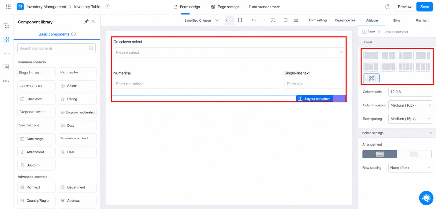
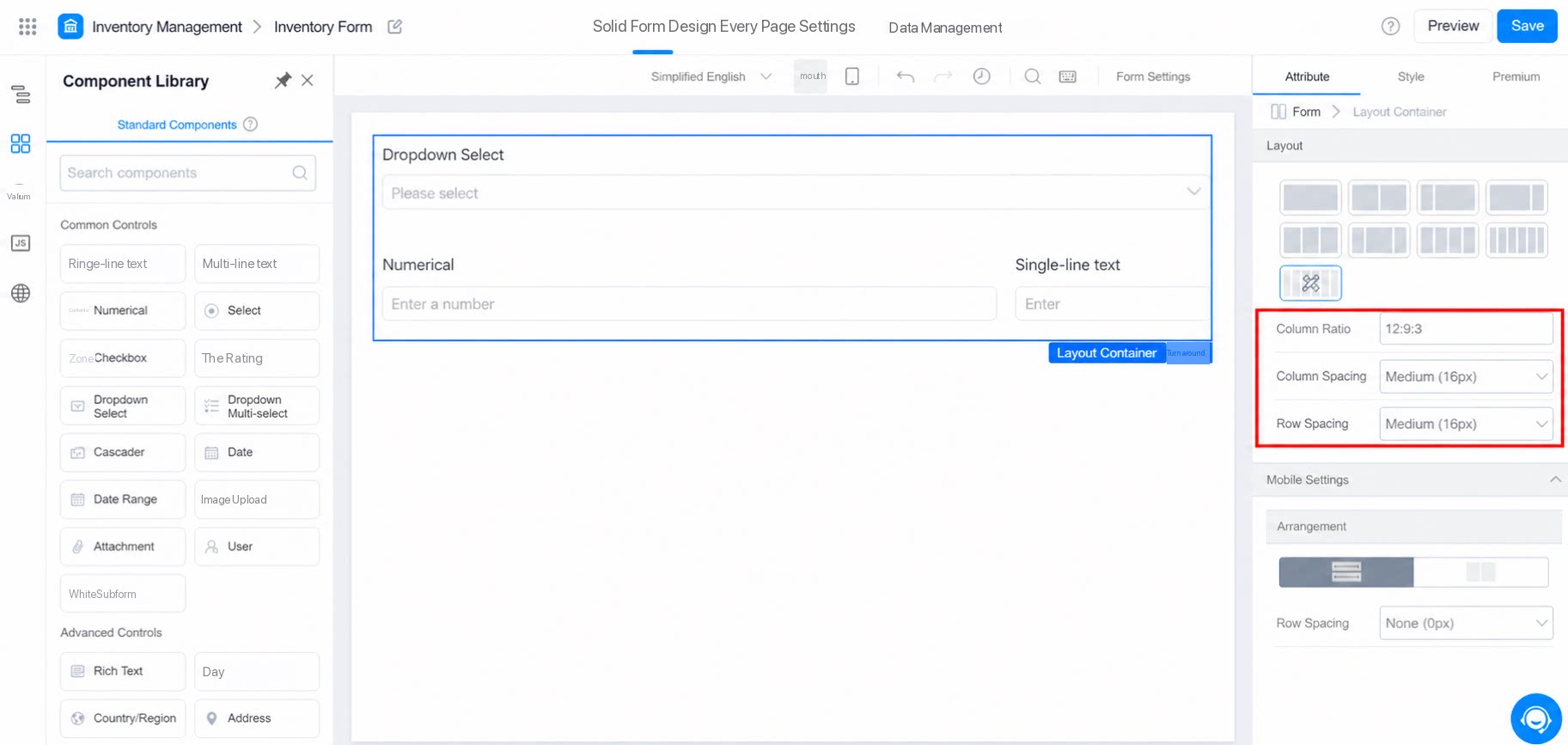
2.2 Mobile Settings
Defines how components are arranged on mobile devices. See the example below.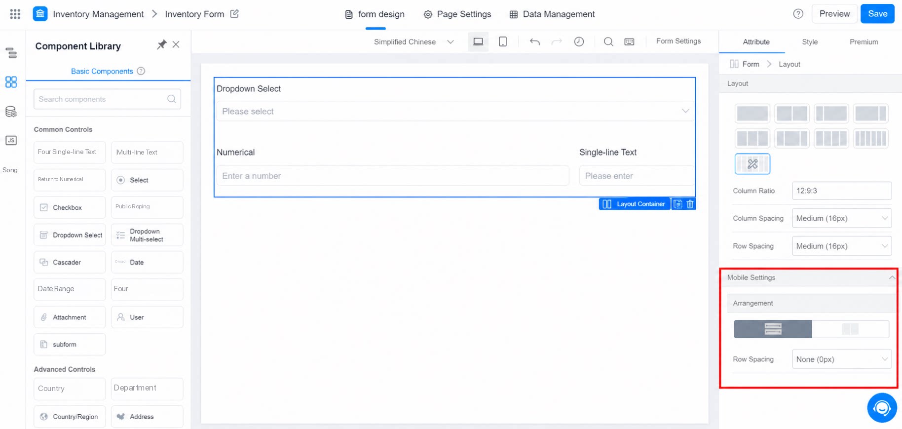
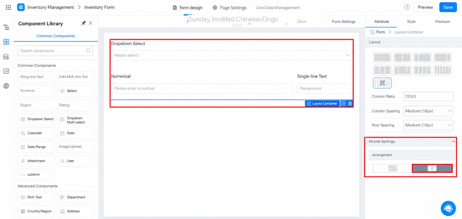
3. Style
Style configuration for the layout container.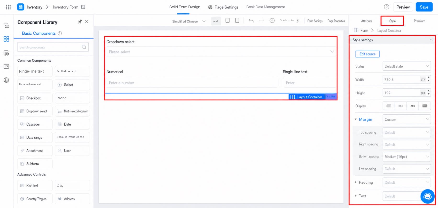
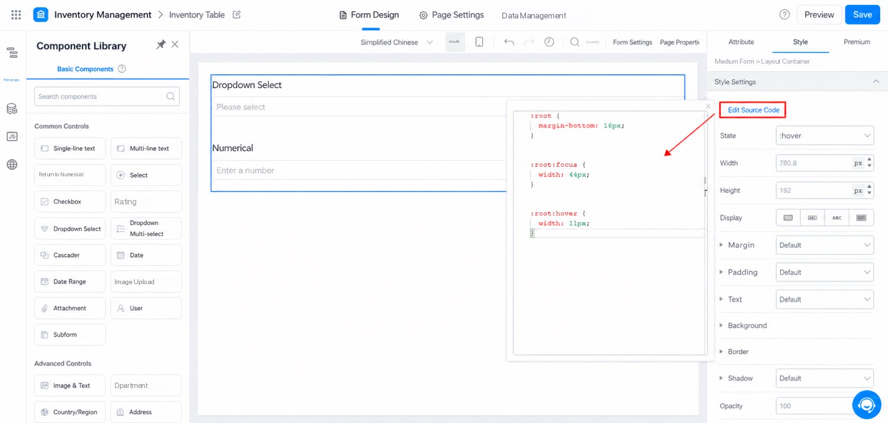
3.1 Source Code Editing
Edit styles directly in CSS source code. The current div uses flex layout by default.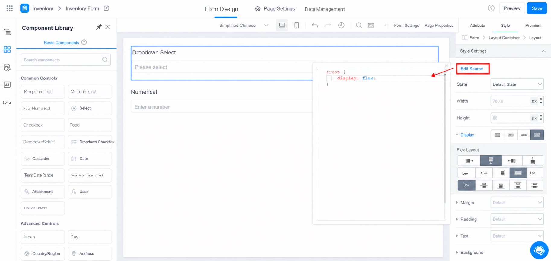
3.2 State
Group settings by traditional PC-side component states:- default: Normal state.
- hover: The pointer hovers over the component’s hot zone without clicking.
- focus: The page element is at the cursor focus position.
- active: The page element is selected and active.
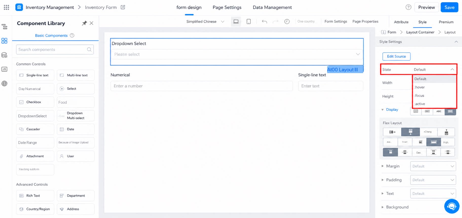
- The default state overrides the other three states.
- The hover, focus, and active state configurations are isolated from one another and do not interfere.
- In CSS, each is represented as an independent selector.
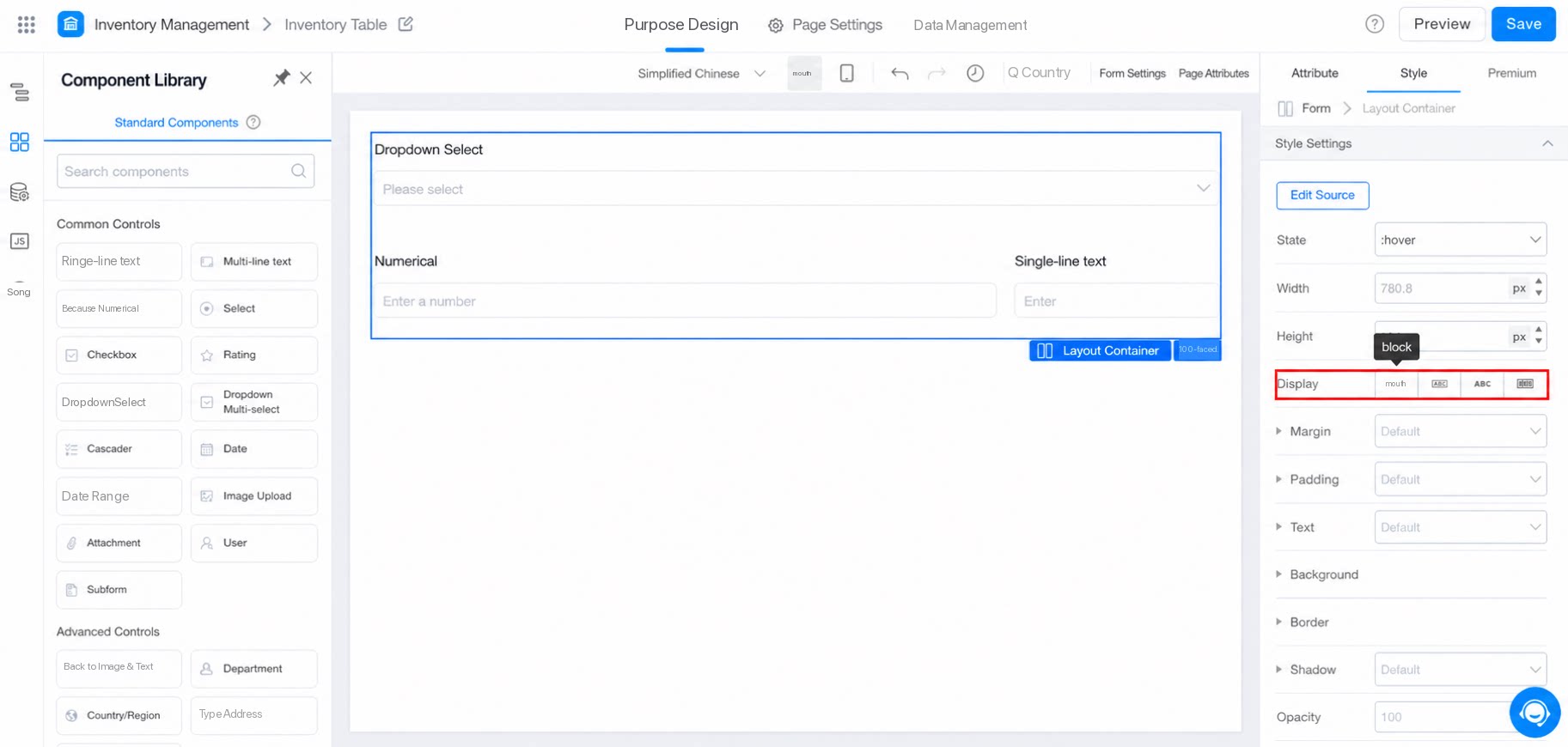
3.3 Display
Corresponds to the CSS display mode:- block: Box model.
- inline-block: Inline box model.
- inline: Inline model.
- flex: Flexible layout model.
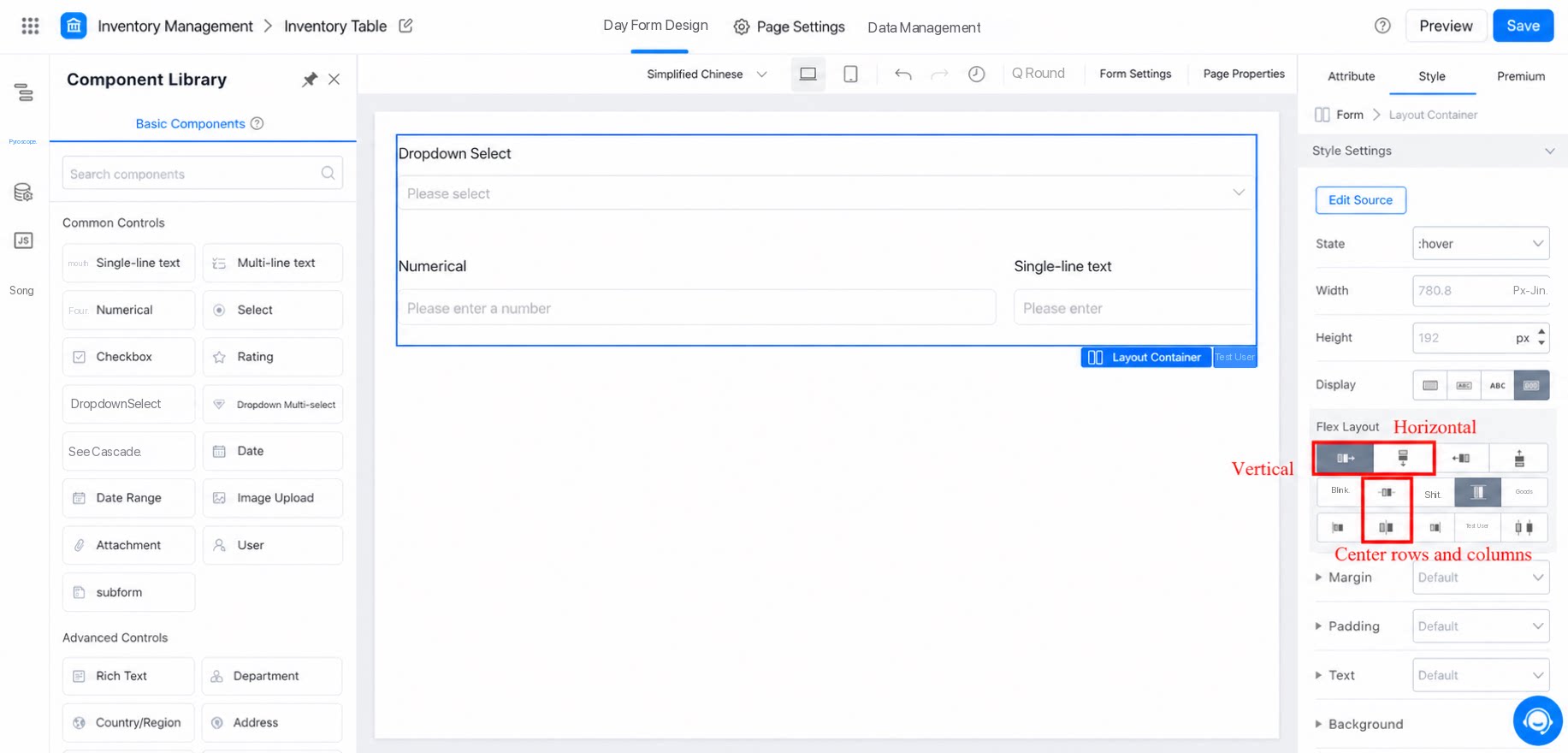
- Use flex layout to arrange components horizontally or vertically as needed.
- Then set both horizontal and vertical alignment to center. See the example below.
3.4 Margin and Padding
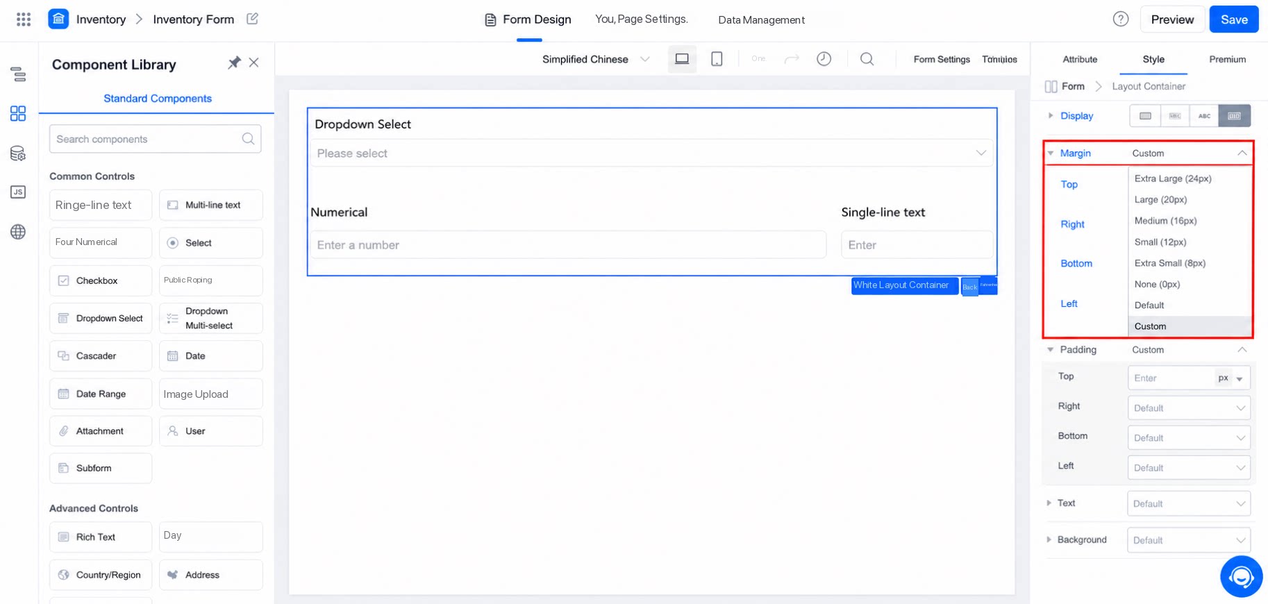
Margin refers to the distance between the box and other element nodes in the box model.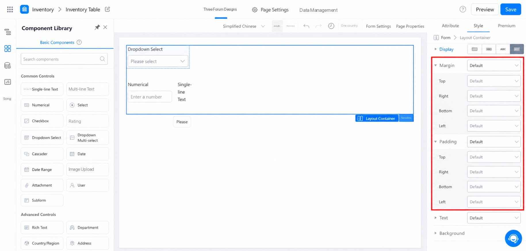
3.5 Text
Text settings affect the component titles within the group. Customize the text, or select a preset text title. See the example below.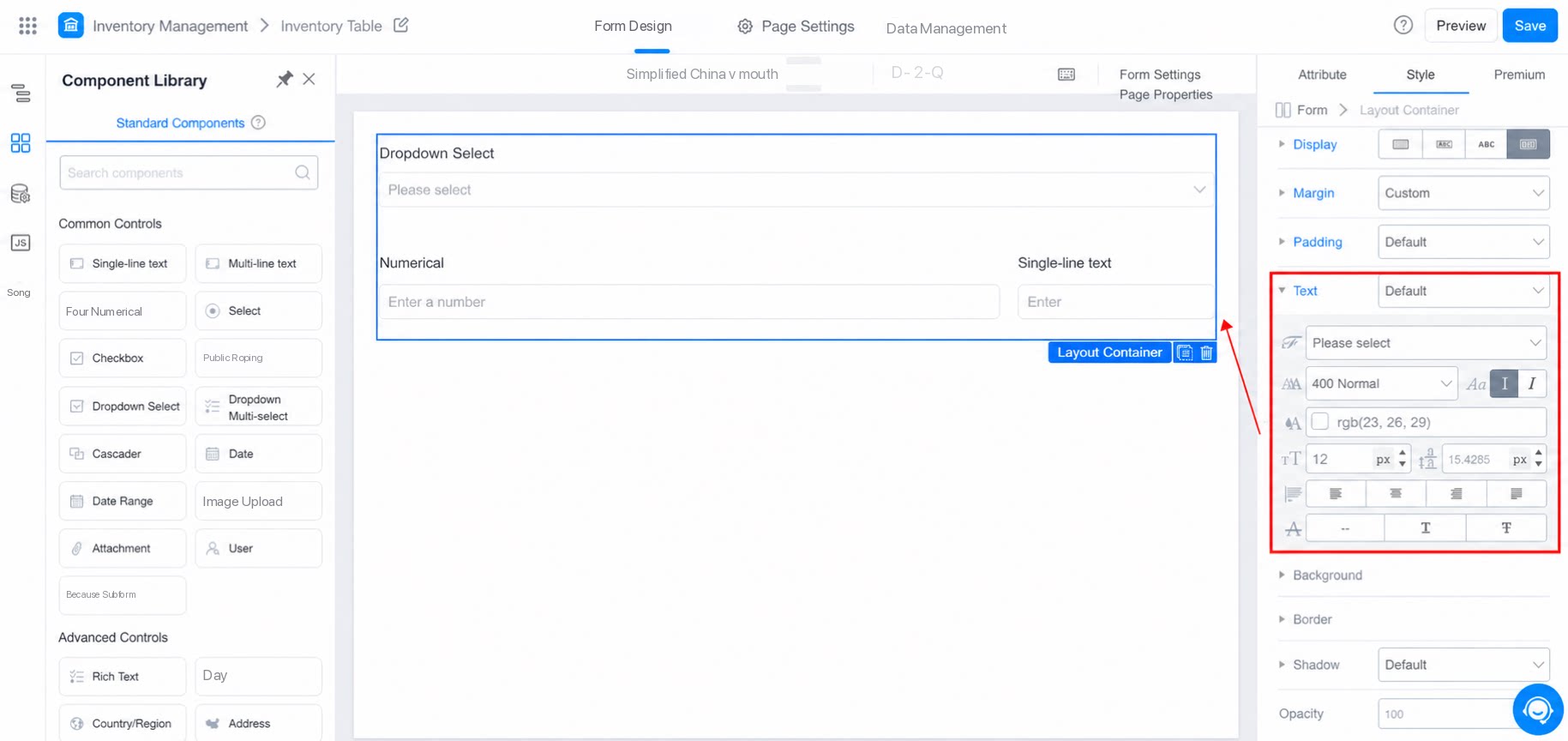
3.6 Background
Choose from the system’s built-in colors, or upload a local image as the background. See the example below.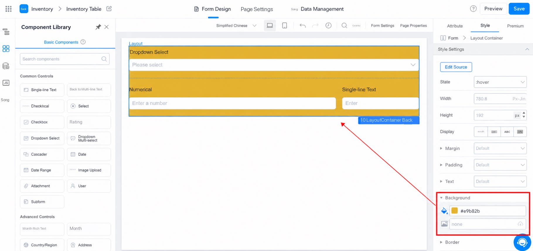
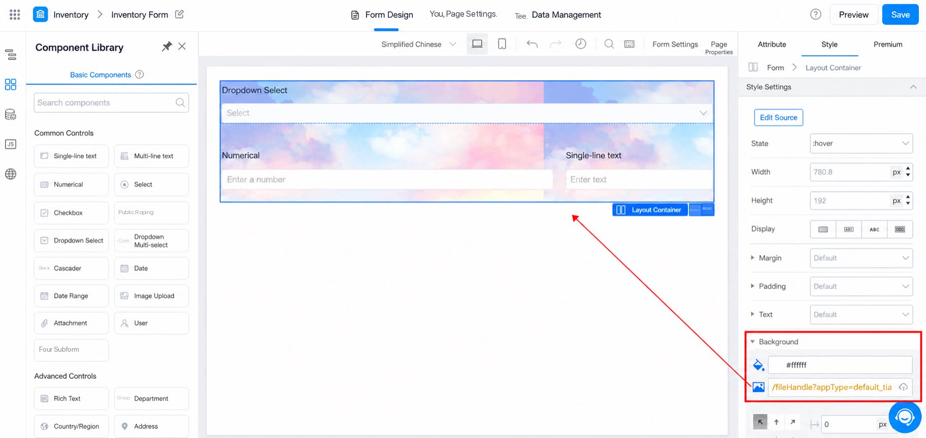
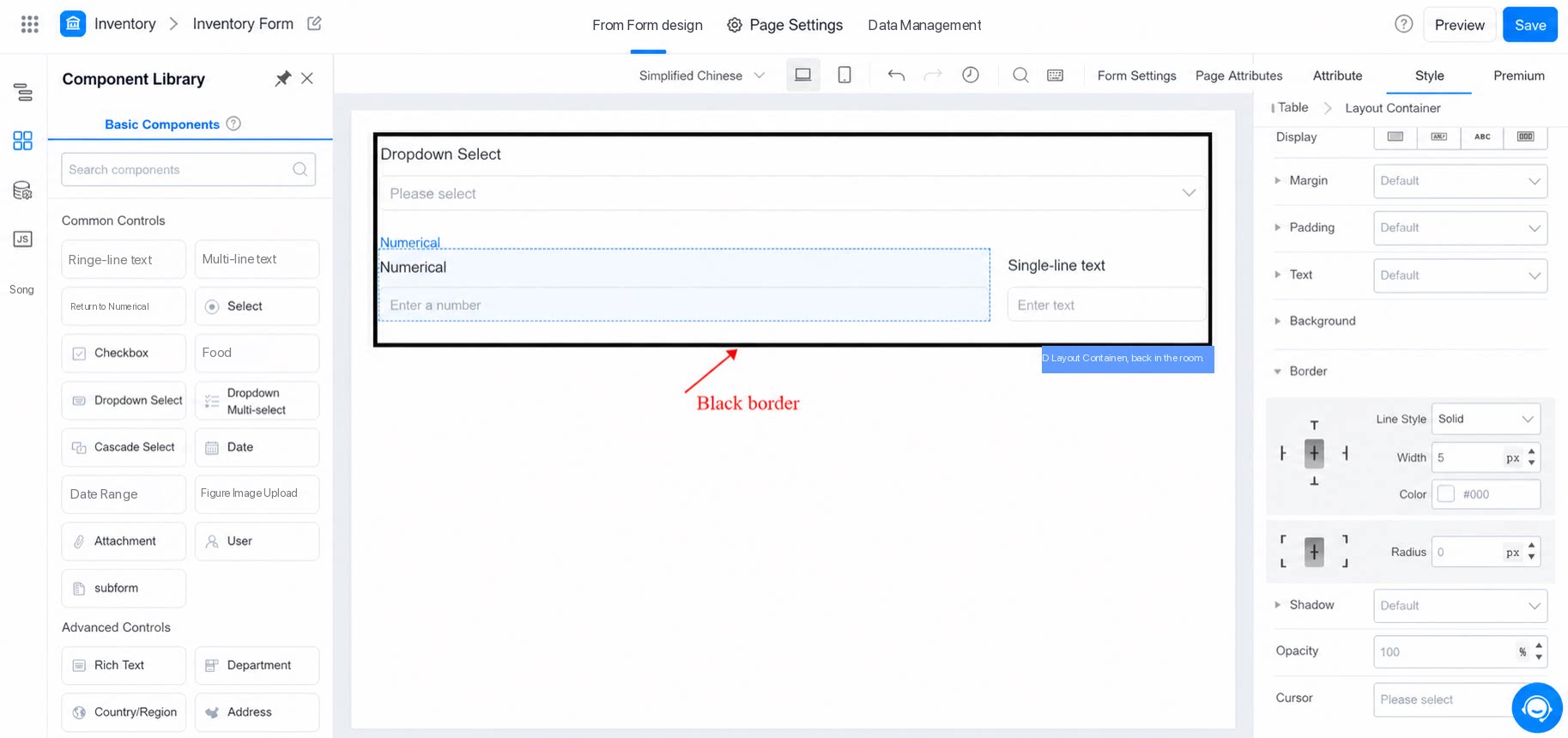
3.7 Border
Sets the border effect of the layout container component.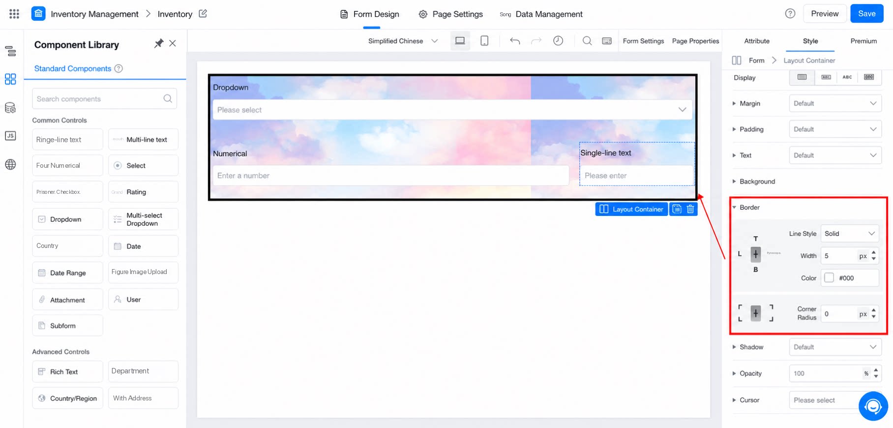
3.8 Shadow
Sets the component’s shadow projection. Use x and y to set the direction, and use blur and spread to set the shadow. See the example below.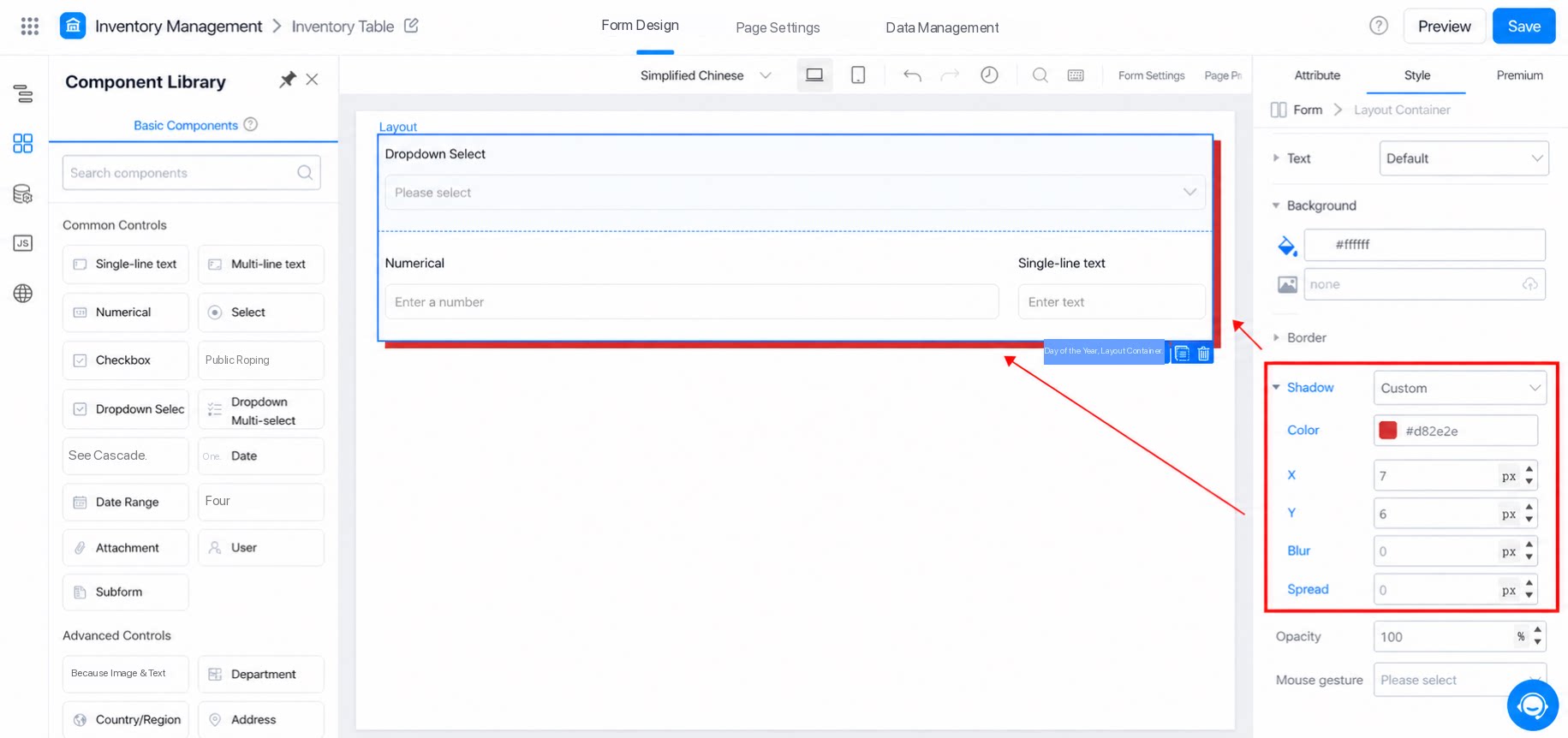
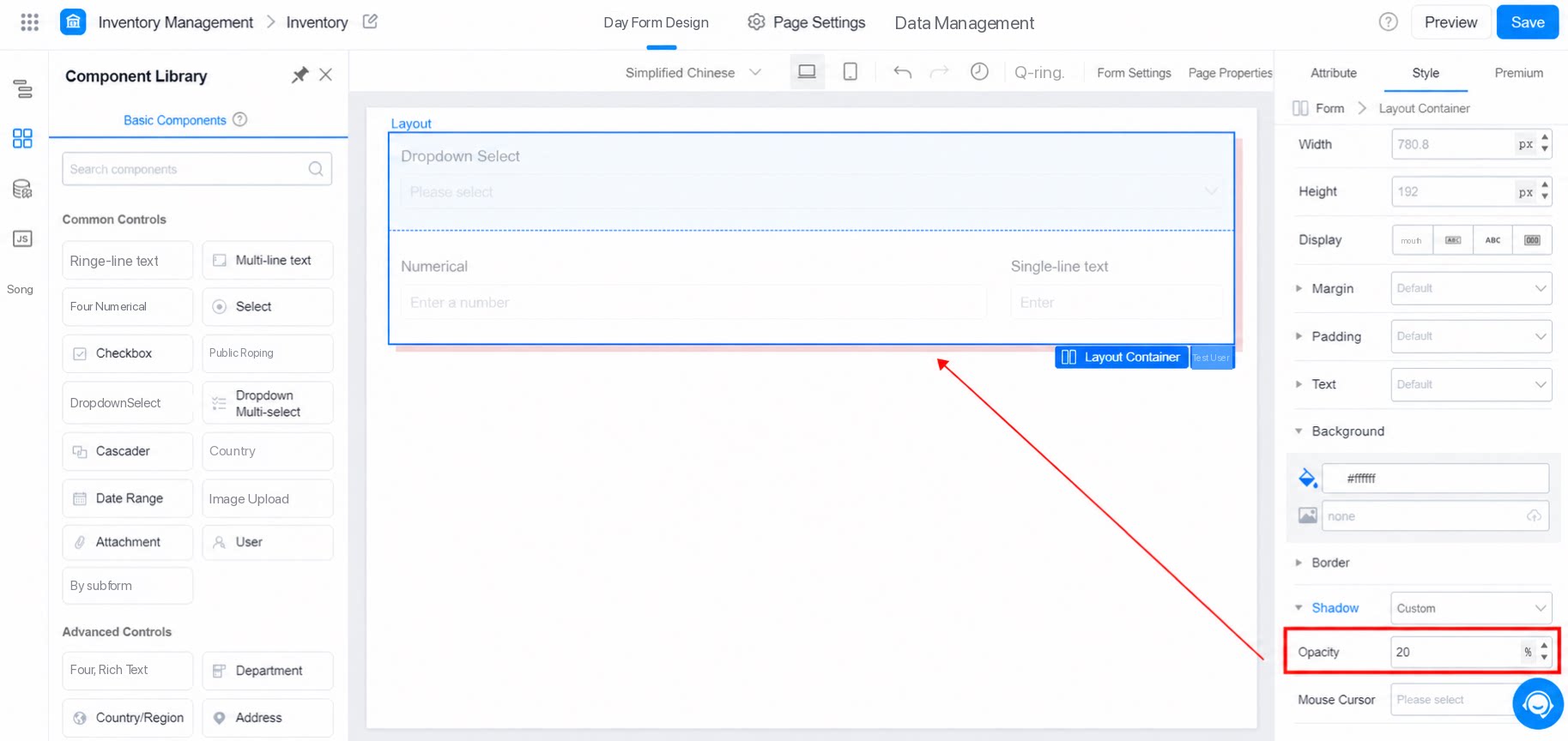
3.9 Opacity
- Sets the overall transparency of the block. The range is 0 to 100.
- The default is 100. A value of 0 means fully transparent.
3.10 Cursor
- Select pointer to show a hand icon when the pointer hovers over the block.
- Select default to show an arrow icon when the pointer hovers over the block.