

 Chats
Chats Calendar
 Meetings
 Contacts
 Mail
Mail Docs
Docs Drive
Drive AI Table
 AI Minutes
 Attendance
 Approval
 YiDA
YiDA Admin Console
1. Introduction to the Group Component
1.1 What Is Group
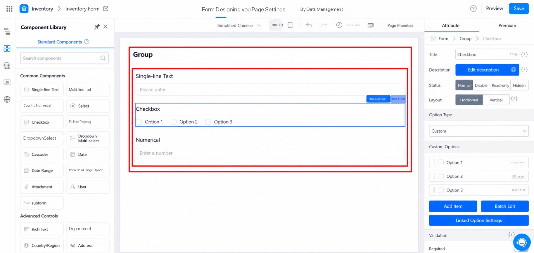
Group is an officially recommended block manager that gathers modules with similar functions into a single group. The effect is shown below: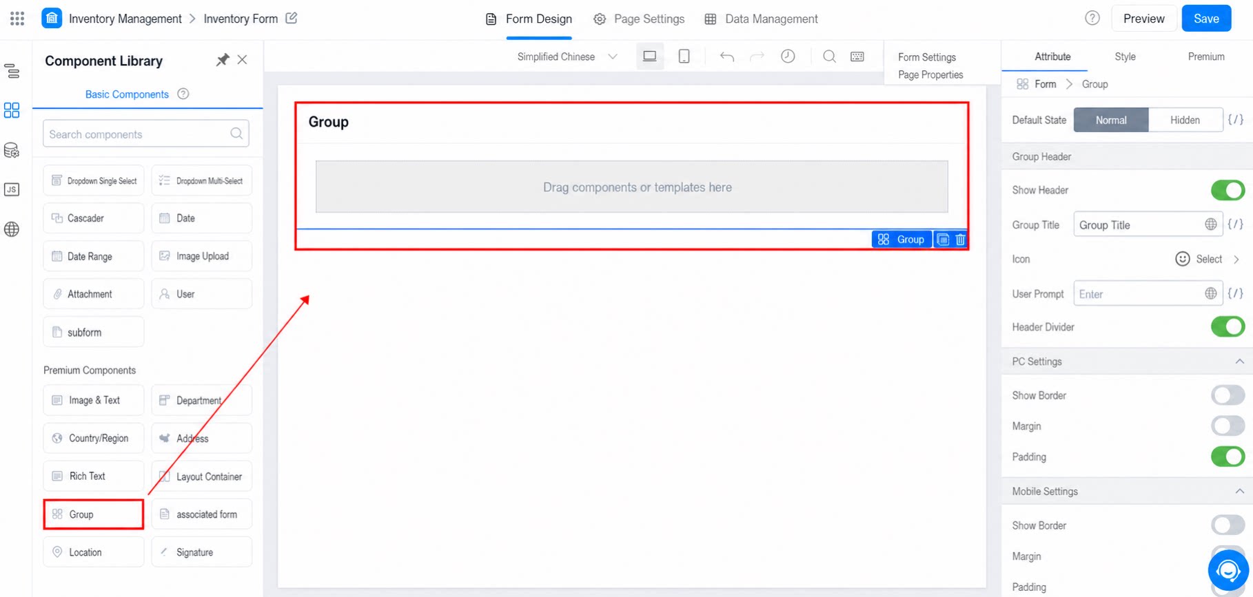
1.2 Use Cases
Use groups when a page contains multiple independent modules (for example, products, shelves, and prices in a store, where each product sits in its own module) and each module includes multiple form components. Place each module into its own group.2. Attributes
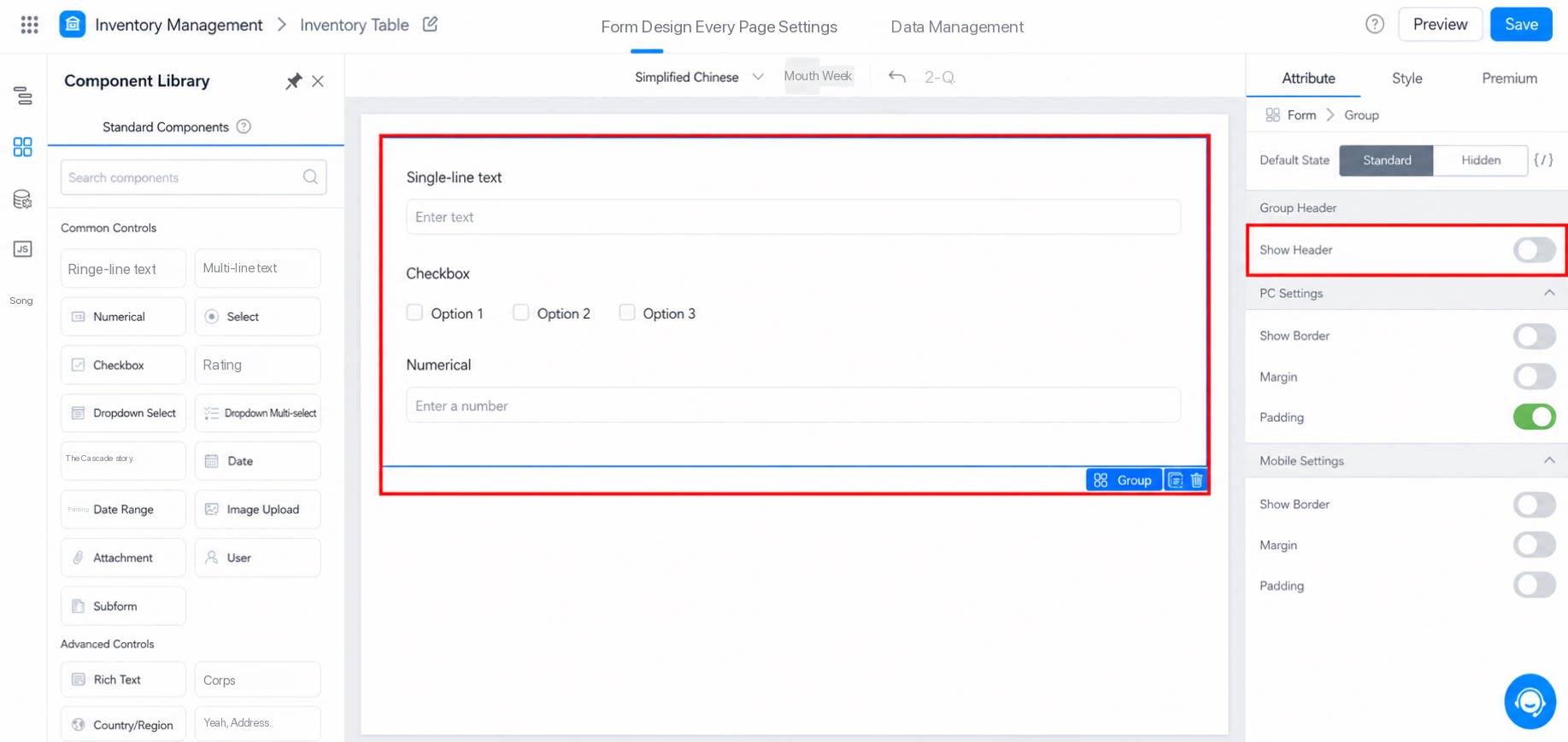
2.1 Show Header
When the toggle is off, all header configuration options collapse automatically. Show header vs. hide header: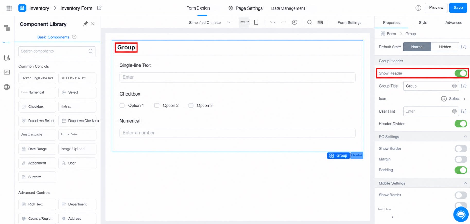
2.1.1 Group Title
Displays the name of the group. When the text is too long, it is truncated and only the first 9 Chinese characters appear.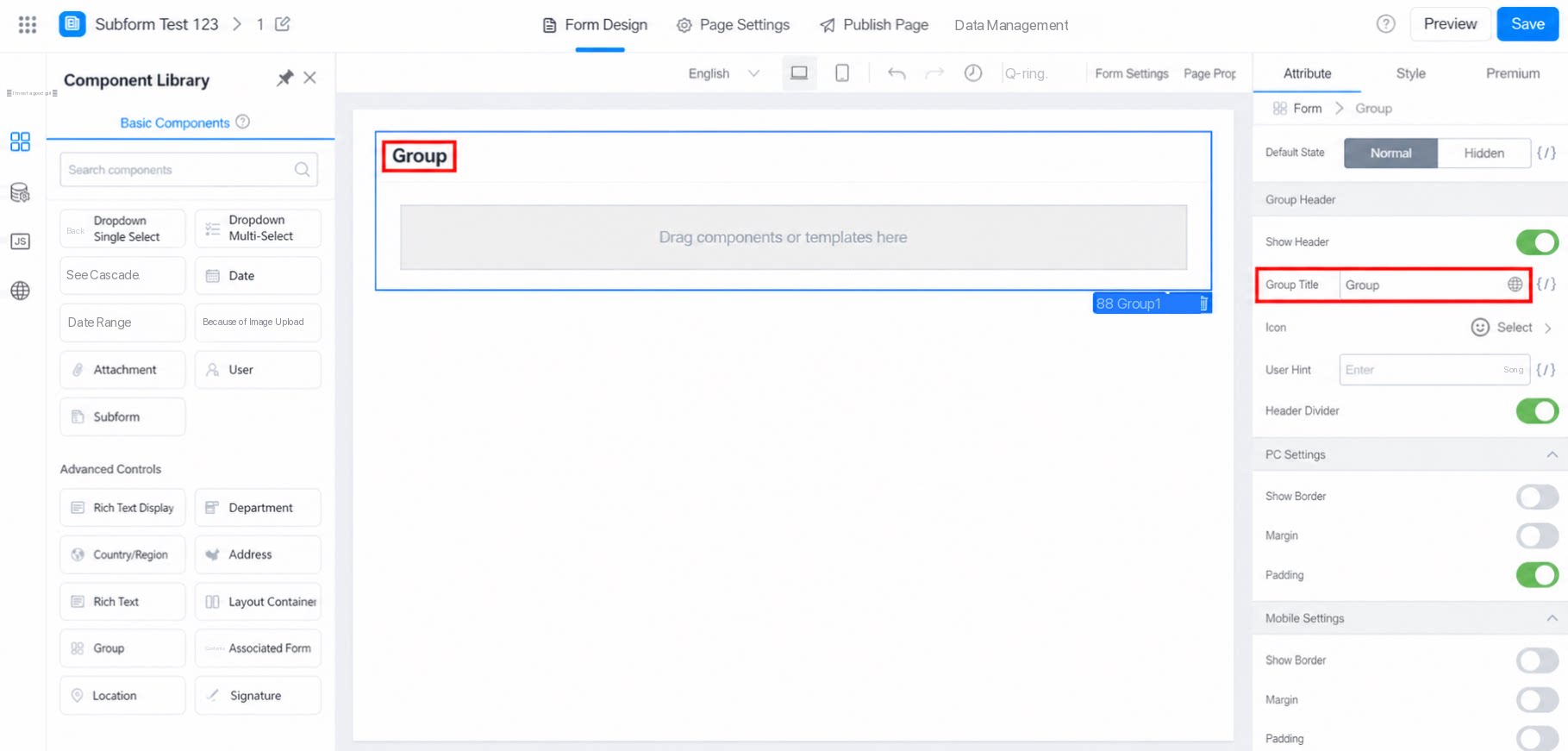
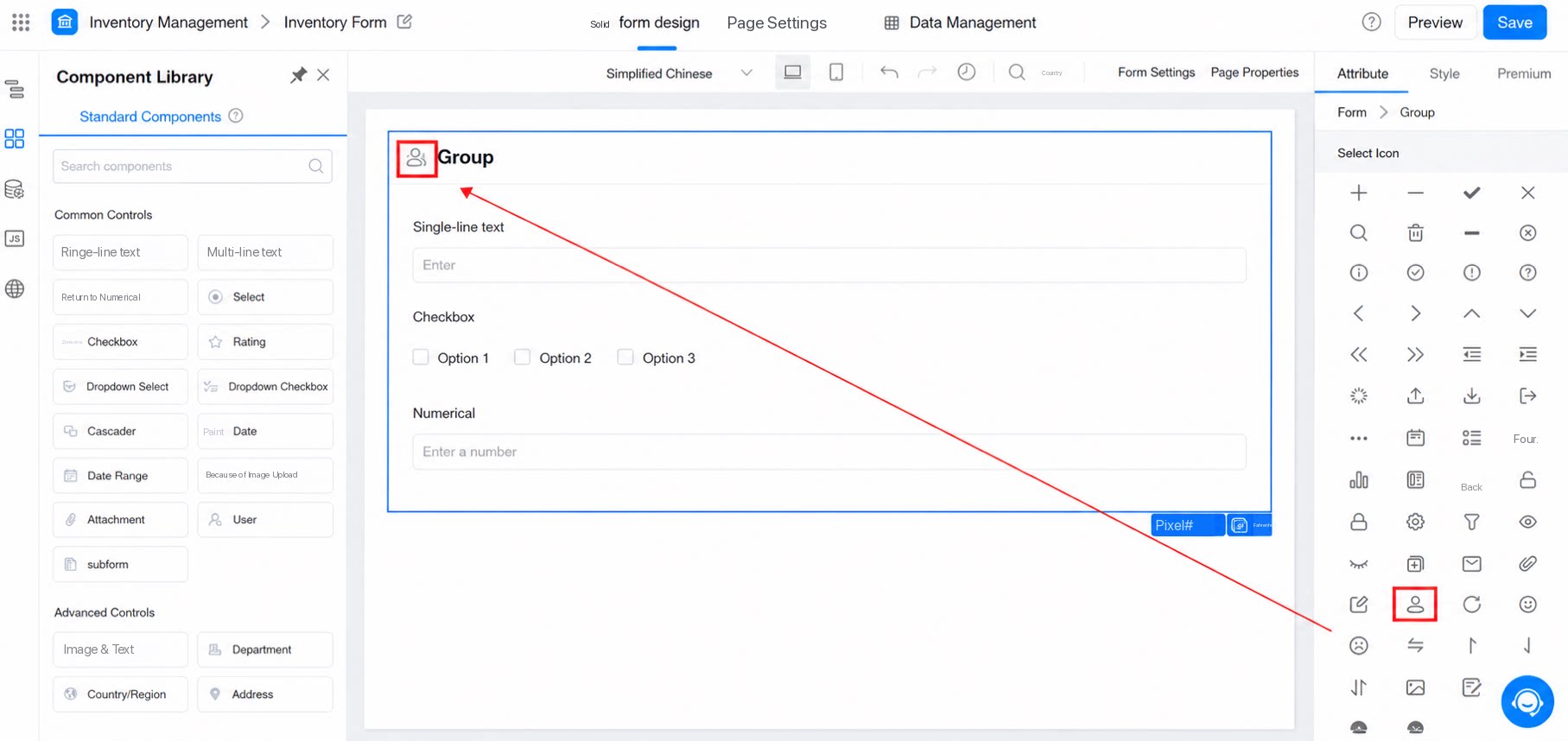
2.1.2 Icon
Set an icon for the group. The effect is shown below: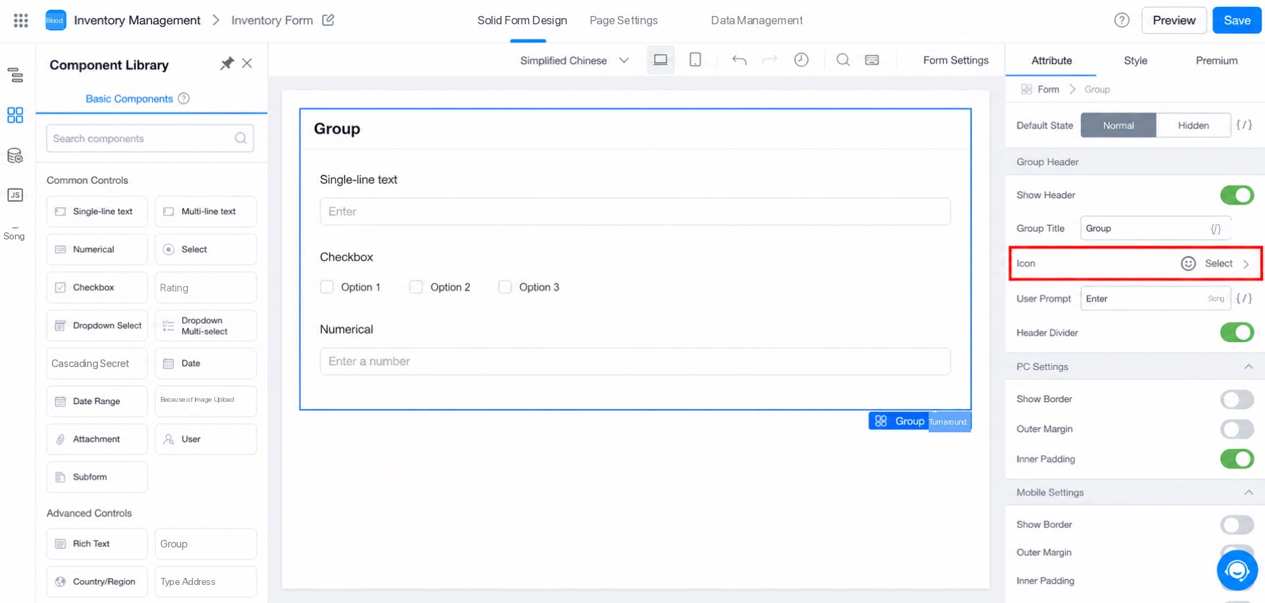
2.1.3 User Tips
Adds an “i” icon after the group name. Click it to view key information. The effect is shown below: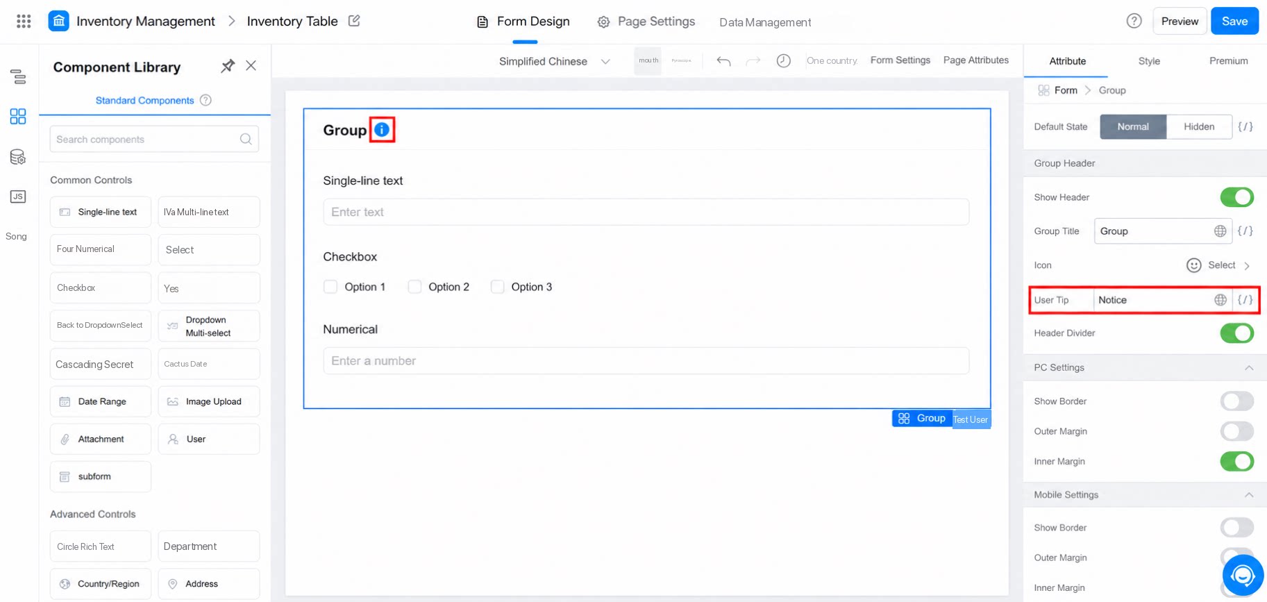
2.1.4 Header Divider
When the toggle is off, the header divider is hidden. The effect is shown below: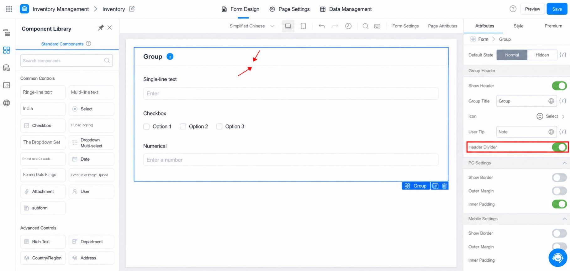
2.2 PC Settings
Control how the Group component appears in the form page layout. The effect is shown below: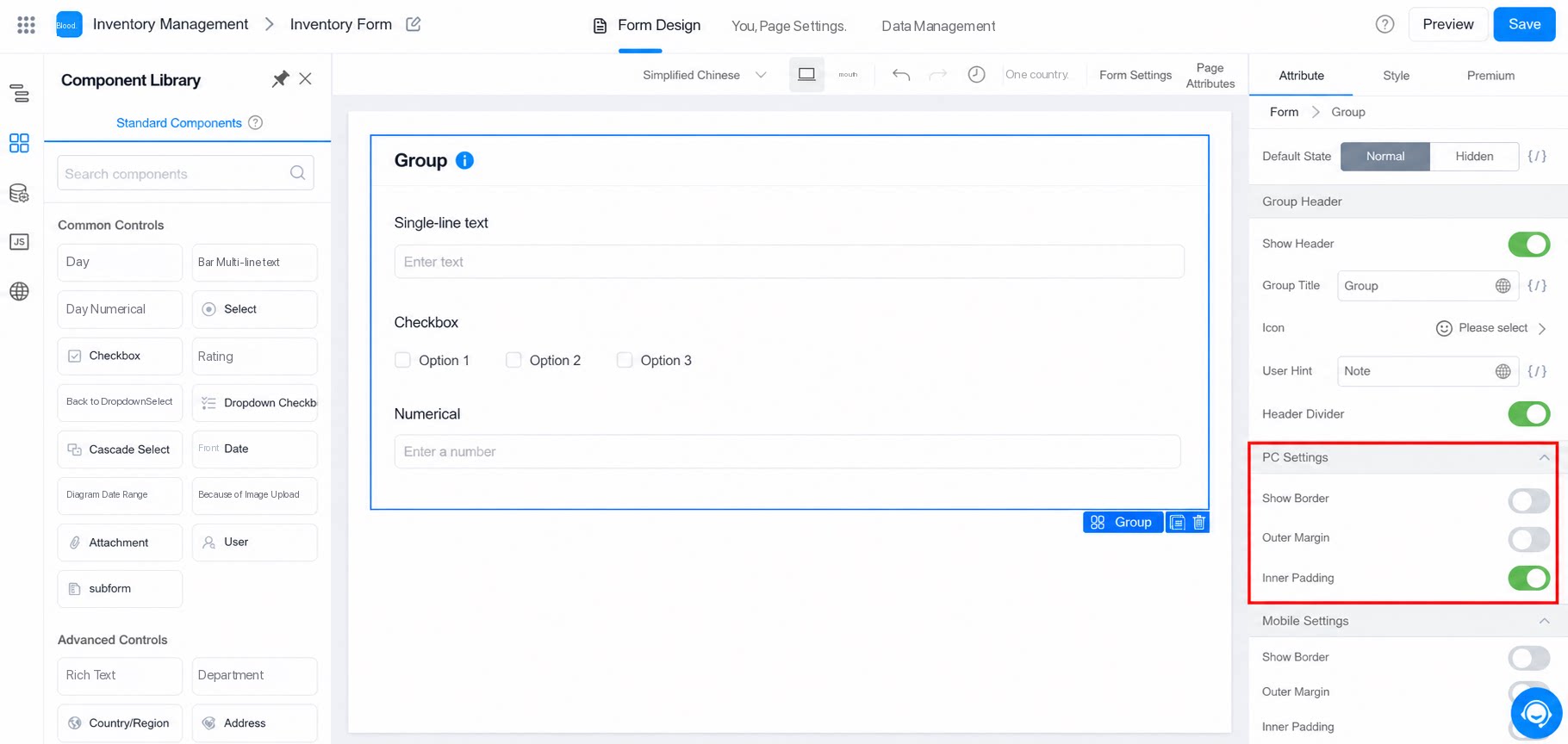
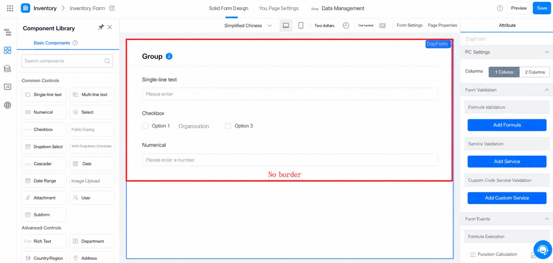
2.2.1 Show Border
Displays a border around the Group component. The effect of turning it on and off is shown below: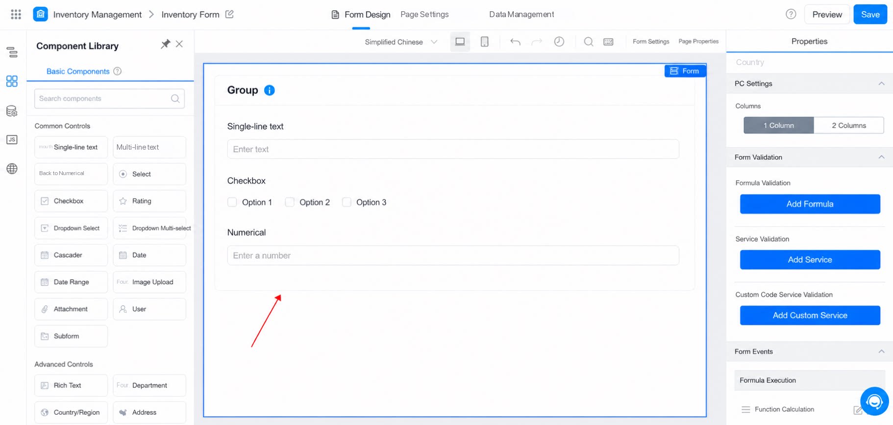
2.2.2 Margin
Adjusts the outer spacing of the Group component. The effect is shown below: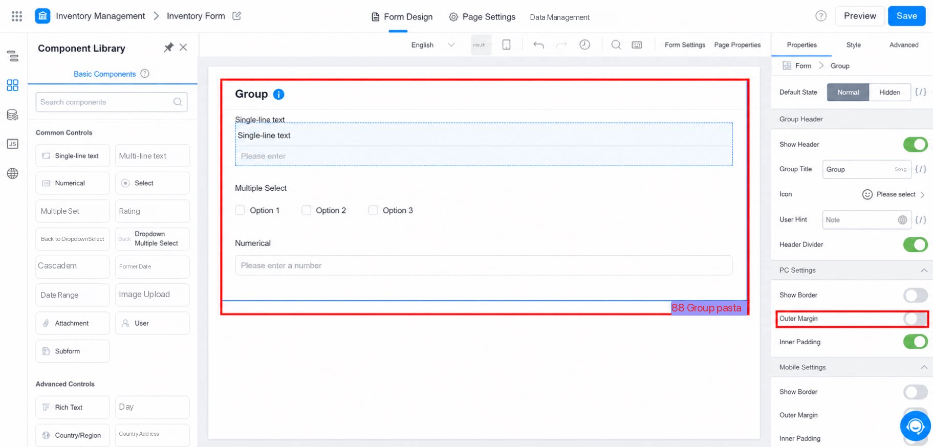
2.2.3 Padding
Adjusts the inner spacing of the Group component. The effect is shown below: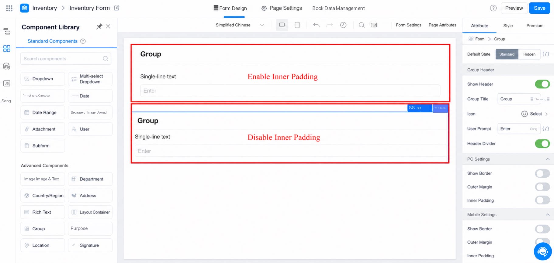
2.3 Mobile Settings
Similar to the PC settings, but applies only to mobile. Configuration is the same as for PC. The effect is shown below: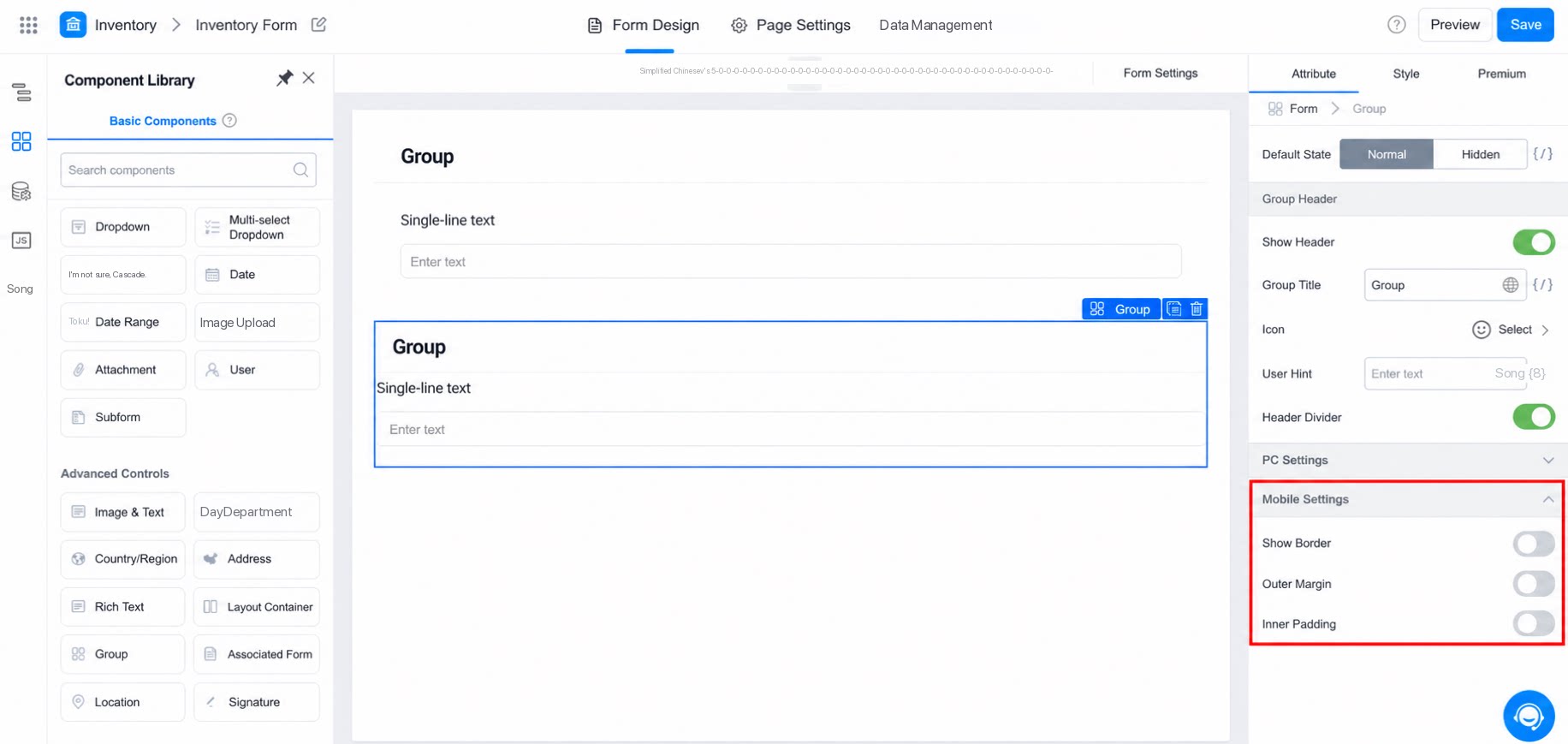
3. Style
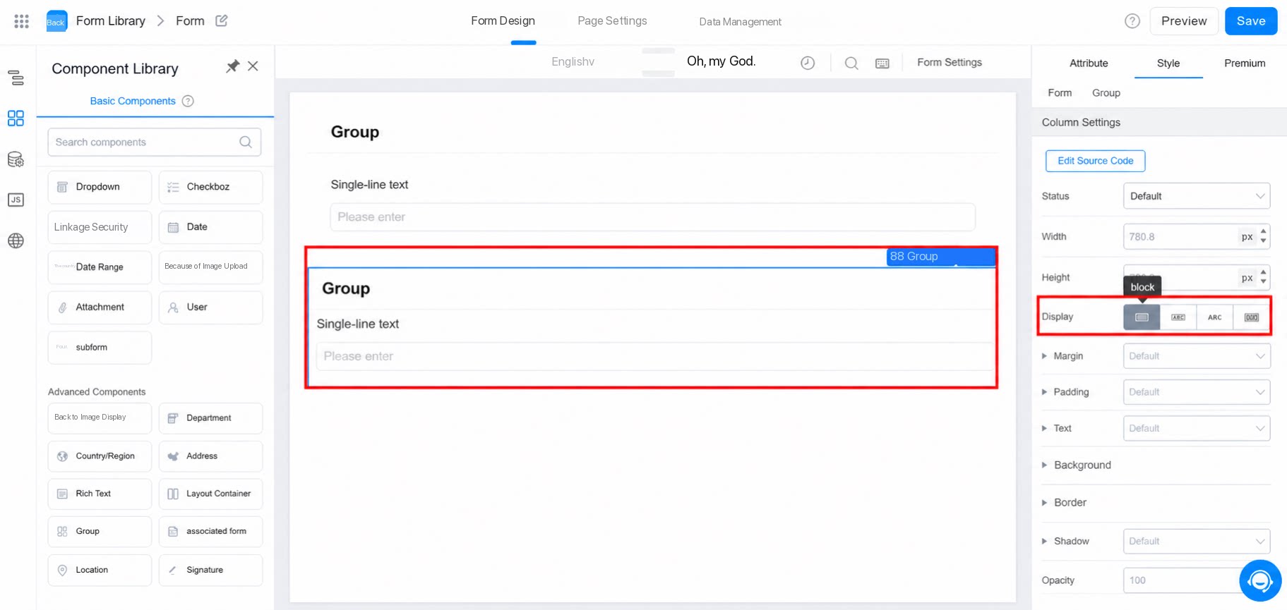
For group styling, the block display mode is typically used directly.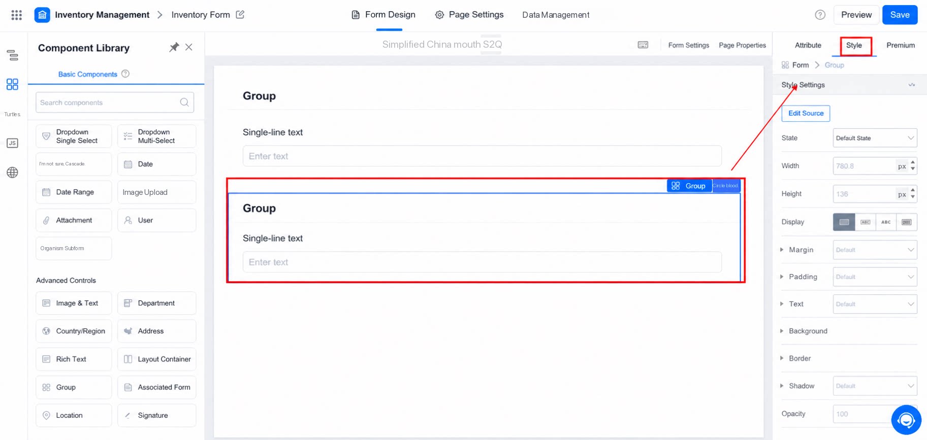
3.1 Source Code Editing
Edit styles directly in the CSS source code. The current div uses flex layout by default.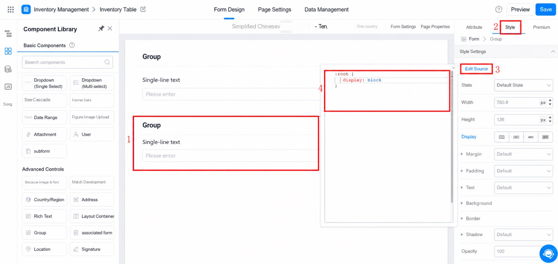
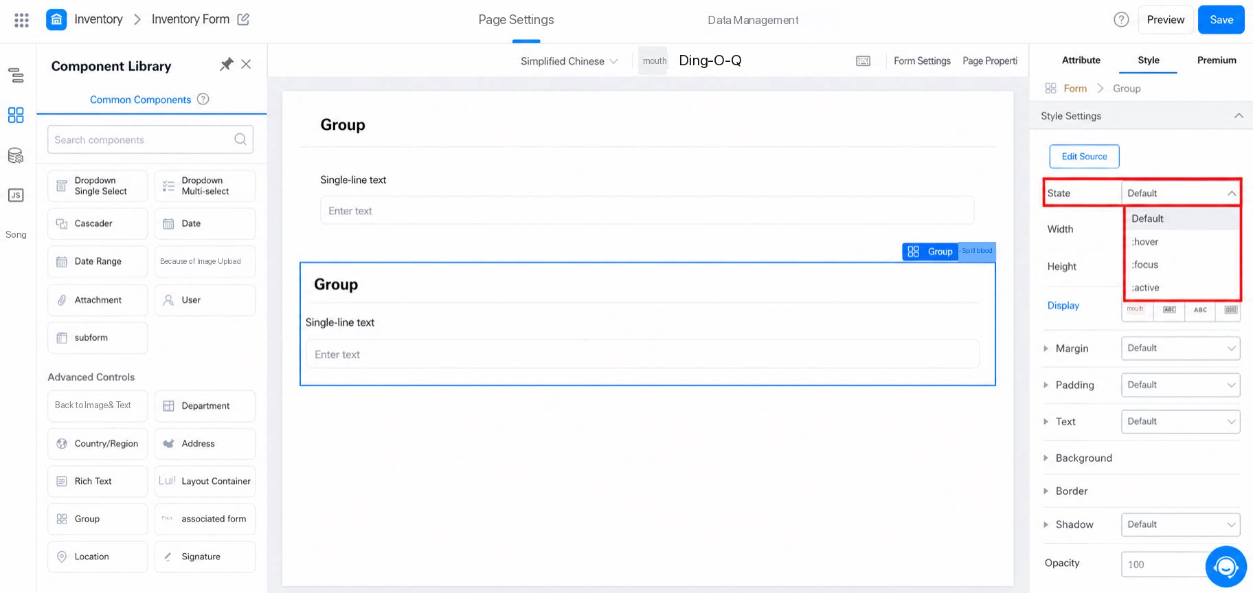
3.2 State
Configure the group using the traditional PC-side component states:- Default: normal state
- hover: the mouse hovers over the component hotspot without clicking
- focus: the page element has cursor focus
- active: the page element is selected and activated
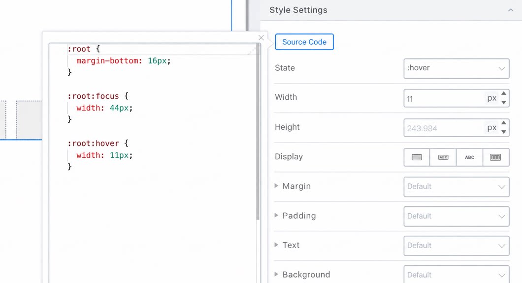
- Among the state settings, the default state overrides the other 3 states.
- The hover, focus, and active states are configured independently and do not affect each other.
- In CSS, they are defined as independent selectors.
3.3 Display
Corresponds to the CSS display mode:- block: box model
- inline-block: inline box model
- inline: inline model
- flex: flexible layout model
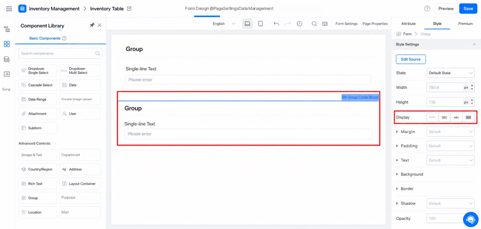
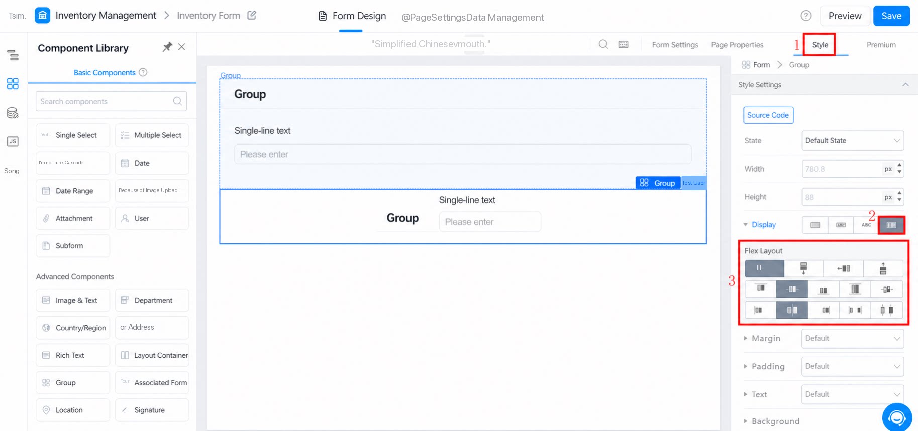
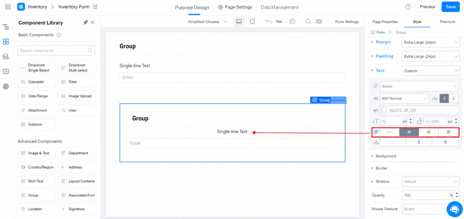
- Use flex layout to arrange items horizontally or vertically as needed.
- Then set both horizontal and vertical center alignment. The effect is shown below:
3.4 Margin and Padding
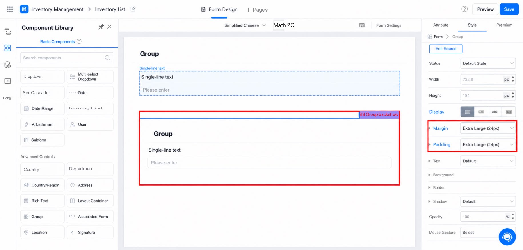
Margin refers to the distance between the box model and other node elements.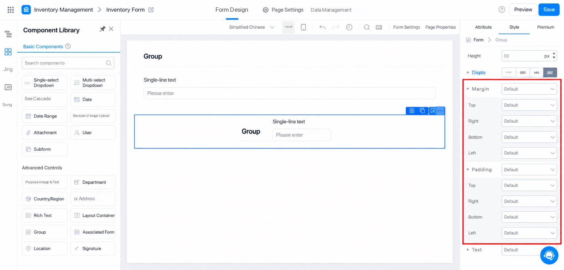
3.5 Text
Text settings affect the component titles inside the group. Customize them, or select a text title directly. The effect is shown below: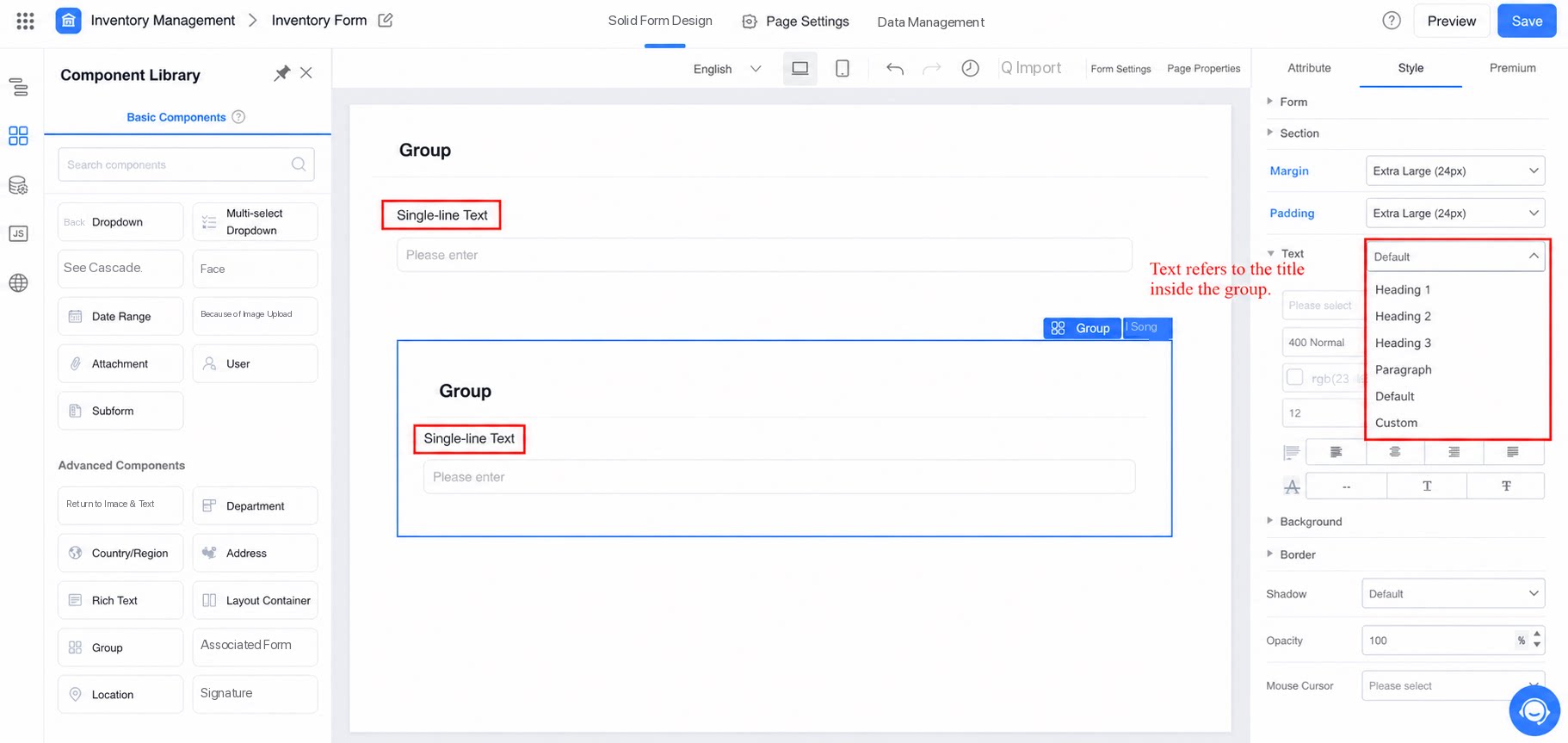
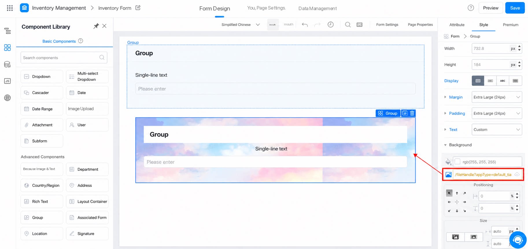
3.6 Background
Select a built-in system color, or upload a local image as the background. The effect is shown below: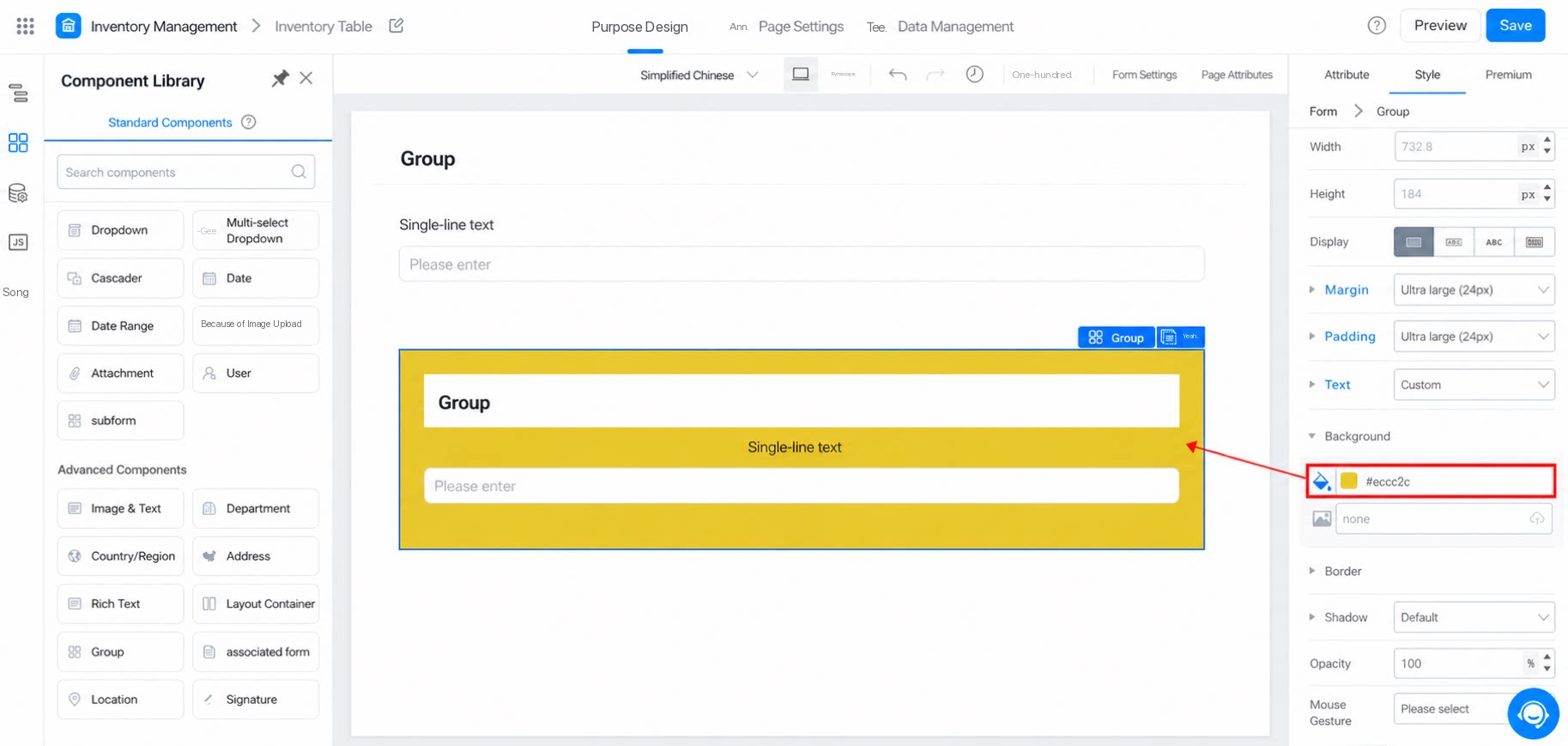
3.7 Border
Sets the border effect of the Group component.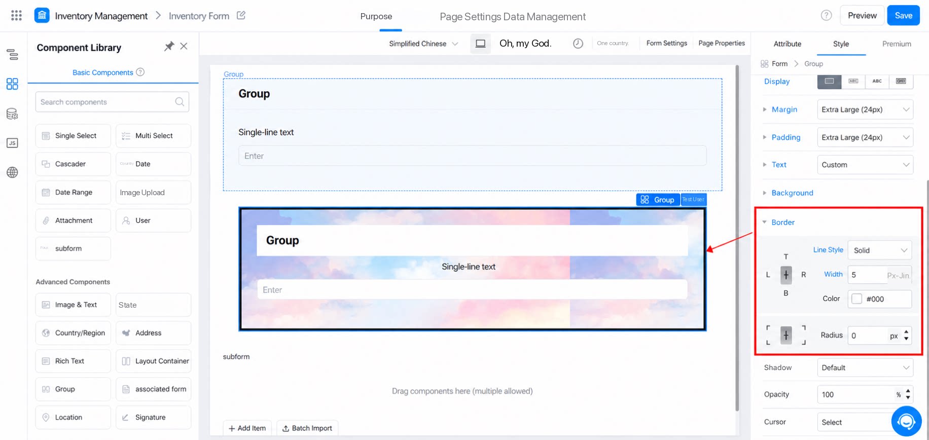
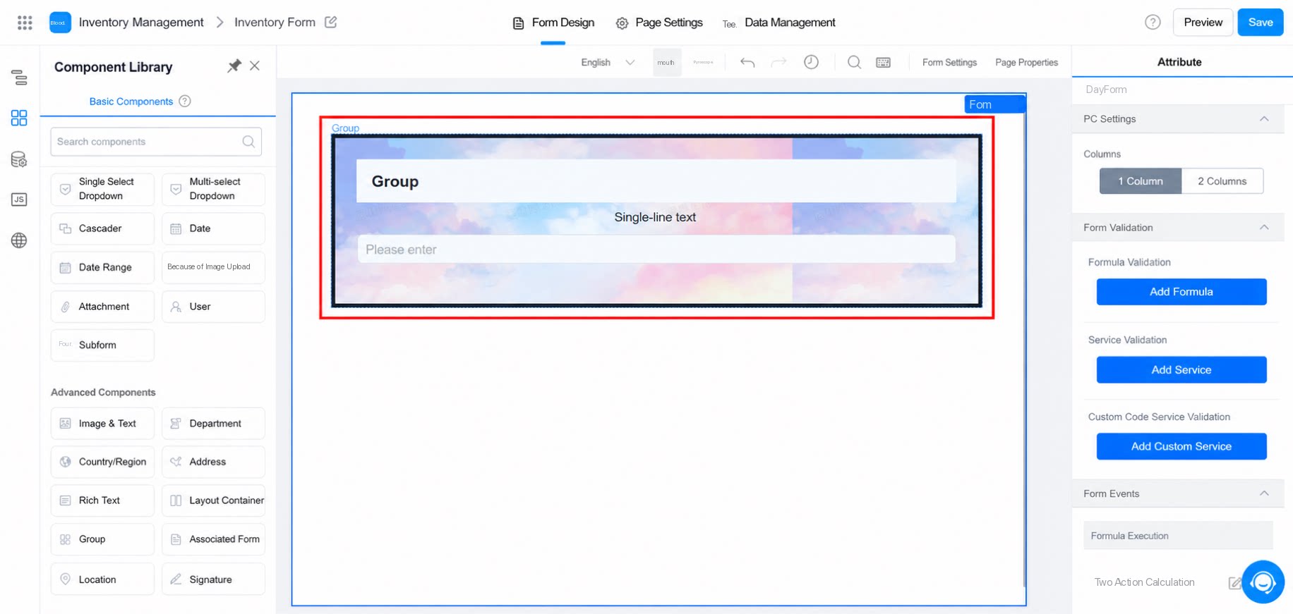
3.8 Shadow
Set the component’s shadow. Use x and y to set the direction, and use blur and spread to shape the shadow.3.9 Opacity
Sets the overall transparency of the component module. The range is 0 to 100, with a default of 100. A value of 0 means fully transparent.3.10 Cursor
- Select pointer: a hand icon appears when the mouse hovers over the block.
- Select default: an arrow icon appears when the mouse hovers over the block.