Add a combo chart
In the upper-left, click Add chart. Pick Combo chart.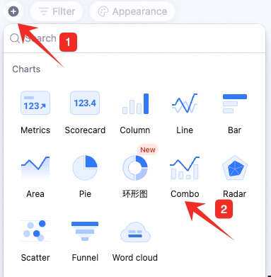
Configure the combo chart
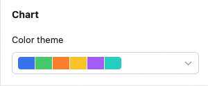
Configure type/data and custom style: Data: pick source — table and data range. All data enables filters. Chart: pick a color theme.
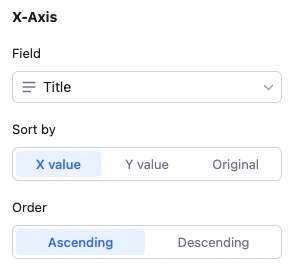
 X-axis: pick the field, sort basis (by X value, Y value, or record order), and order (ascending/descending).
 Y-axis: count of records, or aggregated field value. With “count of records”: Y auto-counts records per X value. With “aggregated field value”: multiple Y fields, each with its own aggregation (count, sum, average, max, etc.), Y position (left or right), and chart type (line, column, or scatter). Remove/move up/down per Y field.
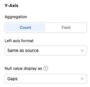 Note: sum, max, min, average only apply to numeric fields.
Custom style: background color, legend, axes — all configurable.
Note: sum, max, min, average only apply to numeric fields.
Custom style: background color, legend, axes — all configurable.
Manage the combo chart
Hover over the chart — find the icon in the upper-right. Click for: configure, rename, copy, add to dashboard center, copy as image, export as image, delete.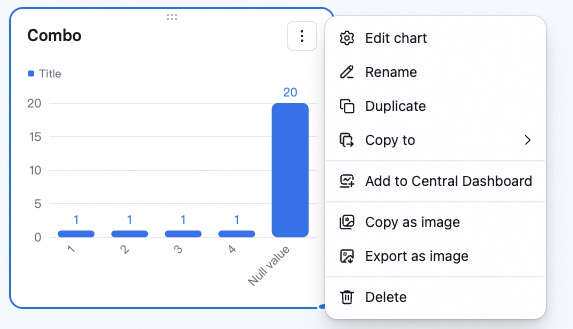 Drag the lower-right corner to resize. Drag the top to reposition.