Add a line chart
In the upper-left, click Add chart. Pick Line chart.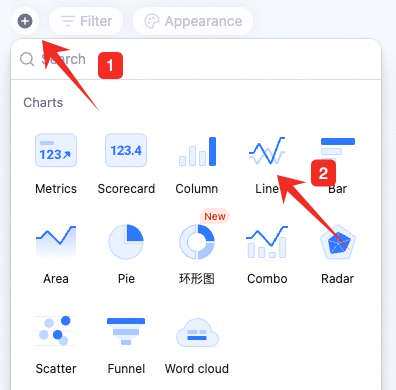
Configure the line chart
Configure type/data and custom style: Data: pick source — table and data range. All data enables filters.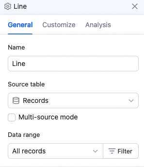 Chart: switch chart type, pick a color theme.
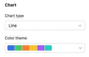
 X-axis: pick the X field, sort basis (by X value, Y value, or record order), and order.
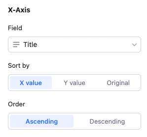 Sort basis details:
X value: sort by the X field’s value — numeric, alphabetical, single/multi-select option order, etc.
Y value: sort by Y numeric value.
Record order: sort by record order in the source view.
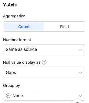
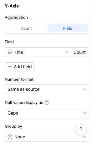
Y-axis: aggregation (count of records or aggregated field value), Y content, and group aggregation.
With “count of records”: only set group aggregation (none or by field).
With “aggregated field value”: no grouping → multiple Y fields, each with its own aggregation (count, sum, average, max, etc.). Remove/move up/down per Y. Grouping → one Y field with one aggregation. Note: with grouping, X can’t sort by Y value.
Sort basis details:
X value: sort by the X field’s value — numeric, alphabetical, single/multi-select option order, etc.
Y value: sort by Y numeric value.
Record order: sort by record order in the source view.
Y-axis: aggregation (count of records or aggregated field value), Y content, and group aggregation.
With “count of records”: only set group aggregation (none or by field).
With “aggregated field value”: no grouping → multiple Y fields, each with its own aggregation (count, sum, average, max, etc.). Remove/move up/down per Y. Grouping → one Y field with one aggregation. Note: with grouping, X can’t sort by Y value.
 Note: sum, max, min, average only apply to numeric fields.
Custom style: background color, legend position, value display, gridlines, axis labels, overlap settings, line type, axis visibility, axis baselines, axis-tick labels, X-label angle — all configurable.
Note: sum, max, min, average only apply to numeric fields.
Custom style: background color, legend position, value display, gridlines, axis labels, overlap settings, line type, axis visibility, axis baselines, axis-tick labels, X-label angle — all configurable.

Manage the line chart
Hover over the chart — find the icon in the upper-right. Click for: configure, rename, copy, add to dashboard center, copy as image, export as image, delete.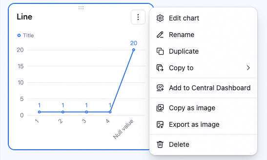 Drag the lower-right corner to resize. Drag the top to reposition.