Add a pie chart
In the upper-left, click Add chart. Pick Pie chart.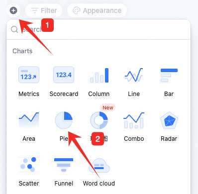
Configure the pie chart
Data: pick source — table and data range. All data enables filters.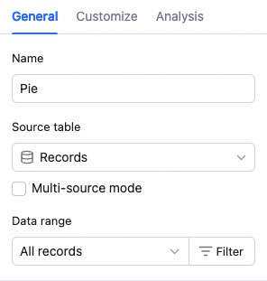 Chart: switch chart type and pick a color theme.
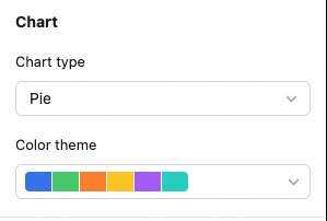
 Sector grouping: set the sector field and sort basis.
 Sector field value: sort by the field’s value — number size, alphabetical, single/multi-select option order, etc.
Sector value: sort by the sector’s numeric value.
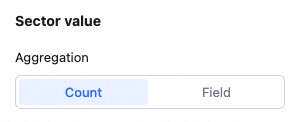
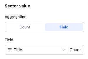
Sector value: count of records, or aggregated field value.
Sector field value: sort by the field’s value — number size, alphabetical, single/multi-select option order, etc.
Sector value: sort by the sector’s numeric value.
Sector value: count of records, or aggregated field value.
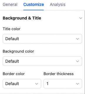
 Custom style: background color, legend position, value display, inner/outer radius — to match your needs.
Manage the pie chart
Hover over the chart — find the icon in the upper-right. Click for: configure, rename, copy, add to dashboard center, copy as image, export as image, delete.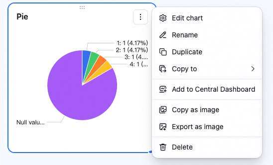 Drag the lower-right corner to resize. Drag the top to reposition.