Chats
Chats Calendar
 Meetings
 Contacts
 Mail
Mail Docs
Docs Drive
Drive AI Table
 AI Minutes
 Attendance
 Approval
 YiDA
YiDA Admin Console
1. Applicable Scenarios
Use the Date component whenever users need to select a date or time, such as overtime records or business trips. The Date component always uses local time. Component basic information2. Basic Features
You can configure the default date value, date format, one-click clearing, date range, and premium custom range.2.1 Set a Fixed Time and Date Format
2.1.1 Default Value (Fixed Time)
The Date component supports default values. Once set, the default value appears when the form is opened. You can still select another date manually. Path: Component >> Attribute >> Default Note: The default value is stored as “YYYY-MM-DD”, but the value displayed in the component follows the format you configure. Example: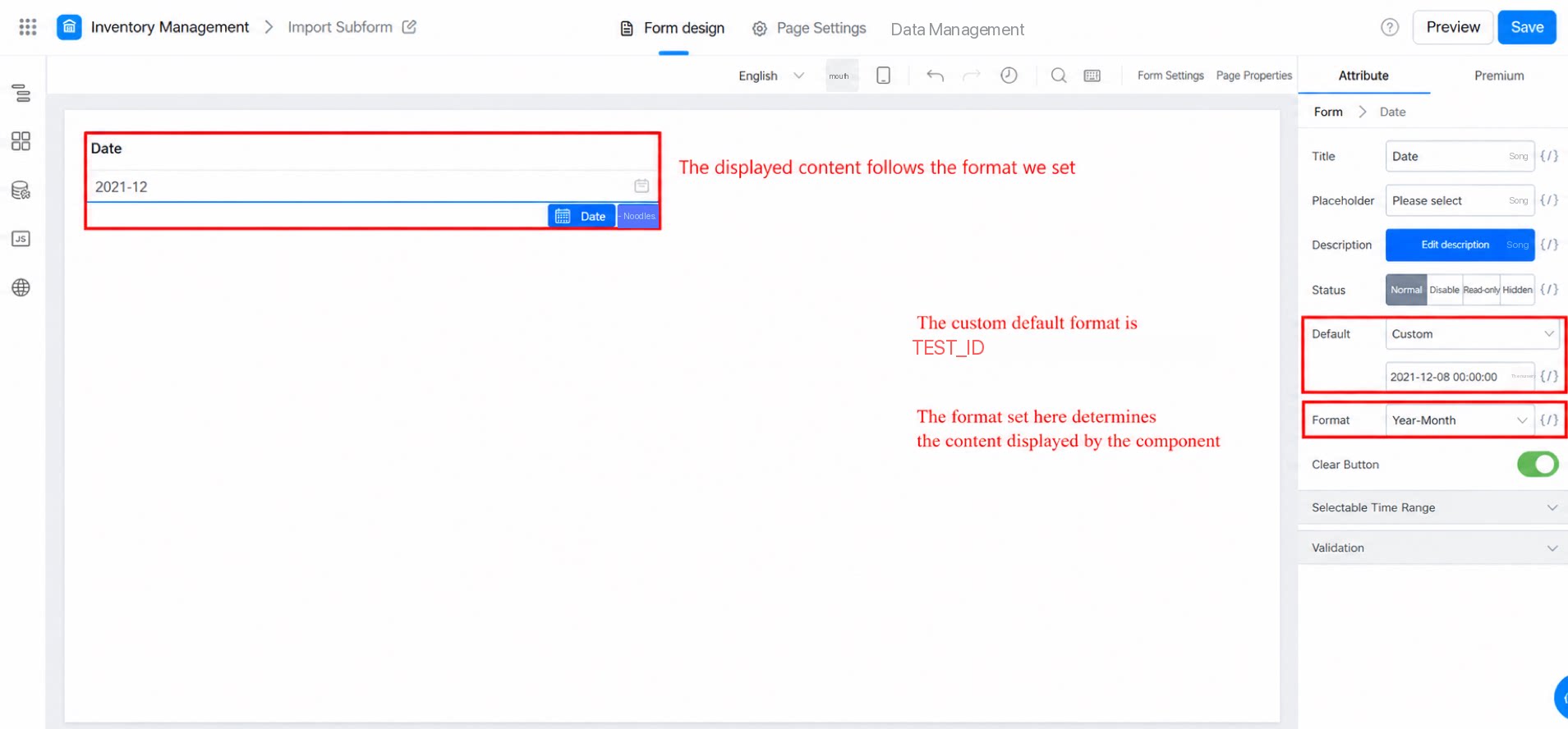
2.1.2 Date format
The default date format is “YYYY-MM-DD”. You can also customize the date format. Example: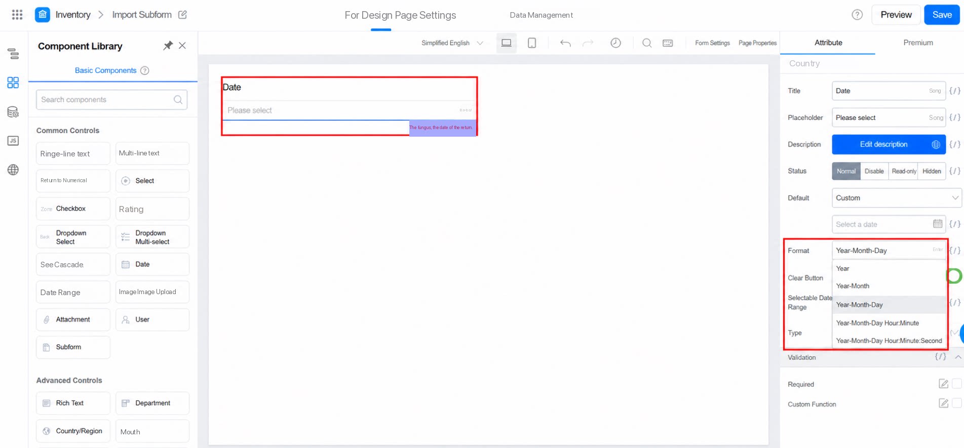
2.2 Selectable Time Range
You can limit the selectable time range, which is useful for scenarios such as leave requests and overtime. Example: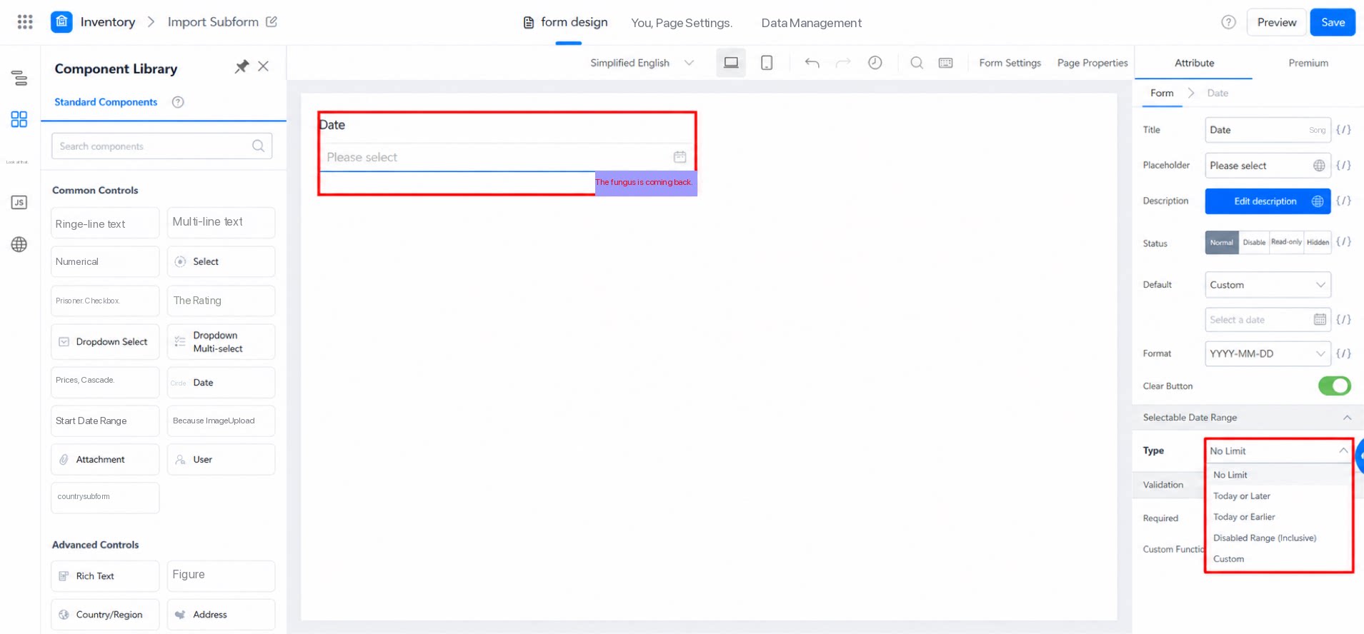
2.2.1 Time Range Scenario Example
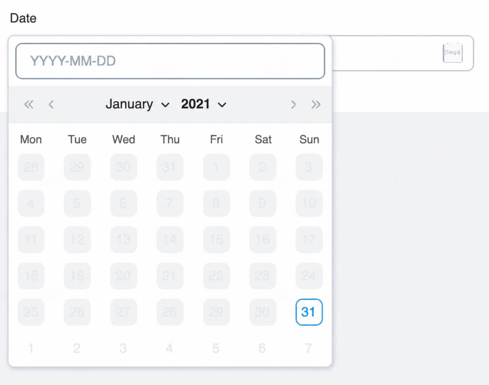
To restrict users to requesting leave only from today onward, set the time range to “Selectable from today onward (including today)”. Dates before today then appear in gray and cannot be selected. Other ranges work in the same way.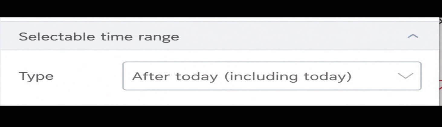
2.2.2 Premium Custom Range Configuration and Scenarios
Use JavaScript to restrict users to selecting only a specified time range. This suits scenarios such as appointment booking and special business processing. Path: Attribute >> Selectable time range >> Select Custom >> Bind action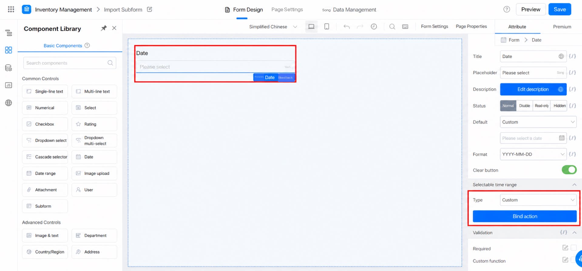
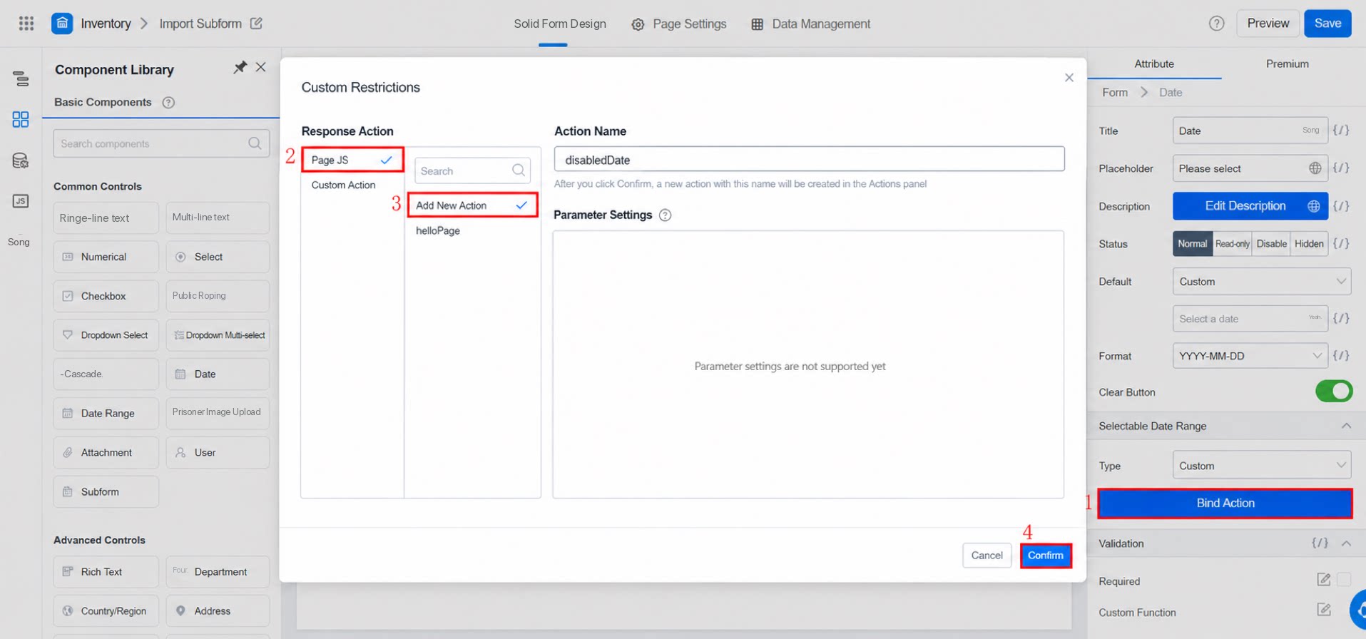
- Click Bind action. The following screen appears. Follow the steps in the screenshot.
- Click Confirm. The following screen appears. Follow the steps in the screenshot.
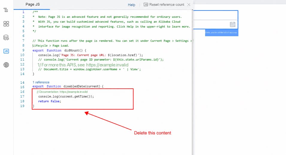
- Delete the existing code, enter the JavaScript code, and click Save. Follow the steps in the screenshot. For sample code, see:
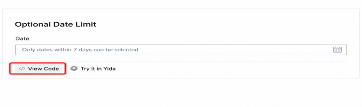
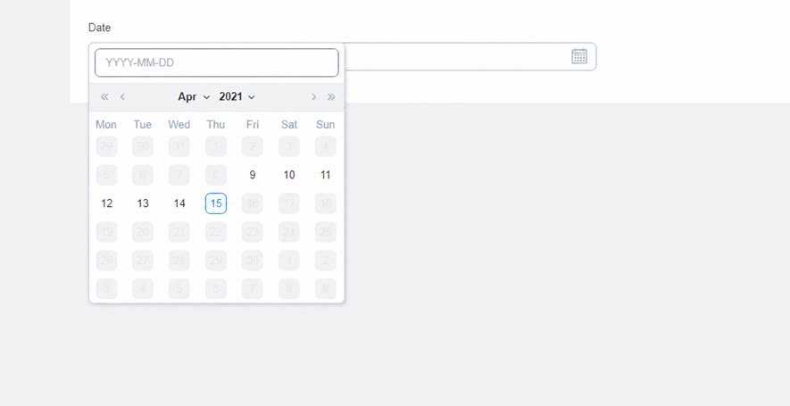
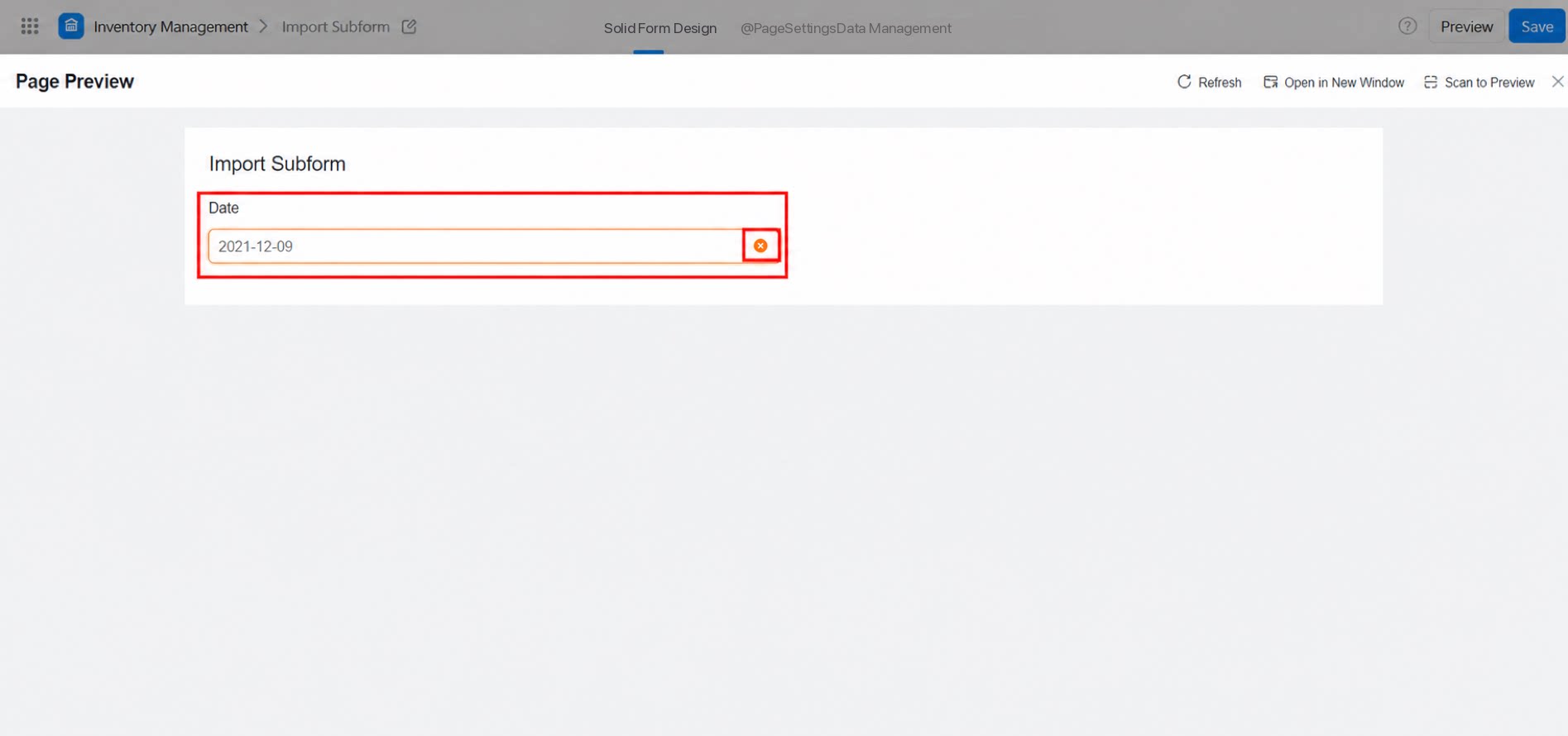
2.3 Clear Button
After you enable the clear button, click × to clear an incorrect time in one step. Example: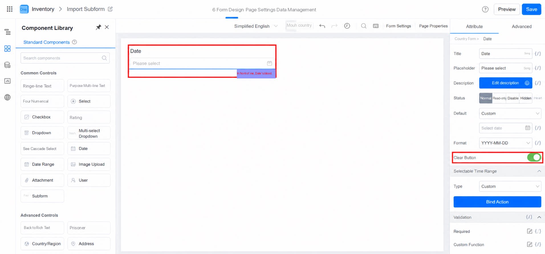
3. FAQ
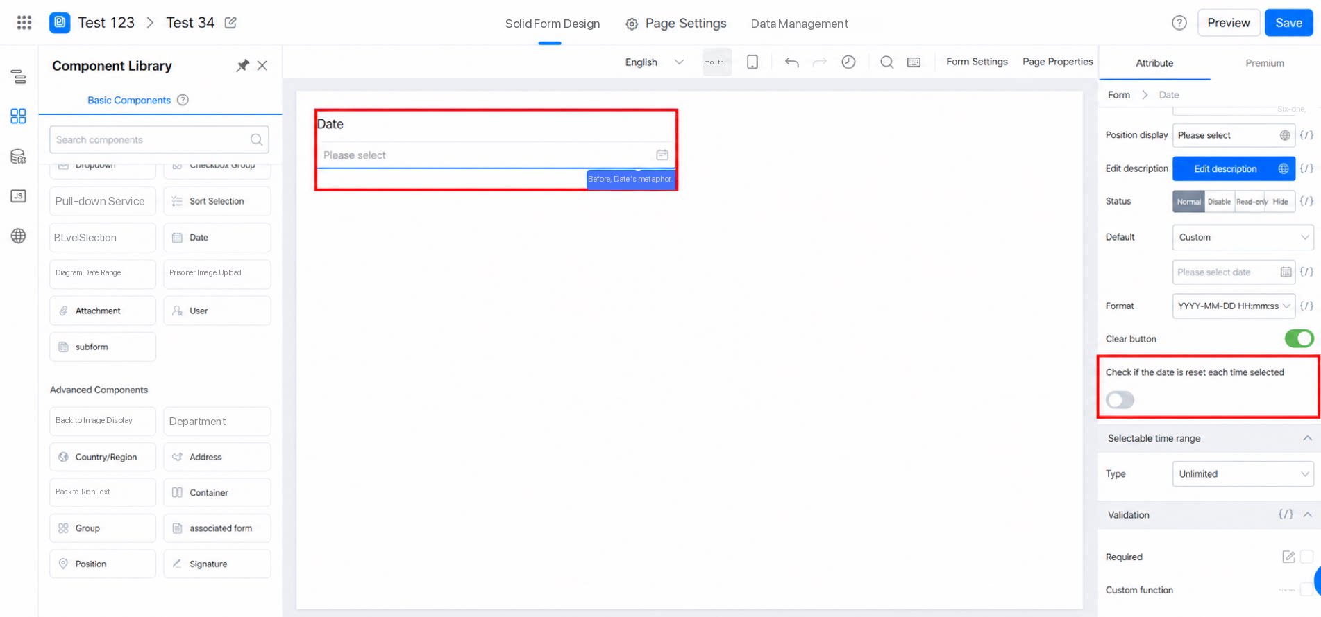
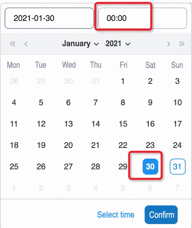
3.1 Why is the time reset after I change the date?
3.1 Why is the time reset after I change the date?
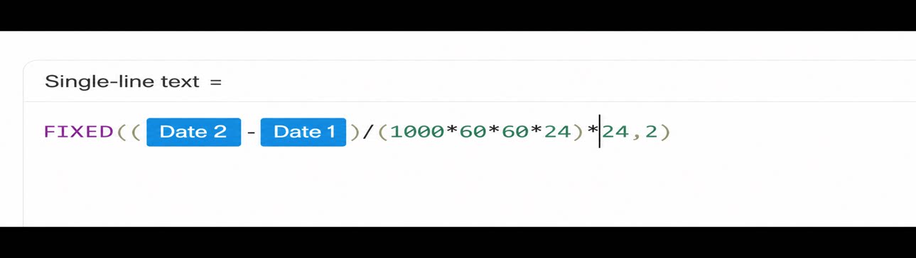
3.2 How do I convert the difference between two Date components into hours?
3.2 How do I convert the difference between two Date components into hours?
3.3 When a day of the week is entered in a Single-line text field, how do I make the Date component below display the date of that day in the current week?
3.3 When a day of the week is entered in a Single-line text field, how do I make the Date component below display the date of that day in the current week?
3.4 I added a date range component to a form. The first field is set to 4 PM on the 12th, and I want the second field to allow times after 4 PM on the 12th. However, the second field can only start from the 13th. It currently supports only day-level precision. Can it support hour-level precision?
3.4 I added a date range component to a form. The first field is set to 4 PM on the 12th, and I want the second field to allow times after 4 PM on the 12th. However, the second field can only start from the 13th. It currently supports only day-level precision. Can it support hour-level precision?
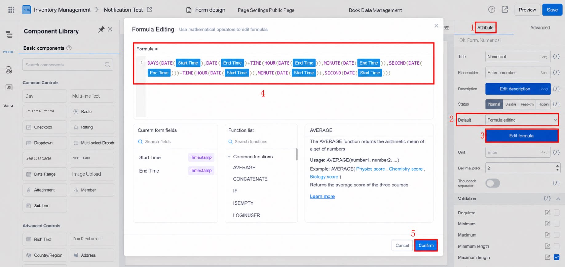
3.5 How do I calculate the number of days, hours, and minutes between two dates?
3.5 How do I calculate the number of days, hours, and minutes between two dates?
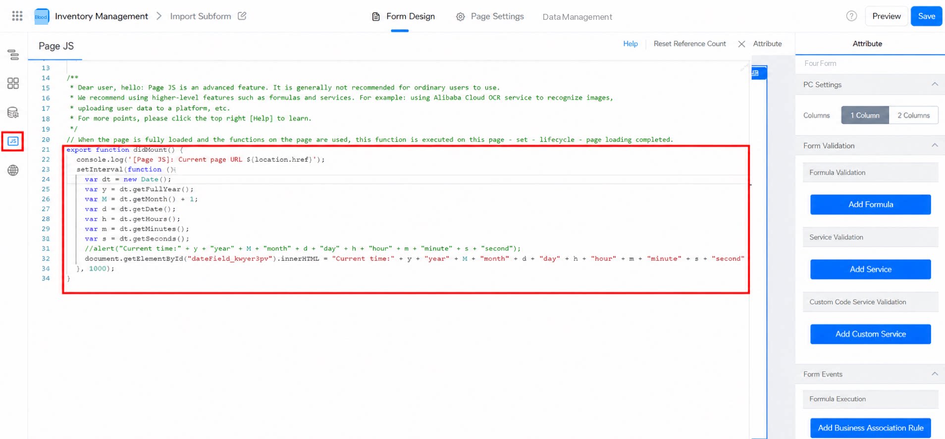
3.6 Implementing a Clock with Ticking Seconds
You can use JavaScript to build this. Add a Date component to the form, then copy the following code into thedidMount() method so that it loads by default.
Note: The unique identifier below must match the unique identifier of the Date component.
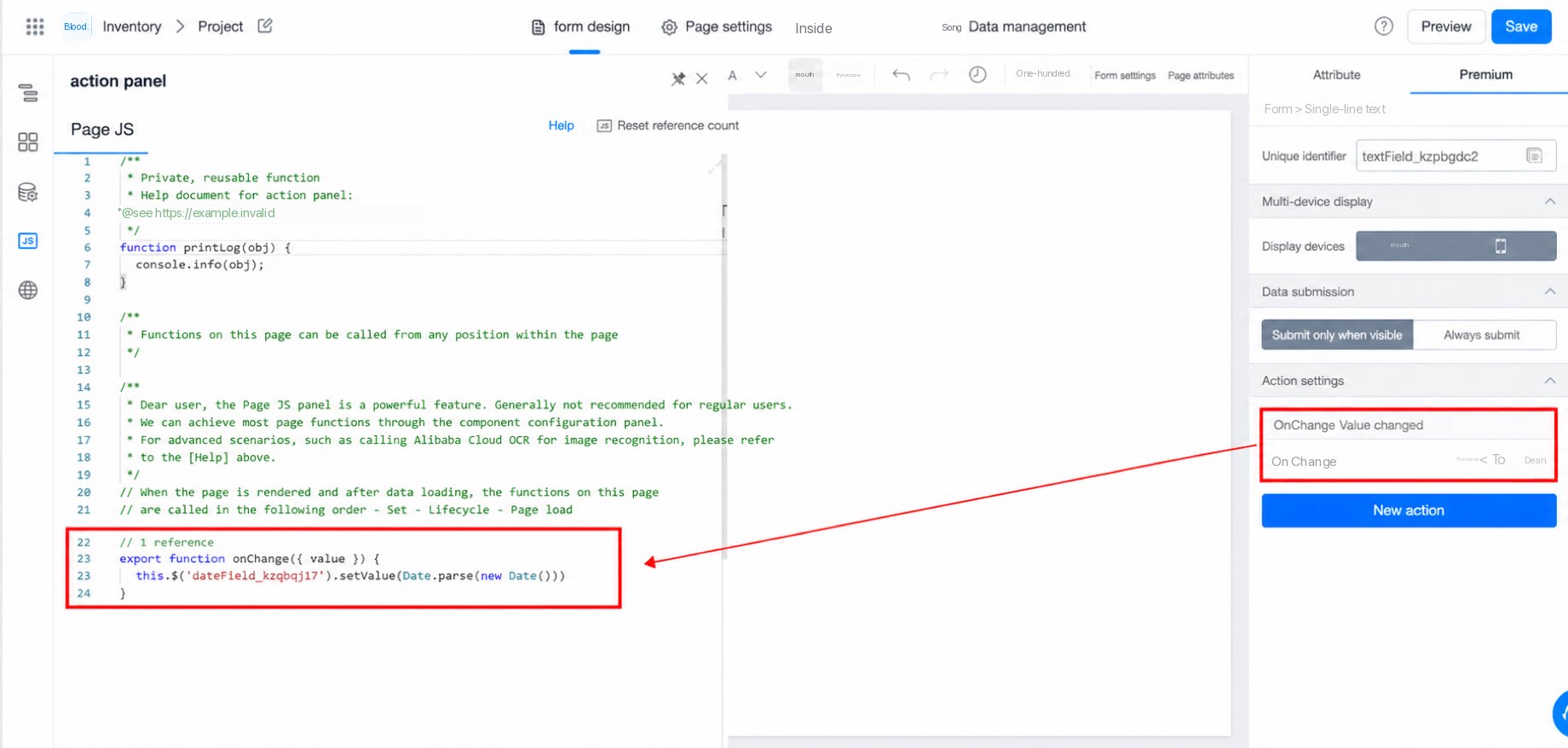
3.7 How do I update the Date component value to the current time in real time when a field value changes?
3.7 How do I update the Date component value to the current time in real time when a field value changes?
3.8 How do I calculate fractional days (for example, 0.x days)?
3.8 How do I calculate fractional days (for example, 0.x days)?