Chats
Chats Calendar
 Meetings
 Contacts
 Mail
Mail Docs
Docs Drive
Drive AI Table
 AI Minutes
 Attendance
 Approval
 YiDA
YiDA Admin Console
1. Use Cases
Use this component when you need to select multiple options at once, such as in procurement scenarios. Component basic informationFor component attributes, usage, and examples, see Component interface.
2. Basic Features
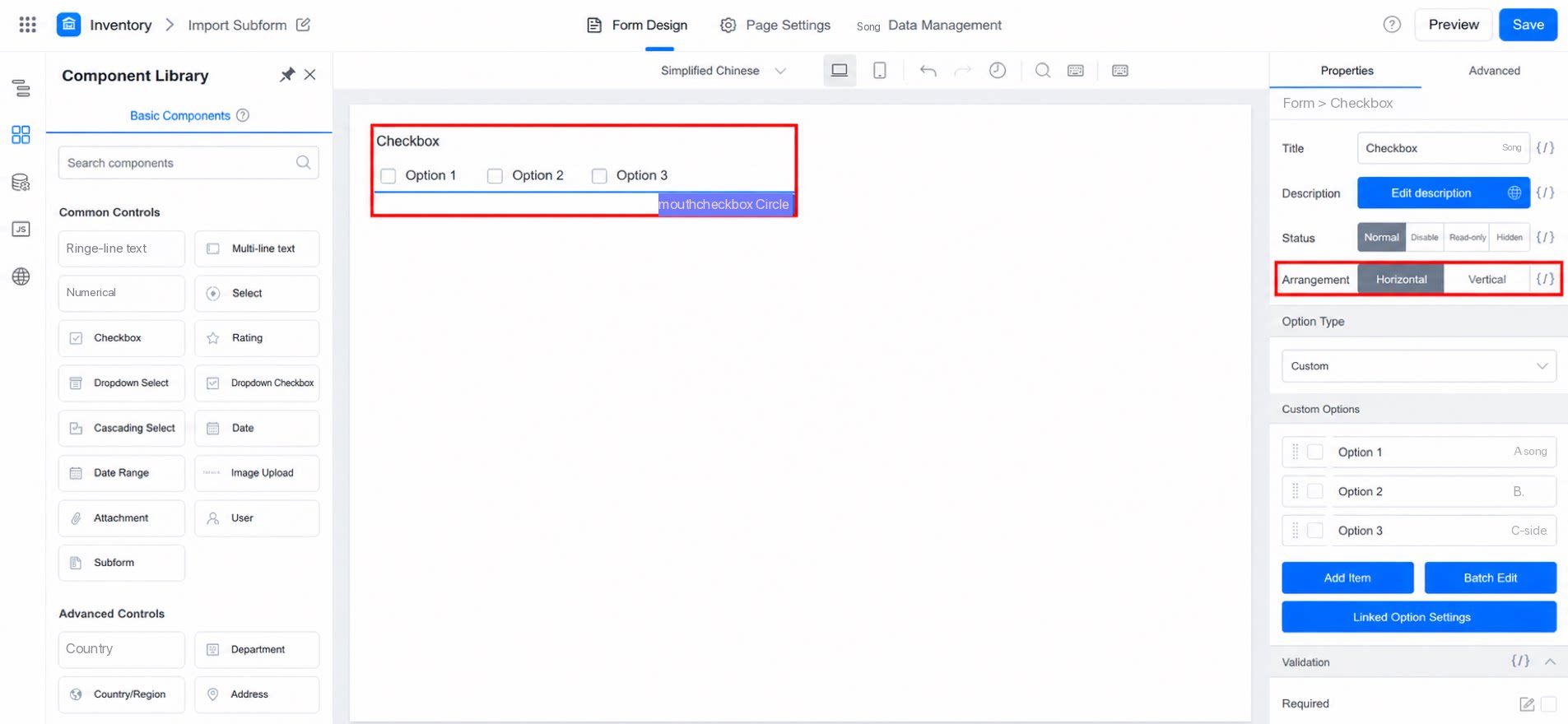
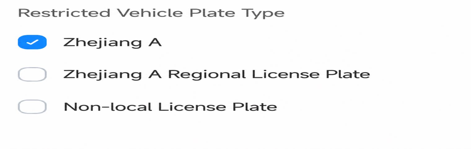
Options support different layout arrangements. Both horizontal and vertical layouts are currently available, as shown below: