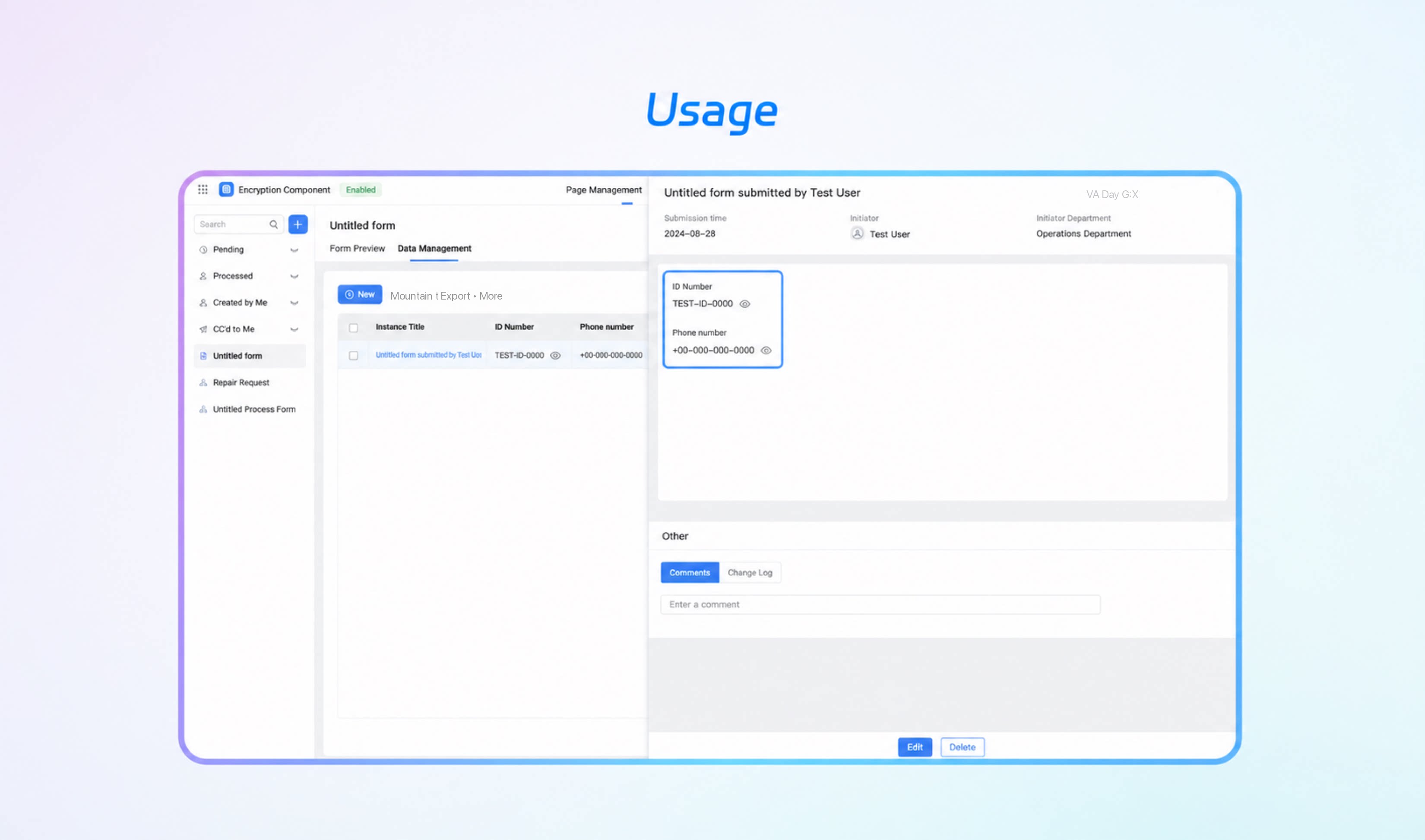
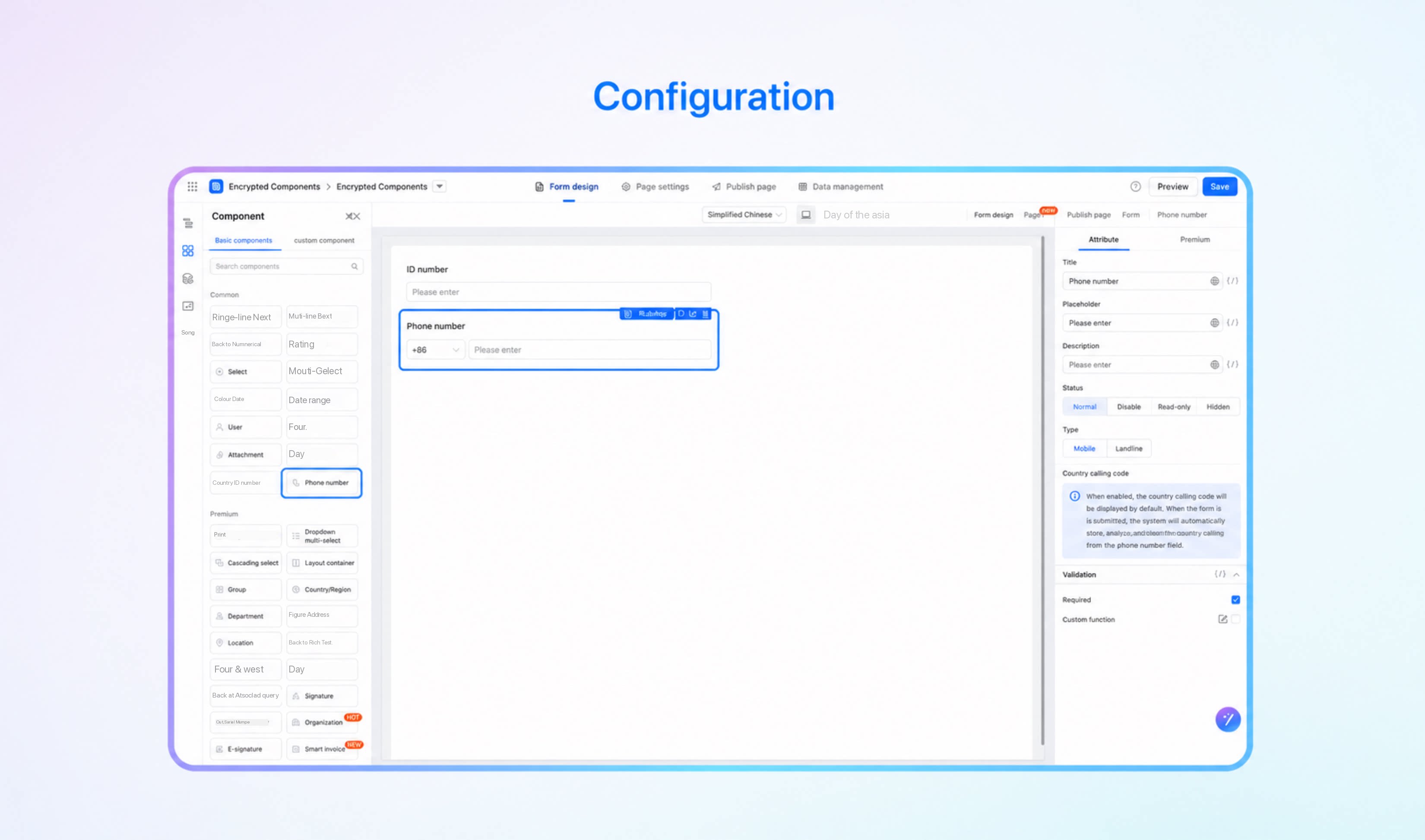
| Title | Sets the display title of the component. Supports multilingual content and variable binding. | lable |
| Placeholder tip | Sets the default content shown in the input box. Supports multilingual content and variable binding. | placeholder |
| Description | The description shown below the component, typically used for additional explanation. | tips |
| Status | Sets the component status. Supports four states: normal, disabled, read-only, and hidden. | behavior |
| Type | Restricts the type of phone number that can be entered. Supports three types: mobile, landline, and both. | type |
| Country code | Determines whether to enable the country code. | enableCountryCode |


 Chats
Chats Calendar
 Meetings
 Contacts
 Mail
Mail Docs
Docs Drive
Drive AI Table
 AI Minutes
 Attendance
 Approval
 YiDA
YiDA Admin Console