Chats
Chats Calendar
 Meetings
 Contacts
 Mail
Mail Docs
Docs Drive
Drive AI Table
 AI Minutes
 Attendance
 Approval
 YiDA
YiDA Admin Console
1. Use Cases
Select one item from multiple dropdown options. This component works well when there are many options. You can customize the option content, and it also supports scenarios such as data linkage and associating other forms. For example, use the Dropdown select component for fields such as leave type or gender in a leave request form. If the options come from another form and, after selection, related information should be filled into the form (data association scenarios)—for example, in a contract management scenario where a contract or order is created and the associated form component options are linked with a customer table to pull in customer information—use the associated form component instead. Note: The maximum length of an option value in the Dropdown select component is 255 characters.For component attributes, usage, and examples, see Component interface.
2. Basic Features
2.1 Clear Button
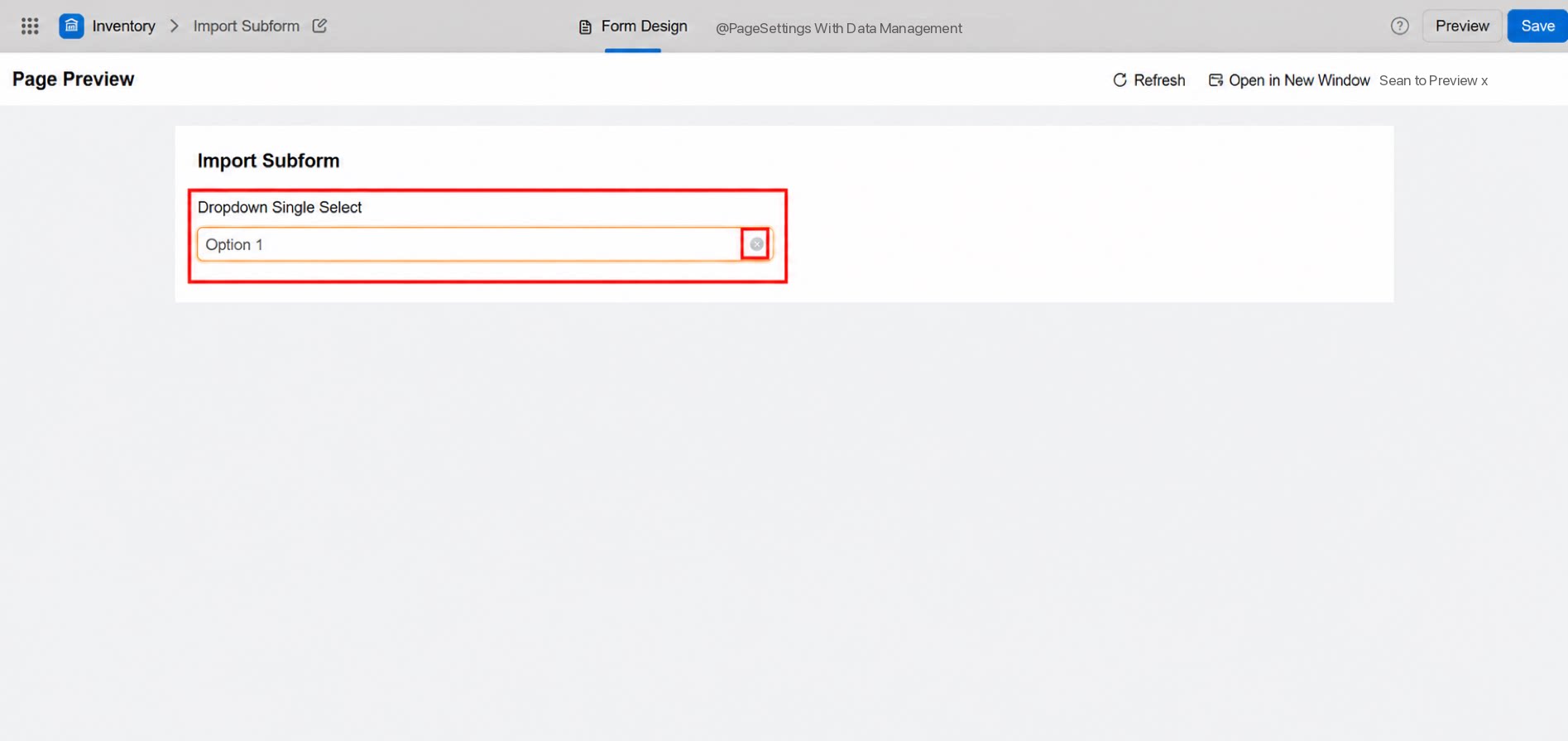
Clears the content in the option box.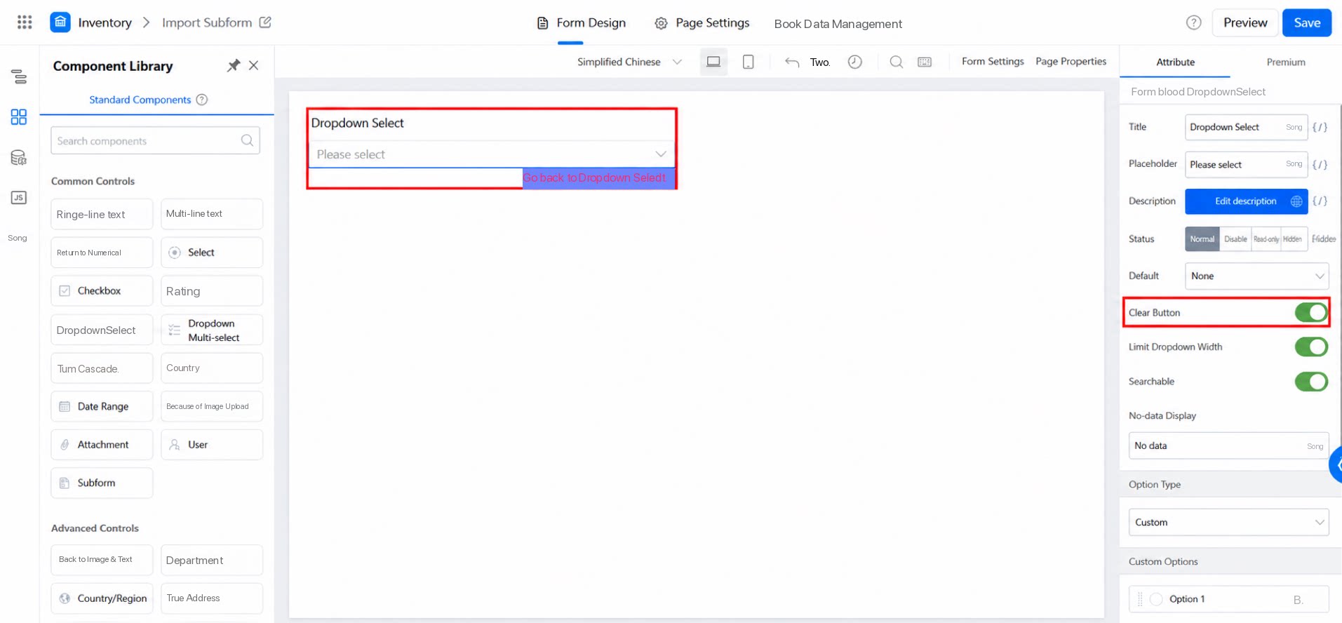
2.2 Searchable
Allows users to search the options. When there are too many dropdown options, use Search to quickly locate the desired content.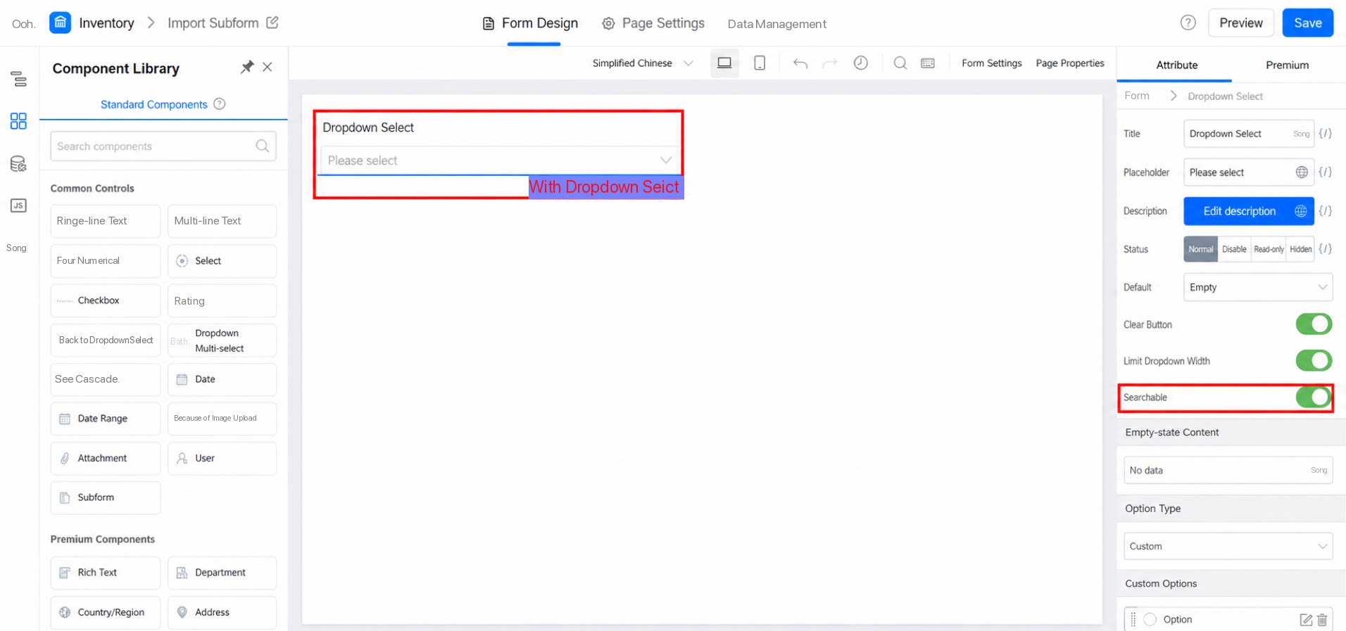
2.3 Content Displayed When No Data Is Available
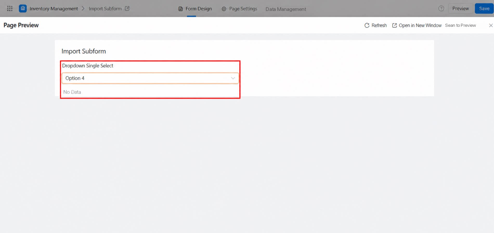
When the searchable option is on, the submission page supports Search. You can set the message shown when no matching data is found.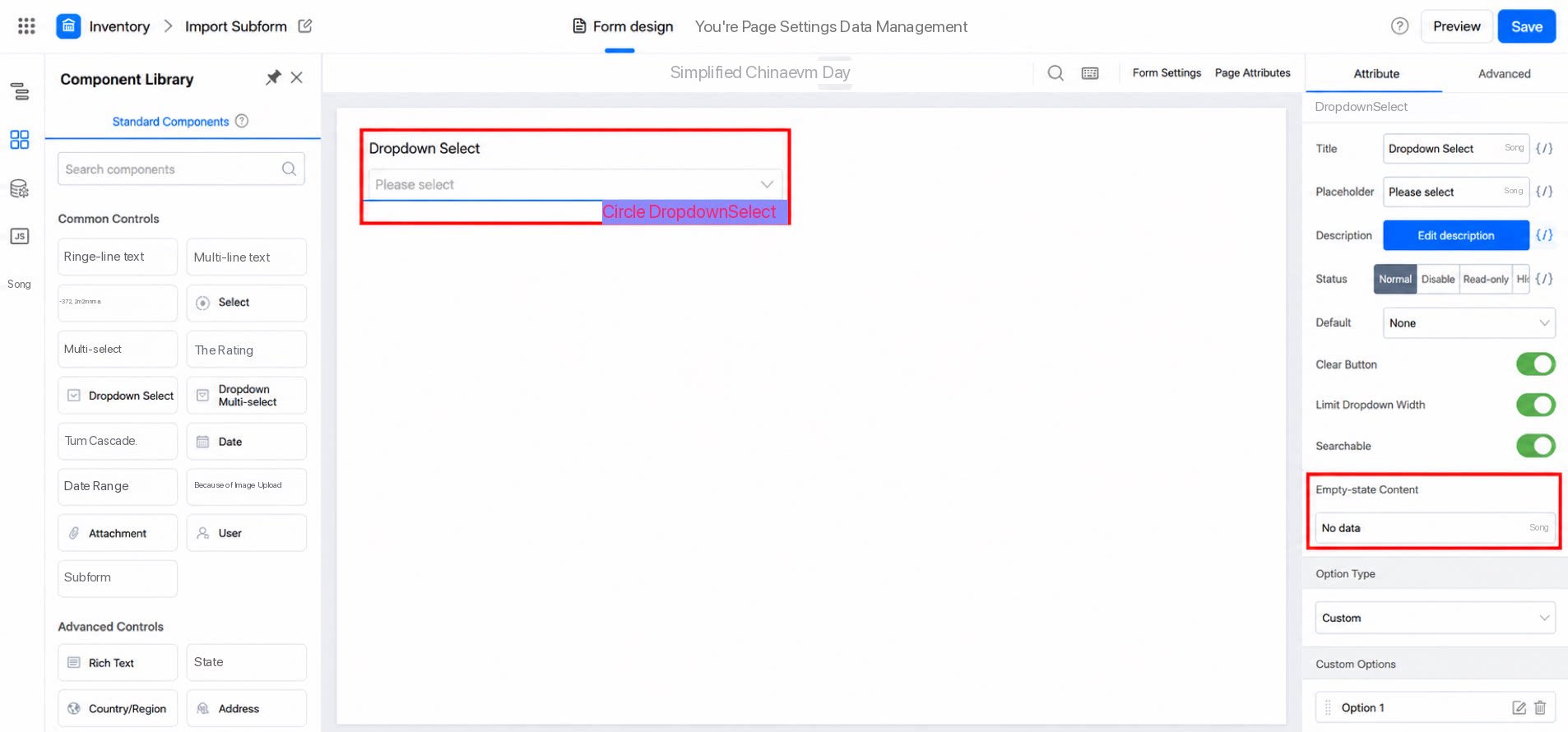
2.4 Option Type
Set the dropdown option content here. You can customize the options or associate them with data from other forms. Available types: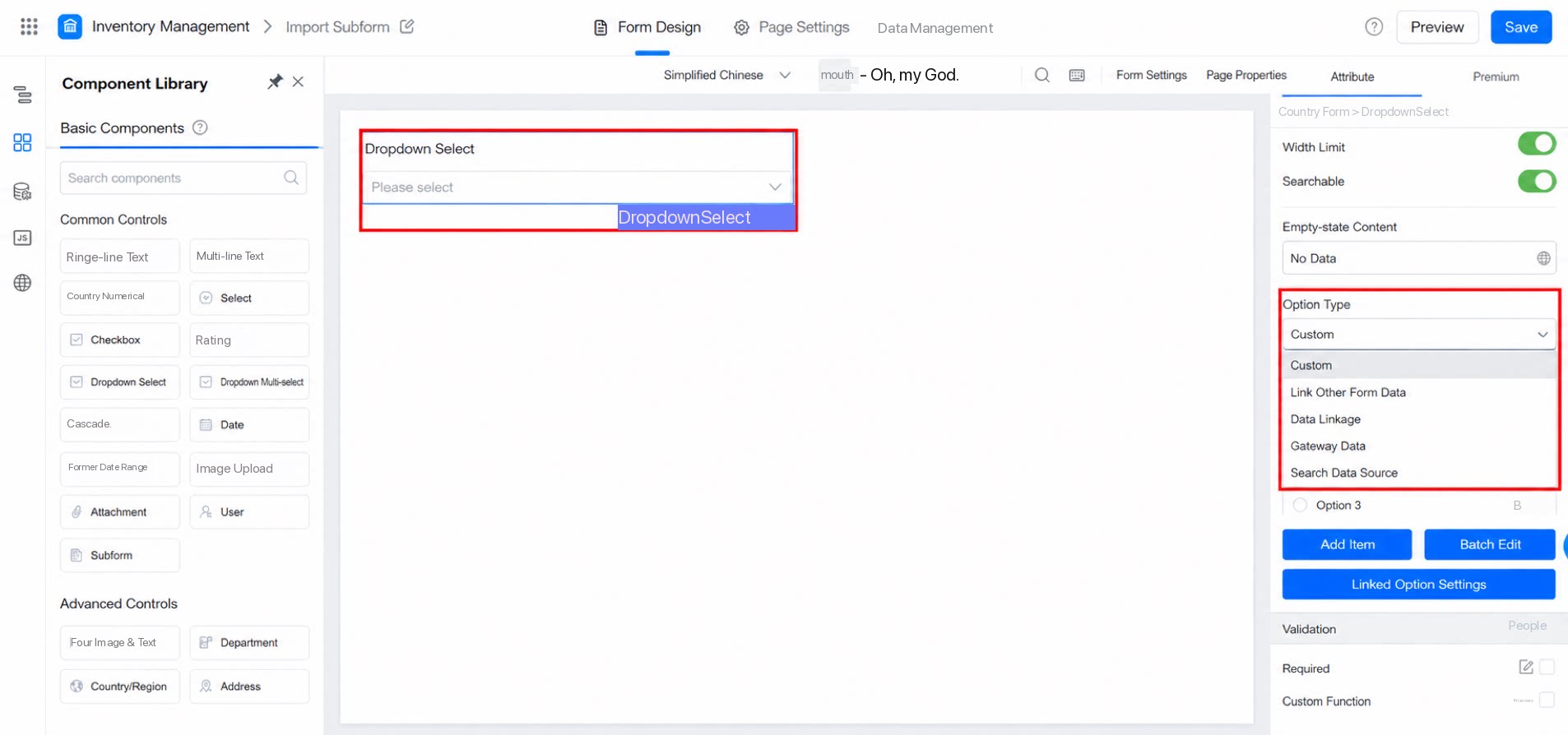
2.4.1 Custom
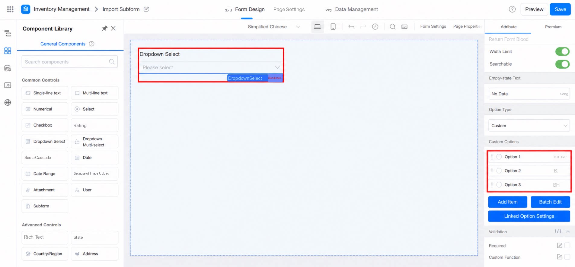
When the option type is Custom, add options below and edit the dropdown content yourself. You can also configure linked option settings.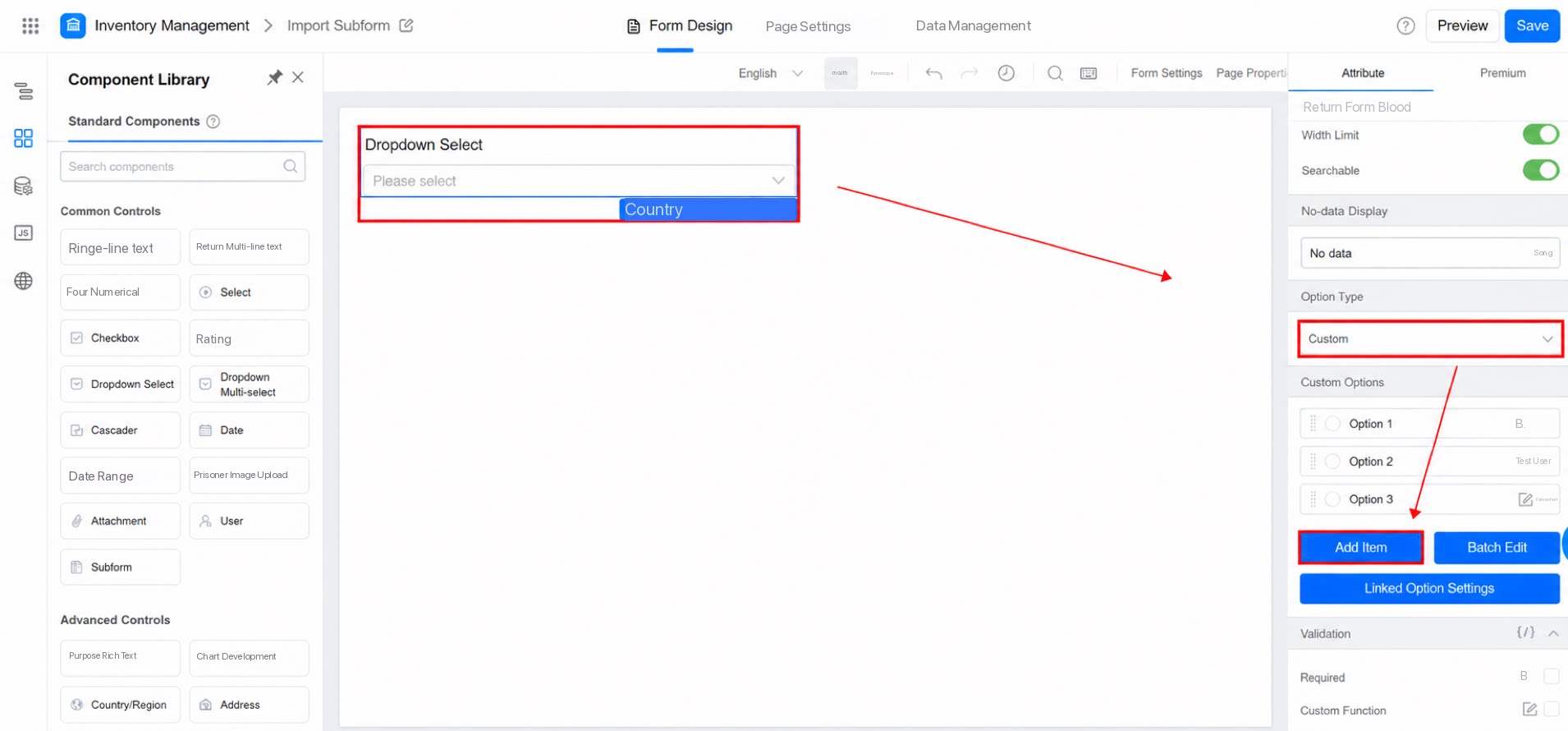
2.4.2 Search Data Source
To use an external data source as the data source—common when integrating with external systems—refer to the following configuration. Configuration path: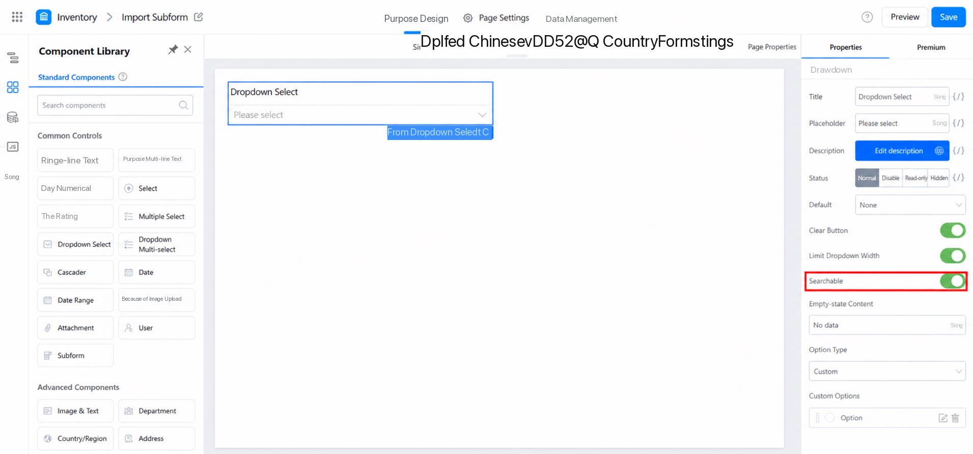
Request parameters
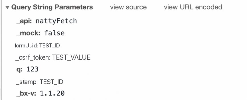
- q: The content the user searches for. When the search box sends a request, it includes the parameters shown in the figure below by default.
Response
3. FAQ
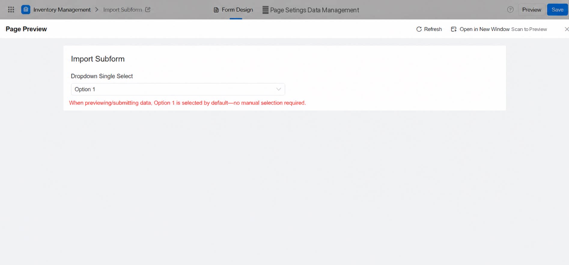
3.1 How to Set a Default Value for the Dropdown Select
Select the corresponding option. The selected option appears with a blue ring, as shown below: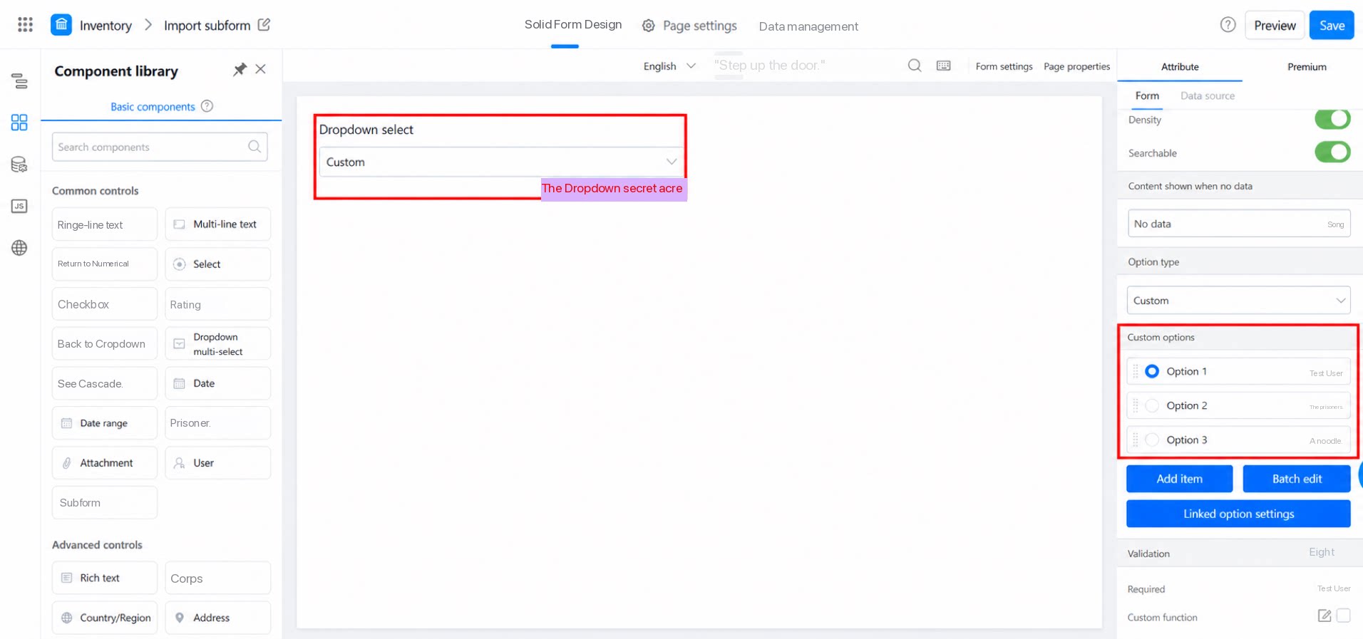
3.2 Option Value and Display Value Can Differ
The option value and the display value can be different, giving you flexibility for scenarios such as multi-language support or changing the display value. Option value and display value.3.3 Difference Between Dropdown Select and Associated Form Components
The two components differ in feature definition and use cases.3.3.1 Dropdown Select
Option source: Custom options, retrieved from another form, retrieved from a remote data source, or obtained through data linkage. Use cases: Typically used for option selection scenarios that do not need to pull in additional data. For example, use the Dropdown select component for fields such as leave type or gender in a leave request form.3.3.2 Associated Form
Option source: Retrieved from another form. Use cases: Typically used for data association scenarios. For example, in a contract management scenario, when creating a contract or order, associate the options of the associated form component with a customer table to pull in customer information.3.4 Does the YiDA Dropdown select component support batch editing and component type conversion?
3.4 Does the YiDA Dropdown select component support batch editing and component type conversion?
Component type conversion is not currently supported. Batch editing is supported.
3.5 How to assign a Dropdown select value to a Single-line text component?
3.5 How to assign a Dropdown select value to a Single-line text component?
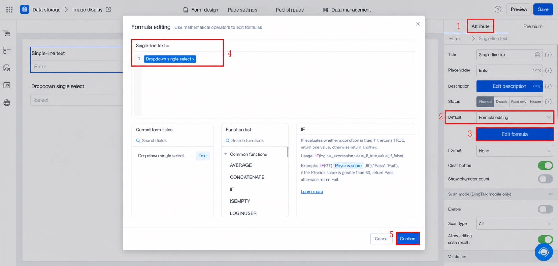
In the Single-line text component, set the formula and select the Dropdown select component directly, as shown below: