Chats
Chats Calendar
 Meetings
 Contacts
 Mail
Mail Docs
Docs Drive
Drive AI Table
 AI Minutes
 Attendance
 Approval
 YiDA
YiDA Admin Console
Layout
Arrange options horizontally or vertically:Custom Options
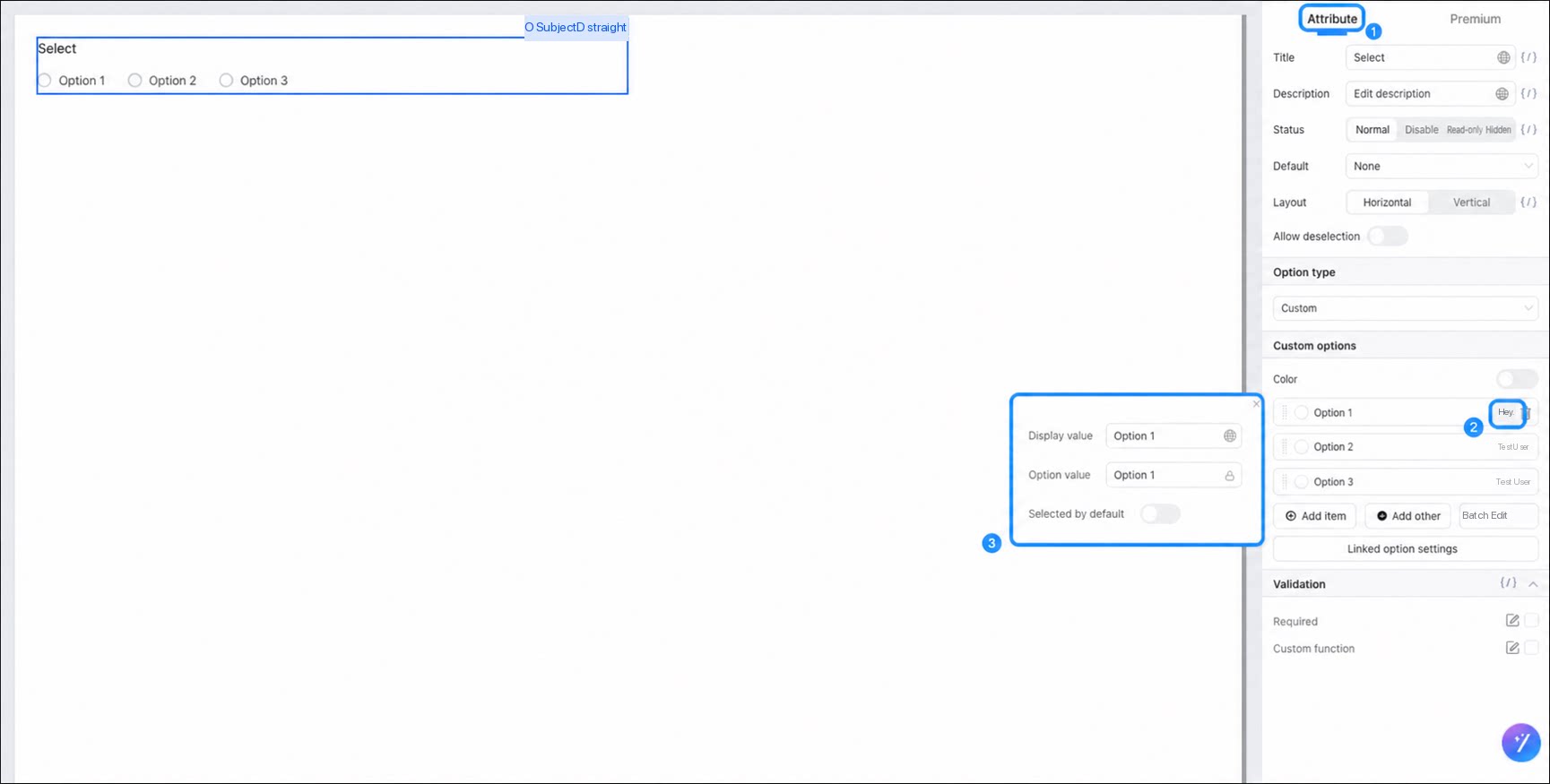
The display value and the option value can differ. You can customize each independently.- Display value: the text shown to users on the form page.
- Option value: the value used for data linkage condition matching. By default, it matches the display value, but you can set it independently.
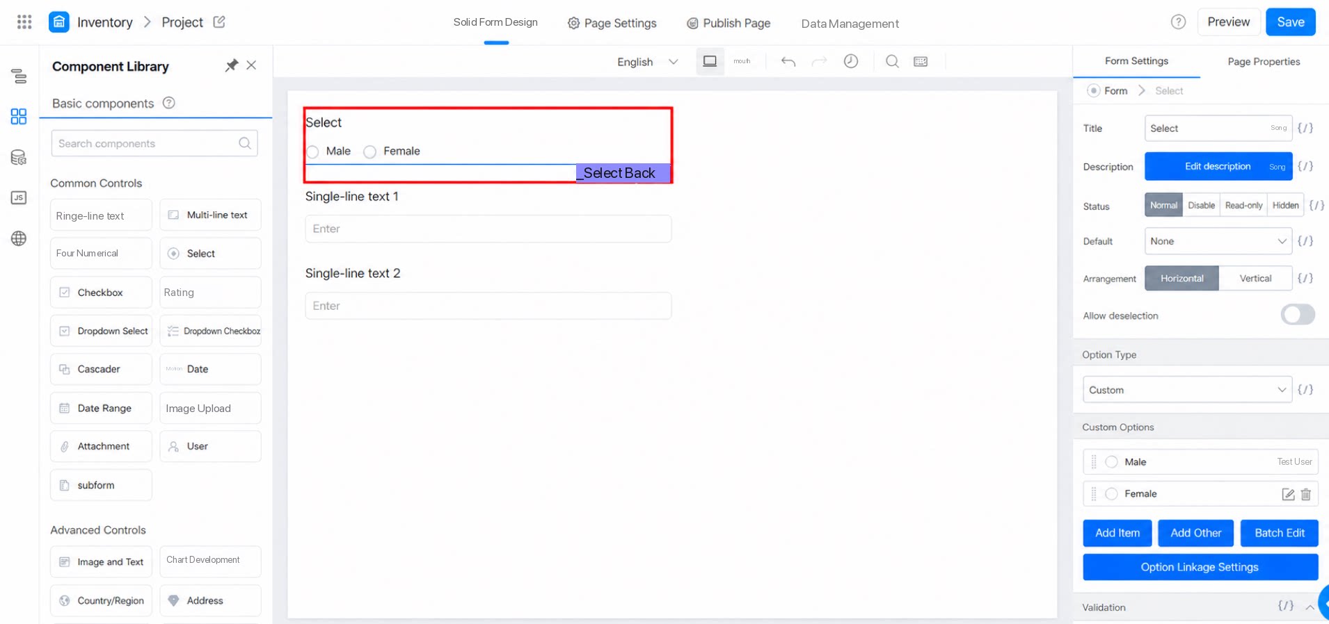
Associated Option Settings - Field Visibility
Use associated options to show content that corresponds to a selected option. This is useful for contract management, item requisition, procurement, and similar scenarios.Deselect Support
Turn on the deselect feature to let users clear a selection by clicking the selected option again. The following video shows the difference between the On and Off states:Option Types
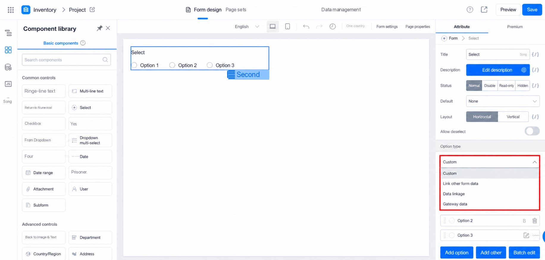
The Select component supports 4 option types:- Custom: define option content based on your own requirements.
- Associate other form data: use an Association setting to pull data from a linked form into the current form.
- Data linkage: when one Field’s Data changes in the form, another Field’s Data changes accordingly. This is typically used to set a component’s Default value.
- Gateway data: the API endpoint must be publicly accessible, and the response format must be
[{"text":"111","value":"111"}].
Color
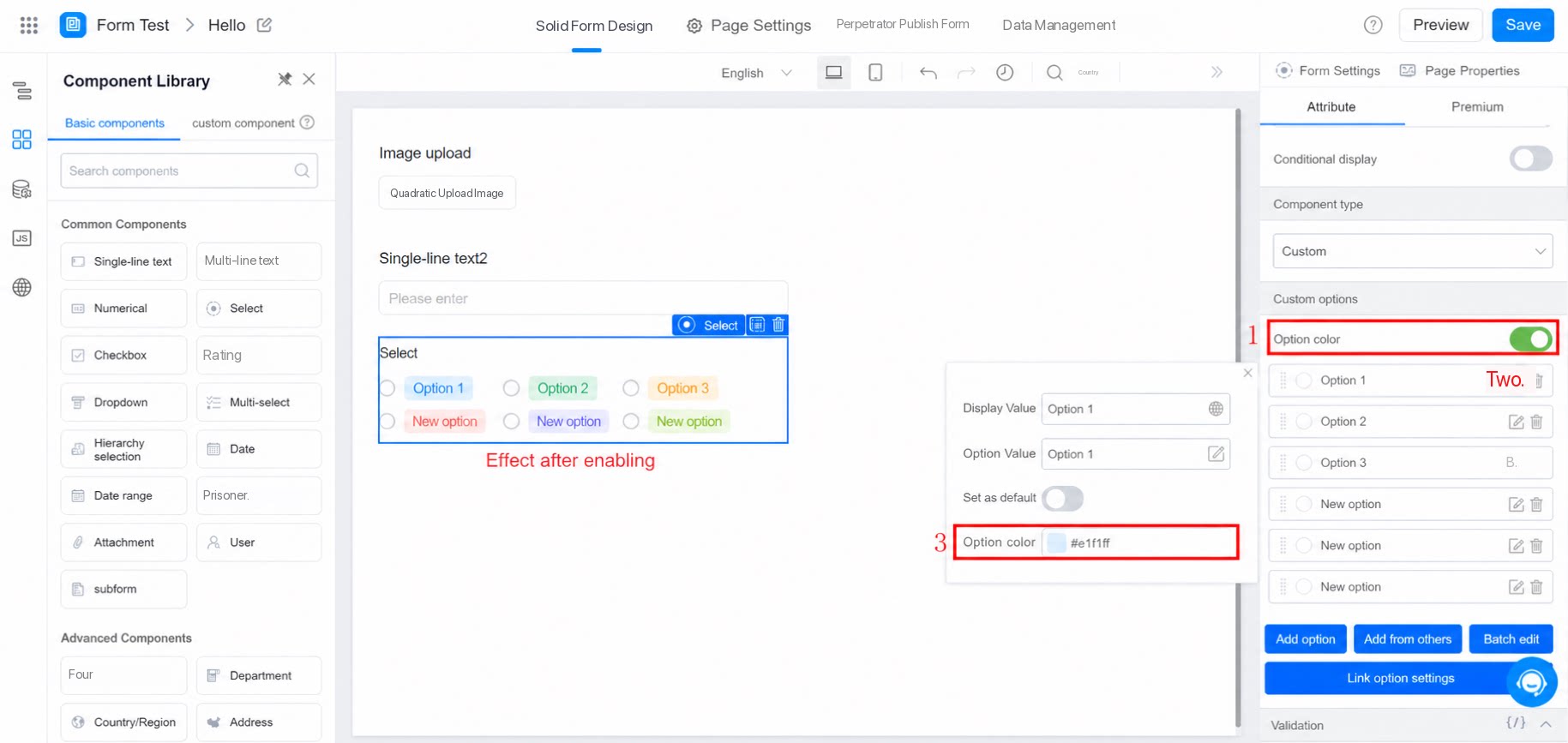
The Select, Multiselect, dropdown select, and dropdown multiselect components all support colored buttons. When enabled, each option displays in a distinct color, and you can customize the colors.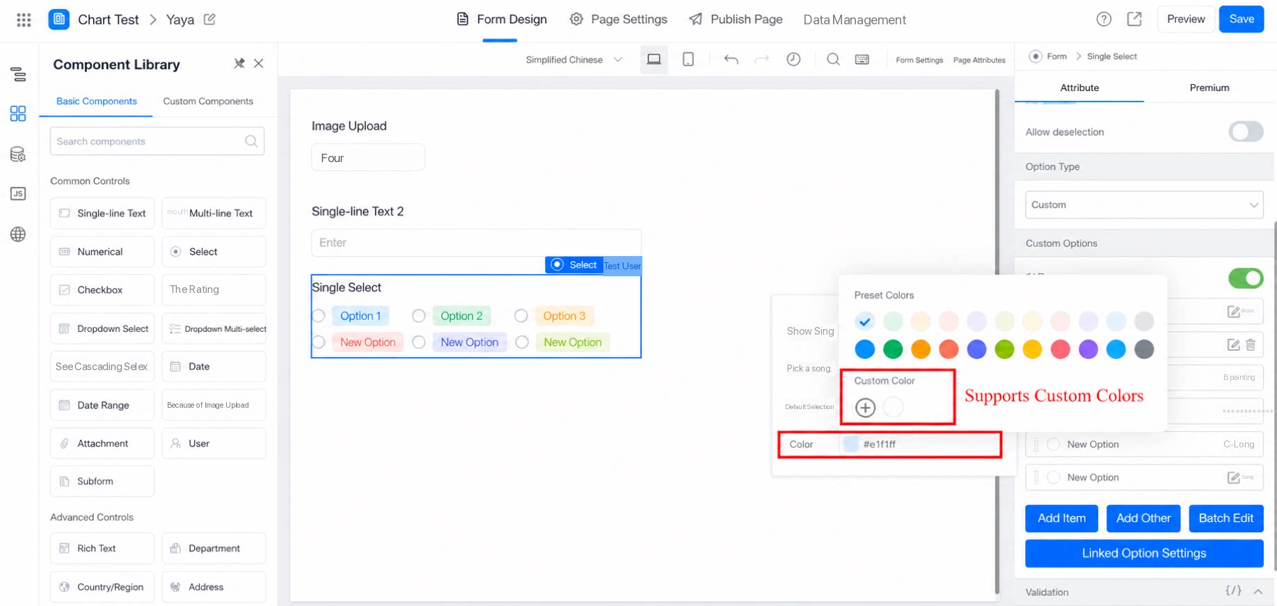
Add “Other”
When options are uncertain, turn on the “Add Other” feature. Users can then select “Other” and enter their own content when none of the listed options apply.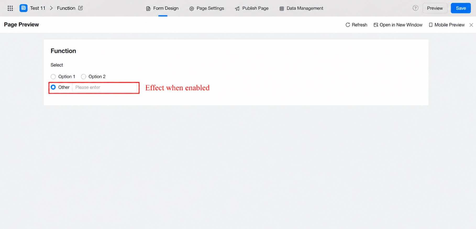
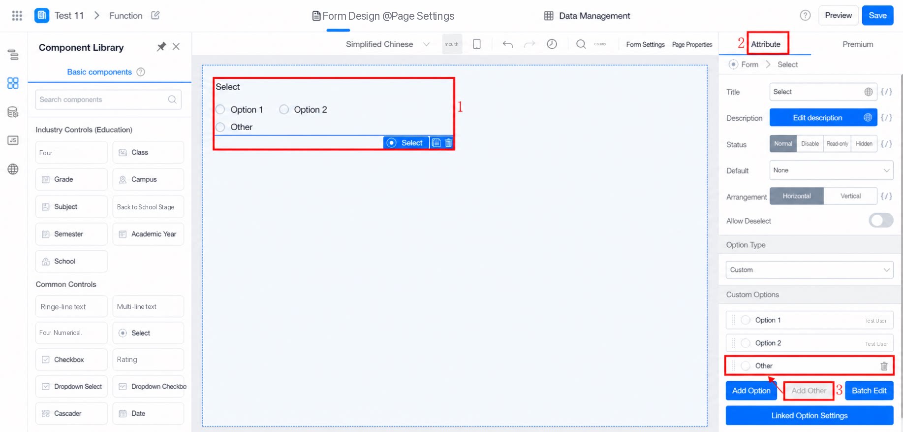
Bulk Editing
When maintaining Custom options for Select, Multiselect, dropdown select, and dropdown multiselect components, use the bulk edit feature to make changes.| Feature entry | Edit interface |
|---|---|
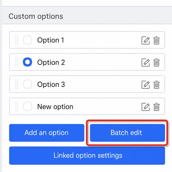 | 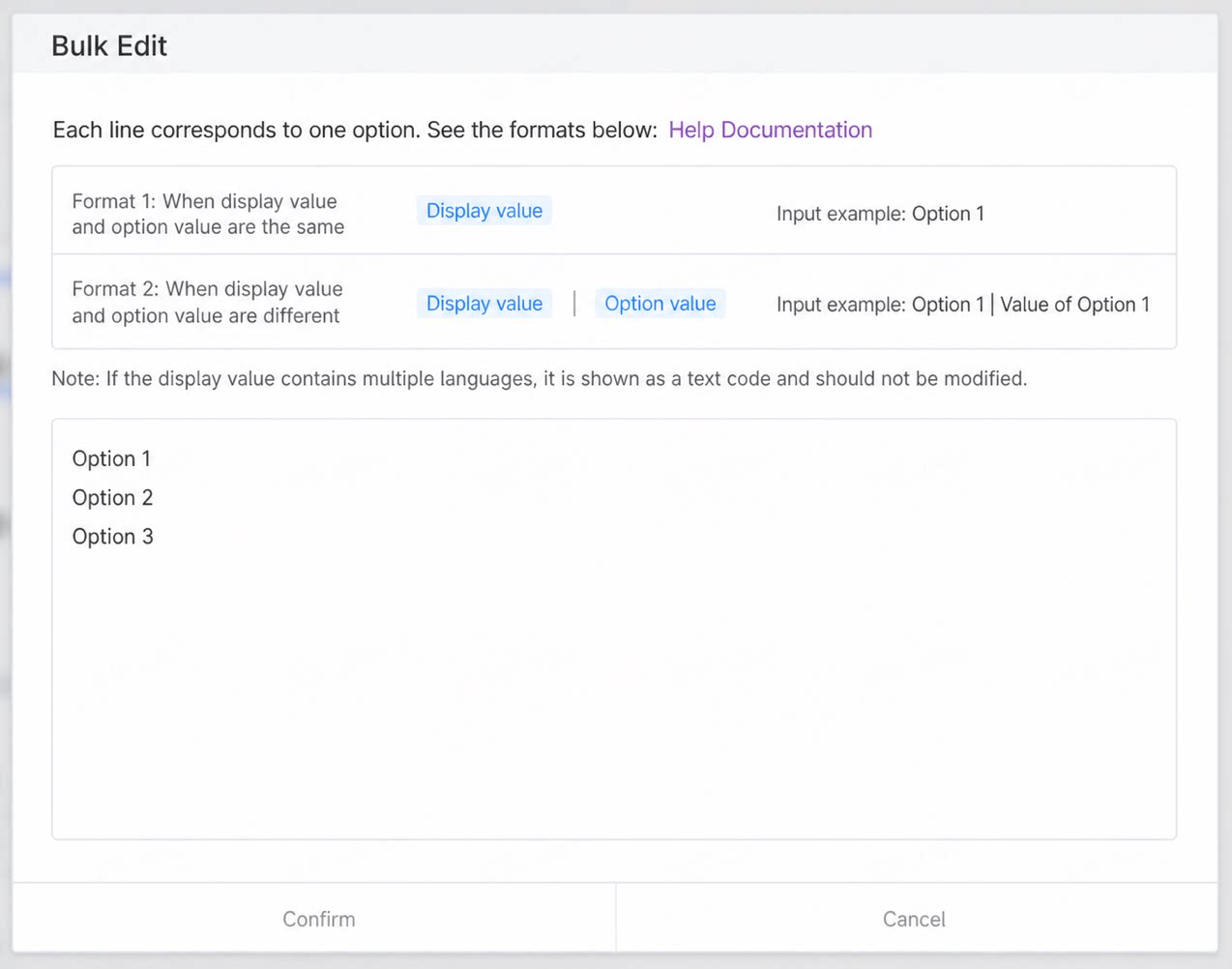 |
- Edit display values only: because YiDA options support separate Custom option values and display values, bulk editing supports multiple formats for different needs. Choose the format that fits your use case.
- Edit both display values and option values at the same time: the display value and the option value for each option are identical.
- Internationalized labels: in this case, A, B, and C are the option values for each option.
The separator is the pipe character
| entered in English input mode.FAQ
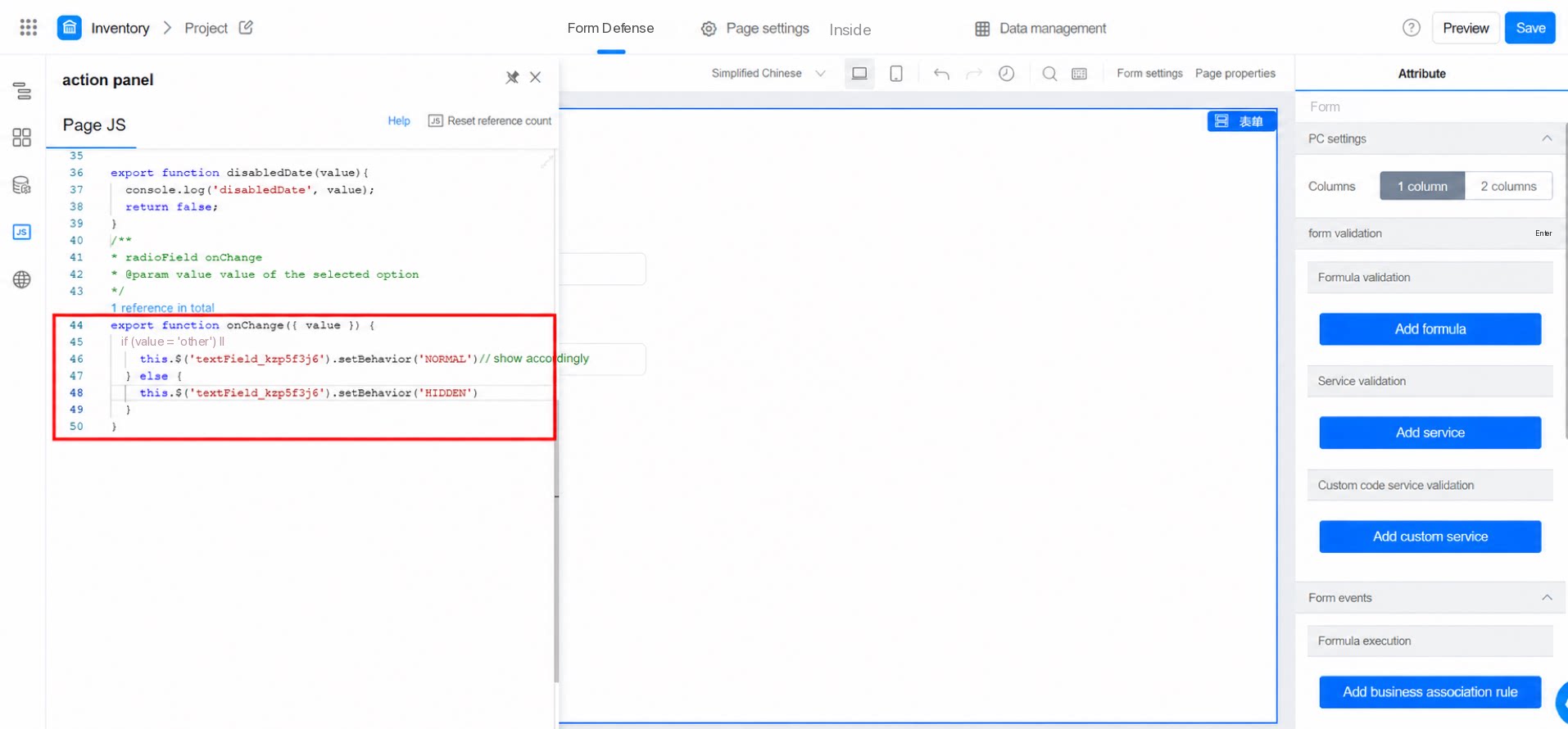
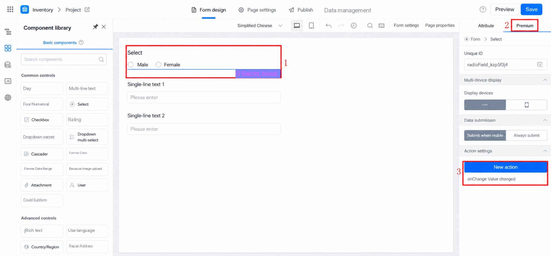
Q: In a Select component with several options, when a user selects “Other,” they should be able to enter content — all within a single component (without using associated options, which would require additional components). Can this be done with code? Or can another component handle this scenario?