

 Chats
Chats Calendar
 Meetings
 Contacts
 Mail
Mail Docs
Docs Drive
Drive AI Table
 AI Minutes
 Attendance
 Approval
 YiDA
YiDA Admin Console
Steps
Follow these steps:- Sign in to the YiDA workbench and open the app settings page.
- Click Data Factory > Data card.
- Click Create data card to open the card design page.
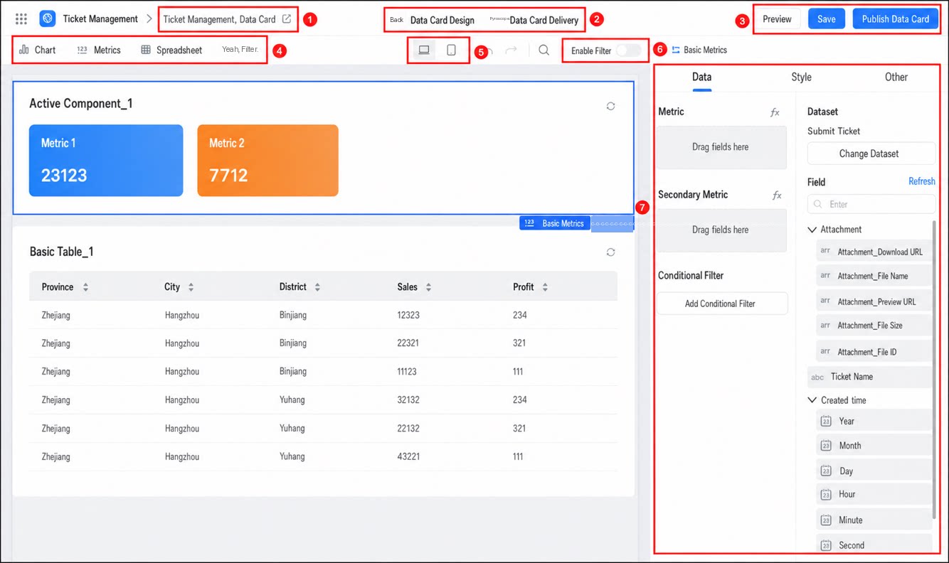
- After building the card, click Publish data card at the top to complete the release.
Card Actions
A card supports three actions: preview, save, and publish data card.- Save: saves only the card’s configuration or changes, without affecting other scenarios where the card is used.
- Publish data card: once a data card is published, it takes effect immediately in all scenarios where the card is used.
Editing Tips for Data Cards
Because a data card in a portal is a single unit, read the following tips carefully to build attractive and practical cards:| Case | Illustration | Tip |
|---|---|---|
| The card shows only half of its content in the portal | 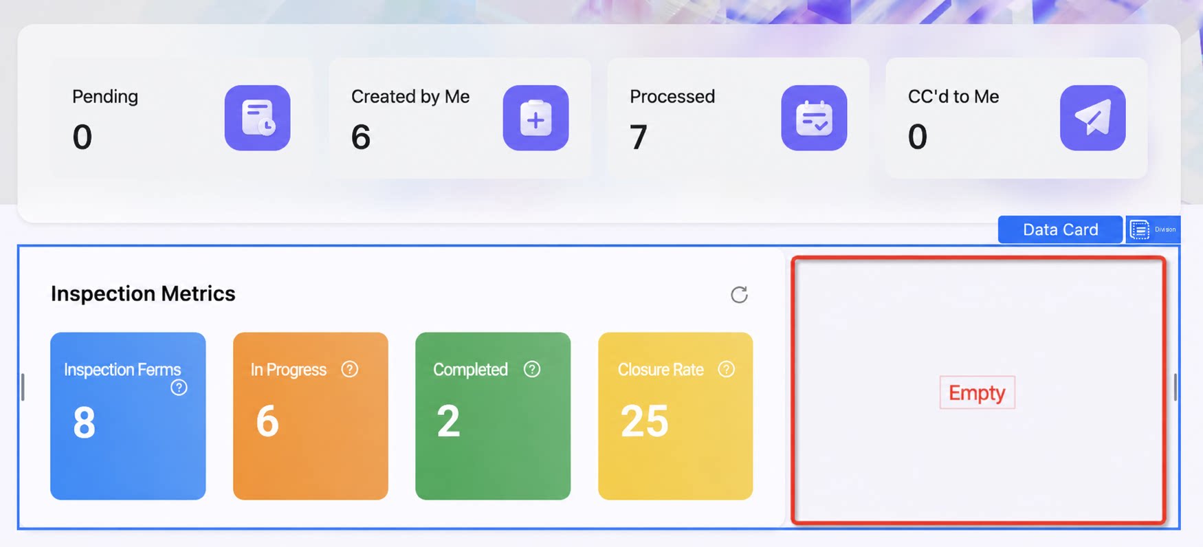 | When building a data card, make sure components are anchored to both sides. |
| The card has data in edit mode but shows none in preview | If the card was created from a template, its data is demo data rather than real data. Preview and access require real data. |
Component Selection
Data cards mainly support three categories of chart components and one category of filter components.- Chart components include: Chart (Column, Line, Pie, Dashboard, Funnel, Heatmap, China Map, Column-Line Combo, Word Cloud, Radar, Calendar Heatmap), Metrics, and Table (Basic Table).
- Filter components include: Filter Dropdown, Filter Range, and Filter Time.
Switch the Display Side
Because a data card is captured at mobile size when broadcast, review how it looks from different user perspectives so that you can adjust the styling accordingly.Turn on Filters
The filter capability is off by default in data cards. To filter data within a card in the portal, turn on this capability and use it together with filter components. For more information, see Filters.Usage Limits
- Each data card supports up to five chart components.
- After distribution, a data card has a lifecycle of seven days. Its data is automatically destroyed seven days after distribution.