

 Chats
Chats Calendar
 Meetings
 Contacts
 Mail
Mail Docs
Docs Drive
Drive AI Table
 AI Minutes
 Attendance
 Approval
 YiDA
YiDA Admin Console
1. Introduction
A radar chart is a graphical method that displays multivariate data on a two-dimensional plane, using three or more quantitative variables plotted on axes that share a common origin. The relative position and angle of the axes are typically uninformative. A radar chart is also known as a web chart, spider chart, star chart, spider web chart, or irregular polygon.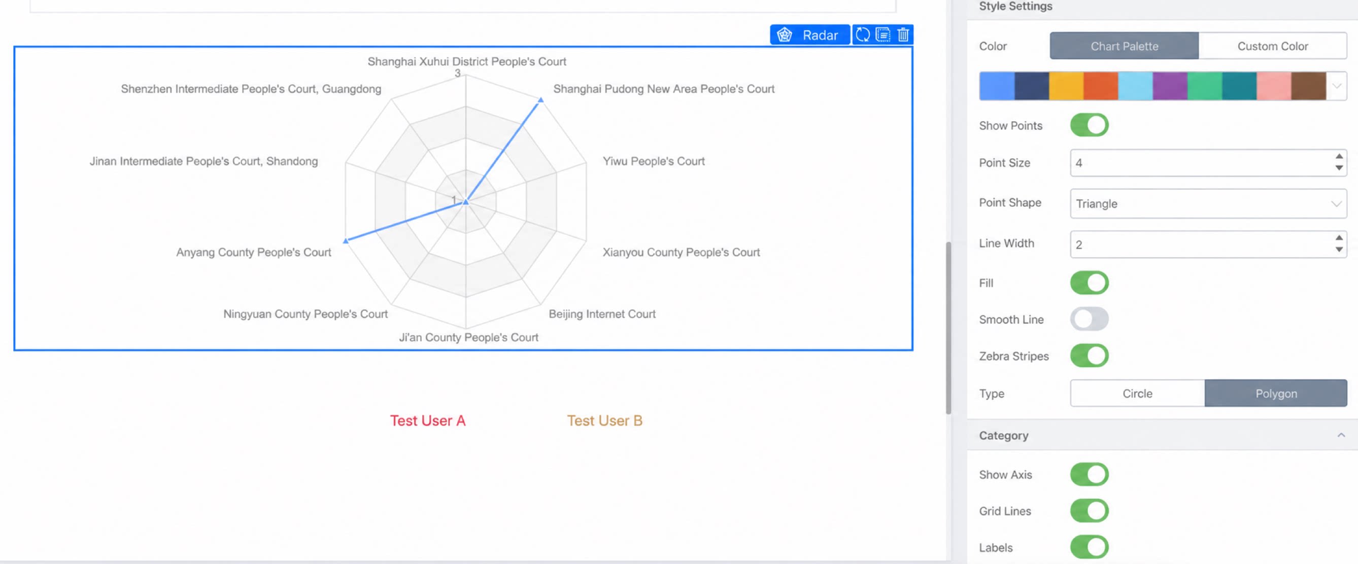
2. Configuration
2.1 Associate a Dataset
Path: Click report >> Chart >> Radar >> Data >> Dataset >> Select a dataset.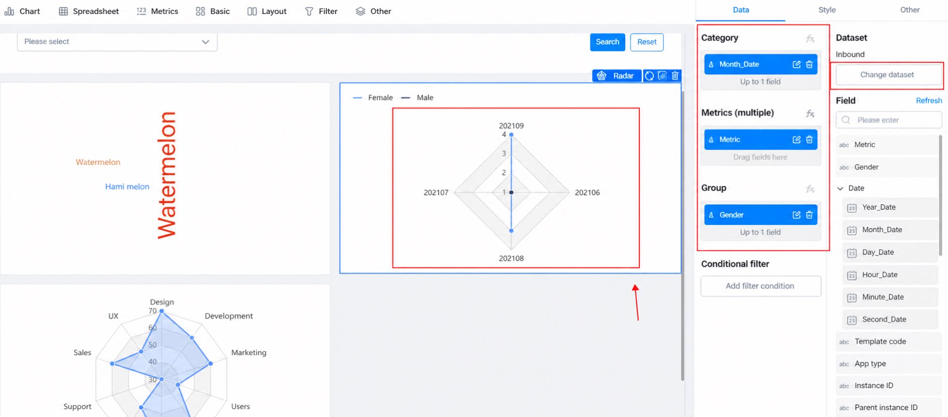
2.2 Select Fields
- Category: The edge dimensions of the radar chart (January to September in the figure above).
- Metric: The specific numerical value (the value in the shaded area of the radar chart above).
- Group: The grouping (for example, Male/Female in the figure above).
2.3 Conditional Filtering
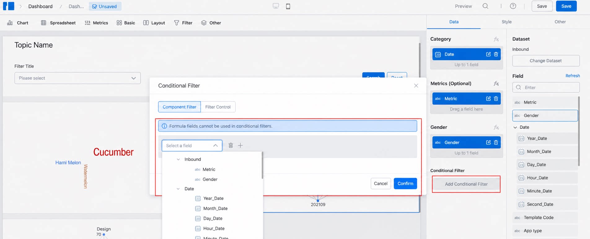
- To hide data that does not need to be displayed in a report, select form components or system default fields to configure filtering.
2.4 Configure Styles
2.4.1 Colors
- Color scheme: Apply a color scheme based on the sort order.
- Custom color: Customize colors. Click here to open the color picker tool.
2.4.2 Style Settings
- Whether to display points, and their shape, size, and type.
- Line thickness and curve/polyline style.
- Background: Whether to show zebra lines and whether to fill areas.
2.4.3 Category
- Grid lines: The edges of the ring in the figure below.
- Label: For example, [February] in the figure below.
- Text order: Customize the display order of text, separated by commas.
2.4.4 Scale
- Scale range:
- Use the maximum and minimum values to define the scale range, and use the scale count to divide it into equal parts. The figure below shows the result with a maximum value of 40, a minimum value of 0, and a scale count of 4.
2.4.5 Legend
- Set whether to display the legend and its position.
2.4.6 Tips
- Whether to display hover tips.