

 Chats
Chats Calendar
 Meetings
 Contacts
 Mail
Mail Docs
Docs Drive
Drive AI Table
 AI Minutes
 Attendance
 Approval
 YiDA
YiDA Admin Console
1. Introduction
1.1 Feature Overview
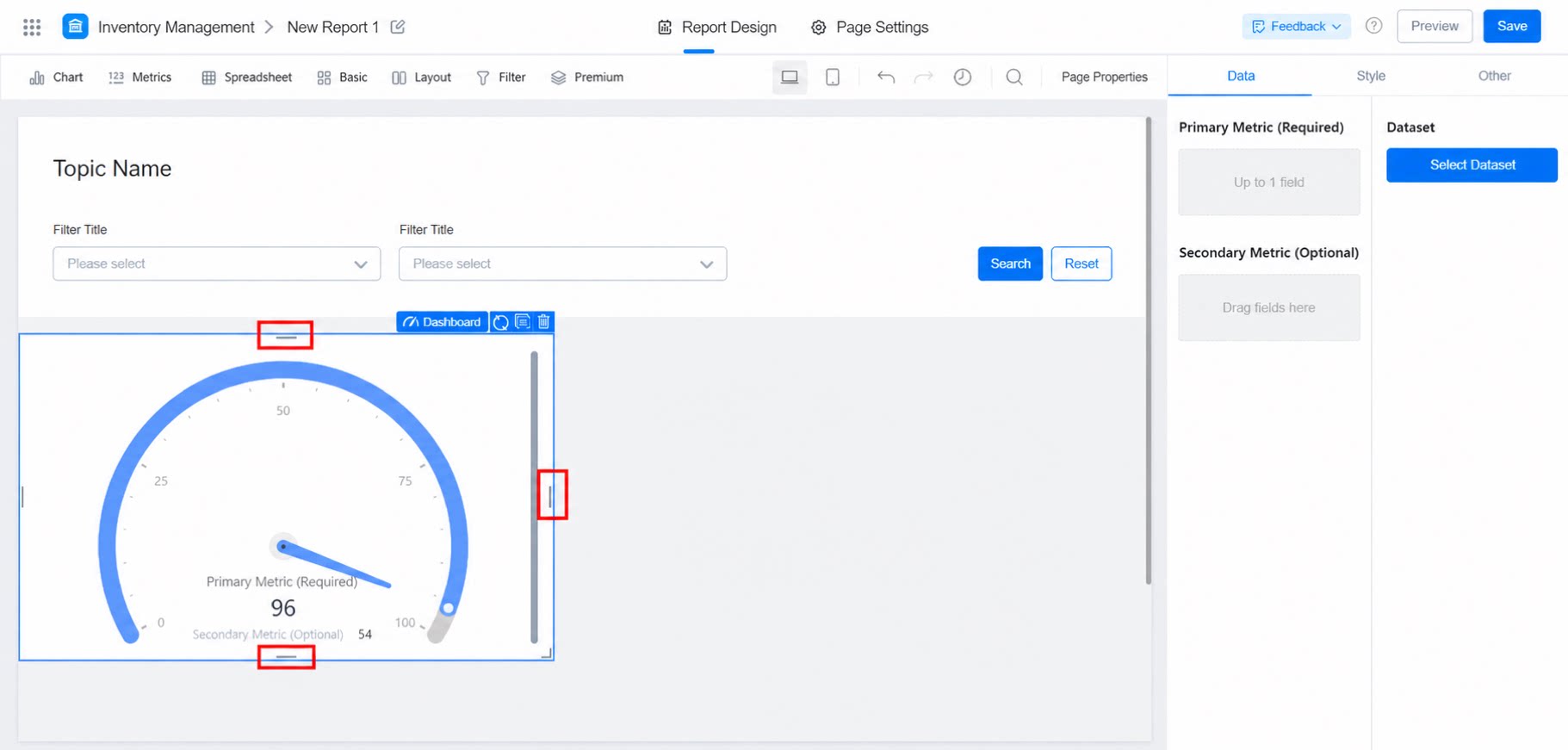
Use the Dashboard to set a Primary metric and Auxiliary metrics, freely configure colors for different scale intervals, and add tips to both primary and auxiliary metrics.
1.2 Basic Requirements
The basic requirements for the Dashboard are as follows:2. Procedure
2.1 Select the Component and Configure the Dataset
Create a report, add the Dashboard component, and select a dataset, as shown below: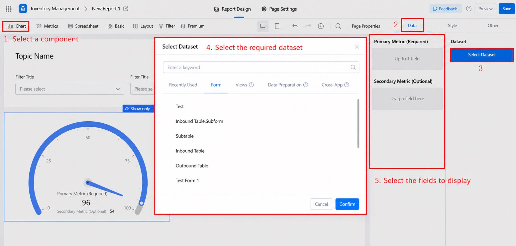
2.2 Select Chart Display Fields
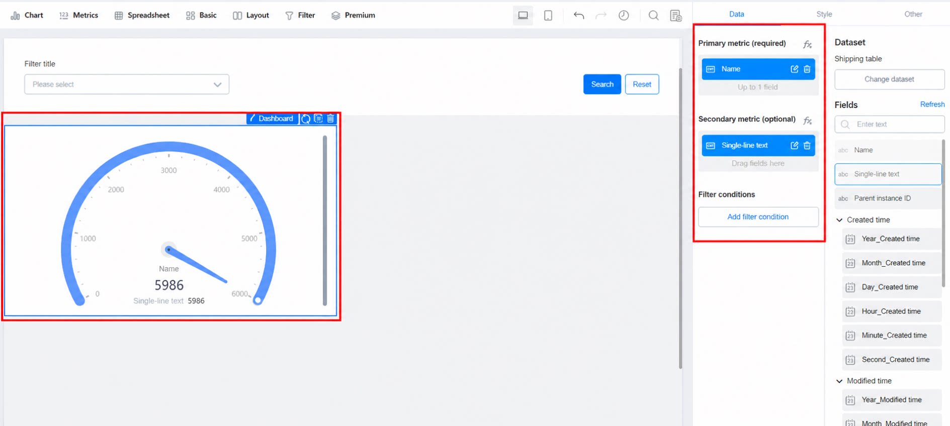
Drag fields from the right panel onto Primary metric and Auxiliary metric.- Only one primary metric is allowed. You can add multiple auxiliary metrics or leave this field empty.
2.3 Configure Data
Refer to the data configuration guide for the combined bar and line chart. This is a Yuque content card. Click the link to view: Combined bar and line chart2.4 Style Settings
2.4.1 Color Interval
- Single color: Uses only one color.
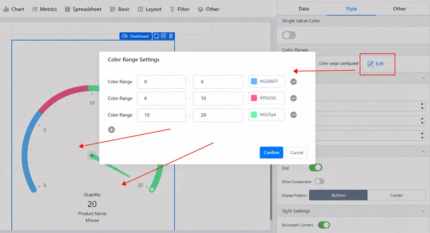
- Color interval: The dashboard scale color is determined by the value on the dashboard, as shown below:
2.4.2 Scale: Configure the Dashboard Scale
- Minimum: The minimum value of the scale interval.
- Maximum: The maximum value of the scale interval.
- Interval: The spacing between two scale marks.
2.4.3 Auxiliary Metric Settings
- On: Whether to display the auxiliary metric.
- Show comparison: Compares the auxiliary metric with the primary metric. Red indicates an increase; green indicates a decrease.
- Display position: Shows the metric at the bottom or in the middle.
2.4.4 Style Configuration: Configure the Dashboard Appearance
- Rounded shape: A rounded shape for the color area.
- Show pointer: Whether to display the pointer on the dashboard.
- Bar thickness: The thickness of the color bar.
- Relative radius: The size of the color area ring.
- Relative inner radius: The size of the scale ring.