Chats
Chats Calendar
 Meetings
 Contacts
 Mail
Mail Docs
Docs Drive
Drive AI Table
 AI Minutes
 Attendance
 Approval
 YiDA
YiDA Admin Console
1. Introduction
The two common forms are standard and capsule. Tabs are mainly used for layout and can be combined with other components.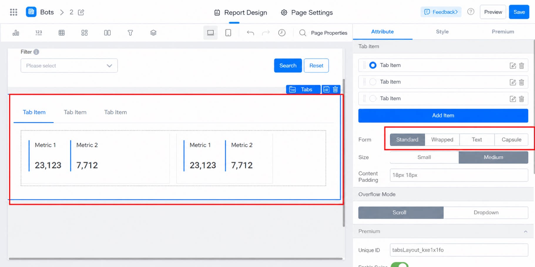
2. Steps
2.1 Select the Component
Select the component and drag it into the designer. Add the component.2.2 Configure Tab Items
- Tab items: Add multiple tab items. When there are too many, configure the display mode.
- Form: Refers to the display form of the tab items — standard, wrapped, text, and capsule.
- Size: Medium by default.
- Content padding: Adjustable. Default is 20px 20px.
2.3 Premium
2.3.1 Enable Tiles
Supports tile drag-and-drop, making it easy to instantly adjust the width, height, and position of the chart.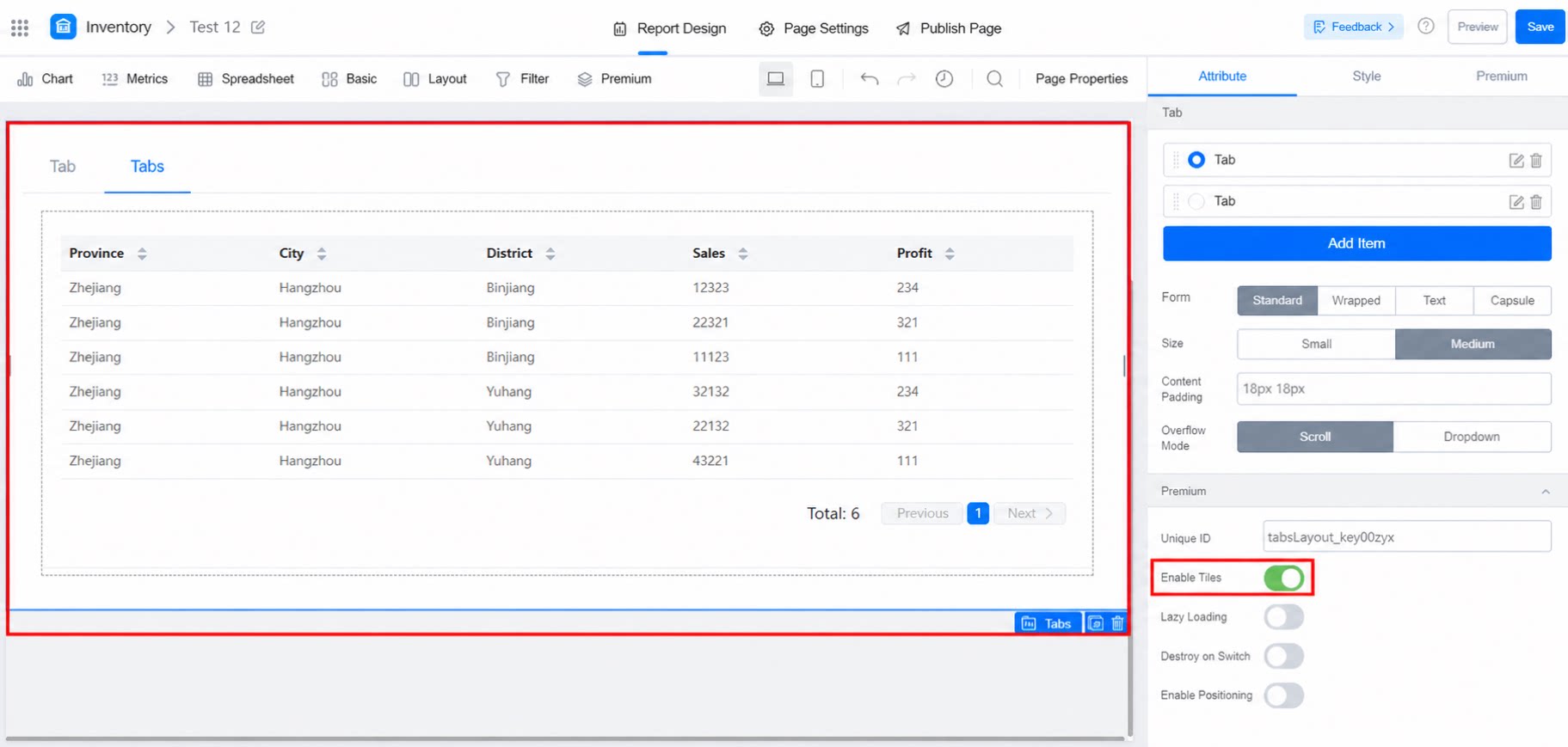
2.3.2 Lazy Loading
When enabled, the content of a tab item loads only when you switch to that tab.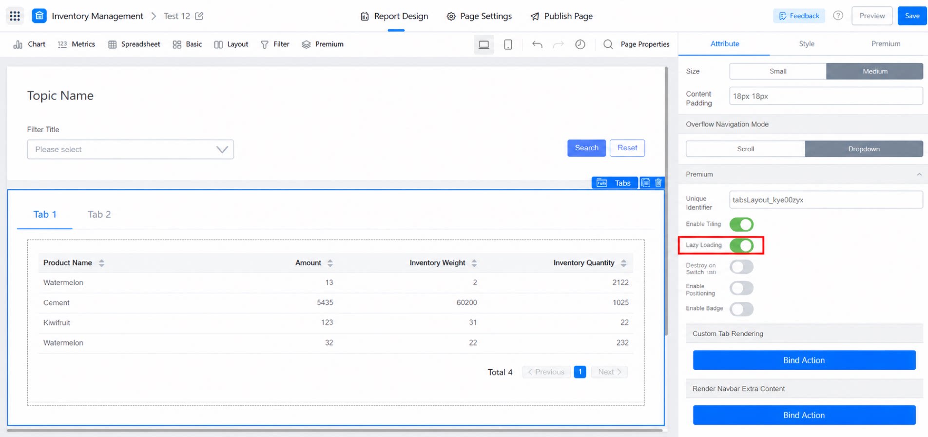
2.3.3 Destroy on Switch
When Destroy on switch is enabled, a blue lightning loading icon appears each time you switch tabs and the data reloads, as shown below:2.3.4 Enable Positioning
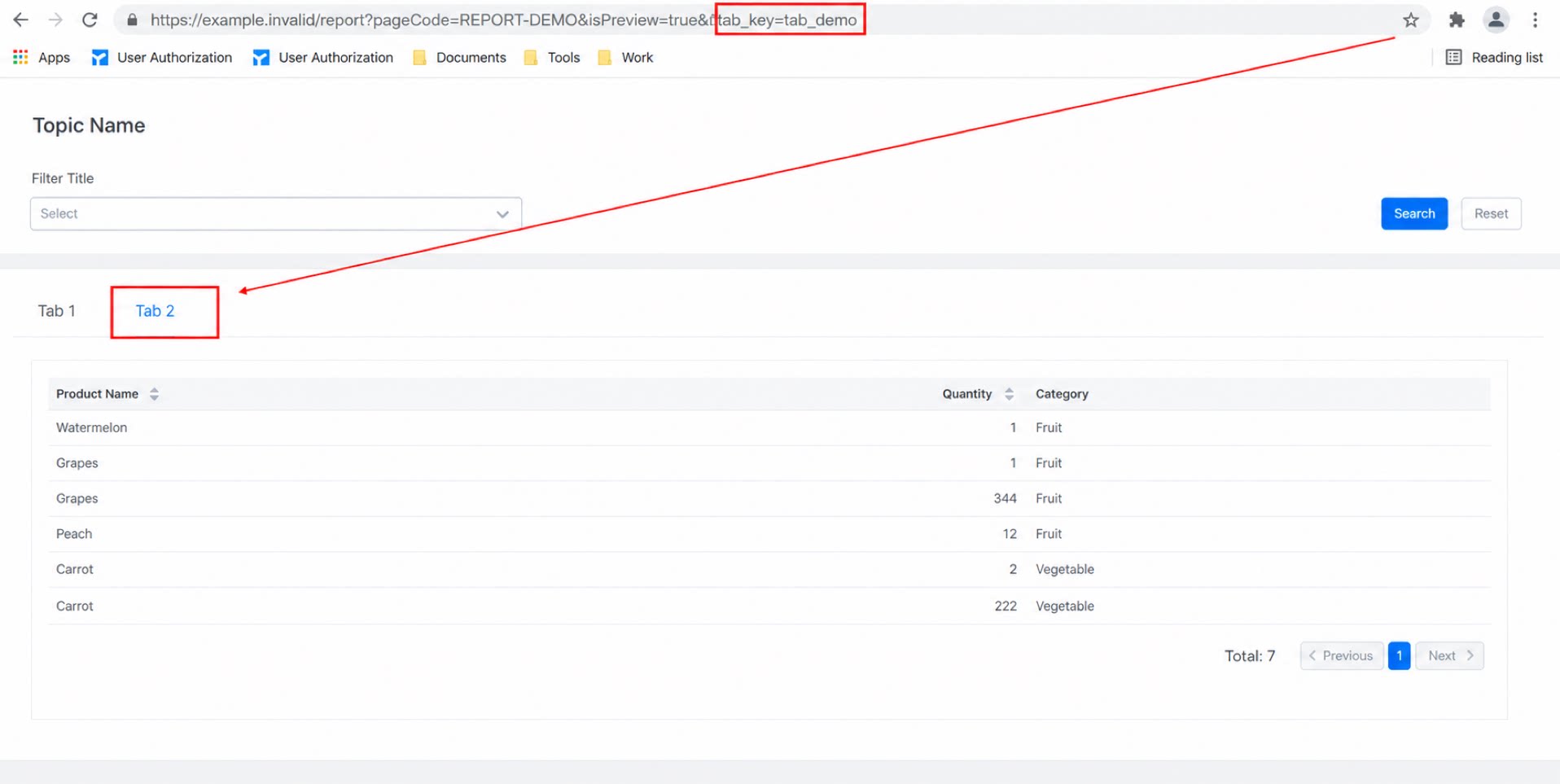
When positioning is enabled and you select a tab item, the browser URL appends the suffix of that tab item. Pasting this link opens the app with the current tab item selected by default.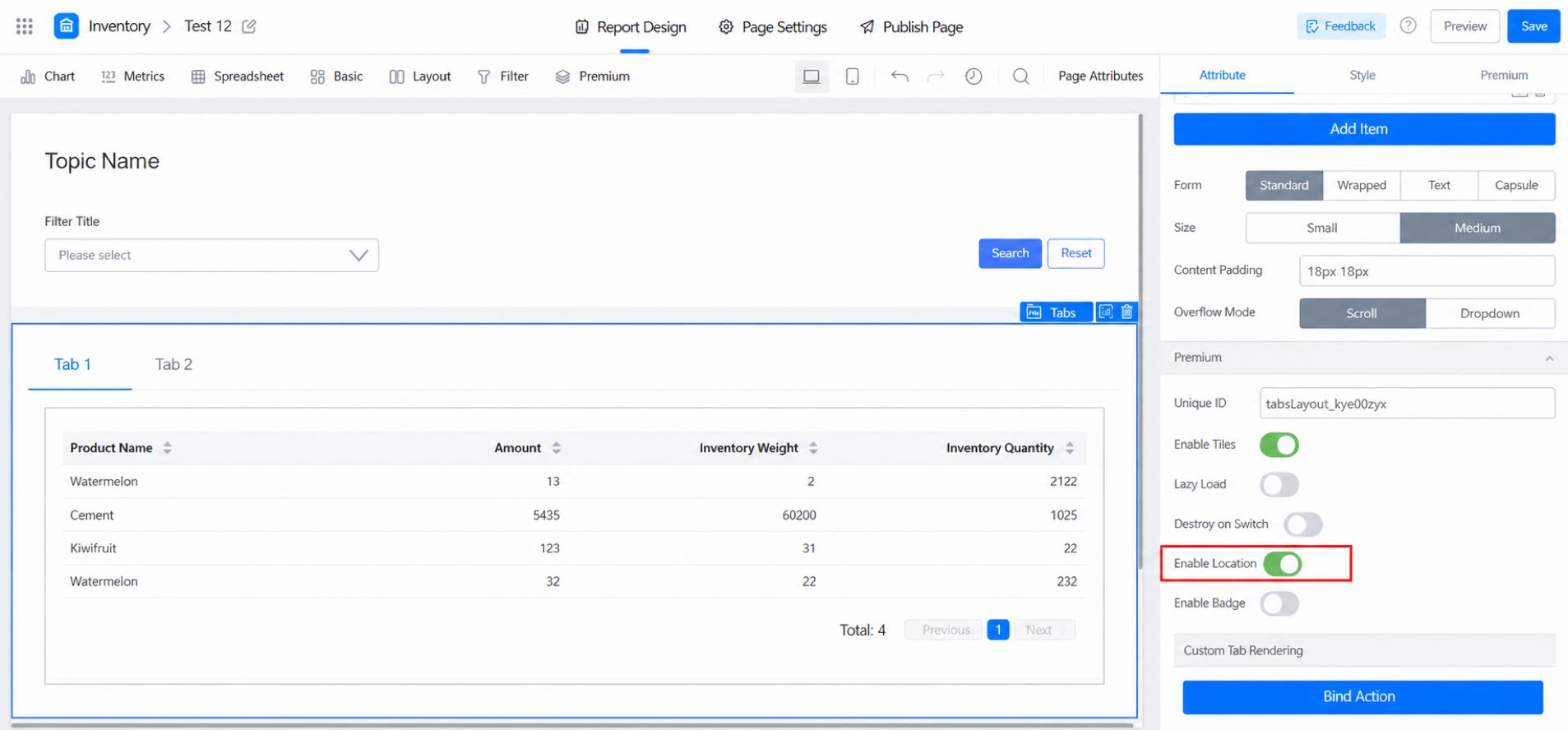
2.3.5 Enable Badge
When Enable badge is turned on, badge settings appear below. You need to write code to configure the badge.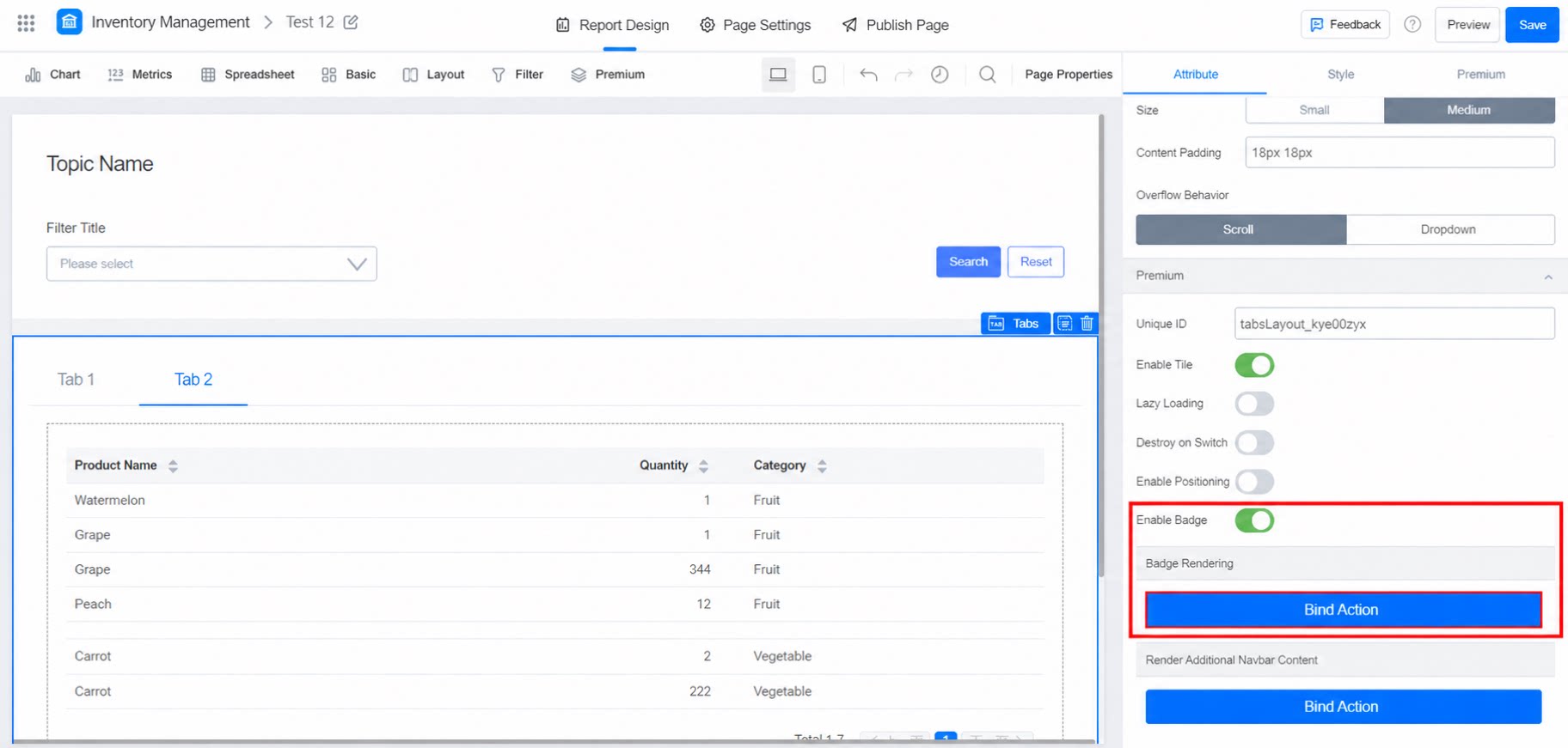
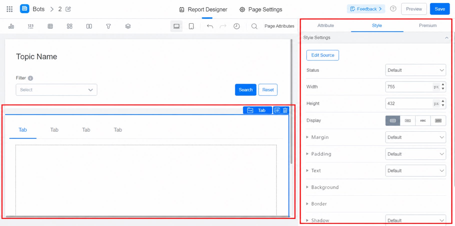
2.4 Configure Styles
Adjust the default state and other styles. For example: Adjust the top margin and the display of border lines.