Chats
Chats Calendar
 Meetings
 Contacts
 Mail
Mail Docs
Docs Drive
Drive AI Table
 AI Minutes
 Attendance
 Approval
 YiDA
YiDA Admin Console
1. Introduction
1.1 Overview
Use the Metrics and Icon settings to display the metric values and icons that matter most. Icons also support click-through drill-down. Highlight: You can resize the component, but you cannot change the alignment of the Metrics card (left, center align, right).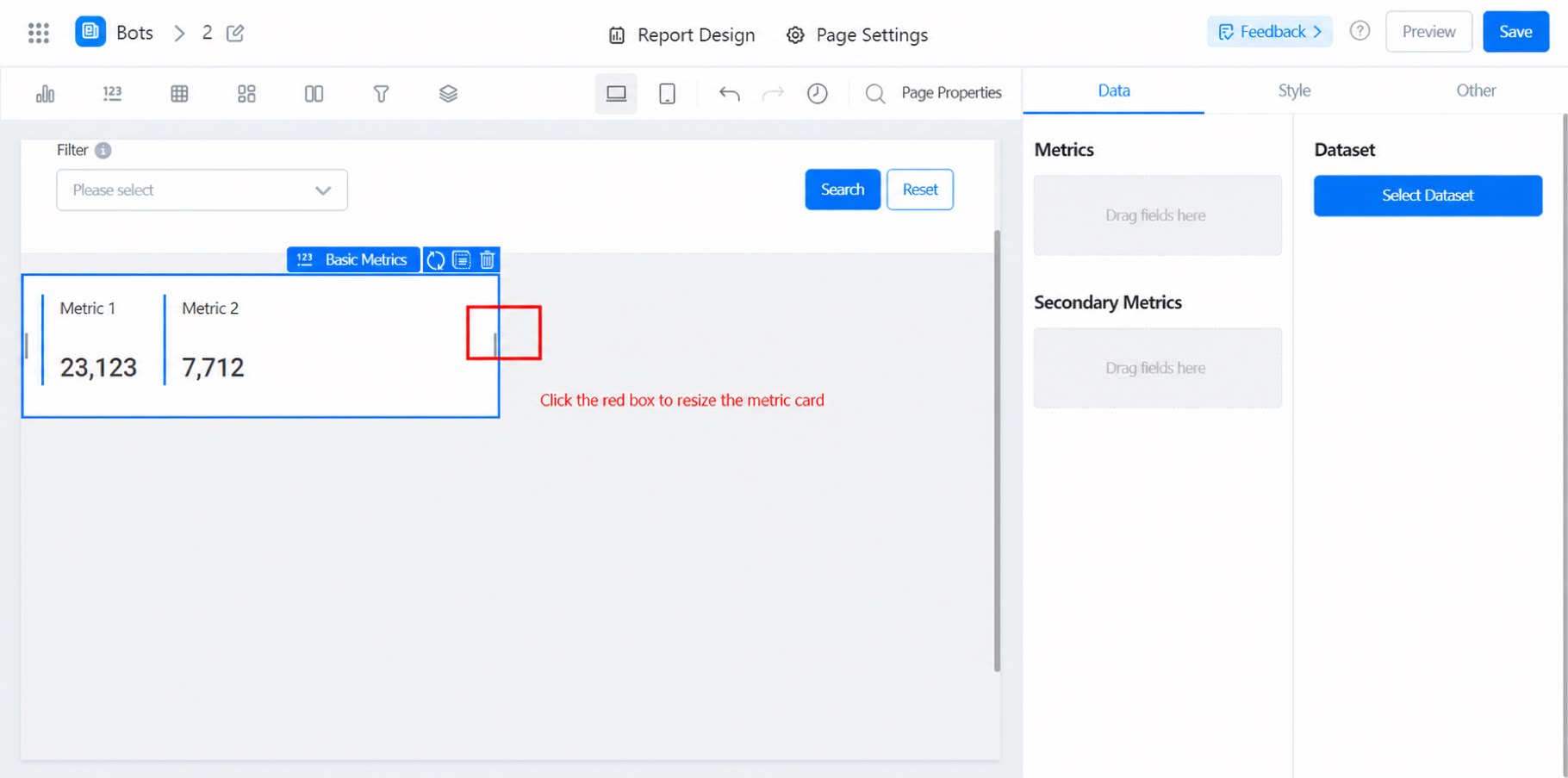
1.2 Use Cases
For example, display metric values such as sales volume and sales amount.1.3 Basic Requirements
2. Steps
2.1 Select the Component and Configure the Dataset
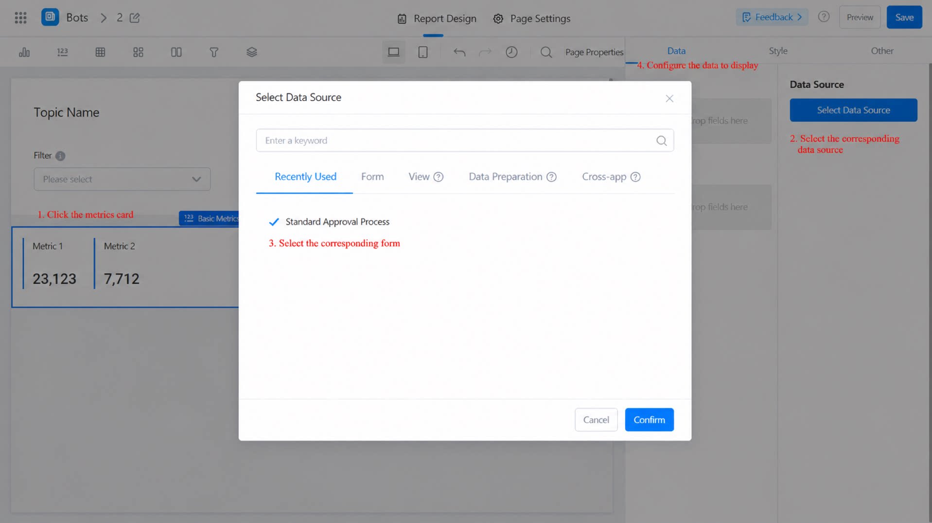
2.2 Select the Chart Display Fields (Metric and Secondary Metric)
Metric: The total value of the data. Supports aggregation. Secondary metric: Optional. Supports aggregation. Select a field directly from the dataset, or generate one using a formula. For details, see Report formulas.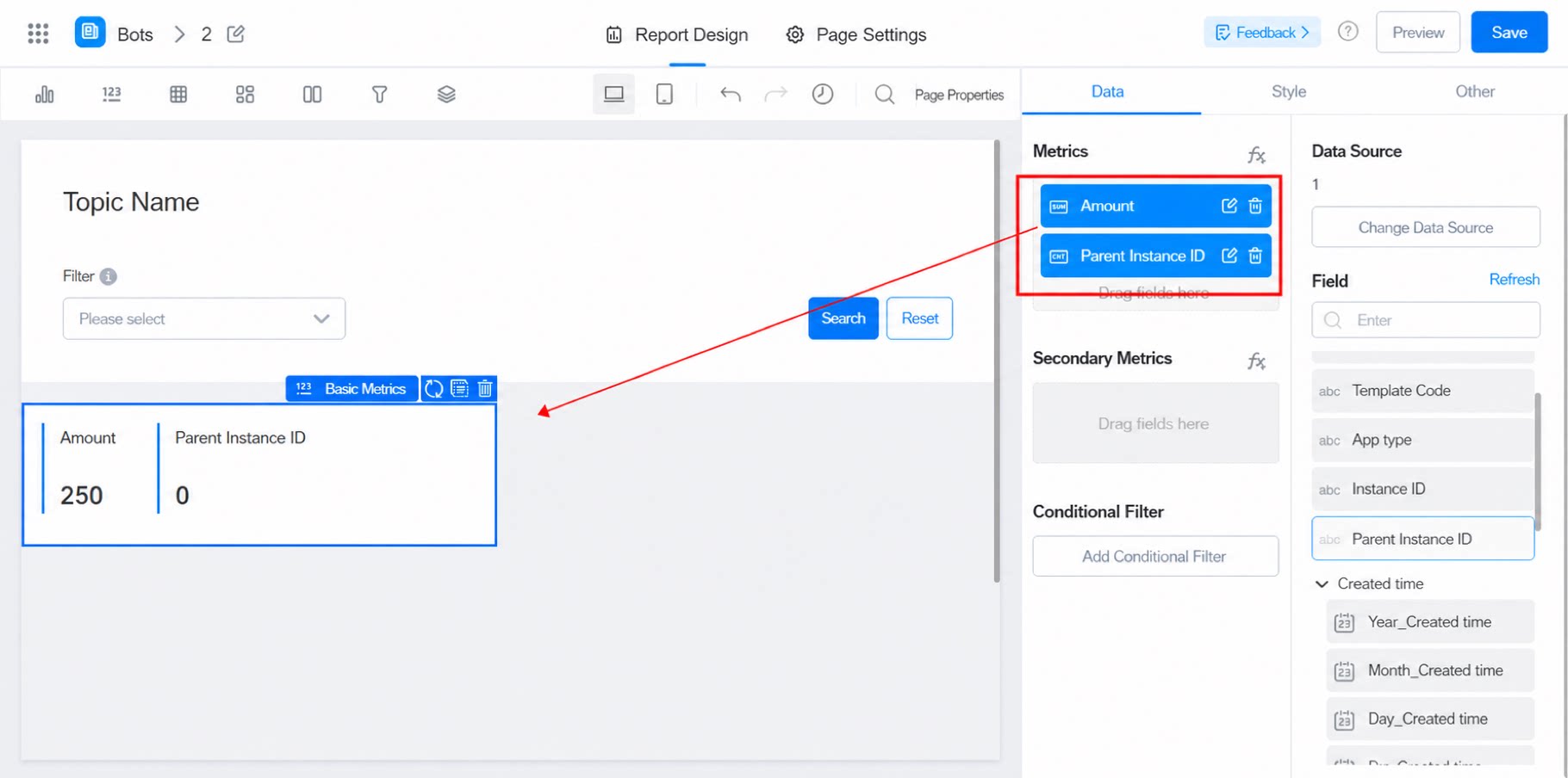
2.2.1 Secondary Metric
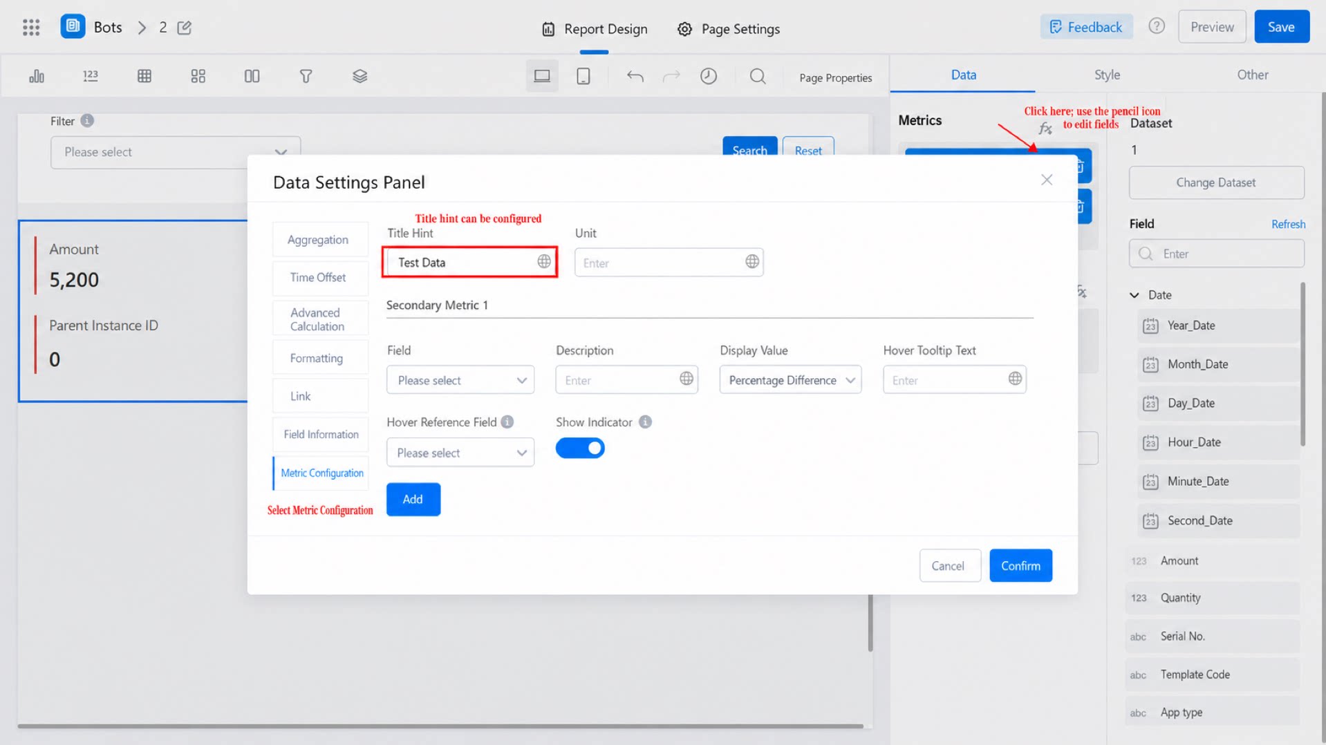
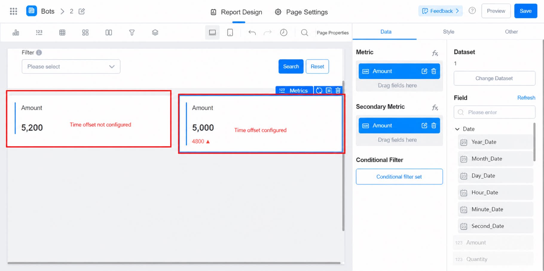
The secondary metric works the same way as the year-over-year field in the 2.0 report Metrics card. It shows the trend of a specific metric value. For example, to compare the number of submissions today with yesterday, configure it as follows:- Set the metric field to the count, and set the secondary metric to the date field in the form.
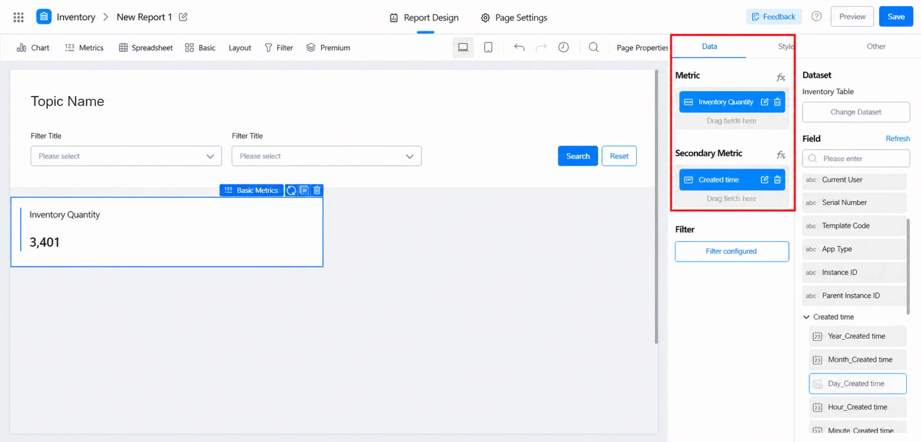
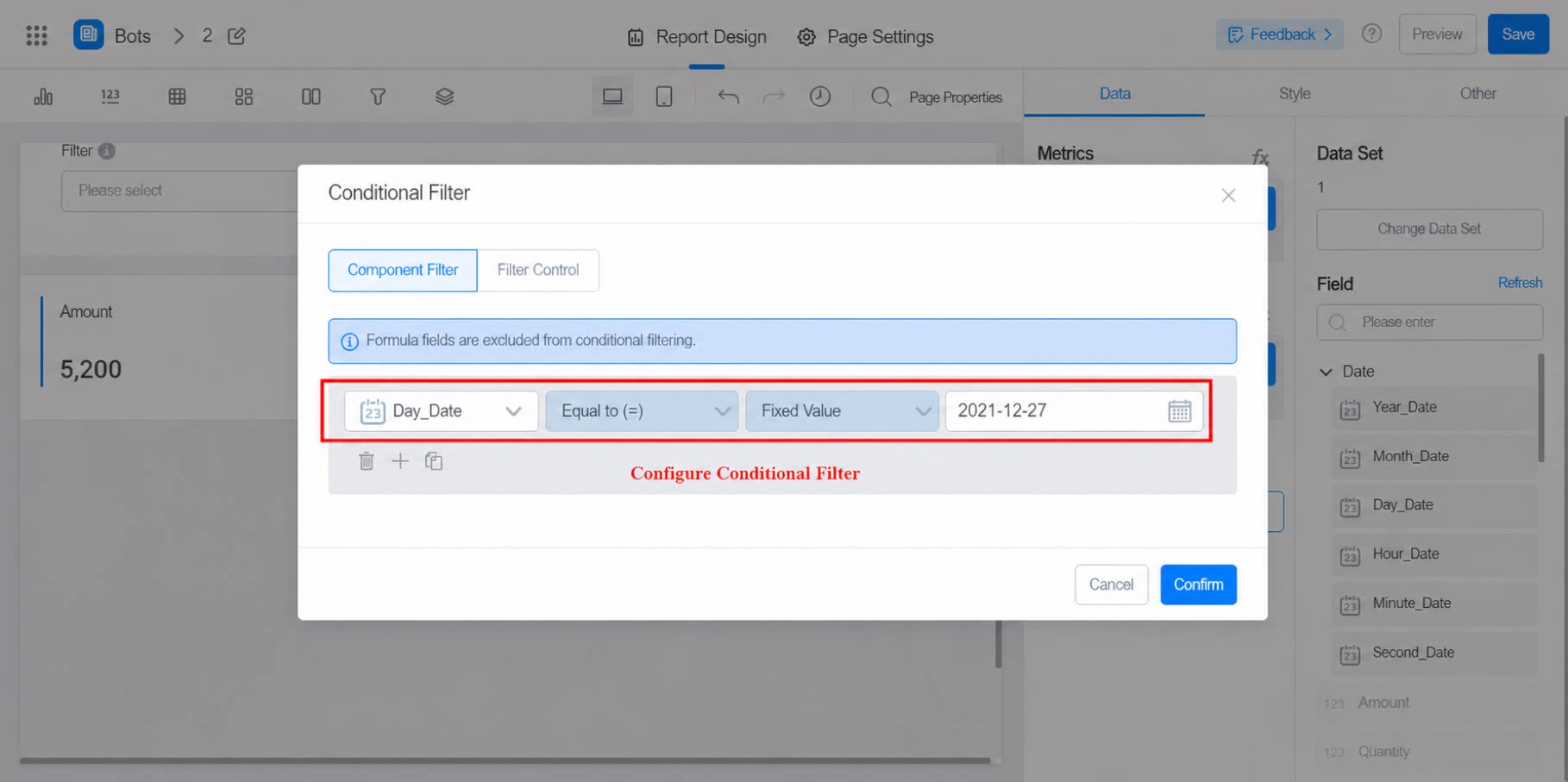
- Set a filter condition to display only today’s data.
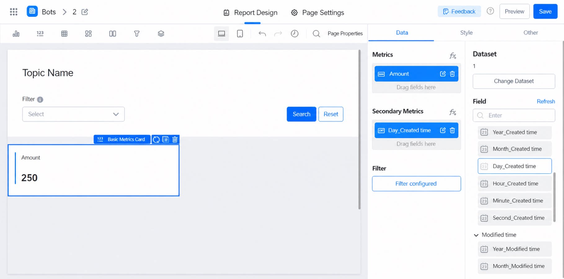
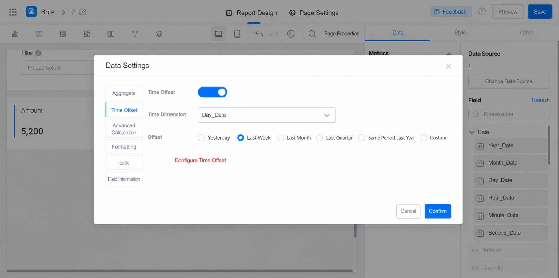
- Configure the time offset. Choose an offset that matches your scenario.
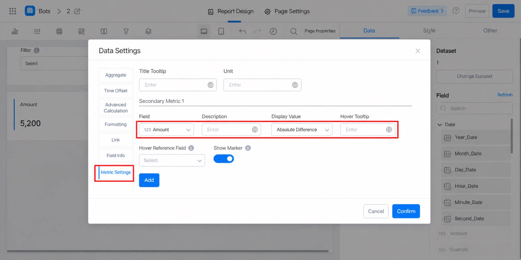
- In the metric settings, select the date field of the secondary metric. For the displayed value, choose Percentage difference, Original value, or Absolute difference.
- Final comparison.
2.3 Style Settings
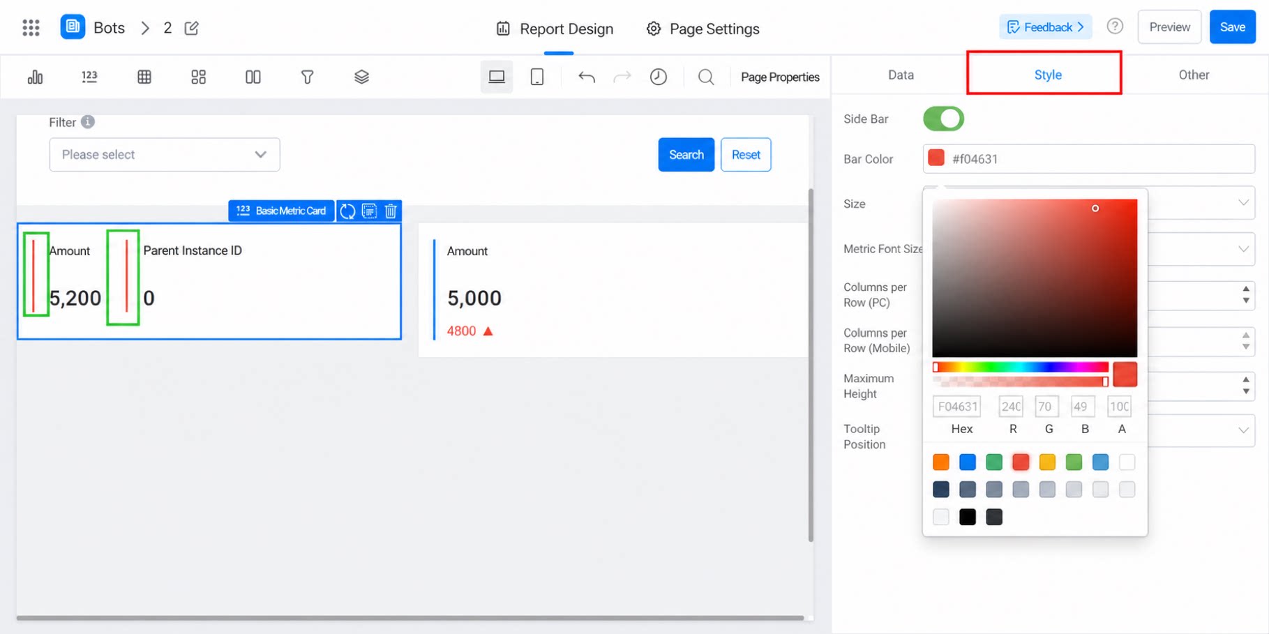
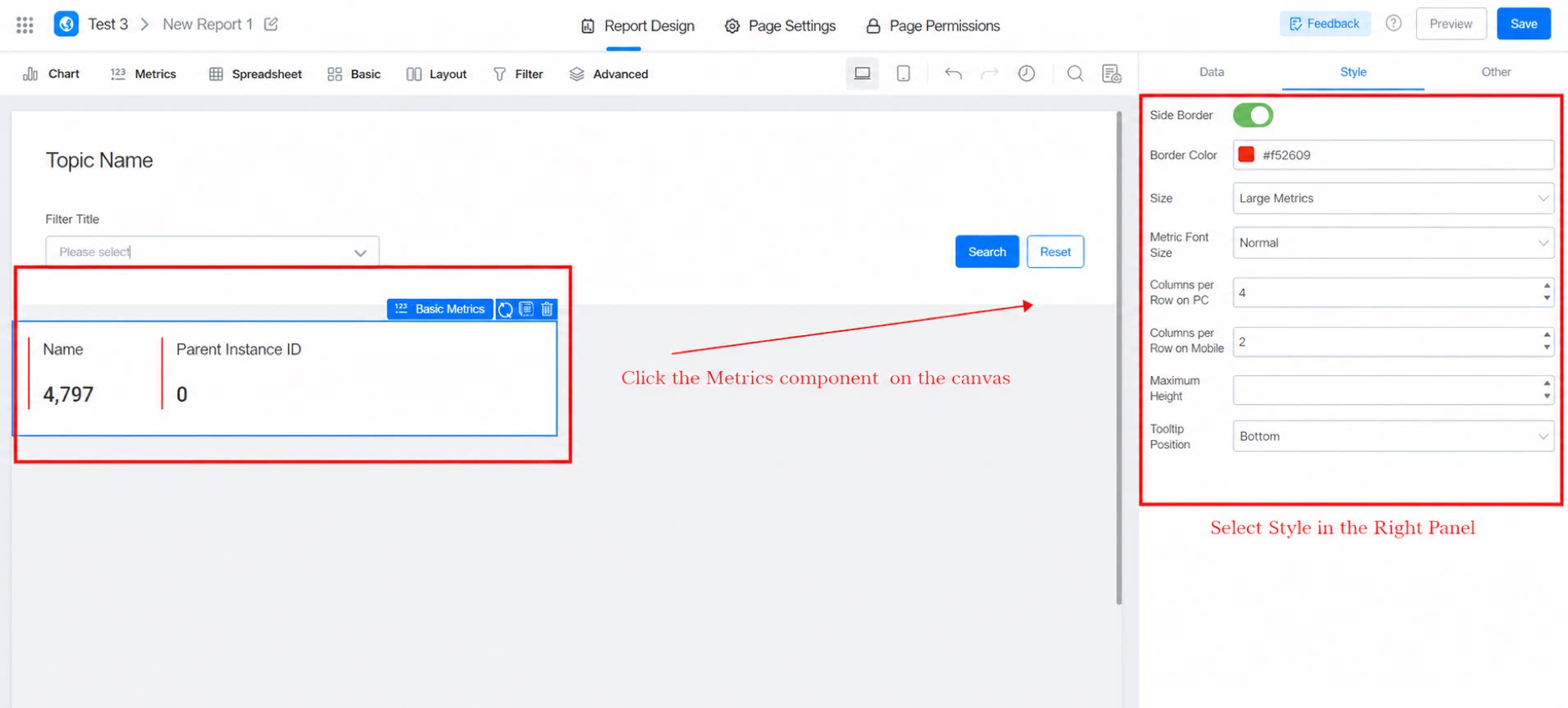
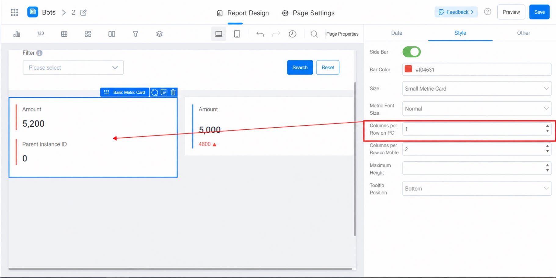
Style settings.- Side bar: Can be turned on.
- Side bar color: Configurable.
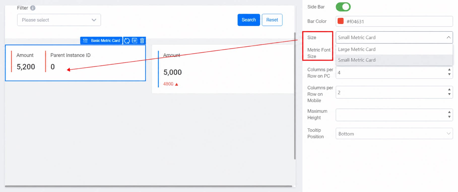
- Size: Choose Large metrics card or Small metrics card to adjust the size automatically.
- Metric font size: Choose Normal or Large to adjust the font size inside the Metrics card automatically.
- Columns per row: The number of fields displayed in a single row. The default is 4 and is adjustable.
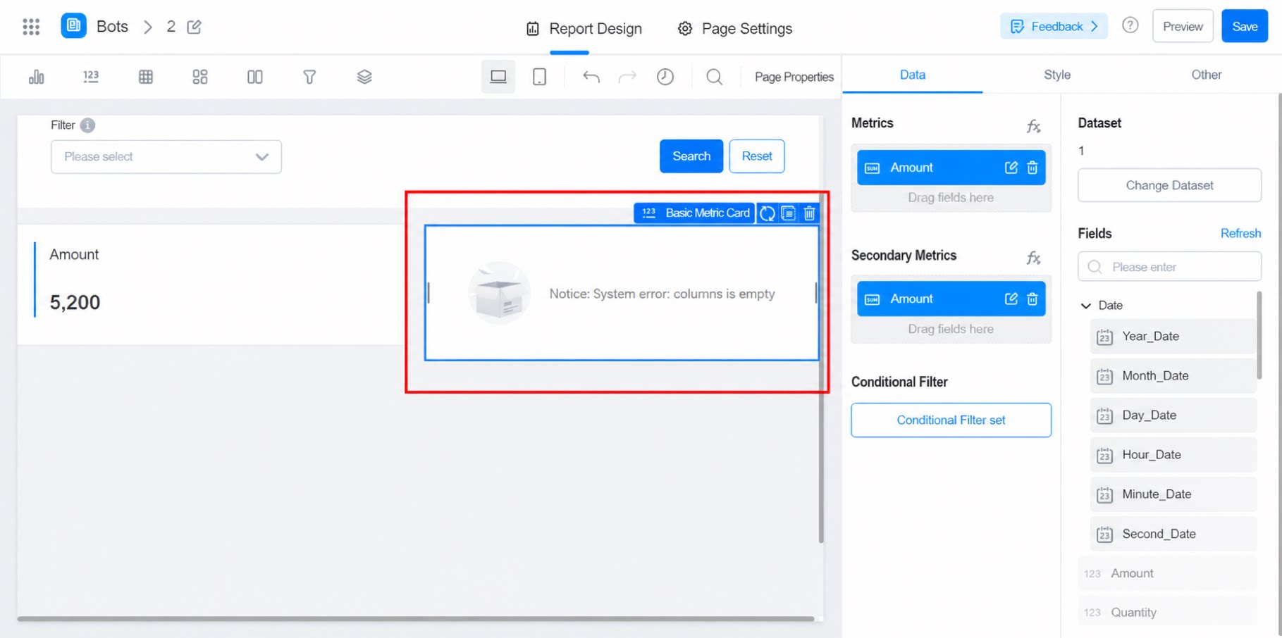
- Maximum height: Adjusts the overall height of the Metrics card.
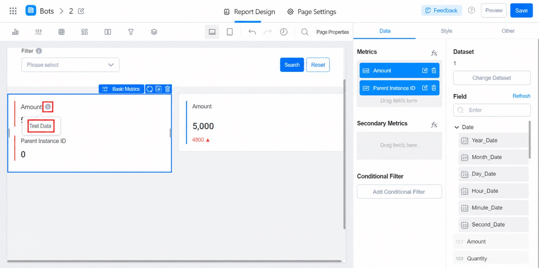
- Tooltip position: The tooltip appears only after the field’s metric settings are configured, as shown below:
3. More Information