
 Chats
Chats Calendar
 Meetings
 Contacts
 Mail
Mail Docs
Docs Drive
Drive AI Table
 AI Minutes
 Attendance
 Approval
 YiDA
YiDA Admin Console
1. Introduction
1.1 Feature Overview
To visualize the data proportion of each department, use the Pie chart component.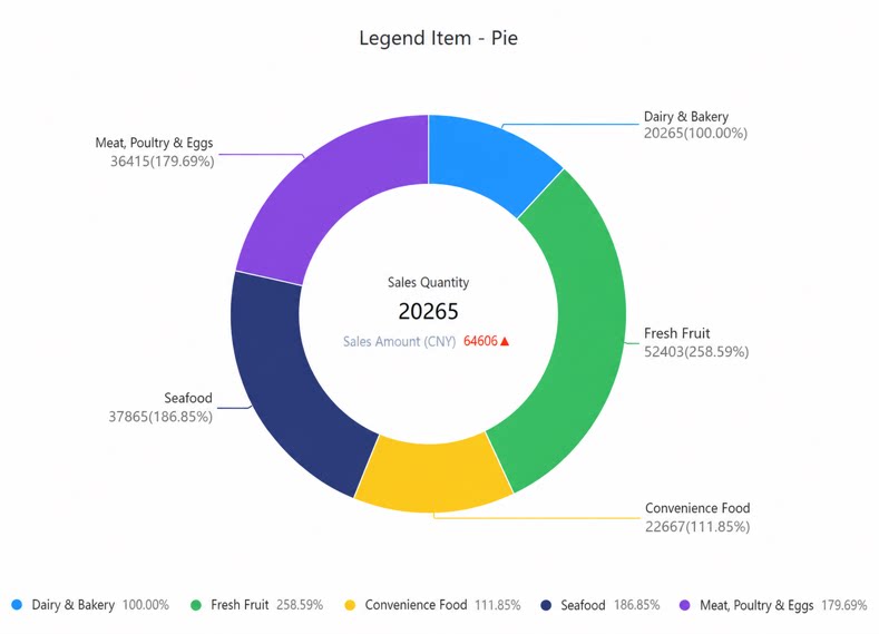
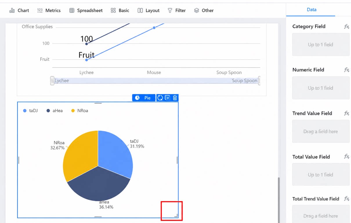
1.2 Use Cases
For example, use angles to represent data proportions, as shown below.1.3 Basic Requirements
The basic requirements for a Pie chart are as follows:2. Procedure
2.1 Select the Component and Configure the Dataset
Create a report, add a Pie chart component, and select a dataset, as shown below.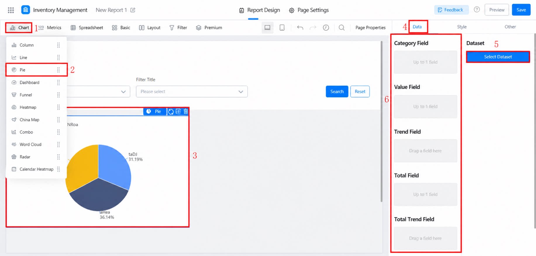
2.2 Select Chart Display Fields
Drag the fields on the right into Category, Numerical, Trend value, Total value, Total trend value, or Total value drill-down icon.- Basic fields
- Premium fields
- Conditional filtering: supported
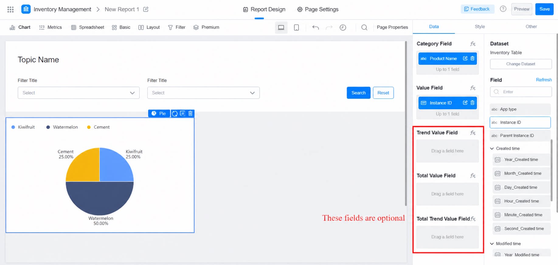
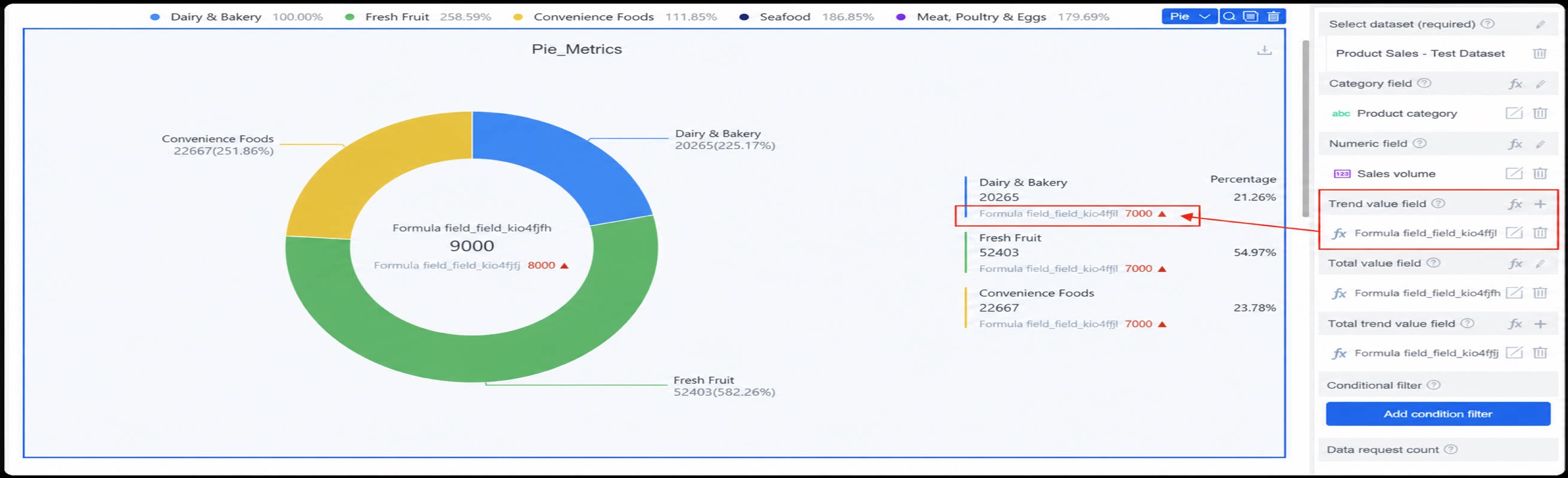
2.3 Style Settings
Five sub-categories are available: style configuration, labels, legend, tips, and percent decimal places, as shown below.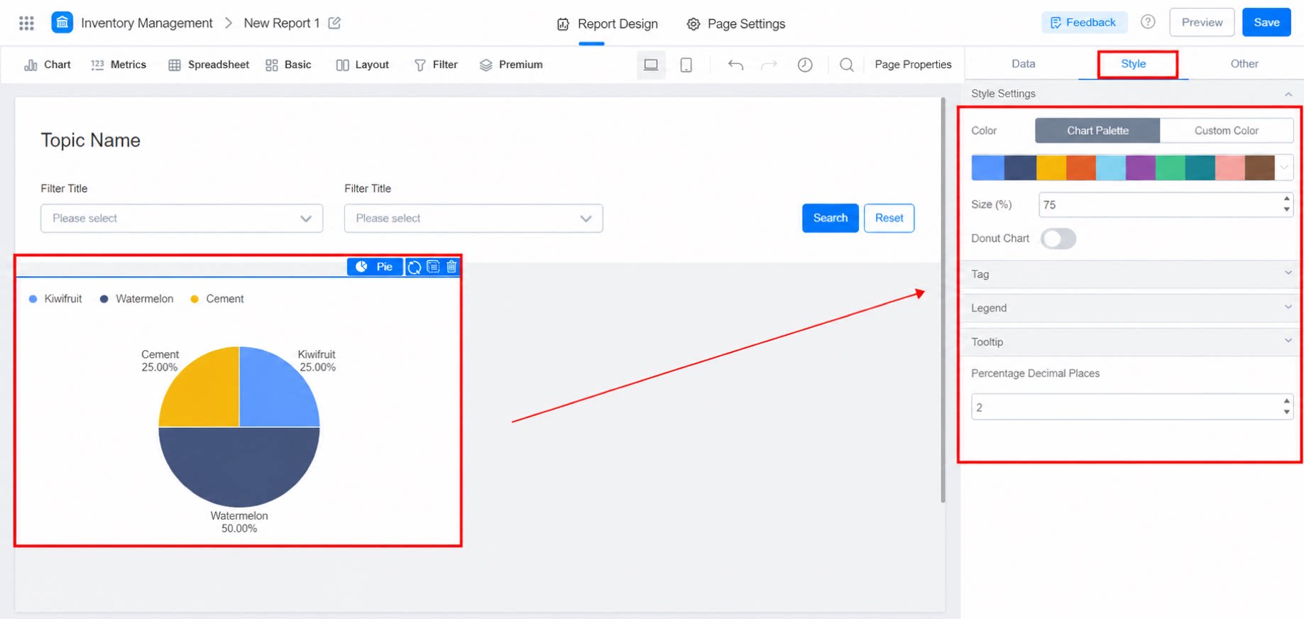
2.3.1 Style Configuration
- Adjust the color and size of the Pie chart
- Convert the basic Pie chart into a ring chart
- Adjust the inner radius of the ring chart
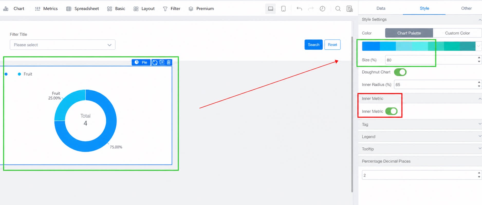
2.3.2 Labels
Turn labels On or Close. When On, you can configure the connection line position and display, label size and content, and color (black by default). Note: When the position is set to Spider, no color settings are available. Font color can only be set when the position is Outside or Inside.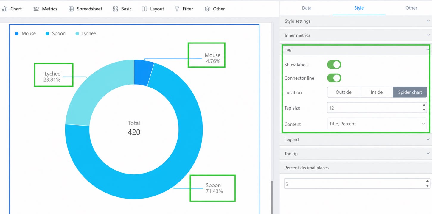
2.3.3 Legend
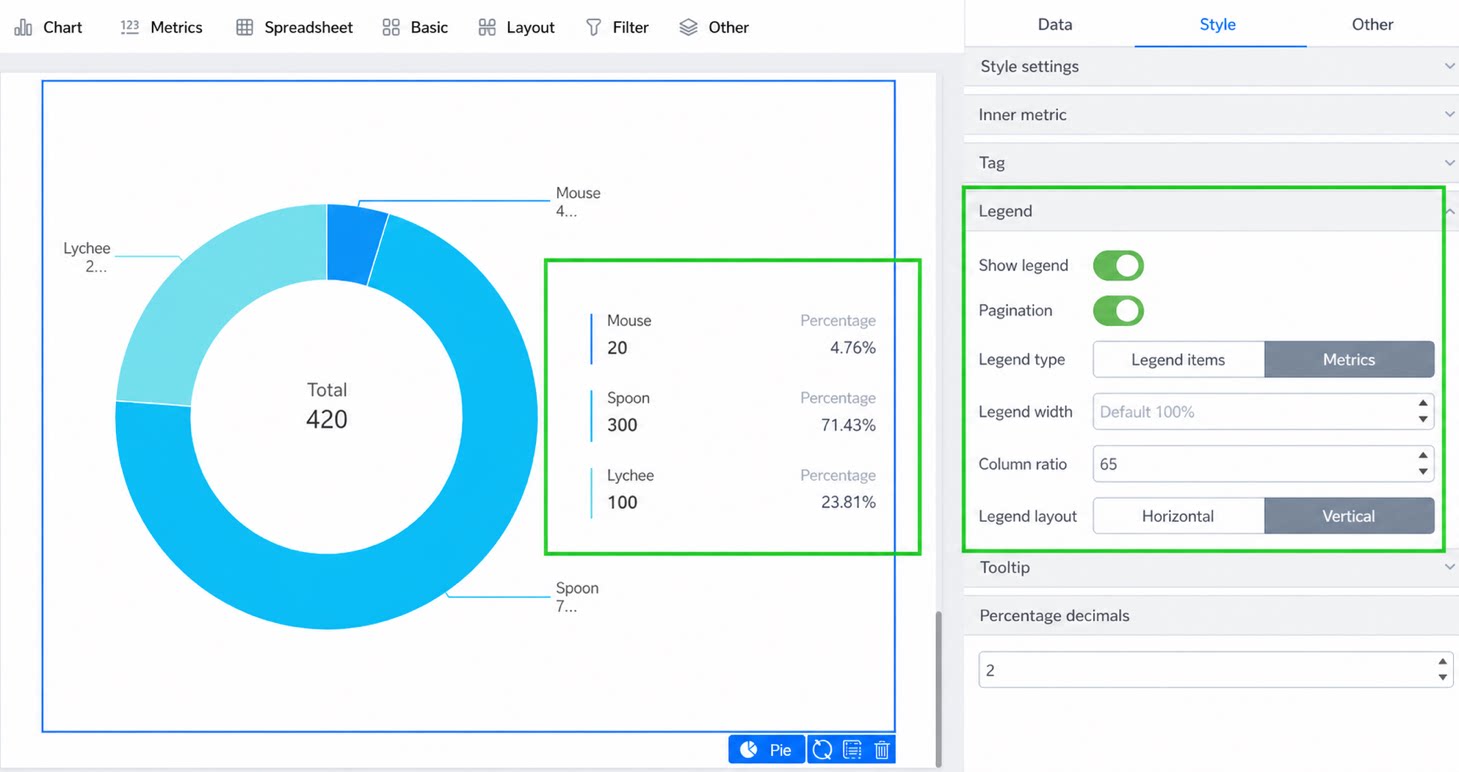
Turn the legend On or Close. When On, you can adjust its position and toggle pagination (On by default).- Legend type: legend items and Metrics
- Metrics: When the Layout is vertical, you can adjust the ratio of the two columns.

2.3.4 Tips
Turn Tips On or Close. The effect when On is shown below.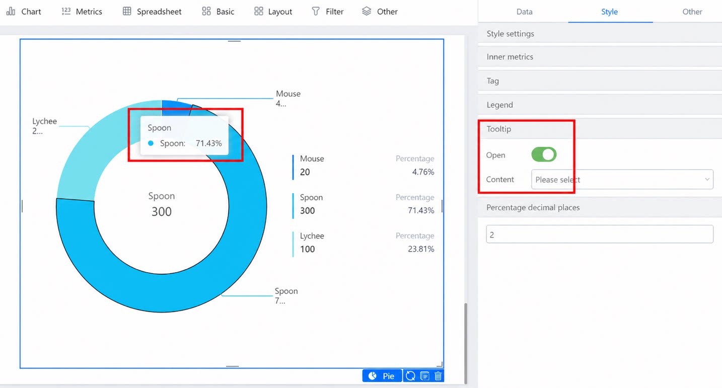
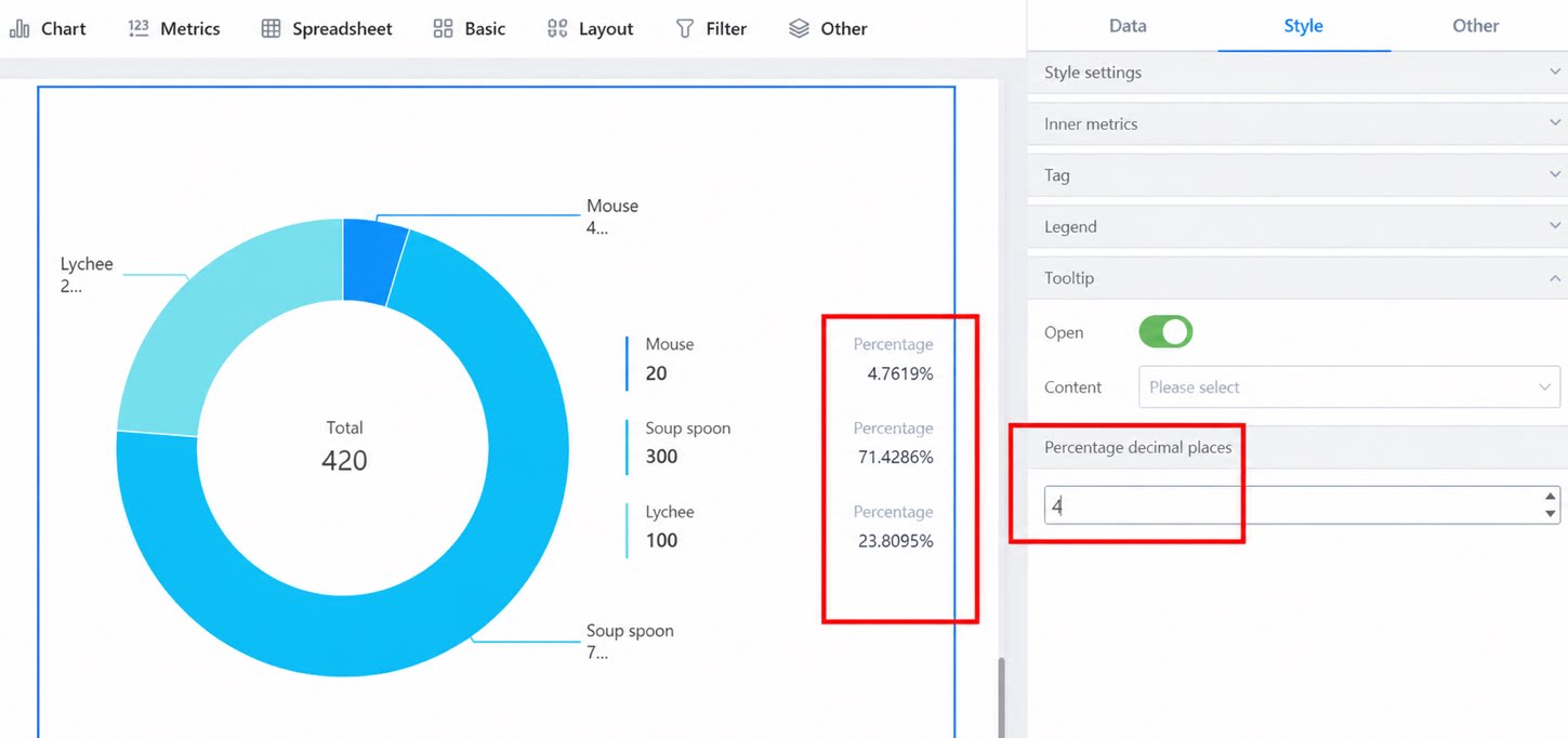
2.3.5 Percent Decimal Places
Set the number of decimal places to display for percentages, as shown below.