Chats
Chats Calendar
 Meetings
 Contacts
 Mail
Mail Docs
Docs Drive
Drive AI Table
 AI Minutes
 Attendance
 Approval
 YiDA
YiDA Admin Console
1. Introduction
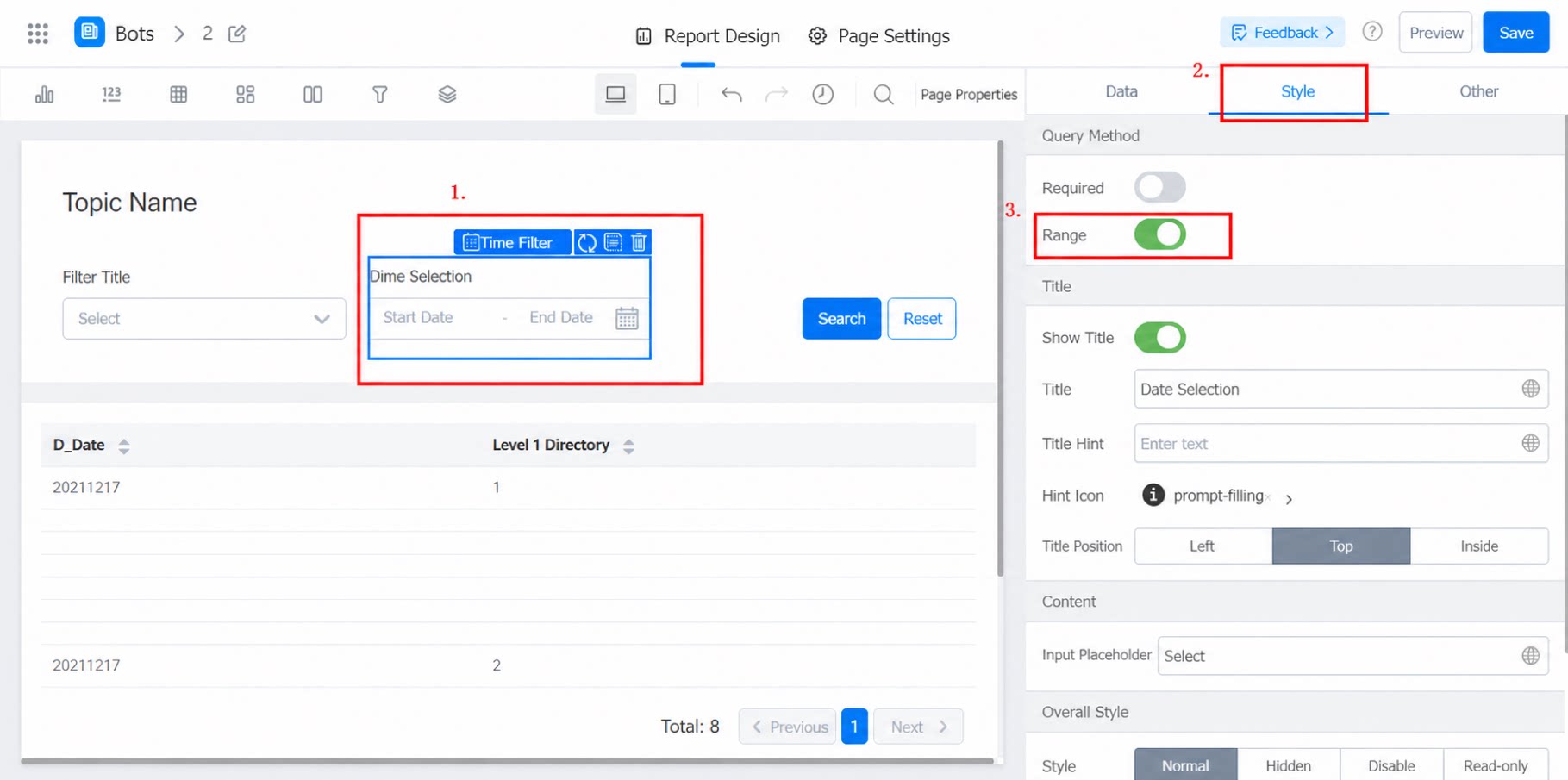
The Date filter supports both [Single value] and [Range] settings.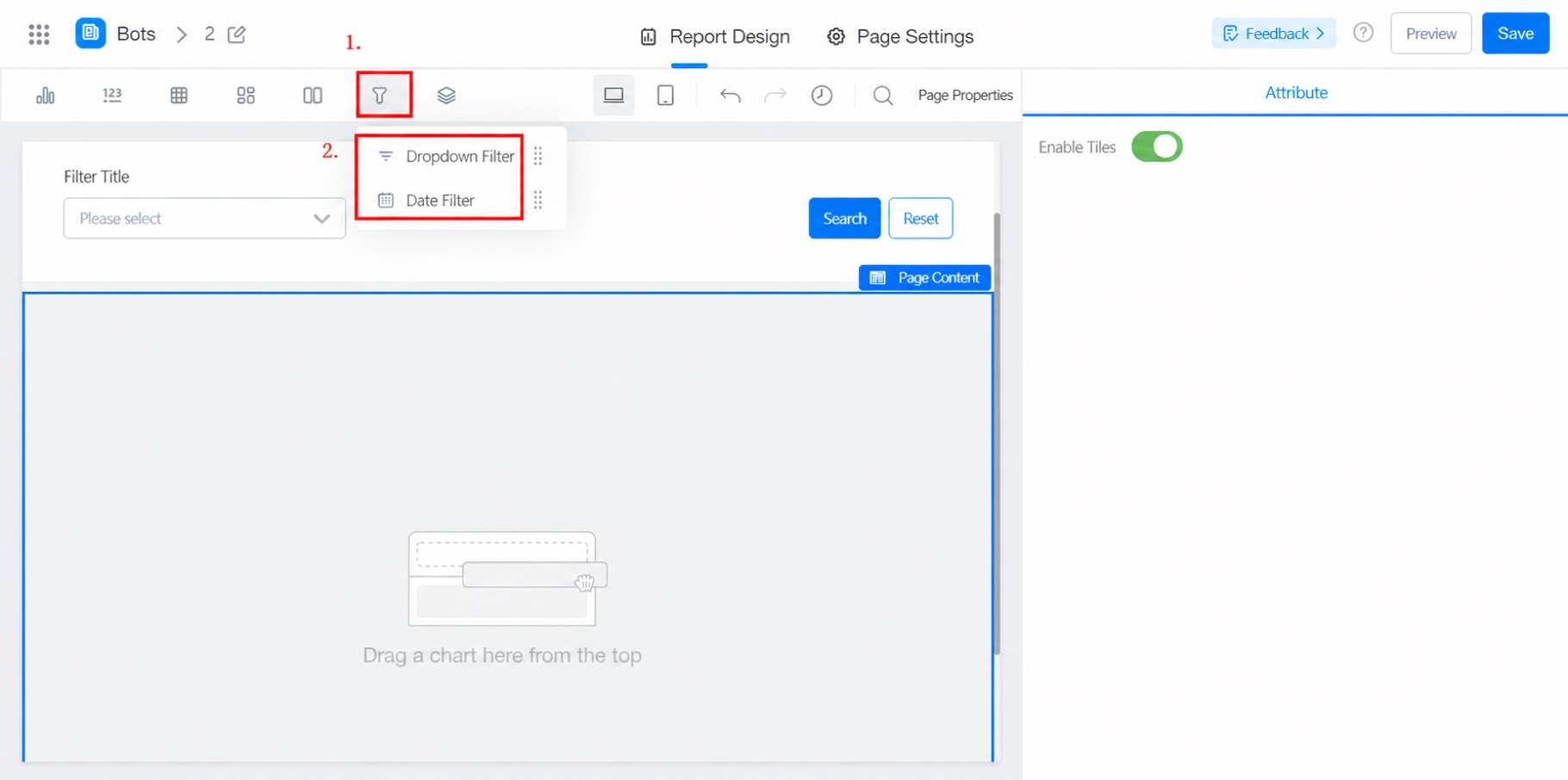
2. Steps
2.1 Select the Component and Configure the Dataset
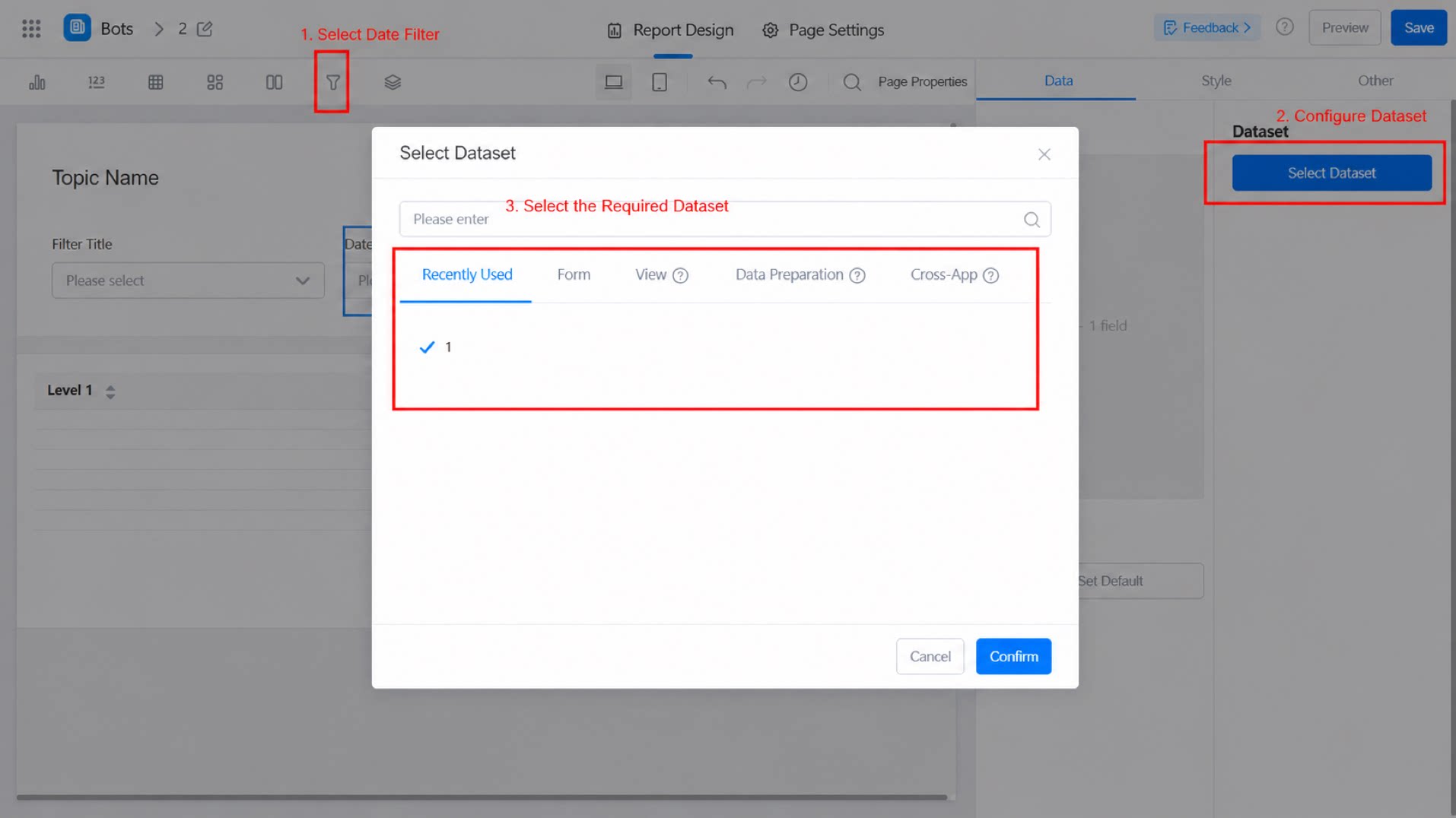
2.2 Select Fields
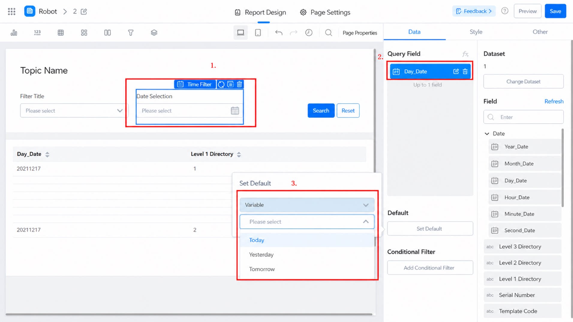
From the field list on the right, drag the corresponding Date-type fields into [Query fields], as shown below: Note: The query field type must be Date.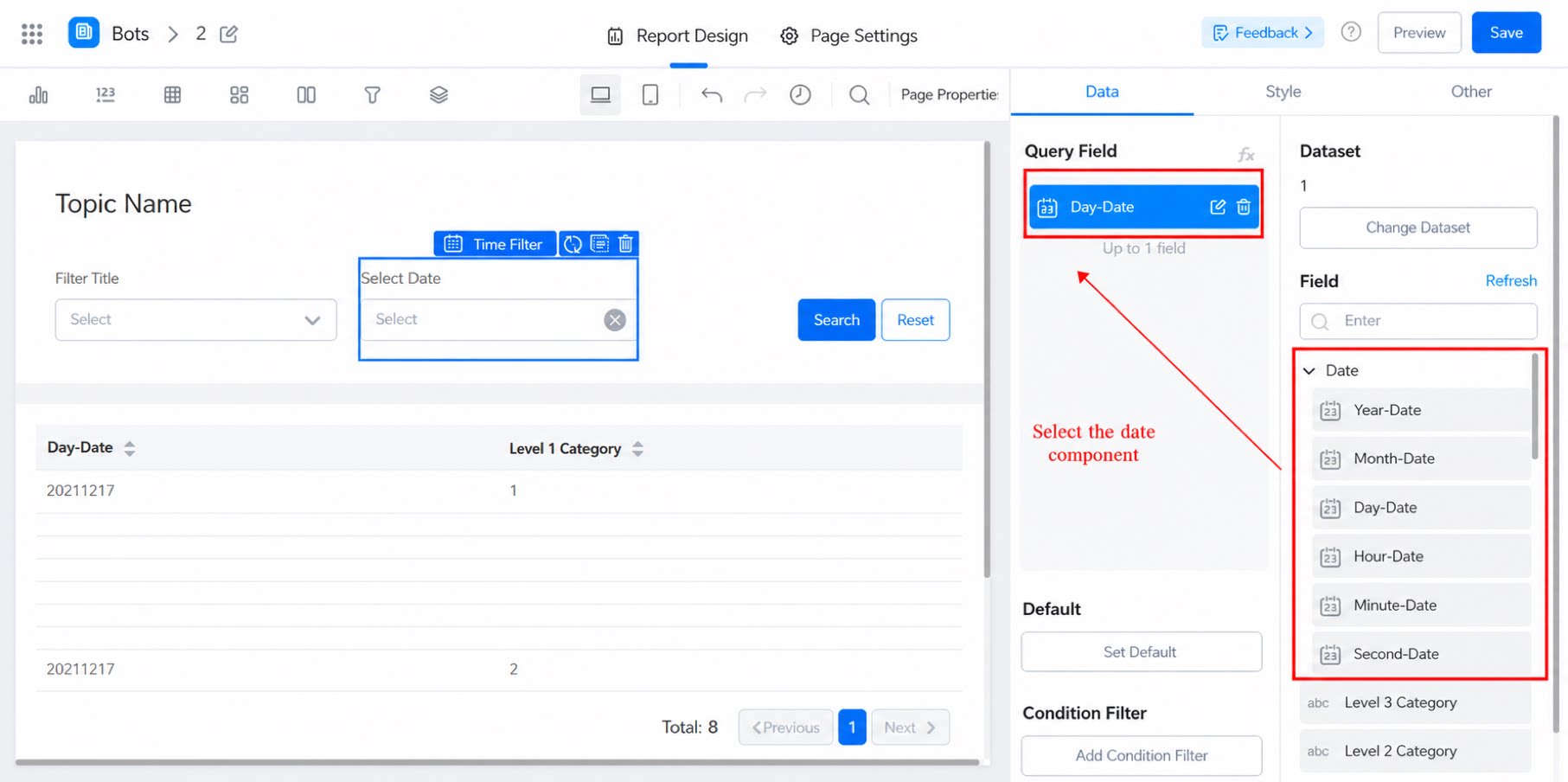
2.3 Set the Default Value
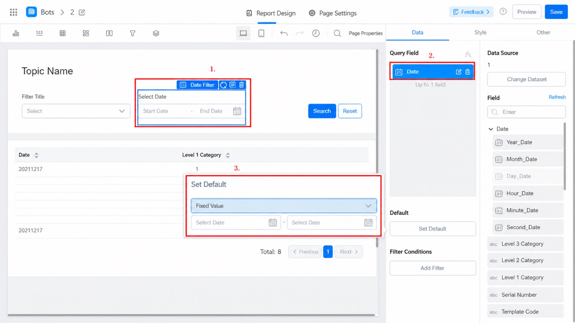
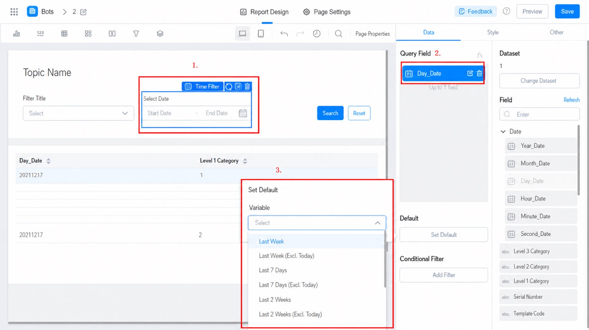
Under Fixed value, set either a fixed date or a variable, as shown below: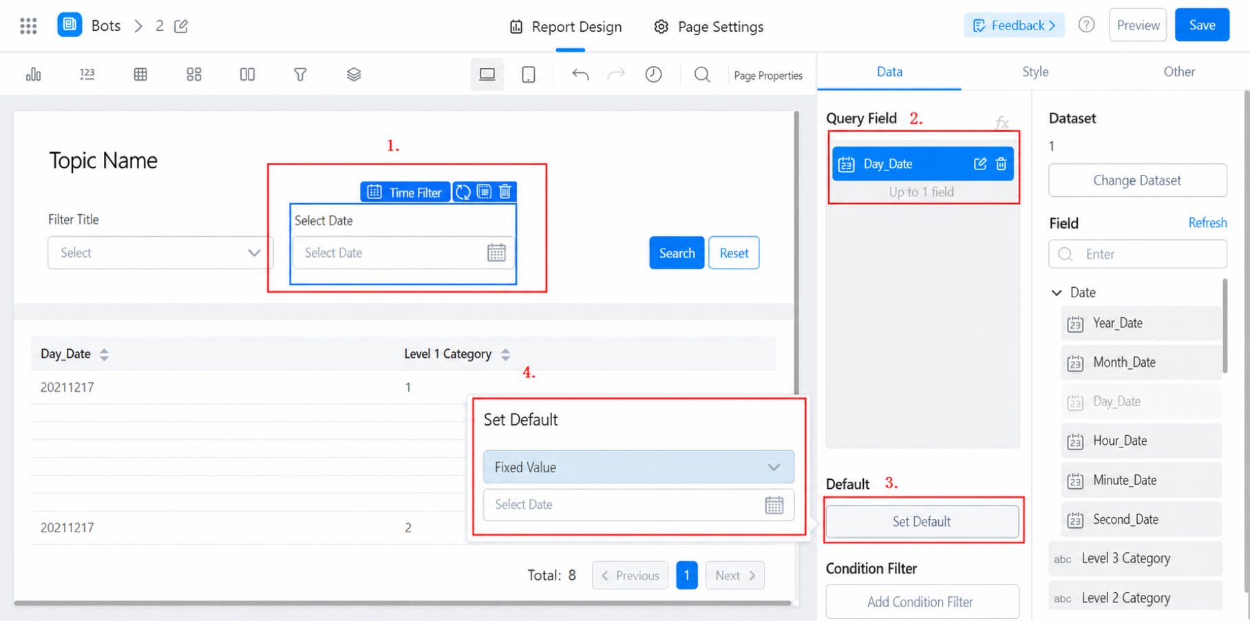
- Scenario 1: Set the default value without enabling the range, as shown below:
- Scenario 2: Set the default value with the range enabled, as shown below:
2.4 Configure the Style
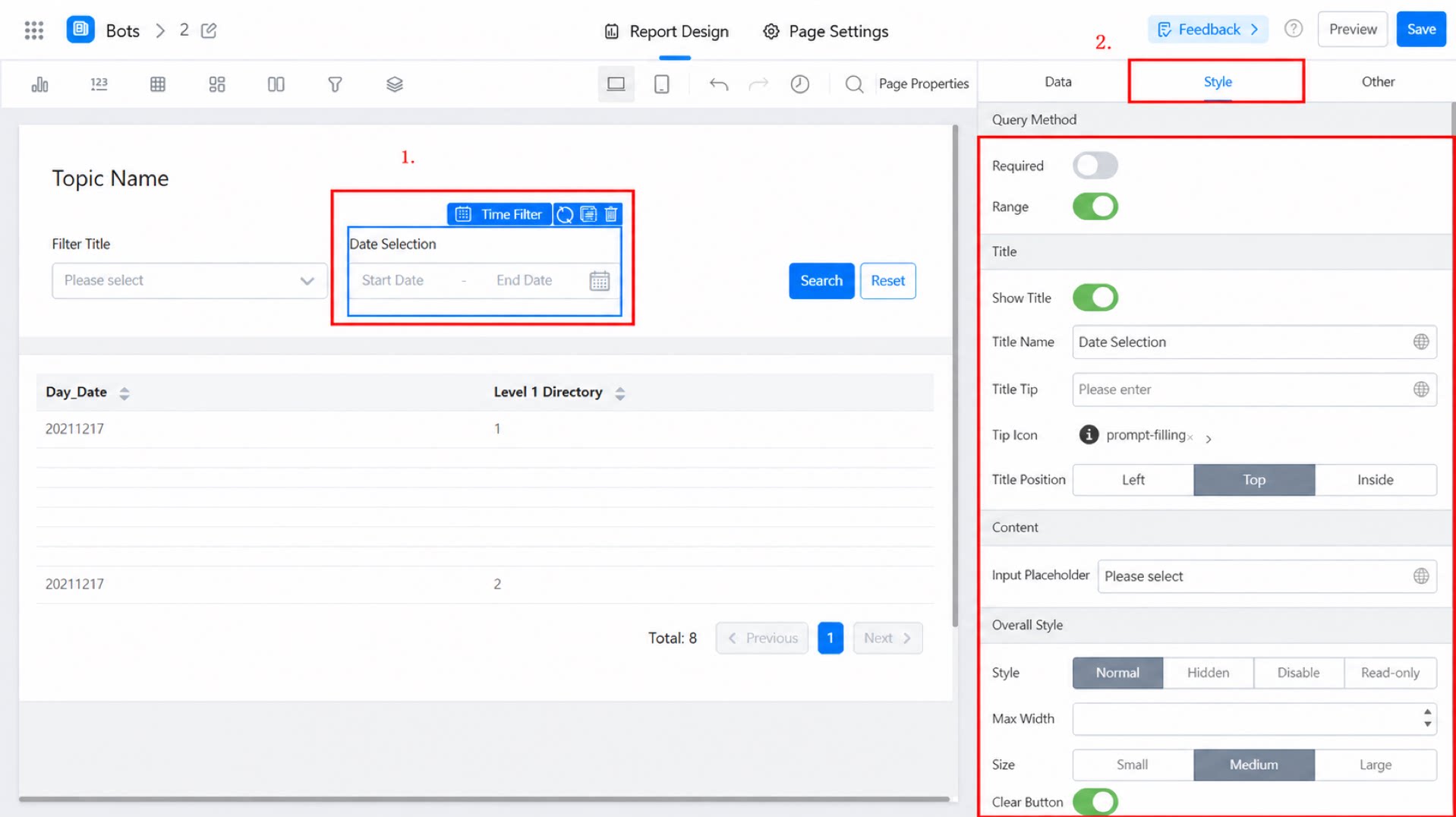
- [Show title]: A toggle switch. On by default. When turned off, all title-related settings below are also hidden.
- [Title name]: The title name of the filter.
- [Title tip]: When users hover over the title, an exclamation mark icon appears to display the tip.
- [Title location]: Top, Left, or Inside. Top by default.
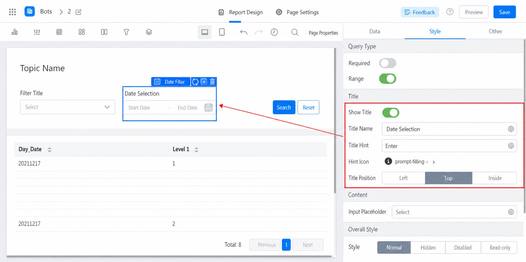
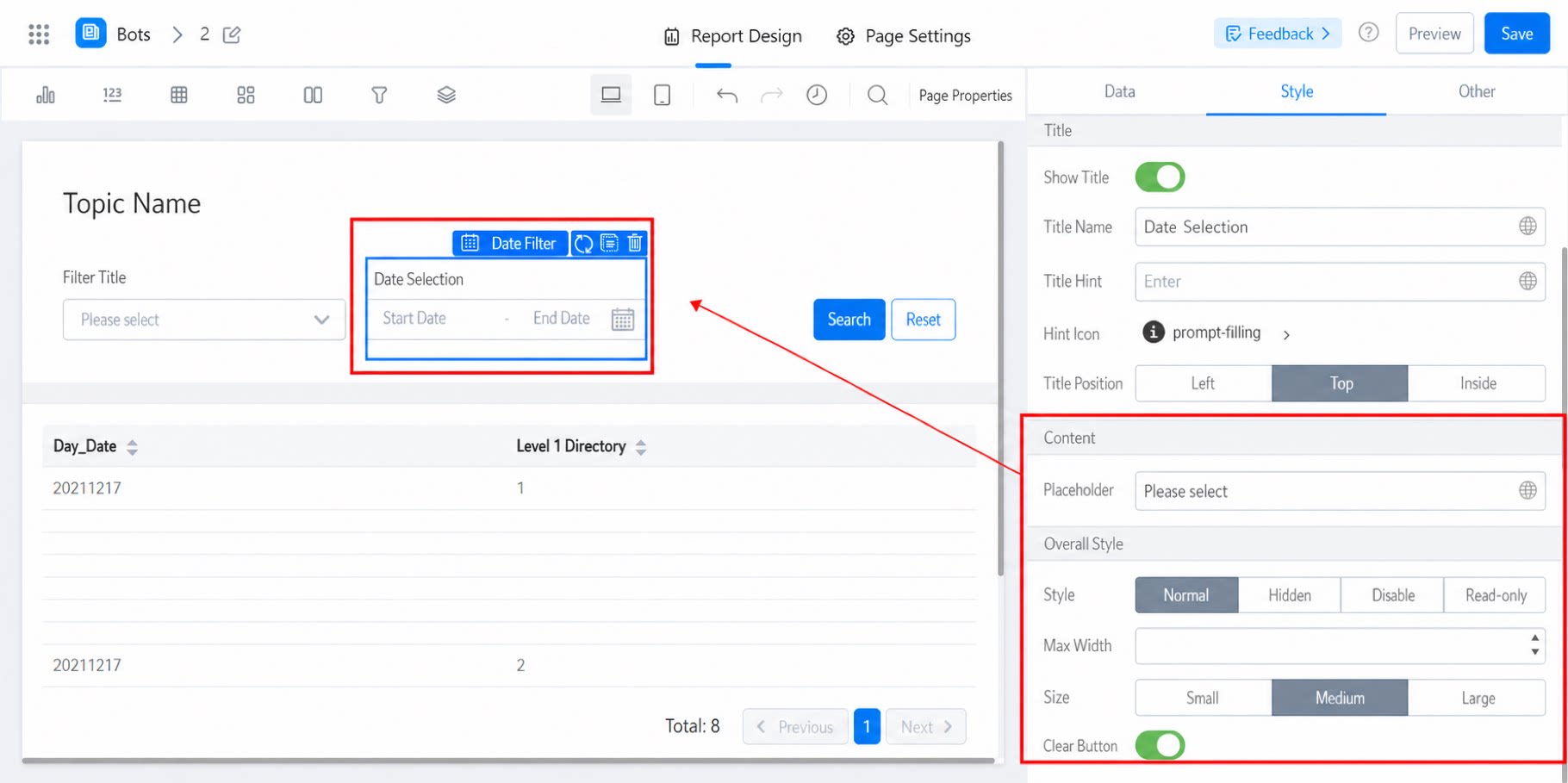
- Input placeholder: The placeholder text inside the input box.
- [Style]: Normal, Hidden, Disabled, or Read-only.
- [Maximum width]: 446 by default. The filter width adjusts automatically to the page size to improve user experience, but never exceeds the maximum width.
- [Overall size]: Medium by default. You can also select Small or Large.
- [Clear button]: Enable a one-click clear button (an X button) that appears next to the input box.
3. Further Reading
How do I filter a date range using the report filter component?