Chats
Chats Calendar
 Meetings
 Contacts
 Mail
Mail Docs
Docs Drive
Drive AI Table
 AI Minutes
 Attendance
 Approval
 YiDA
YiDA Admin Console
1. Introduction
1.1 Feature Overview
Used to display image information.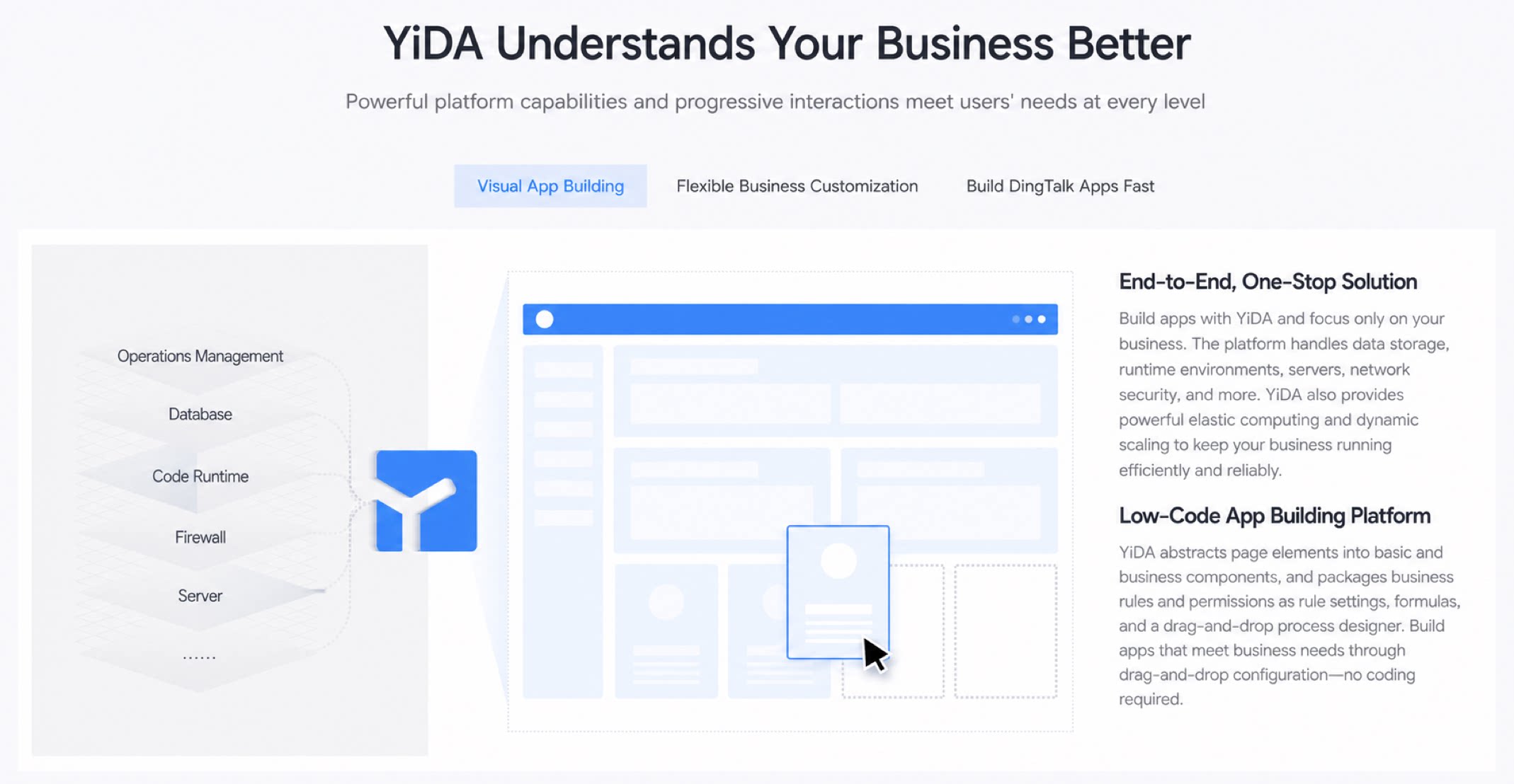
1.2 Use Cases
Displaying warehouse product data with the corresponding product images.2. Operation Steps
2.1 Select the Image Component
Basic >> Image >> Once selected, it appears in the editor, as shown below: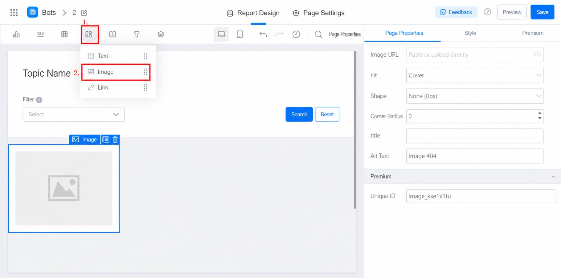
2.2 Attribute Configuration
- Image link: Copy the image link and paste it in. The image is displayed on the page automatically.
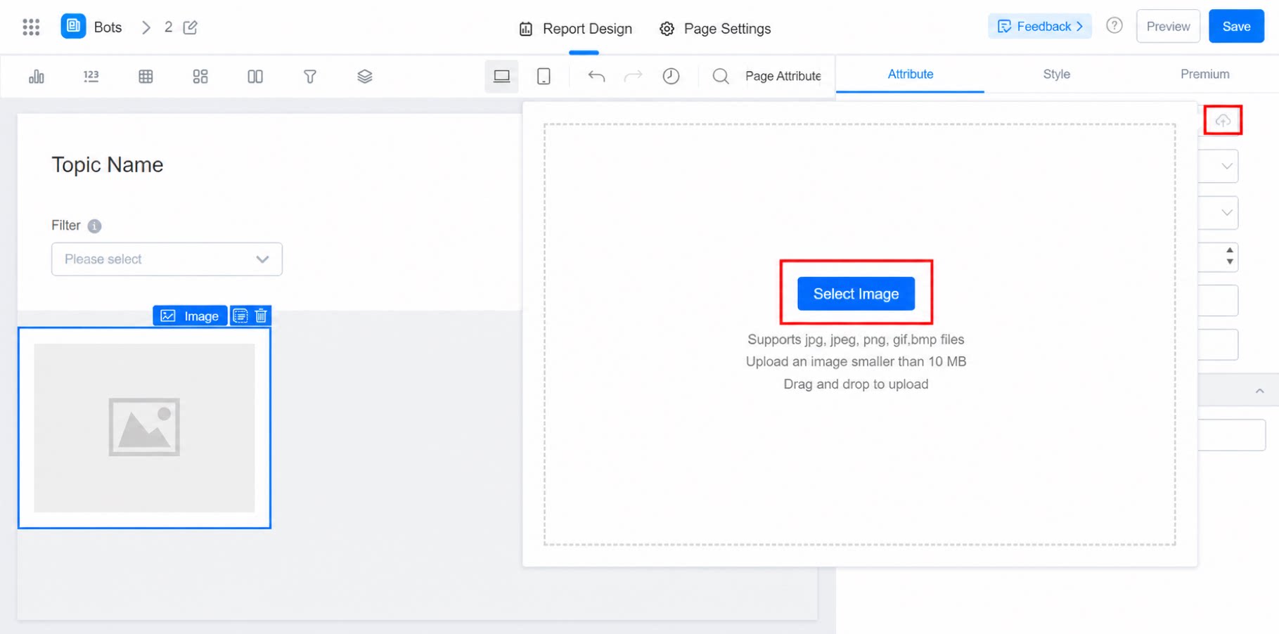
- Direct upload: Drag and drop the image into the dashed frame. Supported formats include jpg, jpeg, png, gif, and mp. Image size must be less than 10 MB.
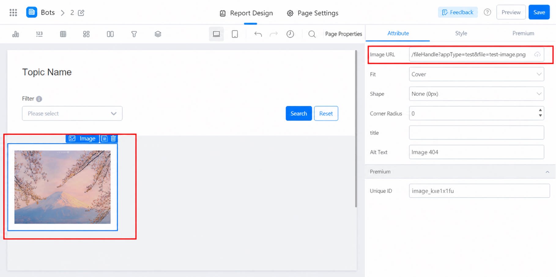
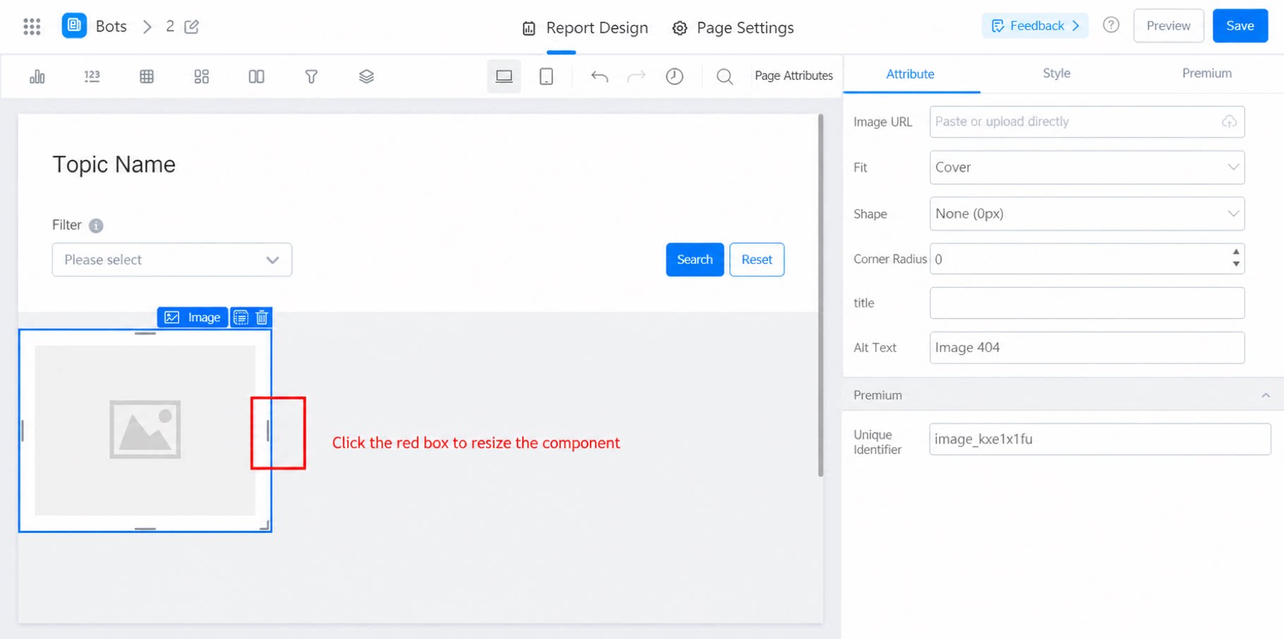
- Layout mode: Fill, Fit, Stretch.
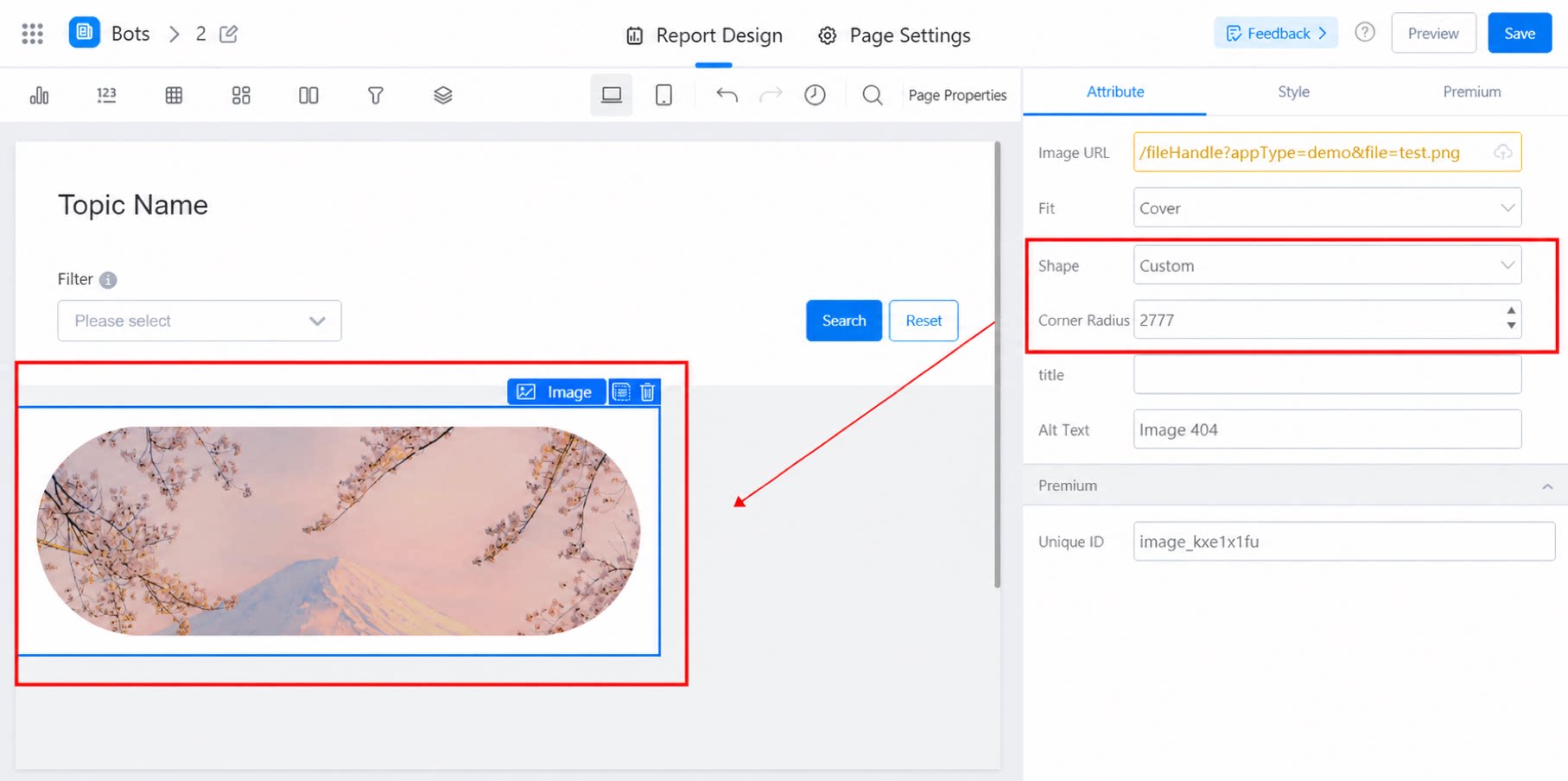
- Corner type: The corner radius of the four corners of the image. Options include Large, Medium, Small, None, and Custom.
- Corner radius size: Works with the Custom corner type. When Custom is selected, you can set the corner radius size.
- title: A basic attribute of the image, not displayed.
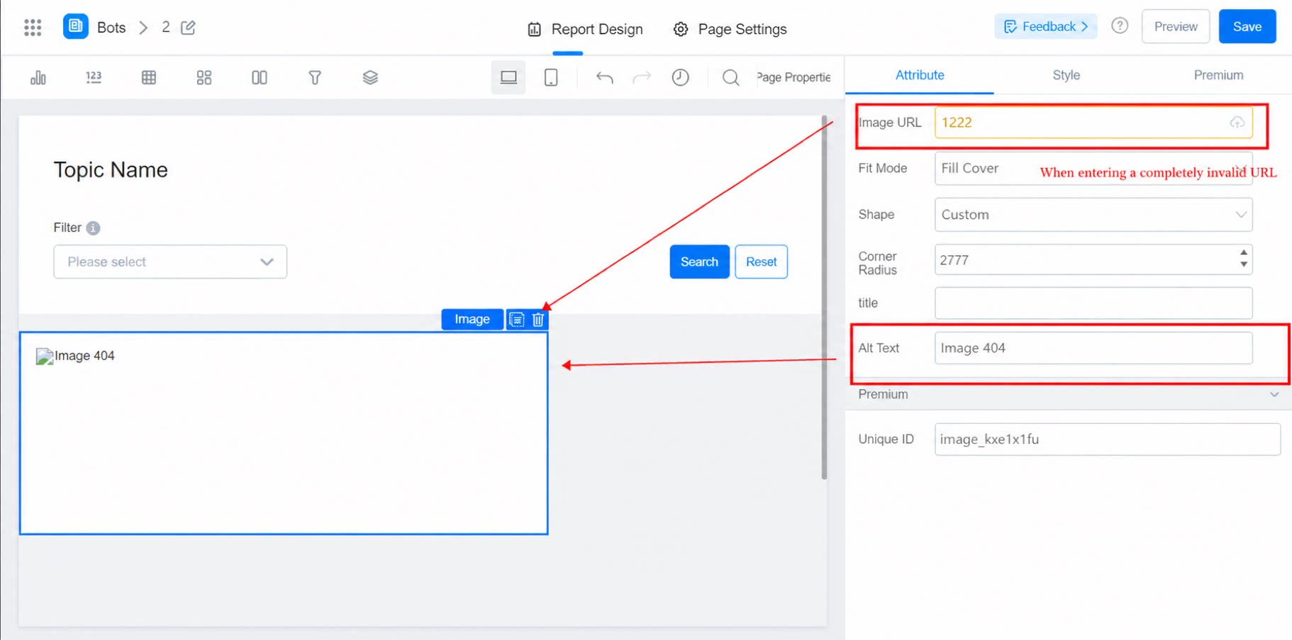
- Alternative text: The fallback text shown when the image URL does not exist, as shown below:
- Premium: Unique identifier.
2.3 Configure Image Style
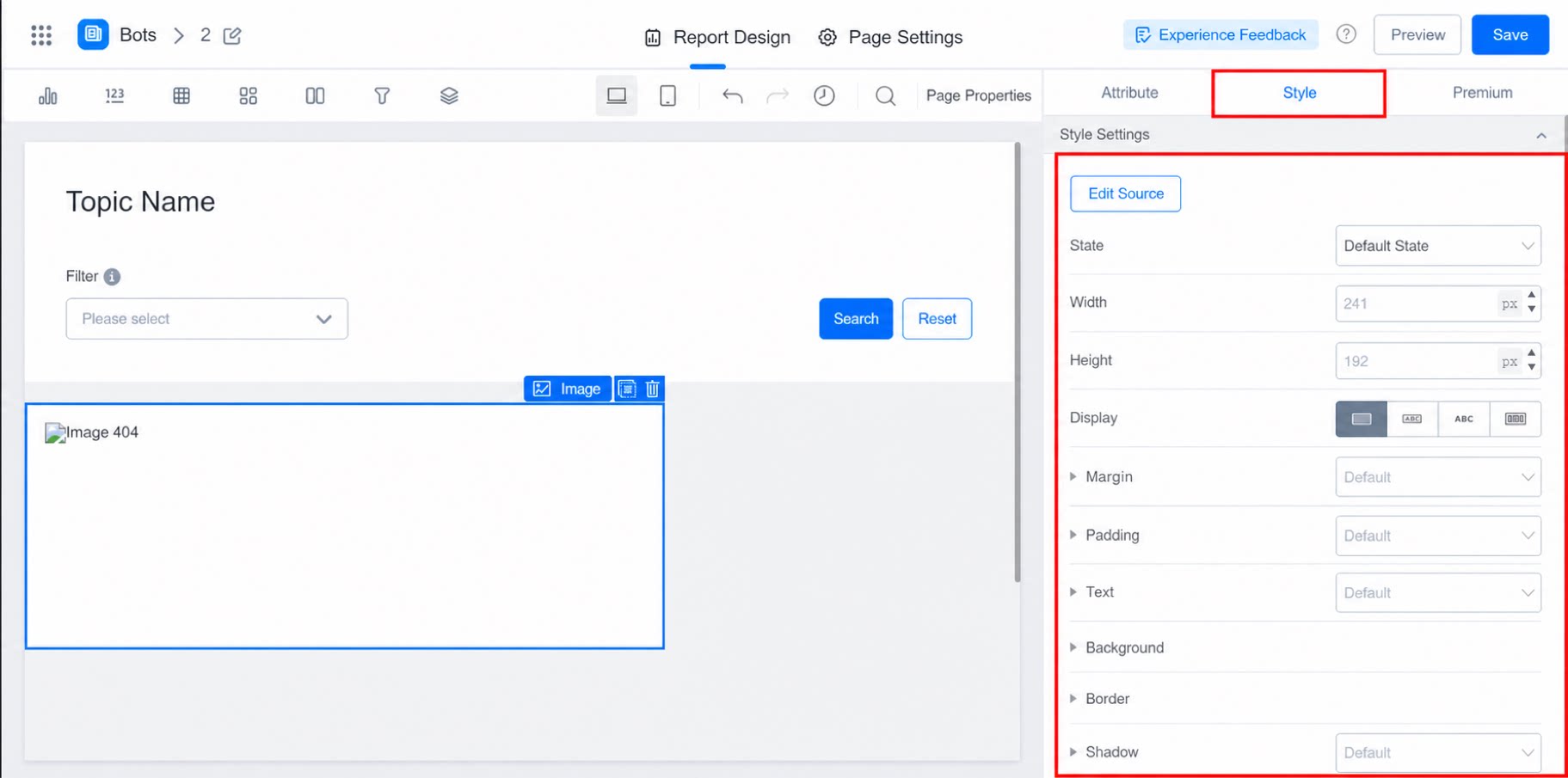
You can adjust the image’s state, height, width, text, background, and more, as shown below: