
 Chats
Chats Calendar
 Meetings
 Contacts
 Mail
Mail Docs
Docs Drive
Drive AI Table
 AI Minutes
 Attendance
 Approval
 YiDA
YiDA Admin Console
1. Overview
1.1 Use Cases
The column chart visually presents data volumes and enables comparison, clearly showing the proportional differences between data points.1.2 Features
Use vertical or horizontal bars to display numerical comparisons across categories. One axis represents the category dimension to be compared, and the other represents the corresponding numerical value. Chart types include standard column, bar, and stacked (standard stacked and percent stacked). Linkage effect for the same category. For usage, see Linkage area. Highlight: control the component size and freely move the component position (left, center, or right).1.3 Basic Requirements
2. Steps
2.1 Select the Component and Configure the Dataset
Select a dataset.2.2 Select the Fields to Display in the Chart
Drag the fields on the right onto X-Axis, Y-Axis, Group, or Reference line.- X-Axis: displays the X-axis of the column chart.
- Y-Axis: displays the Y-axis of the column chart.
- Series group: when the Y-axis contains a single value, series grouping is supported; when the Y-axis contains multiple values, grouping is not supported.
- Reference line: multiple lines are supported.
- Conditional filtering: supported.
2.3 Configure Data
See the data configuration for the column-line combination chart. This is a Yuque content card. Click the link to view: Column-line combination chart.2.4 Style Settings
The settings are divided into seven categories: style, X-axis, Y-axis, legend, label, mini axis, and tooltip. Style settings.2.4.1 Style Settings
Adjust the color, thickness, and width of the columns, stacking and grouping, spacing, and bar chart layout. Custom colors accept English color names or hexadecimal values, such as #5894FF. Separate multiple values with commas.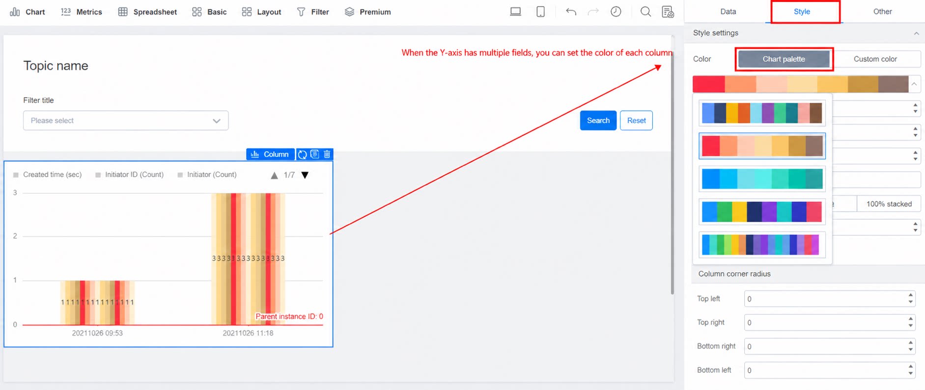
2.4.2 Linkage Area
Note: takes effect when the data adjustment mode is Stacked or Percent stacked. Description: when enabled, hovering over a rectangle connects rectangles in the same category, enhancing the comparison of values within the category. Stacked.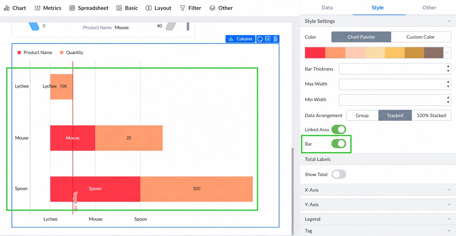
2.4.3 X-Axis
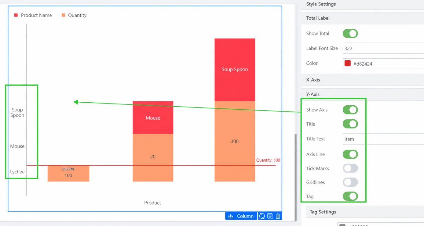
Common basic settings. Try them out to see the effect, as shown below: X-axis settings. Display effect after configuration.2.4.4 Y-Axis
Common basic settings, similar to the X-axis settings, as shown below: