
 Chats
Chats Calendar
 Meetings
 Contacts
 Mail
Mail Docs
Docs Drive
Drive AI Table
 AI Minutes
 Attendance
 Approval
 YiDA
YiDA Admin Console
1. Introduction
1.1 Feature Overview
The following sections walk you through configuring the component step by step, from selecting a dataset to customizing the chart’s appearance. Download the map data: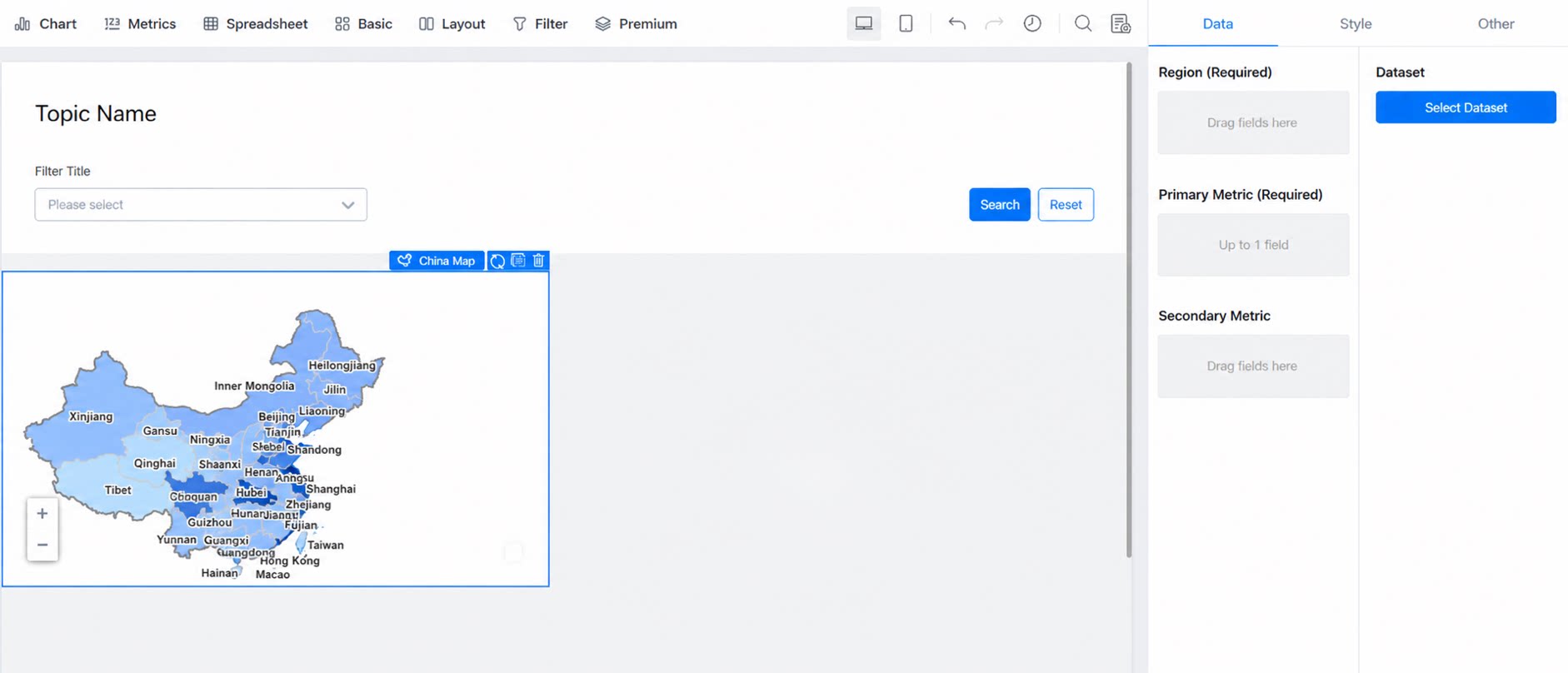
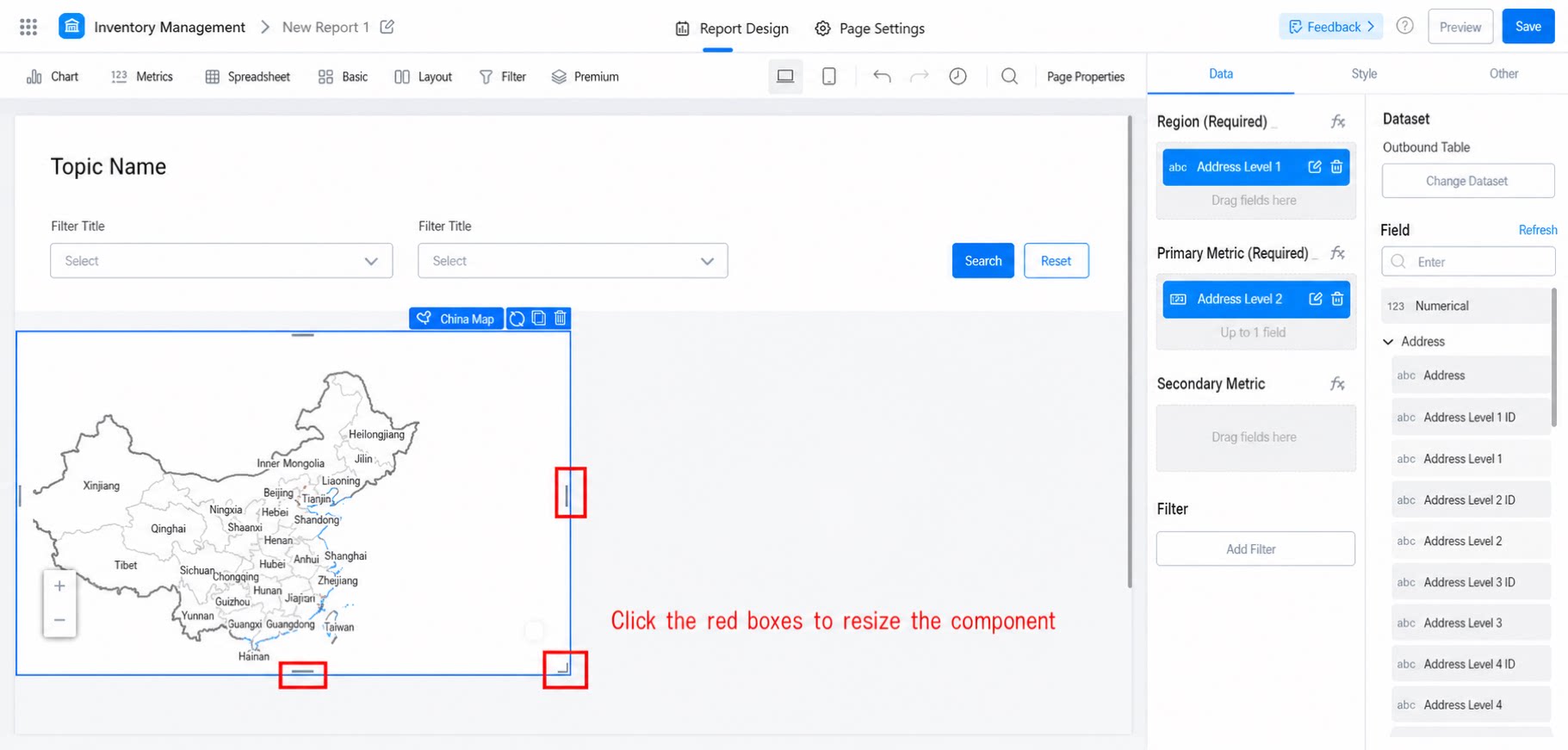
1.2 Use Cases
Statistical analysis often requires examining how data is distributed across geographic regions:- Analyze customer counts and new customer counts by region
- Analyze sales figures by region
- Analyze store counts by region
1.3 Basic Requirements
2. Steps
2.1 Select the Component and Configure the Dataset
Create a report, add the China map component, and select a dataset, as shown below: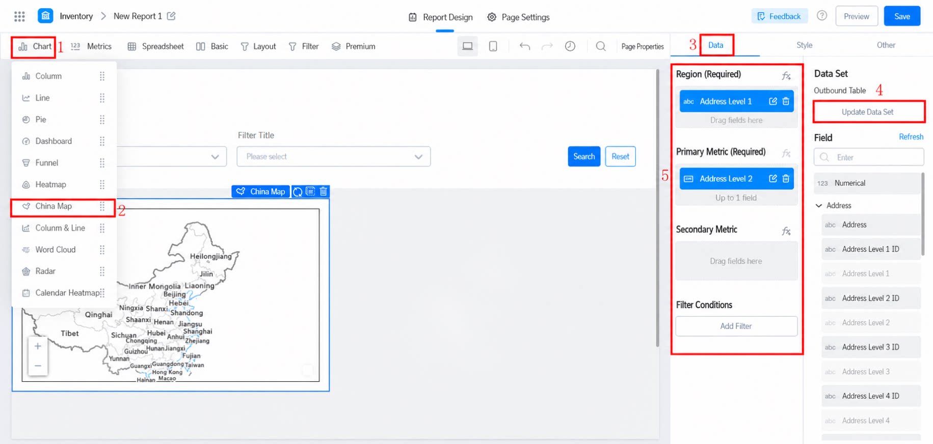
2.2 Select the Chart Display Fields
Drag the fields on the right into Location, Primary metric, and Secondary metric.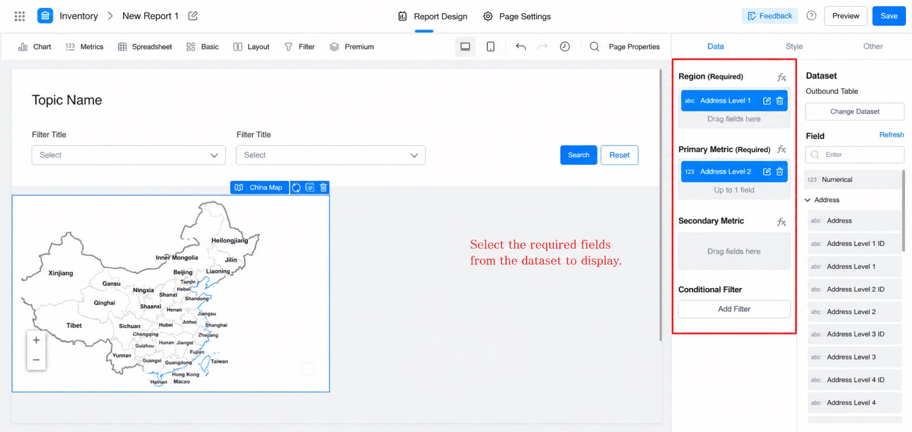
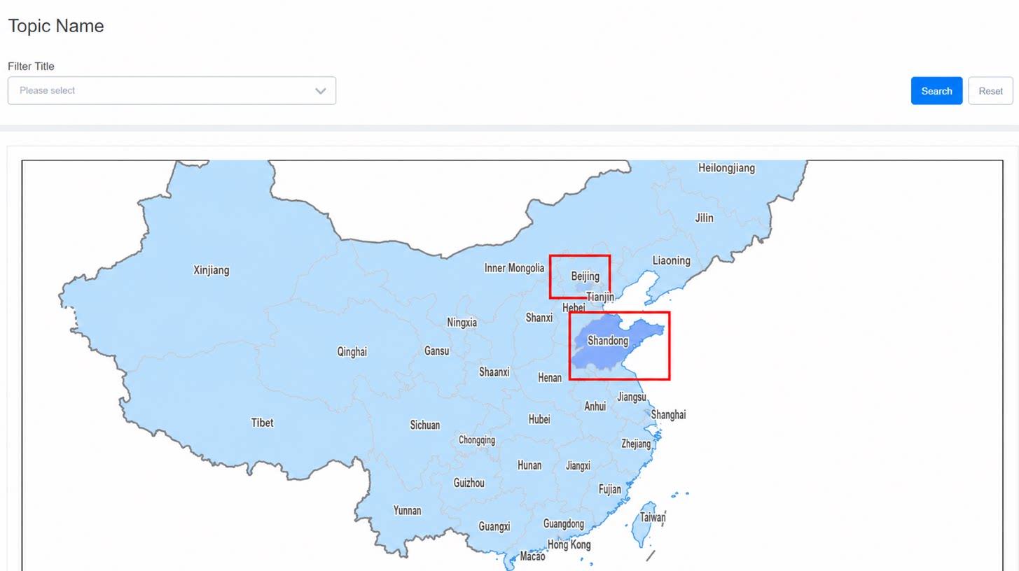
2.3 Style Settings
2.3.1 Overall Settings
Includes chart height, zoom tier, and color (gradient and conditional style). Chart height Zoom tier: The display size of the chart when viewed. Color: The color configuration of the chart.2.3.2 Label
When labels are turned off, region names are not displayed on the map, as shown below: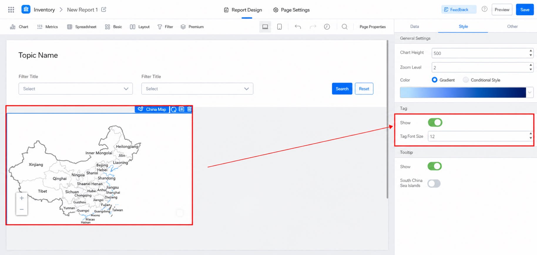
2.3.3 Tips
When tips are turned off, no information appears when hovering over the map, as shown below: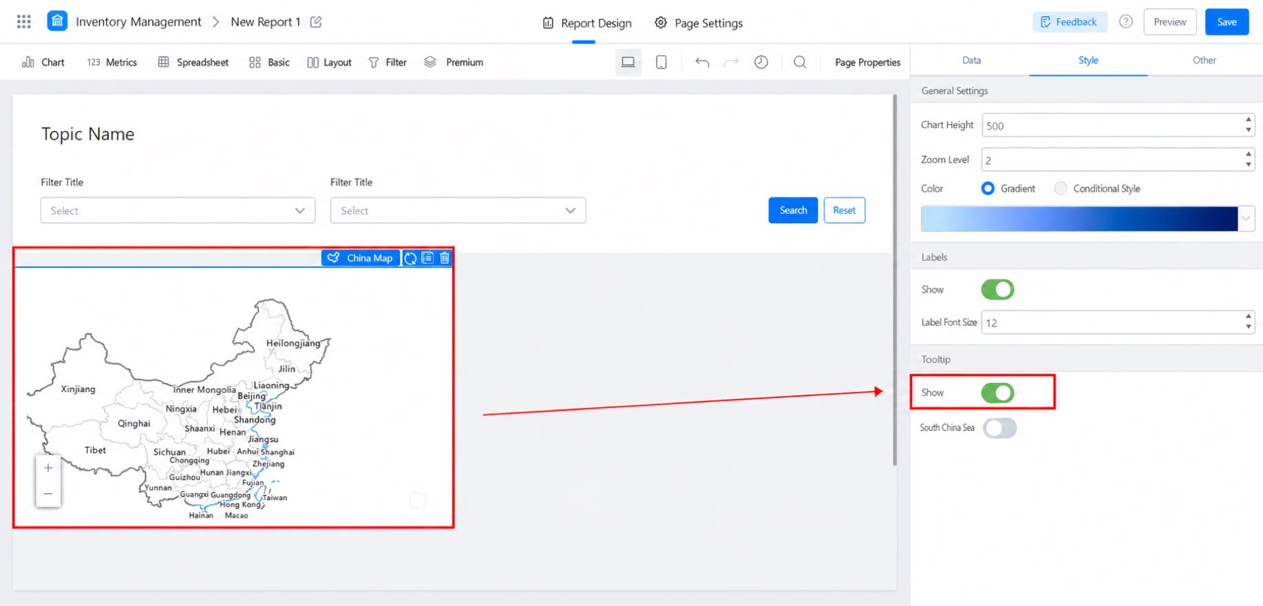
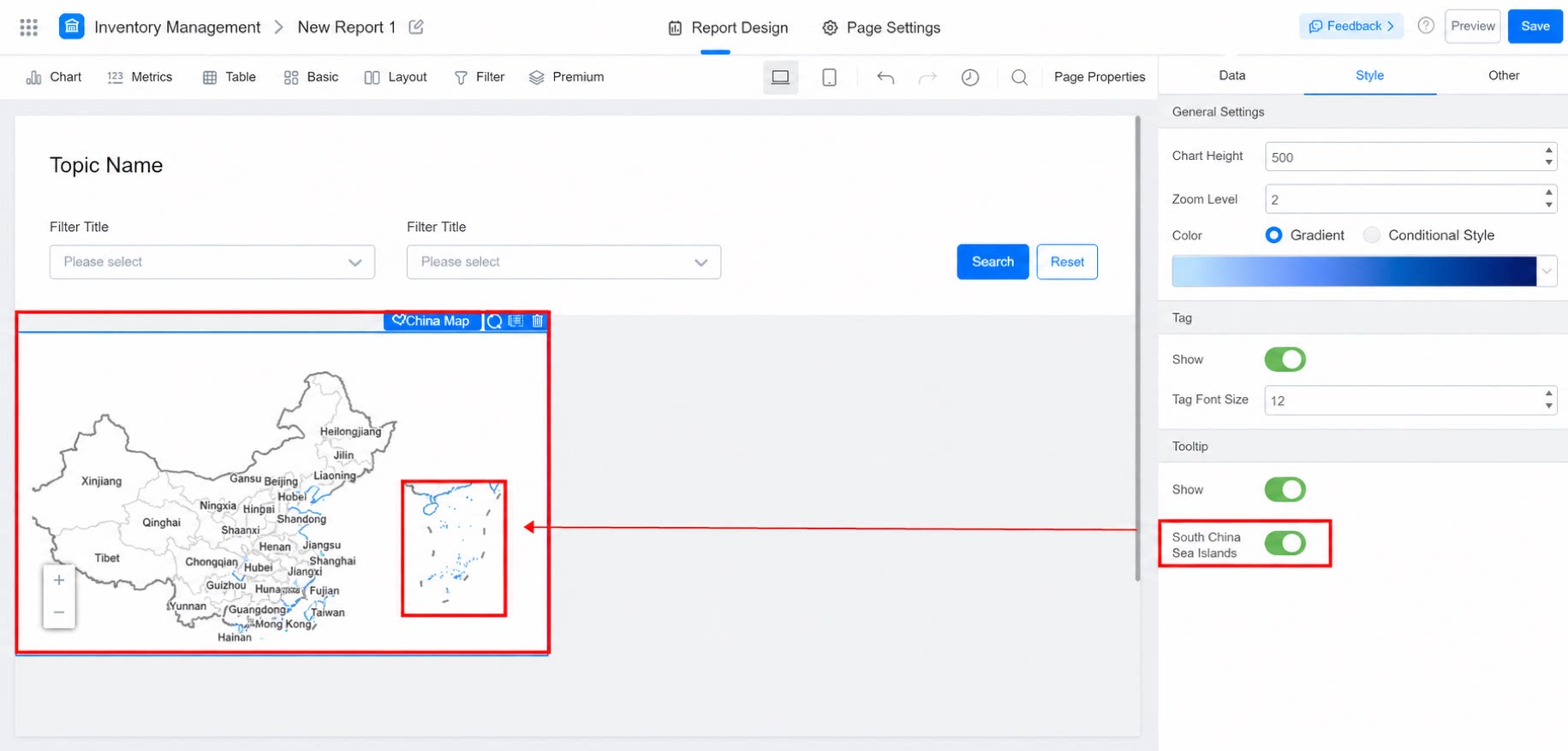
3. FAQ
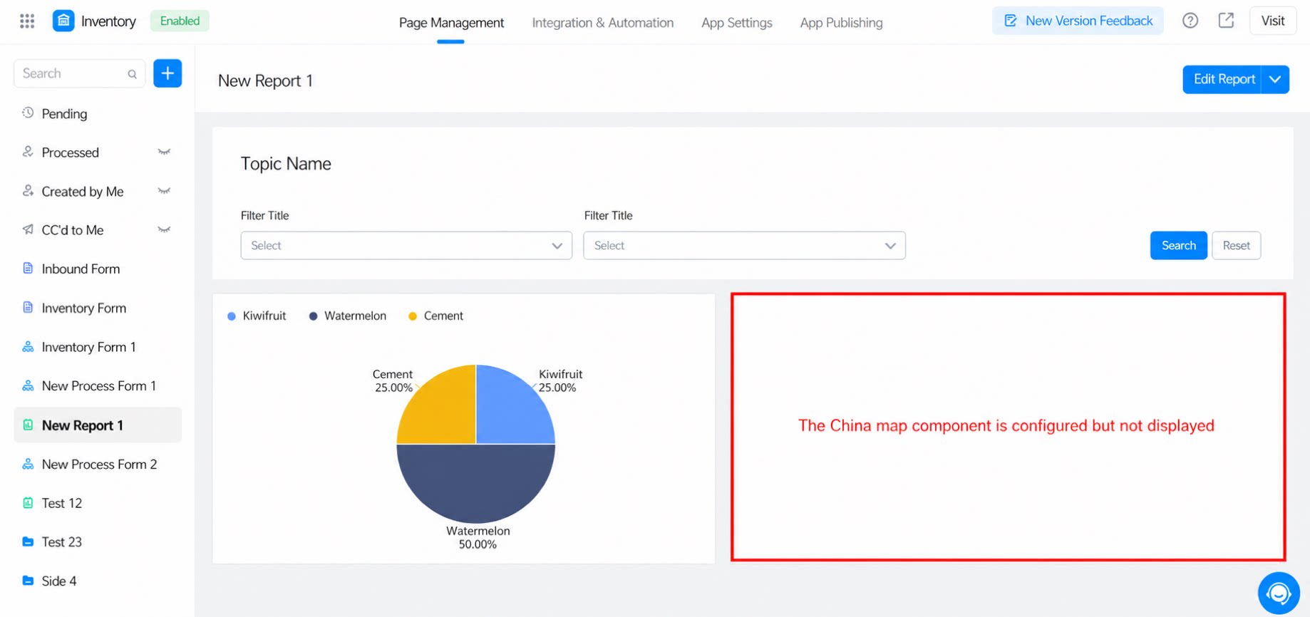
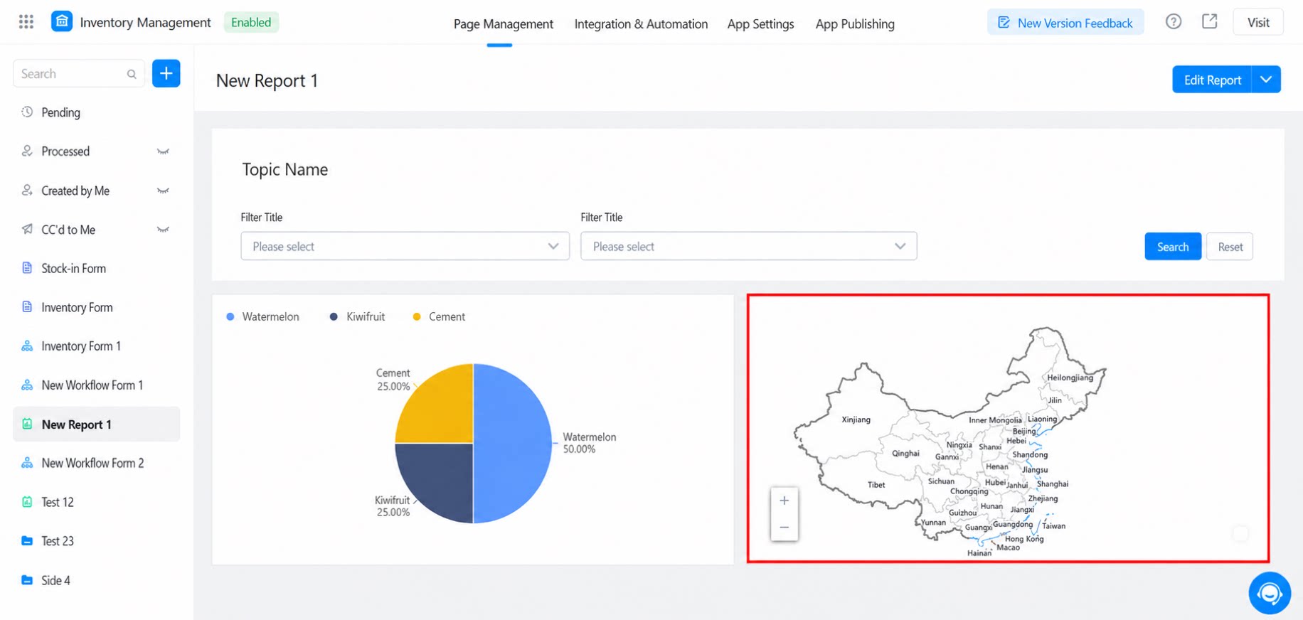
3.1 Why Does the Map Component Appear Blank on Windows PCs?
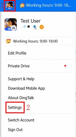
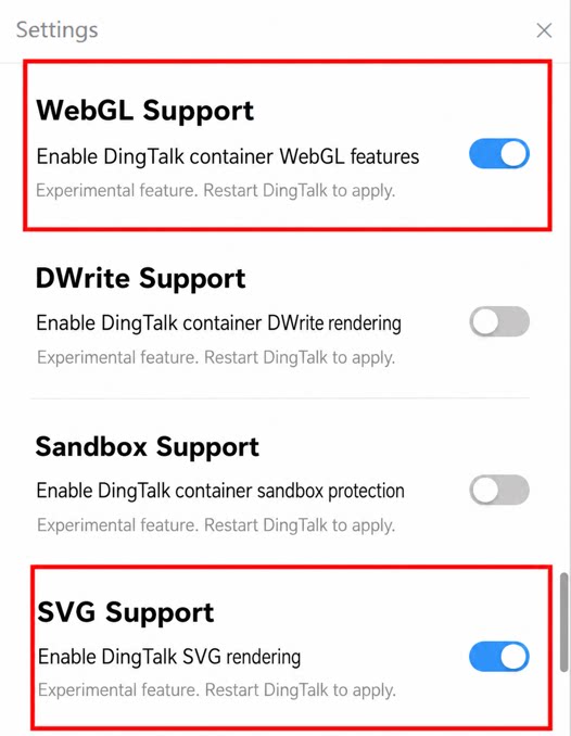
The chart data currently displays normally on Mac PCs and in browsers. If the China map component in a YiDA report appears blank on a Windows PC, resolve the issue with the following configuration: Note: After configuring, sign out of DingTalk and sign in again.