Chats
Chats Calendar
 Meetings
 Contacts
 Mail
Mail Docs
Docs Drive
Drive AI Table
 AI Minutes
 Attendance
 Approval
 YiDA
YiDA Admin Console
1. Overview
As one of the report filter components, the dropdown filter lets end users narrow down displayed data by selecting one or more values from a list. Note: Fuzzy search is not supported on mobile in v3.0 reports. A Tag mode is also available, which delivers a tag-style filtering experience (see the example below).2. Steps
2.1 Select the Component and Configure the Dataset
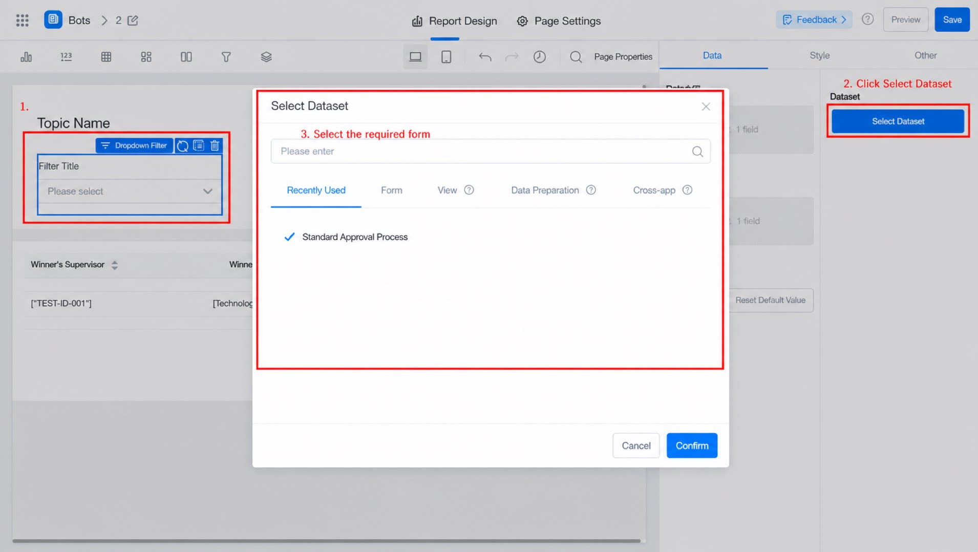
2.2 Select the Fields (Value Field and Show Field)
Note: Difference between the value field and the show field Value field: the field transmitted when querying other components (in the example below, “Price” is transmitted when linked with the component below). Show field: the field displayed in the dropdown for users to select (in the example below, “Product Name” is shown to users).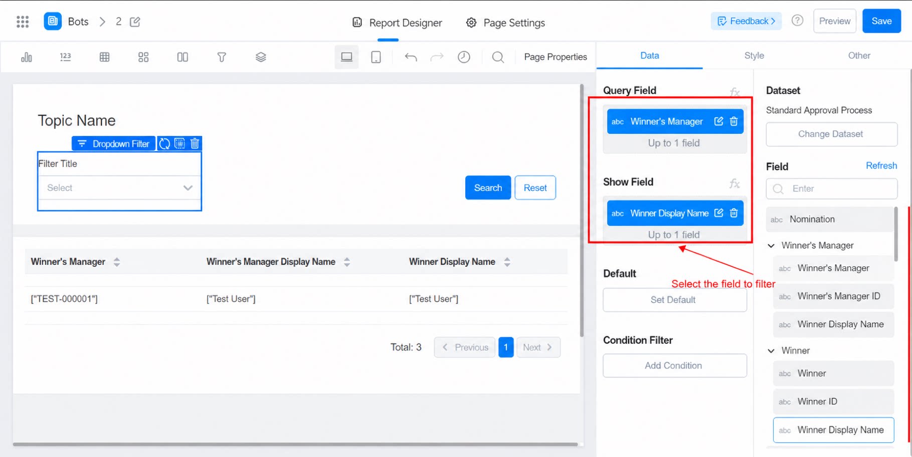
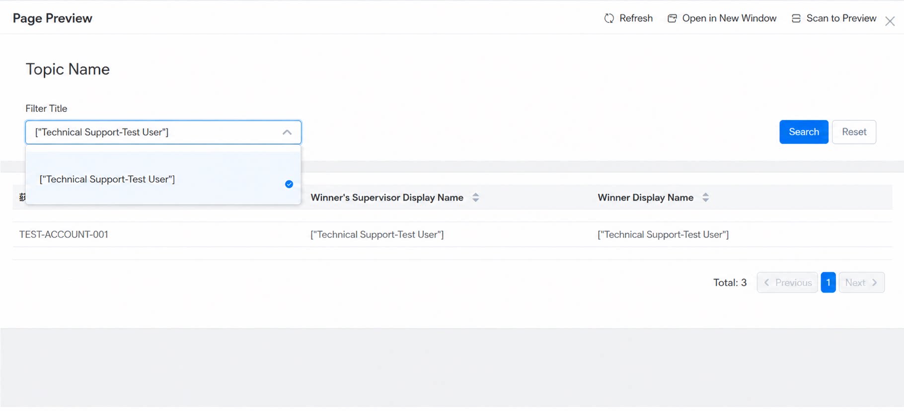
2.3 Set the Default Value
(1) The default value applies to the show field. Fixed value- Select existing content from the dropdown (search).
- Enter text directly and press Enter to confirm.
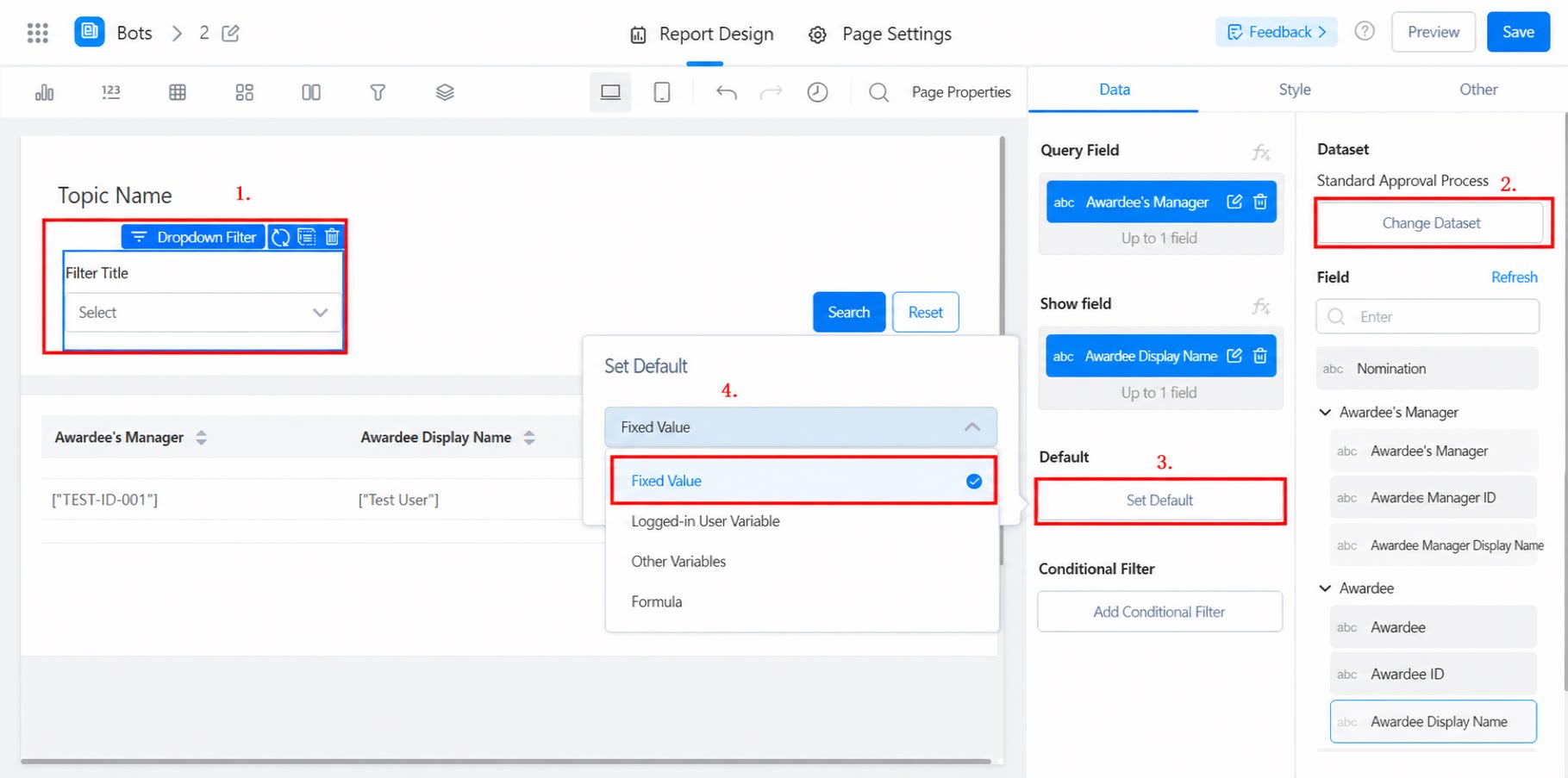
- Includes signed-in user variables (Employee ID, department name, company code, department code) and other variables.
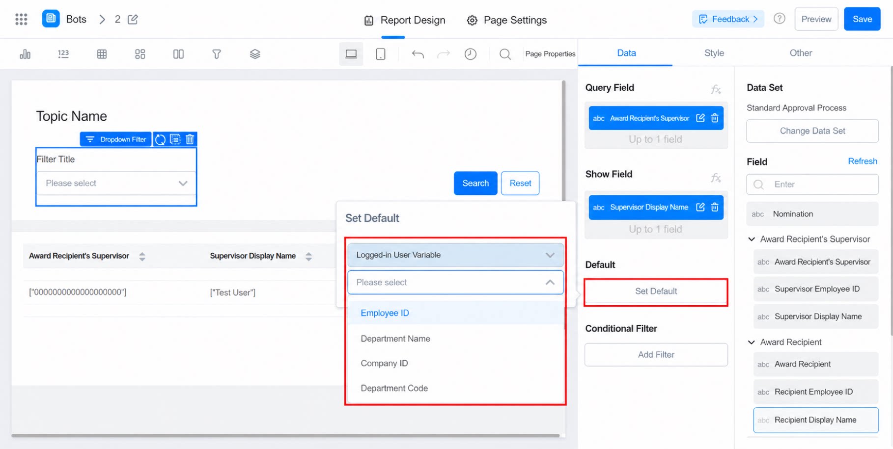
2.4 Condition Filtering
When certain data does not need to participate in filtering, use condition filtering. Once configured, only the filtered data is displayed.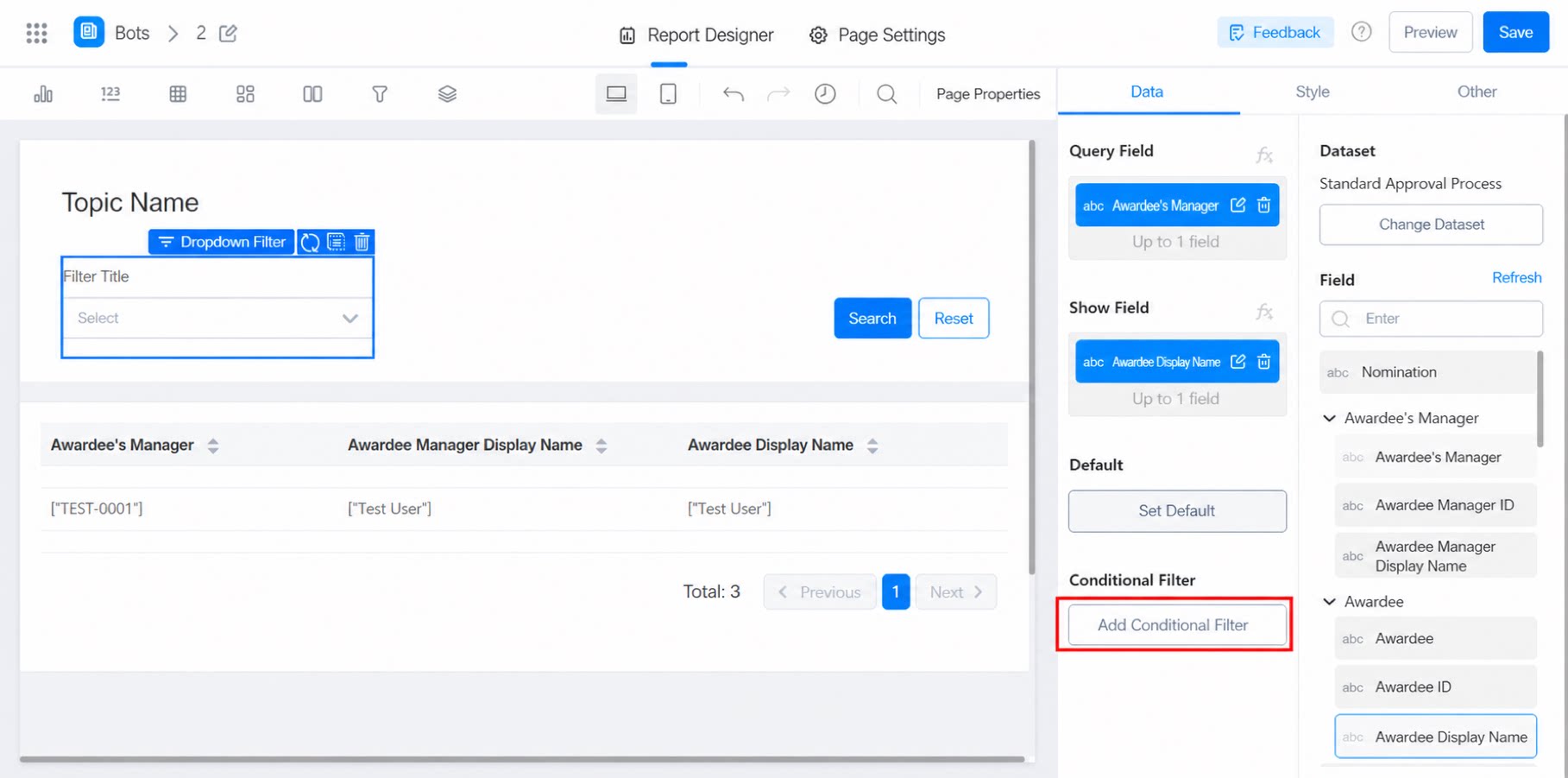
2.4.1 Filter Method
Two filter methods are available: in-component filter and filter-widget filter. In-component filter: select a field in the form and configure the filter condition. Filter-widget filter: filter using the filter component in the report. Note: If a filter component is configured, chart components in the same report that share the same dataset will automatically use filter-widget filtering.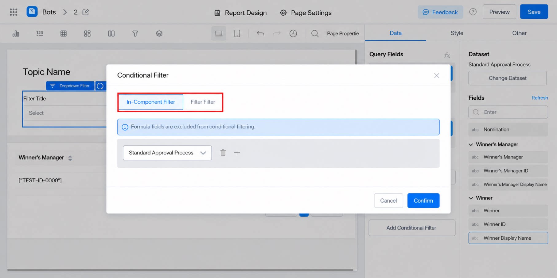
2.4.2 Allowed Values for the Filter Operator
Allowed values include Equals, Contains, Less than or equal to, Greater than or equal to, Greater than, and Less than. Choose the one that fits your needs.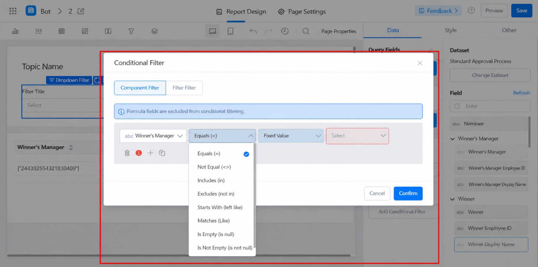
2.4.3 Filter Value Configuration
The filter value supports fixed values, signed-in user variables, and formulas.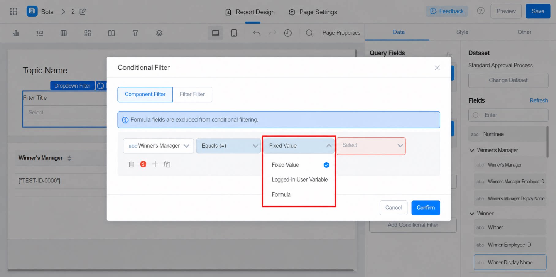
2.4.4 Example
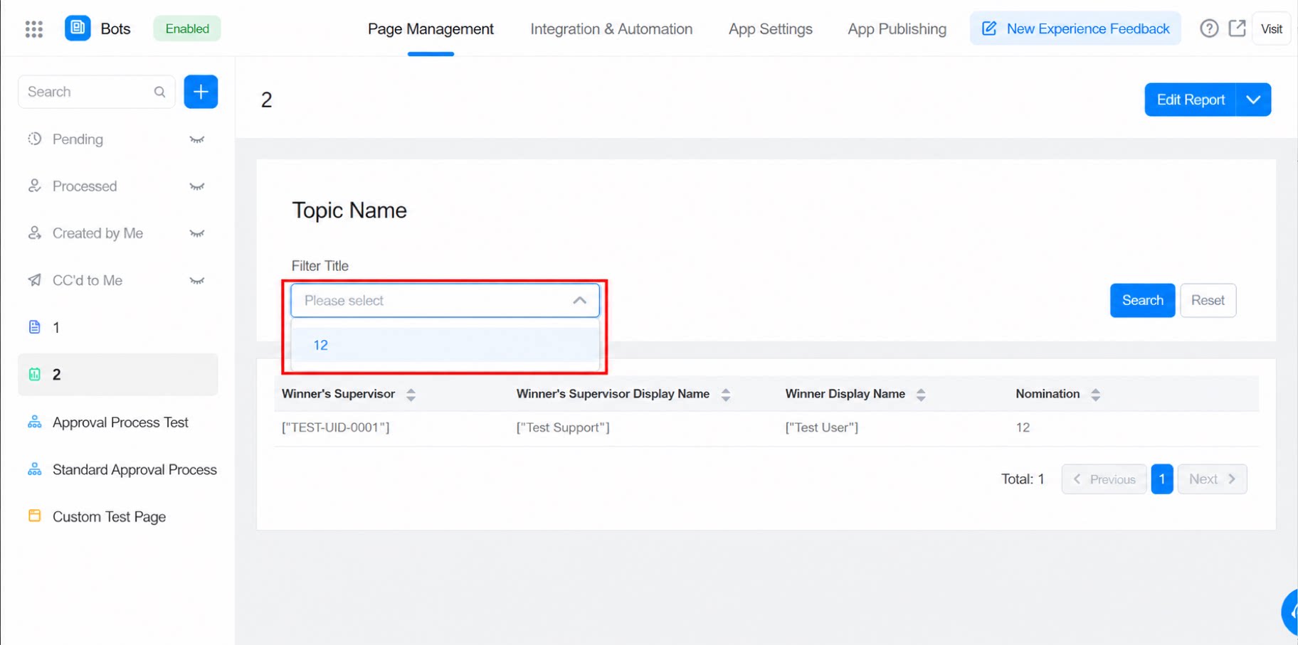
For example, in an inventory table, to show only products with a quantity greater than 1, configure it as follows: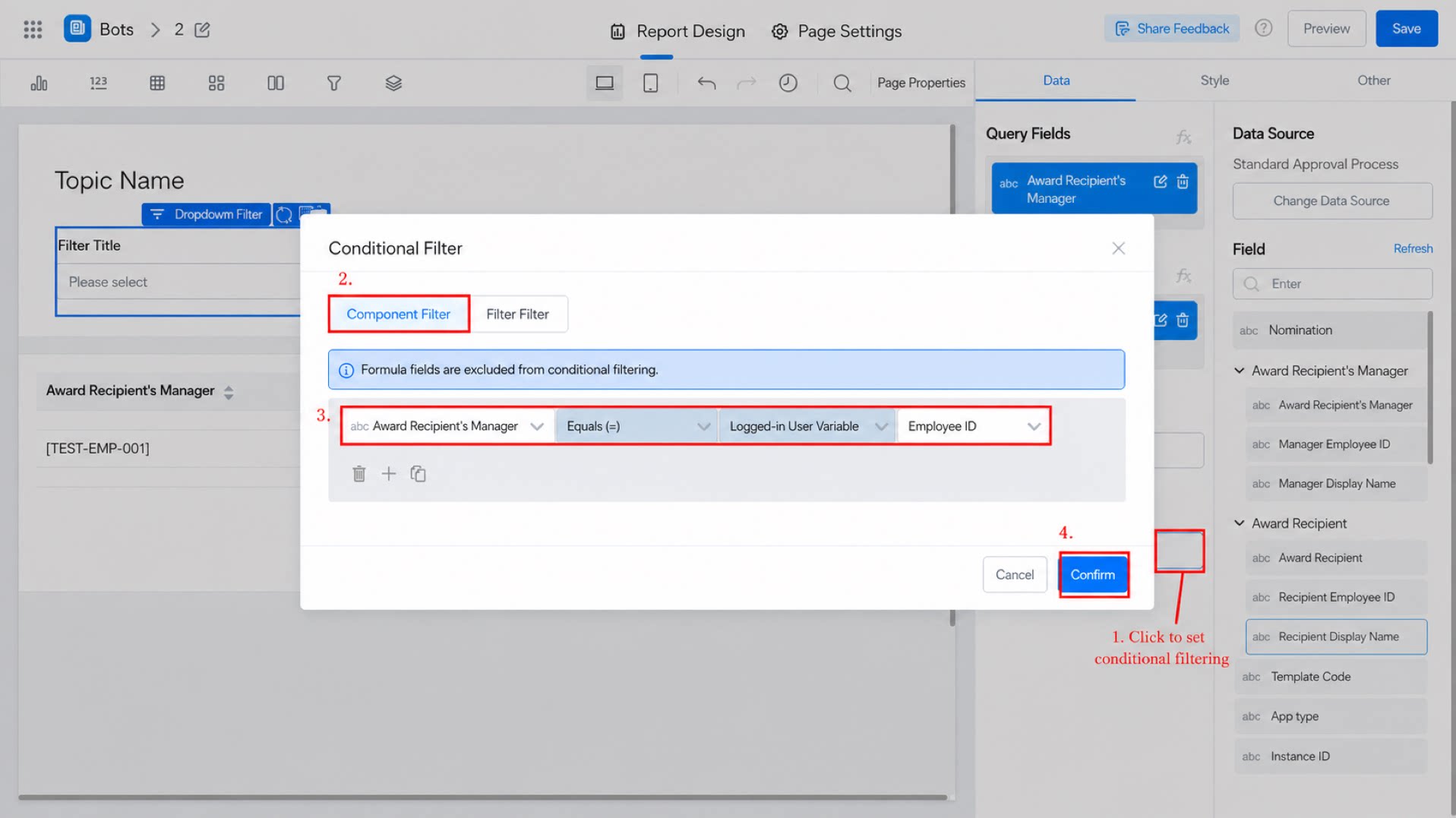
2.5 Configure the Style
2.5.1 Query Method
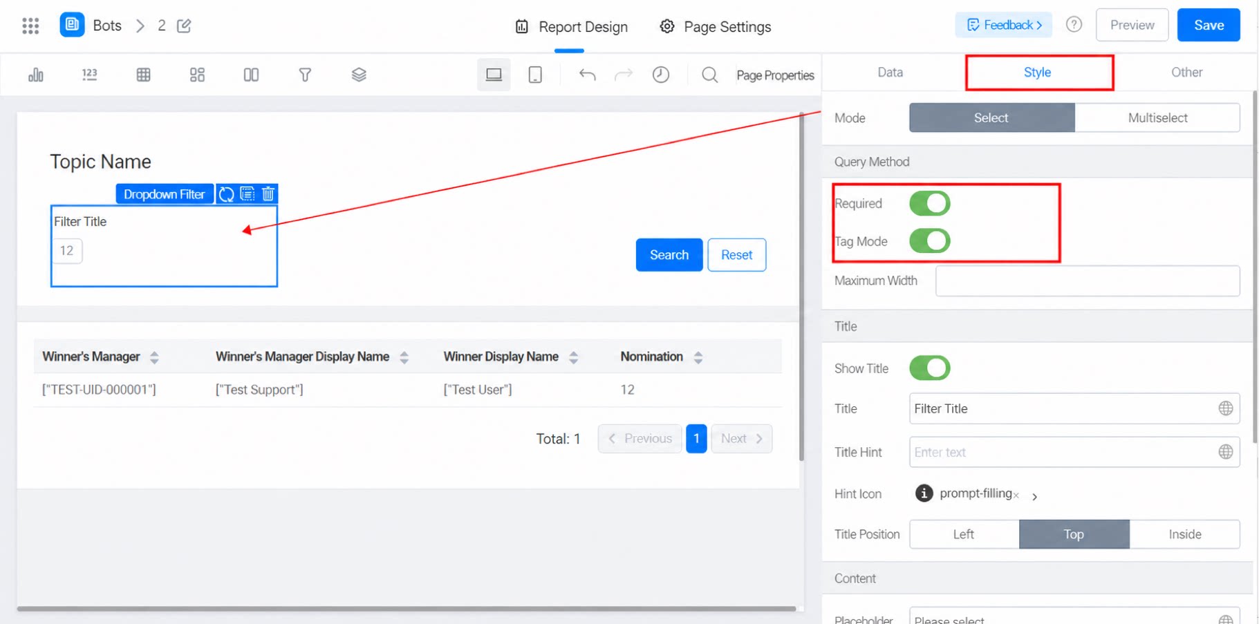
Multiselect mode: when enabled, users can select multiple options. Required: when enabled, the dropdown filter becomes a required item. Tag mode: displays as button-style filters (see the image below). If there are too many options (more than 100), only the first 100 values are shown.- Max width: sets a fixed width for each option. If not set, the width adapts to the text size.
2.5.2 Title
Show title: toggle. On by default. When turned off, all title settings below are hidden. Title name: the title of the filter item. Title tooltip: an exclamation icon appears next to the title. Hovering over it displays the tooltip. Title location: Top, Left, or Inside. Top by default. Set the title.2.5.3 Content
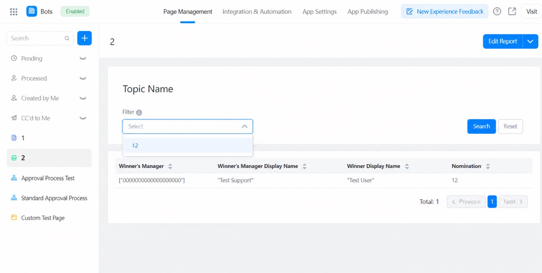
Placeholder: the hint text shown inside the input box. No-option text: the message displayed when the filter has no data and users open the dropdown on the preview page, as shown below: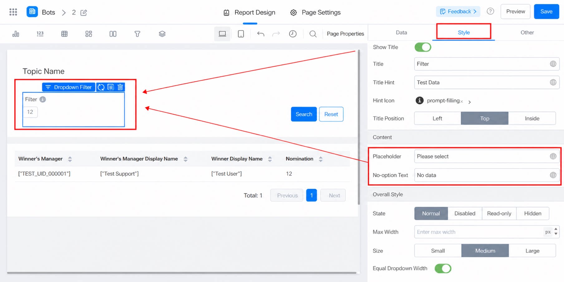
2.5.4 Overall Style
Status: Normal, Disabled, Read-only, or Hidden. Max width: 446 by default. To improve the user experience, the filter width adapts to the page size, but never exceeds the max width. Overall size: Medium by default. Choose Small, Medium, or Large. Clear button: enables one-click clear. When enabled, an X button appears at the end of the input box. Match dropdown width: toggle. Off by default. When enabled, the dropdown list matches the width of the filter input box.