
 Chats
Chats Calendar
 Meetings
 Contacts
 Mail
Mail Docs
Docs Drive
Drive AI Table
 AI Minutes
 Attendance
 Approval
 YiDA
YiDA Admin Console
1. Introduction
1.1 Feature Overview
Word Cloud is a new chart component supported by YiDA 3.0 reports, used for data analysis and data visualization.- The Word Cloud component is configured through three main attributes: “Text”, “Weight”, and “Color”.
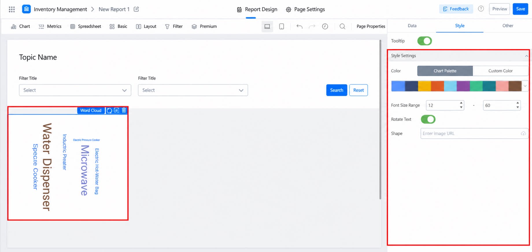
- Supports customizable text size, shape, and color.
- Enables data drill-down through the “Drill-down” attribute, and parameter-based redirection through the “Link” attribute.
1.2 Use Cases
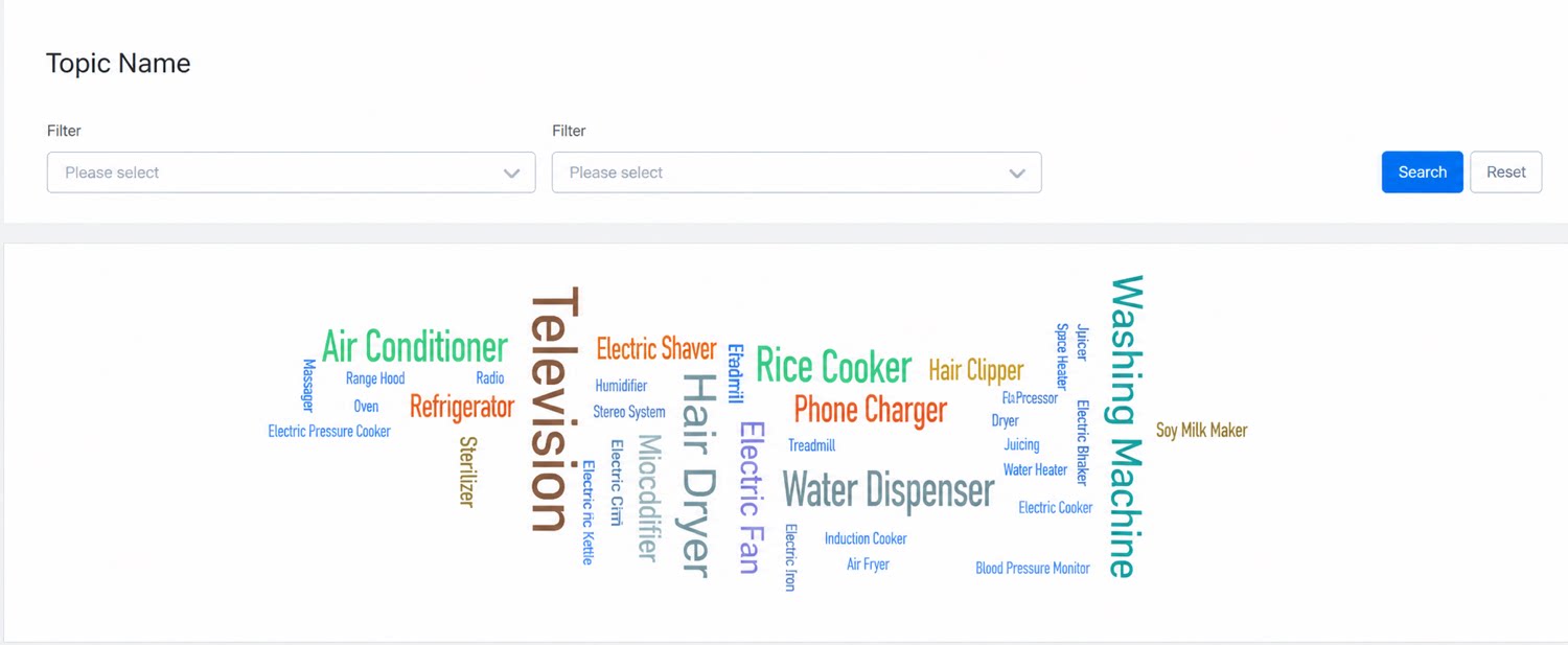
During a Double 11 campaign at an electrical appliance company, the Word Cloud component uses different colors and sizes to represent the relative significance of items, showcasing the products with the highest sales revenue and volume. Similarly, in daily recruitment work, the Word Cloud component can display the positions with the highest business skill requirements.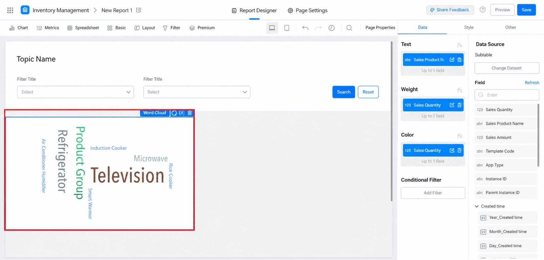
2. User Guide
2.1 Step 1: Create a Report Page and Add the Word Cloud Component
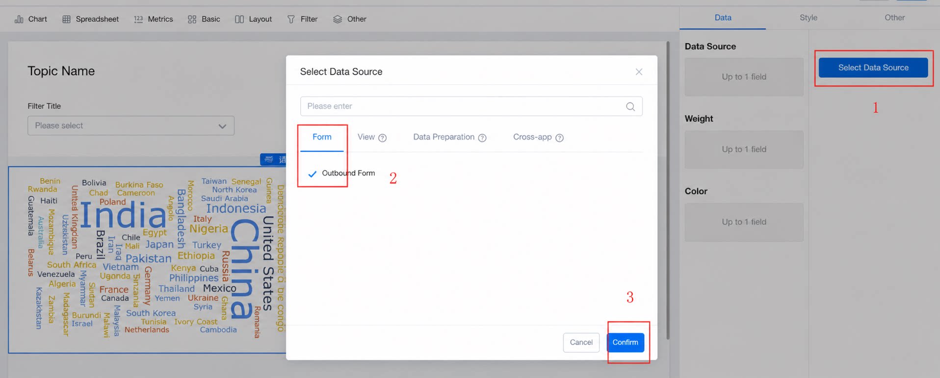
Steps:- Create a report page and name it “Home Appliance Sales Display”.
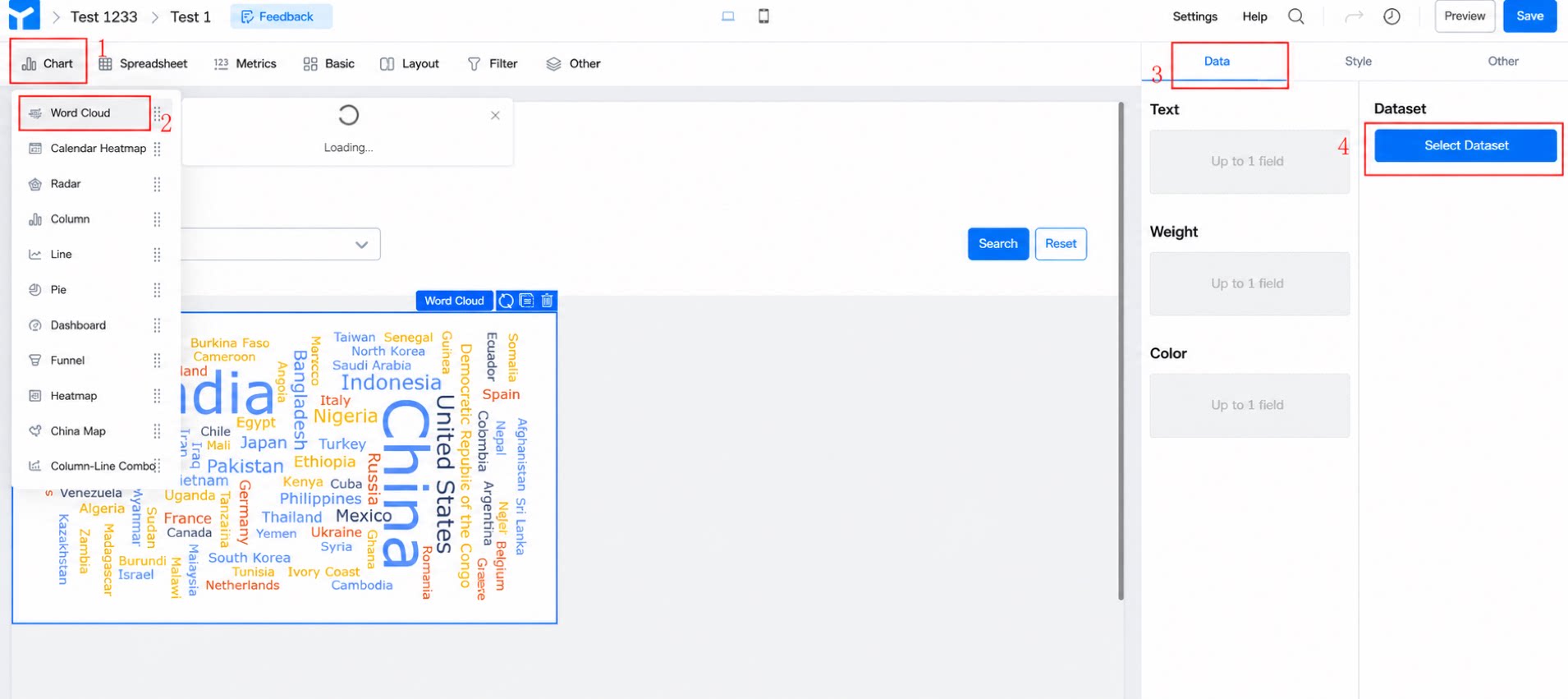
- Add the Word Cloud component via: Chart >> Word Cloud. (See Figure 2.1-1)
2.2 Step 2: Configure the Three Attributes—Text, Weight, and Color
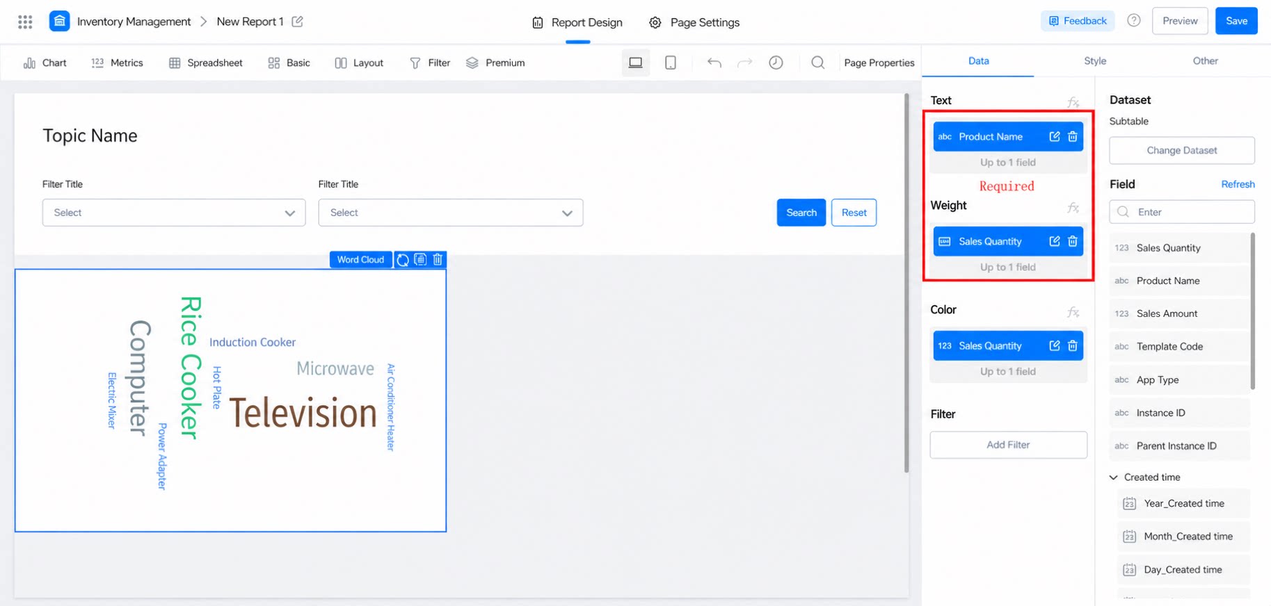
The data for these three attributes can be directly selected from columns in the dataset, or calculated and displayed using report formulas. For instructions on using formulas, view the tutorial.- Text: Required. The words to be displayed.
- Weight: Required. The weight data for each word, which supports aggregation.
- Color: Optional. The field that controls text color. For example, if your word is “Product Name” but you want cities within each province to share the same color, you can enter the “Product Name” field for Color. If left blank, the color will be set according to the “Weight” field by default.
2.3 Configure Data
2.3.1 Entry
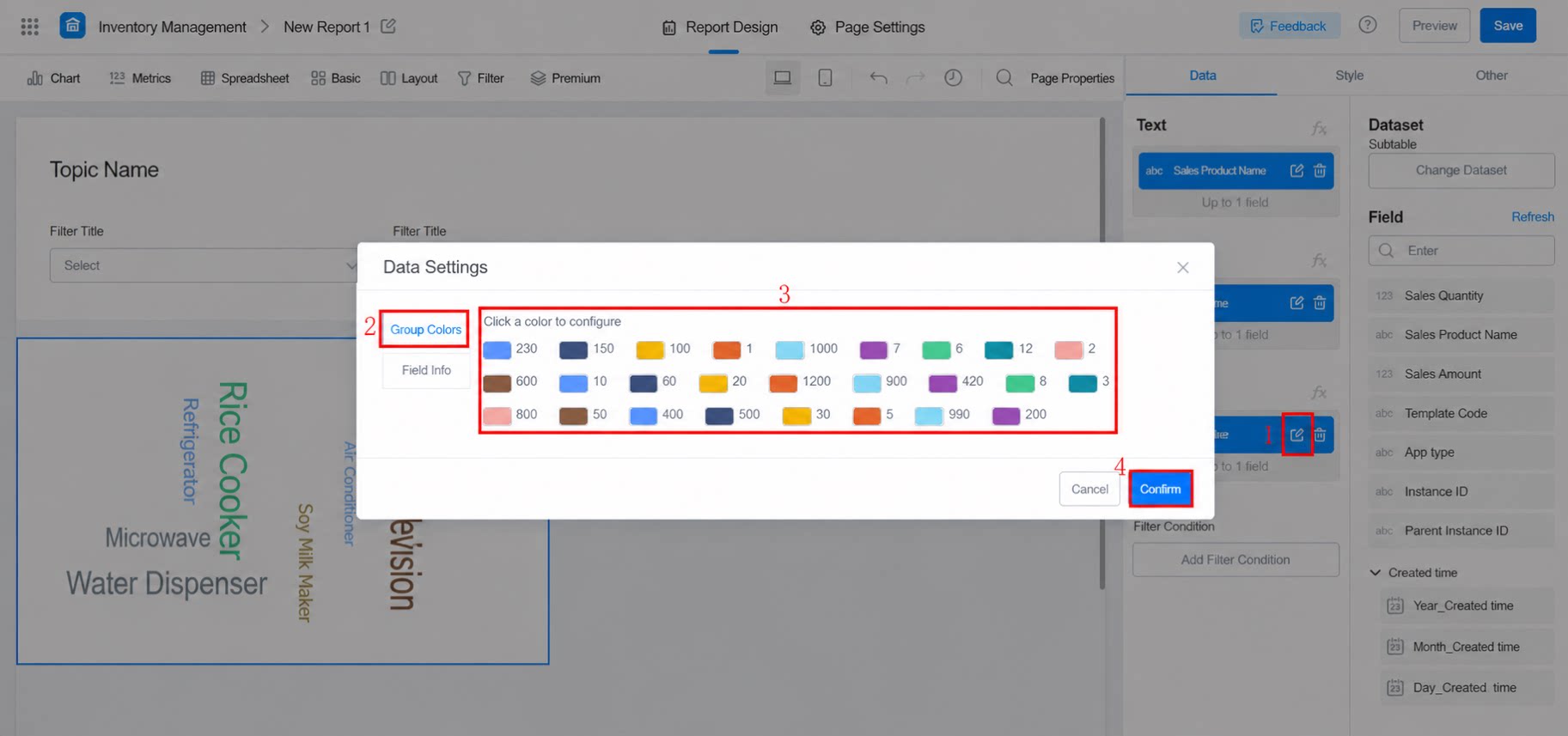
Click the pencil icon on the right side of the field to enter.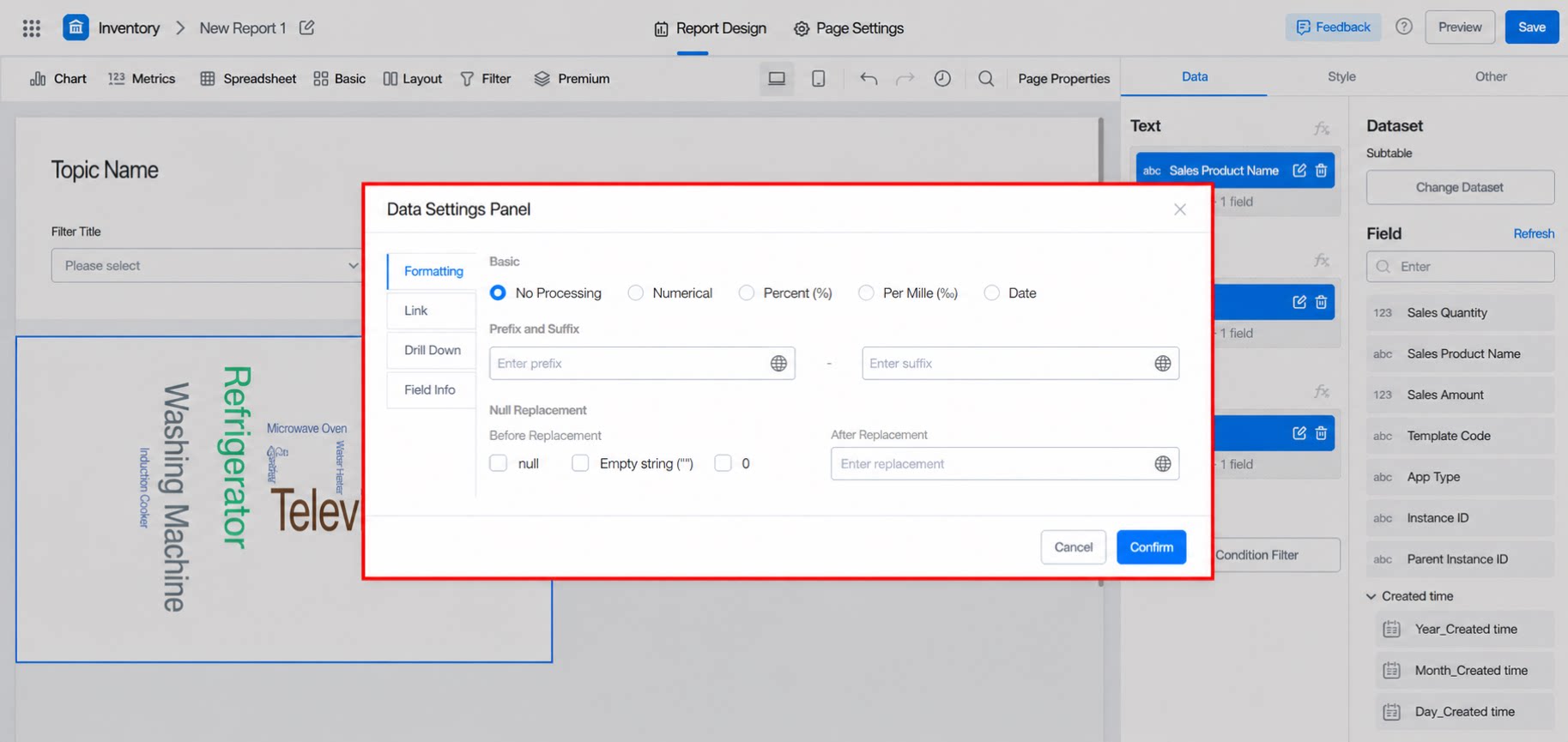
2.3.2 Aggregation
Aggregates scattered data together. Different aggregation methods are available depending on the field type. The Text field has no aggregation button; only the Weight field supports aggregation. For details, click here.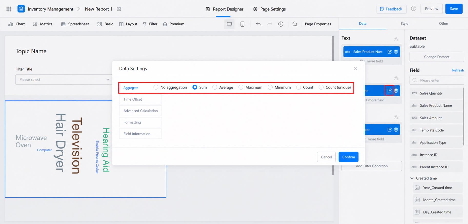
2.3.3 Formatting
You can apply operations such as “Format”, “Prefix/Suffix”, and “Empty Value Replacement” to fields. The image below shows the effect after adding the prefix “Hehe”.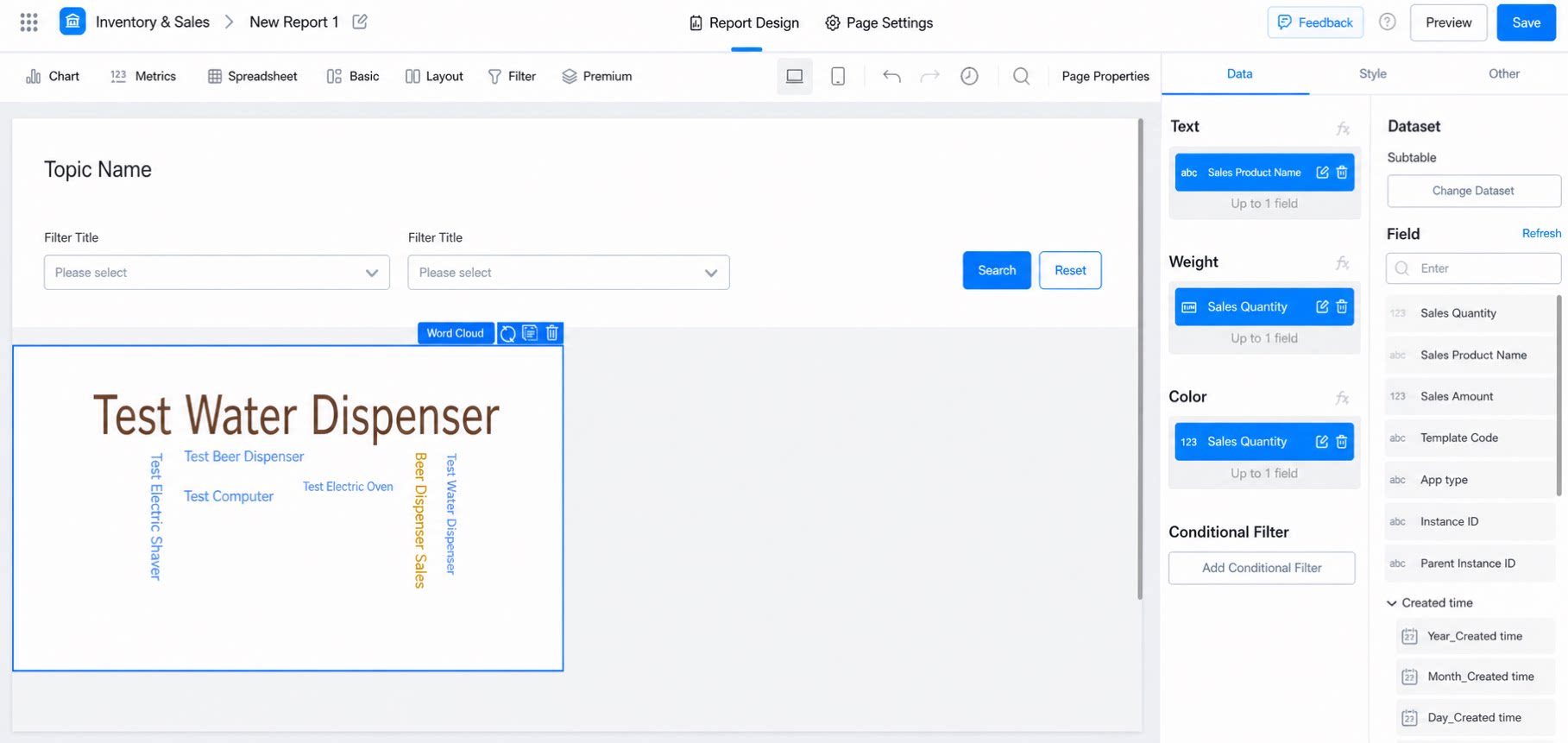
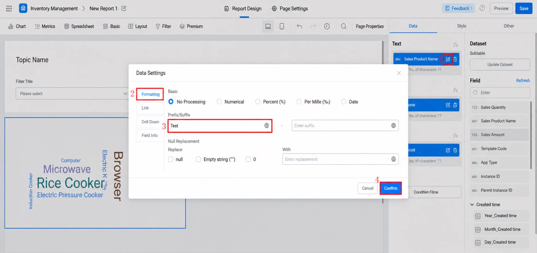
2.3.4 Link
You can redirect to a URL with freely combined parameters, or open a card to achieve a drawer slide-out effect. For details, click here.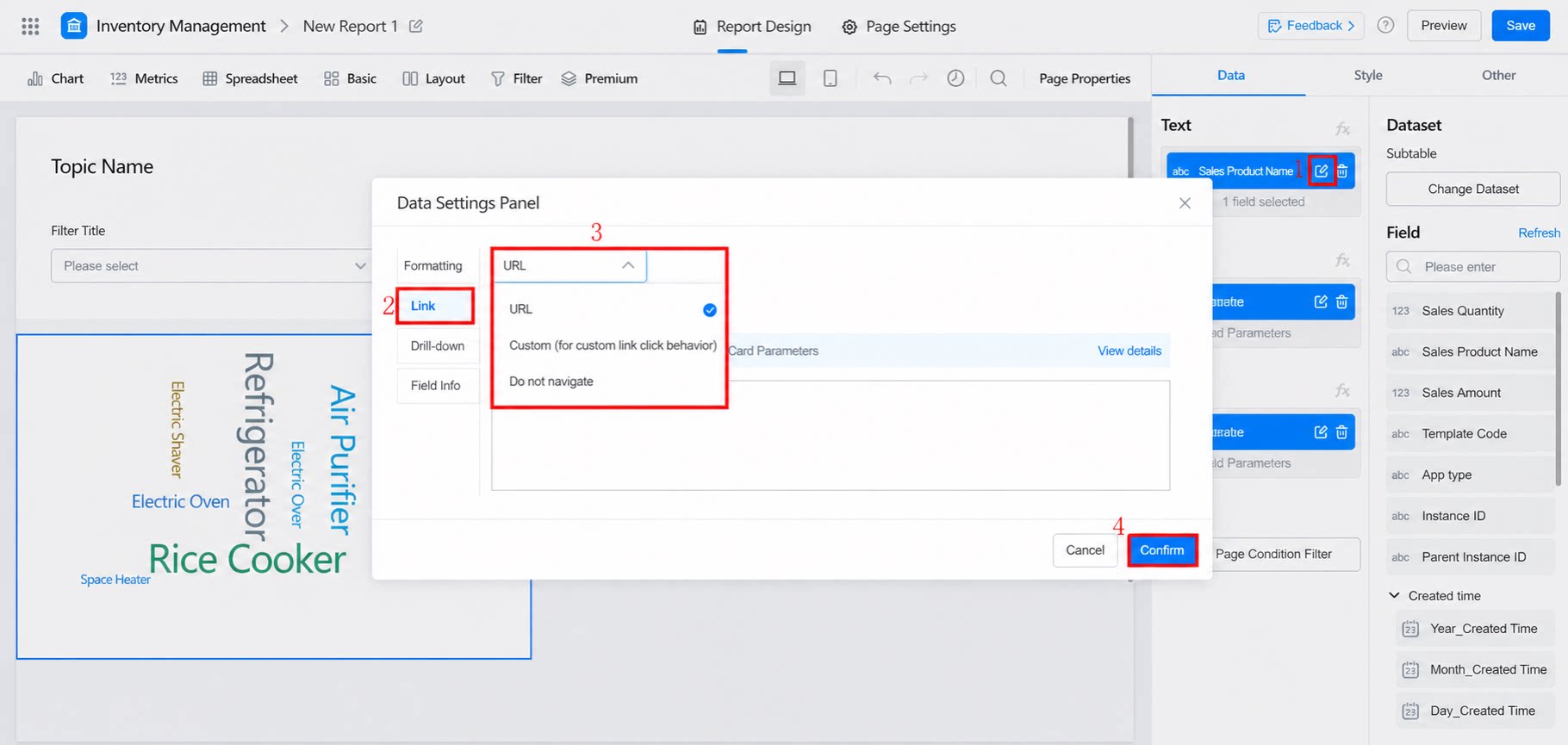
2.3.5 Field Information
Displays the field name, unique identifier, field ID, dataset name, and dataset ID.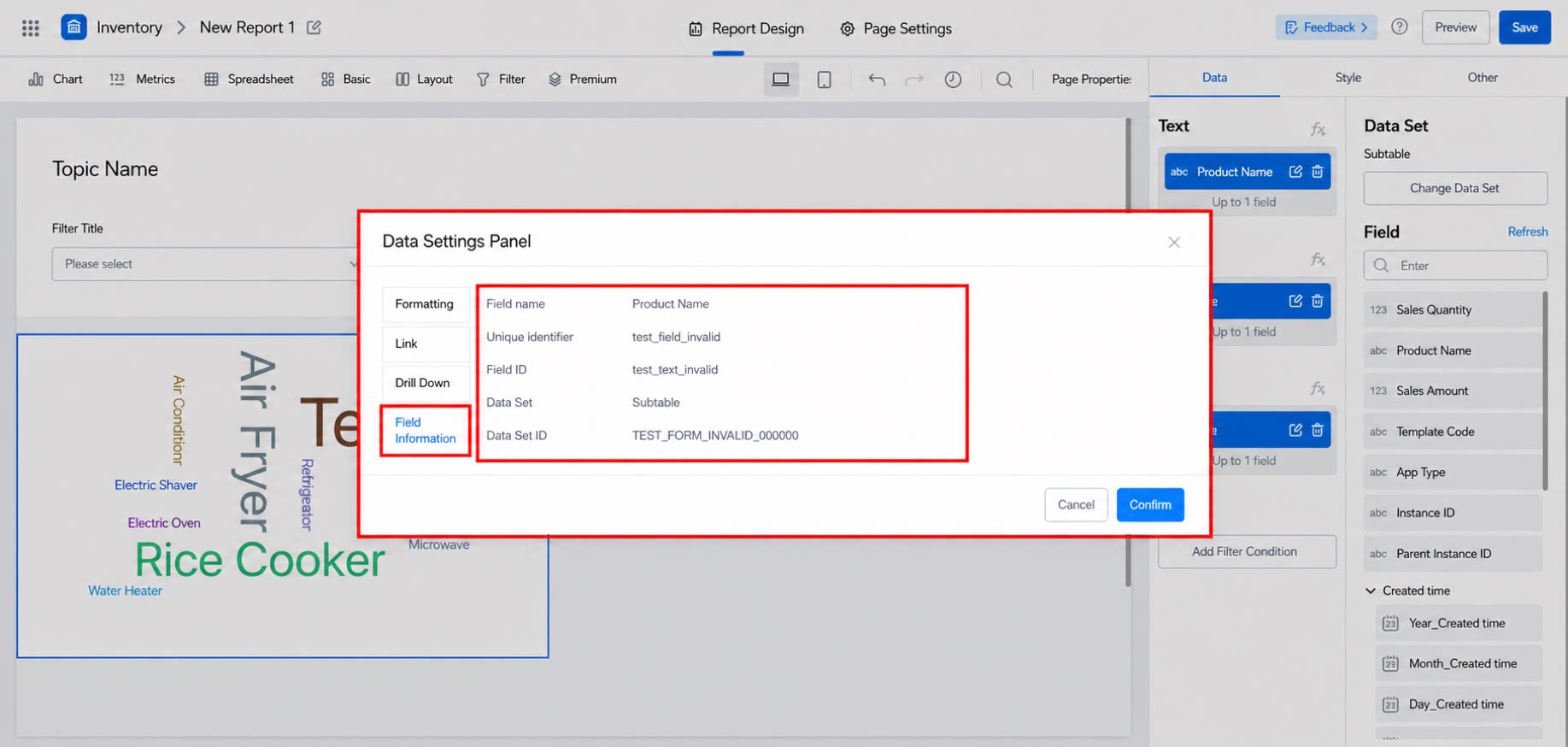
2.3.6 Group Color Settings
You can set colors individually for multiple data fields. The effect is shown below: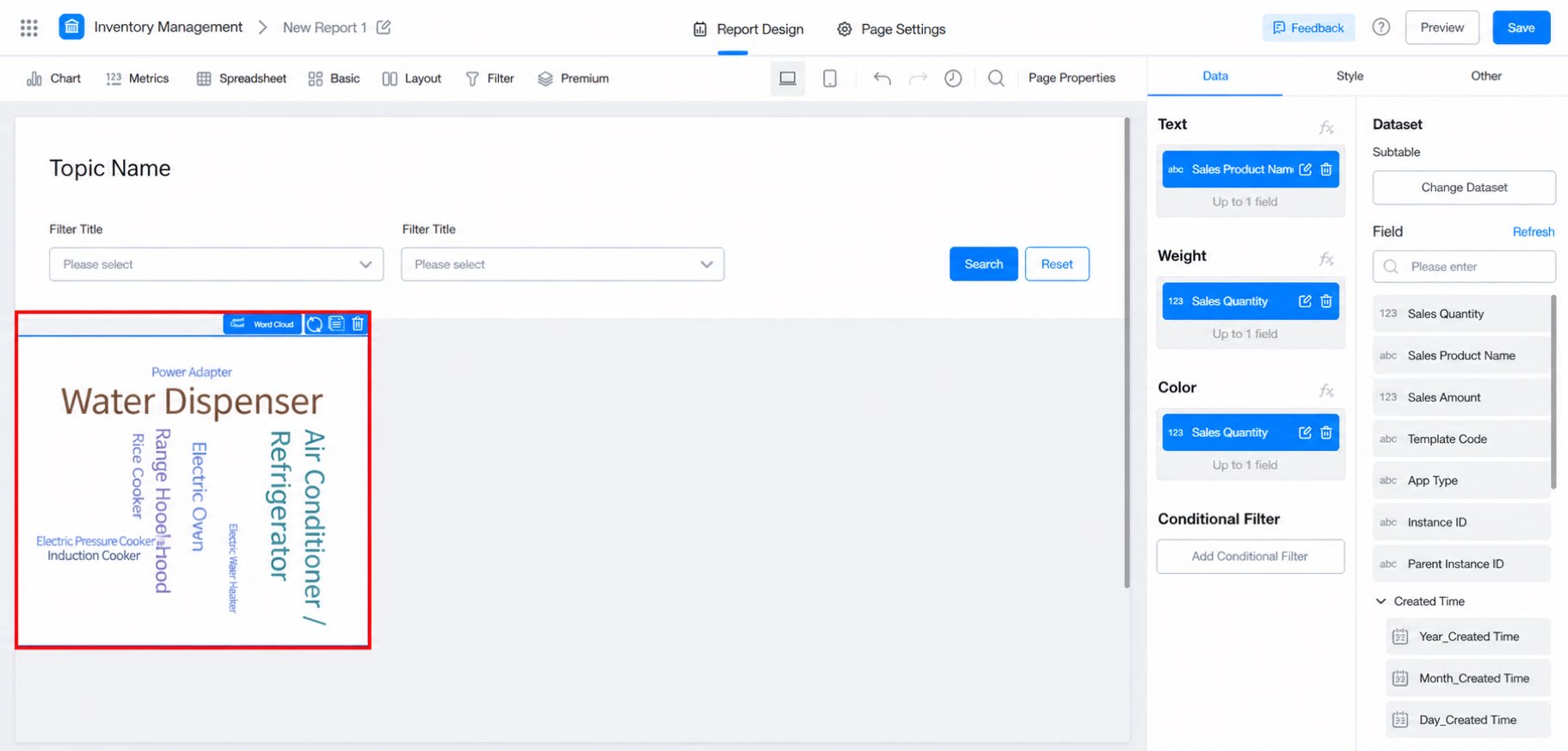
2.4 Style Settings
- Height: The height of the chart. If left blank, it will auto-adapt.
- Tooltip: When enabled, hovering over text displays the weight value.
- Style configuration (see the image below for the effect).
3. Creative Tips
When the Word Cloud contains a large amount of content, configuring it with an engaging company LOGO or a refined background can help words of varying lengths display completely. Example: Word Cloud shape image Car