
 Chats
Chats Calendar
 Meetings
 Contacts
 Mail
Mail Docs
Docs Drive
Drive AI Table
 AI Minutes
 Attendance
 Approval
 YiDA
YiDA Admin Console
1. Overview
1.1 Introduction
A Line chart shows how data changes over a continuous time interval or time span. It reflects trends in data as it varies over time or across ordered categories. A Line chart consists of:- X-Axis: represents time
- Y-Axis: represents values
- Points: mark the position of each data value
- Lines: connect the data points
1.2 Use Cases
In a Line chart, the X-Axis typically represents the passage of time at equal intervals, while the Y-Axis represents data values at each point in time. The chart below shows how monthly sales change over time.1.3 Basic Requirements
To build a Line chart, meet the following basic requirements.2. Steps
2.1 Select the Component and Configure the Dataset
Create a report, add the Line chart component, and select a dataset, as shown below: Add a dataset.2.2 Select the Fields to Display in the Chart
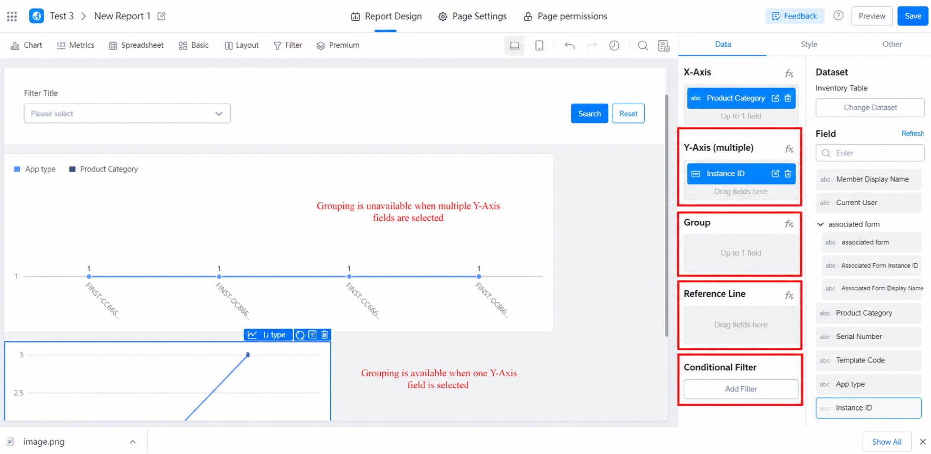
Drag fields from the right panel to X-Axis, Y-Axis, Group, or Reference line.X-Axis
- Sets the X-Axis of the Line chart.
Y-Axis
- Sets the Y-Axis of the Line chart.
Group
- When the Y-Axis has only one field, you can configure a group to expand the display by group dimension. When the Y-Axis has multiple fields, grouping is not supported.
Reference Line
- Each reference line represents a specific value. You can configure multiple reference lines to compare data.
Conditional Filter
- Filter the data shown in the chart based on the conditions you specify.
2.3 Style Settings
Style settings fall into seven categories: Style configuration, X-Axis, Y-Axis, Legend, Label, Slider axis, and Tooltip.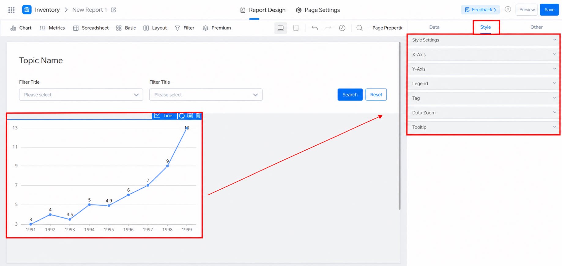
2.3.1 Style Configuration
You can adjust the line color, data display (stacking and percentage stacking), curve smoothing, point display (point size and toggle), line width, line display (toggle line visibility and set line thickness), and area display (turn on to configure as an Area chart). Note: Color settings take effect only when the Y-Axis contains multiple fields. Custom colors support English color names or hexadecimal values such as #5894FF. Separate multiple values with commas. Style configuration.2.3.2 X-Axis
Common basic settings. Try them to see the effect, as shown below: X-Axis settings.2.3.3 Y-Axis
Common basic settings, similar to those for the X-Axis, as shown below: Y-Axis settings.2.3.4 Legend
Supports on and off. When on, you can adjust its position and toggle pagination (on by default). Legend settings.2.3.5 Label
Supports on and off. When on, you can adjust the position, font size, and color (black by default). Label settings.2.3.6 Slider Axis
Supports on and off. When on, you can adjust the start and end range (between 0 and 1), as shown below.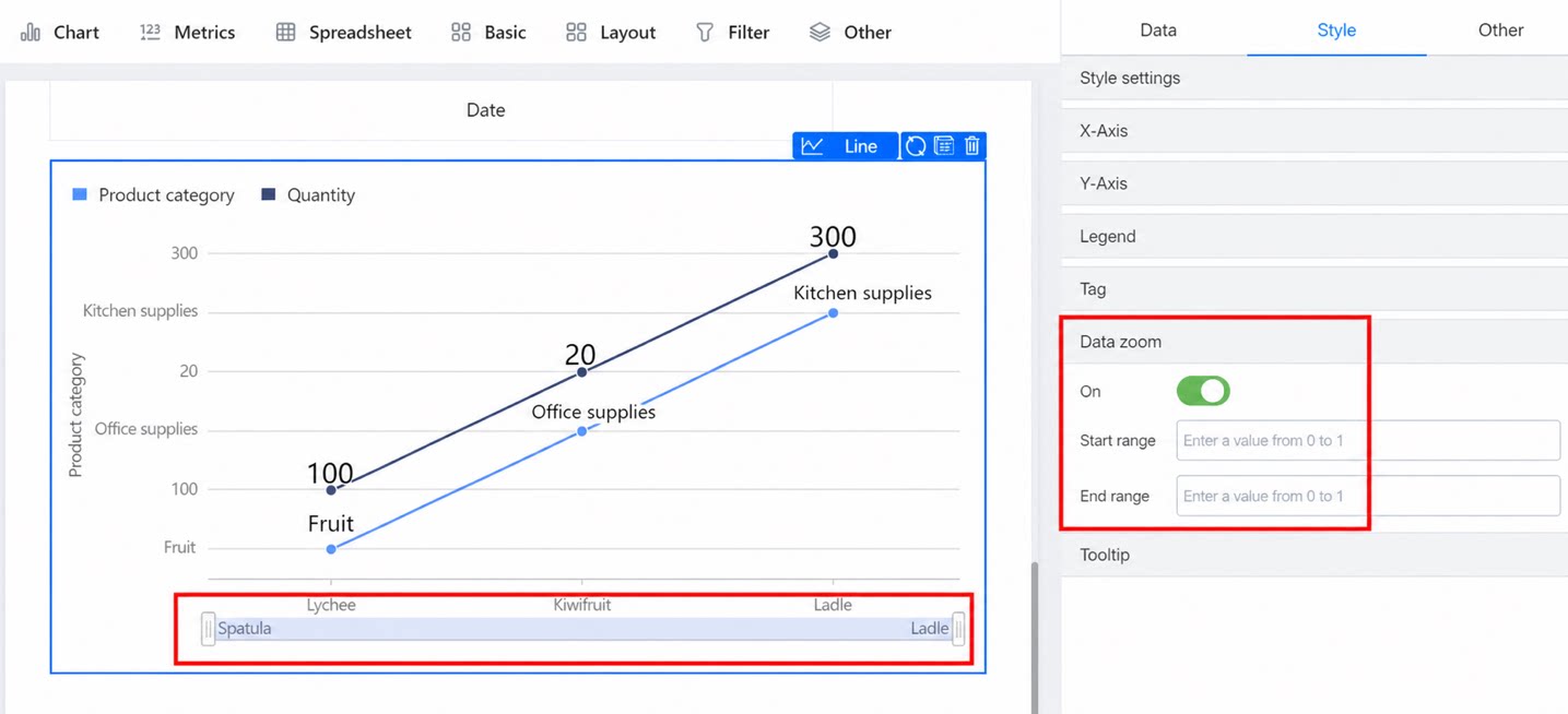
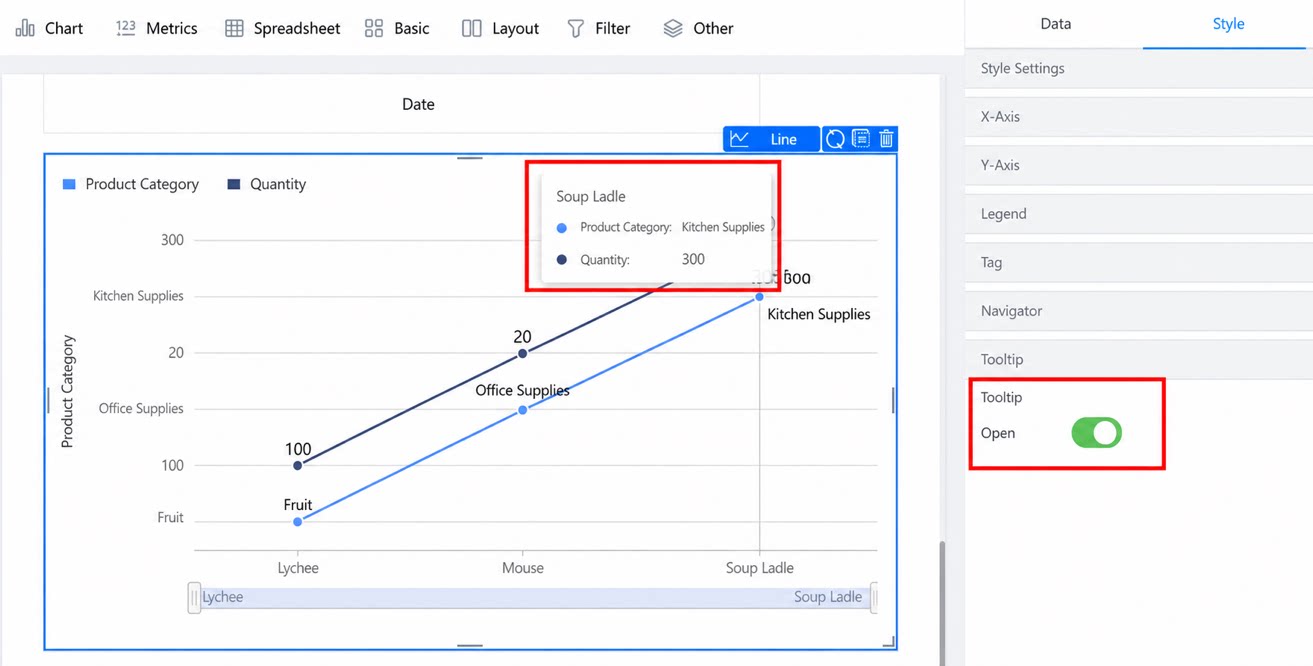
2.3.7 Tooltip
Supports on and off. When on, the effect is as follows: